
With a newly constructed corporate headquarters, Covid-19 hit the world and Oshkosh Corporation was forced to temporarily close the doors on the new building and send everyone to work remotely from the safety of their homes. After the mandated shut-down, the leadership team wanted to resume with business as usual but knew that in order to do it safely, they'd need to follow CDC recommendations and ensure that everyone understood what that would entail.

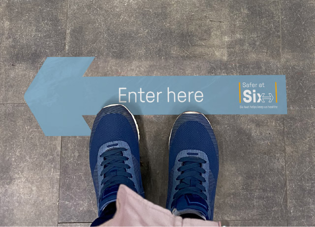
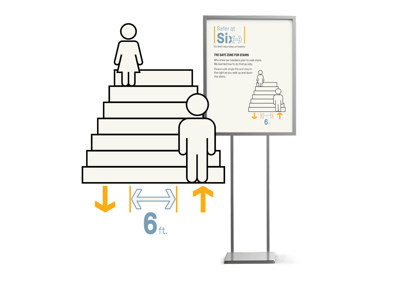
As the recommendation to maintain six feet of distance became a staple for public safety, Quill Creative Studio was hired to create a system of graphics to remind everyone that we're all "Safer at Six." While staying on-brand and true to the corporation's visual identity, we created designs for a combination of floor graphics, signage, and wayfinding to promote health throughout the headquarters.
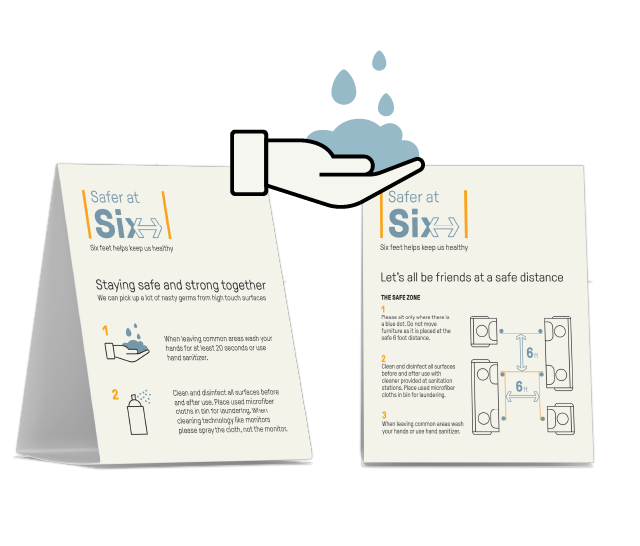
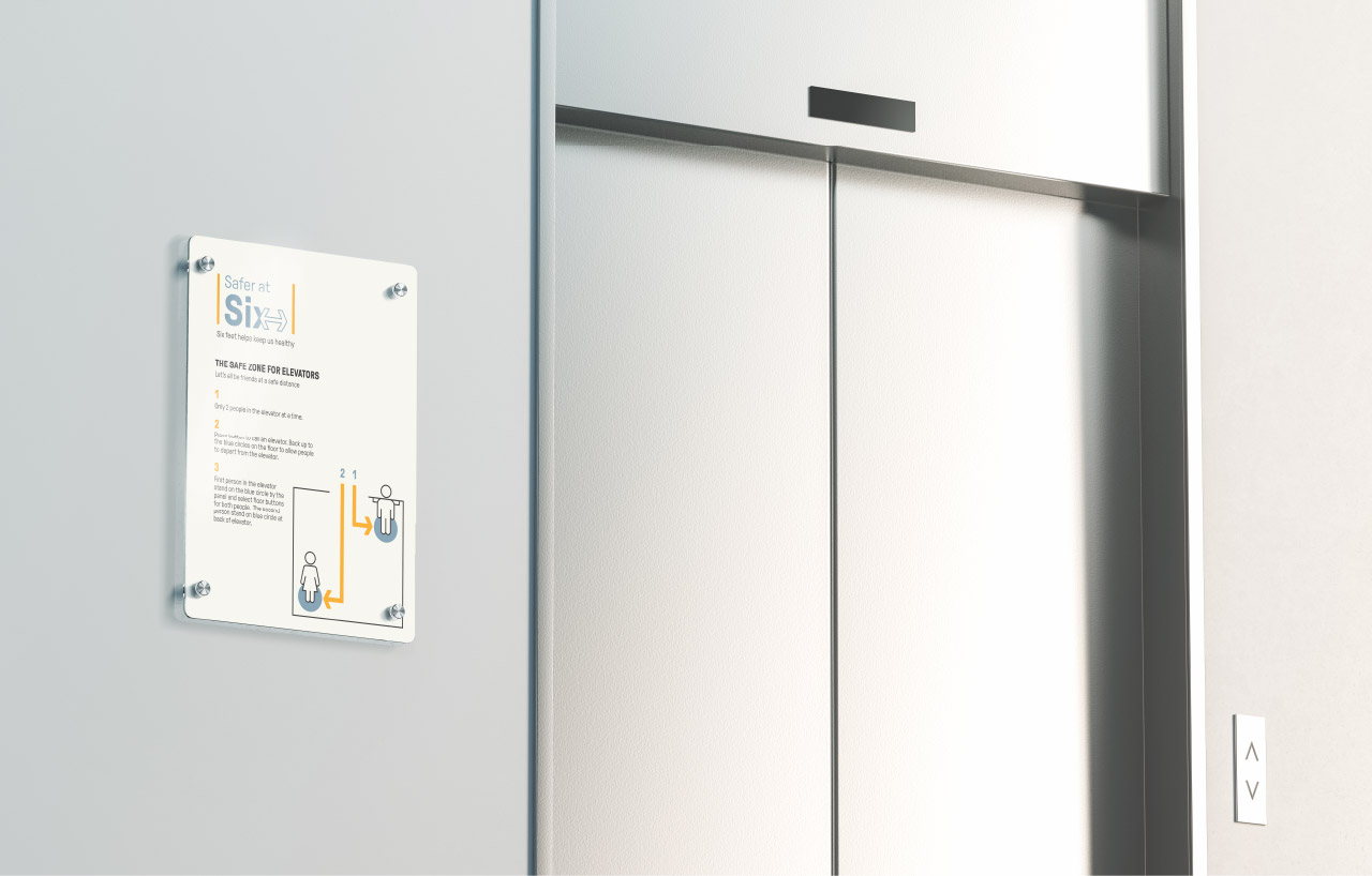
While following recommendations always falls into the hands of the individual, it's helpful to have reminders present and visible. These friendly reminders fit in with the corporation's branding throughout the space and communicate professionalism and strengthen the People First culture.


