
Good Foods started offering natural and organic products to the public before it was a trend. Over the last few decades, they grew into a category champion and in that process, developed various packaging solutions and branded assets along the way. Their marketing department had a firm grasp on their design principals but lacked a document to be easily shared with team members or external partners. With some big projects coming up, they wanted to ensure that everything was on the correct path for brand consistency moving forward. The team at Quill Creative Studio was tasked to provide visual brand consulting and document the findings within an all-inclusive brand style guide.

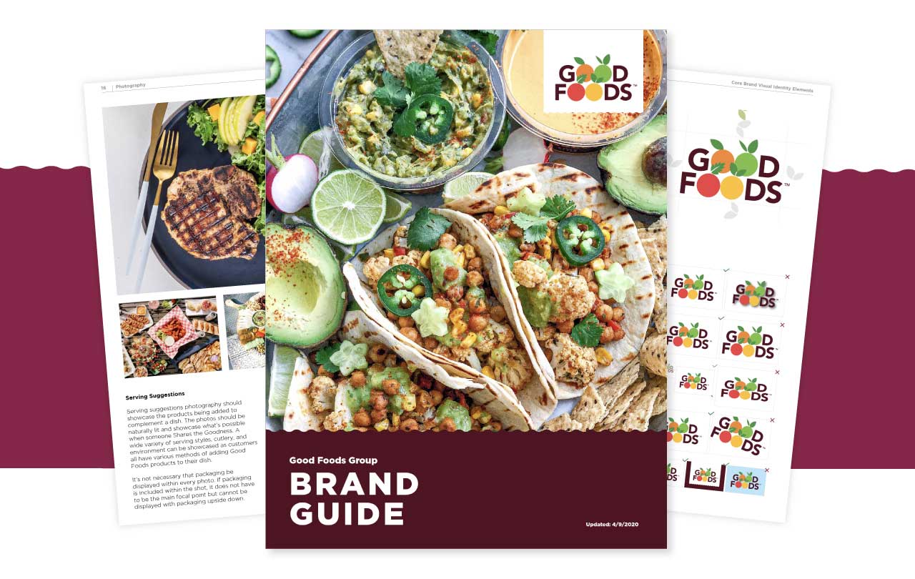
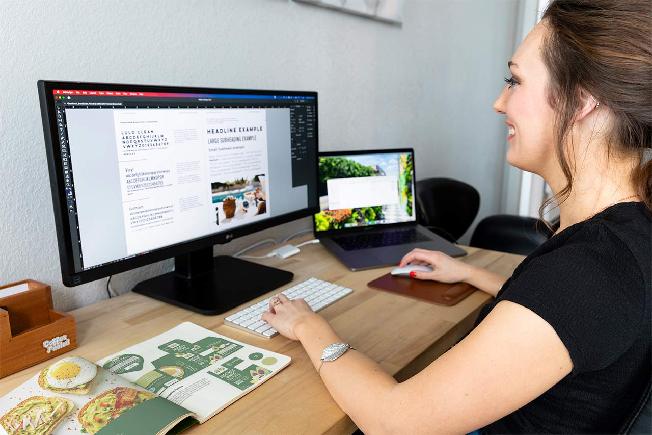
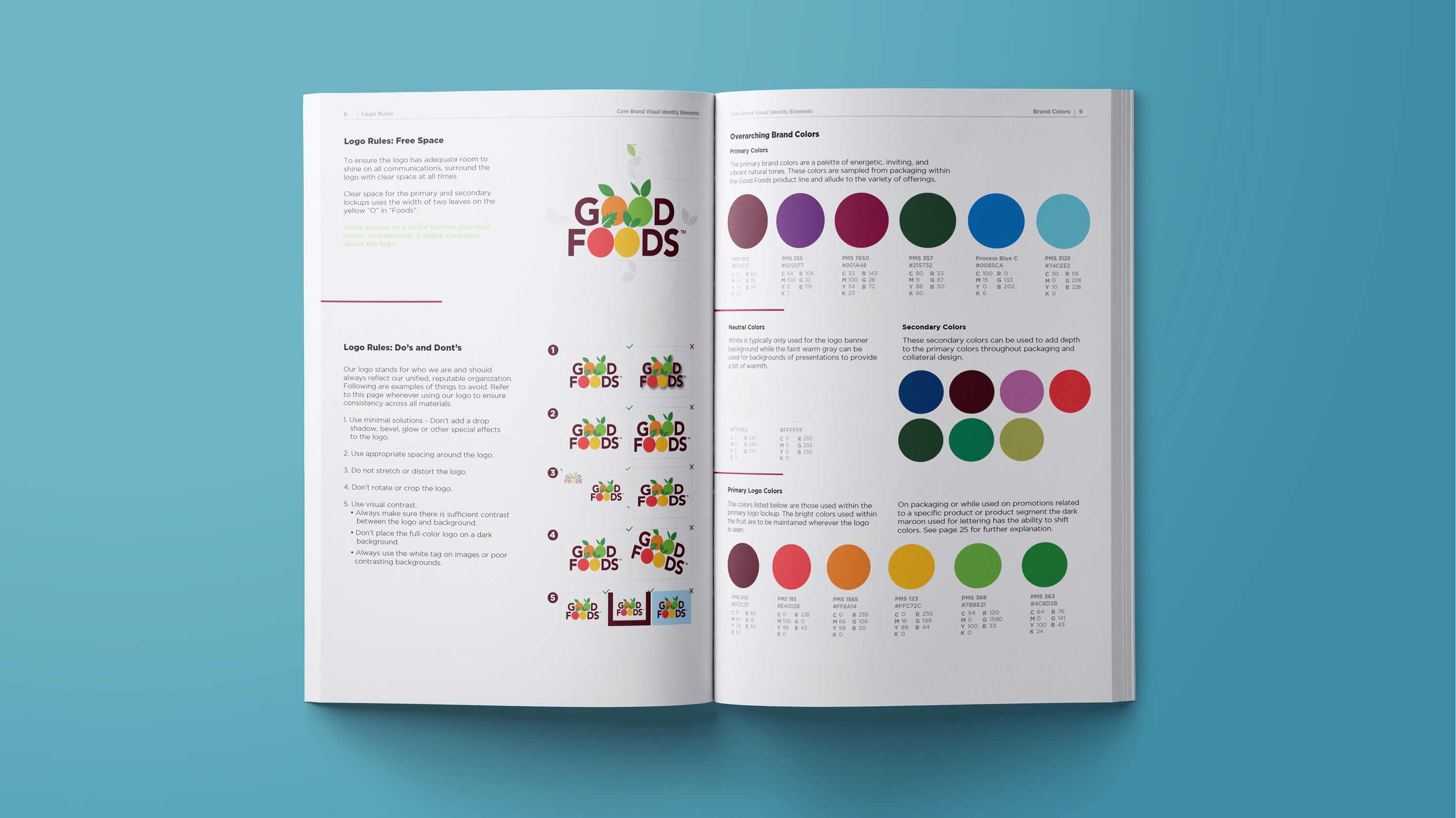
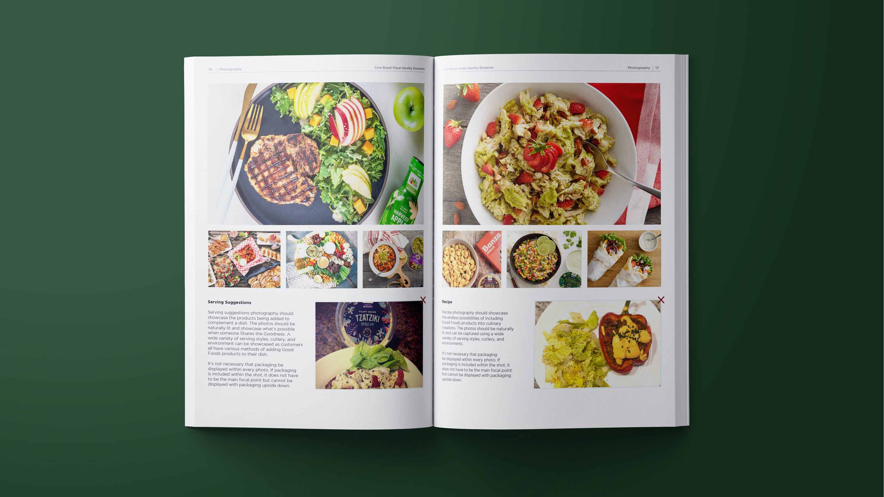
While reviewing all the pieces of their branding puzzle, we began to call out elements and stylings that were true to their brand personality and provide recommendations for how everything could be simplified for more impact. We then documented the rules within an extensive brand style guide.

Today, the Good Foods brand has a clear path forward and has launched an updated website, updated various packaging solutions, and reference the guide regularly so everything remains consistent. As they continue on their mission to ease the minds and lives of consumers everywhere with their delicious foods, they sure look good doing it.

The Quill team did a great job translating years of historical knowledge and evolving design systems to develop our Brand Guide, which has become a great resource tool for our company and our partners. They are great listeners and great partners who worked tirelessly to complete this big project and we highly recommend Quill Creative.
MANDY BOTTOMLEE, DIRECTOR OF CONTENT MARKETING, GOOD FOODS

