
Despite decades of success in the industry, LinerWorld was struggling to pinpoint what was holding the company back from reaching that next level of growth. They had a successful business model, great customer service, quality products, and happy customers. But an out-of-date brand identity and less than ideal website experience was holding them back.
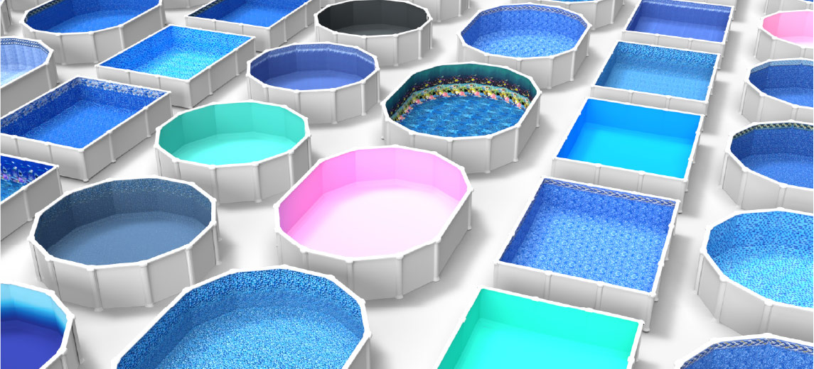
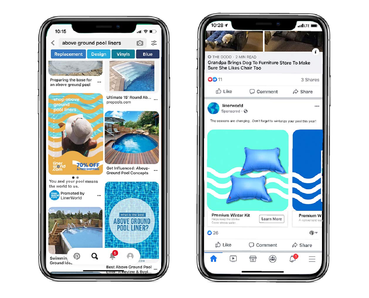
Quill approached the overhaul of LinerWorld’s visual identity with their customer-based firmly at the forefront of each decision. The colors, fonts, and imagery were all updated to be more vibrant, playful, and contemporary and evoke the experience of poolside relaxation and fun. Additionally, Quill integrated simple, clean graphics demonstrating product functionality, facilitating customer decision-making, and ensuring a seamless shopping experience. Lastly, Quill completely streamlined LinerWorld’s website, enhancing navigability and optimizing every touchpoint to prioritize enjoyment and ease of use for customers.

In the first year after the rebrand, LinerWorld witnessed an astounding 54% increase in revenue, coupled with a 51% increase in average order value. Their new website drew a 40% rise in total visits, while pageviews soared by over 145%. Two years post-rebrand, LinerWorld celebrated another 96% increase in gross sales and a 121% increase in average order value. Though their product line remained completely unchanged, their fresh brand identity and new strategic vision helped them achieve unparalleled growth, a testament to the power of strategic branding and customer-focused approach.


We have had an incredible response from our customers since rebranding with Quill. The entire rebranding process was fun and exciting and really opened the door to getting our company to the next level. In addition to increased revenue, Quill’s creative strategy beautifully rejuvenated our look and feel and helped us educate and inspire our customer base. Their team is full of talented true creatives, and we really look forward to future projects together.
BRITTANY THURMAN, CREATIVE DIRECTOR, LINERWORLD

