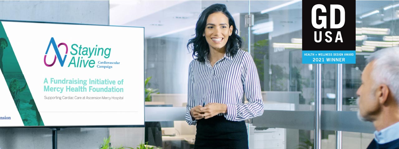
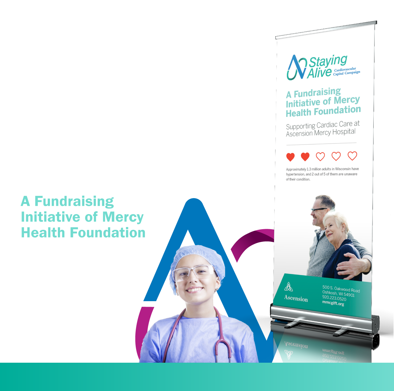
The Foundation at Mercy Medical Center in Oshkosh, WI has generated an incredible impact within their local community through numerous programs and initiatives. One of their fundraising campaigns, primarily focused on cardiovascular technology improvements, was scheduled to launch with the name Staying Alive - Cardiovascular Campaign. The only holdback? It didn’t have a proper visual identity or campaign materials. Our task was to create a solution that would keep the blood flowing.
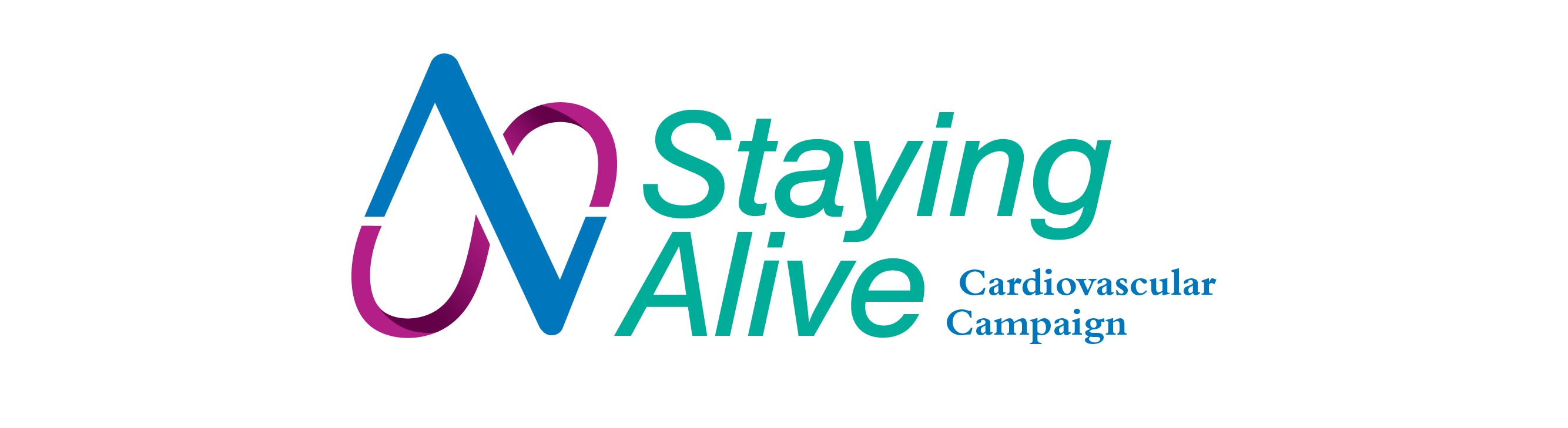
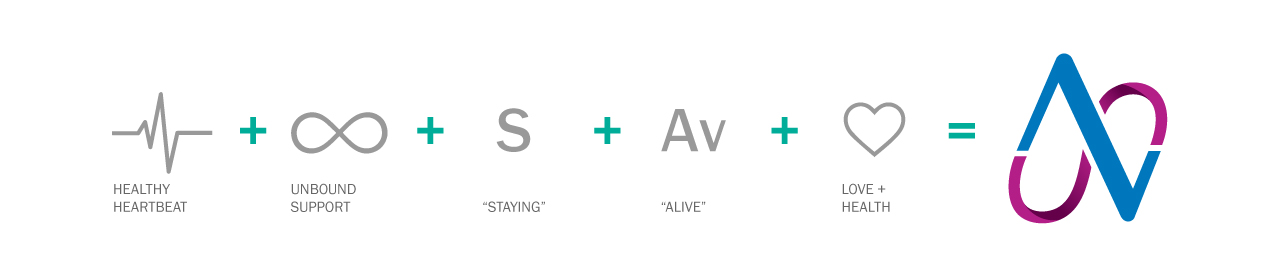
Similar to any established brand, Ascension had strict visual guidelines which we referenced to ensure that the campaign would be in tune with the overarching brand. By combining a pulse indicator and an infinity loop, a symbolic logo was created to visually represent a neverending heartbeat. In pairing the program logo with clean typography and brand appropriate imagery, we developed key tools for their team to leverage for fundraising and they were ready to launch the campaign to the community.
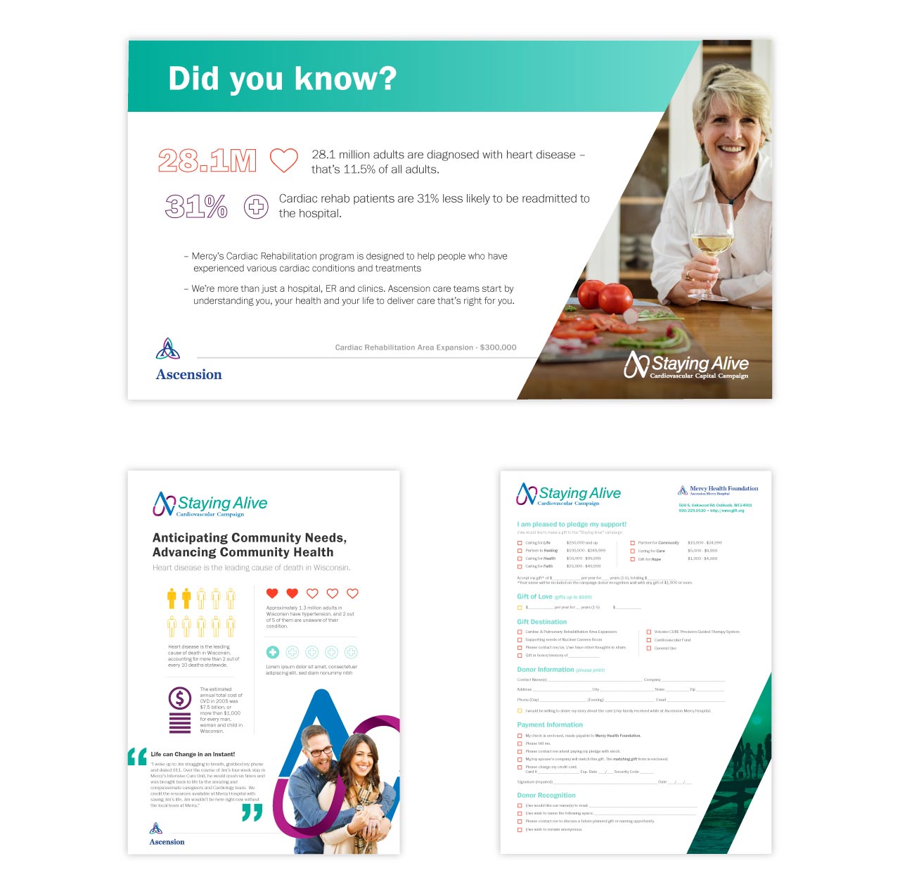
The campaign was slated to roll out during a benefit event but due to Covid-19 concerns, the event was postponed. The materials were instead utilized for one on one presentations and played an essential role in raising over a half a million dollars to go towards cardiovascular center improvements. The Foundation is now planning on a virtual event to help them raise another quarter million to hit their campaign goal.

The Quill team took our many ideas of what we wanted the campaign logo to portray, creating an easily recognizable look and message. At each step along the way, I knew that Ryan and his team were available to answer any questions we had.
LIZ JANSEN, FOUNDATION DIRECTOR, MERCY HEALTH FOUNDATION

