House of Flowers has established a strong reputation within their community. They've become known as the go-to option for those wanting a premier shopping experience for decor and floral arrangements. The visual elements used throughout the brand were beginning to feel dated and since all of their products and offerings were consistent in their aesthetic quality, they wanted the brand to match. Quill was brought in to take a good look at what got them to where they are and create a stronger foundation for the future.


While reviewing all the pieces of their puzzle, we began to call out elements and stylings that were true to their brand personality and provide recommendations for how everything could be simplified for more impact. We then documented the rules within an extensive brand style guide.
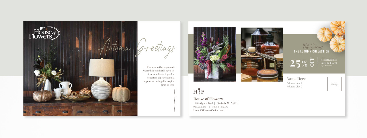
Following the visual identity update, House of Flowers hired a new marketing resource who was equipped with design capabilities. Every identity created by Quill Creative comes complete with a brand style guide to follow so they had all the tools and elements at their fingertips to maintain a strong visual brand. Since the launch of the updated visual identity, they've gone on to update their website, graphic wraps on their fleet of delivery vehicles, signage, and promotional pieces for both print and digital applications such as social media.


