Originally founded as the Winnebago Heroin Task Force, the Winnebago Drug & Alcohol Coalition agreed that the organization would be most effective at mitigating the risks of substance abuse in the area if they were able to present themselves as a more approachable community resource. Focusing efforts on the idea that an educated and strong community will have a natural barrier to block out the hazards of substance abuse. Our job was to develop a new name, messaging, and visual identity for the organization.
Since Oshkosh is the largest city within the county and also known for being on Lake Winnebago, we felt it would be most appropriate to focus the naming convention on a nautical theme. A breakwater is, in essence, a solid structure that's a compilation of many small pieces designed to protect valuable assets from stormy waters. With this concept at the core of the brand, our solution for the identity was to have everything revolve around this storyline and be presented with an approachable and fun-loving appearance. Since each effort to strengthen the community is unique, the logo is symbolic of that combined effort for a greater purpose.

Since re-launching the brand as Breakwater, the Winnebago County team has leveraged the updated position and visual identity to create a deeper impact within their community. A combination of informational handouts, video PSA segments shown at local theaters, an updated website and even the creation of a community podcast has opened the door for conversations with the community. The biggest message that's being driven by Breakwater is that we can all be working together to strengthen our community.
Originally founded as the Winnebago Heroin Task Force, the Winnebago Drug & Alcohol Coalition agreed that the organization would be most effective at mitigating the risks of substance abuse in the area if they were able to present themselves as a more approachable community resource. Focusing efforts on the idea that an educated and strong community will have a natural barrier to block out the hazards of substance abuse. Our job was to develop a new name, messaging, and visual identity for the organization.
Since Oshkosh is the largest city within the county and also known for being on Lake Winnebago, we felt it would be most appropriate to focus the naming convention on a nautical theme. A breakwater is, in essence, a solid structure that's a compilation of many small pieces designed to protect valuable assets from stormy waters. With this concept at the core of the brand, our solution for the identity was to have everything revolve around this storyline and be presented with an approachable and fun-loving appearance. Since each effort to strengthen the community is unique, the logo is symbolic of that combined effort for a greater purpose.

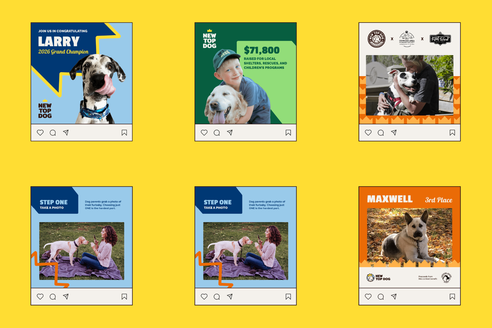
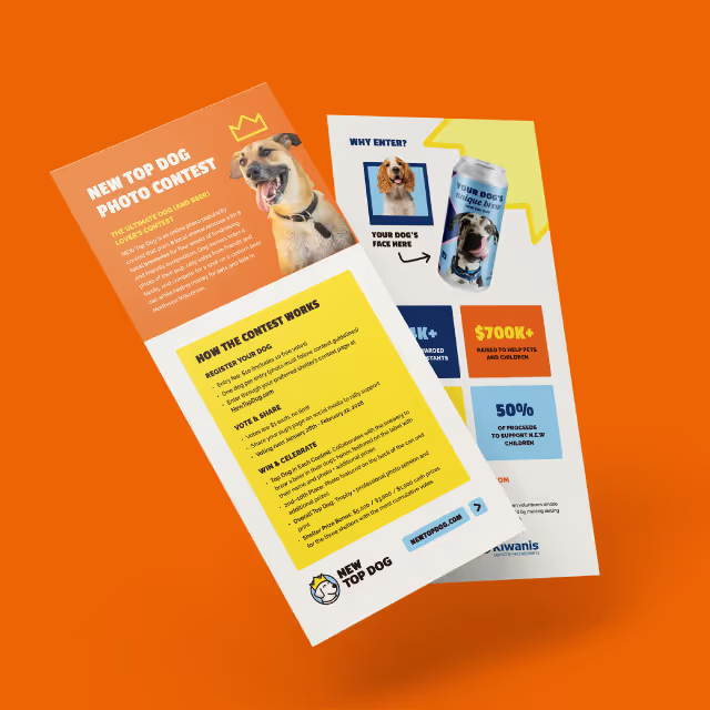
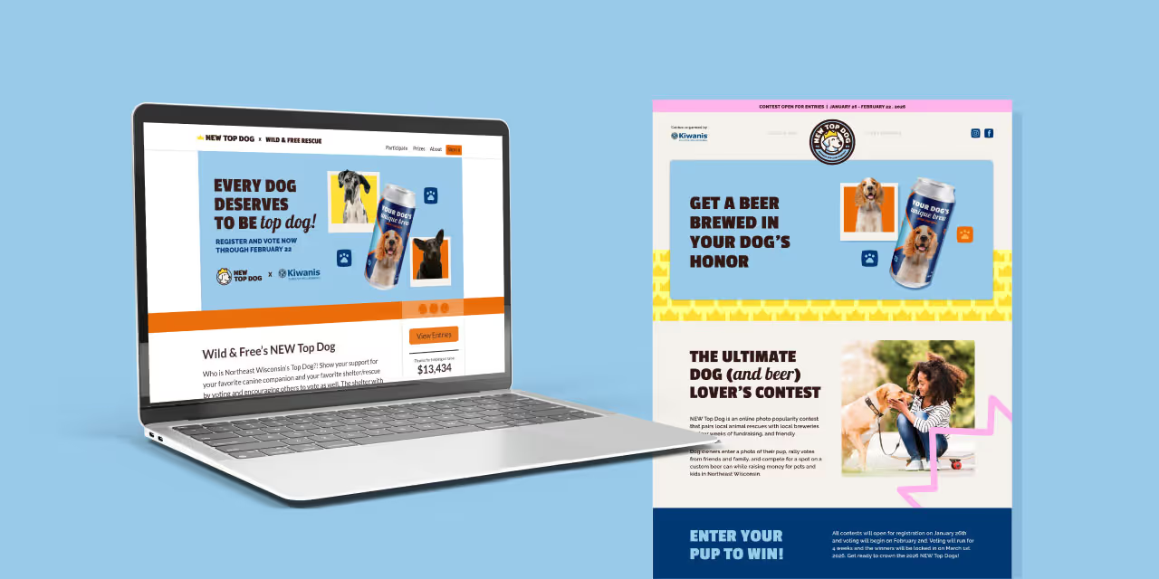
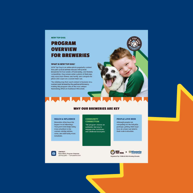
Since re-launching the brand as Breakwater, the Winnebago County team has leveraged the updated position and visual identity to create a deeper impact within their community. A combination of informational handouts, video PSA segments shown at local theaters, an updated website and even the creation of a community podcast has opened the door for conversations with the community. The biggest message that's being driven by Breakwater is that we can all be working together to strengthen our community.



Originally founded as the Winnebago Heroin Task Force, the Winnebago Drug & Alcohol Coalition agreed that the organization would be most effective at mitigating the risks of substance abuse in the area if they were able to present themselves as a more approachable community resource. Focusing efforts on the idea that an educated and strong community will have a natural barrier to block out the hazards of substance abuse. Our job was to develop a new name, messaging, and visual identity for the organization.
Since Oshkosh is the largest city within the county and also known for being on Lake Winnebago, we felt it would be most appropriate to focus the naming convention on a nautical theme. A breakwater is, in essence, a solid structure that's a compilation of many small pieces designed to protect valuable assets from stormy waters. With this concept at the core of the brand, our solution for the identity was to have everything revolve around this storyline and be presented with an approachable and fun-loving appearance. Since each effort to strengthen the community is unique, the logo is symbolic of that combined effort for a greater purpose.
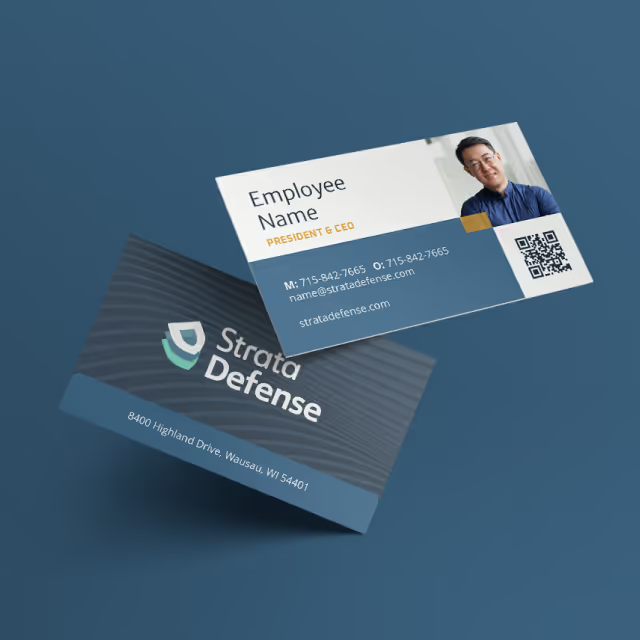


Since re-launching the brand as Breakwater, the Winnebago County team has leveraged the updated position and visual identity to create a deeper impact within their community. A combination of informational handouts, video PSA segments shown at local theaters, an updated website and even the creation of a community podcast has opened the door for conversations with the community. The biggest message that's being driven by Breakwater is that we can all be working together to strengthen our community.


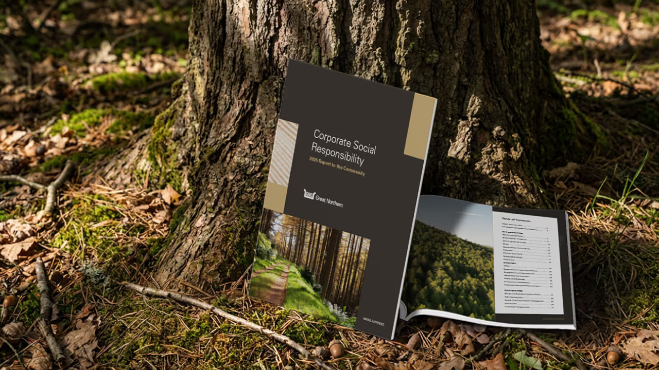
Originally founded as the Winnebago Heroin Task Force, the Winnebago Drug & Alcohol Coalition agreed that the organization would be most effective at mitigating the risks of substance abuse in the area if they were able to present themselves as a more approachable community resource. Focusing efforts on the idea that an educated and strong community will have a natural barrier to block out the hazards of substance abuse. Our job was to develop a new name, messaging, and visual identity for the organization.
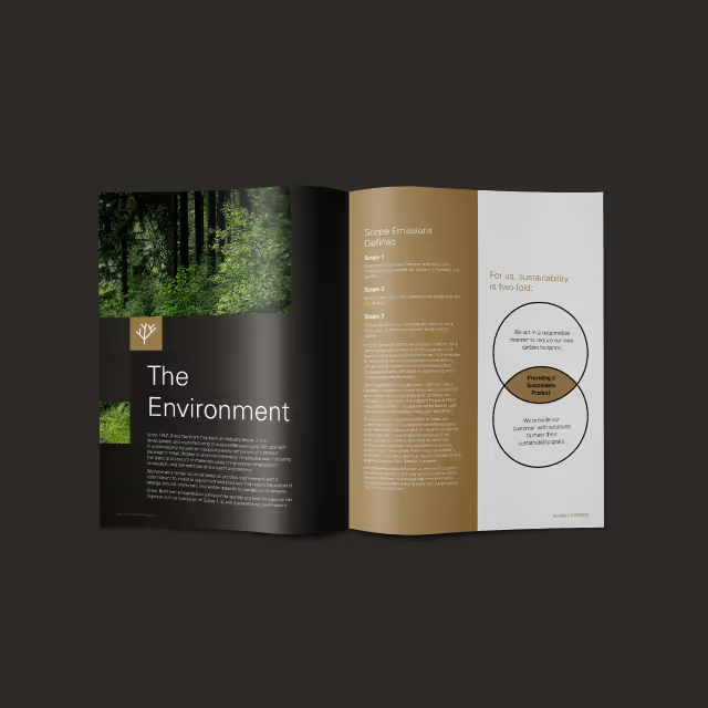
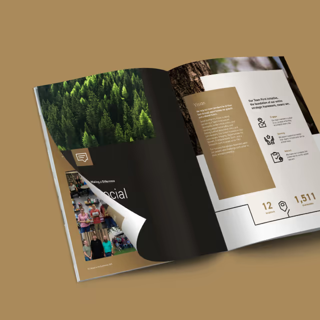
Since Oshkosh is the largest city within the county and also known for being on Lake Winnebago, we felt it would be most appropriate to focus the naming convention on a nautical theme. A breakwater is, in essence, a solid structure that's a compilation of many small pieces designed to protect valuable assets from stormy waters. With this concept at the core of the brand, our solution for the identity was to have everything revolve around this storyline and be presented with an approachable and fun-loving appearance. Since each effort to strengthen the community is unique, the logo is symbolic of that combined effort for a greater purpose.

Since re-launching the brand as Breakwater, the Winnebago County team has leveraged the updated position and visual identity to create a deeper impact within their community. A combination of informational handouts, video PSA segments shown at local theaters, an updated website and even the creation of a community podcast has opened the door for conversations with the community. The biggest message that's being driven by Breakwater is that we can all be working together to strengthen our community.
Originally founded as the Winnebago Heroin Task Force, the Winnebago Drug & Alcohol Coalition agreed that the organization would be most effective at mitigating the risks of substance abuse in the area if they were able to present themselves as a more approachable community resource. Focusing efforts on the idea that an educated and strong community will have a natural barrier to block out the hazards of substance abuse. Our job was to develop a new name, messaging, and visual identity for the organization.


Since Oshkosh is the largest city within the county and also known for being on Lake Winnebago, we felt it would be most appropriate to focus the naming convention on a nautical theme. A breakwater is, in essence, a solid structure that's a compilation of many small pieces designed to protect valuable assets from stormy waters. With this concept at the core of the brand, our solution for the identity was to have everything revolve around this storyline and be presented with an approachable and fun-loving appearance. Since each effort to strengthen the community is unique, the logo is symbolic of that combined effort for a greater purpose.
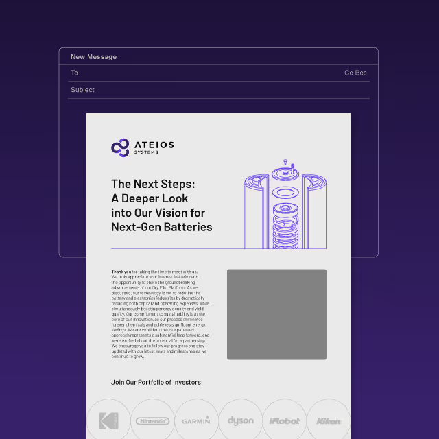
Since re-launching the brand as Breakwater, the Winnebago County team has leveraged the updated position and visual identity to create a deeper impact within their community. A combination of informational handouts, video PSA segments shown at local theaters, an updated website and even the creation of a community podcast has opened the door for conversations with the community. The biggest message that's being driven by Breakwater is that we can all be working together to strengthen our community.

Originally founded as the Winnebago Heroin Task Force, the Winnebago Drug & Alcohol Coalition agreed that the organization would be most effective at mitigating the risks of substance abuse in the area if they were able to present themselves as a more approachable community resource. Focusing efforts on the idea that an educated and strong community will have a natural barrier to block out the hazards of substance abuse. Our job was to develop a new name, messaging, and visual identity for the organization.


Since Oshkosh is the largest city within the county and also known for being on Lake Winnebago, we felt it would be most appropriate to focus the naming convention on a nautical theme. A breakwater is, in essence, a solid structure that's a compilation of many small pieces designed to protect valuable assets from stormy waters. With this concept at the core of the brand, our solution for the identity was to have everything revolve around this storyline and be presented with an approachable and fun-loving appearance. Since each effort to strengthen the community is unique, the logo is symbolic of that combined effort for a greater purpose.
Since re-launching the brand as Breakwater, the Winnebago County team has leveraged the updated position and visual identity to create a deeper impact within their community. A combination of informational handouts, video PSA segments shown at local theaters, an updated website and even the creation of a community podcast has opened the door for conversations with the community. The biggest message that's being driven by Breakwater is that we can all be working together to strengthen our community.
Originally founded as the Winnebago Heroin Task Force, the Winnebago Drug & Alcohol Coalition agreed that the organization would be most effective at mitigating the risks of substance abuse in the area if they were able to present themselves as a more approachable community resource. Focusing efforts on the idea that an educated and strong community will have a natural barrier to block out the hazards of substance abuse. Our job was to develop a new name, messaging, and visual identity for the organization.

Since Oshkosh is the largest city within the county and also known for being on Lake Winnebago, we felt it would be most appropriate to focus the naming convention on a nautical theme. A breakwater is, in essence, a solid structure that's a compilation of many small pieces designed to protect valuable assets from stormy waters. With this concept at the core of the brand, our solution for the identity was to have everything revolve around this storyline and be presented with an approachable and fun-loving appearance. Since each effort to strengthen the community is unique, the logo is symbolic of that combined effort for a greater purpose.


Since re-launching the brand as Breakwater, the Winnebago County team has leveraged the updated position and visual identity to create a deeper impact within their community. A combination of informational handouts, video PSA segments shown at local theaters, an updated website and even the creation of a community podcast has opened the door for conversations with the community. The biggest message that's being driven by Breakwater is that we can all be working together to strengthen our community.
Originally founded as the Winnebago Heroin Task Force, the Winnebago Drug & Alcohol Coalition agreed that the organization would be most effective at mitigating the risks of substance abuse in the area if they were able to present themselves as a more approachable community resource. Focusing efforts on the idea that an educated and strong community will have a natural barrier to block out the hazards of substance abuse. Our job was to develop a new name, messaging, and visual identity for the organization.


Since Oshkosh is the largest city within the county and also known for being on Lake Winnebago, we felt it would be most appropriate to focus the naming convention on a nautical theme. A breakwater is, in essence, a solid structure that's a compilation of many small pieces designed to protect valuable assets from stormy waters. With this concept at the core of the brand, our solution for the identity was to have everything revolve around this storyline and be presented with an approachable and fun-loving appearance. Since each effort to strengthen the community is unique, the logo is symbolic of that combined effort for a greater purpose.

Since re-launching the brand as Breakwater, the Winnebago County team has leveraged the updated position and visual identity to create a deeper impact within their community. A combination of informational handouts, video PSA segments shown at local theaters, an updated website and even the creation of a community podcast has opened the door for conversations with the community. The biggest message that's being driven by Breakwater is that we can all be working together to strengthen our community.

Originally founded as the Winnebago Heroin Task Force, the Winnebago Drug & Alcohol Coalition agreed that the organization would be most effective at mitigating the risks of substance abuse in the area if they were able to present themselves as a more approachable community resource. Focusing efforts on the idea that an educated and strong community will have a natural barrier to block out the hazards of substance abuse. Our job was to develop a new name, messaging, and visual identity for the organization.

Since Oshkosh is the largest city within the county and also known for being on Lake Winnebago, we felt it would be most appropriate to focus the naming convention on a nautical theme. A breakwater is, in essence, a solid structure that's a compilation of many small pieces designed to protect valuable assets from stormy waters. With this concept at the core of the brand, our solution for the identity was to have everything revolve around this storyline and be presented with an approachable and fun-loving appearance. Since each effort to strengthen the community is unique, the logo is symbolic of that combined effort for a greater purpose.

Since re-launching the brand as Breakwater, the Winnebago County team has leveraged the updated position and visual identity to create a deeper impact within their community. A combination of informational handouts, video PSA segments shown at local theaters, an updated website and even the creation of a community podcast has opened the door for conversations with the community. The biggest message that's being driven by Breakwater is that we can all be working together to strengthen our community.


Originally founded as the Winnebago Heroin Task Force, the Winnebago Drug & Alcohol Coalition agreed that the organization would be most effective at mitigating the risks of substance abuse in the area if they were able to present themselves as a more approachable community resource. Focusing efforts on the idea that an educated and strong community will have a natural barrier to block out the hazards of substance abuse. Our job was to develop a new name, messaging, and visual identity for the organization.
Since Oshkosh is the largest city within the county and also known for being on Lake Winnebago, we felt it would be most appropriate to focus the naming convention on a nautical theme. A breakwater is, in essence, a solid structure that's a compilation of many small pieces designed to protect valuable assets from stormy waters. With this concept at the core of the brand, our solution for the identity was to have everything revolve around this storyline and be presented with an approachable and fun-loving appearance. Since each effort to strengthen the community is unique, the logo is symbolic of that combined effort for a greater purpose.
Since re-launching the brand as Breakwater, the Winnebago County team has leveraged the updated position and visual identity to create a deeper impact within their community. A combination of informational handouts, video PSA segments shown at local theaters, an updated website and even the creation of a community podcast has opened the door for conversations with the community. The biggest message that's being driven by Breakwater is that we can all be working together to strengthen our community.


Originally founded as the Winnebago Heroin Task Force, the Winnebago Drug & Alcohol Coalition agreed that the organization would be most effective at mitigating the risks of substance abuse in the area if they were able to present themselves as a more approachable community resource. Focusing efforts on the idea that an educated and strong community will have a natural barrier to block out the hazards of substance abuse. Our job was to develop a new name, messaging, and visual identity for the organization.

Since Oshkosh is the largest city within the county and also known for being on Lake Winnebago, we felt it would be most appropriate to focus the naming convention on a nautical theme. A breakwater is, in essence, a solid structure that's a compilation of many small pieces designed to protect valuable assets from stormy waters. With this concept at the core of the brand, our solution for the identity was to have everything revolve around this storyline and be presented with an approachable and fun-loving appearance. Since each effort to strengthen the community is unique, the logo is symbolic of that combined effort for a greater purpose.

Since re-launching the brand as Breakwater, the Winnebago County team has leveraged the updated position and visual identity to create a deeper impact within their community. A combination of informational handouts, video PSA segments shown at local theaters, an updated website and even the creation of a community podcast has opened the door for conversations with the community. The biggest message that's being driven by Breakwater is that we can all be working together to strengthen our community.

Originally founded as the Winnebago Heroin Task Force, the Winnebago Drug & Alcohol Coalition agreed that the organization would be most effective at mitigating the risks of substance abuse in the area if they were able to present themselves as a more approachable community resource. Focusing efforts on the idea that an educated and strong community will have a natural barrier to block out the hazards of substance abuse. Our job was to develop a new name, messaging, and visual identity for the organization.
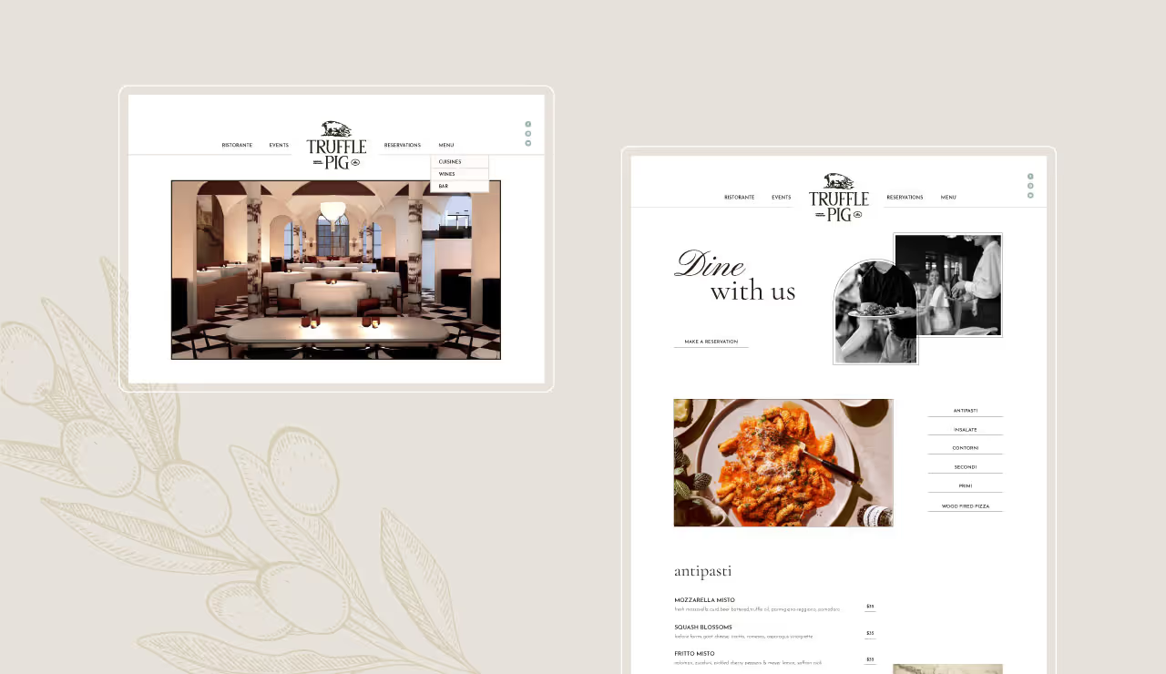
Since Oshkosh is the largest city within the county and also known for being on Lake Winnebago, we felt it would be most appropriate to focus the naming convention on a nautical theme. A breakwater is, in essence, a solid structure that's a compilation of many small pieces designed to protect valuable assets from stormy waters. With this concept at the core of the brand, our solution for the identity was to have everything revolve around this storyline and be presented with an approachable and fun-loving appearance. Since each effort to strengthen the community is unique, the logo is symbolic of that combined effort for a greater purpose.

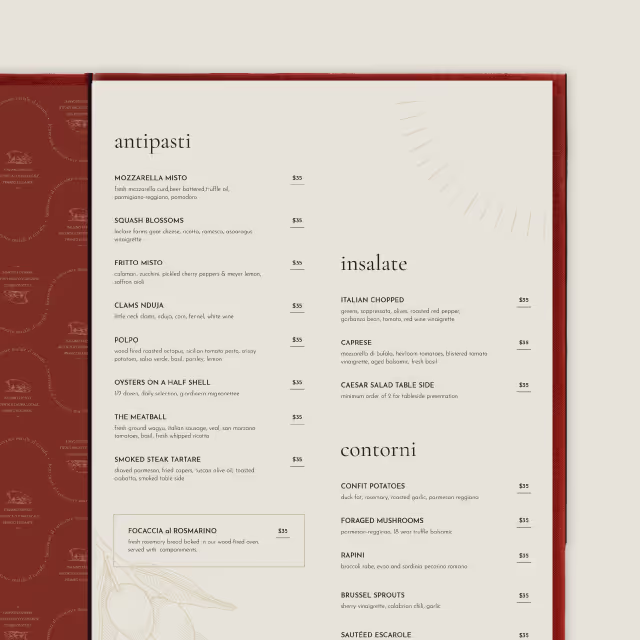
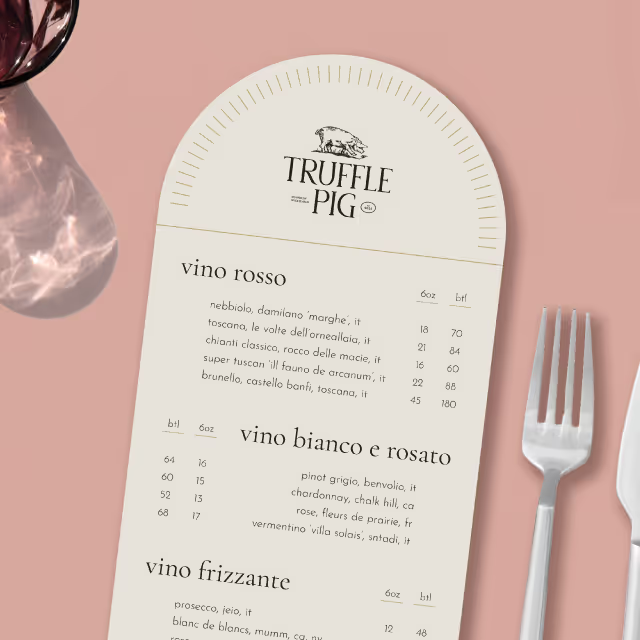
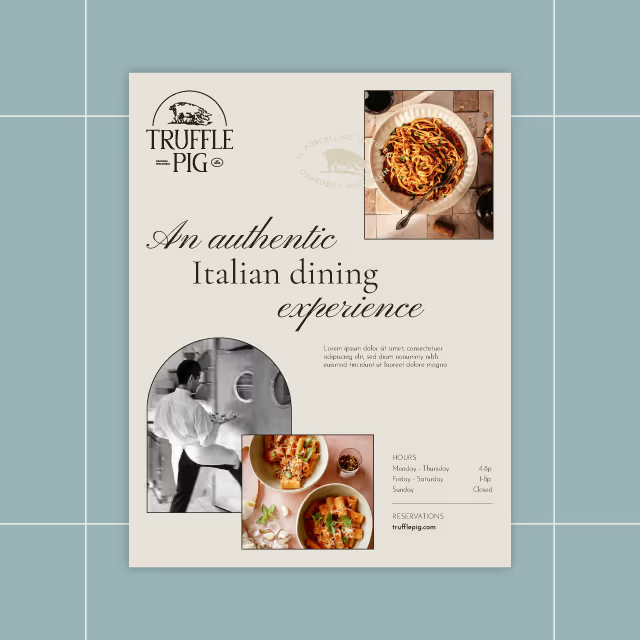
Since re-launching the brand as Breakwater, the Winnebago County team has leveraged the updated position and visual identity to create a deeper impact within their community. A combination of informational handouts, video PSA segments shown at local theaters, an updated website and even the creation of a community podcast has opened the door for conversations with the community. The biggest message that's being driven by Breakwater is that we can all be working together to strengthen our community.

Originally founded as the Winnebago Heroin Task Force, the Winnebago Drug & Alcohol Coalition agreed that the organization would be most effective at mitigating the risks of substance abuse in the area if they were able to present themselves as a more approachable community resource. Focusing efforts on the idea that an educated and strong community will have a natural barrier to block out the hazards of substance abuse. Our job was to develop a new name, messaging, and visual identity for the organization.

Since Oshkosh is the largest city within the county and also known for being on Lake Winnebago, we felt it would be most appropriate to focus the naming convention on a nautical theme. A breakwater is, in essence, a solid structure that's a compilation of many small pieces designed to protect valuable assets from stormy waters. With this concept at the core of the brand, our solution for the identity was to have everything revolve around this storyline and be presented with an approachable and fun-loving appearance. Since each effort to strengthen the community is unique, the logo is symbolic of that combined effort for a greater purpose.

Since re-launching the brand as Breakwater, the Winnebago County team has leveraged the updated position and visual identity to create a deeper impact within their community. A combination of informational handouts, video PSA segments shown at local theaters, an updated website and even the creation of a community podcast has opened the door for conversations with the community. The biggest message that's being driven by Breakwater is that we can all be working together to strengthen our community.

Originally founded as the Winnebago Heroin Task Force, the Winnebago Drug & Alcohol Coalition agreed that the organization would be most effective at mitigating the risks of substance abuse in the area if they were able to present themselves as a more approachable community resource. Focusing efforts on the idea that an educated and strong community will have a natural barrier to block out the hazards of substance abuse. Our job was to develop a new name, messaging, and visual identity for the organization.
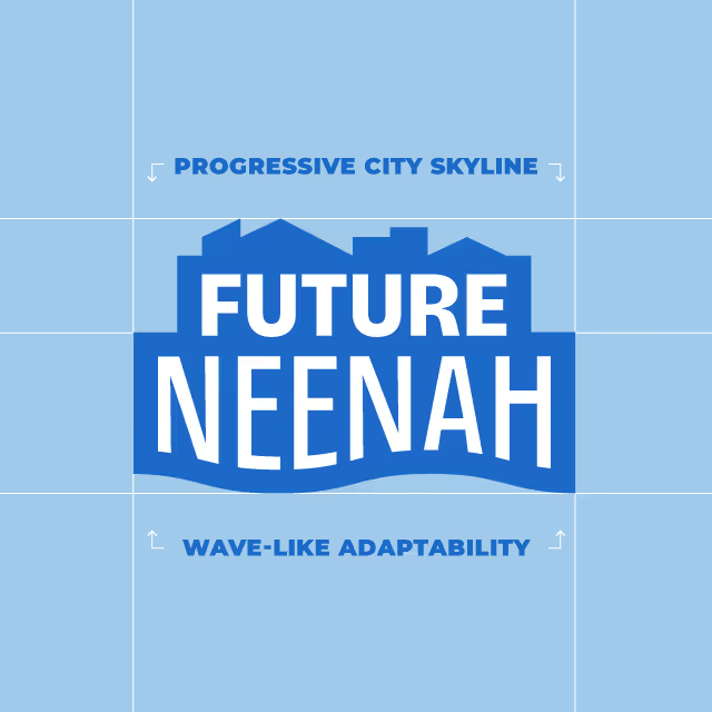
Since Oshkosh is the largest city within the county and also known for being on Lake Winnebago, we felt it would be most appropriate to focus the naming convention on a nautical theme. A breakwater is, in essence, a solid structure that's a compilation of many small pieces designed to protect valuable assets from stormy waters. With this concept at the core of the brand, our solution for the identity was to have everything revolve around this storyline and be presented with an approachable and fun-loving appearance. Since each effort to strengthen the community is unique, the logo is symbolic of that combined effort for a greater purpose.

Since re-launching the brand as Breakwater, the Winnebago County team has leveraged the updated position and visual identity to create a deeper impact within their community. A combination of informational handouts, video PSA segments shown at local theaters, an updated website and even the creation of a community podcast has opened the door for conversations with the community. The biggest message that's being driven by Breakwater is that we can all be working together to strengthen our community.


Originally founded as the Winnebago Heroin Task Force, the Winnebago Drug & Alcohol Coalition agreed that the organization would be most effective at mitigating the risks of substance abuse in the area if they were able to present themselves as a more approachable community resource. Focusing efforts on the idea that an educated and strong community will have a natural barrier to block out the hazards of substance abuse. Our job was to develop a new name, messaging, and visual identity for the organization.

Since Oshkosh is the largest city within the county and also known for being on Lake Winnebago, we felt it would be most appropriate to focus the naming convention on a nautical theme. A breakwater is, in essence, a solid structure that's a compilation of many small pieces designed to protect valuable assets from stormy waters. With this concept at the core of the brand, our solution for the identity was to have everything revolve around this storyline and be presented with an approachable and fun-loving appearance. Since each effort to strengthen the community is unique, the logo is symbolic of that combined effort for a greater purpose.
Since re-launching the brand as Breakwater, the Winnebago County team has leveraged the updated position and visual identity to create a deeper impact within their community. A combination of informational handouts, video PSA segments shown at local theaters, an updated website and even the creation of a community podcast has opened the door for conversations with the community. The biggest message that's being driven by Breakwater is that we can all be working together to strengthen our community.


Originally founded as the Winnebago Heroin Task Force, the Winnebago Drug & Alcohol Coalition agreed that the organization would be most effective at mitigating the risks of substance abuse in the area if they were able to present themselves as a more approachable community resource. Focusing efforts on the idea that an educated and strong community will have a natural barrier to block out the hazards of substance abuse. Our job was to develop a new name, messaging, and visual identity for the organization.


Since Oshkosh is the largest city within the county and also known for being on Lake Winnebago, we felt it would be most appropriate to focus the naming convention on a nautical theme. A breakwater is, in essence, a solid structure that's a compilation of many small pieces designed to protect valuable assets from stormy waters. With this concept at the core of the brand, our solution for the identity was to have everything revolve around this storyline and be presented with an approachable and fun-loving appearance. Since each effort to strengthen the community is unique, the logo is symbolic of that combined effort for a greater purpose.

Since re-launching the brand as Breakwater, the Winnebago County team has leveraged the updated position and visual identity to create a deeper impact within their community. A combination of informational handouts, video PSA segments shown at local theaters, an updated website and even the creation of a community podcast has opened the door for conversations with the community. The biggest message that's being driven by Breakwater is that we can all be working together to strengthen our community.


Originally founded as the Winnebago Heroin Task Force, the Winnebago Drug & Alcohol Coalition agreed that the organization would be most effective at mitigating the risks of substance abuse in the area if they were able to present themselves as a more approachable community resource. Focusing efforts on the idea that an educated and strong community will have a natural barrier to block out the hazards of substance abuse. Our job was to develop a new name, messaging, and visual identity for the organization.

Since Oshkosh is the largest city within the county and also known for being on Lake Winnebago, we felt it would be most appropriate to focus the naming convention on a nautical theme. A breakwater is, in essence, a solid structure that's a compilation of many small pieces designed to protect valuable assets from stormy waters. With this concept at the core of the brand, our solution for the identity was to have everything revolve around this storyline and be presented with an approachable and fun-loving appearance. Since each effort to strengthen the community is unique, the logo is symbolic of that combined effort for a greater purpose.


Since re-launching the brand as Breakwater, the Winnebago County team has leveraged the updated position and visual identity to create a deeper impact within their community. A combination of informational handouts, video PSA segments shown at local theaters, an updated website and even the creation of a community podcast has opened the door for conversations with the community. The biggest message that's being driven by Breakwater is that we can all be working together to strengthen our community.


Originally founded as the Winnebago Heroin Task Force, the Winnebago Drug & Alcohol Coalition agreed that the organization would be most effective at mitigating the risks of substance abuse in the area if they were able to present themselves as a more approachable community resource. Focusing efforts on the idea that an educated and strong community will have a natural barrier to block out the hazards of substance abuse. Our job was to develop a new name, messaging, and visual identity for the organization.


Since Oshkosh is the largest city within the county and also known for being on Lake Winnebago, we felt it would be most appropriate to focus the naming convention on a nautical theme. A breakwater is, in essence, a solid structure that's a compilation of many small pieces designed to protect valuable assets from stormy waters. With this concept at the core of the brand, our solution for the identity was to have everything revolve around this storyline and be presented with an approachable and fun-loving appearance. Since each effort to strengthen the community is unique, the logo is symbolic of that combined effort for a greater purpose.


Since re-launching the brand as Breakwater, the Winnebago County team has leveraged the updated position and visual identity to create a deeper impact within their community. A combination of informational handouts, video PSA segments shown at local theaters, an updated website and even the creation of a community podcast has opened the door for conversations with the community. The biggest message that's being driven by Breakwater is that we can all be working together to strengthen our community.




Originally founded as the Winnebago Heroin Task Force, the Winnebago Drug & Alcohol Coalition agreed that the organization would be most effective at mitigating the risks of substance abuse in the area if they were able to present themselves as a more approachable community resource. Focusing efforts on the idea that an educated and strong community will have a natural barrier to block out the hazards of substance abuse. Our job was to develop a new name, messaging, and visual identity for the organization.


Since Oshkosh is the largest city within the county and also known for being on Lake Winnebago, we felt it would be most appropriate to focus the naming convention on a nautical theme. A breakwater is, in essence, a solid structure that's a compilation of many small pieces designed to protect valuable assets from stormy waters. With this concept at the core of the brand, our solution for the identity was to have everything revolve around this storyline and be presented with an approachable and fun-loving appearance. Since each effort to strengthen the community is unique, the logo is symbolic of that combined effort for a greater purpose.

Since re-launching the brand as Breakwater, the Winnebago County team has leveraged the updated position and visual identity to create a deeper impact within their community. A combination of informational handouts, video PSA segments shown at local theaters, an updated website and even the creation of a community podcast has opened the door for conversations with the community. The biggest message that's being driven by Breakwater is that we can all be working together to strengthen our community.


Originally founded as the Winnebago Heroin Task Force, the Winnebago Drug & Alcohol Coalition agreed that the organization would be most effective at mitigating the risks of substance abuse in the area if they were able to present themselves as a more approachable community resource. Focusing efforts on the idea that an educated and strong community will have a natural barrier to block out the hazards of substance abuse. Our job was to develop a new name, messaging, and visual identity for the organization.


Since Oshkosh is the largest city within the county and also known for being on Lake Winnebago, we felt it would be most appropriate to focus the naming convention on a nautical theme. A breakwater is, in essence, a solid structure that's a compilation of many small pieces designed to protect valuable assets from stormy waters. With this concept at the core of the brand, our solution for the identity was to have everything revolve around this storyline and be presented with an approachable and fun-loving appearance. Since each effort to strengthen the community is unique, the logo is symbolic of that combined effort for a greater purpose.


Since re-launching the brand as Breakwater, the Winnebago County team has leveraged the updated position and visual identity to create a deeper impact within their community. A combination of informational handouts, video PSA segments shown at local theaters, an updated website and even the creation of a community podcast has opened the door for conversations with the community. The biggest message that's being driven by Breakwater is that we can all be working together to strengthen our community.


Originally founded as the Winnebago Heroin Task Force, the Winnebago Drug & Alcohol Coalition agreed that the organization would be most effective at mitigating the risks of substance abuse in the area if they were able to present themselves as a more approachable community resource. Focusing efforts on the idea that an educated and strong community will have a natural barrier to block out the hazards of substance abuse. Our job was to develop a new name, messaging, and visual identity for the organization.

Since Oshkosh is the largest city within the county and also known for being on Lake Winnebago, we felt it would be most appropriate to focus the naming convention on a nautical theme. A breakwater is, in essence, a solid structure that's a compilation of many small pieces designed to protect valuable assets from stormy waters. With this concept at the core of the brand, our solution for the identity was to have everything revolve around this storyline and be presented with an approachable and fun-loving appearance. Since each effort to strengthen the community is unique, the logo is symbolic of that combined effort for a greater purpose.


Since re-launching the brand as Breakwater, the Winnebago County team has leveraged the updated position and visual identity to create a deeper impact within their community. A combination of informational handouts, video PSA segments shown at local theaters, an updated website and even the creation of a community podcast has opened the door for conversations with the community. The biggest message that's being driven by Breakwater is that we can all be working together to strengthen our community.


Originally founded as the Winnebago Heroin Task Force, the Winnebago Drug & Alcohol Coalition agreed that the organization would be most effective at mitigating the risks of substance abuse in the area if they were able to present themselves as a more approachable community resource. Focusing efforts on the idea that an educated and strong community will have a natural barrier to block out the hazards of substance abuse. Our job was to develop a new name, messaging, and visual identity for the organization.


Since Oshkosh is the largest city within the county and also known for being on Lake Winnebago, we felt it would be most appropriate to focus the naming convention on a nautical theme. A breakwater is, in essence, a solid structure that's a compilation of many small pieces designed to protect valuable assets from stormy waters. With this concept at the core of the brand, our solution for the identity was to have everything revolve around this storyline and be presented with an approachable and fun-loving appearance. Since each effort to strengthen the community is unique, the logo is symbolic of that combined effort for a greater purpose.


Since re-launching the brand as Breakwater, the Winnebago County team has leveraged the updated position and visual identity to create a deeper impact within their community. A combination of informational handouts, video PSA segments shown at local theaters, an updated website and even the creation of a community podcast has opened the door for conversations with the community. The biggest message that's being driven by Breakwater is that we can all be working together to strengthen our community.


Originally founded as the Winnebago Heroin Task Force, the Winnebago Drug & Alcohol Coalition agreed that the organization would be most effective at mitigating the risks of substance abuse in the area if they were able to present themselves as a more approachable community resource. Focusing efforts on the idea that an educated and strong community will have a natural barrier to block out the hazards of substance abuse. Our job was to develop a new name, messaging, and visual identity for the organization.

Since Oshkosh is the largest city within the county and also known for being on Lake Winnebago, we felt it would be most appropriate to focus the naming convention on a nautical theme. A breakwater is, in essence, a solid structure that's a compilation of many small pieces designed to protect valuable assets from stormy waters. With this concept at the core of the brand, our solution for the identity was to have everything revolve around this storyline and be presented with an approachable and fun-loving appearance. Since each effort to strengthen the community is unique, the logo is symbolic of that combined effort for a greater purpose.


Since re-launching the brand as Breakwater, the Winnebago County team has leveraged the updated position and visual identity to create a deeper impact within their community. A combination of informational handouts, video PSA segments shown at local theaters, an updated website and even the creation of a community podcast has opened the door for conversations with the community. The biggest message that's being driven by Breakwater is that we can all be working together to strengthen our community.


Originally founded as the Winnebago Heroin Task Force, the Winnebago Drug & Alcohol Coalition agreed that the organization would be most effective at mitigating the risks of substance abuse in the area if they were able to present themselves as a more approachable community resource. Focusing efforts on the idea that an educated and strong community will have a natural barrier to block out the hazards of substance abuse. Our job was to develop a new name, messaging, and visual identity for the organization.

Since Oshkosh is the largest city within the county and also known for being on Lake Winnebago, we felt it would be most appropriate to focus the naming convention on a nautical theme. A breakwater is, in essence, a solid structure that's a compilation of many small pieces designed to protect valuable assets from stormy waters. With this concept at the core of the brand, our solution for the identity was to have everything revolve around this storyline and be presented with an approachable and fun-loving appearance. Since each effort to strengthen the community is unique, the logo is symbolic of that combined effort for a greater purpose.


Since re-launching the brand as Breakwater, the Winnebago County team has leveraged the updated position and visual identity to create a deeper impact within their community. A combination of informational handouts, video PSA segments shown at local theaters, an updated website and even the creation of a community podcast has opened the door for conversations with the community. The biggest message that's being driven by Breakwater is that we can all be working together to strengthen our community.


Originally founded as the Winnebago Heroin Task Force, the Winnebago Drug & Alcohol Coalition agreed that the organization would be most effective at mitigating the risks of substance abuse in the area if they were able to present themselves as a more approachable community resource. Focusing efforts on the idea that an educated and strong community will have a natural barrier to block out the hazards of substance abuse. Our job was to develop a new name, messaging, and visual identity for the organization.


Since Oshkosh is the largest city within the county and also known for being on Lake Winnebago, we felt it would be most appropriate to focus the naming convention on a nautical theme. A breakwater is, in essence, a solid structure that's a compilation of many small pieces designed to protect valuable assets from stormy waters. With this concept at the core of the brand, our solution for the identity was to have everything revolve around this storyline and be presented with an approachable and fun-loving appearance. Since each effort to strengthen the community is unique, the logo is symbolic of that combined effort for a greater purpose.

Since re-launching the brand as Breakwater, the Winnebago County team has leveraged the updated position and visual identity to create a deeper impact within their community. A combination of informational handouts, video PSA segments shown at local theaters, an updated website and even the creation of a community podcast has opened the door for conversations with the community. The biggest message that's being driven by Breakwater is that we can all be working together to strengthen our community.


Originally founded as the Winnebago Heroin Task Force, the Winnebago Drug & Alcohol Coalition agreed that the organization would be most effective at mitigating the risks of substance abuse in the area if they were able to present themselves as a more approachable community resource. Focusing efforts on the idea that an educated and strong community will have a natural barrier to block out the hazards of substance abuse. Our job was to develop a new name, messaging, and visual identity for the organization.

Since Oshkosh is the largest city within the county and also known for being on Lake Winnebago, we felt it would be most appropriate to focus the naming convention on a nautical theme. A breakwater is, in essence, a solid structure that's a compilation of many small pieces designed to protect valuable assets from stormy waters. With this concept at the core of the brand, our solution for the identity was to have everything revolve around this storyline and be presented with an approachable and fun-loving appearance. Since each effort to strengthen the community is unique, the logo is symbolic of that combined effort for a greater purpose.


Since re-launching the brand as Breakwater, the Winnebago County team has leveraged the updated position and visual identity to create a deeper impact within their community. A combination of informational handouts, video PSA segments shown at local theaters, an updated website and even the creation of a community podcast has opened the door for conversations with the community. The biggest message that's being driven by Breakwater is that we can all be working together to strengthen our community.


Originally founded as the Winnebago Heroin Task Force, the Winnebago Drug & Alcohol Coalition agreed that the organization would be most effective at mitigating the risks of substance abuse in the area if they were able to present themselves as a more approachable community resource. Focusing efforts on the idea that an educated and strong community will have a natural barrier to block out the hazards of substance abuse. Our job was to develop a new name, messaging, and visual identity for the organization.

Since Oshkosh is the largest city within the county and also known for being on Lake Winnebago, we felt it would be most appropriate to focus the naming convention on a nautical theme. A breakwater is, in essence, a solid structure that's a compilation of many small pieces designed to protect valuable assets from stormy waters. With this concept at the core of the brand, our solution for the identity was to have everything revolve around this storyline and be presented with an approachable and fun-loving appearance. Since each effort to strengthen the community is unique, the logo is symbolic of that combined effort for a greater purpose.


Since re-launching the brand as Breakwater, the Winnebago County team has leveraged the updated position and visual identity to create a deeper impact within their community. A combination of informational handouts, video PSA segments shown at local theaters, an updated website and even the creation of a community podcast has opened the door for conversations with the community. The biggest message that's being driven by Breakwater is that we can all be working together to strengthen our community.


Originally founded as the Winnebago Heroin Task Force, the Winnebago Drug & Alcohol Coalition agreed that the organization would be most effective at mitigating the risks of substance abuse in the area if they were able to present themselves as a more approachable community resource. Focusing efforts on the idea that an educated and strong community will have a natural barrier to block out the hazards of substance abuse. Our job was to develop a new name, messaging, and visual identity for the organization.


Since Oshkosh is the largest city within the county and also known for being on Lake Winnebago, we felt it would be most appropriate to focus the naming convention on a nautical theme. A breakwater is, in essence, a solid structure that's a compilation of many small pieces designed to protect valuable assets from stormy waters. With this concept at the core of the brand, our solution for the identity was to have everything revolve around this storyline and be presented with an approachable and fun-loving appearance. Since each effort to strengthen the community is unique, the logo is symbolic of that combined effort for a greater purpose.

Since re-launching the brand as Breakwater, the Winnebago County team has leveraged the updated position and visual identity to create a deeper impact within their community. A combination of informational handouts, video PSA segments shown at local theaters, an updated website and even the creation of a community podcast has opened the door for conversations with the community. The biggest message that's being driven by Breakwater is that we can all be working together to strengthen our community.


Originally founded as the Winnebago Heroin Task Force, the Winnebago Drug & Alcohol Coalition agreed that the organization would be most effective at mitigating the risks of substance abuse in the area if they were able to present themselves as a more approachable community resource. Focusing efforts on the idea that an educated and strong community will have a natural barrier to block out the hazards of substance abuse. Our job was to develop a new name, messaging, and visual identity for the organization.


Since Oshkosh is the largest city within the county and also known for being on Lake Winnebago, we felt it would be most appropriate to focus the naming convention on a nautical theme. A breakwater is, in essence, a solid structure that's a compilation of many small pieces designed to protect valuable assets from stormy waters. With this concept at the core of the brand, our solution for the identity was to have everything revolve around this storyline and be presented with an approachable and fun-loving appearance. Since each effort to strengthen the community is unique, the logo is symbolic of that combined effort for a greater purpose.

Since re-launching the brand as Breakwater, the Winnebago County team has leveraged the updated position and visual identity to create a deeper impact within their community. A combination of informational handouts, video PSA segments shown at local theaters, an updated website and even the creation of a community podcast has opened the door for conversations with the community. The biggest message that's being driven by Breakwater is that we can all be working together to strengthen our community.


Originally founded as the Winnebago Heroin Task Force, the Winnebago Drug & Alcohol Coalition agreed that the organization would be most effective at mitigating the risks of substance abuse in the area if they were able to present themselves as a more approachable community resource. Focusing efforts on the idea that an educated and strong community will have a natural barrier to block out the hazards of substance abuse. Our job was to develop a new name, messaging, and visual identity for the organization.


Since Oshkosh is the largest city within the county and also known for being on Lake Winnebago, we felt it would be most appropriate to focus the naming convention on a nautical theme. A breakwater is, in essence, a solid structure that's a compilation of many small pieces designed to protect valuable assets from stormy waters. With this concept at the core of the brand, our solution for the identity was to have everything revolve around this storyline and be presented with an approachable and fun-loving appearance. Since each effort to strengthen the community is unique, the logo is symbolic of that combined effort for a greater purpose.


Since re-launching the brand as Breakwater, the Winnebago County team has leveraged the updated position and visual identity to create a deeper impact within their community. A combination of informational handouts, video PSA segments shown at local theaters, an updated website and even the creation of a community podcast has opened the door for conversations with the community. The biggest message that's being driven by Breakwater is that we can all be working together to strengthen our community.


Originally founded as the Winnebago Heroin Task Force, the Winnebago Drug & Alcohol Coalition agreed that the organization would be most effective at mitigating the risks of substance abuse in the area if they were able to present themselves as a more approachable community resource. Focusing efforts on the idea that an educated and strong community will have a natural barrier to block out the hazards of substance abuse. Our job was to develop a new name, messaging, and visual identity for the organization.


Since Oshkosh is the largest city within the county and also known for being on Lake Winnebago, we felt it would be most appropriate to focus the naming convention on a nautical theme. A breakwater is, in essence, a solid structure that's a compilation of many small pieces designed to protect valuable assets from stormy waters. With this concept at the core of the brand, our solution for the identity was to have everything revolve around this storyline and be presented with an approachable and fun-loving appearance. Since each effort to strengthen the community is unique, the logo is symbolic of that combined effort for a greater purpose.


Since re-launching the brand as Breakwater, the Winnebago County team has leveraged the updated position and visual identity to create a deeper impact within their community. A combination of informational handouts, video PSA segments shown at local theaters, an updated website and even the creation of a community podcast has opened the door for conversations with the community. The biggest message that's being driven by Breakwater is that we can all be working together to strengthen our community.


Originally founded as the Winnebago Heroin Task Force, the Winnebago Drug & Alcohol Coalition agreed that the organization would be most effective at mitigating the risks of substance abuse in the area if they were able to present themselves as a more approachable community resource. Focusing efforts on the idea that an educated and strong community will have a natural barrier to block out the hazards of substance abuse. Our job was to develop a new name, messaging, and visual identity for the organization.

Since Oshkosh is the largest city within the county and also known for being on Lake Winnebago, we felt it would be most appropriate to focus the naming convention on a nautical theme. A breakwater is, in essence, a solid structure that's a compilation of many small pieces designed to protect valuable assets from stormy waters. With this concept at the core of the brand, our solution for the identity was to have everything revolve around this storyline and be presented with an approachable and fun-loving appearance. Since each effort to strengthen the community is unique, the logo is symbolic of that combined effort for a greater purpose.

Since re-launching the brand as Breakwater, the Winnebago County team has leveraged the updated position and visual identity to create a deeper impact within their community. A combination of informational handouts, video PSA segments shown at local theaters, an updated website and even the creation of a community podcast has opened the door for conversations with the community. The biggest message that's being driven by Breakwater is that we can all be working together to strengthen our community.


Originally founded as the Winnebago Heroin Task Force, the Winnebago Drug & Alcohol Coalition agreed that the organization would be most effective at mitigating the risks of substance abuse in the area if they were able to present themselves as a more approachable community resource. Focusing efforts on the idea that an educated and strong community will have a natural barrier to block out the hazards of substance abuse. Our job was to develop a new name, messaging, and visual identity for the organization.


Since Oshkosh is the largest city within the county and also known for being on Lake Winnebago, we felt it would be most appropriate to focus the naming convention on a nautical theme. A breakwater is, in essence, a solid structure that's a compilation of many small pieces designed to protect valuable assets from stormy waters. With this concept at the core of the brand, our solution for the identity was to have everything revolve around this storyline and be presented with an approachable and fun-loving appearance. Since each effort to strengthen the community is unique, the logo is symbolic of that combined effort for a greater purpose.


Since re-launching the brand as Breakwater, the Winnebago County team has leveraged the updated position and visual identity to create a deeper impact within their community. A combination of informational handouts, video PSA segments shown at local theaters, an updated website and even the creation of a community podcast has opened the door for conversations with the community. The biggest message that's being driven by Breakwater is that we can all be working together to strengthen our community.


Originally founded as the Winnebago Heroin Task Force, the Winnebago Drug & Alcohol Coalition agreed that the organization would be most effective at mitigating the risks of substance abuse in the area if they were able to present themselves as a more approachable community resource. Focusing efforts on the idea that an educated and strong community will have a natural barrier to block out the hazards of substance abuse. Our job was to develop a new name, messaging, and visual identity for the organization.


Since Oshkosh is the largest city within the county and also known for being on Lake Winnebago, we felt it would be most appropriate to focus the naming convention on a nautical theme. A breakwater is, in essence, a solid structure that's a compilation of many small pieces designed to protect valuable assets from stormy waters. With this concept at the core of the brand, our solution for the identity was to have everything revolve around this storyline and be presented with an approachable and fun-loving appearance. Since each effort to strengthen the community is unique, the logo is symbolic of that combined effort for a greater purpose.


Since re-launching the brand as Breakwater, the Winnebago County team has leveraged the updated position and visual identity to create a deeper impact within their community. A combination of informational handouts, video PSA segments shown at local theaters, an updated website and even the creation of a community podcast has opened the door for conversations with the community. The biggest message that's being driven by Breakwater is that we can all be working together to strengthen our community.


Originally founded as the Winnebago Heroin Task Force, the Winnebago Drug & Alcohol Coalition agreed that the organization would be most effective at mitigating the risks of substance abuse in the area if they were able to present themselves as a more approachable community resource. Focusing efforts on the idea that an educated and strong community will have a natural barrier to block out the hazards of substance abuse. Our job was to develop a new name, messaging, and visual identity for the organization.


Since Oshkosh is the largest city within the county and also known for being on Lake Winnebago, we felt it would be most appropriate to focus the naming convention on a nautical theme. A breakwater is, in essence, a solid structure that's a compilation of many small pieces designed to protect valuable assets from stormy waters. With this concept at the core of the brand, our solution for the identity was to have everything revolve around this storyline and be presented with an approachable and fun-loving appearance. Since each effort to strengthen the community is unique, the logo is symbolic of that combined effort for a greater purpose.


Since re-launching the brand as Breakwater, the Winnebago County team has leveraged the updated position and visual identity to create a deeper impact within their community. A combination of informational handouts, video PSA segments shown at local theaters, an updated website and even the creation of a community podcast has opened the door for conversations with the community. The biggest message that's being driven by Breakwater is that we can all be working together to strengthen our community.



Originally founded as the Winnebago Heroin Task Force, the Winnebago Drug & Alcohol Coalition agreed that the organization would be most effective at mitigating the risks of substance abuse in the area if they were able to present themselves as a more approachable community resource. Focusing efforts on the idea that an educated and strong community will have a natural barrier to block out the hazards of substance abuse. Our job was to develop a new name, messaging, and visual identity for the organization.


Since Oshkosh is the largest city within the county and also known for being on Lake Winnebago, we felt it would be most appropriate to focus the naming convention on a nautical theme. A breakwater is, in essence, a solid structure that's a compilation of many small pieces designed to protect valuable assets from stormy waters. With this concept at the core of the brand, our solution for the identity was to have everything revolve around this storyline and be presented with an approachable and fun-loving appearance. Since each effort to strengthen the community is unique, the logo is symbolic of that combined effort for a greater purpose.


Since re-launching the brand as Breakwater, the Winnebago County team has leveraged the updated position and visual identity to create a deeper impact within their community. A combination of informational handouts, video PSA segments shown at local theaters, an updated website and even the creation of a community podcast has opened the door for conversations with the community. The biggest message that's being driven by Breakwater is that we can all be working together to strengthen our community.


Originally founded as the Winnebago Heroin Task Force, the Winnebago Drug & Alcohol Coalition agreed that the organization would be most effective at mitigating the risks of substance abuse in the area if they were able to present themselves as a more approachable community resource. Focusing efforts on the idea that an educated and strong community will have a natural barrier to block out the hazards of substance abuse. Our job was to develop a new name, messaging, and visual identity for the organization.

Since Oshkosh is the largest city within the county and also known for being on Lake Winnebago, we felt it would be most appropriate to focus the naming convention on a nautical theme. A breakwater is, in essence, a solid structure that's a compilation of many small pieces designed to protect valuable assets from stormy waters. With this concept at the core of the brand, our solution for the identity was to have everything revolve around this storyline and be presented with an approachable and fun-loving appearance. Since each effort to strengthen the community is unique, the logo is symbolic of that combined effort for a greater purpose.


Since re-launching the brand as Breakwater, the Winnebago County team has leveraged the updated position and visual identity to create a deeper impact within their community. A combination of informational handouts, video PSA segments shown at local theaters, an updated website and even the creation of a community podcast has opened the door for conversations with the community. The biggest message that's being driven by Breakwater is that we can all be working together to strengthen our community.


Originally founded as the Winnebago Heroin Task Force, the Winnebago Drug & Alcohol Coalition agreed that the organization would be most effective at mitigating the risks of substance abuse in the area if they were able to present themselves as a more approachable community resource. Focusing efforts on the idea that an educated and strong community will have a natural barrier to block out the hazards of substance abuse. Our job was to develop a new name, messaging, and visual identity for the organization.




Since Oshkosh is the largest city within the county and also known for being on Lake Winnebago, we felt it would be most appropriate to focus the naming convention on a nautical theme. A breakwater is, in essence, a solid structure that's a compilation of many small pieces designed to protect valuable assets from stormy waters. With this concept at the core of the brand, our solution for the identity was to have everything revolve around this storyline and be presented with an approachable and fun-loving appearance. Since each effort to strengthen the community is unique, the logo is symbolic of that combined effort for a greater purpose.


Since re-launching the brand as Breakwater, the Winnebago County team has leveraged the updated position and visual identity to create a deeper impact within their community. A combination of informational handouts, video PSA segments shown at local theaters, an updated website and even the creation of a community podcast has opened the door for conversations with the community. The biggest message that's being driven by Breakwater is that we can all be working together to strengthen our community.

Originally founded as the Winnebago Heroin Task Force, the Winnebago Drug & Alcohol Coalition agreed that the organization would be most effective at mitigating the risks of substance abuse in the area if they were able to present themselves as a more approachable community resource. Focusing efforts on the idea that an educated and strong community will have a natural barrier to block out the hazards of substance abuse. Our job was to develop a new name, messaging, and visual identity for the organization.


Since Oshkosh is the largest city within the county and also known for being on Lake Winnebago, we felt it would be most appropriate to focus the naming convention on a nautical theme. A breakwater is, in essence, a solid structure that's a compilation of many small pieces designed to protect valuable assets from stormy waters. With this concept at the core of the brand, our solution for the identity was to have everything revolve around this storyline and be presented with an approachable and fun-loving appearance. Since each effort to strengthen the community is unique, the logo is symbolic of that combined effort for a greater purpose.


Since re-launching the brand as Breakwater, the Winnebago County team has leveraged the updated position and visual identity to create a deeper impact within their community. A combination of informational handouts, video PSA segments shown at local theaters, an updated website and even the creation of a community podcast has opened the door for conversations with the community. The biggest message that's being driven by Breakwater is that we can all be working together to strengthen our community.


Originally founded as the Winnebago Heroin Task Force, the Winnebago Drug & Alcohol Coalition agreed that the organization would be most effective at mitigating the risks of substance abuse in the area if they were able to present themselves as a more approachable community resource. Focusing efforts on the idea that an educated and strong community will have a natural barrier to block out the hazards of substance abuse. Our job was to develop a new name, messaging, and visual identity for the organization.

Since Oshkosh is the largest city within the county and also known for being on Lake Winnebago, we felt it would be most appropriate to focus the naming convention on a nautical theme. A breakwater is, in essence, a solid structure that's a compilation of many small pieces designed to protect valuable assets from stormy waters. With this concept at the core of the brand, our solution for the identity was to have everything revolve around this storyline and be presented with an approachable and fun-loving appearance. Since each effort to strengthen the community is unique, the logo is symbolic of that combined effort for a greater purpose.


Since re-launching the brand as Breakwater, the Winnebago County team has leveraged the updated position and visual identity to create a deeper impact within their community. A combination of informational handouts, video PSA segments shown at local theaters, an updated website and even the creation of a community podcast has opened the door for conversations with the community. The biggest message that's being driven by Breakwater is that we can all be working together to strengthen our community.


Originally founded as the Winnebago Heroin Task Force, the Winnebago Drug & Alcohol Coalition agreed that the organization would be most effective at mitigating the risks of substance abuse in the area if they were able to present themselves as a more approachable community resource. Focusing efforts on the idea that an educated and strong community will have a natural barrier to block out the hazards of substance abuse. Our job was to develop a new name, messaging, and visual identity for the organization.


Since Oshkosh is the largest city within the county and also known for being on Lake Winnebago, we felt it would be most appropriate to focus the naming convention on a nautical theme. A breakwater is, in essence, a solid structure that's a compilation of many small pieces designed to protect valuable assets from stormy waters. With this concept at the core of the brand, our solution for the identity was to have everything revolve around this storyline and be presented with an approachable and fun-loving appearance. Since each effort to strengthen the community is unique, the logo is symbolic of that combined effort for a greater purpose.


Since re-launching the brand as Breakwater, the Winnebago County team has leveraged the updated position and visual identity to create a deeper impact within their community. A combination of informational handouts, video PSA segments shown at local theaters, an updated website and even the creation of a community podcast has opened the door for conversations with the community. The biggest message that's being driven by Breakwater is that we can all be working together to strengthen our community.


Originally founded as the Winnebago Heroin Task Force, the Winnebago Drug & Alcohol Coalition agreed that the organization would be most effective at mitigating the risks of substance abuse in the area if they were able to present themselves as a more approachable community resource. Focusing efforts on the idea that an educated and strong community will have a natural barrier to block out the hazards of substance abuse. Our job was to develop a new name, messaging, and visual identity for the organization.


Since Oshkosh is the largest city within the county and also known for being on Lake Winnebago, we felt it would be most appropriate to focus the naming convention on a nautical theme. A breakwater is, in essence, a solid structure that's a compilation of many small pieces designed to protect valuable assets from stormy waters. With this concept at the core of the brand, our solution for the identity was to have everything revolve around this storyline and be presented with an approachable and fun-loving appearance. Since each effort to strengthen the community is unique, the logo is symbolic of that combined effort for a greater purpose.


Since re-launching the brand as Breakwater, the Winnebago County team has leveraged the updated position and visual identity to create a deeper impact within their community. A combination of informational handouts, video PSA segments shown at local theaters, an updated website and even the creation of a community podcast has opened the door for conversations with the community. The biggest message that's being driven by Breakwater is that we can all be working together to strengthen our community.


Originally founded as the Winnebago Heroin Task Force, the Winnebago Drug & Alcohol Coalition agreed that the organization would be most effective at mitigating the risks of substance abuse in the area if they were able to present themselves as a more approachable community resource. Focusing efforts on the idea that an educated and strong community will have a natural barrier to block out the hazards of substance abuse. Our job was to develop a new name, messaging, and visual identity for the organization.


Since Oshkosh is the largest city within the county and also known for being on Lake Winnebago, we felt it would be most appropriate to focus the naming convention on a nautical theme. A breakwater is, in essence, a solid structure that's a compilation of many small pieces designed to protect valuable assets from stormy waters. With this concept at the core of the brand, our solution for the identity was to have everything revolve around this storyline and be presented with an approachable and fun-loving appearance. Since each effort to strengthen the community is unique, the logo is symbolic of that combined effort for a greater purpose.


Since re-launching the brand as Breakwater, the Winnebago County team has leveraged the updated position and visual identity to create a deeper impact within their community. A combination of informational handouts, video PSA segments shown at local theaters, an updated website and even the creation of a community podcast has opened the door for conversations with the community. The biggest message that's being driven by Breakwater is that we can all be working together to strengthen our community.




Originally founded as the Winnebago Heroin Task Force, the Winnebago Drug & Alcohol Coalition agreed that the organization would be most effective at mitigating the risks of substance abuse in the area if they were able to present themselves as a more approachable community resource. Focusing efforts on the idea that an educated and strong community will have a natural barrier to block out the hazards of substance abuse. Our job was to develop a new name, messaging, and visual identity for the organization.


Since Oshkosh is the largest city within the county and also known for being on Lake Winnebago, we felt it would be most appropriate to focus the naming convention on a nautical theme. A breakwater is, in essence, a solid structure that's a compilation of many small pieces designed to protect valuable assets from stormy waters. With this concept at the core of the brand, our solution for the identity was to have everything revolve around this storyline and be presented with an approachable and fun-loving appearance. Since each effort to strengthen the community is unique, the logo is symbolic of that combined effort for a greater purpose.


Since re-launching the brand as Breakwater, the Winnebago County team has leveraged the updated position and visual identity to create a deeper impact within their community. A combination of informational handouts, video PSA segments shown at local theaters, an updated website and even the creation of a community podcast has opened the door for conversations with the community. The biggest message that's being driven by Breakwater is that we can all be working together to strengthen our community.


Originally founded as the Winnebago Heroin Task Force, the Winnebago Drug & Alcohol Coalition agreed that the organization would be most effective at mitigating the risks of substance abuse in the area if they were able to present themselves as a more approachable community resource. Focusing efforts on the idea that an educated and strong community will have a natural barrier to block out the hazards of substance abuse. Our job was to develop a new name, messaging, and visual identity for the organization.
Since Oshkosh is the largest city within the county and also known for being on Lake Winnebago, we felt it would be most appropriate to focus the naming convention on a nautical theme. A breakwater is, in essence, a solid structure that's a compilation of many small pieces designed to protect valuable assets from stormy waters. With this concept at the core of the brand, our solution for the identity was to have everything revolve around this storyline and be presented with an approachable and fun-loving appearance. Since each effort to strengthen the community is unique, the logo is symbolic of that combined effort for a greater purpose.


Since re-launching the brand as Breakwater, the Winnebago County team has leveraged the updated position and visual identity to create a deeper impact within their community. A combination of informational handouts, video PSA segments shown at local theaters, an updated website and even the creation of a community podcast has opened the door for conversations with the community. The biggest message that's being driven by Breakwater is that we can all be working together to strengthen our community.


Originally founded as the Winnebago Heroin Task Force, the Winnebago Drug & Alcohol Coalition agreed that the organization would be most effective at mitigating the risks of substance abuse in the area if they were able to present themselves as a more approachable community resource. Focusing efforts on the idea that an educated and strong community will have a natural barrier to block out the hazards of substance abuse. Our job was to develop a new name, messaging, and visual identity for the organization.




Since Oshkosh is the largest city within the county and also known for being on Lake Winnebago, we felt it would be most appropriate to focus the naming convention on a nautical theme. A breakwater is, in essence, a solid structure that's a compilation of many small pieces designed to protect valuable assets from stormy waters. With this concept at the core of the brand, our solution for the identity was to have everything revolve around this storyline and be presented with an approachable and fun-loving appearance. Since each effort to strengthen the community is unique, the logo is symbolic of that combined effort for a greater purpose.


Since re-launching the brand as Breakwater, the Winnebago County team has leveraged the updated position and visual identity to create a deeper impact within their community. A combination of informational handouts, video PSA segments shown at local theaters, an updated website and even the creation of a community podcast has opened the door for conversations with the community. The biggest message that's being driven by Breakwater is that we can all be working together to strengthen our community.


Originally founded as the Winnebago Heroin Task Force, the Winnebago Drug & Alcohol Coalition agreed that the organization would be most effective at mitigating the risks of substance abuse in the area if they were able to present themselves as a more approachable community resource. Focusing efforts on the idea that an educated and strong community will have a natural barrier to block out the hazards of substance abuse. Our job was to develop a new name, messaging, and visual identity for the organization.

Since Oshkosh is the largest city within the county and also known for being on Lake Winnebago, we felt it would be most appropriate to focus the naming convention on a nautical theme. A breakwater is, in essence, a solid structure that's a compilation of many small pieces designed to protect valuable assets from stormy waters. With this concept at the core of the brand, our solution for the identity was to have everything revolve around this storyline and be presented with an approachable and fun-loving appearance. Since each effort to strengthen the community is unique, the logo is symbolic of that combined effort for a greater purpose.


Since re-launching the brand as Breakwater, the Winnebago County team has leveraged the updated position and visual identity to create a deeper impact within their community. A combination of informational handouts, video PSA segments shown at local theaters, an updated website and even the creation of a community podcast has opened the door for conversations with the community. The biggest message that's being driven by Breakwater is that we can all be working together to strengthen our community.


Originally founded as the Winnebago Heroin Task Force, the Winnebago Drug & Alcohol Coalition agreed that the organization would be most effective at mitigating the risks of substance abuse in the area if they were able to present themselves as a more approachable community resource. Focusing efforts on the idea that an educated and strong community will have a natural barrier to block out the hazards of substance abuse. Our job was to develop a new name, messaging, and visual identity for the organization.


Since Oshkosh is the largest city within the county and also known for being on Lake Winnebago, we felt it would be most appropriate to focus the naming convention on a nautical theme. A breakwater is, in essence, a solid structure that's a compilation of many small pieces designed to protect valuable assets from stormy waters. With this concept at the core of the brand, our solution for the identity was to have everything revolve around this storyline and be presented with an approachable and fun-loving appearance. Since each effort to strengthen the community is unique, the logo is symbolic of that combined effort for a greater purpose.



Since re-launching the brand as Breakwater, the Winnebago County team has leveraged the updated position and visual identity to create a deeper impact within their community. A combination of informational handouts, video PSA segments shown at local theaters, an updated website and even the creation of a community podcast has opened the door for conversations with the community. The biggest message that's being driven by Breakwater is that we can all be working together to strengthen our community.


Originally founded as the Winnebago Heroin Task Force, the Winnebago Drug & Alcohol Coalition agreed that the organization would be most effective at mitigating the risks of substance abuse in the area if they were able to present themselves as a more approachable community resource. Focusing efforts on the idea that an educated and strong community will have a natural barrier to block out the hazards of substance abuse. Our job was to develop a new name, messaging, and visual identity for the organization.


Since Oshkosh is the largest city within the county and also known for being on Lake Winnebago, we felt it would be most appropriate to focus the naming convention on a nautical theme. A breakwater is, in essence, a solid structure that's a compilation of many small pieces designed to protect valuable assets from stormy waters. With this concept at the core of the brand, our solution for the identity was to have everything revolve around this storyline and be presented with an approachable and fun-loving appearance. Since each effort to strengthen the community is unique, the logo is symbolic of that combined effort for a greater purpose.


Since re-launching the brand as Breakwater, the Winnebago County team has leveraged the updated position and visual identity to create a deeper impact within their community. A combination of informational handouts, video PSA segments shown at local theaters, an updated website and even the creation of a community podcast has opened the door for conversations with the community. The biggest message that's being driven by Breakwater is that we can all be working together to strengthen our community.


Originally founded as the Winnebago Heroin Task Force, the Winnebago Drug & Alcohol Coalition agreed that the organization would be most effective at mitigating the risks of substance abuse in the area if they were able to present themselves as a more approachable community resource. Focusing efforts on the idea that an educated and strong community will have a natural barrier to block out the hazards of substance abuse. Our job was to develop a new name, messaging, and visual identity for the organization.


Since Oshkosh is the largest city within the county and also known for being on Lake Winnebago, we felt it would be most appropriate to focus the naming convention on a nautical theme. A breakwater is, in essence, a solid structure that's a compilation of many small pieces designed to protect valuable assets from stormy waters. With this concept at the core of the brand, our solution for the identity was to have everything revolve around this storyline and be presented with an approachable and fun-loving appearance. Since each effort to strengthen the community is unique, the logo is symbolic of that combined effort for a greater purpose.


Since re-launching the brand as Breakwater, the Winnebago County team has leveraged the updated position and visual identity to create a deeper impact within their community. A combination of informational handouts, video PSA segments shown at local theaters, an updated website and even the creation of a community podcast has opened the door for conversations with the community. The biggest message that's being driven by Breakwater is that we can all be working together to strengthen our community.


Originally founded as the Winnebago Heroin Task Force, the Winnebago Drug & Alcohol Coalition agreed that the organization would be most effective at mitigating the risks of substance abuse in the area if they were able to present themselves as a more approachable community resource. Focusing efforts on the idea that an educated and strong community will have a natural barrier to block out the hazards of substance abuse. Our job was to develop a new name, messaging, and visual identity for the organization.


Since Oshkosh is the largest city within the county and also known for being on Lake Winnebago, we felt it would be most appropriate to focus the naming convention on a nautical theme. A breakwater is, in essence, a solid structure that's a compilation of many small pieces designed to protect valuable assets from stormy waters. With this concept at the core of the brand, our solution for the identity was to have everything revolve around this storyline and be presented with an approachable and fun-loving appearance. Since each effort to strengthen the community is unique, the logo is symbolic of that combined effort for a greater purpose.


Originally founded as the Winnebago Heroin Task Force, the Winnebago Drug & Alcohol Coalition agreed that the organization would be most effective at mitigating the risks of substance abuse in the area if they were able to present themselves as a more approachable community resource. Focusing efforts on the idea that an educated and strong community will have a natural barrier to block out the hazards of substance abuse. Our job was to develop a new name, messaging, and visual identity for the organization.
Since Oshkosh is the largest city within the county and also known for being on Lake Winnebago, we felt it would be most appropriate to focus the naming convention on a nautical theme. A breakwater is, in essence, a solid structure that's a compilation of many small pieces designed to protect valuable assets from stormy waters. With this concept at the core of the brand, our solution for the identity was to have everything revolve around this storyline and be presented with an approachable and fun-loving appearance. Since each effort to strengthen the community is unique, the logo is symbolic of that combined effort for a greater purpose.


Since re-launching the brand as Breakwater, the Winnebago County team has leveraged the updated position and visual identity to create a deeper impact within their community. A combination of informational handouts, video PSA segments shown at local theaters, an updated website and even the creation of a community podcast has opened the door for conversations with the community. The biggest message that's being driven by Breakwater is that we can all be working together to strengthen our community.


Originally founded as the Winnebago Heroin Task Force, the Winnebago Drug & Alcohol Coalition agreed that the organization would be most effective at mitigating the risks of substance abuse in the area if they were able to present themselves as a more approachable community resource. Focusing efforts on the idea that an educated and strong community will have a natural barrier to block out the hazards of substance abuse. Our job was to develop a new name, messaging, and visual identity for the organization.


Since Oshkosh is the largest city within the county and also known for being on Lake Winnebago, we felt it would be most appropriate to focus the naming convention on a nautical theme. A breakwater is, in essence, a solid structure that's a compilation of many small pieces designed to protect valuable assets from stormy waters. With this concept at the core of the brand, our solution for the identity was to have everything revolve around this storyline and be presented with an approachable and fun-loving appearance. Since each effort to strengthen the community is unique, the logo is symbolic of that combined effort for a greater purpose.
Since re-launching the brand as Breakwater, the Winnebago County team has leveraged the updated position and visual identity to create a deeper impact within their community. A combination of informational handouts, video PSA segments shown at local theaters, an updated website and even the creation of a community podcast has opened the door for conversations with the community. The biggest message that's being driven by Breakwater is that we can all be working together to strengthen our community.

Originally founded as the Winnebago Heroin Task Force, the Winnebago Drug & Alcohol Coalition agreed that the organization would be most effective at mitigating the risks of substance abuse in the area if they were able to present themselves as a more approachable community resource. Focusing efforts on the idea that an educated and strong community will have a natural barrier to block out the hazards of substance abuse. Our job was to develop a new name, messaging, and visual identity for the organization.


Since Oshkosh is the largest city within the county and also known for being on Lake Winnebago, we felt it would be most appropriate to focus the naming convention on a nautical theme. A breakwater is, in essence, a solid structure that's a compilation of many small pieces designed to protect valuable assets from stormy waters. With this concept at the core of the brand, our solution for the identity was to have everything revolve around this storyline and be presented with an approachable and fun-loving appearance. Since each effort to strengthen the community is unique, the logo is symbolic of that combined effort for a greater purpose.


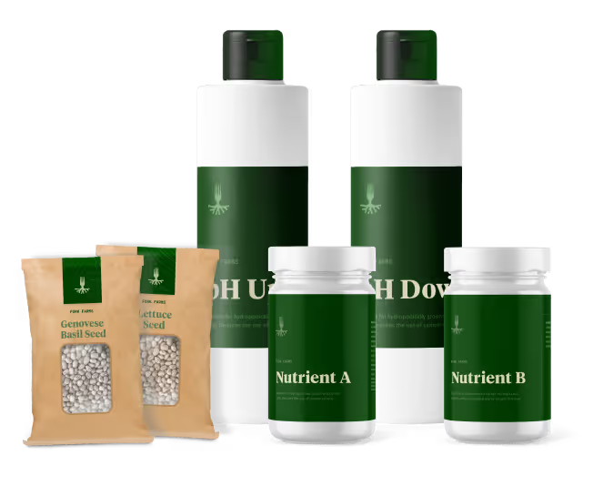
Since re-launching the brand as Breakwater, the Winnebago County team has leveraged the updated position and visual identity to create a deeper impact within their community. A combination of informational handouts, video PSA segments shown at local theaters, an updated website and even the creation of a community podcast has opened the door for conversations with the community. The biggest message that's being driven by Breakwater is that we can all be working together to strengthen our community.


Originally founded as the Winnebago Heroin Task Force, the Winnebago Drug & Alcohol Coalition agreed that the organization would be most effective at mitigating the risks of substance abuse in the area if they were able to present themselves as a more approachable community resource. Focusing efforts on the idea that an educated and strong community will have a natural barrier to block out the hazards of substance abuse. Our job was to develop a new name, messaging, and visual identity for the organization.

Since Oshkosh is the largest city within the county and also known for being on Lake Winnebago, we felt it would be most appropriate to focus the naming convention on a nautical theme. A breakwater is, in essence, a solid structure that's a compilation of many small pieces designed to protect valuable assets from stormy waters. With this concept at the core of the brand, our solution for the identity was to have everything revolve around this storyline and be presented with an approachable and fun-loving appearance. Since each effort to strengthen the community is unique, the logo is symbolic of that combined effort for a greater purpose.


Since re-launching the brand as Breakwater, the Winnebago County team has leveraged the updated position and visual identity to create a deeper impact within their community. A combination of informational handouts, video PSA segments shown at local theaters, an updated website and even the creation of a community podcast has opened the door for conversations with the community. The biggest message that's being driven by Breakwater is that we can all be working together to strengthen our community.


Originally founded as the Winnebago Heroin Task Force, the Winnebago Drug & Alcohol Coalition agreed that the organization would be most effective at mitigating the risks of substance abuse in the area if they were able to present themselves as a more approachable community resource. Focusing efforts on the idea that an educated and strong community will have a natural barrier to block out the hazards of substance abuse. Our job was to develop a new name, messaging, and visual identity for the organization.

Since Oshkosh is the largest city within the county and also known for being on Lake Winnebago, we felt it would be most appropriate to focus the naming convention on a nautical theme. A breakwater is, in essence, a solid structure that's a compilation of many small pieces designed to protect valuable assets from stormy waters. With this concept at the core of the brand, our solution for the identity was to have everything revolve around this storyline and be presented with an approachable and fun-loving appearance. Since each effort to strengthen the community is unique, the logo is symbolic of that combined effort for a greater purpose.

Since re-launching the brand as Breakwater, the Winnebago County team has leveraged the updated position and visual identity to create a deeper impact within their community. A combination of informational handouts, video PSA segments shown at local theaters, an updated website and even the creation of a community podcast has opened the door for conversations with the community. The biggest message that's being driven by Breakwater is that we can all be working together to strengthen our community.


Originally founded as the Winnebago Heroin Task Force, the Winnebago Drug & Alcohol Coalition agreed that the organization would be most effective at mitigating the risks of substance abuse in the area if they were able to present themselves as a more approachable community resource. Focusing efforts on the idea that an educated and strong community will have a natural barrier to block out the hazards of substance abuse. Our job was to develop a new name, messaging, and visual identity for the organization.


Since Oshkosh is the largest city within the county and also known for being on Lake Winnebago, we felt it would be most appropriate to focus the naming convention on a nautical theme. A breakwater is, in essence, a solid structure that's a compilation of many small pieces designed to protect valuable assets from stormy waters. With this concept at the core of the brand, our solution for the identity was to have everything revolve around this storyline and be presented with an approachable and fun-loving appearance. Since each effort to strengthen the community is unique, the logo is symbolic of that combined effort for a greater purpose.


Since re-launching the brand as Breakwater, the Winnebago County team has leveraged the updated position and visual identity to create a deeper impact within their community. A combination of informational handouts, video PSA segments shown at local theaters, an updated website and even the creation of a community podcast has opened the door for conversations with the community. The biggest message that's being driven by Breakwater is that we can all be working together to strengthen our community.


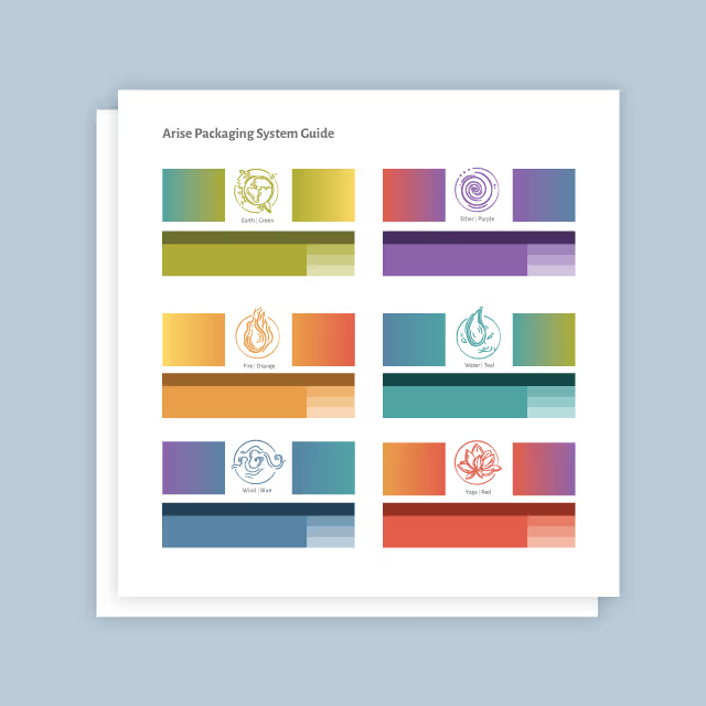
Originally founded as the Winnebago Heroin Task Force, the Winnebago Drug & Alcohol Coalition agreed that the organization would be most effective at mitigating the risks of substance abuse in the area if they were able to present themselves as a more approachable community resource. Focusing efforts on the idea that an educated and strong community will have a natural barrier to block out the hazards of substance abuse. Our job was to develop a new name, messaging, and visual identity for the organization.
Since Oshkosh is the largest city within the county and also known for being on Lake Winnebago, we felt it would be most appropriate to focus the naming convention on a nautical theme. A breakwater is, in essence, a solid structure that's a compilation of many small pieces designed to protect valuable assets from stormy waters. With this concept at the core of the brand, our solution for the identity was to have everything revolve around this storyline and be presented with an approachable and fun-loving appearance. Since each effort to strengthen the community is unique, the logo is symbolic of that combined effort for a greater purpose.


Since re-launching the brand as Breakwater, the Winnebago County team has leveraged the updated position and visual identity to create a deeper impact within their community. A combination of informational handouts, video PSA segments shown at local theaters, an updated website and even the creation of a community podcast has opened the door for conversations with the community. The biggest message that's being driven by Breakwater is that we can all be working together to strengthen our community.


Originally founded as the Winnebago Heroin Task Force, the Winnebago Drug & Alcohol Coalition agreed that the organization would be most effective at mitigating the risks of substance abuse in the area if they were able to present themselves as a more approachable community resource. Focusing efforts on the idea that an educated and strong community will have a natural barrier to block out the hazards of substance abuse. Our job was to develop a new name, messaging, and visual identity for the organization.


Since Oshkosh is the largest city within the county and also known for being on Lake Winnebago, we felt it would be most appropriate to focus the naming convention on a nautical theme. A breakwater is, in essence, a solid structure that's a compilation of many small pieces designed to protect valuable assets from stormy waters. With this concept at the core of the brand, our solution for the identity was to have everything revolve around this storyline and be presented with an approachable and fun-loving appearance. Since each effort to strengthen the community is unique, the logo is symbolic of that combined effort for a greater purpose.


Since re-launching the brand as Breakwater, the Winnebago County team has leveraged the updated position and visual identity to create a deeper impact within their community. A combination of informational handouts, video PSA segments shown at local theaters, an updated website and even the creation of a community podcast has opened the door for conversations with the community. The biggest message that's being driven by Breakwater is that we can all be working together to strengthen our community.


Originally founded as the Winnebago Heroin Task Force, the Winnebago Drug & Alcohol Coalition agreed that the organization would be most effective at mitigating the risks of substance abuse in the area if they were able to present themselves as a more approachable community resource. Focusing efforts on the idea that an educated and strong community will have a natural barrier to block out the hazards of substance abuse. Our job was to develop a new name, messaging, and visual identity for the organization.


Since Oshkosh is the largest city within the county and also known for being on Lake Winnebago, we felt it would be most appropriate to focus the naming convention on a nautical theme. A breakwater is, in essence, a solid structure that's a compilation of many small pieces designed to protect valuable assets from stormy waters. With this concept at the core of the brand, our solution for the identity was to have everything revolve around this storyline and be presented with an approachable and fun-loving appearance. Since each effort to strengthen the community is unique, the logo is symbolic of that combined effort for a greater purpose.


Since re-launching the brand as Breakwater, the Winnebago County team has leveraged the updated position and visual identity to create a deeper impact within their community. A combination of informational handouts, video PSA segments shown at local theaters, an updated website and even the creation of a community podcast has opened the door for conversations with the community. The biggest message that's being driven by Breakwater is that we can all be working together to strengthen our community.


Originally founded as the Winnebago Heroin Task Force, the Winnebago Drug & Alcohol Coalition agreed that the organization would be most effective at mitigating the risks of substance abuse in the area if they were able to present themselves as a more approachable community resource. Focusing efforts on the idea that an educated and strong community will have a natural barrier to block out the hazards of substance abuse. Our job was to develop a new name, messaging, and visual identity for the organization.


Since Oshkosh is the largest city within the county and also known for being on Lake Winnebago, we felt it would be most appropriate to focus the naming convention on a nautical theme. A breakwater is, in essence, a solid structure that's a compilation of many small pieces designed to protect valuable assets from stormy waters. With this concept at the core of the brand, our solution for the identity was to have everything revolve around this storyline and be presented with an approachable and fun-loving appearance. Since each effort to strengthen the community is unique, the logo is symbolic of that combined effort for a greater purpose.


Since re-launching the brand as Breakwater, the Winnebago County team has leveraged the updated position and visual identity to create a deeper impact within their community. A combination of informational handouts, video PSA segments shown at local theaters, an updated website and even the creation of a community podcast has opened the door for conversations with the community. The biggest message that's being driven by Breakwater is that we can all be working together to strengthen our community.


Originally founded as the Winnebago Heroin Task Force, the Winnebago Drug & Alcohol Coalition agreed that the organization would be most effective at mitigating the risks of substance abuse in the area if they were able to present themselves as a more approachable community resource. Focusing efforts on the idea that an educated and strong community will have a natural barrier to block out the hazards of substance abuse. Our job was to develop a new name, messaging, and visual identity for the organization.

Since Oshkosh is the largest city within the county and also known for being on Lake Winnebago, we felt it would be most appropriate to focus the naming convention on a nautical theme. A breakwater is, in essence, a solid structure that's a compilation of many small pieces designed to protect valuable assets from stormy waters. With this concept at the core of the brand, our solution for the identity was to have everything revolve around this storyline and be presented with an approachable and fun-loving appearance. Since each effort to strengthen the community is unique, the logo is symbolic of that combined effort for a greater purpose.

Since re-launching the brand as Breakwater, the Winnebago County team has leveraged the updated position and visual identity to create a deeper impact within their community. A combination of informational handouts, video PSA segments shown at local theaters, an updated website and even the creation of a community podcast has opened the door for conversations with the community. The biggest message that's being driven by Breakwater is that we can all be working together to strengthen our community.

Originally founded as the Winnebago Heroin Task Force, the Winnebago Drug & Alcohol Coalition agreed that the organization would be most effective at mitigating the risks of substance abuse in the area if they were able to present themselves as a more approachable community resource. Focusing efforts on the idea that an educated and strong community will have a natural barrier to block out the hazards of substance abuse. Our job was to develop a new name, messaging, and visual identity for the organization.

Since Oshkosh is the largest city within the county and also known for being on Lake Winnebago, we felt it would be most appropriate to focus the naming convention on a nautical theme. A breakwater is, in essence, a solid structure that's a compilation of many small pieces designed to protect valuable assets from stormy waters. With this concept at the core of the brand, our solution for the identity was to have everything revolve around this storyline and be presented with an approachable and fun-loving appearance. Since each effort to strengthen the community is unique, the logo is symbolic of that combined effort for a greater purpose.


Since re-launching the brand as Breakwater, the Winnebago County team has leveraged the updated position and visual identity to create a deeper impact within their community. A combination of informational handouts, video PSA segments shown at local theaters, an updated website and even the creation of a community podcast has opened the door for conversations with the community. The biggest message that's being driven by Breakwater is that we can all be working together to strengthen our community.
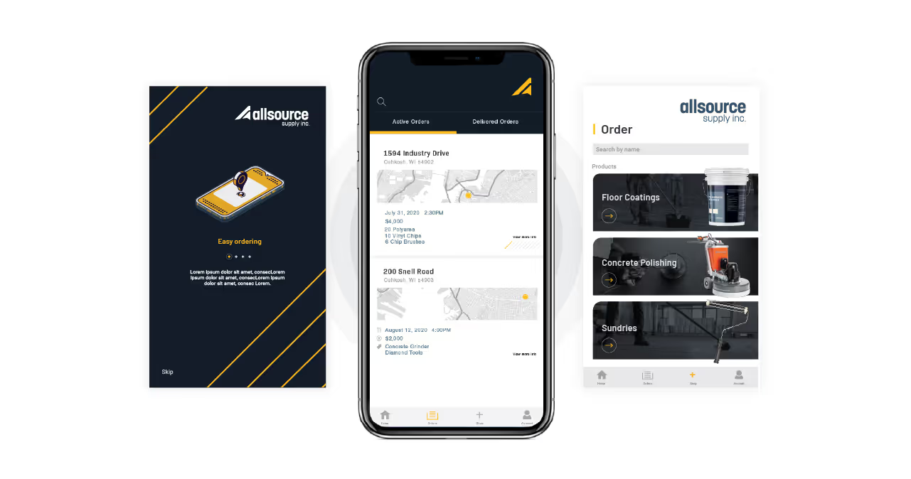


Originally founded as the Winnebago Heroin Task Force, the Winnebago Drug & Alcohol Coalition agreed that the organization would be most effective at mitigating the risks of substance abuse in the area if they were able to present themselves as a more approachable community resource. Focusing efforts on the idea that an educated and strong community will have a natural barrier to block out the hazards of substance abuse. Our job was to develop a new name, messaging, and visual identity for the organization.


Since Oshkosh is the largest city within the county and also known for being on Lake Winnebago, we felt it would be most appropriate to focus the naming convention on a nautical theme. A breakwater is, in essence, a solid structure that's a compilation of many small pieces designed to protect valuable assets from stormy waters. With this concept at the core of the brand, our solution for the identity was to have everything revolve around this storyline and be presented with an approachable and fun-loving appearance. Since each effort to strengthen the community is unique, the logo is symbolic of that combined effort for a greater purpose.


Since re-launching the brand as Breakwater, the Winnebago County team has leveraged the updated position and visual identity to create a deeper impact within their community. A combination of informational handouts, video PSA segments shown at local theaters, an updated website and even the creation of a community podcast has opened the door for conversations with the community. The biggest message that's being driven by Breakwater is that we can all be working together to strengthen our community.


Originally founded as the Winnebago Heroin Task Force, the Winnebago Drug & Alcohol Coalition agreed that the organization would be most effective at mitigating the risks of substance abuse in the area if they were able to present themselves as a more approachable community resource. Focusing efforts on the idea that an educated and strong community will have a natural barrier to block out the hazards of substance abuse. Our job was to develop a new name, messaging, and visual identity for the organization.


Since Oshkosh is the largest city within the county and also known for being on Lake Winnebago, we felt it would be most appropriate to focus the naming convention on a nautical theme. A breakwater is, in essence, a solid structure that's a compilation of many small pieces designed to protect valuable assets from stormy waters. With this concept at the core of the brand, our solution for the identity was to have everything revolve around this storyline and be presented with an approachable and fun-loving appearance. Since each effort to strengthen the community is unique, the logo is symbolic of that combined effort for a greater purpose.


Since re-launching the brand as Breakwater, the Winnebago County team has leveraged the updated position and visual identity to create a deeper impact within their community. A combination of informational handouts, video PSA segments shown at local theaters, an updated website and even the creation of a community podcast has opened the door for conversations with the community. The biggest message that's being driven by Breakwater is that we can all be working together to strengthen our community.


Originally founded as the Winnebago Heroin Task Force, the Winnebago Drug & Alcohol Coalition agreed that the organization would be most effective at mitigating the risks of substance abuse in the area if they were able to present themselves as a more approachable community resource. Focusing efforts on the idea that an educated and strong community will have a natural barrier to block out the hazards of substance abuse. Our job was to develop a new name, messaging, and visual identity for the organization.

Since Oshkosh is the largest city within the county and also known for being on Lake Winnebago, we felt it would be most appropriate to focus the naming convention on a nautical theme. A breakwater is, in essence, a solid structure that's a compilation of many small pieces designed to protect valuable assets from stormy waters. With this concept at the core of the brand, our solution for the identity was to have everything revolve around this storyline and be presented with an approachable and fun-loving appearance. Since each effort to strengthen the community is unique, the logo is symbolic of that combined effort for a greater purpose.


Since re-launching the brand as Breakwater, the Winnebago County team has leveraged the updated position and visual identity to create a deeper impact within their community. A combination of informational handouts, video PSA segments shown at local theaters, an updated website and even the creation of a community podcast has opened the door for conversations with the community. The biggest message that's being driven by Breakwater is that we can all be working together to strengthen our community.


Originally founded as the Winnebago Heroin Task Force, the Winnebago Drug & Alcohol Coalition agreed that the organization would be most effective at mitigating the risks of substance abuse in the area if they were able to present themselves as a more approachable community resource. Focusing efforts on the idea that an educated and strong community will have a natural barrier to block out the hazards of substance abuse. Our job was to develop a new name, messaging, and visual identity for the organization.


Since Oshkosh is the largest city within the county and also known for being on Lake Winnebago, we felt it would be most appropriate to focus the naming convention on a nautical theme. A breakwater is, in essence, a solid structure that's a compilation of many small pieces designed to protect valuable assets from stormy waters. With this concept at the core of the brand, our solution for the identity was to have everything revolve around this storyline and be presented with an approachable and fun-loving appearance. Since each effort to strengthen the community is unique, the logo is symbolic of that combined effort for a greater purpose.

Since re-launching the brand as Breakwater, the Winnebago County team has leveraged the updated position and visual identity to create a deeper impact within their community. A combination of informational handouts, video PSA segments shown at local theaters, an updated website and even the creation of a community podcast has opened the door for conversations with the community. The biggest message that's being driven by Breakwater is that we can all be working together to strengthen our community.


Originally founded as the Winnebago Heroin Task Force, the Winnebago Drug & Alcohol Coalition agreed that the organization would be most effective at mitigating the risks of substance abuse in the area if they were able to present themselves as a more approachable community resource. Focusing efforts on the idea that an educated and strong community will have a natural barrier to block out the hazards of substance abuse. Our job was to develop a new name, messaging, and visual identity for the organization.

Since Oshkosh is the largest city within the county and also known for being on Lake Winnebago, we felt it would be most appropriate to focus the naming convention on a nautical theme. A breakwater is, in essence, a solid structure that's a compilation of many small pieces designed to protect valuable assets from stormy waters. With this concept at the core of the brand, our solution for the identity was to have everything revolve around this storyline and be presented with an approachable and fun-loving appearance. Since each effort to strengthen the community is unique, the logo is symbolic of that combined effort for a greater purpose.


Since re-launching the brand as Breakwater, the Winnebago County team has leveraged the updated position and visual identity to create a deeper impact within their community. A combination of informational handouts, video PSA segments shown at local theaters, an updated website and even the creation of a community podcast has opened the door for conversations with the community. The biggest message that's being driven by Breakwater is that we can all be working together to strengthen our community.


Since re-launching the brand as Breakwater, the Winnebago County team has leveraged the updated position and visual identity to create a deeper impact within their community. A combination of informational handouts, video PSA segments shown at local theaters, an updated website and even the creation of a community podcast has opened the door for conversations with the community. The biggest message that's being driven by Breakwater is that we can all be working together to strengthen our community.
Originally founded as the Winnebago Heroin Task Force, the Winnebago Drug & Alcohol Coalition agreed that the organization would be most effective at mitigating the risks of substance abuse in the area if they were able to present themselves as a more approachable community resource. Focusing efforts on the idea that an educated and strong community will have a natural barrier to block out the hazards of substance abuse. Our job was to develop a new name, messaging, and visual identity for the organization.

Since Oshkosh is the largest city within the county and also known for being on Lake Winnebago, we felt it would be most appropriate to focus the naming convention on a nautical theme. A breakwater is, in essence, a solid structure that's a compilation of many small pieces designed to protect valuable assets from stormy waters. With this concept at the core of the brand, our solution for the identity was to have everything revolve around this storyline and be presented with an approachable and fun-loving appearance. Since each effort to strengthen the community is unique, the logo is symbolic of that combined effort for a greater purpose.

Since re-launching the brand as Breakwater, the Winnebago County team has leveraged the updated position and visual identity to create a deeper impact within their community. A combination of informational handouts, video PSA segments shown at local theaters, an updated website and even the creation of a community podcast has opened the door for conversations with the community. The biggest message that's being driven by Breakwater is that we can all be working together to strengthen our community.

Since re-launching the brand as Breakwater, the Winnebago County team has leveraged the updated position and visual identity to create a deeper impact within their community. A combination of informational handouts, video PSA segments shown at local theaters, an updated website and even the creation of a community podcast has opened the door for conversations with the community. The biggest message that's being driven by Breakwater is that we can all be working together to strengthen our community.

Since Oshkosh is the largest city within the county and also known for being on Lake Winnebago, we felt it would be most appropriate to focus the naming convention on a nautical theme. A breakwater is, in essence, a solid structure that's a compilation of many small pieces designed to protect valuable assets from stormy waters. With this concept at the core of the brand, our solution for the identity was to have everything revolve around this storyline and be presented with an approachable and fun-loving appearance. Since each effort to strengthen the community is unique, the logo is symbolic of that combined effort for a greater purpose.

Originally founded as the Winnebago Heroin Task Force, the Winnebago Drug & Alcohol Coalition agreed that the organization would be most effective at mitigating the risks of substance abuse in the area if they were able to present themselves as a more approachable community resource. Focusing efforts on the idea that an educated and strong community will have a natural barrier to block out the hazards of substance abuse. Our job was to develop a new name, messaging, and visual identity for the organization.

Since re-launching the brand as Breakwater, the Winnebago County team has leveraged the updated position and visual identity to create a deeper impact within their community. A combination of informational handouts, video PSA segments shown at local theaters, an updated website and even the creation of a community podcast has opened the door for conversations with the community. The biggest message that's being driven by Breakwater is that we can all be working together to strengthen our community.


Since re-launching the brand as Breakwater, the Winnebago County team has leveraged the updated position and visual identity to create a deeper impact within their community. A combination of informational handouts, video PSA segments shown at local theaters, an updated website and even the creation of a community podcast has opened the door for conversations with the community. The biggest message that's being driven by Breakwater is that we can all be working together to strengthen our community.


Originally founded as the Winnebago Heroin Task Force, the Winnebago Drug & Alcohol Coalition agreed that the organization would be most effective at mitigating the risks of substance abuse in the area if they were able to present themselves as a more approachable community resource. Focusing efforts on the idea that an educated and strong community will have a natural barrier to block out the hazards of substance abuse. Our job was to develop a new name, messaging, and visual identity for the organization.


Since Oshkosh is the largest city within the county and also known for being on Lake Winnebago, we felt it would be most appropriate to focus the naming convention on a nautical theme. A breakwater is, in essence, a solid structure that's a compilation of many small pieces designed to protect valuable assets from stormy waters. With this concept at the core of the brand, our solution for the identity was to have everything revolve around this storyline and be presented with an approachable and fun-loving appearance. Since each effort to strengthen the community is unique, the logo is symbolic of that combined effort for a greater purpose.

Since re-launching the brand as Breakwater, the Winnebago County team has leveraged the updated position and visual identity to create a deeper impact within their community. A combination of informational handouts, video PSA segments shown at local theaters, an updated website and even the creation of a community podcast has opened the door for conversations with the community. The biggest message that's being driven by Breakwater is that we can all be working together to strengthen our community.


Originally founded as the Winnebago Heroin Task Force, the Winnebago Drug & Alcohol Coalition agreed that the organization would be most effective at mitigating the risks of substance abuse in the area if they were able to present themselves as a more approachable community resource. Focusing efforts on the idea that an educated and strong community will have a natural barrier to block out the hazards of substance abuse. Our job was to develop a new name, messaging, and visual identity for the organization.
Since Oshkosh is the largest city within the county and also known for being on Lake Winnebago, we felt it would be most appropriate to focus the naming convention on a nautical theme. A breakwater is, in essence, a solid structure that's a compilation of many small pieces designed to protect valuable assets from stormy waters. With this concept at the core of the brand, our solution for the identity was to have everything revolve around this storyline and be presented with an approachable and fun-loving appearance. Since each effort to strengthen the community is unique, the logo is symbolic of that combined effort for a greater purpose.


Since re-launching the brand as Breakwater, the Winnebago County team has leveraged the updated position and visual identity to create a deeper impact within their community. A combination of informational handouts, video PSA segments shown at local theaters, an updated website and even the creation of a community podcast has opened the door for conversations with the community. The biggest message that's being driven by Breakwater is that we can all be working together to strengthen our community.


Originally founded as the Winnebago Heroin Task Force, the Winnebago Drug & Alcohol Coalition agreed that the organization would be most effective at mitigating the risks of substance abuse in the area if they were able to present themselves as a more approachable community resource. Focusing efforts on the idea that an educated and strong community will have a natural barrier to block out the hazards of substance abuse. Our job was to develop a new name, messaging, and visual identity for the organization.
Since re-launching the brand as Breakwater, the Winnebago County team has leveraged the updated position and visual identity to create a deeper impact within their community. A combination of informational handouts, video PSA segments shown at local theaters, an updated website and even the creation of a community podcast has opened the door for conversations with the community. The biggest message that's being driven by Breakwater is that we can all be working together to strengthen our community.

Since Oshkosh is the largest city within the county and also known for being on Lake Winnebago, we felt it would be most appropriate to focus the naming convention on a nautical theme. A breakwater is, in essence, a solid structure that's a compilation of many small pieces designed to protect valuable assets from stormy waters. With this concept at the core of the brand, our solution for the identity was to have everything revolve around this storyline and be presented with an approachable and fun-loving appearance. Since each effort to strengthen the community is unique, the logo is symbolic of that combined effort for a greater purpose.


Since re-launching the brand as Breakwater, the Winnebago County team has leveraged the updated position and visual identity to create a deeper impact within their community. A combination of informational handouts, video PSA segments shown at local theaters, an updated website and even the creation of a community podcast has opened the door for conversations with the community. The biggest message that's being driven by Breakwater is that we can all be working together to strengthen our community.


Originally founded as the Winnebago Heroin Task Force, the Winnebago Drug & Alcohol Coalition agreed that the organization would be most effective at mitigating the risks of substance abuse in the area if they were able to present themselves as a more approachable community resource. Focusing efforts on the idea that an educated and strong community will have a natural barrier to block out the hazards of substance abuse. Our job was to develop a new name, messaging, and visual identity for the organization.
Since Oshkosh is the largest city within the county and also known for being on Lake Winnebago, we felt it would be most appropriate to focus the naming convention on a nautical theme. A breakwater is, in essence, a solid structure that's a compilation of many small pieces designed to protect valuable assets from stormy waters. With this concept at the core of the brand, our solution for the identity was to have everything revolve around this storyline and be presented with an approachable and fun-loving appearance. Since each effort to strengthen the community is unique, the logo is symbolic of that combined effort for a greater purpose.


Since re-launching the brand as Breakwater, the Winnebago County team has leveraged the updated position and visual identity to create a deeper impact within their community. A combination of informational handouts, video PSA segments shown at local theaters, an updated website and even the creation of a community podcast has opened the door for conversations with the community. The biggest message that's being driven by Breakwater is that we can all be working together to strengthen our community.


Originally founded as the Winnebago Heroin Task Force, the Winnebago Drug & Alcohol Coalition agreed that the organization would be most effective at mitigating the risks of substance abuse in the area if they were able to present themselves as a more approachable community resource. Focusing efforts on the idea that an educated and strong community will have a natural barrier to block out the hazards of substance abuse. Our job was to develop a new name, messaging, and visual identity for the organization.

Since Oshkosh is the largest city within the county and also known for being on Lake Winnebago, we felt it would be most appropriate to focus the naming convention on a nautical theme. A breakwater is, in essence, a solid structure that's a compilation of many small pieces designed to protect valuable assets from stormy waters. With this concept at the core of the brand, our solution for the identity was to have everything revolve around this storyline and be presented with an approachable and fun-loving appearance. Since each effort to strengthen the community is unique, the logo is symbolic of that combined effort for a greater purpose.

Since re-launching the brand as Breakwater, the Winnebago County team has leveraged the updated position and visual identity to create a deeper impact within their community. A combination of informational handouts, video PSA segments shown at local theaters, an updated website and even the creation of a community podcast has opened the door for conversations with the community. The biggest message that's being driven by Breakwater is that we can all be working together to strengthen our community.


Originally founded as the Winnebago Heroin Task Force, the Winnebago Drug & Alcohol Coalition agreed that the organization would be most effective at mitigating the risks of substance abuse in the area if they were able to present themselves as a more approachable community resource. Focusing efforts on the idea that an educated and strong community will have a natural barrier to block out the hazards of substance abuse. Our job was to develop a new name, messaging, and visual identity for the organization.

Since Oshkosh is the largest city within the county and also known for being on Lake Winnebago, we felt it would be most appropriate to focus the naming convention on a nautical theme. A breakwater is, in essence, a solid structure that's a compilation of many small pieces designed to protect valuable assets from stormy waters. With this concept at the core of the brand, our solution for the identity was to have everything revolve around this storyline and be presented with an approachable and fun-loving appearance. Since each effort to strengthen the community is unique, the logo is symbolic of that combined effort for a greater purpose.


Since re-launching the brand as Breakwater, the Winnebago County team has leveraged the updated position and visual identity to create a deeper impact within their community. A combination of informational handouts, video PSA segments shown at local theaters, an updated website and even the creation of a community podcast has opened the door for conversations with the community. The biggest message that's being driven by Breakwater is that we can all be working together to strengthen our community.


Our work is about community and connection. We needed a name and brand that was inviting and memorable. Quill helped us achieve both. We love working with Quill and highly recommend them to others.
SAMANTHA HILKER, COMMUNITY HEALTH STRATEGIST, BREAKWATER
