
A few short years after Nathan and Austin finished their studies at Michigan Tech with degrees in engineering, they found a unique way to apply their education that paired with personal passions. Both being long distance hikers with thousands of miles under their boots, they found themselves unhappy with the products available in the market. They took it upon themselves to design, develop, sew and test ultralight and durable gear made with their own hands.
Little did they know that these products would solve fundamental problems felt by many other long distance hikers. They saw themselves as humble trampers while their community saw them as industry leaders who brought their vibrant personalities to market through their products. Our challenge was to create a brand identity that represented the authenticity of their approach and gave them a foundation to scale an ecommerce business.

As with any successfully positioned brand identity, our focus was on customers and competitors. We learned that long distance hikers love their equipment as much as the trail itself. Their equipment allows them to safely enjoy remote areas and act as a catalyst for memories to be made. With long distance hikers especially, these memories are rooted in the camaraderie developed with others on the trail. Although the scenery is usually epic, it’s the people that make the hard work of hiking up and down mountains and traveling miles upon miles for months on end worth it.
We also found that most competitors focus their marketing efforts on the products being sold rather than the experience of the trail. They display their products in vast and impressive mountain ranges but lack the emotional enjoyment that comes from friendships. Because of this we chose to focus the CTUG brand on people rather than just pushing products and features first. Not to mention that if you’ve ever hiked a long trail, you’ll know that lighter miles make for a more enjoyable experience.

During the brand development process, the team at Chicken Tramper felt that the authenticity of their brand was finally coming to life by seeing examples of messaging and visuals. Since they have marketing resources on staff, we made sure that every element of their brand identity could be expanded in-house for rapid speed to market of new campaigns and products. The growing team at Chicken Tramper is now fully aligned on their mission to accelerate brand positioning towards market success.

A few short years after Nathan and Austin finished their studies at Michigan Tech with degrees in engineering, they found a unique way to apply their education that paired with personal passions. Both being long distance hikers with thousands of miles under their boots, they found themselves unhappy with the products available in the market. They took it upon themselves to design, develop, sew and test ultralight and durable gear made with their own hands.
Little did they know that these products would solve fundamental problems felt by many other long distance hikers. They saw themselves as humble trampers while their community saw them as industry leaders who brought their vibrant personalities to market through their products. Our challenge was to create a brand identity that represented the authenticity of their approach and gave them a foundation to scale an ecommerce business.
As with any successfully positioned brand identity, our focus was on customers and competitors. We learned that long distance hikers love their equipment as much as the trail itself. Their equipment allows them to safely enjoy remote areas and act as a catalyst for memories to be made. With long distance hikers especially, these memories are rooted in the camaraderie developed with others on the trail. Although the scenery is usually epic, it’s the people that make the hard work of hiking up and down mountains and traveling miles upon miles for months on end worth it.
We also found that most competitors focus their marketing efforts on the products being sold rather than the experience of the trail. They display their products in vast and impressive mountain ranges but lack the emotional enjoyment that comes from friendships. Because of this we chose to focus the CTUG brand on people rather than just pushing products and features first. Not to mention that if you’ve ever hiked a long trail, you’ll know that lighter miles make for a more enjoyable experience.


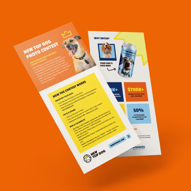
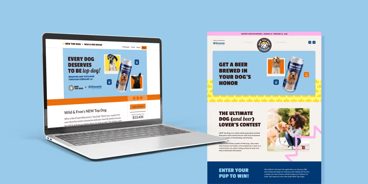
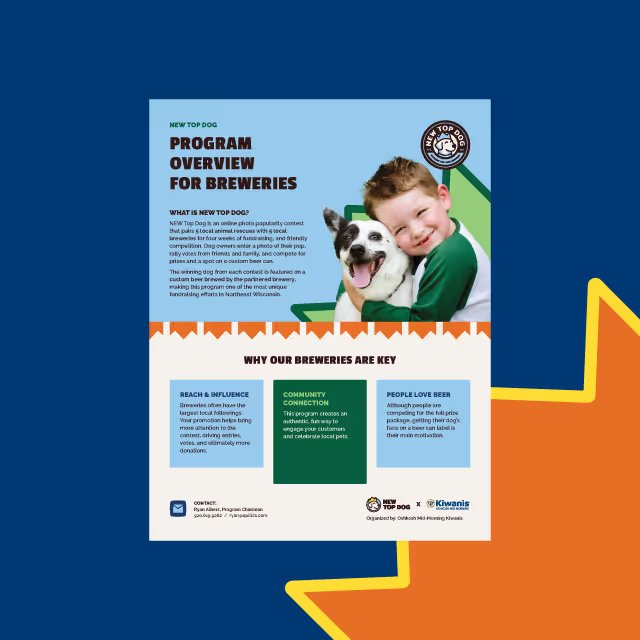
During the brand development process, the team at Chicken Tramper felt that the authenticity of their brand was finally coming to life by seeing examples of messaging and visuals. Since they have marketing resources on staff, we made sure that every element of their brand identity could be expanded in-house for rapid speed to market of new campaigns and products. The growing team at Chicken Tramper is now fully aligned on their mission to accelerate brand positioning towards market success.



A few short years after Nathan and Austin finished their studies at Michigan Tech with degrees in engineering, they found a unique way to apply their education that paired with personal passions. Both being long distance hikers with thousands of miles under their boots, they found themselves unhappy with the products available in the market. They took it upon themselves to design, develop, sew and test ultralight and durable gear made with their own hands.
Little did they know that these products would solve fundamental problems felt by many other long distance hikers. They saw themselves as humble trampers while their community saw them as industry leaders who brought their vibrant personalities to market through their products. Our challenge was to create a brand identity that represented the authenticity of their approach and gave them a foundation to scale an ecommerce business.
As with any successfully positioned brand identity, our focus was on customers and competitors. We learned that long distance hikers love their equipment as much as the trail itself. Their equipment allows them to safely enjoy remote areas and act as a catalyst for memories to be made. With long distance hikers especially, these memories are rooted in the camaraderie developed with others on the trail. Although the scenery is usually epic, it’s the people that make the hard work of hiking up and down mountains and traveling miles upon miles for months on end worth it.
We also found that most competitors focus their marketing efforts on the products being sold rather than the experience of the trail. They display their products in vast and impressive mountain ranges but lack the emotional enjoyment that comes from friendships. Because of this we chose to focus the CTUG brand on people rather than just pushing products and features first. Not to mention that if you’ve ever hiked a long trail, you’ll know that lighter miles make for a more enjoyable experience.


During the brand development process, the team at Chicken Tramper felt that the authenticity of their brand was finally coming to life by seeing examples of messaging and visuals. Since they have marketing resources on staff, we made sure that every element of their brand identity could be expanded in-house for rapid speed to market of new campaigns and products. The growing team at Chicken Tramper is now fully aligned on their mission to accelerate brand positioning towards market success.


A few short years after Nathan and Austin finished their studies at Michigan Tech with degrees in engineering, they found a unique way to apply their education that paired with personal passions. Both being long distance hikers with thousands of miles under their boots, they found themselves unhappy with the products available in the market. They took it upon themselves to design, develop, sew and test ultralight and durable gear made with their own hands.
Little did they know that these products would solve fundamental problems felt by many other long distance hikers. They saw themselves as humble trampers while their community saw them as industry leaders who brought their vibrant personalities to market through their products. Our challenge was to create a brand identity that represented the authenticity of their approach and gave them a foundation to scale an ecommerce business.
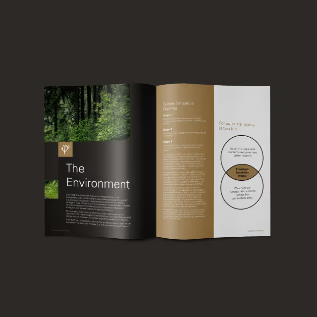
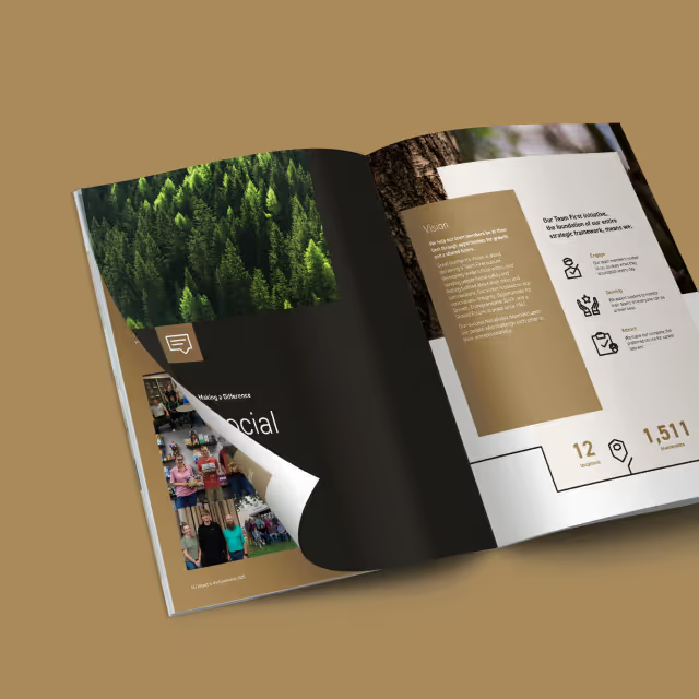
As with any successfully positioned brand identity, our focus was on customers and competitors. We learned that long distance hikers love their equipment as much as the trail itself. Their equipment allows them to safely enjoy remote areas and act as a catalyst for memories to be made. With long distance hikers especially, these memories are rooted in the camaraderie developed with others on the trail. Although the scenery is usually epic, it’s the people that make the hard work of hiking up and down mountains and traveling miles upon miles for months on end worth it.
We also found that most competitors focus their marketing efforts on the products being sold rather than the experience of the trail. They display their products in vast and impressive mountain ranges but lack the emotional enjoyment that comes from friendships. Because of this we chose to focus the CTUG brand on people rather than just pushing products and features first. Not to mention that if you’ve ever hiked a long trail, you’ll know that lighter miles make for a more enjoyable experience.

During the brand development process, the team at Chicken Tramper felt that the authenticity of their brand was finally coming to life by seeing examples of messaging and visuals. Since they have marketing resources on staff, we made sure that every element of their brand identity could be expanded in-house for rapid speed to market of new campaigns and products. The growing team at Chicken Tramper is now fully aligned on their mission to accelerate brand positioning towards market success.
A few short years after Nathan and Austin finished their studies at Michigan Tech with degrees in engineering, they found a unique way to apply their education that paired with personal passions. Both being long distance hikers with thousands of miles under their boots, they found themselves unhappy with the products available in the market. They took it upon themselves to design, develop, sew and test ultralight and durable gear made with their own hands.
Little did they know that these products would solve fundamental problems felt by many other long distance hikers. They saw themselves as humble trampers while their community saw them as industry leaders who brought their vibrant personalities to market through their products. Our challenge was to create a brand identity that represented the authenticity of their approach and gave them a foundation to scale an ecommerce business.


As with any successfully positioned brand identity, our focus was on customers and competitors. We learned that long distance hikers love their equipment as much as the trail itself. Their equipment allows them to safely enjoy remote areas and act as a catalyst for memories to be made. With long distance hikers especially, these memories are rooted in the camaraderie developed with others on the trail. Although the scenery is usually epic, it’s the people that make the hard work of hiking up and down mountains and traveling miles upon miles for months on end worth it.
We also found that most competitors focus their marketing efforts on the products being sold rather than the experience of the trail. They display their products in vast and impressive mountain ranges but lack the emotional enjoyment that comes from friendships. Because of this we chose to focus the CTUG brand on people rather than just pushing products and features first. Not to mention that if you’ve ever hiked a long trail, you’ll know that lighter miles make for a more enjoyable experience.
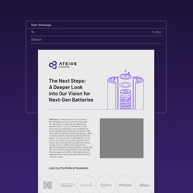
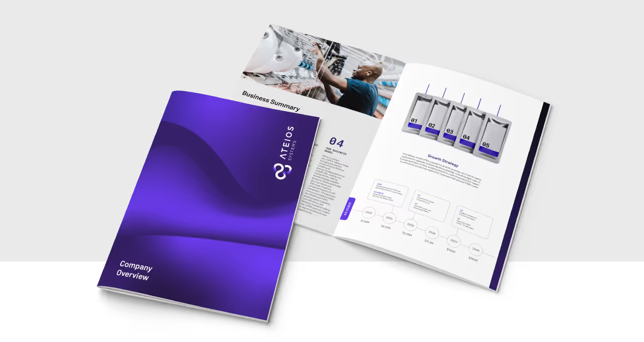
During the brand development process, the team at Chicken Tramper felt that the authenticity of their brand was finally coming to life by seeing examples of messaging and visuals. Since they have marketing resources on staff, we made sure that every element of their brand identity could be expanded in-house for rapid speed to market of new campaigns and products. The growing team at Chicken Tramper is now fully aligned on their mission to accelerate brand positioning towards market success.

A few short years after Nathan and Austin finished their studies at Michigan Tech with degrees in engineering, they found a unique way to apply their education that paired with personal passions. Both being long distance hikers with thousands of miles under their boots, they found themselves unhappy with the products available in the market. They took it upon themselves to design, develop, sew and test ultralight and durable gear made with their own hands.
Little did they know that these products would solve fundamental problems felt by many other long distance hikers. They saw themselves as humble trampers while their community saw them as industry leaders who brought their vibrant personalities to market through their products. Our challenge was to create a brand identity that represented the authenticity of their approach and gave them a foundation to scale an ecommerce business.


As with any successfully positioned brand identity, our focus was on customers and competitors. We learned that long distance hikers love their equipment as much as the trail itself. Their equipment allows them to safely enjoy remote areas and act as a catalyst for memories to be made. With long distance hikers especially, these memories are rooted in the camaraderie developed with others on the trail. Although the scenery is usually epic, it’s the people that make the hard work of hiking up and down mountains and traveling miles upon miles for months on end worth it.
We also found that most competitors focus their marketing efforts on the products being sold rather than the experience of the trail. They display their products in vast and impressive mountain ranges but lack the emotional enjoyment that comes from friendships. Because of this we chose to focus the CTUG brand on people rather than just pushing products and features first. Not to mention that if you’ve ever hiked a long trail, you’ll know that lighter miles make for a more enjoyable experience.


During the brand development process, the team at Chicken Tramper felt that the authenticity of their brand was finally coming to life by seeing examples of messaging and visuals. Since they have marketing resources on staff, we made sure that every element of their brand identity could be expanded in-house for rapid speed to market of new campaigns and products. The growing team at Chicken Tramper is now fully aligned on their mission to accelerate brand positioning towards market success.


A few short years after Nathan and Austin finished their studies at Michigan Tech with degrees in engineering, they found a unique way to apply their education that paired with personal passions. Both being long distance hikers with thousands of miles under their boots, they found themselves unhappy with the products available in the market. They took it upon themselves to design, develop, sew and test ultralight and durable gear made with their own hands.
Little did they know that these products would solve fundamental problems felt by many other long distance hikers. They saw themselves as humble trampers while their community saw them as industry leaders who brought their vibrant personalities to market through their products. Our challenge was to create a brand identity that represented the authenticity of their approach and gave them a foundation to scale an ecommerce business.

As with any successfully positioned brand identity, our focus was on customers and competitors. We learned that long distance hikers love their equipment as much as the trail itself. Their equipment allows them to safely enjoy remote areas and act as a catalyst for memories to be made. With long distance hikers especially, these memories are rooted in the camaraderie developed with others on the trail. Although the scenery is usually epic, it’s the people that make the hard work of hiking up and down mountains and traveling miles upon miles for months on end worth it.
We also found that most competitors focus their marketing efforts on the products being sold rather than the experience of the trail. They display their products in vast and impressive mountain ranges but lack the emotional enjoyment that comes from friendships. Because of this we chose to focus the CTUG brand on people rather than just pushing products and features first. Not to mention that if you’ve ever hiked a long trail, you’ll know that lighter miles make for a more enjoyable experience.


During the brand development process, the team at Chicken Tramper felt that the authenticity of their brand was finally coming to life by seeing examples of messaging and visuals. Since they have marketing resources on staff, we made sure that every element of their brand identity could be expanded in-house for rapid speed to market of new campaigns and products. The growing team at Chicken Tramper is now fully aligned on their mission to accelerate brand positioning towards market success.

A few short years after Nathan and Austin finished their studies at Michigan Tech with degrees in engineering, they found a unique way to apply their education that paired with personal passions. Both being long distance hikers with thousands of miles under their boots, they found themselves unhappy with the products available in the market. They took it upon themselves to design, develop, sew and test ultralight and durable gear made with their own hands.
Little did they know that these products would solve fundamental problems felt by many other long distance hikers. They saw themselves as humble trampers while their community saw them as industry leaders who brought their vibrant personalities to market through their products. Our challenge was to create a brand identity that represented the authenticity of their approach and gave them a foundation to scale an ecommerce business.


As with any successfully positioned brand identity, our focus was on customers and competitors. We learned that long distance hikers love their equipment as much as the trail itself. Their equipment allows them to safely enjoy remote areas and act as a catalyst for memories to be made. With long distance hikers especially, these memories are rooted in the camaraderie developed with others on the trail. Although the scenery is usually epic, it’s the people that make the hard work of hiking up and down mountains and traveling miles upon miles for months on end worth it.
We also found that most competitors focus their marketing efforts on the products being sold rather than the experience of the trail. They display their products in vast and impressive mountain ranges but lack the emotional enjoyment that comes from friendships. Because of this we chose to focus the CTUG brand on people rather than just pushing products and features first. Not to mention that if you’ve ever hiked a long trail, you’ll know that lighter miles make for a more enjoyable experience.


During the brand development process, the team at Chicken Tramper felt that the authenticity of their brand was finally coming to life by seeing examples of messaging and visuals. Since they have marketing resources on staff, we made sure that every element of their brand identity could be expanded in-house for rapid speed to market of new campaigns and products. The growing team at Chicken Tramper is now fully aligned on their mission to accelerate brand positioning towards market success.



A few short years after Nathan and Austin finished their studies at Michigan Tech with degrees in engineering, they found a unique way to apply their education that paired with personal passions. Both being long distance hikers with thousands of miles under their boots, they found themselves unhappy with the products available in the market. They took it upon themselves to design, develop, sew and test ultralight and durable gear made with their own hands.
Little did they know that these products would solve fundamental problems felt by many other long distance hikers. They saw themselves as humble trampers while their community saw them as industry leaders who brought their vibrant personalities to market through their products. Our challenge was to create a brand identity that represented the authenticity of their approach and gave them a foundation to scale an ecommerce business.

As with any successfully positioned brand identity, our focus was on customers and competitors. We learned that long distance hikers love their equipment as much as the trail itself. Their equipment allows them to safely enjoy remote areas and act as a catalyst for memories to be made. With long distance hikers especially, these memories are rooted in the camaraderie developed with others on the trail. Although the scenery is usually epic, it’s the people that make the hard work of hiking up and down mountains and traveling miles upon miles for months on end worth it.
We also found that most competitors focus their marketing efforts on the products being sold rather than the experience of the trail. They display their products in vast and impressive mountain ranges but lack the emotional enjoyment that comes from friendships. Because of this we chose to focus the CTUG brand on people rather than just pushing products and features first. Not to mention that if you’ve ever hiked a long trail, you’ll know that lighter miles make for a more enjoyable experience.



During the brand development process, the team at Chicken Tramper felt that the authenticity of their brand was finally coming to life by seeing examples of messaging and visuals. Since they have marketing resources on staff, we made sure that every element of their brand identity could be expanded in-house for rapid speed to market of new campaigns and products. The growing team at Chicken Tramper is now fully aligned on their mission to accelerate brand positioning towards market success.



A few short years after Nathan and Austin finished their studies at Michigan Tech with degrees in engineering, they found a unique way to apply their education that paired with personal passions. Both being long distance hikers with thousands of miles under their boots, they found themselves unhappy with the products available in the market. They took it upon themselves to design, develop, sew and test ultralight and durable gear made with their own hands.
Little did they know that these products would solve fundamental problems felt by many other long distance hikers. They saw themselves as humble trampers while their community saw them as industry leaders who brought their vibrant personalities to market through their products. Our challenge was to create a brand identity that represented the authenticity of their approach and gave them a foundation to scale an ecommerce business.
As with any successfully positioned brand identity, our focus was on customers and competitors. We learned that long distance hikers love their equipment as much as the trail itself. Their equipment allows them to safely enjoy remote areas and act as a catalyst for memories to be made. With long distance hikers especially, these memories are rooted in the camaraderie developed with others on the trail. Although the scenery is usually epic, it’s the people that make the hard work of hiking up and down mountains and traveling miles upon miles for months on end worth it.
We also found that most competitors focus their marketing efforts on the products being sold rather than the experience of the trail. They display their products in vast and impressive mountain ranges but lack the emotional enjoyment that comes from friendships. Because of this we chose to focus the CTUG brand on people rather than just pushing products and features first. Not to mention that if you’ve ever hiked a long trail, you’ll know that lighter miles make for a more enjoyable experience.



During the brand development process, the team at Chicken Tramper felt that the authenticity of their brand was finally coming to life by seeing examples of messaging and visuals. Since they have marketing resources on staff, we made sure that every element of their brand identity could be expanded in-house for rapid speed to market of new campaigns and products. The growing team at Chicken Tramper is now fully aligned on their mission to accelerate brand positioning towards market success.



A few short years after Nathan and Austin finished their studies at Michigan Tech with degrees in engineering, they found a unique way to apply their education that paired with personal passions. Both being long distance hikers with thousands of miles under their boots, they found themselves unhappy with the products available in the market. They took it upon themselves to design, develop, sew and test ultralight and durable gear made with their own hands.
Little did they know that these products would solve fundamental problems felt by many other long distance hikers. They saw themselves as humble trampers while their community saw them as industry leaders who brought their vibrant personalities to market through their products. Our challenge was to create a brand identity that represented the authenticity of their approach and gave them a foundation to scale an ecommerce business.

As with any successfully positioned brand identity, our focus was on customers and competitors. We learned that long distance hikers love their equipment as much as the trail itself. Their equipment allows them to safely enjoy remote areas and act as a catalyst for memories to be made. With long distance hikers especially, these memories are rooted in the camaraderie developed with others on the trail. Although the scenery is usually epic, it’s the people that make the hard work of hiking up and down mountains and traveling miles upon miles for months on end worth it.
We also found that most competitors focus their marketing efforts on the products being sold rather than the experience of the trail. They display their products in vast and impressive mountain ranges but lack the emotional enjoyment that comes from friendships. Because of this we chose to focus the CTUG brand on people rather than just pushing products and features first. Not to mention that if you’ve ever hiked a long trail, you’ll know that lighter miles make for a more enjoyable experience.


During the brand development process, the team at Chicken Tramper felt that the authenticity of their brand was finally coming to life by seeing examples of messaging and visuals. Since they have marketing resources on staff, we made sure that every element of their brand identity could be expanded in-house for rapid speed to market of new campaigns and products. The growing team at Chicken Tramper is now fully aligned on their mission to accelerate brand positioning towards market success.

A few short years after Nathan and Austin finished their studies at Michigan Tech with degrees in engineering, they found a unique way to apply their education that paired with personal passions. Both being long distance hikers with thousands of miles under their boots, they found themselves unhappy with the products available in the market. They took it upon themselves to design, develop, sew and test ultralight and durable gear made with their own hands.
Little did they know that these products would solve fundamental problems felt by many other long distance hikers. They saw themselves as humble trampers while their community saw them as industry leaders who brought their vibrant personalities to market through their products. Our challenge was to create a brand identity that represented the authenticity of their approach and gave them a foundation to scale an ecommerce business.
As with any successfully positioned brand identity, our focus was on customers and competitors. We learned that long distance hikers love their equipment as much as the trail itself. Their equipment allows them to safely enjoy remote areas and act as a catalyst for memories to be made. With long distance hikers especially, these memories are rooted in the camaraderie developed with others on the trail. Although the scenery is usually epic, it’s the people that make the hard work of hiking up and down mountains and traveling miles upon miles for months on end worth it.
We also found that most competitors focus their marketing efforts on the products being sold rather than the experience of the trail. They display their products in vast and impressive mountain ranges but lack the emotional enjoyment that comes from friendships. Because of this we chose to focus the CTUG brand on people rather than just pushing products and features first. Not to mention that if you’ve ever hiked a long trail, you’ll know that lighter miles make for a more enjoyable experience.

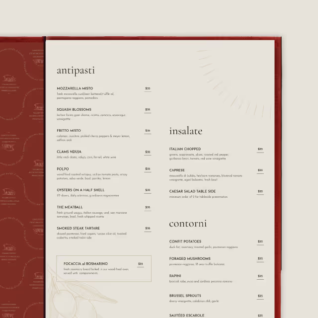
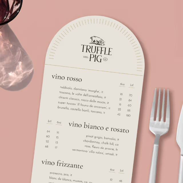
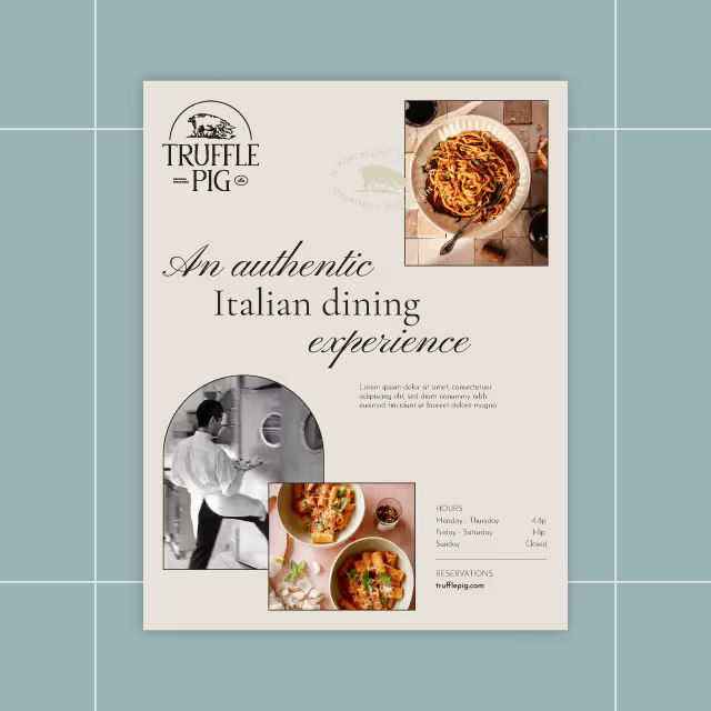
During the brand development process, the team at Chicken Tramper felt that the authenticity of their brand was finally coming to life by seeing examples of messaging and visuals. Since they have marketing resources on staff, we made sure that every element of their brand identity could be expanded in-house for rapid speed to market of new campaigns and products. The growing team at Chicken Tramper is now fully aligned on their mission to accelerate brand positioning towards market success.
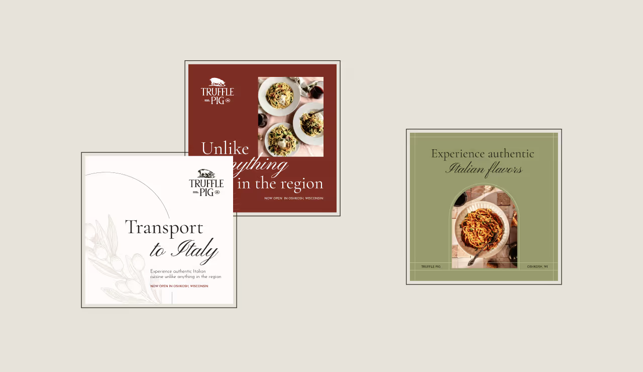
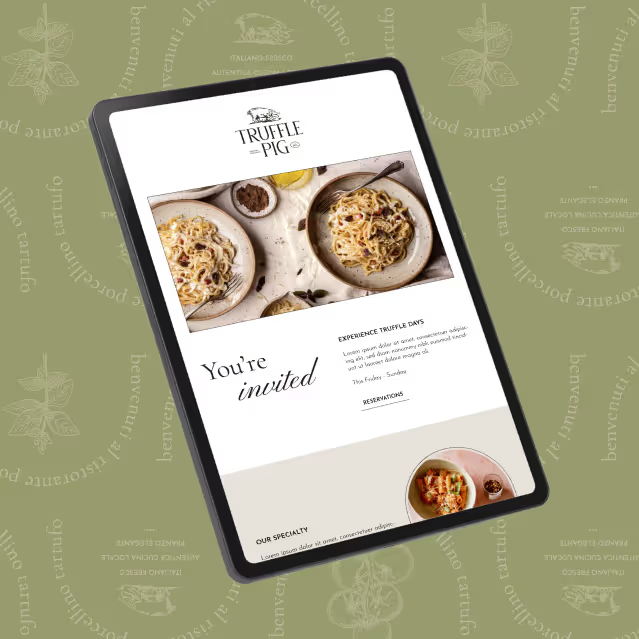

A few short years after Nathan and Austin finished their studies at Michigan Tech with degrees in engineering, they found a unique way to apply their education that paired with personal passions. Both being long distance hikers with thousands of miles under their boots, they found themselves unhappy with the products available in the market. They took it upon themselves to design, develop, sew and test ultralight and durable gear made with their own hands.
Little did they know that these products would solve fundamental problems felt by many other long distance hikers. They saw themselves as humble trampers while their community saw them as industry leaders who brought their vibrant personalities to market through their products. Our challenge was to create a brand identity that represented the authenticity of their approach and gave them a foundation to scale an ecommerce business.

As with any successfully positioned brand identity, our focus was on customers and competitors. We learned that long distance hikers love their equipment as much as the trail itself. Their equipment allows them to safely enjoy remote areas and act as a catalyst for memories to be made. With long distance hikers especially, these memories are rooted in the camaraderie developed with others on the trail. Although the scenery is usually epic, it’s the people that make the hard work of hiking up and down mountains and traveling miles upon miles for months on end worth it.
We also found that most competitors focus their marketing efforts on the products being sold rather than the experience of the trail. They display their products in vast and impressive mountain ranges but lack the emotional enjoyment that comes from friendships. Because of this we chose to focus the CTUG brand on people rather than just pushing products and features first. Not to mention that if you’ve ever hiked a long trail, you’ll know that lighter miles make for a more enjoyable experience.

During the brand development process, the team at Chicken Tramper felt that the authenticity of their brand was finally coming to life by seeing examples of messaging and visuals. Since they have marketing resources on staff, we made sure that every element of their brand identity could be expanded in-house for rapid speed to market of new campaigns and products. The growing team at Chicken Tramper is now fully aligned on their mission to accelerate brand positioning towards market success.

A few short years after Nathan and Austin finished their studies at Michigan Tech with degrees in engineering, they found a unique way to apply their education that paired with personal passions. Both being long distance hikers with thousands of miles under their boots, they found themselves unhappy with the products available in the market. They took it upon themselves to design, develop, sew and test ultralight and durable gear made with their own hands.
Little did they know that these products would solve fundamental problems felt by many other long distance hikers. They saw themselves as humble trampers while their community saw them as industry leaders who brought their vibrant personalities to market through their products. Our challenge was to create a brand identity that represented the authenticity of their approach and gave them a foundation to scale an ecommerce business.

As with any successfully positioned brand identity, our focus was on customers and competitors. We learned that long distance hikers love their equipment as much as the trail itself. Their equipment allows them to safely enjoy remote areas and act as a catalyst for memories to be made. With long distance hikers especially, these memories are rooted in the camaraderie developed with others on the trail. Although the scenery is usually epic, it’s the people that make the hard work of hiking up and down mountains and traveling miles upon miles for months on end worth it.
We also found that most competitors focus their marketing efforts on the products being sold rather than the experience of the trail. They display their products in vast and impressive mountain ranges but lack the emotional enjoyment that comes from friendships. Because of this we chose to focus the CTUG brand on people rather than just pushing products and features first. Not to mention that if you’ve ever hiked a long trail, you’ll know that lighter miles make for a more enjoyable experience.

During the brand development process, the team at Chicken Tramper felt that the authenticity of their brand was finally coming to life by seeing examples of messaging and visuals. Since they have marketing resources on staff, we made sure that every element of their brand identity could be expanded in-house for rapid speed to market of new campaigns and products. The growing team at Chicken Tramper is now fully aligned on their mission to accelerate brand positioning towards market success.



A few short years after Nathan and Austin finished their studies at Michigan Tech with degrees in engineering, they found a unique way to apply their education that paired with personal passions. Both being long distance hikers with thousands of miles under their boots, they found themselves unhappy with the products available in the market. They took it upon themselves to design, develop, sew and test ultralight and durable gear made with their own hands.
Little did they know that these products would solve fundamental problems felt by many other long distance hikers. They saw themselves as humble trampers while their community saw them as industry leaders who brought their vibrant personalities to market through their products. Our challenge was to create a brand identity that represented the authenticity of their approach and gave them a foundation to scale an ecommerce business.

As with any successfully positioned brand identity, our focus was on customers and competitors. We learned that long distance hikers love their equipment as much as the trail itself. Their equipment allows them to safely enjoy remote areas and act as a catalyst for memories to be made. With long distance hikers especially, these memories are rooted in the camaraderie developed with others on the trail. Although the scenery is usually epic, it’s the people that make the hard work of hiking up and down mountains and traveling miles upon miles for months on end worth it.
We also found that most competitors focus their marketing efforts on the products being sold rather than the experience of the trail. They display their products in vast and impressive mountain ranges but lack the emotional enjoyment that comes from friendships. Because of this we chose to focus the CTUG brand on people rather than just pushing products and features first. Not to mention that if you’ve ever hiked a long trail, you’ll know that lighter miles make for a more enjoyable experience.
During the brand development process, the team at Chicken Tramper felt that the authenticity of their brand was finally coming to life by seeing examples of messaging and visuals. Since they have marketing resources on staff, we made sure that every element of their brand identity could be expanded in-house for rapid speed to market of new campaigns and products. The growing team at Chicken Tramper is now fully aligned on their mission to accelerate brand positioning towards market success.


A few short years after Nathan and Austin finished their studies at Michigan Tech with degrees in engineering, they found a unique way to apply their education that paired with personal passions. Both being long distance hikers with thousands of miles under their boots, they found themselves unhappy with the products available in the market. They took it upon themselves to design, develop, sew and test ultralight and durable gear made with their own hands.
Little did they know that these products would solve fundamental problems felt by many other long distance hikers. They saw themselves as humble trampers while their community saw them as industry leaders who brought their vibrant personalities to market through their products. Our challenge was to create a brand identity that represented the authenticity of their approach and gave them a foundation to scale an ecommerce business.


As with any successfully positioned brand identity, our focus was on customers and competitors. We learned that long distance hikers love their equipment as much as the trail itself. Their equipment allows them to safely enjoy remote areas and act as a catalyst for memories to be made. With long distance hikers especially, these memories are rooted in the camaraderie developed with others on the trail. Although the scenery is usually epic, it’s the people that make the hard work of hiking up and down mountains and traveling miles upon miles for months on end worth it.
We also found that most competitors focus their marketing efforts on the products being sold rather than the experience of the trail. They display their products in vast and impressive mountain ranges but lack the emotional enjoyment that comes from friendships. Because of this we chose to focus the CTUG brand on people rather than just pushing products and features first. Not to mention that if you’ve ever hiked a long trail, you’ll know that lighter miles make for a more enjoyable experience.

During the brand development process, the team at Chicken Tramper felt that the authenticity of their brand was finally coming to life by seeing examples of messaging and visuals. Since they have marketing resources on staff, we made sure that every element of their brand identity could be expanded in-house for rapid speed to market of new campaigns and products. The growing team at Chicken Tramper is now fully aligned on their mission to accelerate brand positioning towards market success.


A few short years after Nathan and Austin finished their studies at Michigan Tech with degrees in engineering, they found a unique way to apply their education that paired with personal passions. Both being long distance hikers with thousands of miles under their boots, they found themselves unhappy with the products available in the market. They took it upon themselves to design, develop, sew and test ultralight and durable gear made with their own hands.
Little did they know that these products would solve fundamental problems felt by many other long distance hikers. They saw themselves as humble trampers while their community saw them as industry leaders who brought their vibrant personalities to market through their products. Our challenge was to create a brand identity that represented the authenticity of their approach and gave them a foundation to scale an ecommerce business.

As with any successfully positioned brand identity, our focus was on customers and competitors. We learned that long distance hikers love their equipment as much as the trail itself. Their equipment allows them to safely enjoy remote areas and act as a catalyst for memories to be made. With long distance hikers especially, these memories are rooted in the camaraderie developed with others on the trail. Although the scenery is usually epic, it’s the people that make the hard work of hiking up and down mountains and traveling miles upon miles for months on end worth it.
We also found that most competitors focus their marketing efforts on the products being sold rather than the experience of the trail. They display their products in vast and impressive mountain ranges but lack the emotional enjoyment that comes from friendships. Because of this we chose to focus the CTUG brand on people rather than just pushing products and features first. Not to mention that if you’ve ever hiked a long trail, you’ll know that lighter miles make for a more enjoyable experience.


During the brand development process, the team at Chicken Tramper felt that the authenticity of their brand was finally coming to life by seeing examples of messaging and visuals. Since they have marketing resources on staff, we made sure that every element of their brand identity could be expanded in-house for rapid speed to market of new campaigns and products. The growing team at Chicken Tramper is now fully aligned on their mission to accelerate brand positioning towards market success.


A few short years after Nathan and Austin finished their studies at Michigan Tech with degrees in engineering, they found a unique way to apply their education that paired with personal passions. Both being long distance hikers with thousands of miles under their boots, they found themselves unhappy with the products available in the market. They took it upon themselves to design, develop, sew and test ultralight and durable gear made with their own hands.
Little did they know that these products would solve fundamental problems felt by many other long distance hikers. They saw themselves as humble trampers while their community saw them as industry leaders who brought their vibrant personalities to market through their products. Our challenge was to create a brand identity that represented the authenticity of their approach and gave them a foundation to scale an ecommerce business.


As with any successfully positioned brand identity, our focus was on customers and competitors. We learned that long distance hikers love their equipment as much as the trail itself. Their equipment allows them to safely enjoy remote areas and act as a catalyst for memories to be made. With long distance hikers especially, these memories are rooted in the camaraderie developed with others on the trail. Although the scenery is usually epic, it’s the people that make the hard work of hiking up and down mountains and traveling miles upon miles for months on end worth it.
We also found that most competitors focus their marketing efforts on the products being sold rather than the experience of the trail. They display their products in vast and impressive mountain ranges but lack the emotional enjoyment that comes from friendships. Because of this we chose to focus the CTUG brand on people rather than just pushing products and features first. Not to mention that if you’ve ever hiked a long trail, you’ll know that lighter miles make for a more enjoyable experience.


During the brand development process, the team at Chicken Tramper felt that the authenticity of their brand was finally coming to life by seeing examples of messaging and visuals. Since they have marketing resources on staff, we made sure that every element of their brand identity could be expanded in-house for rapid speed to market of new campaigns and products. The growing team at Chicken Tramper is now fully aligned on their mission to accelerate brand positioning towards market success.





A few short years after Nathan and Austin finished their studies at Michigan Tech with degrees in engineering, they found a unique way to apply their education that paired with personal passions. Both being long distance hikers with thousands of miles under their boots, they found themselves unhappy with the products available in the market. They took it upon themselves to design, develop, sew and test ultralight and durable gear made with their own hands.
Little did they know that these products would solve fundamental problems felt by many other long distance hikers. They saw themselves as humble trampers while their community saw them as industry leaders who brought their vibrant personalities to market through their products. Our challenge was to create a brand identity that represented the authenticity of their approach and gave them a foundation to scale an ecommerce business.


As with any successfully positioned brand identity, our focus was on customers and competitors. We learned that long distance hikers love their equipment as much as the trail itself. Their equipment allows them to safely enjoy remote areas and act as a catalyst for memories to be made. With long distance hikers especially, these memories are rooted in the camaraderie developed with others on the trail. Although the scenery is usually epic, it’s the people that make the hard work of hiking up and down mountains and traveling miles upon miles for months on end worth it.
We also found that most competitors focus their marketing efforts on the products being sold rather than the experience of the trail. They display their products in vast and impressive mountain ranges but lack the emotional enjoyment that comes from friendships. Because of this we chose to focus the CTUG brand on people rather than just pushing products and features first. Not to mention that if you’ve ever hiked a long trail, you’ll know that lighter miles make for a more enjoyable experience.

During the brand development process, the team at Chicken Tramper felt that the authenticity of their brand was finally coming to life by seeing examples of messaging and visuals. Since they have marketing resources on staff, we made sure that every element of their brand identity could be expanded in-house for rapid speed to market of new campaigns and products. The growing team at Chicken Tramper is now fully aligned on their mission to accelerate brand positioning towards market success.


A few short years after Nathan and Austin finished their studies at Michigan Tech with degrees in engineering, they found a unique way to apply their education that paired with personal passions. Both being long distance hikers with thousands of miles under their boots, they found themselves unhappy with the products available in the market. They took it upon themselves to design, develop, sew and test ultralight and durable gear made with their own hands.
Little did they know that these products would solve fundamental problems felt by many other long distance hikers. They saw themselves as humble trampers while their community saw them as industry leaders who brought their vibrant personalities to market through their products. Our challenge was to create a brand identity that represented the authenticity of their approach and gave them a foundation to scale an ecommerce business.


As with any successfully positioned brand identity, our focus was on customers and competitors. We learned that long distance hikers love their equipment as much as the trail itself. Their equipment allows them to safely enjoy remote areas and act as a catalyst for memories to be made. With long distance hikers especially, these memories are rooted in the camaraderie developed with others on the trail. Although the scenery is usually epic, it’s the people that make the hard work of hiking up and down mountains and traveling miles upon miles for months on end worth it.
We also found that most competitors focus their marketing efforts on the products being sold rather than the experience of the trail. They display their products in vast and impressive mountain ranges but lack the emotional enjoyment that comes from friendships. Because of this we chose to focus the CTUG brand on people rather than just pushing products and features first. Not to mention that if you’ve ever hiked a long trail, you’ll know that lighter miles make for a more enjoyable experience.


During the brand development process, the team at Chicken Tramper felt that the authenticity of their brand was finally coming to life by seeing examples of messaging and visuals. Since they have marketing resources on staff, we made sure that every element of their brand identity could be expanded in-house for rapid speed to market of new campaigns and products. The growing team at Chicken Tramper is now fully aligned on their mission to accelerate brand positioning towards market success.


A few short years after Nathan and Austin finished their studies at Michigan Tech with degrees in engineering, they found a unique way to apply their education that paired with personal passions. Both being long distance hikers with thousands of miles under their boots, they found themselves unhappy with the products available in the market. They took it upon themselves to design, develop, sew and test ultralight and durable gear made with their own hands.
Little did they know that these products would solve fundamental problems felt by many other long distance hikers. They saw themselves as humble trampers while their community saw them as industry leaders who brought their vibrant personalities to market through their products. Our challenge was to create a brand identity that represented the authenticity of their approach and gave them a foundation to scale an ecommerce business.

As with any successfully positioned brand identity, our focus was on customers and competitors. We learned that long distance hikers love their equipment as much as the trail itself. Their equipment allows them to safely enjoy remote areas and act as a catalyst for memories to be made. With long distance hikers especially, these memories are rooted in the camaraderie developed with others on the trail. Although the scenery is usually epic, it’s the people that make the hard work of hiking up and down mountains and traveling miles upon miles for months on end worth it.
We also found that most competitors focus their marketing efforts on the products being sold rather than the experience of the trail. They display their products in vast and impressive mountain ranges but lack the emotional enjoyment that comes from friendships. Because of this we chose to focus the CTUG brand on people rather than just pushing products and features first. Not to mention that if you’ve ever hiked a long trail, you’ll know that lighter miles make for a more enjoyable experience.


During the brand development process, the team at Chicken Tramper felt that the authenticity of their brand was finally coming to life by seeing examples of messaging and visuals. Since they have marketing resources on staff, we made sure that every element of their brand identity could be expanded in-house for rapid speed to market of new campaigns and products. The growing team at Chicken Tramper is now fully aligned on their mission to accelerate brand positioning towards market success.


A few short years after Nathan and Austin finished their studies at Michigan Tech with degrees in engineering, they found a unique way to apply their education that paired with personal passions. Both being long distance hikers with thousands of miles under their boots, they found themselves unhappy with the products available in the market. They took it upon themselves to design, develop, sew and test ultralight and durable gear made with their own hands.
Little did they know that these products would solve fundamental problems felt by many other long distance hikers. They saw themselves as humble trampers while their community saw them as industry leaders who brought their vibrant personalities to market through their products. Our challenge was to create a brand identity that represented the authenticity of their approach and gave them a foundation to scale an ecommerce business.


As with any successfully positioned brand identity, our focus was on customers and competitors. We learned that long distance hikers love their equipment as much as the trail itself. Their equipment allows them to safely enjoy remote areas and act as a catalyst for memories to be made. With long distance hikers especially, these memories are rooted in the camaraderie developed with others on the trail. Although the scenery is usually epic, it’s the people that make the hard work of hiking up and down mountains and traveling miles upon miles for months on end worth it.
We also found that most competitors focus their marketing efforts on the products being sold rather than the experience of the trail. They display their products in vast and impressive mountain ranges but lack the emotional enjoyment that comes from friendships. Because of this we chose to focus the CTUG brand on people rather than just pushing products and features first. Not to mention that if you’ve ever hiked a long trail, you’ll know that lighter miles make for a more enjoyable experience.


During the brand development process, the team at Chicken Tramper felt that the authenticity of their brand was finally coming to life by seeing examples of messaging and visuals. Since they have marketing resources on staff, we made sure that every element of their brand identity could be expanded in-house for rapid speed to market of new campaigns and products. The growing team at Chicken Tramper is now fully aligned on their mission to accelerate brand positioning towards market success.


A few short years after Nathan and Austin finished their studies at Michigan Tech with degrees in engineering, they found a unique way to apply their education that paired with personal passions. Both being long distance hikers with thousands of miles under their boots, they found themselves unhappy with the products available in the market. They took it upon themselves to design, develop, sew and test ultralight and durable gear made with their own hands.
Little did they know that these products would solve fundamental problems felt by many other long distance hikers. They saw themselves as humble trampers while their community saw them as industry leaders who brought their vibrant personalities to market through their products. Our challenge was to create a brand identity that represented the authenticity of their approach and gave them a foundation to scale an ecommerce business.

As with any successfully positioned brand identity, our focus was on customers and competitors. We learned that long distance hikers love their equipment as much as the trail itself. Their equipment allows them to safely enjoy remote areas and act as a catalyst for memories to be made. With long distance hikers especially, these memories are rooted in the camaraderie developed with others on the trail. Although the scenery is usually epic, it’s the people that make the hard work of hiking up and down mountains and traveling miles upon miles for months on end worth it.
We also found that most competitors focus their marketing efforts on the products being sold rather than the experience of the trail. They display their products in vast and impressive mountain ranges but lack the emotional enjoyment that comes from friendships. Because of this we chose to focus the CTUG brand on people rather than just pushing products and features first. Not to mention that if you’ve ever hiked a long trail, you’ll know that lighter miles make for a more enjoyable experience.


During the brand development process, the team at Chicken Tramper felt that the authenticity of their brand was finally coming to life by seeing examples of messaging and visuals. Since they have marketing resources on staff, we made sure that every element of their brand identity could be expanded in-house for rapid speed to market of new campaigns and products. The growing team at Chicken Tramper is now fully aligned on their mission to accelerate brand positioning towards market success.


A few short years after Nathan and Austin finished their studies at Michigan Tech with degrees in engineering, they found a unique way to apply their education that paired with personal passions. Both being long distance hikers with thousands of miles under their boots, they found themselves unhappy with the products available in the market. They took it upon themselves to design, develop, sew and test ultralight and durable gear made with their own hands.
Little did they know that these products would solve fundamental problems felt by many other long distance hikers. They saw themselves as humble trampers while their community saw them as industry leaders who brought their vibrant personalities to market through their products. Our challenge was to create a brand identity that represented the authenticity of their approach and gave them a foundation to scale an ecommerce business.

As with any successfully positioned brand identity, our focus was on customers and competitors. We learned that long distance hikers love their equipment as much as the trail itself. Their equipment allows them to safely enjoy remote areas and act as a catalyst for memories to be made. With long distance hikers especially, these memories are rooted in the camaraderie developed with others on the trail. Although the scenery is usually epic, it’s the people that make the hard work of hiking up and down mountains and traveling miles upon miles for months on end worth it.
We also found that most competitors focus their marketing efforts on the products being sold rather than the experience of the trail. They display their products in vast and impressive mountain ranges but lack the emotional enjoyment that comes from friendships. Because of this we chose to focus the CTUG brand on people rather than just pushing products and features first. Not to mention that if you’ve ever hiked a long trail, you’ll know that lighter miles make for a more enjoyable experience.


During the brand development process, the team at Chicken Tramper felt that the authenticity of their brand was finally coming to life by seeing examples of messaging and visuals. Since they have marketing resources on staff, we made sure that every element of their brand identity could be expanded in-house for rapid speed to market of new campaigns and products. The growing team at Chicken Tramper is now fully aligned on their mission to accelerate brand positioning towards market success.


A few short years after Nathan and Austin finished their studies at Michigan Tech with degrees in engineering, they found a unique way to apply their education that paired with personal passions. Both being long distance hikers with thousands of miles under their boots, they found themselves unhappy with the products available in the market. They took it upon themselves to design, develop, sew and test ultralight and durable gear made with their own hands.
Little did they know that these products would solve fundamental problems felt by many other long distance hikers. They saw themselves as humble trampers while their community saw them as industry leaders who brought their vibrant personalities to market through their products. Our challenge was to create a brand identity that represented the authenticity of their approach and gave them a foundation to scale an ecommerce business.


As with any successfully positioned brand identity, our focus was on customers and competitors. We learned that long distance hikers love their equipment as much as the trail itself. Their equipment allows them to safely enjoy remote areas and act as a catalyst for memories to be made. With long distance hikers especially, these memories are rooted in the camaraderie developed with others on the trail. Although the scenery is usually epic, it’s the people that make the hard work of hiking up and down mountains and traveling miles upon miles for months on end worth it.
We also found that most competitors focus their marketing efforts on the products being sold rather than the experience of the trail. They display their products in vast and impressive mountain ranges but lack the emotional enjoyment that comes from friendships. Because of this we chose to focus the CTUG brand on people rather than just pushing products and features first. Not to mention that if you’ve ever hiked a long trail, you’ll know that lighter miles make for a more enjoyable experience.

During the brand development process, the team at Chicken Tramper felt that the authenticity of their brand was finally coming to life by seeing examples of messaging and visuals. Since they have marketing resources on staff, we made sure that every element of their brand identity could be expanded in-house for rapid speed to market of new campaigns and products. The growing team at Chicken Tramper is now fully aligned on their mission to accelerate brand positioning towards market success.


A few short years after Nathan and Austin finished their studies at Michigan Tech with degrees in engineering, they found a unique way to apply their education that paired with personal passions. Both being long distance hikers with thousands of miles under their boots, they found themselves unhappy with the products available in the market. They took it upon themselves to design, develop, sew and test ultralight and durable gear made with their own hands.
Little did they know that these products would solve fundamental problems felt by many other long distance hikers. They saw themselves as humble trampers while their community saw them as industry leaders who brought their vibrant personalities to market through their products. Our challenge was to create a brand identity that represented the authenticity of their approach and gave them a foundation to scale an ecommerce business.

As with any successfully positioned brand identity, our focus was on customers and competitors. We learned that long distance hikers love their equipment as much as the trail itself. Their equipment allows them to safely enjoy remote areas and act as a catalyst for memories to be made. With long distance hikers especially, these memories are rooted in the camaraderie developed with others on the trail. Although the scenery is usually epic, it’s the people that make the hard work of hiking up and down mountains and traveling miles upon miles for months on end worth it.
We also found that most competitors focus their marketing efforts on the products being sold rather than the experience of the trail. They display their products in vast and impressive mountain ranges but lack the emotional enjoyment that comes from friendships. Because of this we chose to focus the CTUG brand on people rather than just pushing products and features first. Not to mention that if you’ve ever hiked a long trail, you’ll know that lighter miles make for a more enjoyable experience.


During the brand development process, the team at Chicken Tramper felt that the authenticity of their brand was finally coming to life by seeing examples of messaging and visuals. Since they have marketing resources on staff, we made sure that every element of their brand identity could be expanded in-house for rapid speed to market of new campaigns and products. The growing team at Chicken Tramper is now fully aligned on their mission to accelerate brand positioning towards market success.


A few short years after Nathan and Austin finished their studies at Michigan Tech with degrees in engineering, they found a unique way to apply their education that paired with personal passions. Both being long distance hikers with thousands of miles under their boots, they found themselves unhappy with the products available in the market. They took it upon themselves to design, develop, sew and test ultralight and durable gear made with their own hands.
Little did they know that these products would solve fundamental problems felt by many other long distance hikers. They saw themselves as humble trampers while their community saw them as industry leaders who brought their vibrant personalities to market through their products. Our challenge was to create a brand identity that represented the authenticity of their approach and gave them a foundation to scale an ecommerce business.

As with any successfully positioned brand identity, our focus was on customers and competitors. We learned that long distance hikers love their equipment as much as the trail itself. Their equipment allows them to safely enjoy remote areas and act as a catalyst for memories to be made. With long distance hikers especially, these memories are rooted in the camaraderie developed with others on the trail. Although the scenery is usually epic, it’s the people that make the hard work of hiking up and down mountains and traveling miles upon miles for months on end worth it.
We also found that most competitors focus their marketing efforts on the products being sold rather than the experience of the trail. They display their products in vast and impressive mountain ranges but lack the emotional enjoyment that comes from friendships. Because of this we chose to focus the CTUG brand on people rather than just pushing products and features first. Not to mention that if you’ve ever hiked a long trail, you’ll know that lighter miles make for a more enjoyable experience.


During the brand development process, the team at Chicken Tramper felt that the authenticity of their brand was finally coming to life by seeing examples of messaging and visuals. Since they have marketing resources on staff, we made sure that every element of their brand identity could be expanded in-house for rapid speed to market of new campaigns and products. The growing team at Chicken Tramper is now fully aligned on their mission to accelerate brand positioning towards market success.


A few short years after Nathan and Austin finished their studies at Michigan Tech with degrees in engineering, they found a unique way to apply their education that paired with personal passions. Both being long distance hikers with thousands of miles under their boots, they found themselves unhappy with the products available in the market. They took it upon themselves to design, develop, sew and test ultralight and durable gear made with their own hands.
Little did they know that these products would solve fundamental problems felt by many other long distance hikers. They saw themselves as humble trampers while their community saw them as industry leaders who brought their vibrant personalities to market through their products. Our challenge was to create a brand identity that represented the authenticity of their approach and gave them a foundation to scale an ecommerce business.


As with any successfully positioned brand identity, our focus was on customers and competitors. We learned that long distance hikers love their equipment as much as the trail itself. Their equipment allows them to safely enjoy remote areas and act as a catalyst for memories to be made. With long distance hikers especially, these memories are rooted in the camaraderie developed with others on the trail. Although the scenery is usually epic, it’s the people that make the hard work of hiking up and down mountains and traveling miles upon miles for months on end worth it.
We also found that most competitors focus their marketing efforts on the products being sold rather than the experience of the trail. They display their products in vast and impressive mountain ranges but lack the emotional enjoyment that comes from friendships. Because of this we chose to focus the CTUG brand on people rather than just pushing products and features first. Not to mention that if you’ve ever hiked a long trail, you’ll know that lighter miles make for a more enjoyable experience.

During the brand development process, the team at Chicken Tramper felt that the authenticity of their brand was finally coming to life by seeing examples of messaging and visuals. Since they have marketing resources on staff, we made sure that every element of their brand identity could be expanded in-house for rapid speed to market of new campaigns and products. The growing team at Chicken Tramper is now fully aligned on their mission to accelerate brand positioning towards market success.


A few short years after Nathan and Austin finished their studies at Michigan Tech with degrees in engineering, they found a unique way to apply their education that paired with personal passions. Both being long distance hikers with thousands of miles under their boots, they found themselves unhappy with the products available in the market. They took it upon themselves to design, develop, sew and test ultralight and durable gear made with their own hands.
Little did they know that these products would solve fundamental problems felt by many other long distance hikers. They saw themselves as humble trampers while their community saw them as industry leaders who brought their vibrant personalities to market through their products. Our challenge was to create a brand identity that represented the authenticity of their approach and gave them a foundation to scale an ecommerce business.


As with any successfully positioned brand identity, our focus was on customers and competitors. We learned that long distance hikers love their equipment as much as the trail itself. Their equipment allows them to safely enjoy remote areas and act as a catalyst for memories to be made. With long distance hikers especially, these memories are rooted in the camaraderie developed with others on the trail. Although the scenery is usually epic, it’s the people that make the hard work of hiking up and down mountains and traveling miles upon miles for months on end worth it.
We also found that most competitors focus their marketing efforts on the products being sold rather than the experience of the trail. They display their products in vast and impressive mountain ranges but lack the emotional enjoyment that comes from friendships. Because of this we chose to focus the CTUG brand on people rather than just pushing products and features first. Not to mention that if you’ve ever hiked a long trail, you’ll know that lighter miles make for a more enjoyable experience.

During the brand development process, the team at Chicken Tramper felt that the authenticity of their brand was finally coming to life by seeing examples of messaging and visuals. Since they have marketing resources on staff, we made sure that every element of their brand identity could be expanded in-house for rapid speed to market of new campaigns and products. The growing team at Chicken Tramper is now fully aligned on their mission to accelerate brand positioning towards market success.


A few short years after Nathan and Austin finished their studies at Michigan Tech with degrees in engineering, they found a unique way to apply their education that paired with personal passions. Both being long distance hikers with thousands of miles under their boots, they found themselves unhappy with the products available in the market. They took it upon themselves to design, develop, sew and test ultralight and durable gear made with their own hands.
Little did they know that these products would solve fundamental problems felt by many other long distance hikers. They saw themselves as humble trampers while their community saw them as industry leaders who brought their vibrant personalities to market through their products. Our challenge was to create a brand identity that represented the authenticity of their approach and gave them a foundation to scale an ecommerce business.


As with any successfully positioned brand identity, our focus was on customers and competitors. We learned that long distance hikers love their equipment as much as the trail itself. Their equipment allows them to safely enjoy remote areas and act as a catalyst for memories to be made. With long distance hikers especially, these memories are rooted in the camaraderie developed with others on the trail. Although the scenery is usually epic, it’s the people that make the hard work of hiking up and down mountains and traveling miles upon miles for months on end worth it.
We also found that most competitors focus their marketing efforts on the products being sold rather than the experience of the trail. They display their products in vast and impressive mountain ranges but lack the emotional enjoyment that comes from friendships. Because of this we chose to focus the CTUG brand on people rather than just pushing products and features first. Not to mention that if you’ve ever hiked a long trail, you’ll know that lighter miles make for a more enjoyable experience.


During the brand development process, the team at Chicken Tramper felt that the authenticity of their brand was finally coming to life by seeing examples of messaging and visuals. Since they have marketing resources on staff, we made sure that every element of their brand identity could be expanded in-house for rapid speed to market of new campaigns and products. The growing team at Chicken Tramper is now fully aligned on their mission to accelerate brand positioning towards market success.


A few short years after Nathan and Austin finished their studies at Michigan Tech with degrees in engineering, they found a unique way to apply their education that paired with personal passions. Both being long distance hikers with thousands of miles under their boots, they found themselves unhappy with the products available in the market. They took it upon themselves to design, develop, sew and test ultralight and durable gear made with their own hands.
Little did they know that these products would solve fundamental problems felt by many other long distance hikers. They saw themselves as humble trampers while their community saw them as industry leaders who brought their vibrant personalities to market through their products. Our challenge was to create a brand identity that represented the authenticity of their approach and gave them a foundation to scale an ecommerce business.


As with any successfully positioned brand identity, our focus was on customers and competitors. We learned that long distance hikers love their equipment as much as the trail itself. Their equipment allows them to safely enjoy remote areas and act as a catalyst for memories to be made. With long distance hikers especially, these memories are rooted in the camaraderie developed with others on the trail. Although the scenery is usually epic, it’s the people that make the hard work of hiking up and down mountains and traveling miles upon miles for months on end worth it.
We also found that most competitors focus their marketing efforts on the products being sold rather than the experience of the trail. They display their products in vast and impressive mountain ranges but lack the emotional enjoyment that comes from friendships. Because of this we chose to focus the CTUG brand on people rather than just pushing products and features first. Not to mention that if you’ve ever hiked a long trail, you’ll know that lighter miles make for a more enjoyable experience.


During the brand development process, the team at Chicken Tramper felt that the authenticity of their brand was finally coming to life by seeing examples of messaging and visuals. Since they have marketing resources on staff, we made sure that every element of their brand identity could be expanded in-house for rapid speed to market of new campaigns and products. The growing team at Chicken Tramper is now fully aligned on their mission to accelerate brand positioning towards market success.



A few short years after Nathan and Austin finished their studies at Michigan Tech with degrees in engineering, they found a unique way to apply their education that paired with personal passions. Both being long distance hikers with thousands of miles under their boots, they found themselves unhappy with the products available in the market. They took it upon themselves to design, develop, sew and test ultralight and durable gear made with their own hands.
Little did they know that these products would solve fundamental problems felt by many other long distance hikers. They saw themselves as humble trampers while their community saw them as industry leaders who brought their vibrant personalities to market through their products. Our challenge was to create a brand identity that represented the authenticity of their approach and gave them a foundation to scale an ecommerce business.

As with any successfully positioned brand identity, our focus was on customers and competitors. We learned that long distance hikers love their equipment as much as the trail itself. Their equipment allows them to safely enjoy remote areas and act as a catalyst for memories to be made. With long distance hikers especially, these memories are rooted in the camaraderie developed with others on the trail. Although the scenery is usually epic, it’s the people that make the hard work of hiking up and down mountains and traveling miles upon miles for months on end worth it.
We also found that most competitors focus their marketing efforts on the products being sold rather than the experience of the trail. They display their products in vast and impressive mountain ranges but lack the emotional enjoyment that comes from friendships. Because of this we chose to focus the CTUG brand on people rather than just pushing products and features first. Not to mention that if you’ve ever hiked a long trail, you’ll know that lighter miles make for a more enjoyable experience.

During the brand development process, the team at Chicken Tramper felt that the authenticity of their brand was finally coming to life by seeing examples of messaging and visuals. Since they have marketing resources on staff, we made sure that every element of their brand identity could be expanded in-house for rapid speed to market of new campaigns and products. The growing team at Chicken Tramper is now fully aligned on their mission to accelerate brand positioning towards market success.


A few short years after Nathan and Austin finished their studies at Michigan Tech with degrees in engineering, they found a unique way to apply their education that paired with personal passions. Both being long distance hikers with thousands of miles under their boots, they found themselves unhappy with the products available in the market. They took it upon themselves to design, develop, sew and test ultralight and durable gear made with their own hands.
Little did they know that these products would solve fundamental problems felt by many other long distance hikers. They saw themselves as humble trampers while their community saw them as industry leaders who brought their vibrant personalities to market through their products. Our challenge was to create a brand identity that represented the authenticity of their approach and gave them a foundation to scale an ecommerce business.


As with any successfully positioned brand identity, our focus was on customers and competitors. We learned that long distance hikers love their equipment as much as the trail itself. Their equipment allows them to safely enjoy remote areas and act as a catalyst for memories to be made. With long distance hikers especially, these memories are rooted in the camaraderie developed with others on the trail. Although the scenery is usually epic, it’s the people that make the hard work of hiking up and down mountains and traveling miles upon miles for months on end worth it.
We also found that most competitors focus their marketing efforts on the products being sold rather than the experience of the trail. They display their products in vast and impressive mountain ranges but lack the emotional enjoyment that comes from friendships. Because of this we chose to focus the CTUG brand on people rather than just pushing products and features first. Not to mention that if you’ve ever hiked a long trail, you’ll know that lighter miles make for a more enjoyable experience.


During the brand development process, the team at Chicken Tramper felt that the authenticity of their brand was finally coming to life by seeing examples of messaging and visuals. Since they have marketing resources on staff, we made sure that every element of their brand identity could be expanded in-house for rapid speed to market of new campaigns and products. The growing team at Chicken Tramper is now fully aligned on their mission to accelerate brand positioning towards market success.


A few short years after Nathan and Austin finished their studies at Michigan Tech with degrees in engineering, they found a unique way to apply their education that paired with personal passions. Both being long distance hikers with thousands of miles under their boots, they found themselves unhappy with the products available in the market. They took it upon themselves to design, develop, sew and test ultralight and durable gear made with their own hands.
Little did they know that these products would solve fundamental problems felt by many other long distance hikers. They saw themselves as humble trampers while their community saw them as industry leaders who brought their vibrant personalities to market through their products. Our challenge was to create a brand identity that represented the authenticity of their approach and gave them a foundation to scale an ecommerce business.


As with any successfully positioned brand identity, our focus was on customers and competitors. We learned that long distance hikers love their equipment as much as the trail itself. Their equipment allows them to safely enjoy remote areas and act as a catalyst for memories to be made. With long distance hikers especially, these memories are rooted in the camaraderie developed with others on the trail. Although the scenery is usually epic, it’s the people that make the hard work of hiking up and down mountains and traveling miles upon miles for months on end worth it.
We also found that most competitors focus their marketing efforts on the products being sold rather than the experience of the trail. They display their products in vast and impressive mountain ranges but lack the emotional enjoyment that comes from friendships. Because of this we chose to focus the CTUG brand on people rather than just pushing products and features first. Not to mention that if you’ve ever hiked a long trail, you’ll know that lighter miles make for a more enjoyable experience.


During the brand development process, the team at Chicken Tramper felt that the authenticity of their brand was finally coming to life by seeing examples of messaging and visuals. Since they have marketing resources on staff, we made sure that every element of their brand identity could be expanded in-house for rapid speed to market of new campaigns and products. The growing team at Chicken Tramper is now fully aligned on their mission to accelerate brand positioning towards market success.


A few short years after Nathan and Austin finished their studies at Michigan Tech with degrees in engineering, they found a unique way to apply their education that paired with personal passions. Both being long distance hikers with thousands of miles under their boots, they found themselves unhappy with the products available in the market. They took it upon themselves to design, develop, sew and test ultralight and durable gear made with their own hands.
Little did they know that these products would solve fundamental problems felt by many other long distance hikers. They saw themselves as humble trampers while their community saw them as industry leaders who brought their vibrant personalities to market through their products. Our challenge was to create a brand identity that represented the authenticity of their approach and gave them a foundation to scale an ecommerce business.


As with any successfully positioned brand identity, our focus was on customers and competitors. We learned that long distance hikers love their equipment as much as the trail itself. Their equipment allows them to safely enjoy remote areas and act as a catalyst for memories to be made. With long distance hikers especially, these memories are rooted in the camaraderie developed with others on the trail. Although the scenery is usually epic, it’s the people that make the hard work of hiking up and down mountains and traveling miles upon miles for months on end worth it.
We also found that most competitors focus their marketing efforts on the products being sold rather than the experience of the trail. They display their products in vast and impressive mountain ranges but lack the emotional enjoyment that comes from friendships. Because of this we chose to focus the CTUG brand on people rather than just pushing products and features first. Not to mention that if you’ve ever hiked a long trail, you’ll know that lighter miles make for a more enjoyable experience.


During the brand development process, the team at Chicken Tramper felt that the authenticity of their brand was finally coming to life by seeing examples of messaging and visuals. Since they have marketing resources on staff, we made sure that every element of their brand identity could be expanded in-house for rapid speed to market of new campaigns and products. The growing team at Chicken Tramper is now fully aligned on their mission to accelerate brand positioning towards market success.

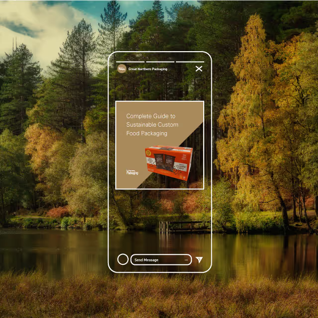


A few short years after Nathan and Austin finished their studies at Michigan Tech with degrees in engineering, they found a unique way to apply their education that paired with personal passions. Both being long distance hikers with thousands of miles under their boots, they found themselves unhappy with the products available in the market. They took it upon themselves to design, develop, sew and test ultralight and durable gear made with their own hands.
Little did they know that these products would solve fundamental problems felt by many other long distance hikers. They saw themselves as humble trampers while their community saw them as industry leaders who brought their vibrant personalities to market through their products. Our challenge was to create a brand identity that represented the authenticity of their approach and gave them a foundation to scale an ecommerce business.


As with any successfully positioned brand identity, our focus was on customers and competitors. We learned that long distance hikers love their equipment as much as the trail itself. Their equipment allows them to safely enjoy remote areas and act as a catalyst for memories to be made. With long distance hikers especially, these memories are rooted in the camaraderie developed with others on the trail. Although the scenery is usually epic, it’s the people that make the hard work of hiking up and down mountains and traveling miles upon miles for months on end worth it.
We also found that most competitors focus their marketing efforts on the products being sold rather than the experience of the trail. They display their products in vast and impressive mountain ranges but lack the emotional enjoyment that comes from friendships. Because of this we chose to focus the CTUG brand on people rather than just pushing products and features first. Not to mention that if you’ve ever hiked a long trail, you’ll know that lighter miles make for a more enjoyable experience.


During the brand development process, the team at Chicken Tramper felt that the authenticity of their brand was finally coming to life by seeing examples of messaging and visuals. Since they have marketing resources on staff, we made sure that every element of their brand identity could be expanded in-house for rapid speed to market of new campaigns and products. The growing team at Chicken Tramper is now fully aligned on their mission to accelerate brand positioning towards market success.


A few short years after Nathan and Austin finished their studies at Michigan Tech with degrees in engineering, they found a unique way to apply their education that paired with personal passions. Both being long distance hikers with thousands of miles under their boots, they found themselves unhappy with the products available in the market. They took it upon themselves to design, develop, sew and test ultralight and durable gear made with their own hands.
Little did they know that these products would solve fundamental problems felt by many other long distance hikers. They saw themselves as humble trampers while their community saw them as industry leaders who brought their vibrant personalities to market through their products. Our challenge was to create a brand identity that represented the authenticity of their approach and gave them a foundation to scale an ecommerce business.

As with any successfully positioned brand identity, our focus was on customers and competitors. We learned that long distance hikers love their equipment as much as the trail itself. Their equipment allows them to safely enjoy remote areas and act as a catalyst for memories to be made. With long distance hikers especially, these memories are rooted in the camaraderie developed with others on the trail. Although the scenery is usually epic, it’s the people that make the hard work of hiking up and down mountains and traveling miles upon miles for months on end worth it.
We also found that most competitors focus their marketing efforts on the products being sold rather than the experience of the trail. They display their products in vast and impressive mountain ranges but lack the emotional enjoyment that comes from friendships. Because of this we chose to focus the CTUG brand on people rather than just pushing products and features first. Not to mention that if you’ve ever hiked a long trail, you’ll know that lighter miles make for a more enjoyable experience.


During the brand development process, the team at Chicken Tramper felt that the authenticity of their brand was finally coming to life by seeing examples of messaging and visuals. Since they have marketing resources on staff, we made sure that every element of their brand identity could be expanded in-house for rapid speed to market of new campaigns and products. The growing team at Chicken Tramper is now fully aligned on their mission to accelerate brand positioning towards market success.


A few short years after Nathan and Austin finished their studies at Michigan Tech with degrees in engineering, they found a unique way to apply their education that paired with personal passions. Both being long distance hikers with thousands of miles under their boots, they found themselves unhappy with the products available in the market. They took it upon themselves to design, develop, sew and test ultralight and durable gear made with their own hands.
Little did they know that these products would solve fundamental problems felt by many other long distance hikers. They saw themselves as humble trampers while their community saw them as industry leaders who brought their vibrant personalities to market through their products. Our challenge was to create a brand identity that represented the authenticity of their approach and gave them a foundation to scale an ecommerce business.


As with any successfully positioned brand identity, our focus was on customers and competitors. We learned that long distance hikers love their equipment as much as the trail itself. Their equipment allows them to safely enjoy remote areas and act as a catalyst for memories to be made. With long distance hikers especially, these memories are rooted in the camaraderie developed with others on the trail. Although the scenery is usually epic, it’s the people that make the hard work of hiking up and down mountains and traveling miles upon miles for months on end worth it.
We also found that most competitors focus their marketing efforts on the products being sold rather than the experience of the trail. They display their products in vast and impressive mountain ranges but lack the emotional enjoyment that comes from friendships. Because of this we chose to focus the CTUG brand on people rather than just pushing products and features first. Not to mention that if you’ve ever hiked a long trail, you’ll know that lighter miles make for a more enjoyable experience.


During the brand development process, the team at Chicken Tramper felt that the authenticity of their brand was finally coming to life by seeing examples of messaging and visuals. Since they have marketing resources on staff, we made sure that every element of their brand identity could be expanded in-house for rapid speed to market of new campaigns and products. The growing team at Chicken Tramper is now fully aligned on their mission to accelerate brand positioning towards market success.

A few short years after Nathan and Austin finished their studies at Michigan Tech with degrees in engineering, they found a unique way to apply their education that paired with personal passions. Both being long distance hikers with thousands of miles under their boots, they found themselves unhappy with the products available in the market. They took it upon themselves to design, develop, sew and test ultralight and durable gear made with their own hands.
Little did they know that these products would solve fundamental problems felt by many other long distance hikers. They saw themselves as humble trampers while their community saw them as industry leaders who brought their vibrant personalities to market through their products. Our challenge was to create a brand identity that represented the authenticity of their approach and gave them a foundation to scale an ecommerce business.


As with any successfully positioned brand identity, our focus was on customers and competitors. We learned that long distance hikers love their equipment as much as the trail itself. Their equipment allows them to safely enjoy remote areas and act as a catalyst for memories to be made. With long distance hikers especially, these memories are rooted in the camaraderie developed with others on the trail. Although the scenery is usually epic, it’s the people that make the hard work of hiking up and down mountains and traveling miles upon miles for months on end worth it.
We also found that most competitors focus their marketing efforts on the products being sold rather than the experience of the trail. They display their products in vast and impressive mountain ranges but lack the emotional enjoyment that comes from friendships. Because of this we chose to focus the CTUG brand on people rather than just pushing products and features first. Not to mention that if you’ve ever hiked a long trail, you’ll know that lighter miles make for a more enjoyable experience.


During the brand development process, the team at Chicken Tramper felt that the authenticity of their brand was finally coming to life by seeing examples of messaging and visuals. Since they have marketing resources on staff, we made sure that every element of their brand identity could be expanded in-house for rapid speed to market of new campaigns and products. The growing team at Chicken Tramper is now fully aligned on their mission to accelerate brand positioning towards market success.


A few short years after Nathan and Austin finished their studies at Michigan Tech with degrees in engineering, they found a unique way to apply their education that paired with personal passions. Both being long distance hikers with thousands of miles under their boots, they found themselves unhappy with the products available in the market. They took it upon themselves to design, develop, sew and test ultralight and durable gear made with their own hands.
Little did they know that these products would solve fundamental problems felt by many other long distance hikers. They saw themselves as humble trampers while their community saw them as industry leaders who brought their vibrant personalities to market through their products. Our challenge was to create a brand identity that represented the authenticity of their approach and gave them a foundation to scale an ecommerce business.

As with any successfully positioned brand identity, our focus was on customers and competitors. We learned that long distance hikers love their equipment as much as the trail itself. Their equipment allows them to safely enjoy remote areas and act as a catalyst for memories to be made. With long distance hikers especially, these memories are rooted in the camaraderie developed with others on the trail. Although the scenery is usually epic, it’s the people that make the hard work of hiking up and down mountains and traveling miles upon miles for months on end worth it.
We also found that most competitors focus their marketing efforts on the products being sold rather than the experience of the trail. They display their products in vast and impressive mountain ranges but lack the emotional enjoyment that comes from friendships. Because of this we chose to focus the CTUG brand on people rather than just pushing products and features first. Not to mention that if you’ve ever hiked a long trail, you’ll know that lighter miles make for a more enjoyable experience.


During the brand development process, the team at Chicken Tramper felt that the authenticity of their brand was finally coming to life by seeing examples of messaging and visuals. Since they have marketing resources on staff, we made sure that every element of their brand identity could be expanded in-house for rapid speed to market of new campaigns and products. The growing team at Chicken Tramper is now fully aligned on their mission to accelerate brand positioning towards market success.


A few short years after Nathan and Austin finished their studies at Michigan Tech with degrees in engineering, they found a unique way to apply their education that paired with personal passions. Both being long distance hikers with thousands of miles under their boots, they found themselves unhappy with the products available in the market. They took it upon themselves to design, develop, sew and test ultralight and durable gear made with their own hands.
Little did they know that these products would solve fundamental problems felt by many other long distance hikers. They saw themselves as humble trampers while their community saw them as industry leaders who brought their vibrant personalities to market through their products. Our challenge was to create a brand identity that represented the authenticity of their approach and gave them a foundation to scale an ecommerce business.


As with any successfully positioned brand identity, our focus was on customers and competitors. We learned that long distance hikers love their equipment as much as the trail itself. Their equipment allows them to safely enjoy remote areas and act as a catalyst for memories to be made. With long distance hikers especially, these memories are rooted in the camaraderie developed with others on the trail. Although the scenery is usually epic, it’s the people that make the hard work of hiking up and down mountains and traveling miles upon miles for months on end worth it.
We also found that most competitors focus their marketing efforts on the products being sold rather than the experience of the trail. They display their products in vast and impressive mountain ranges but lack the emotional enjoyment that comes from friendships. Because of this we chose to focus the CTUG brand on people rather than just pushing products and features first. Not to mention that if you’ve ever hiked a long trail, you’ll know that lighter miles make for a more enjoyable experience.


During the brand development process, the team at Chicken Tramper felt that the authenticity of their brand was finally coming to life by seeing examples of messaging and visuals. Since they have marketing resources on staff, we made sure that every element of their brand identity could be expanded in-house for rapid speed to market of new campaigns and products. The growing team at Chicken Tramper is now fully aligned on their mission to accelerate brand positioning towards market success.


A few short years after Nathan and Austin finished their studies at Michigan Tech with degrees in engineering, they found a unique way to apply their education that paired with personal passions. Both being long distance hikers with thousands of miles under their boots, they found themselves unhappy with the products available in the market. They took it upon themselves to design, develop, sew and test ultralight and durable gear made with their own hands.
Little did they know that these products would solve fundamental problems felt by many other long distance hikers. They saw themselves as humble trampers while their community saw them as industry leaders who brought their vibrant personalities to market through their products. Our challenge was to create a brand identity that represented the authenticity of their approach and gave them a foundation to scale an ecommerce business.


As with any successfully positioned brand identity, our focus was on customers and competitors. We learned that long distance hikers love their equipment as much as the trail itself. Their equipment allows them to safely enjoy remote areas and act as a catalyst for memories to be made. With long distance hikers especially, these memories are rooted in the camaraderie developed with others on the trail. Although the scenery is usually epic, it’s the people that make the hard work of hiking up and down mountains and traveling miles upon miles for months on end worth it.
We also found that most competitors focus their marketing efforts on the products being sold rather than the experience of the trail. They display their products in vast and impressive mountain ranges but lack the emotional enjoyment that comes from friendships. Because of this we chose to focus the CTUG brand on people rather than just pushing products and features first. Not to mention that if you’ve ever hiked a long trail, you’ll know that lighter miles make for a more enjoyable experience.


During the brand development process, the team at Chicken Tramper felt that the authenticity of their brand was finally coming to life by seeing examples of messaging and visuals. Since they have marketing resources on staff, we made sure that every element of their brand identity could be expanded in-house for rapid speed to market of new campaigns and products. The growing team at Chicken Tramper is now fully aligned on their mission to accelerate brand positioning towards market success.


A few short years after Nathan and Austin finished their studies at Michigan Tech with degrees in engineering, they found a unique way to apply their education that paired with personal passions. Both being long distance hikers with thousands of miles under their boots, they found themselves unhappy with the products available in the market. They took it upon themselves to design, develop, sew and test ultralight and durable gear made with their own hands.
Little did they know that these products would solve fundamental problems felt by many other long distance hikers. They saw themselves as humble trampers while their community saw them as industry leaders who brought their vibrant personalities to market through their products. Our challenge was to create a brand identity that represented the authenticity of their approach and gave them a foundation to scale an ecommerce business.


As with any successfully positioned brand identity, our focus was on customers and competitors. We learned that long distance hikers love their equipment as much as the trail itself. Their equipment allows them to safely enjoy remote areas and act as a catalyst for memories to be made. With long distance hikers especially, these memories are rooted in the camaraderie developed with others on the trail. Although the scenery is usually epic, it’s the people that make the hard work of hiking up and down mountains and traveling miles upon miles for months on end worth it.
We also found that most competitors focus their marketing efforts on the products being sold rather than the experience of the trail. They display their products in vast and impressive mountain ranges but lack the emotional enjoyment that comes from friendships. Because of this we chose to focus the CTUG brand on people rather than just pushing products and features first. Not to mention that if you’ve ever hiked a long trail, you’ll know that lighter miles make for a more enjoyable experience.


During the brand development process, the team at Chicken Tramper felt that the authenticity of their brand was finally coming to life by seeing examples of messaging and visuals. Since they have marketing resources on staff, we made sure that every element of their brand identity could be expanded in-house for rapid speed to market of new campaigns and products. The growing team at Chicken Tramper is now fully aligned on their mission to accelerate brand positioning towards market success.


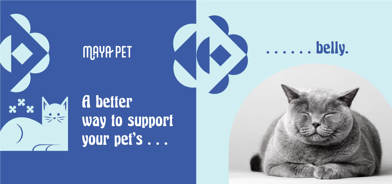


A few short years after Nathan and Austin finished their studies at Michigan Tech with degrees in engineering, they found a unique way to apply their education that paired with personal passions. Both being long distance hikers with thousands of miles under their boots, they found themselves unhappy with the products available in the market. They took it upon themselves to design, develop, sew and test ultralight and durable gear made with their own hands.
Little did they know that these products would solve fundamental problems felt by many other long distance hikers. They saw themselves as humble trampers while their community saw them as industry leaders who brought their vibrant personalities to market through their products. Our challenge was to create a brand identity that represented the authenticity of their approach and gave them a foundation to scale an ecommerce business.


As with any successfully positioned brand identity, our focus was on customers and competitors. We learned that long distance hikers love their equipment as much as the trail itself. Their equipment allows them to safely enjoy remote areas and act as a catalyst for memories to be made. With long distance hikers especially, these memories are rooted in the camaraderie developed with others on the trail. Although the scenery is usually epic, it’s the people that make the hard work of hiking up and down mountains and traveling miles upon miles for months on end worth it.
We also found that most competitors focus their marketing efforts on the products being sold rather than the experience of the trail. They display their products in vast and impressive mountain ranges but lack the emotional enjoyment that comes from friendships. Because of this we chose to focus the CTUG brand on people rather than just pushing products and features first. Not to mention that if you’ve ever hiked a long trail, you’ll know that lighter miles make for a more enjoyable experience.


During the brand development process, the team at Chicken Tramper felt that the authenticity of their brand was finally coming to life by seeing examples of messaging and visuals. Since they have marketing resources on staff, we made sure that every element of their brand identity could be expanded in-house for rapid speed to market of new campaigns and products. The growing team at Chicken Tramper is now fully aligned on their mission to accelerate brand positioning towards market success.


A few short years after Nathan and Austin finished their studies at Michigan Tech with degrees in engineering, they found a unique way to apply their education that paired with personal passions. Both being long distance hikers with thousands of miles under their boots, they found themselves unhappy with the products available in the market. They took it upon themselves to design, develop, sew and test ultralight and durable gear made with their own hands.
Little did they know that these products would solve fundamental problems felt by many other long distance hikers. They saw themselves as humble trampers while their community saw them as industry leaders who brought their vibrant personalities to market through their products. Our challenge was to create a brand identity that represented the authenticity of their approach and gave them a foundation to scale an ecommerce business.
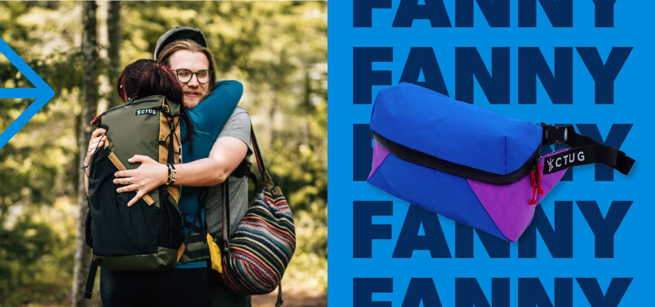
As with any successfully positioned brand identity, our focus was on customers and competitors. We learned that long distance hikers love their equipment as much as the trail itself. Their equipment allows them to safely enjoy remote areas and act as a catalyst for memories to be made. With long distance hikers especially, these memories are rooted in the camaraderie developed with others on the trail. Although the scenery is usually epic, it’s the people that make the hard work of hiking up and down mountains and traveling miles upon miles for months on end worth it.
We also found that most competitors focus their marketing efforts on the products being sold rather than the experience of the trail. They display their products in vast and impressive mountain ranges but lack the emotional enjoyment that comes from friendships. Because of this we chose to focus the CTUG brand on people rather than just pushing products and features first. Not to mention that if you’ve ever hiked a long trail, you’ll know that lighter miles make for a more enjoyable experience.


During the brand development process, the team at Chicken Tramper felt that the authenticity of their brand was finally coming to life by seeing examples of messaging and visuals. Since they have marketing resources on staff, we made sure that every element of their brand identity could be expanded in-house for rapid speed to market of new campaigns and products. The growing team at Chicken Tramper is now fully aligned on their mission to accelerate brand positioning towards market success.


A few short years after Nathan and Austin finished their studies at Michigan Tech with degrees in engineering, they found a unique way to apply their education that paired with personal passions. Both being long distance hikers with thousands of miles under their boots, they found themselves unhappy with the products available in the market. They took it upon themselves to design, develop, sew and test ultralight and durable gear made with their own hands.
Little did they know that these products would solve fundamental problems felt by many other long distance hikers. They saw themselves as humble trampers while their community saw them as industry leaders who brought their vibrant personalities to market through their products. Our challenge was to create a brand identity that represented the authenticity of their approach and gave them a foundation to scale an ecommerce business.


As with any successfully positioned brand identity, our focus was on customers and competitors. We learned that long distance hikers love their equipment as much as the trail itself. Their equipment allows them to safely enjoy remote areas and act as a catalyst for memories to be made. With long distance hikers especially, these memories are rooted in the camaraderie developed with others on the trail. Although the scenery is usually epic, it’s the people that make the hard work of hiking up and down mountains and traveling miles upon miles for months on end worth it.
We also found that most competitors focus their marketing efforts on the products being sold rather than the experience of the trail. They display their products in vast and impressive mountain ranges but lack the emotional enjoyment that comes from friendships. Because of this we chose to focus the CTUG brand on people rather than just pushing products and features first. Not to mention that if you’ve ever hiked a long trail, you’ll know that lighter miles make for a more enjoyable experience.


During the brand development process, the team at Chicken Tramper felt that the authenticity of their brand was finally coming to life by seeing examples of messaging and visuals. Since they have marketing resources on staff, we made sure that every element of their brand identity could be expanded in-house for rapid speed to market of new campaigns and products. The growing team at Chicken Tramper is now fully aligned on their mission to accelerate brand positioning towards market success.


A few short years after Nathan and Austin finished their studies at Michigan Tech with degrees in engineering, they found a unique way to apply their education that paired with personal passions. Both being long distance hikers with thousands of miles under their boots, they found themselves unhappy with the products available in the market. They took it upon themselves to design, develop, sew and test ultralight and durable gear made with their own hands.
Little did they know that these products would solve fundamental problems felt by many other long distance hikers. They saw themselves as humble trampers while their community saw them as industry leaders who brought their vibrant personalities to market through their products. Our challenge was to create a brand identity that represented the authenticity of their approach and gave them a foundation to scale an ecommerce business.

As with any successfully positioned brand identity, our focus was on customers and competitors. We learned that long distance hikers love their equipment as much as the trail itself. Their equipment allows them to safely enjoy remote areas and act as a catalyst for memories to be made. With long distance hikers especially, these memories are rooted in the camaraderie developed with others on the trail. Although the scenery is usually epic, it’s the people that make the hard work of hiking up and down mountains and traveling miles upon miles for months on end worth it.
We also found that most competitors focus their marketing efforts on the products being sold rather than the experience of the trail. They display their products in vast and impressive mountain ranges but lack the emotional enjoyment that comes from friendships. Because of this we chose to focus the CTUG brand on people rather than just pushing products and features first. Not to mention that if you’ve ever hiked a long trail, you’ll know that lighter miles make for a more enjoyable experience.


During the brand development process, the team at Chicken Tramper felt that the authenticity of their brand was finally coming to life by seeing examples of messaging and visuals. Since they have marketing resources on staff, we made sure that every element of their brand identity could be expanded in-house for rapid speed to market of new campaigns and products. The growing team at Chicken Tramper is now fully aligned on their mission to accelerate brand positioning towards market success.


I can't speak highly enough of Quill Creative and the team behind it. They have worked with us to redefine our brand and gave us the tools we needed to recreate our website, invigorate our advertising efforts and feel good about our brand identity. They were able to do all of this by spending the time getting to know us, our company culture and our customers to make sure that the image we ended up with fit like a glove. Thanks to all of you on the Quill Team!
Austin Gongos, Co-Founder, Chicken Tramper Ultra Light Gear
