As with all creative projects, we began with inspiration gathering to ensure a concept was chosen that would not only align with the established brand identity but also act as a foundation for the theme “40 Years and Forward.” The solution needed to work as a theme for their annual fundraising gala as well as the annual report so we began sharpening our pencils early.
Since this was an exciting milestone for Feeding America, we chose a theme that was vibrant in colors and exciting in layout. This concept injected life and energy into the event theme and provided us with a plethora of features and elements to use in both print and digital presentations for the report.

The 2022 Annual Report for Feeding America Eastern Wisconsin came to life in both print as well as a microsite to bring the report to life on-screen. It was a cornerstone piece for their anniversary year and provided continuity between the year’s events. With a throwback vibe and forward, yet stable design style, the community felt an expression of gratitude for the past decades of effort and momentum for what’s yet to come.

As with all creative projects, we began with inspiration gathering to ensure a concept was chosen that would not only align with the established brand identity but also act as a foundation for the theme “40 Years and Forward.” The solution needed to work as a theme for their annual fundraising gala as well as the annual report so we began sharpening our pencils early.
Since this was an exciting milestone for Feeding America, we chose a theme that was vibrant in colors and exciting in layout. This concept injected life and energy into the event theme and provided us with a plethora of features and elements to use in both print and digital presentations for the report.

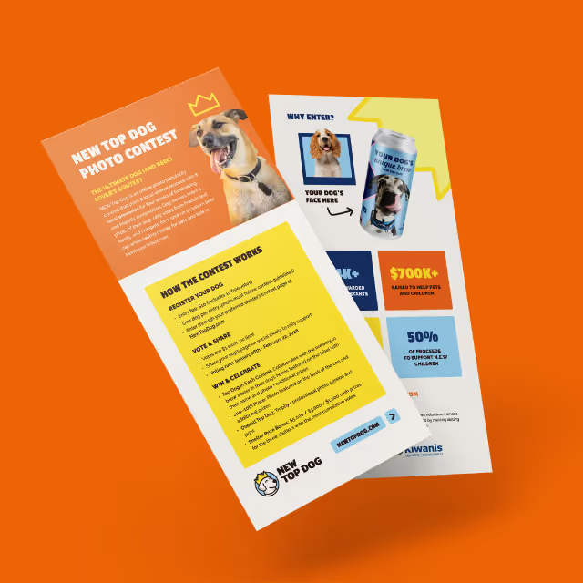

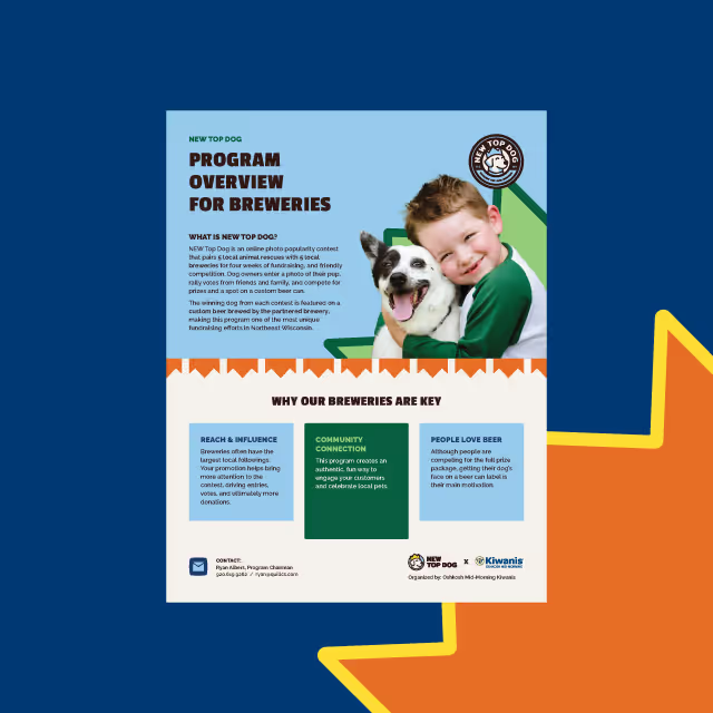
The 2022 Annual Report for Feeding America Eastern Wisconsin came to life in both print as well as a microsite to bring the report to life on-screen. It was a cornerstone piece for their anniversary year and provided continuity between the year’s events. With a throwback vibe and forward, yet stable design style, the community felt an expression of gratitude for the past decades of effort and momentum for what’s yet to come.
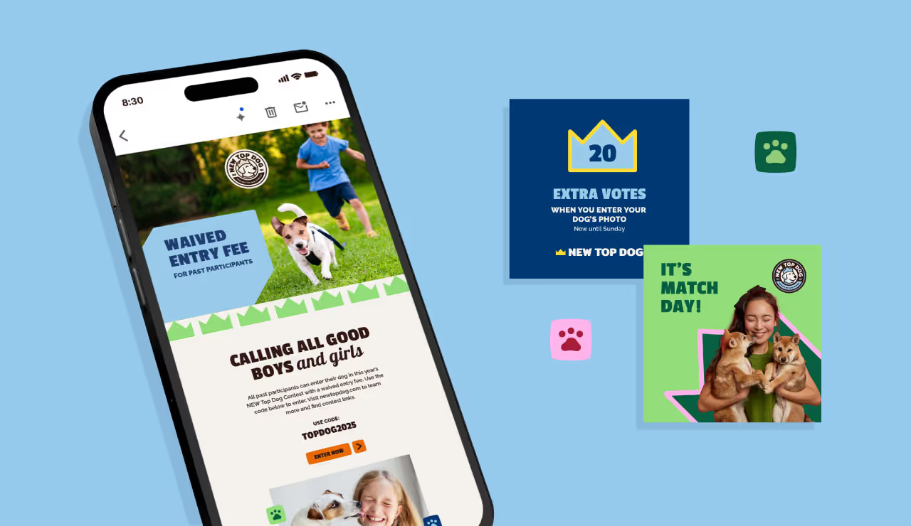


As with all creative projects, we began with inspiration gathering to ensure a concept was chosen that would not only align with the established brand identity but also act as a foundation for the theme “40 Years and Forward.” The solution needed to work as a theme for their annual fundraising gala as well as the annual report so we began sharpening our pencils early.

Since this was an exciting milestone for Feeding America, we chose a theme that was vibrant in colors and exciting in layout. This concept injected life and energy into the event theme and provided us with a plethora of features and elements to use in both print and digital presentations for the report.

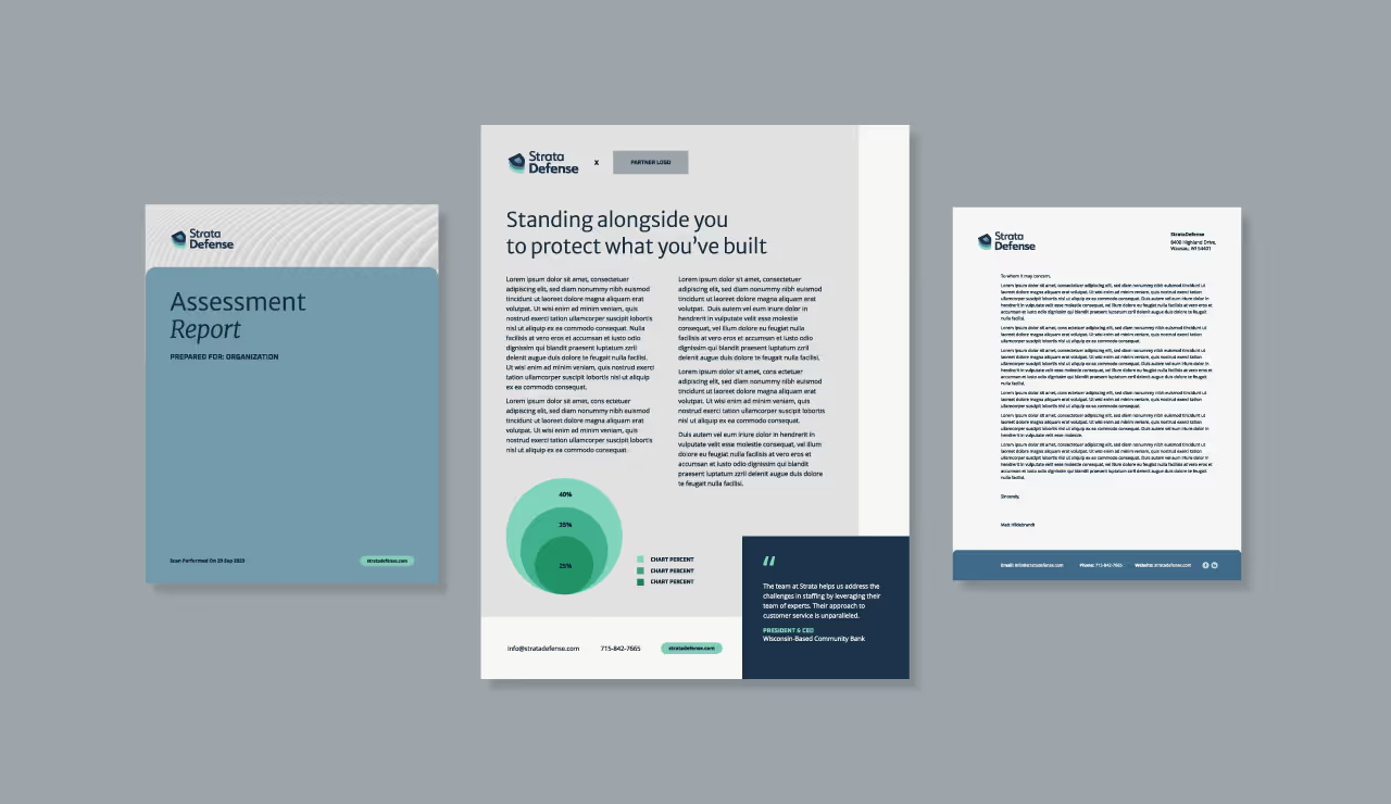


The 2022 Annual Report for Feeding America Eastern Wisconsin came to life in both print as well as a microsite to bring the report to life on-screen. It was a cornerstone piece for their anniversary year and provided continuity between the year’s events. With a throwback vibe and forward, yet stable design style, the community felt an expression of gratitude for the past decades of effort and momentum for what’s yet to come.


As with all creative projects, we began with inspiration gathering to ensure a concept was chosen that would not only align with the established brand identity but also act as a foundation for the theme “40 Years and Forward.” The solution needed to work as a theme for their annual fundraising gala as well as the annual report so we began sharpening our pencils early.
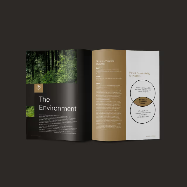
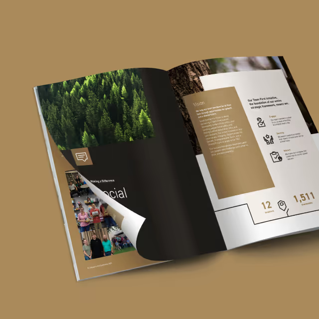
Since this was an exciting milestone for Feeding America, we chose a theme that was vibrant in colors and exciting in layout. This concept injected life and energy into the event theme and provided us with a plethora of features and elements to use in both print and digital presentations for the report.

The 2022 Annual Report for Feeding America Eastern Wisconsin came to life in both print as well as a microsite to bring the report to life on-screen. It was a cornerstone piece for their anniversary year and provided continuity between the year’s events. With a throwback vibe and forward, yet stable design style, the community felt an expression of gratitude for the past decades of effort and momentum for what’s yet to come.
As with all creative projects, we began with inspiration gathering to ensure a concept was chosen that would not only align with the established brand identity but also act as a foundation for the theme “40 Years and Forward.” The solution needed to work as a theme for their annual fundraising gala as well as the annual report so we began sharpening our pencils early.
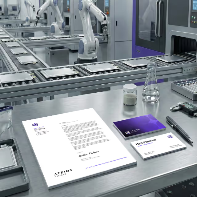

Since this was an exciting milestone for Feeding America, we chose a theme that was vibrant in colors and exciting in layout. This concept injected life and energy into the event theme and provided us with a plethora of features and elements to use in both print and digital presentations for the report.
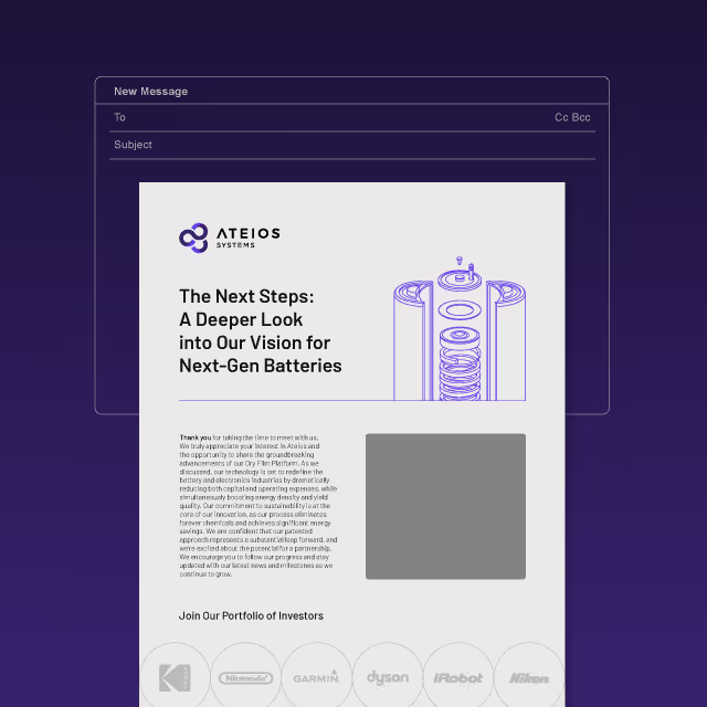
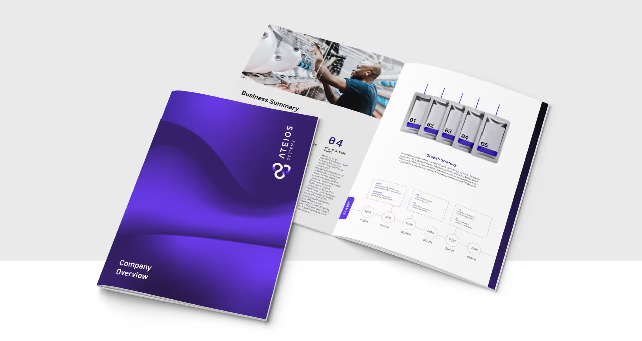
The 2022 Annual Report for Feeding America Eastern Wisconsin came to life in both print as well as a microsite to bring the report to life on-screen. It was a cornerstone piece for their anniversary year and provided continuity between the year’s events. With a throwback vibe and forward, yet stable design style, the community felt an expression of gratitude for the past decades of effort and momentum for what’s yet to come.

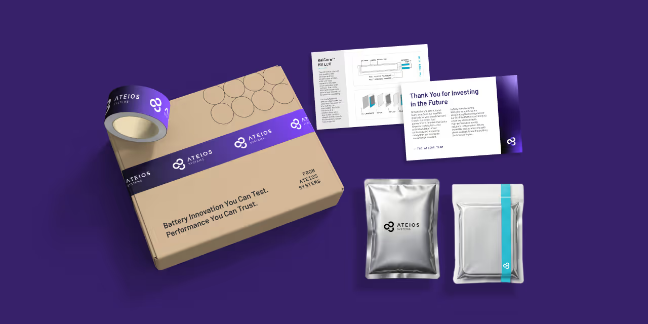
As with all creative projects, we began with inspiration gathering to ensure a concept was chosen that would not only align with the established brand identity but also act as a foundation for the theme “40 Years and Forward.” The solution needed to work as a theme for their annual fundraising gala as well as the annual report so we began sharpening our pencils early.

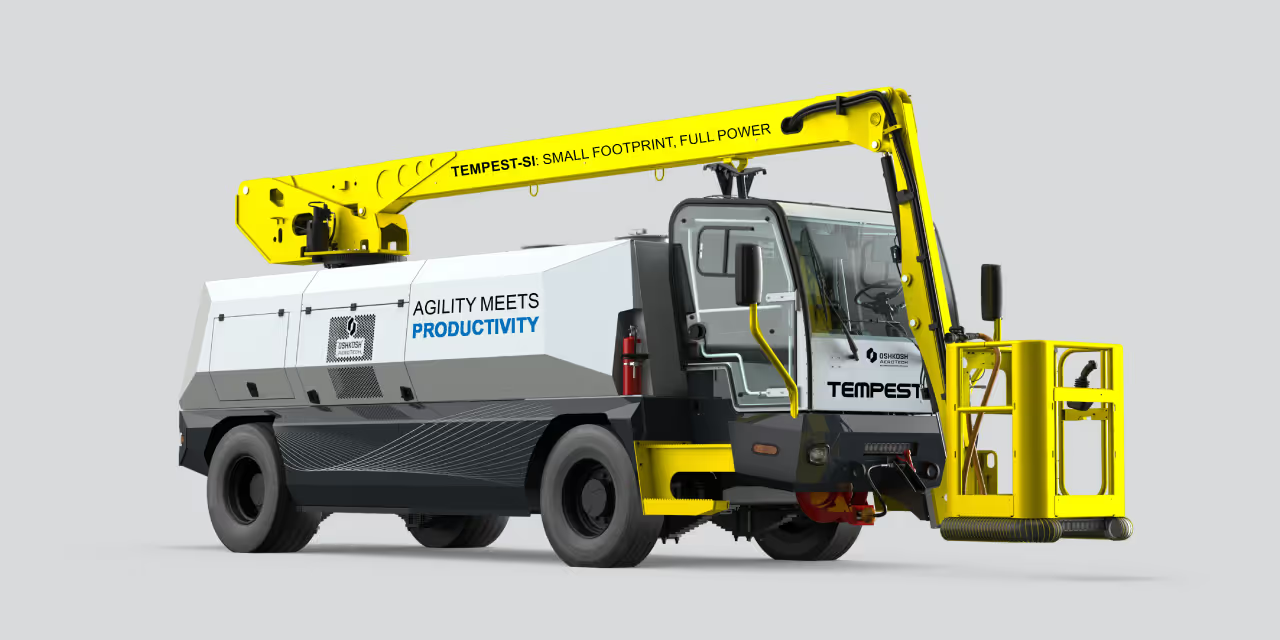

Since this was an exciting milestone for Feeding America, we chose a theme that was vibrant in colors and exciting in layout. This concept injected life and energy into the event theme and provided us with a plethora of features and elements to use in both print and digital presentations for the report.
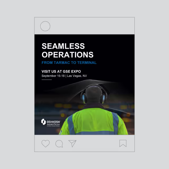
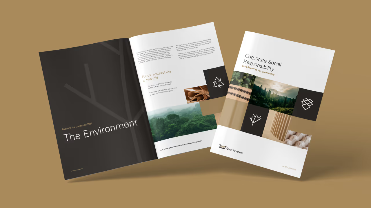
The 2022 Annual Report for Feeding America Eastern Wisconsin came to life in both print as well as a microsite to bring the report to life on-screen. It was a cornerstone piece for their anniversary year and provided continuity between the year’s events. With a throwback vibe and forward, yet stable design style, the community felt an expression of gratitude for the past decades of effort and momentum for what’s yet to come.

As with all creative projects, we began with inspiration gathering to ensure a concept was chosen that would not only align with the established brand identity but also act as a foundation for the theme “40 Years and Forward.” The solution needed to work as a theme for their annual fundraising gala as well as the annual report so we began sharpening our pencils early.
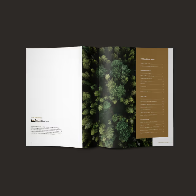

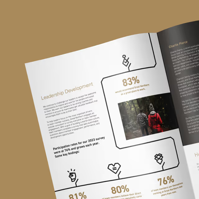
Since this was an exciting milestone for Feeding America, we chose a theme that was vibrant in colors and exciting in layout. This concept injected life and energy into the event theme and provided us with a plethora of features and elements to use in both print and digital presentations for the report.


The 2022 Annual Report for Feeding America Eastern Wisconsin came to life in both print as well as a microsite to bring the report to life on-screen. It was a cornerstone piece for their anniversary year and provided continuity between the year’s events. With a throwback vibe and forward, yet stable design style, the community felt an expression of gratitude for the past decades of effort and momentum for what’s yet to come.
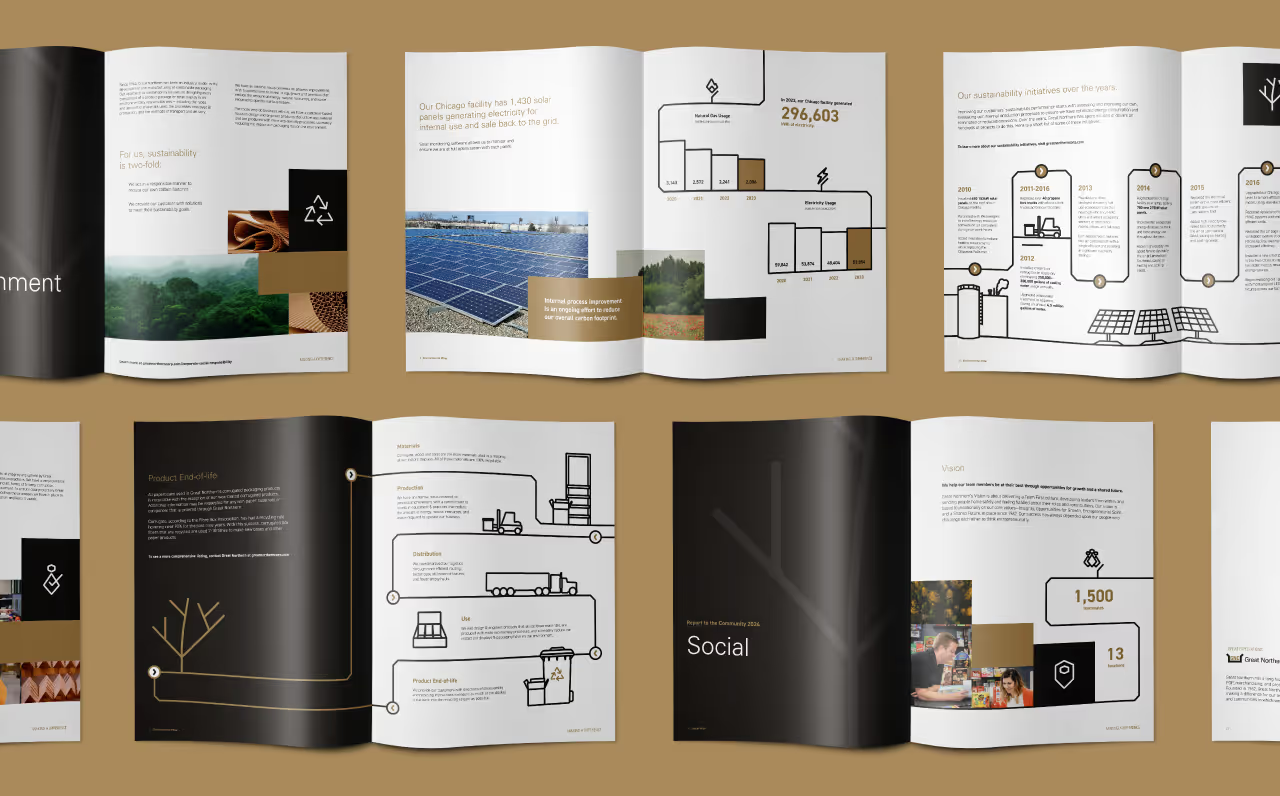
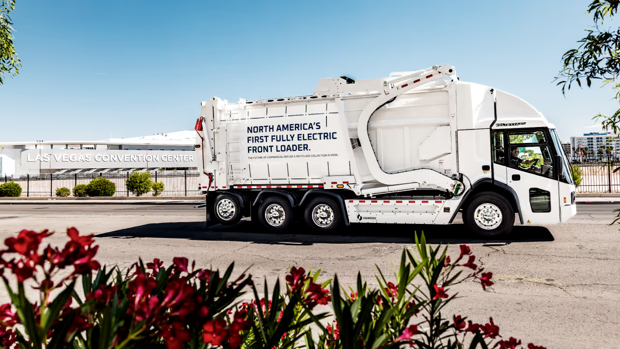
As with all creative projects, we began with inspiration gathering to ensure a concept was chosen that would not only align with the established brand identity but also act as a foundation for the theme “40 Years and Forward.” The solution needed to work as a theme for their annual fundraising gala as well as the annual report so we began sharpening our pencils early.

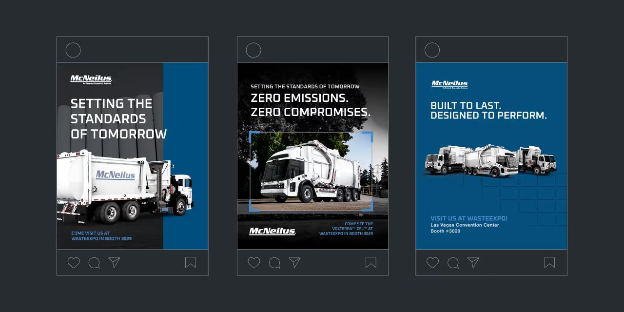

Since this was an exciting milestone for Feeding America, we chose a theme that was vibrant in colors and exciting in layout. This concept injected life and energy into the event theme and provided us with a plethora of features and elements to use in both print and digital presentations for the report.

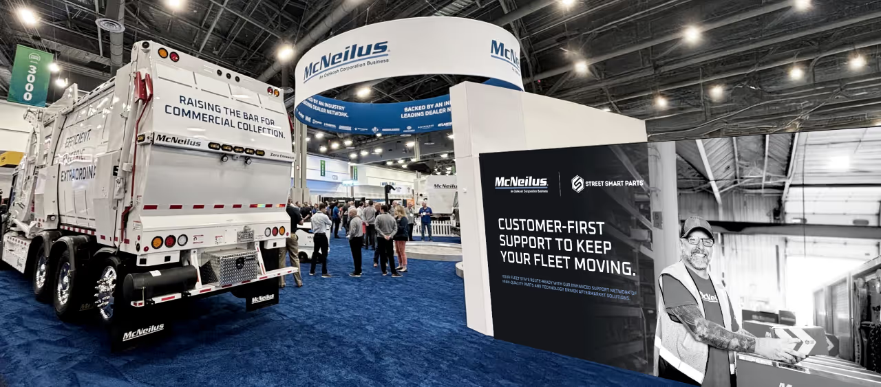
The 2022 Annual Report for Feeding America Eastern Wisconsin came to life in both print as well as a microsite to bring the report to life on-screen. It was a cornerstone piece for their anniversary year and provided continuity between the year’s events. With a throwback vibe and forward, yet stable design style, the community felt an expression of gratitude for the past decades of effort and momentum for what’s yet to come.

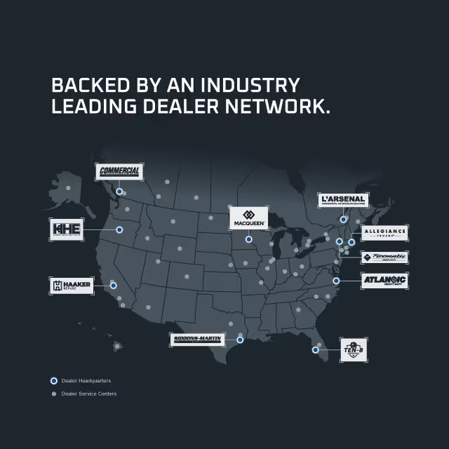
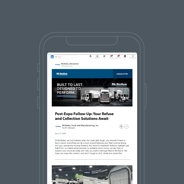

As with all creative projects, we began with inspiration gathering to ensure a concept was chosen that would not only align with the established brand identity but also act as a foundation for the theme “40 Years and Forward.” The solution needed to work as a theme for their annual fundraising gala as well as the annual report so we began sharpening our pencils early.

Since this was an exciting milestone for Feeding America, we chose a theme that was vibrant in colors and exciting in layout. This concept injected life and energy into the event theme and provided us with a plethora of features and elements to use in both print and digital presentations for the report.


The 2022 Annual Report for Feeding America Eastern Wisconsin came to life in both print as well as a microsite to bring the report to life on-screen. It was a cornerstone piece for their anniversary year and provided continuity between the year’s events. With a throwback vibe and forward, yet stable design style, the community felt an expression of gratitude for the past decades of effort and momentum for what’s yet to come.



As with all creative projects, we began with inspiration gathering to ensure a concept was chosen that would not only align with the established brand identity but also act as a foundation for the theme “40 Years and Forward.” The solution needed to work as a theme for their annual fundraising gala as well as the annual report so we began sharpening our pencils early.
Since this was an exciting milestone for Feeding America, we chose a theme that was vibrant in colors and exciting in layout. This concept injected life and energy into the event theme and provided us with a plethora of features and elements to use in both print and digital presentations for the report.
The 2022 Annual Report for Feeding America Eastern Wisconsin came to life in both print as well as a microsite to bring the report to life on-screen. It was a cornerstone piece for their anniversary year and provided continuity between the year’s events. With a throwback vibe and forward, yet stable design style, the community felt an expression of gratitude for the past decades of effort and momentum for what’s yet to come.


As with all creative projects, we began with inspiration gathering to ensure a concept was chosen that would not only align with the established brand identity but also act as a foundation for the theme “40 Years and Forward.” The solution needed to work as a theme for their annual fundraising gala as well as the annual report so we began sharpening our pencils early.

Since this was an exciting milestone for Feeding America, we chose a theme that was vibrant in colors and exciting in layout. This concept injected life and energy into the event theme and provided us with a plethora of features and elements to use in both print and digital presentations for the report.

The 2022 Annual Report for Feeding America Eastern Wisconsin came to life in both print as well as a microsite to bring the report to life on-screen. It was a cornerstone piece for their anniversary year and provided continuity between the year’s events. With a throwback vibe and forward, yet stable design style, the community felt an expression of gratitude for the past decades of effort and momentum for what’s yet to come.

As with all creative projects, we began with inspiration gathering to ensure a concept was chosen that would not only align with the established brand identity but also act as a foundation for the theme “40 Years and Forward.” The solution needed to work as a theme for their annual fundraising gala as well as the annual report so we began sharpening our pencils early.
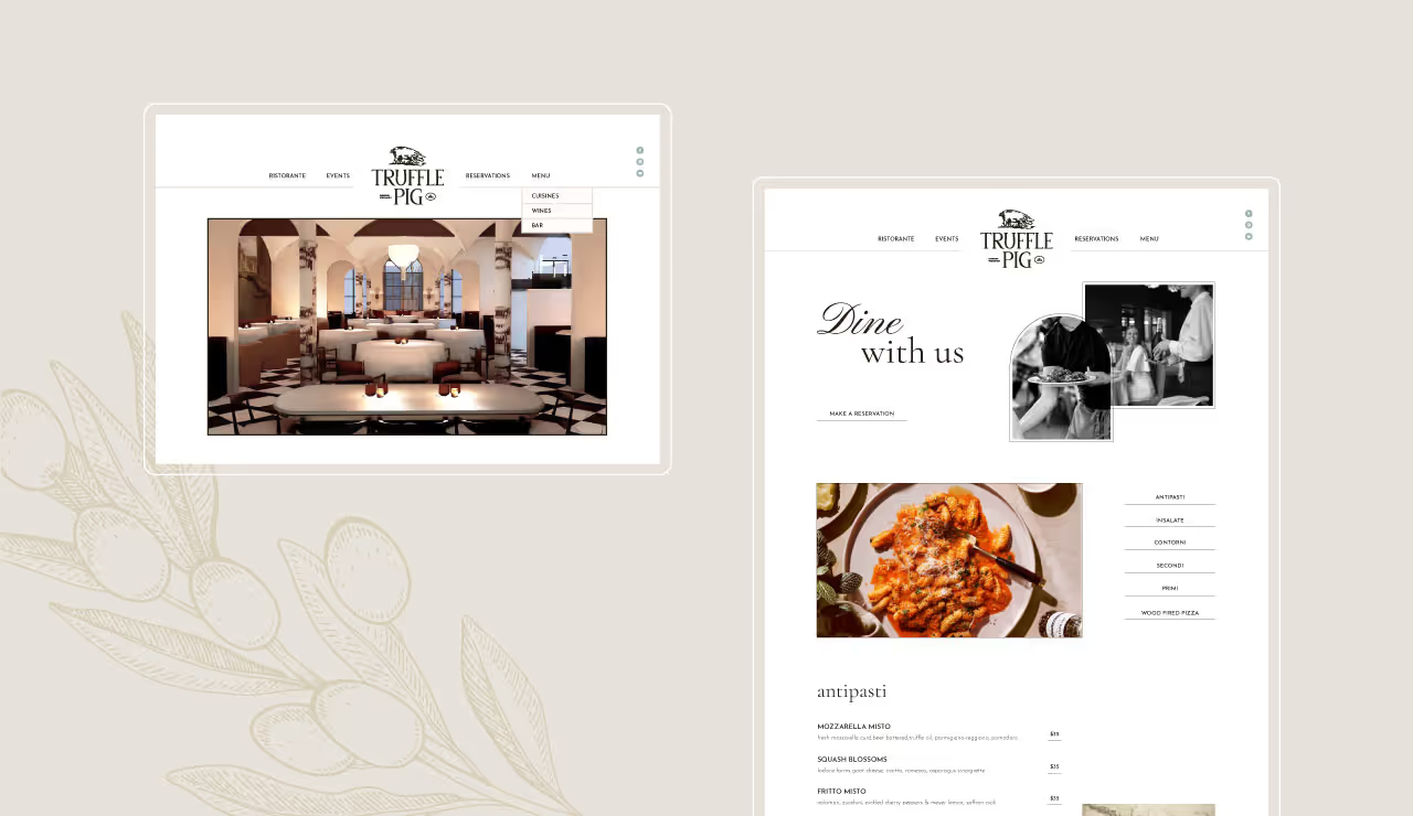
Since this was an exciting milestone for Feeding America, we chose a theme that was vibrant in colors and exciting in layout. This concept injected life and energy into the event theme and provided us with a plethora of features and elements to use in both print and digital presentations for the report.
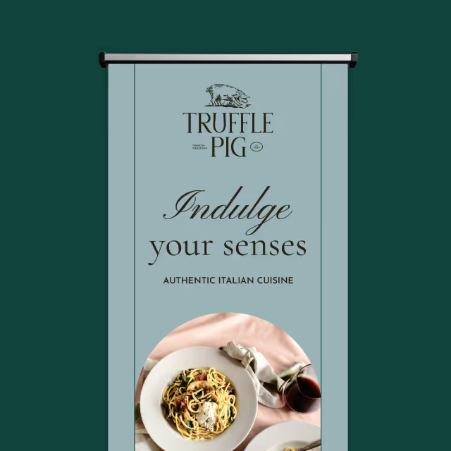
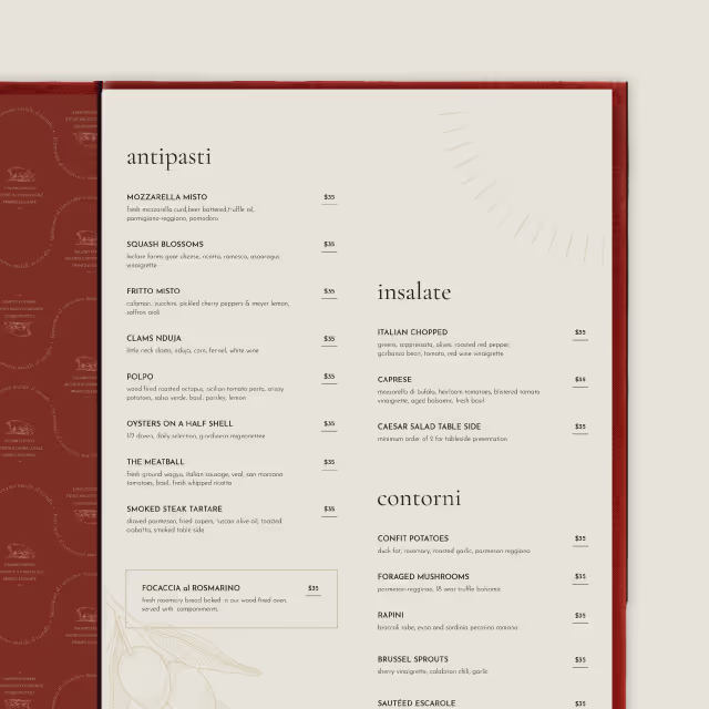
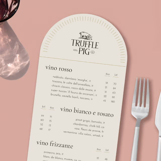
The 2022 Annual Report for Feeding America Eastern Wisconsin came to life in both print as well as a microsite to bring the report to life on-screen. It was a cornerstone piece for their anniversary year and provided continuity between the year’s events. With a throwback vibe and forward, yet stable design style, the community felt an expression of gratitude for the past decades of effort and momentum for what’s yet to come.
As with all creative projects, we began with inspiration gathering to ensure a concept was chosen that would not only align with the established brand identity but also act as a foundation for the theme “40 Years and Forward.” The solution needed to work as a theme for their annual fundraising gala as well as the annual report so we began sharpening our pencils early.

Since this was an exciting milestone for Feeding America, we chose a theme that was vibrant in colors and exciting in layout. This concept injected life and energy into the event theme and provided us with a plethora of features and elements to use in both print and digital presentations for the report.

The 2022 Annual Report for Feeding America Eastern Wisconsin came to life in both print as well as a microsite to bring the report to life on-screen. It was a cornerstone piece for their anniversary year and provided continuity between the year’s events. With a throwback vibe and forward, yet stable design style, the community felt an expression of gratitude for the past decades of effort and momentum for what’s yet to come.

As with all creative projects, we began with inspiration gathering to ensure a concept was chosen that would not only align with the established brand identity but also act as a foundation for the theme “40 Years and Forward.” The solution needed to work as a theme for their annual fundraising gala as well as the annual report so we began sharpening our pencils early.

Since this was an exciting milestone for Feeding America, we chose a theme that was vibrant in colors and exciting in layout. This concept injected life and energy into the event theme and provided us with a plethora of features and elements to use in both print and digital presentations for the report.

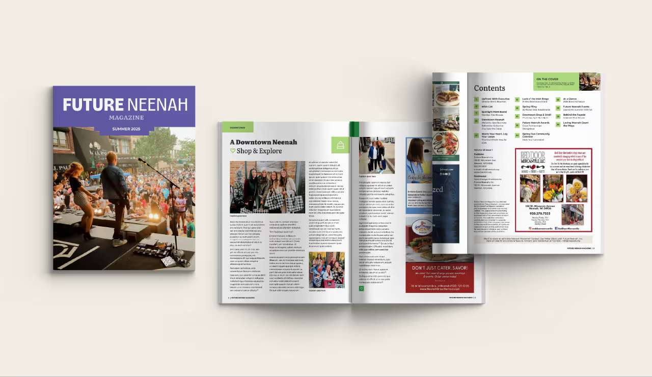
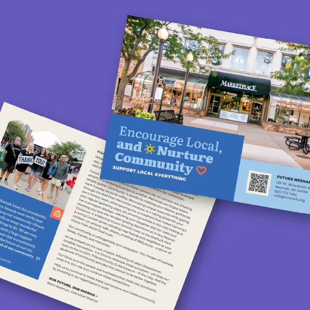
The 2022 Annual Report for Feeding America Eastern Wisconsin came to life in both print as well as a microsite to bring the report to life on-screen. It was a cornerstone piece for their anniversary year and provided continuity between the year’s events. With a throwback vibe and forward, yet stable design style, the community felt an expression of gratitude for the past decades of effort and momentum for what’s yet to come.

As with all creative projects, we began with inspiration gathering to ensure a concept was chosen that would not only align with the established brand identity but also act as a foundation for the theme “40 Years and Forward.” The solution needed to work as a theme for their annual fundraising gala as well as the annual report so we began sharpening our pencils early.

Since this was an exciting milestone for Feeding America, we chose a theme that was vibrant in colors and exciting in layout. This concept injected life and energy into the event theme and provided us with a plethora of features and elements to use in both print and digital presentations for the report.
The 2022 Annual Report for Feeding America Eastern Wisconsin came to life in both print as well as a microsite to bring the report to life on-screen. It was a cornerstone piece for their anniversary year and provided continuity between the year’s events. With a throwback vibe and forward, yet stable design style, the community felt an expression of gratitude for the past decades of effort and momentum for what’s yet to come.


As with all creative projects, we began with inspiration gathering to ensure a concept was chosen that would not only align with the established brand identity but also act as a foundation for the theme “40 Years and Forward.” The solution needed to work as a theme for their annual fundraising gala as well as the annual report so we began sharpening our pencils early.


Since this was an exciting milestone for Feeding America, we chose a theme that was vibrant in colors and exciting in layout. This concept injected life and energy into the event theme and provided us with a plethora of features and elements to use in both print and digital presentations for the report.

The 2022 Annual Report for Feeding America Eastern Wisconsin came to life in both print as well as a microsite to bring the report to life on-screen. It was a cornerstone piece for their anniversary year and provided continuity between the year’s events. With a throwback vibe and forward, yet stable design style, the community felt an expression of gratitude for the past decades of effort and momentum for what’s yet to come.


As with all creative projects, we began with inspiration gathering to ensure a concept was chosen that would not only align with the established brand identity but also act as a foundation for the theme “40 Years and Forward.” The solution needed to work as a theme for their annual fundraising gala as well as the annual report so we began sharpening our pencils early.

Since this was an exciting milestone for Feeding America, we chose a theme that was vibrant in colors and exciting in layout. This concept injected life and energy into the event theme and provided us with a plethora of features and elements to use in both print and digital presentations for the report.


The 2022 Annual Report for Feeding America Eastern Wisconsin came to life in both print as well as a microsite to bring the report to life on-screen. It was a cornerstone piece for their anniversary year and provided continuity between the year’s events. With a throwback vibe and forward, yet stable design style, the community felt an expression of gratitude for the past decades of effort and momentum for what’s yet to come.


As with all creative projects, we began with inspiration gathering to ensure a concept was chosen that would not only align with the established brand identity but also act as a foundation for the theme “40 Years and Forward.” The solution needed to work as a theme for their annual fundraising gala as well as the annual report so we began sharpening our pencils early.


Since this was an exciting milestone for Feeding America, we chose a theme that was vibrant in colors and exciting in layout. This concept injected life and energy into the event theme and provided us with a plethora of features and elements to use in both print and digital presentations for the report.


The 2022 Annual Report for Feeding America Eastern Wisconsin came to life in both print as well as a microsite to bring the report to life on-screen. It was a cornerstone piece for their anniversary year and provided continuity between the year’s events. With a throwback vibe and forward, yet stable design style, the community felt an expression of gratitude for the past decades of effort and momentum for what’s yet to come.




As with all creative projects, we began with inspiration gathering to ensure a concept was chosen that would not only align with the established brand identity but also act as a foundation for the theme “40 Years and Forward.” The solution needed to work as a theme for their annual fundraising gala as well as the annual report so we began sharpening our pencils early.


Since this was an exciting milestone for Feeding America, we chose a theme that was vibrant in colors and exciting in layout. This concept injected life and energy into the event theme and provided us with a plethora of features and elements to use in both print and digital presentations for the report.

The 2022 Annual Report for Feeding America Eastern Wisconsin came to life in both print as well as a microsite to bring the report to life on-screen. It was a cornerstone piece for their anniversary year and provided continuity between the year’s events. With a throwback vibe and forward, yet stable design style, the community felt an expression of gratitude for the past decades of effort and momentum for what’s yet to come.


As with all creative projects, we began with inspiration gathering to ensure a concept was chosen that would not only align with the established brand identity but also act as a foundation for the theme “40 Years and Forward.” The solution needed to work as a theme for their annual fundraising gala as well as the annual report so we began sharpening our pencils early.


Since this was an exciting milestone for Feeding America, we chose a theme that was vibrant in colors and exciting in layout. This concept injected life and energy into the event theme and provided us with a plethora of features and elements to use in both print and digital presentations for the report.


The 2022 Annual Report for Feeding America Eastern Wisconsin came to life in both print as well as a microsite to bring the report to life on-screen. It was a cornerstone piece for their anniversary year and provided continuity between the year’s events. With a throwback vibe and forward, yet stable design style, the community felt an expression of gratitude for the past decades of effort and momentum for what’s yet to come.


As with all creative projects, we began with inspiration gathering to ensure a concept was chosen that would not only align with the established brand identity but also act as a foundation for the theme “40 Years and Forward.” The solution needed to work as a theme for their annual fundraising gala as well as the annual report so we began sharpening our pencils early.

Since this was an exciting milestone for Feeding America, we chose a theme that was vibrant in colors and exciting in layout. This concept injected life and energy into the event theme and provided us with a plethora of features and elements to use in both print and digital presentations for the report.


The 2022 Annual Report for Feeding America Eastern Wisconsin came to life in both print as well as a microsite to bring the report to life on-screen. It was a cornerstone piece for their anniversary year and provided continuity between the year’s events. With a throwback vibe and forward, yet stable design style, the community felt an expression of gratitude for the past decades of effort and momentum for what’s yet to come.


As with all creative projects, we began with inspiration gathering to ensure a concept was chosen that would not only align with the established brand identity but also act as a foundation for the theme “40 Years and Forward.” The solution needed to work as a theme for their annual fundraising gala as well as the annual report so we began sharpening our pencils early.


Since this was an exciting milestone for Feeding America, we chose a theme that was vibrant in colors and exciting in layout. This concept injected life and energy into the event theme and provided us with a plethora of features and elements to use in both print and digital presentations for the report.


The 2022 Annual Report for Feeding America Eastern Wisconsin came to life in both print as well as a microsite to bring the report to life on-screen. It was a cornerstone piece for their anniversary year and provided continuity between the year’s events. With a throwback vibe and forward, yet stable design style, the community felt an expression of gratitude for the past decades of effort and momentum for what’s yet to come.


As with all creative projects, we began with inspiration gathering to ensure a concept was chosen that would not only align with the established brand identity but also act as a foundation for the theme “40 Years and Forward.” The solution needed to work as a theme for their annual fundraising gala as well as the annual report so we began sharpening our pencils early.

Since this was an exciting milestone for Feeding America, we chose a theme that was vibrant in colors and exciting in layout. This concept injected life and energy into the event theme and provided us with a plethora of features and elements to use in both print and digital presentations for the report.


The 2022 Annual Report for Feeding America Eastern Wisconsin came to life in both print as well as a microsite to bring the report to life on-screen. It was a cornerstone piece for their anniversary year and provided continuity between the year’s events. With a throwback vibe and forward, yet stable design style, the community felt an expression of gratitude for the past decades of effort and momentum for what’s yet to come.


As with all creative projects, we began with inspiration gathering to ensure a concept was chosen that would not only align with the established brand identity but also act as a foundation for the theme “40 Years and Forward.” The solution needed to work as a theme for their annual fundraising gala as well as the annual report so we began sharpening our pencils early.

Since this was an exciting milestone for Feeding America, we chose a theme that was vibrant in colors and exciting in layout. This concept injected life and energy into the event theme and provided us with a plethora of features and elements to use in both print and digital presentations for the report.


The 2022 Annual Report for Feeding America Eastern Wisconsin came to life in both print as well as a microsite to bring the report to life on-screen. It was a cornerstone piece for their anniversary year and provided continuity between the year’s events. With a throwback vibe and forward, yet stable design style, the community felt an expression of gratitude for the past decades of effort and momentum for what’s yet to come.


As with all creative projects, we began with inspiration gathering to ensure a concept was chosen that would not only align with the established brand identity but also act as a foundation for the theme “40 Years and Forward.” The solution needed to work as a theme for their annual fundraising gala as well as the annual report so we began sharpening our pencils early.


Since this was an exciting milestone for Feeding America, we chose a theme that was vibrant in colors and exciting in layout. This concept injected life and energy into the event theme and provided us with a plethora of features and elements to use in both print and digital presentations for the report.

The 2022 Annual Report for Feeding America Eastern Wisconsin came to life in both print as well as a microsite to bring the report to life on-screen. It was a cornerstone piece for their anniversary year and provided continuity between the year’s events. With a throwback vibe and forward, yet stable design style, the community felt an expression of gratitude for the past decades of effort and momentum for what’s yet to come.


As with all creative projects, we began with inspiration gathering to ensure a concept was chosen that would not only align with the established brand identity but also act as a foundation for the theme “40 Years and Forward.” The solution needed to work as a theme for their annual fundraising gala as well as the annual report so we began sharpening our pencils early.

Since this was an exciting milestone for Feeding America, we chose a theme that was vibrant in colors and exciting in layout. This concept injected life and energy into the event theme and provided us with a plethora of features and elements to use in both print and digital presentations for the report.


The 2022 Annual Report for Feeding America Eastern Wisconsin came to life in both print as well as a microsite to bring the report to life on-screen. It was a cornerstone piece for their anniversary year and provided continuity between the year’s events. With a throwback vibe and forward, yet stable design style, the community felt an expression of gratitude for the past decades of effort and momentum for what’s yet to come.


As with all creative projects, we began with inspiration gathering to ensure a concept was chosen that would not only align with the established brand identity but also act as a foundation for the theme “40 Years and Forward.” The solution needed to work as a theme for their annual fundraising gala as well as the annual report so we began sharpening our pencils early.

Since this was an exciting milestone for Feeding America, we chose a theme that was vibrant in colors and exciting in layout. This concept injected life and energy into the event theme and provided us with a plethora of features and elements to use in both print and digital presentations for the report.


The 2022 Annual Report for Feeding America Eastern Wisconsin came to life in both print as well as a microsite to bring the report to life on-screen. It was a cornerstone piece for their anniversary year and provided continuity between the year’s events. With a throwback vibe and forward, yet stable design style, the community felt an expression of gratitude for the past decades of effort and momentum for what’s yet to come.


As with all creative projects, we began with inspiration gathering to ensure a concept was chosen that would not only align with the established brand identity but also act as a foundation for the theme “40 Years and Forward.” The solution needed to work as a theme for their annual fundraising gala as well as the annual report so we began sharpening our pencils early.


Since this was an exciting milestone for Feeding America, we chose a theme that was vibrant in colors and exciting in layout. This concept injected life and energy into the event theme and provided us with a plethora of features and elements to use in both print and digital presentations for the report.

The 2022 Annual Report for Feeding America Eastern Wisconsin came to life in both print as well as a microsite to bring the report to life on-screen. It was a cornerstone piece for their anniversary year and provided continuity between the year’s events. With a throwback vibe and forward, yet stable design style, the community felt an expression of gratitude for the past decades of effort and momentum for what’s yet to come.


As with all creative projects, we began with inspiration gathering to ensure a concept was chosen that would not only align with the established brand identity but also act as a foundation for the theme “40 Years and Forward.” The solution needed to work as a theme for their annual fundraising gala as well as the annual report so we began sharpening our pencils early.


Since this was an exciting milestone for Feeding America, we chose a theme that was vibrant in colors and exciting in layout. This concept injected life and energy into the event theme and provided us with a plethora of features and elements to use in both print and digital presentations for the report.

The 2022 Annual Report for Feeding America Eastern Wisconsin came to life in both print as well as a microsite to bring the report to life on-screen. It was a cornerstone piece for their anniversary year and provided continuity between the year’s events. With a throwback vibe and forward, yet stable design style, the community felt an expression of gratitude for the past decades of effort and momentum for what’s yet to come.


As with all creative projects, we began with inspiration gathering to ensure a concept was chosen that would not only align with the established brand identity but also act as a foundation for the theme “40 Years and Forward.” The solution needed to work as a theme for their annual fundraising gala as well as the annual report so we began sharpening our pencils early.


Since this was an exciting milestone for Feeding America, we chose a theme that was vibrant in colors and exciting in layout. This concept injected life and energy into the event theme and provided us with a plethora of features and elements to use in both print and digital presentations for the report.


The 2022 Annual Report for Feeding America Eastern Wisconsin came to life in both print as well as a microsite to bring the report to life on-screen. It was a cornerstone piece for their anniversary year and provided continuity between the year’s events. With a throwback vibe and forward, yet stable design style, the community felt an expression of gratitude for the past decades of effort and momentum for what’s yet to come.


As with all creative projects, we began with inspiration gathering to ensure a concept was chosen that would not only align with the established brand identity but also act as a foundation for the theme “40 Years and Forward.” The solution needed to work as a theme for their annual fundraising gala as well as the annual report so we began sharpening our pencils early.


Since this was an exciting milestone for Feeding America, we chose a theme that was vibrant in colors and exciting in layout. This concept injected life and energy into the event theme and provided us with a plethora of features and elements to use in both print and digital presentations for the report.


The 2022 Annual Report for Feeding America Eastern Wisconsin came to life in both print as well as a microsite to bring the report to life on-screen. It was a cornerstone piece for their anniversary year and provided continuity between the year’s events. With a throwback vibe and forward, yet stable design style, the community felt an expression of gratitude for the past decades of effort and momentum for what’s yet to come.


As with all creative projects, we began with inspiration gathering to ensure a concept was chosen that would not only align with the established brand identity but also act as a foundation for the theme “40 Years and Forward.” The solution needed to work as a theme for their annual fundraising gala as well as the annual report so we began sharpening our pencils early.

Since this was an exciting milestone for Feeding America, we chose a theme that was vibrant in colors and exciting in layout. This concept injected life and energy into the event theme and provided us with a plethora of features and elements to use in both print and digital presentations for the report.

The 2022 Annual Report for Feeding America Eastern Wisconsin came to life in both print as well as a microsite to bring the report to life on-screen. It was a cornerstone piece for their anniversary year and provided continuity between the year’s events. With a throwback vibe and forward, yet stable design style, the community felt an expression of gratitude for the past decades of effort and momentum for what’s yet to come.


As with all creative projects, we began with inspiration gathering to ensure a concept was chosen that would not only align with the established brand identity but also act as a foundation for the theme “40 Years and Forward.” The solution needed to work as a theme for their annual fundraising gala as well as the annual report so we began sharpening our pencils early.


Since this was an exciting milestone for Feeding America, we chose a theme that was vibrant in colors and exciting in layout. This concept injected life and energy into the event theme and provided us with a plethora of features and elements to use in both print and digital presentations for the report.


The 2022 Annual Report for Feeding America Eastern Wisconsin came to life in both print as well as a microsite to bring the report to life on-screen. It was a cornerstone piece for their anniversary year and provided continuity between the year’s events. With a throwback vibe and forward, yet stable design style, the community felt an expression of gratitude for the past decades of effort and momentum for what’s yet to come.


As with all creative projects, we began with inspiration gathering to ensure a concept was chosen that would not only align with the established brand identity but also act as a foundation for the theme “40 Years and Forward.” The solution needed to work as a theme for their annual fundraising gala as well as the annual report so we began sharpening our pencils early.


Since this was an exciting milestone for Feeding America, we chose a theme that was vibrant in colors and exciting in layout. This concept injected life and energy into the event theme and provided us with a plethora of features and elements to use in both print and digital presentations for the report.


The 2022 Annual Report for Feeding America Eastern Wisconsin came to life in both print as well as a microsite to bring the report to life on-screen. It was a cornerstone piece for their anniversary year and provided continuity between the year’s events. With a throwback vibe and forward, yet stable design style, the community felt an expression of gratitude for the past decades of effort and momentum for what’s yet to come.


As with all creative projects, we began with inspiration gathering to ensure a concept was chosen that would not only align with the established brand identity but also act as a foundation for the theme “40 Years and Forward.” The solution needed to work as a theme for their annual fundraising gala as well as the annual report so we began sharpening our pencils early.


Since this was an exciting milestone for Feeding America, we chose a theme that was vibrant in colors and exciting in layout. This concept injected life and energy into the event theme and provided us with a plethora of features and elements to use in both print and digital presentations for the report.


The 2022 Annual Report for Feeding America Eastern Wisconsin came to life in both print as well as a microsite to bring the report to life on-screen. It was a cornerstone piece for their anniversary year and provided continuity between the year’s events. With a throwback vibe and forward, yet stable design style, the community felt an expression of gratitude for the past decades of effort and momentum for what’s yet to come.



As with all creative projects, we began with inspiration gathering to ensure a concept was chosen that would not only align with the established brand identity but also act as a foundation for the theme “40 Years and Forward.” The solution needed to work as a theme for their annual fundraising gala as well as the annual report so we began sharpening our pencils early.


Since this was an exciting milestone for Feeding America, we chose a theme that was vibrant in colors and exciting in layout. This concept injected life and energy into the event theme and provided us with a plethora of features and elements to use in both print and digital presentations for the report.


The 2022 Annual Report for Feeding America Eastern Wisconsin came to life in both print as well as a microsite to bring the report to life on-screen. It was a cornerstone piece for their anniversary year and provided continuity between the year’s events. With a throwback vibe and forward, yet stable design style, the community felt an expression of gratitude for the past decades of effort and momentum for what’s yet to come.


As with all creative projects, we began with inspiration gathering to ensure a concept was chosen that would not only align with the established brand identity but also act as a foundation for the theme “40 Years and Forward.” The solution needed to work as a theme for their annual fundraising gala as well as the annual report so we began sharpening our pencils early.

Since this was an exciting milestone for Feeding America, we chose a theme that was vibrant in colors and exciting in layout. This concept injected life and energy into the event theme and provided us with a plethora of features and elements to use in both print and digital presentations for the report.


The 2022 Annual Report for Feeding America Eastern Wisconsin came to life in both print as well as a microsite to bring the report to life on-screen. It was a cornerstone piece for their anniversary year and provided continuity between the year’s events. With a throwback vibe and forward, yet stable design style, the community felt an expression of gratitude for the past decades of effort and momentum for what’s yet to come.


As with all creative projects, we began with inspiration gathering to ensure a concept was chosen that would not only align with the established brand identity but also act as a foundation for the theme “40 Years and Forward.” The solution needed to work as a theme for their annual fundraising gala as well as the annual report so we began sharpening our pencils early.


Since this was an exciting milestone for Feeding America, we chose a theme that was vibrant in colors and exciting in layout. This concept injected life and energy into the event theme and provided us with a plethora of features and elements to use in both print and digital presentations for the report.


The 2022 Annual Report for Feeding America Eastern Wisconsin came to life in both print as well as a microsite to bring the report to life on-screen. It was a cornerstone piece for their anniversary year and provided continuity between the year’s events. With a throwback vibe and forward, yet stable design style, the community felt an expression of gratitude for the past decades of effort and momentum for what’s yet to come.

As with all creative projects, we began with inspiration gathering to ensure a concept was chosen that would not only align with the established brand identity but also act as a foundation for the theme “40 Years and Forward.” The solution needed to work as a theme for their annual fundraising gala as well as the annual report so we began sharpening our pencils early.


Since this was an exciting milestone for Feeding America, we chose a theme that was vibrant in colors and exciting in layout. This concept injected life and energy into the event theme and provided us with a plethora of features and elements to use in both print and digital presentations for the report.


The 2022 Annual Report for Feeding America Eastern Wisconsin came to life in both print as well as a microsite to bring the report to life on-screen. It was a cornerstone piece for their anniversary year and provided continuity between the year’s events. With a throwback vibe and forward, yet stable design style, the community felt an expression of gratitude for the past decades of effort and momentum for what’s yet to come.


As with all creative projects, we began with inspiration gathering to ensure a concept was chosen that would not only align with the established brand identity but also act as a foundation for the theme “40 Years and Forward.” The solution needed to work as a theme for their annual fundraising gala as well as the annual report so we began sharpening our pencils early.

Since this was an exciting milestone for Feeding America, we chose a theme that was vibrant in colors and exciting in layout. This concept injected life and energy into the event theme and provided us with a plethora of features and elements to use in both print and digital presentations for the report.


The 2022 Annual Report for Feeding America Eastern Wisconsin came to life in both print as well as a microsite to bring the report to life on-screen. It was a cornerstone piece for their anniversary year and provided continuity between the year’s events. With a throwback vibe and forward, yet stable design style, the community felt an expression of gratitude for the past decades of effort and momentum for what’s yet to come.


As with all creative projects, we began with inspiration gathering to ensure a concept was chosen that would not only align with the established brand identity but also act as a foundation for the theme “40 Years and Forward.” The solution needed to work as a theme for their annual fundraising gala as well as the annual report so we began sharpening our pencils early.


Since this was an exciting milestone for Feeding America, we chose a theme that was vibrant in colors and exciting in layout. This concept injected life and energy into the event theme and provided us with a plethora of features and elements to use in both print and digital presentations for the report.


The 2022 Annual Report for Feeding America Eastern Wisconsin came to life in both print as well as a microsite to bring the report to life on-screen. It was a cornerstone piece for their anniversary year and provided continuity between the year’s events. With a throwback vibe and forward, yet stable design style, the community felt an expression of gratitude for the past decades of effort and momentum for what’s yet to come.


As with all creative projects, we began with inspiration gathering to ensure a concept was chosen that would not only align with the established brand identity but also act as a foundation for the theme “40 Years and Forward.” The solution needed to work as a theme for their annual fundraising gala as well as the annual report so we began sharpening our pencils early.


Since this was an exciting milestone for Feeding America, we chose a theme that was vibrant in colors and exciting in layout. This concept injected life and energy into the event theme and provided us with a plethora of features and elements to use in both print and digital presentations for the report.


The 2022 Annual Report for Feeding America Eastern Wisconsin came to life in both print as well as a microsite to bring the report to life on-screen. It was a cornerstone piece for their anniversary year and provided continuity between the year’s events. With a throwback vibe and forward, yet stable design style, the community felt an expression of gratitude for the past decades of effort and momentum for what’s yet to come.


As with all creative projects, we began with inspiration gathering to ensure a concept was chosen that would not only align with the established brand identity but also act as a foundation for the theme “40 Years and Forward.” The solution needed to work as a theme for their annual fundraising gala as well as the annual report so we began sharpening our pencils early.


Since this was an exciting milestone for Feeding America, we chose a theme that was vibrant in colors and exciting in layout. This concept injected life and energy into the event theme and provided us with a plethora of features and elements to use in both print and digital presentations for the report.


The 2022 Annual Report for Feeding America Eastern Wisconsin came to life in both print as well as a microsite to bring the report to life on-screen. It was a cornerstone piece for their anniversary year and provided continuity between the year’s events. With a throwback vibe and forward, yet stable design style, the community felt an expression of gratitude for the past decades of effort and momentum for what’s yet to come.


As with all creative projects, we began with inspiration gathering to ensure a concept was chosen that would not only align with the established brand identity but also act as a foundation for the theme “40 Years and Forward.” The solution needed to work as a theme for their annual fundraising gala as well as the annual report so we began sharpening our pencils early.


Since this was an exciting milestone for Feeding America, we chose a theme that was vibrant in colors and exciting in layout. This concept injected life and energy into the event theme and provided us with a plethora of features and elements to use in both print and digital presentations for the report.


The 2022 Annual Report for Feeding America Eastern Wisconsin came to life in both print as well as a microsite to bring the report to life on-screen. It was a cornerstone piece for their anniversary year and provided continuity between the year’s events. With a throwback vibe and forward, yet stable design style, the community felt an expression of gratitude for the past decades of effort and momentum for what’s yet to come.


As with all creative projects, we began with inspiration gathering to ensure a concept was chosen that would not only align with the established brand identity but also act as a foundation for the theme “40 Years and Forward.” The solution needed to work as a theme for their annual fundraising gala as well as the annual report so we began sharpening our pencils early.

Since this was an exciting milestone for Feeding America, we chose a theme that was vibrant in colors and exciting in layout. This concept injected life and energy into the event theme and provided us with a plethora of features and elements to use in both print and digital presentations for the report.


The 2022 Annual Report for Feeding America Eastern Wisconsin came to life in both print as well as a microsite to bring the report to life on-screen. It was a cornerstone piece for their anniversary year and provided continuity between the year’s events. With a throwback vibe and forward, yet stable design style, the community felt an expression of gratitude for the past decades of effort and momentum for what’s yet to come.


As with all creative projects, we began with inspiration gathering to ensure a concept was chosen that would not only align with the established brand identity but also act as a foundation for the theme “40 Years and Forward.” The solution needed to work as a theme for their annual fundraising gala as well as the annual report so we began sharpening our pencils early.


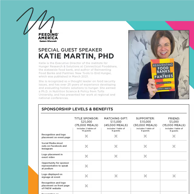
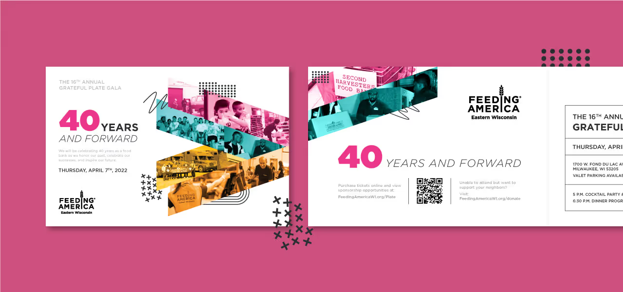


Since this was an exciting milestone for Feeding America, we chose a theme that was vibrant in colors and exciting in layout. This concept injected life and energy into the event theme and provided us with a plethora of features and elements to use in both print and digital presentations for the report.


The 2022 Annual Report for Feeding America Eastern Wisconsin came to life in both print as well as a microsite to bring the report to life on-screen. It was a cornerstone piece for their anniversary year and provided continuity between the year’s events. With a throwback vibe and forward, yet stable design style, the community felt an expression of gratitude for the past decades of effort and momentum for what’s yet to come.


As with all creative projects, we began with inspiration gathering to ensure a concept was chosen that would not only align with the established brand identity but also act as a foundation for the theme “40 Years and Forward.” The solution needed to work as a theme for their annual fundraising gala as well as the annual report so we began sharpening our pencils early.

Since this was an exciting milestone for Feeding America, we chose a theme that was vibrant in colors and exciting in layout. This concept injected life and energy into the event theme and provided us with a plethora of features and elements to use in both print and digital presentations for the report.


The 2022 Annual Report for Feeding America Eastern Wisconsin came to life in both print as well as a microsite to bring the report to life on-screen. It was a cornerstone piece for their anniversary year and provided continuity between the year’s events. With a throwback vibe and forward, yet stable design style, the community felt an expression of gratitude for the past decades of effort and momentum for what’s yet to come.


Working with Quill on our annual report always leaves us with a compelling and impactful piece that helps tell our story and illustrate how we are living out our mission. We are always excited to share the finished product with our donors and partners.
LISA ENDL, DIRECTOR OF COMMUNICATIONS, FEEDING AMERICA EASTERN WISCONSIN
