While their product quality and loyal customer base were strong assets, Valley Pop’s brand aesthetics had become slightly outdated since their previous visual refresh. They also lacked a clearly articulated brand position in the market and were struggling to differentiate themselves from other players in the industry in an impactful way. Because the popcorn market is heavily focused on health consciousness, this brand niche had already become well-occupied. The challenge for our team at Quill was to carve out a distinct and compelling space for Valley Pop to differentiate themselves from the competitors without losing their established brand values.
We began by refining Valley Pop's brand strategy, exploring core values, mission, and competitors. This led to a new brand identity focused on the social aspect of enjoying popcorn. The identity highlighted popcorn as a catalyst for bringing people together, transforming ordinary moments into something special, resulting in the new tagline, "Share the Moment, Savor the Pop."
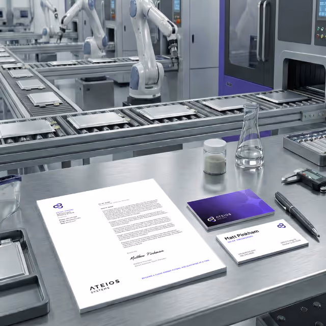
Quill updated fonts, colors, and the logo while retaining connections to the existing brand. The refreshed logo is cleaner and more modern, with a slight curve to evoke the "pop" of a kernel turning into popcorn. The updated design elements reflect a vibrant, joyful, and welcoming identity while staying true to the established brand palette and typography.
Photography emphasized social and communal enjoyment, featuring people gathering and interacting with the product. Product shots consistently included hands reaching for the popcorn, reinforcing the theme of shared experiences.

Through our holistic approach, we successfully redefined Valley Pop's brand identity, positioning it as a symbol of memorable moments and social connection, all while preserving the brand’s established equity.
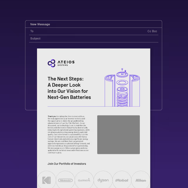
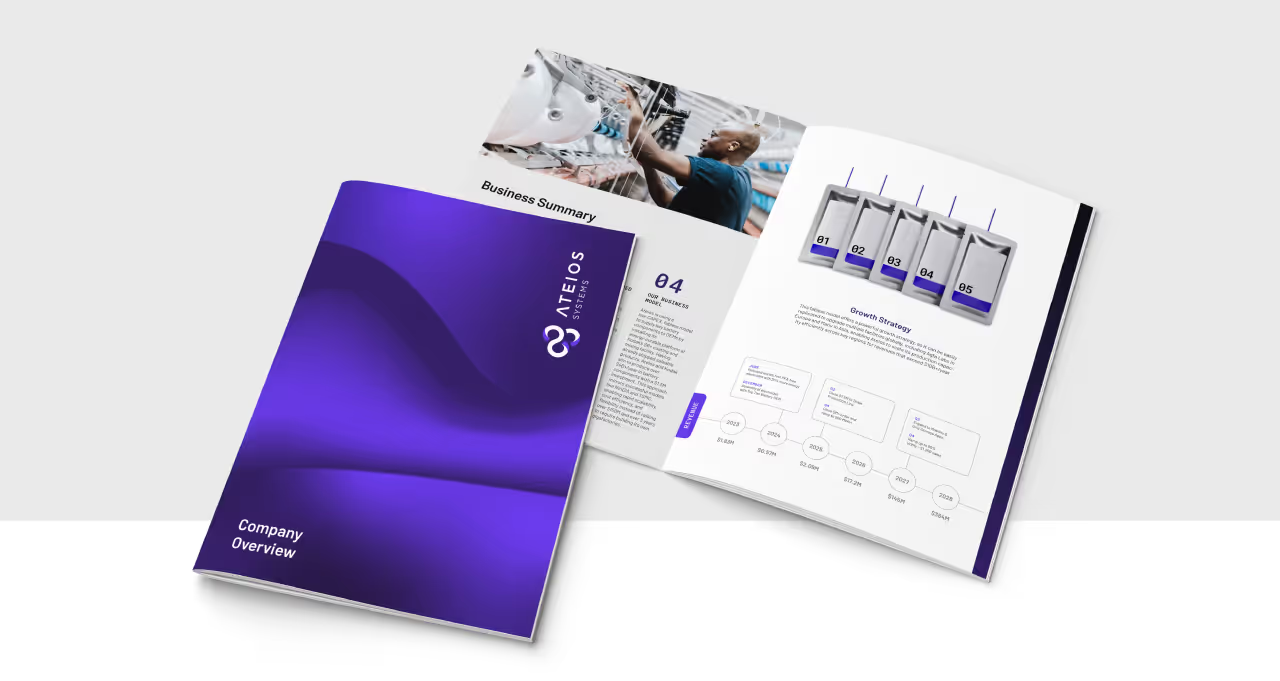
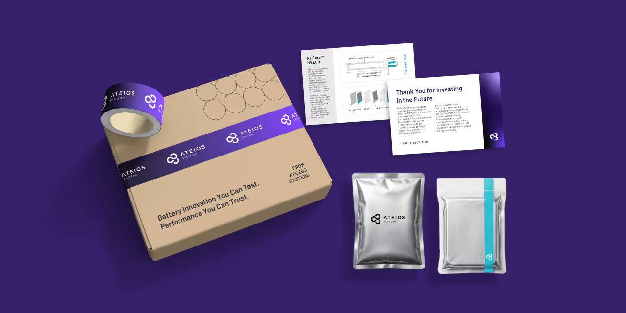
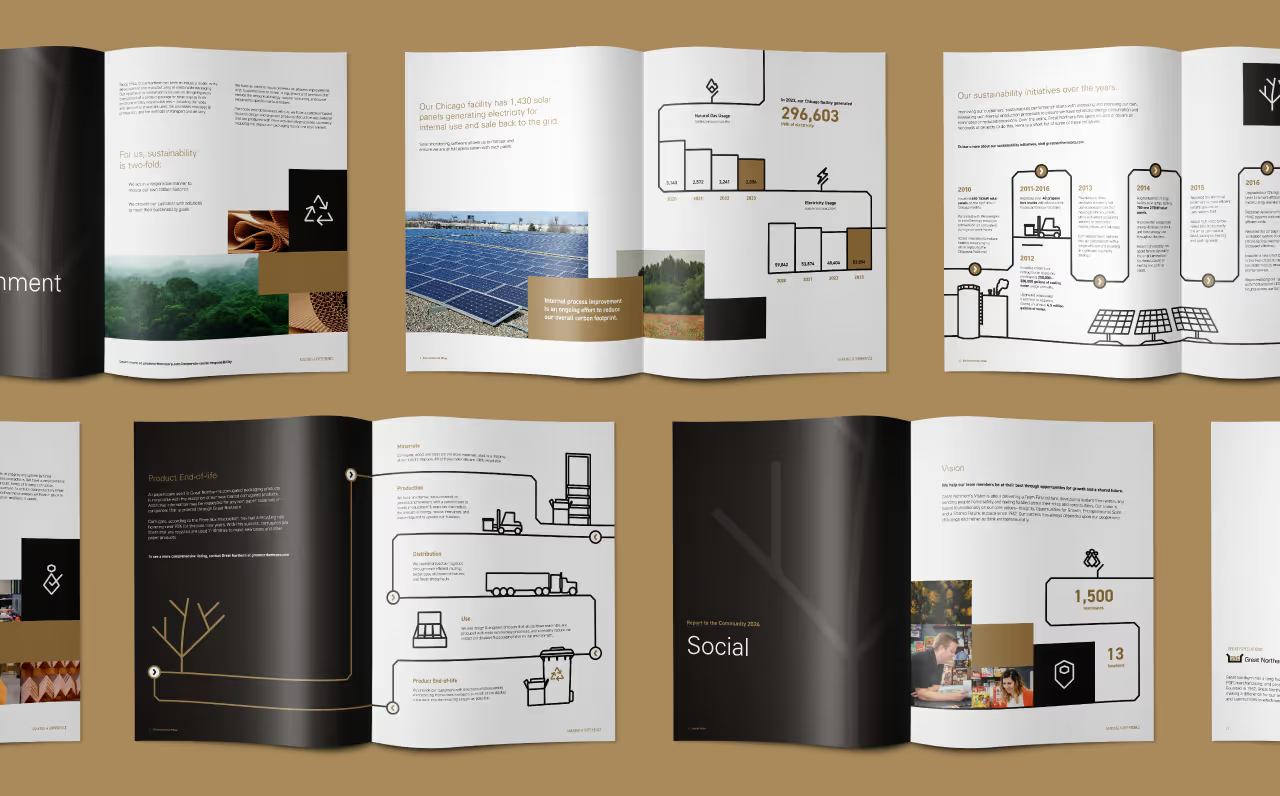
We also recognized Valley Pop’s need to gradually phase out the old branding on existing physical collateral like packaging while ramping up marketing efforts with their new branding at other touchpoints. To facilitate this, we designed a variety of collateral concepts and templates that can be used at any point during the brand’s evolution to ensure the identity stays cohesive. This included creating essential materials such as presentations for distributors and wholesalers, trade show assets, product packaging mock-ups, digital ads, and social media templates that could be effortlessly integrated as part of a larger communications strategy.
While their product quality and loyal customer base were strong assets, Valley Pop’s brand aesthetics had become slightly outdated since their previous visual refresh. They also lacked a clearly articulated brand position in the market and were struggling to differentiate themselves from other players in the industry in an impactful way. Because the popcorn market is heavily focused on health consciousness, this brand niche had already become well-occupied. The challenge for our team at Quill was to carve out a distinct and compelling space for Valley Pop to differentiate themselves from the competitors without losing their established brand values.
We began by refining Valley Pop's brand strategy, exploring core values, mission, and competitors. This led to a new brand identity focused on the social aspect of enjoying popcorn. The identity highlighted popcorn as a catalyst for bringing people together, transforming ordinary moments into something special, resulting in the new tagline, "Share the Moment, Savor the Pop."
Quill updated fonts, colors, and the logo while retaining connections to the existing brand. The refreshed logo is cleaner and more modern, with a slight curve to evoke the "pop" of a kernel turning into popcorn. The updated design elements reflect a vibrant, joyful, and welcoming identity while staying true to the established brand palette and typography.
Photography emphasized social and communal enjoyment, featuring people gathering and interacting with the product. Product shots consistently included hands reaching for the popcorn, reinforcing the theme of shared experiences.
Through our holistic approach, we successfully redefined Valley Pop's brand identity, positioning it as a symbol of memorable moments and social connection, all while preserving the brand’s established equity.
We also recognized Valley Pop’s need to gradually phase out the old branding on existing physical collateral like packaging while ramping up marketing efforts with their new branding at other touchpoints. To facilitate this, we designed a variety of collateral concepts and templates that can be used at any point during the brand’s evolution to ensure the identity stays cohesive. This included creating essential materials such as presentations for distributors and wholesalers, trade show assets, product packaging mock-ups, digital ads, and social media templates that could be effortlessly integrated as part of a larger communications strategy.


While their product quality and loyal customer base were strong assets, Valley Pop’s brand aesthetics had become slightly outdated since their previous visual refresh. They also lacked a clearly articulated brand position in the market and were struggling to differentiate themselves from other players in the industry in an impactful way. Because the popcorn market is heavily focused on health consciousness, this brand niche had already become well-occupied. The challenge for our team at Quill was to carve out a distinct and compelling space for Valley Pop to differentiate themselves from the competitors without losing their established brand values.

We began by refining Valley Pop's brand strategy, exploring core values, mission, and competitors. This led to a new brand identity focused on the social aspect of enjoying popcorn. The identity highlighted popcorn as a catalyst for bringing people together, transforming ordinary moments into something special, resulting in the new tagline, "Share the Moment, Savor the Pop."
Quill updated fonts, colors, and the logo while retaining connections to the existing brand. The refreshed logo is cleaner and more modern, with a slight curve to evoke the "pop" of a kernel turning into popcorn. The updated design elements reflect a vibrant, joyful, and welcoming identity while staying true to the established brand palette and typography.
Photography emphasized social and communal enjoyment, featuring people gathering and interacting with the product. Product shots consistently included hands reaching for the popcorn, reinforcing the theme of shared experiences.


Through our holistic approach, we successfully redefined Valley Pop's brand identity, positioning it as a symbol of memorable moments and social connection, all while preserving the brand’s established equity.
We also recognized Valley Pop’s need to gradually phase out the old branding on existing physical collateral like packaging while ramping up marketing efforts with their new branding at other touchpoints. To facilitate this, we designed a variety of collateral concepts and templates that can be used at any point during the brand’s evolution to ensure the identity stays cohesive. This included creating essential materials such as presentations for distributors and wholesalers, trade show assets, product packaging mock-ups, digital ads, and social media templates that could be effortlessly integrated as part of a larger communications strategy.


While their product quality and loyal customer base were strong assets, Valley Pop’s brand aesthetics had become slightly outdated since their previous visual refresh. They also lacked a clearly articulated brand position in the market and were struggling to differentiate themselves from other players in the industry in an impactful way. Because the popcorn market is heavily focused on health consciousness, this brand niche had already become well-occupied. The challenge for our team at Quill was to carve out a distinct and compelling space for Valley Pop to differentiate themselves from the competitors without losing their established brand values.
We began by refining Valley Pop's brand strategy, exploring core values, mission, and competitors. This led to a new brand identity focused on the social aspect of enjoying popcorn. The identity highlighted popcorn as a catalyst for bringing people together, transforming ordinary moments into something special, resulting in the new tagline, "Share the Moment, Savor the Pop."
Quill updated fonts, colors, and the logo while retaining connections to the existing brand. The refreshed logo is cleaner and more modern, with a slight curve to evoke the "pop" of a kernel turning into popcorn. The updated design elements reflect a vibrant, joyful, and welcoming identity while staying true to the established brand palette and typography.
Photography emphasized social and communal enjoyment, featuring people gathering and interacting with the product. Product shots consistently included hands reaching for the popcorn, reinforcing the theme of shared experiences.

Through our holistic approach, we successfully redefined Valley Pop's brand identity, positioning it as a symbol of memorable moments and social connection, all while preserving the brand’s established equity.
We also recognized Valley Pop’s need to gradually phase out the old branding on existing physical collateral like packaging while ramping up marketing efforts with their new branding at other touchpoints. To facilitate this, we designed a variety of collateral concepts and templates that can be used at any point during the brand’s evolution to ensure the identity stays cohesive. This included creating essential materials such as presentations for distributors and wholesalers, trade show assets, product packaging mock-ups, digital ads, and social media templates that could be effortlessly integrated as part of a larger communications strategy.
While their product quality and loyal customer base were strong assets, Valley Pop’s brand aesthetics had become slightly outdated since their previous visual refresh. They also lacked a clearly articulated brand position in the market and were struggling to differentiate themselves from other players in the industry in an impactful way. Because the popcorn market is heavily focused on health consciousness, this brand niche had already become well-occupied. The challenge for our team at Quill was to carve out a distinct and compelling space for Valley Pop to differentiate themselves from the competitors without losing their established brand values.

We began by refining Valley Pop's brand strategy, exploring core values, mission, and competitors. This led to a new brand identity focused on the social aspect of enjoying popcorn. The identity highlighted popcorn as a catalyst for bringing people together, transforming ordinary moments into something special, resulting in the new tagline, "Share the Moment, Savor the Pop."
Quill updated fonts, colors, and the logo while retaining connections to the existing brand. The refreshed logo is cleaner and more modern, with a slight curve to evoke the "pop" of a kernel turning into popcorn. The updated design elements reflect a vibrant, joyful, and welcoming identity while staying true to the established brand palette and typography.
Photography emphasized social and communal enjoyment, featuring people gathering and interacting with the product. Product shots consistently included hands reaching for the popcorn, reinforcing the theme of shared experiences.
Through our holistic approach, we successfully redefined Valley Pop's brand identity, positioning it as a symbol of memorable moments and social connection, all while preserving the brand’s established equity.
We also recognized Valley Pop’s need to gradually phase out the old branding on existing physical collateral like packaging while ramping up marketing efforts with their new branding at other touchpoints. To facilitate this, we designed a variety of collateral concepts and templates that can be used at any point during the brand’s evolution to ensure the identity stays cohesive. This included creating essential materials such as presentations for distributors and wholesalers, trade show assets, product packaging mock-ups, digital ads, and social media templates that could be effortlessly integrated as part of a larger communications strategy.

While their product quality and loyal customer base were strong assets, Valley Pop’s brand aesthetics had become slightly outdated since their previous visual refresh. They also lacked a clearly articulated brand position in the market and were struggling to differentiate themselves from other players in the industry in an impactful way. Because the popcorn market is heavily focused on health consciousness, this brand niche had already become well-occupied. The challenge for our team at Quill was to carve out a distinct and compelling space for Valley Pop to differentiate themselves from the competitors without losing their established brand values.

We began by refining Valley Pop's brand strategy, exploring core values, mission, and competitors. This led to a new brand identity focused on the social aspect of enjoying popcorn. The identity highlighted popcorn as a catalyst for bringing people together, transforming ordinary moments into something special, resulting in the new tagline, "Share the Moment, Savor the Pop."
Quill updated fonts, colors, and the logo while retaining connections to the existing brand. The refreshed logo is cleaner and more modern, with a slight curve to evoke the "pop" of a kernel turning into popcorn. The updated design elements reflect a vibrant, joyful, and welcoming identity while staying true to the established brand palette and typography.
Photography emphasized social and communal enjoyment, featuring people gathering and interacting with the product. Product shots consistently included hands reaching for the popcorn, reinforcing the theme of shared experiences.


Through our holistic approach, we successfully redefined Valley Pop's brand identity, positioning it as a symbol of memorable moments and social connection, all while preserving the brand’s established equity.
We also recognized Valley Pop’s need to gradually phase out the old branding on existing physical collateral like packaging while ramping up marketing efforts with their new branding at other touchpoints. To facilitate this, we designed a variety of collateral concepts and templates that can be used at any point during the brand’s evolution to ensure the identity stays cohesive. This included creating essential materials such as presentations for distributors and wholesalers, trade show assets, product packaging mock-ups, digital ads, and social media templates that could be effortlessly integrated as part of a larger communications strategy.

While their product quality and loyal customer base were strong assets, Valley Pop’s brand aesthetics had become slightly outdated since their previous visual refresh. They also lacked a clearly articulated brand position in the market and were struggling to differentiate themselves from other players in the industry in an impactful way. Because the popcorn market is heavily focused on health consciousness, this brand niche had already become well-occupied. The challenge for our team at Quill was to carve out a distinct and compelling space for Valley Pop to differentiate themselves from the competitors without losing their established brand values.


We began by refining Valley Pop's brand strategy, exploring core values, mission, and competitors. This led to a new brand identity focused on the social aspect of enjoying popcorn. The identity highlighted popcorn as a catalyst for bringing people together, transforming ordinary moments into something special, resulting in the new tagline, "Share the Moment, Savor the Pop."
Quill updated fonts, colors, and the logo while retaining connections to the existing brand. The refreshed logo is cleaner and more modern, with a slight curve to evoke the "pop" of a kernel turning into popcorn. The updated design elements reflect a vibrant, joyful, and welcoming identity while staying true to the established brand palette and typography.
Photography emphasized social and communal enjoyment, featuring people gathering and interacting with the product. Product shots consistently included hands reaching for the popcorn, reinforcing the theme of shared experiences.


Through our holistic approach, we successfully redefined Valley Pop's brand identity, positioning it as a symbol of memorable moments and social connection, all while preserving the brand’s established equity.
We also recognized Valley Pop’s need to gradually phase out the old branding on existing physical collateral like packaging while ramping up marketing efforts with their new branding at other touchpoints. To facilitate this, we designed a variety of collateral concepts and templates that can be used at any point during the brand’s evolution to ensure the identity stays cohesive. This included creating essential materials such as presentations for distributors and wholesalers, trade show assets, product packaging mock-ups, digital ads, and social media templates that could be effortlessly integrated as part of a larger communications strategy.


While their product quality and loyal customer base were strong assets, Valley Pop’s brand aesthetics had become slightly outdated since their previous visual refresh. They also lacked a clearly articulated brand position in the market and were struggling to differentiate themselves from other players in the industry in an impactful way. Because the popcorn market is heavily focused on health consciousness, this brand niche had already become well-occupied. The challenge for our team at Quill was to carve out a distinct and compelling space for Valley Pop to differentiate themselves from the competitors without losing their established brand values.

We began by refining Valley Pop's brand strategy, exploring core values, mission, and competitors. This led to a new brand identity focused on the social aspect of enjoying popcorn. The identity highlighted popcorn as a catalyst for bringing people together, transforming ordinary moments into something special, resulting in the new tagline, "Share the Moment, Savor the Pop."
Quill updated fonts, colors, and the logo while retaining connections to the existing brand. The refreshed logo is cleaner and more modern, with a slight curve to evoke the "pop" of a kernel turning into popcorn. The updated design elements reflect a vibrant, joyful, and welcoming identity while staying true to the established brand palette and typography.
Photography emphasized social and communal enjoyment, featuring people gathering and interacting with the product. Product shots consistently included hands reaching for the popcorn, reinforcing the theme of shared experiences.

Through our holistic approach, we successfully redefined Valley Pop's brand identity, positioning it as a symbol of memorable moments and social connection, all while preserving the brand’s established equity.
We also recognized Valley Pop’s need to gradually phase out the old branding on existing physical collateral like packaging while ramping up marketing efforts with their new branding at other touchpoints. To facilitate this, we designed a variety of collateral concepts and templates that can be used at any point during the brand’s evolution to ensure the identity stays cohesive. This included creating essential materials such as presentations for distributors and wholesalers, trade show assets, product packaging mock-ups, digital ads, and social media templates that could be effortlessly integrated as part of a larger communications strategy.


While their product quality and loyal customer base were strong assets, Valley Pop’s brand aesthetics had become slightly outdated since their previous visual refresh. They also lacked a clearly articulated brand position in the market and were struggling to differentiate themselves from other players in the industry in an impactful way. Because the popcorn market is heavily focused on health consciousness, this brand niche had already become well-occupied. The challenge for our team at Quill was to carve out a distinct and compelling space for Valley Pop to differentiate themselves from the competitors without losing their established brand values.

We began by refining Valley Pop's brand strategy, exploring core values, mission, and competitors. This led to a new brand identity focused on the social aspect of enjoying popcorn. The identity highlighted popcorn as a catalyst for bringing people together, transforming ordinary moments into something special, resulting in the new tagline, "Share the Moment, Savor the Pop."
Quill updated fonts, colors, and the logo while retaining connections to the existing brand. The refreshed logo is cleaner and more modern, with a slight curve to evoke the "pop" of a kernel turning into popcorn. The updated design elements reflect a vibrant, joyful, and welcoming identity while staying true to the established brand palette and typography.
Photography emphasized social and communal enjoyment, featuring people gathering and interacting with the product. Product shots consistently included hands reaching for the popcorn, reinforcing the theme of shared experiences.

Through our holistic approach, we successfully redefined Valley Pop's brand identity, positioning it as a symbol of memorable moments and social connection, all while preserving the brand’s established equity.
We also recognized Valley Pop’s need to gradually phase out the old branding on existing physical collateral like packaging while ramping up marketing efforts with their new branding at other touchpoints. To facilitate this, we designed a variety of collateral concepts and templates that can be used at any point during the brand’s evolution to ensure the identity stays cohesive. This included creating essential materials such as presentations for distributors and wholesalers, trade show assets, product packaging mock-ups, digital ads, and social media templates that could be effortlessly integrated as part of a larger communications strategy.

While their product quality and loyal customer base were strong assets, Valley Pop’s brand aesthetics had become slightly outdated since their previous visual refresh. They also lacked a clearly articulated brand position in the market and were struggling to differentiate themselves from other players in the industry in an impactful way. Because the popcorn market is heavily focused on health consciousness, this brand niche had already become well-occupied. The challenge for our team at Quill was to carve out a distinct and compelling space for Valley Pop to differentiate themselves from the competitors without losing their established brand values.
We began by refining Valley Pop's brand strategy, exploring core values, mission, and competitors. This led to a new brand identity focused on the social aspect of enjoying popcorn. The identity highlighted popcorn as a catalyst for bringing people together, transforming ordinary moments into something special, resulting in the new tagline, "Share the Moment, Savor the Pop."
Quill updated fonts, colors, and the logo while retaining connections to the existing brand. The refreshed logo is cleaner and more modern, with a slight curve to evoke the "pop" of a kernel turning into popcorn. The updated design elements reflect a vibrant, joyful, and welcoming identity while staying true to the established brand palette and typography.
Photography emphasized social and communal enjoyment, featuring people gathering and interacting with the product. Product shots consistently included hands reaching for the popcorn, reinforcing the theme of shared experiences.
Through our holistic approach, we successfully redefined Valley Pop's brand identity, positioning it as a symbol of memorable moments and social connection, all while preserving the brand’s established equity.
We also recognized Valley Pop’s need to gradually phase out the old branding on existing physical collateral like packaging while ramping up marketing efforts with their new branding at other touchpoints. To facilitate this, we designed a variety of collateral concepts and templates that can be used at any point during the brand’s evolution to ensure the identity stays cohesive. This included creating essential materials such as presentations for distributors and wholesalers, trade show assets, product packaging mock-ups, digital ads, and social media templates that could be effortlessly integrated as part of a larger communications strategy.
While their product quality and loyal customer base were strong assets, Valley Pop’s brand aesthetics had become slightly outdated since their previous visual refresh. They also lacked a clearly articulated brand position in the market and were struggling to differentiate themselves from other players in the industry in an impactful way. Because the popcorn market is heavily focused on health consciousness, this brand niche had already become well-occupied. The challenge for our team at Quill was to carve out a distinct and compelling space for Valley Pop to differentiate themselves from the competitors without losing their established brand values.

We began by refining Valley Pop's brand strategy, exploring core values, mission, and competitors. This led to a new brand identity focused on the social aspect of enjoying popcorn. The identity highlighted popcorn as a catalyst for bringing people together, transforming ordinary moments into something special, resulting in the new tagline, "Share the Moment, Savor the Pop."
Quill updated fonts, colors, and the logo while retaining connections to the existing brand. The refreshed logo is cleaner and more modern, with a slight curve to evoke the "pop" of a kernel turning into popcorn. The updated design elements reflect a vibrant, joyful, and welcoming identity while staying true to the established brand palette and typography.
Photography emphasized social and communal enjoyment, featuring people gathering and interacting with the product. Product shots consistently included hands reaching for the popcorn, reinforcing the theme of shared experiences.
Through our holistic approach, we successfully redefined Valley Pop's brand identity, positioning it as a symbol of memorable moments and social connection, all while preserving the brand’s established equity.
We also recognized Valley Pop’s need to gradually phase out the old branding on existing physical collateral like packaging while ramping up marketing efforts with their new branding at other touchpoints. To facilitate this, we designed a variety of collateral concepts and templates that can be used at any point during the brand’s evolution to ensure the identity stays cohesive. This included creating essential materials such as presentations for distributors and wholesalers, trade show assets, product packaging mock-ups, digital ads, and social media templates that could be effortlessly integrated as part of a larger communications strategy.

While their product quality and loyal customer base were strong assets, Valley Pop’s brand aesthetics had become slightly outdated since their previous visual refresh. They also lacked a clearly articulated brand position in the market and were struggling to differentiate themselves from other players in the industry in an impactful way. Because the popcorn market is heavily focused on health consciousness, this brand niche had already become well-occupied. The challenge for our team at Quill was to carve out a distinct and compelling space for Valley Pop to differentiate themselves from the competitors without losing their established brand values.

We began by refining Valley Pop's brand strategy, exploring core values, mission, and competitors. This led to a new brand identity focused on the social aspect of enjoying popcorn. The identity highlighted popcorn as a catalyst for bringing people together, transforming ordinary moments into something special, resulting in the new tagline, "Share the Moment, Savor the Pop."
Quill updated fonts, colors, and the logo while retaining connections to the existing brand. The refreshed logo is cleaner and more modern, with a slight curve to evoke the "pop" of a kernel turning into popcorn. The updated design elements reflect a vibrant, joyful, and welcoming identity while staying true to the established brand palette and typography.
Photography emphasized social and communal enjoyment, featuring people gathering and interacting with the product. Product shots consistently included hands reaching for the popcorn, reinforcing the theme of shared experiences.

Through our holistic approach, we successfully redefined Valley Pop's brand identity, positioning it as a symbol of memorable moments and social connection, all while preserving the brand’s established equity.
We also recognized Valley Pop’s need to gradually phase out the old branding on existing physical collateral like packaging while ramping up marketing efforts with their new branding at other touchpoints. To facilitate this, we designed a variety of collateral concepts and templates that can be used at any point during the brand’s evolution to ensure the identity stays cohesive. This included creating essential materials such as presentations for distributors and wholesalers, trade show assets, product packaging mock-ups, digital ads, and social media templates that could be effortlessly integrated as part of a larger communications strategy.
While their product quality and loyal customer base were strong assets, Valley Pop’s brand aesthetics had become slightly outdated since their previous visual refresh. They also lacked a clearly articulated brand position in the market and were struggling to differentiate themselves from other players in the industry in an impactful way. Because the popcorn market is heavily focused on health consciousness, this brand niche had already become well-occupied. The challenge for our team at Quill was to carve out a distinct and compelling space for Valley Pop to differentiate themselves from the competitors without losing their established brand values.

We began by refining Valley Pop's brand strategy, exploring core values, mission, and competitors. This led to a new brand identity focused on the social aspect of enjoying popcorn. The identity highlighted popcorn as a catalyst for bringing people together, transforming ordinary moments into something special, resulting in the new tagline, "Share the Moment, Savor the Pop."
Quill updated fonts, colors, and the logo while retaining connections to the existing brand. The refreshed logo is cleaner and more modern, with a slight curve to evoke the "pop" of a kernel turning into popcorn. The updated design elements reflect a vibrant, joyful, and welcoming identity while staying true to the established brand palette and typography.
Photography emphasized social and communal enjoyment, featuring people gathering and interacting with the product. Product shots consistently included hands reaching for the popcorn, reinforcing the theme of shared experiences.
Through our holistic approach, we successfully redefined Valley Pop's brand identity, positioning it as a symbol of memorable moments and social connection, all while preserving the brand’s established equity.
We also recognized Valley Pop’s need to gradually phase out the old branding on existing physical collateral like packaging while ramping up marketing efforts with their new branding at other touchpoints. To facilitate this, we designed a variety of collateral concepts and templates that can be used at any point during the brand’s evolution to ensure the identity stays cohesive. This included creating essential materials such as presentations for distributors and wholesalers, trade show assets, product packaging mock-ups, digital ads, and social media templates that could be effortlessly integrated as part of a larger communications strategy.


While their product quality and loyal customer base were strong assets, Valley Pop’s brand aesthetics had become slightly outdated since their previous visual refresh. They also lacked a clearly articulated brand position in the market and were struggling to differentiate themselves from other players in the industry in an impactful way. Because the popcorn market is heavily focused on health consciousness, this brand niche had already become well-occupied. The challenge for our team at Quill was to carve out a distinct and compelling space for Valley Pop to differentiate themselves from the competitors without losing their established brand values.


We began by refining Valley Pop's brand strategy, exploring core values, mission, and competitors. This led to a new brand identity focused on the social aspect of enjoying popcorn. The identity highlighted popcorn as a catalyst for bringing people together, transforming ordinary moments into something special, resulting in the new tagline, "Share the Moment, Savor the Pop."
Quill updated fonts, colors, and the logo while retaining connections to the existing brand. The refreshed logo is cleaner and more modern, with a slight curve to evoke the "pop" of a kernel turning into popcorn. The updated design elements reflect a vibrant, joyful, and welcoming identity while staying true to the established brand palette and typography.
Photography emphasized social and communal enjoyment, featuring people gathering and interacting with the product. Product shots consistently included hands reaching for the popcorn, reinforcing the theme of shared experiences.

Through our holistic approach, we successfully redefined Valley Pop's brand identity, positioning it as a symbol of memorable moments and social connection, all while preserving the brand’s established equity.
We also recognized Valley Pop’s need to gradually phase out the old branding on existing physical collateral like packaging while ramping up marketing efforts with their new branding at other touchpoints. To facilitate this, we designed a variety of collateral concepts and templates that can be used at any point during the brand’s evolution to ensure the identity stays cohesive. This included creating essential materials such as presentations for distributors and wholesalers, trade show assets, product packaging mock-ups, digital ads, and social media templates that could be effortlessly integrated as part of a larger communications strategy.


While their product quality and loyal customer base were strong assets, Valley Pop’s brand aesthetics had become slightly outdated since their previous visual refresh. They also lacked a clearly articulated brand position in the market and were struggling to differentiate themselves from other players in the industry in an impactful way. Because the popcorn market is heavily focused on health consciousness, this brand niche had already become well-occupied. The challenge for our team at Quill was to carve out a distinct and compelling space for Valley Pop to differentiate themselves from the competitors without losing their established brand values.

We began by refining Valley Pop's brand strategy, exploring core values, mission, and competitors. This led to a new brand identity focused on the social aspect of enjoying popcorn. The identity highlighted popcorn as a catalyst for bringing people together, transforming ordinary moments into something special, resulting in the new tagline, "Share the Moment, Savor the Pop."
Quill updated fonts, colors, and the logo while retaining connections to the existing brand. The refreshed logo is cleaner and more modern, with a slight curve to evoke the "pop" of a kernel turning into popcorn. The updated design elements reflect a vibrant, joyful, and welcoming identity while staying true to the established brand palette and typography.
Photography emphasized social and communal enjoyment, featuring people gathering and interacting with the product. Product shots consistently included hands reaching for the popcorn, reinforcing the theme of shared experiences.


Through our holistic approach, we successfully redefined Valley Pop's brand identity, positioning it as a symbol of memorable moments and social connection, all while preserving the brand’s established equity.
We also recognized Valley Pop’s need to gradually phase out the old branding on existing physical collateral like packaging while ramping up marketing efforts with their new branding at other touchpoints. To facilitate this, we designed a variety of collateral concepts and templates that can be used at any point during the brand’s evolution to ensure the identity stays cohesive. This included creating essential materials such as presentations for distributors and wholesalers, trade show assets, product packaging mock-ups, digital ads, and social media templates that could be effortlessly integrated as part of a larger communications strategy.


While their product quality and loyal customer base were strong assets, Valley Pop’s brand aesthetics had become slightly outdated since their previous visual refresh. They also lacked a clearly articulated brand position in the market and were struggling to differentiate themselves from other players in the industry in an impactful way. Because the popcorn market is heavily focused on health consciousness, this brand niche had already become well-occupied. The challenge for our team at Quill was to carve out a distinct and compelling space for Valley Pop to differentiate themselves from the competitors without losing their established brand values.


We began by refining Valley Pop's brand strategy, exploring core values, mission, and competitors. This led to a new brand identity focused on the social aspect of enjoying popcorn. The identity highlighted popcorn as a catalyst for bringing people together, transforming ordinary moments into something special, resulting in the new tagline, "Share the Moment, Savor the Pop."
Quill updated fonts, colors, and the logo while retaining connections to the existing brand. The refreshed logo is cleaner and more modern, with a slight curve to evoke the "pop" of a kernel turning into popcorn. The updated design elements reflect a vibrant, joyful, and welcoming identity while staying true to the established brand palette and typography.
Photography emphasized social and communal enjoyment, featuring people gathering and interacting with the product. Product shots consistently included hands reaching for the popcorn, reinforcing the theme of shared experiences.


Through our holistic approach, we successfully redefined Valley Pop's brand identity, positioning it as a symbol of memorable moments and social connection, all while preserving the brand’s established equity.
We also recognized Valley Pop’s need to gradually phase out the old branding on existing physical collateral like packaging while ramping up marketing efforts with their new branding at other touchpoints. To facilitate this, we designed a variety of collateral concepts and templates that can be used at any point during the brand’s evolution to ensure the identity stays cohesive. This included creating essential materials such as presentations for distributors and wholesalers, trade show assets, product packaging mock-ups, digital ads, and social media templates that could be effortlessly integrated as part of a larger communications strategy.


While their product quality and loyal customer base were strong assets, Valley Pop’s brand aesthetics had become slightly outdated since their previous visual refresh. They also lacked a clearly articulated brand position in the market and were struggling to differentiate themselves from other players in the industry in an impactful way. Because the popcorn market is heavily focused on health consciousness, this brand niche had already become well-occupied. The challenge for our team at Quill was to carve out a distinct and compelling space for Valley Pop to differentiate themselves from the competitors without losing their established brand values.


We began by refining Valley Pop's brand strategy, exploring core values, mission, and competitors. This led to a new brand identity focused on the social aspect of enjoying popcorn. The identity highlighted popcorn as a catalyst for bringing people together, transforming ordinary moments into something special, resulting in the new tagline, "Share the Moment, Savor the Pop."
Quill updated fonts, colors, and the logo while retaining connections to the existing brand. The refreshed logo is cleaner and more modern, with a slight curve to evoke the "pop" of a kernel turning into popcorn. The updated design elements reflect a vibrant, joyful, and welcoming identity while staying true to the established brand palette and typography.
Photography emphasized social and communal enjoyment, featuring people gathering and interacting with the product. Product shots consistently included hands reaching for the popcorn, reinforcing the theme of shared experiences.

Through our holistic approach, we successfully redefined Valley Pop's brand identity, positioning it as a symbol of memorable moments and social connection, all while preserving the brand’s established equity.
We also recognized Valley Pop’s need to gradually phase out the old branding on existing physical collateral like packaging while ramping up marketing efforts with their new branding at other touchpoints. To facilitate this, we designed a variety of collateral concepts and templates that can be used at any point during the brand’s evolution to ensure the identity stays cohesive. This included creating essential materials such as presentations for distributors and wholesalers, trade show assets, product packaging mock-ups, digital ads, and social media templates that could be effortlessly integrated as part of a larger communications strategy.


While their product quality and loyal customer base were strong assets, Valley Pop’s brand aesthetics had become slightly outdated since their previous visual refresh. They also lacked a clearly articulated brand position in the market and were struggling to differentiate themselves from other players in the industry in an impactful way. Because the popcorn market is heavily focused on health consciousness, this brand niche had already become well-occupied. The challenge for our team at Quill was to carve out a distinct and compelling space for Valley Pop to differentiate themselves from the competitors without losing their established brand values.

We began by refining Valley Pop's brand strategy, exploring core values, mission, and competitors. This led to a new brand identity focused on the social aspect of enjoying popcorn. The identity highlighted popcorn as a catalyst for bringing people together, transforming ordinary moments into something special, resulting in the new tagline, "Share the Moment, Savor the Pop."
Quill updated fonts, colors, and the logo while retaining connections to the existing brand. The refreshed logo is cleaner and more modern, with a slight curve to evoke the "pop" of a kernel turning into popcorn. The updated design elements reflect a vibrant, joyful, and welcoming identity while staying true to the established brand palette and typography.
Photography emphasized social and communal enjoyment, featuring people gathering and interacting with the product. Product shots consistently included hands reaching for the popcorn, reinforcing the theme of shared experiences.


Through our holistic approach, we successfully redefined Valley Pop's brand identity, positioning it as a symbol of memorable moments and social connection, all while preserving the brand’s established equity.
We also recognized Valley Pop’s need to gradually phase out the old branding on existing physical collateral like packaging while ramping up marketing efforts with their new branding at other touchpoints. To facilitate this, we designed a variety of collateral concepts and templates that can be used at any point during the brand’s evolution to ensure the identity stays cohesive. This included creating essential materials such as presentations for distributors and wholesalers, trade show assets, product packaging mock-ups, digital ads, and social media templates that could be effortlessly integrated as part of a larger communications strategy.


While their product quality and loyal customer base were strong assets, Valley Pop’s brand aesthetics had become slightly outdated since their previous visual refresh. They also lacked a clearly articulated brand position in the market and were struggling to differentiate themselves from other players in the industry in an impactful way. Because the popcorn market is heavily focused on health consciousness, this brand niche had already become well-occupied. The challenge for our team at Quill was to carve out a distinct and compelling space for Valley Pop to differentiate themselves from the competitors without losing their established brand values.


We began by refining Valley Pop's brand strategy, exploring core values, mission, and competitors. This led to a new brand identity focused on the social aspect of enjoying popcorn. The identity highlighted popcorn as a catalyst for bringing people together, transforming ordinary moments into something special, resulting in the new tagline, "Share the Moment, Savor the Pop."
Quill updated fonts, colors, and the logo while retaining connections to the existing brand. The refreshed logo is cleaner and more modern, with a slight curve to evoke the "pop" of a kernel turning into popcorn. The updated design elements reflect a vibrant, joyful, and welcoming identity while staying true to the established brand palette and typography.
Photography emphasized social and communal enjoyment, featuring people gathering and interacting with the product. Product shots consistently included hands reaching for the popcorn, reinforcing the theme of shared experiences.


Through our holistic approach, we successfully redefined Valley Pop's brand identity, positioning it as a symbol of memorable moments and social connection, all while preserving the brand’s established equity.
We also recognized Valley Pop’s need to gradually phase out the old branding on existing physical collateral like packaging while ramping up marketing efforts with their new branding at other touchpoints. To facilitate this, we designed a variety of collateral concepts and templates that can be used at any point during the brand’s evolution to ensure the identity stays cohesive. This included creating essential materials such as presentations for distributors and wholesalers, trade show assets, product packaging mock-ups, digital ads, and social media templates that could be effortlessly integrated as part of a larger communications strategy.


While their product quality and loyal customer base were strong assets, Valley Pop’s brand aesthetics had become slightly outdated since their previous visual refresh. They also lacked a clearly articulated brand position in the market and were struggling to differentiate themselves from other players in the industry in an impactful way. Because the popcorn market is heavily focused on health consciousness, this brand niche had already become well-occupied. The challenge for our team at Quill was to carve out a distinct and compelling space for Valley Pop to differentiate themselves from the competitors without losing their established brand values.


We began by refining Valley Pop's brand strategy, exploring core values, mission, and competitors. This led to a new brand identity focused on the social aspect of enjoying popcorn. The identity highlighted popcorn as a catalyst for bringing people together, transforming ordinary moments into something special, resulting in the new tagline, "Share the Moment, Savor the Pop."
Quill updated fonts, colors, and the logo while retaining connections to the existing brand. The refreshed logo is cleaner and more modern, with a slight curve to evoke the "pop" of a kernel turning into popcorn. The updated design elements reflect a vibrant, joyful, and welcoming identity while staying true to the established brand palette and typography.
Photography emphasized social and communal enjoyment, featuring people gathering and interacting with the product. Product shots consistently included hands reaching for the popcorn, reinforcing the theme of shared experiences.


Through our holistic approach, we successfully redefined Valley Pop's brand identity, positioning it as a symbol of memorable moments and social connection, all while preserving the brand’s established equity.
We also recognized Valley Pop’s need to gradually phase out the old branding on existing physical collateral like packaging while ramping up marketing efforts with their new branding at other touchpoints. To facilitate this, we designed a variety of collateral concepts and templates that can be used at any point during the brand’s evolution to ensure the identity stays cohesive. This included creating essential materials such as presentations for distributors and wholesalers, trade show assets, product packaging mock-ups, digital ads, and social media templates that could be effortlessly integrated as part of a larger communications strategy.


While their product quality and loyal customer base were strong assets, Valley Pop’s brand aesthetics had become slightly outdated since their previous visual refresh. They also lacked a clearly articulated brand position in the market and were struggling to differentiate themselves from other players in the industry in an impactful way. Because the popcorn market is heavily focused on health consciousness, this brand niche had already become well-occupied. The challenge for our team at Quill was to carve out a distinct and compelling space for Valley Pop to differentiate themselves from the competitors without losing their established brand values.

We began by refining Valley Pop's brand strategy, exploring core values, mission, and competitors. This led to a new brand identity focused on the social aspect of enjoying popcorn. The identity highlighted popcorn as a catalyst for bringing people together, transforming ordinary moments into something special, resulting in the new tagline, "Share the Moment, Savor the Pop."
Quill updated fonts, colors, and the logo while retaining connections to the existing brand. The refreshed logo is cleaner and more modern, with a slight curve to evoke the "pop" of a kernel turning into popcorn. The updated design elements reflect a vibrant, joyful, and welcoming identity while staying true to the established brand palette and typography.
Photography emphasized social and communal enjoyment, featuring people gathering and interacting with the product. Product shots consistently included hands reaching for the popcorn, reinforcing the theme of shared experiences.


Through our holistic approach, we successfully redefined Valley Pop's brand identity, positioning it as a symbol of memorable moments and social connection, all while preserving the brand’s established equity.
We also recognized Valley Pop’s need to gradually phase out the old branding on existing physical collateral like packaging while ramping up marketing efforts with their new branding at other touchpoints. To facilitate this, we designed a variety of collateral concepts and templates that can be used at any point during the brand’s evolution to ensure the identity stays cohesive. This included creating essential materials such as presentations for distributors and wholesalers, trade show assets, product packaging mock-ups, digital ads, and social media templates that could be effortlessly integrated as part of a larger communications strategy.


We were delighted with the deliverables the Quill team brought to Valley Pop. We were a successful brand feeling a little rudderless as our competition evolved. We found ourselves looking for a fresh and cleaner image while searching for the story that would connect new consumers to our brand. The folks at Quill took the time to listen, study the landscape we compete in and bring us a look and brand story to help fuel our growth.
Jim Labas, National Sales Manager, Valley Pop

