Fletch’s vision for this new space required branding that evoked a specific aesthetic—one that captured the attention of patrons seeking an upscale experience—while maintaining continuity with the existing Fletch’s brand in order to leverage established brand recognition and customer loyalty.
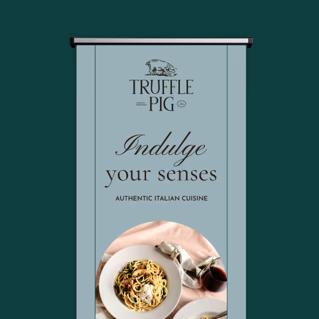
We knew we needed a name that distinguished this bar as a premier destination for patrons seeking a top-tier “bourbon bar” experience while still incorporating the Fletch’s name. After several brainstorming sessions, our team landed on “Fletch’s High Spirits,” which communicates the elevated atmosphere with a clever nod to its physical second-floor mezzanine location.
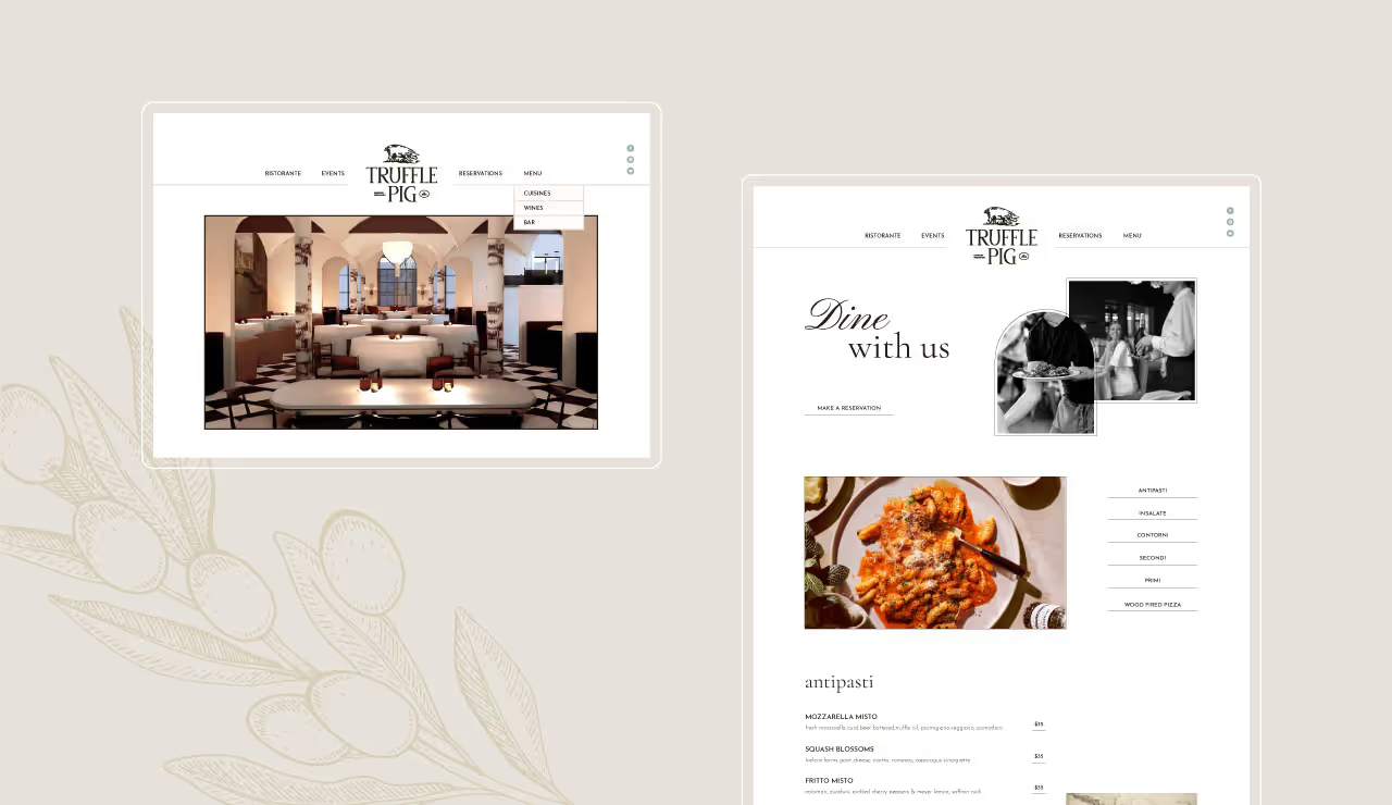
Our designers also incorporated a new, sleek dog emblem into the logo—an evolution of the iconic Fletch’s dog logo (Fletch’s namesake). In addition to the logo, we designed an upscale typeface, characterized by unique serif styles coupled with a carefully crafted color palette featuring deep, confident hues that infuse a feeling of inviting, refined ambiance.

The transformation of the upstairs mezzanine into Fletch’s High Spirits marks a new chapter for Fletch’s, offering patrons a niche upscale ambiance that exudes both charm and prestige. No aesthetic detail has been spared, from the new modern logo and visual elements to the handpicked decor elements like new wood and leather furnishings and distinctive industrial lighting. With a seamless blend of traditional yet contemporary ambiance, Fletch’s High Spirits promises to elevate their patron’s drinking experience to new heights.
Fletch’s vision for this new space required branding that evoked a specific aesthetic—one that captured the attention of patrons seeking an upscale experience—while maintaining continuity with the existing Fletch’s brand in order to leverage established brand recognition and customer loyalty.
We knew we needed a name that distinguished this bar as a premier destination for patrons seeking a top-tier “bourbon bar” experience while still incorporating the Fletch’s name. After several brainstorming sessions, our team landed on “Fletch’s High Spirits,” which communicates the elevated atmosphere with a clever nod to its physical second-floor mezzanine location.
Our designers also incorporated a new, sleek dog emblem into the logo—an evolution of the iconic Fletch’s dog logo (Fletch’s namesake). In addition to the logo, we designed an upscale typeface, characterized by unique serif styles coupled with a carefully crafted color palette featuring deep, confident hues that infuse a feeling of inviting, refined ambiance.
The transformation of the upstairs mezzanine into Fletch’s High Spirits marks a new chapter for Fletch’s, offering patrons a niche upscale ambiance that exudes both charm and prestige. No aesthetic detail has been spared, from the new modern logo and visual elements to the handpicked decor elements like new wood and leather furnishings and distinctive industrial lighting. With a seamless blend of traditional yet contemporary ambiance, Fletch’s High Spirits promises to elevate their patron’s drinking experience to new heights.


Fletch’s vision for this new space required branding that evoked a specific aesthetic—one that captured the attention of patrons seeking an upscale experience—while maintaining continuity with the existing Fletch’s brand in order to leverage established brand recognition and customer loyalty.
We knew we needed a name that distinguished this bar as a premier destination for patrons seeking a top-tier “bourbon bar” experience while still incorporating the Fletch’s name. After several brainstorming sessions, our team landed on “Fletch’s High Spirits,” which communicates the elevated atmosphere with a clever nod to its physical second-floor mezzanine location.
Our designers also incorporated a new, sleek dog emblem into the logo—an evolution of the iconic Fletch’s dog logo (Fletch’s namesake). In addition to the logo, we designed an upscale typeface, characterized by unique serif styles coupled with a carefully crafted color palette featuring deep, confident hues that infuse a feeling of inviting, refined ambiance.

The transformation of the upstairs mezzanine into Fletch’s High Spirits marks a new chapter for Fletch’s, offering patrons a niche upscale ambiance that exudes both charm and prestige. No aesthetic detail has been spared, from the new modern logo and visual elements to the handpicked decor elements like new wood and leather furnishings and distinctive industrial lighting. With a seamless blend of traditional yet contemporary ambiance, Fletch’s High Spirits promises to elevate their patron’s drinking experience to new heights.
Fletch’s vision for this new space required branding that evoked a specific aesthetic—one that captured the attention of patrons seeking an upscale experience—while maintaining continuity with the existing Fletch’s brand in order to leverage established brand recognition and customer loyalty.
We knew we needed a name that distinguished this bar as a premier destination for patrons seeking a top-tier “bourbon bar” experience while still incorporating the Fletch’s name. After several brainstorming sessions, our team landed on “Fletch’s High Spirits,” which communicates the elevated atmosphere with a clever nod to its physical second-floor mezzanine location.
Our designers also incorporated a new, sleek dog emblem into the logo—an evolution of the iconic Fletch’s dog logo (Fletch’s namesake). In addition to the logo, we designed an upscale typeface, characterized by unique serif styles coupled with a carefully crafted color palette featuring deep, confident hues that infuse a feeling of inviting, refined ambiance.
The transformation of the upstairs mezzanine into Fletch’s High Spirits marks a new chapter for Fletch’s, offering patrons a niche upscale ambiance that exudes both charm and prestige. No aesthetic detail has been spared, from the new modern logo and visual elements to the handpicked decor elements like new wood and leather furnishings and distinctive industrial lighting. With a seamless blend of traditional yet contemporary ambiance, Fletch’s High Spirits promises to elevate their patron’s drinking experience to new heights.

Fletch’s vision for this new space required branding that evoked a specific aesthetic—one that captured the attention of patrons seeking an upscale experience—while maintaining continuity with the existing Fletch’s brand in order to leverage established brand recognition and customer loyalty.

We knew we needed a name that distinguished this bar as a premier destination for patrons seeking a top-tier “bourbon bar” experience while still incorporating the Fletch’s name. After several brainstorming sessions, our team landed on “Fletch’s High Spirits,” which communicates the elevated atmosphere with a clever nod to its physical second-floor mezzanine location.
Our designers also incorporated a new, sleek dog emblem into the logo—an evolution of the iconic Fletch’s dog logo (Fletch’s namesake). In addition to the logo, we designed an upscale typeface, characterized by unique serif styles coupled with a carefully crafted color palette featuring deep, confident hues that infuse a feeling of inviting, refined ambiance.


The transformation of the upstairs mezzanine into Fletch’s High Spirits marks a new chapter for Fletch’s, offering patrons a niche upscale ambiance that exudes both charm and prestige. No aesthetic detail has been spared, from the new modern logo and visual elements to the handpicked decor elements like new wood and leather furnishings and distinctive industrial lighting. With a seamless blend of traditional yet contemporary ambiance, Fletch’s High Spirits promises to elevate their patron’s drinking experience to new heights.
Fletch’s vision for this new space required branding that evoked a specific aesthetic—one that captured the attention of patrons seeking an upscale experience—while maintaining continuity with the existing Fletch’s brand in order to leverage established brand recognition and customer loyalty.


We knew we needed a name that distinguished this bar as a premier destination for patrons seeking a top-tier “bourbon bar” experience while still incorporating the Fletch’s name. After several brainstorming sessions, our team landed on “Fletch’s High Spirits,” which communicates the elevated atmosphere with a clever nod to its physical second-floor mezzanine location.
Our designers also incorporated a new, sleek dog emblem into the logo—an evolution of the iconic Fletch’s dog logo (Fletch’s namesake). In addition to the logo, we designed an upscale typeface, characterized by unique serif styles coupled with a carefully crafted color palette featuring deep, confident hues that infuse a feeling of inviting, refined ambiance.

The transformation of the upstairs mezzanine into Fletch’s High Spirits marks a new chapter for Fletch’s, offering patrons a niche upscale ambiance that exudes both charm and prestige. No aesthetic detail has been spared, from the new modern logo and visual elements to the handpicked decor elements like new wood and leather furnishings and distinctive industrial lighting. With a seamless blend of traditional yet contemporary ambiance, Fletch’s High Spirits promises to elevate their patron’s drinking experience to new heights.


Fletch’s vision for this new space required branding that evoked a specific aesthetic—one that captured the attention of patrons seeking an upscale experience—while maintaining continuity with the existing Fletch’s brand in order to leverage established brand recognition and customer loyalty.

We knew we needed a name that distinguished this bar as a premier destination for patrons seeking a top-tier “bourbon bar” experience while still incorporating the Fletch’s name. After several brainstorming sessions, our team landed on “Fletch’s High Spirits,” which communicates the elevated atmosphere with a clever nod to its physical second-floor mezzanine location.
Our designers also incorporated a new, sleek dog emblem into the logo—an evolution of the iconic Fletch’s dog logo (Fletch’s namesake). In addition to the logo, we designed an upscale typeface, characterized by unique serif styles coupled with a carefully crafted color palette featuring deep, confident hues that infuse a feeling of inviting, refined ambiance.


The transformation of the upstairs mezzanine into Fletch’s High Spirits marks a new chapter for Fletch’s, offering patrons a niche upscale ambiance that exudes both charm and prestige. No aesthetic detail has been spared, from the new modern logo and visual elements to the handpicked decor elements like new wood and leather furnishings and distinctive industrial lighting. With a seamless blend of traditional yet contemporary ambiance, Fletch’s High Spirits promises to elevate their patron’s drinking experience to new heights.

Fletch’s vision for this new space required branding that evoked a specific aesthetic—one that captured the attention of patrons seeking an upscale experience—while maintaining continuity with the existing Fletch’s brand in order to leverage established brand recognition and customer loyalty.
We knew we needed a name that distinguished this bar as a premier destination for patrons seeking a top-tier “bourbon bar” experience while still incorporating the Fletch’s name. After several brainstorming sessions, our team landed on “Fletch’s High Spirits,” which communicates the elevated atmosphere with a clever nod to its physical second-floor mezzanine location.
Our designers also incorporated a new, sleek dog emblem into the logo—an evolution of the iconic Fletch’s dog logo (Fletch’s namesake). In addition to the logo, we designed an upscale typeface, characterized by unique serif styles coupled with a carefully crafted color palette featuring deep, confident hues that infuse a feeling of inviting, refined ambiance.
The transformation of the upstairs mezzanine into Fletch’s High Spirits marks a new chapter for Fletch’s, offering patrons a niche upscale ambiance that exudes both charm and prestige. No aesthetic detail has been spared, from the new modern logo and visual elements to the handpicked decor elements like new wood and leather furnishings and distinctive industrial lighting. With a seamless blend of traditional yet contemporary ambiance, Fletch’s High Spirits promises to elevate their patron’s drinking experience to new heights.
Fletch’s vision for this new space required branding that evoked a specific aesthetic—one that captured the attention of patrons seeking an upscale experience—while maintaining continuity with the existing Fletch’s brand in order to leverage established brand recognition and customer loyalty.

We knew we needed a name that distinguished this bar as a premier destination for patrons seeking a top-tier “bourbon bar” experience while still incorporating the Fletch’s name. After several brainstorming sessions, our team landed on “Fletch’s High Spirits,” which communicates the elevated atmosphere with a clever nod to its physical second-floor mezzanine location.
Our designers also incorporated a new, sleek dog emblem into the logo—an evolution of the iconic Fletch’s dog logo (Fletch’s namesake). In addition to the logo, we designed an upscale typeface, characterized by unique serif styles coupled with a carefully crafted color palette featuring deep, confident hues that infuse a feeling of inviting, refined ambiance.
The transformation of the upstairs mezzanine into Fletch’s High Spirits marks a new chapter for Fletch’s, offering patrons a niche upscale ambiance that exudes both charm and prestige. No aesthetic detail has been spared, from the new modern logo and visual elements to the handpicked decor elements like new wood and leather furnishings and distinctive industrial lighting. With a seamless blend of traditional yet contemporary ambiance, Fletch’s High Spirits promises to elevate their patron’s drinking experience to new heights.

Fletch’s vision for this new space required branding that evoked a specific aesthetic—one that captured the attention of patrons seeking an upscale experience—while maintaining continuity with the existing Fletch’s brand in order to leverage established brand recognition and customer loyalty.

We knew we needed a name that distinguished this bar as a premier destination for patrons seeking a top-tier “bourbon bar” experience while still incorporating the Fletch’s name. After several brainstorming sessions, our team landed on “Fletch’s High Spirits,” which communicates the elevated atmosphere with a clever nod to its physical second-floor mezzanine location.
Our designers also incorporated a new, sleek dog emblem into the logo—an evolution of the iconic Fletch’s dog logo (Fletch’s namesake). In addition to the logo, we designed an upscale typeface, characterized by unique serif styles coupled with a carefully crafted color palette featuring deep, confident hues that infuse a feeling of inviting, refined ambiance.

The transformation of the upstairs mezzanine into Fletch’s High Spirits marks a new chapter for Fletch’s, offering patrons a niche upscale ambiance that exudes both charm and prestige. No aesthetic detail has been spared, from the new modern logo and visual elements to the handpicked decor elements like new wood and leather furnishings and distinctive industrial lighting. With a seamless blend of traditional yet contemporary ambiance, Fletch’s High Spirits promises to elevate their patron’s drinking experience to new heights.
Fletch’s vision for this new space required branding that evoked a specific aesthetic—one that captured the attention of patrons seeking an upscale experience—while maintaining continuity with the existing Fletch’s brand in order to leverage established brand recognition and customer loyalty.

We knew we needed a name that distinguished this bar as a premier destination for patrons seeking a top-tier “bourbon bar” experience while still incorporating the Fletch’s name. After several brainstorming sessions, our team landed on “Fletch’s High Spirits,” which communicates the elevated atmosphere with a clever nod to its physical second-floor mezzanine location.
Our designers also incorporated a new, sleek dog emblem into the logo—an evolution of the iconic Fletch’s dog logo (Fletch’s namesake). In addition to the logo, we designed an upscale typeface, characterized by unique serif styles coupled with a carefully crafted color palette featuring deep, confident hues that infuse a feeling of inviting, refined ambiance.
The transformation of the upstairs mezzanine into Fletch’s High Spirits marks a new chapter for Fletch’s, offering patrons a niche upscale ambiance that exudes both charm and prestige. No aesthetic detail has been spared, from the new modern logo and visual elements to the handpicked decor elements like new wood and leather furnishings and distinctive industrial lighting. With a seamless blend of traditional yet contemporary ambiance, Fletch’s High Spirits promises to elevate their patron’s drinking experience to new heights.


Fletch’s vision for this new space required branding that evoked a specific aesthetic—one that captured the attention of patrons seeking an upscale experience—while maintaining continuity with the existing Fletch’s brand in order to leverage established brand recognition and customer loyalty.


We knew we needed a name that distinguished this bar as a premier destination for patrons seeking a top-tier “bourbon bar” experience while still incorporating the Fletch’s name. After several brainstorming sessions, our team landed on “Fletch’s High Spirits,” which communicates the elevated atmosphere with a clever nod to its physical second-floor mezzanine location.
Our designers also incorporated a new, sleek dog emblem into the logo—an evolution of the iconic Fletch’s dog logo (Fletch’s namesake). In addition to the logo, we designed an upscale typeface, characterized by unique serif styles coupled with a carefully crafted color palette featuring deep, confident hues that infuse a feeling of inviting, refined ambiance.

The transformation of the upstairs mezzanine into Fletch’s High Spirits marks a new chapter for Fletch’s, offering patrons a niche upscale ambiance that exudes both charm and prestige. No aesthetic detail has been spared, from the new modern logo and visual elements to the handpicked decor elements like new wood and leather furnishings and distinctive industrial lighting. With a seamless blend of traditional yet contemporary ambiance, Fletch’s High Spirits promises to elevate their patron’s drinking experience to new heights.


Fletch’s vision for this new space required branding that evoked a specific aesthetic—one that captured the attention of patrons seeking an upscale experience—while maintaining continuity with the existing Fletch’s brand in order to leverage established brand recognition and customer loyalty.

We knew we needed a name that distinguished this bar as a premier destination for patrons seeking a top-tier “bourbon bar” experience while still incorporating the Fletch’s name. After several brainstorming sessions, our team landed on “Fletch’s High Spirits,” which communicates the elevated atmosphere with a clever nod to its physical second-floor mezzanine location.
Our designers also incorporated a new, sleek dog emblem into the logo—an evolution of the iconic Fletch’s dog logo (Fletch’s namesake). In addition to the logo, we designed an upscale typeface, characterized by unique serif styles coupled with a carefully crafted color palette featuring deep, confident hues that infuse a feeling of inviting, refined ambiance.


The transformation of the upstairs mezzanine into Fletch’s High Spirits marks a new chapter for Fletch’s, offering patrons a niche upscale ambiance that exudes both charm and prestige. No aesthetic detail has been spared, from the new modern logo and visual elements to the handpicked decor elements like new wood and leather furnishings and distinctive industrial lighting. With a seamless blend of traditional yet contemporary ambiance, Fletch’s High Spirits promises to elevate their patron’s drinking experience to new heights.


Fletch’s vision for this new space required branding that evoked a specific aesthetic—one that captured the attention of patrons seeking an upscale experience—while maintaining continuity with the existing Fletch’s brand in order to leverage established brand recognition and customer loyalty.


We knew we needed a name that distinguished this bar as a premier destination for patrons seeking a top-tier “bourbon bar” experience while still incorporating the Fletch’s name. After several brainstorming sessions, our team landed on “Fletch’s High Spirits,” which communicates the elevated atmosphere with a clever nod to its physical second-floor mezzanine location.
Our designers also incorporated a new, sleek dog emblem into the logo—an evolution of the iconic Fletch’s dog logo (Fletch’s namesake). In addition to the logo, we designed an upscale typeface, characterized by unique serif styles coupled with a carefully crafted color palette featuring deep, confident hues that infuse a feeling of inviting, refined ambiance.


The transformation of the upstairs mezzanine into Fletch’s High Spirits marks a new chapter for Fletch’s, offering patrons a niche upscale ambiance that exudes both charm and prestige. No aesthetic detail has been spared, from the new modern logo and visual elements to the handpicked decor elements like new wood and leather furnishings and distinctive industrial lighting. With a seamless blend of traditional yet contemporary ambiance, Fletch’s High Spirits promises to elevate their patron’s drinking experience to new heights.


Fletch’s vision for this new space required branding that evoked a specific aesthetic—one that captured the attention of patrons seeking an upscale experience—while maintaining continuity with the existing Fletch’s brand in order to leverage established brand recognition and customer loyalty.


We knew we needed a name that distinguished this bar as a premier destination for patrons seeking a top-tier “bourbon bar” experience while still incorporating the Fletch’s name. After several brainstorming sessions, our team landed on “Fletch’s High Spirits,” which communicates the elevated atmosphere with a clever nod to its physical second-floor mezzanine location.
Our designers also incorporated a new, sleek dog emblem into the logo—an evolution of the iconic Fletch’s dog logo (Fletch’s namesake). In addition to the logo, we designed an upscale typeface, characterized by unique serif styles coupled with a carefully crafted color palette featuring deep, confident hues that infuse a feeling of inviting, refined ambiance.

The transformation of the upstairs mezzanine into Fletch’s High Spirits marks a new chapter for Fletch’s, offering patrons a niche upscale ambiance that exudes both charm and prestige. No aesthetic detail has been spared, from the new modern logo and visual elements to the handpicked decor elements like new wood and leather furnishings and distinctive industrial lighting. With a seamless blend of traditional yet contemporary ambiance, Fletch’s High Spirits promises to elevate their patron’s drinking experience to new heights.


Fletch’s vision for this new space required branding that evoked a specific aesthetic—one that captured the attention of patrons seeking an upscale experience—while maintaining continuity with the existing Fletch’s brand in order to leverage established brand recognition and customer loyalty.

We knew we needed a name that distinguished this bar as a premier destination for patrons seeking a top-tier “bourbon bar” experience while still incorporating the Fletch’s name. After several brainstorming sessions, our team landed on “Fletch’s High Spirits,” which communicates the elevated atmosphere with a clever nod to its physical second-floor mezzanine location.
Our designers also incorporated a new, sleek dog emblem into the logo—an evolution of the iconic Fletch’s dog logo (Fletch’s namesake). In addition to the logo, we designed an upscale typeface, characterized by unique serif styles coupled with a carefully crafted color palette featuring deep, confident hues that infuse a feeling of inviting, refined ambiance.


The transformation of the upstairs mezzanine into Fletch’s High Spirits marks a new chapter for Fletch’s, offering patrons a niche upscale ambiance that exudes both charm and prestige. No aesthetic detail has been spared, from the new modern logo and visual elements to the handpicked decor elements like new wood and leather furnishings and distinctive industrial lighting. With a seamless blend of traditional yet contemporary ambiance, Fletch’s High Spirits promises to elevate their patron’s drinking experience to new heights.


Fletch’s vision for this new space required branding that evoked a specific aesthetic—one that captured the attention of patrons seeking an upscale experience—while maintaining continuity with the existing Fletch’s brand in order to leverage established brand recognition and customer loyalty.


We knew we needed a name that distinguished this bar as a premier destination for patrons seeking a top-tier “bourbon bar” experience while still incorporating the Fletch’s name. After several brainstorming sessions, our team landed on “Fletch’s High Spirits,” which communicates the elevated atmosphere with a clever nod to its physical second-floor mezzanine location.
Our designers also incorporated a new, sleek dog emblem into the logo—an evolution of the iconic Fletch’s dog logo (Fletch’s namesake). In addition to the logo, we designed an upscale typeface, characterized by unique serif styles coupled with a carefully crafted color palette featuring deep, confident hues that infuse a feeling of inviting, refined ambiance.


The transformation of the upstairs mezzanine into Fletch’s High Spirits marks a new chapter for Fletch’s, offering patrons a niche upscale ambiance that exudes both charm and prestige. No aesthetic detail has been spared, from the new modern logo and visual elements to the handpicked decor elements like new wood and leather furnishings and distinctive industrial lighting. With a seamless blend of traditional yet contemporary ambiance, Fletch’s High Spirits promises to elevate their patron’s drinking experience to new heights.


Fletch’s vision for this new space required branding that evoked a specific aesthetic—one that captured the attention of patrons seeking an upscale experience—while maintaining continuity with the existing Fletch’s brand in order to leverage established brand recognition and customer loyalty.


We knew we needed a name that distinguished this bar as a premier destination for patrons seeking a top-tier “bourbon bar” experience while still incorporating the Fletch’s name. After several brainstorming sessions, our team landed on “Fletch’s High Spirits,” which communicates the elevated atmosphere with a clever nod to its physical second-floor mezzanine location.
Our designers also incorporated a new, sleek dog emblem into the logo—an evolution of the iconic Fletch’s dog logo (Fletch’s namesake). In addition to the logo, we designed an upscale typeface, characterized by unique serif styles coupled with a carefully crafted color palette featuring deep, confident hues that infuse a feeling of inviting, refined ambiance.


The transformation of the upstairs mezzanine into Fletch’s High Spirits marks a new chapter for Fletch’s, offering patrons a niche upscale ambiance that exudes both charm and prestige. No aesthetic detail has been spared, from the new modern logo and visual elements to the handpicked decor elements like new wood and leather furnishings and distinctive industrial lighting. With a seamless blend of traditional yet contemporary ambiance, Fletch’s High Spirits promises to elevate their patron’s drinking experience to new heights.


Fletch’s vision for this new space required branding that evoked a specific aesthetic—one that captured the attention of patrons seeking an upscale experience—while maintaining continuity with the existing Fletch’s brand in order to leverage established brand recognition and customer loyalty.

We knew we needed a name that distinguished this bar as a premier destination for patrons seeking a top-tier “bourbon bar” experience while still incorporating the Fletch’s name. After several brainstorming sessions, our team landed on “Fletch’s High Spirits,” which communicates the elevated atmosphere with a clever nod to its physical second-floor mezzanine location.
Our designers also incorporated a new, sleek dog emblem into the logo—an evolution of the iconic Fletch’s dog logo (Fletch’s namesake). In addition to the logo, we designed an upscale typeface, characterized by unique serif styles coupled with a carefully crafted color palette featuring deep, confident hues that infuse a feeling of inviting, refined ambiance.


The transformation of the upstairs mezzanine into Fletch’s High Spirits marks a new chapter for Fletch’s, offering patrons a niche upscale ambiance that exudes both charm and prestige. No aesthetic detail has been spared, from the new modern logo and visual elements to the handpicked decor elements like new wood and leather furnishings and distinctive industrial lighting. With a seamless blend of traditional yet contemporary ambiance, Fletch’s High Spirits promises to elevate their patron’s drinking experience to new heights.


