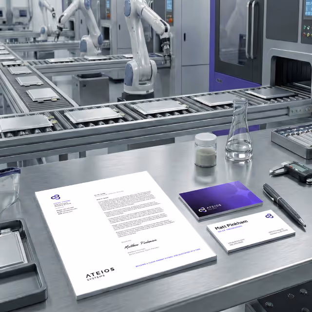
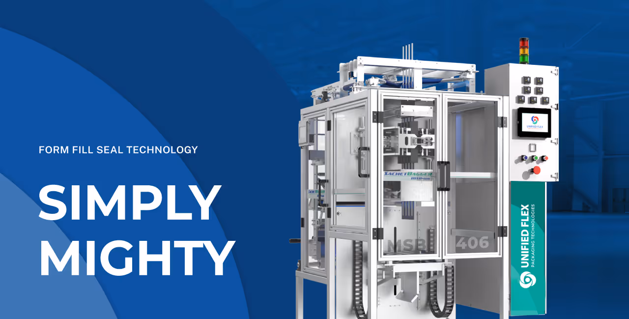
Unified Flex had built a strong reputation for producing high-quality Form Fill & Seal machines and flexible packaging materials. Their name and logo held valuable brand equity, but the supporting identity lacked cohesion, clarity, and depth. With plans to expand their marketing efforts, update their website, and solidify their standing in the flexible packaging industry, the Unified Flex team needed a brand refresh that retained their visual legacy while elevating the overall experience.
Quill Creative Studio developed a refreshed brand built on a strategic foundation centered on collaboration, simplicity, and industry expertise. Core brand pillars such as Simplified Experience, Form Fill & Seal Focus, and Sustainability guided the development of messaging and design. We refined their voice to sound confident, knowledgeable, and clear. The visual identity system added polish and energy while remaining true to the existing brand.
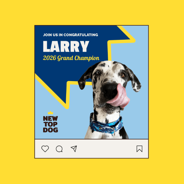
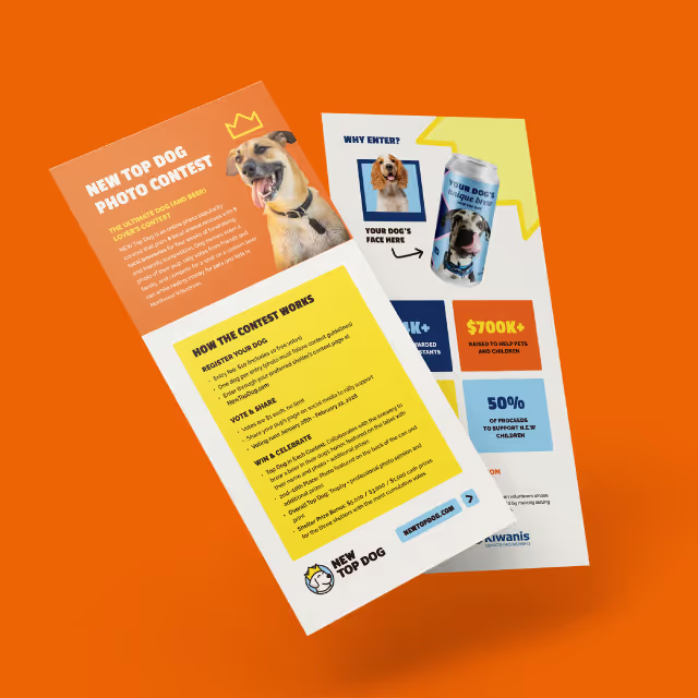
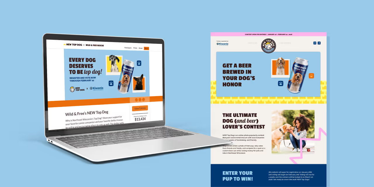
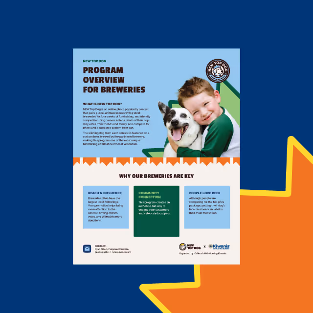
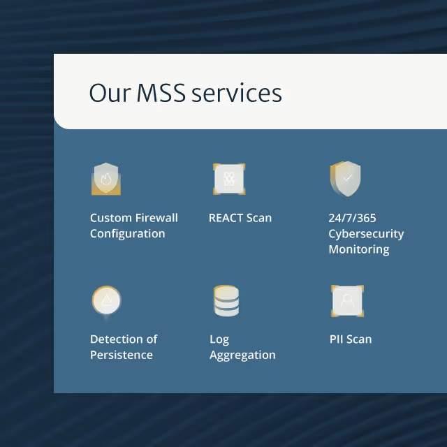
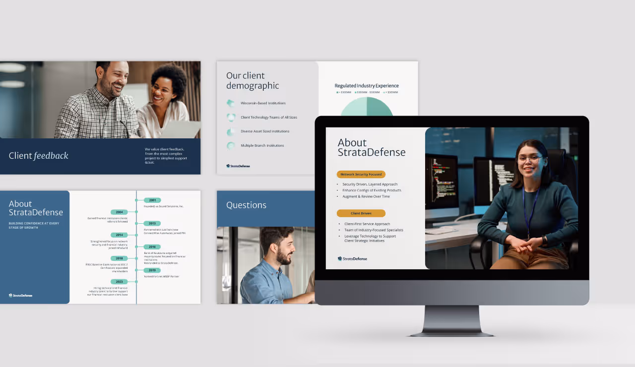
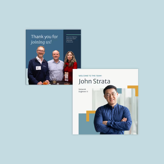
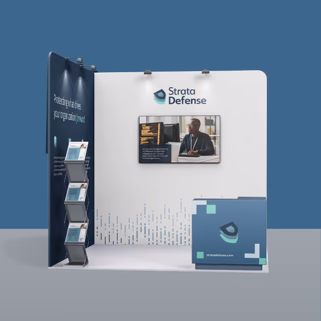
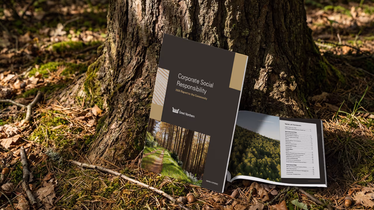
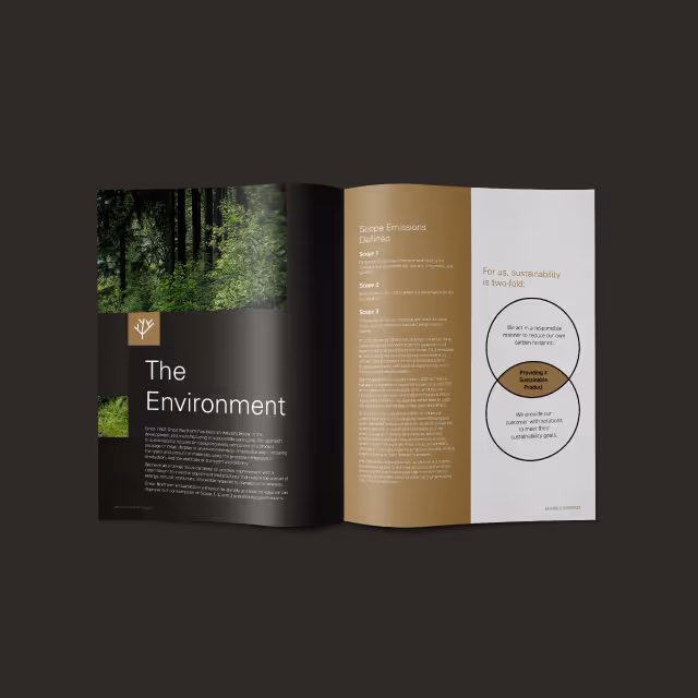
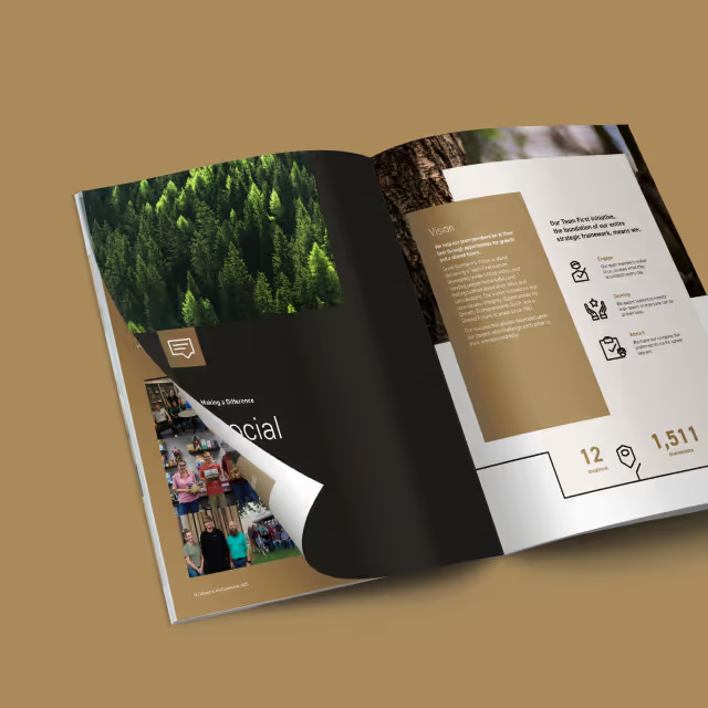
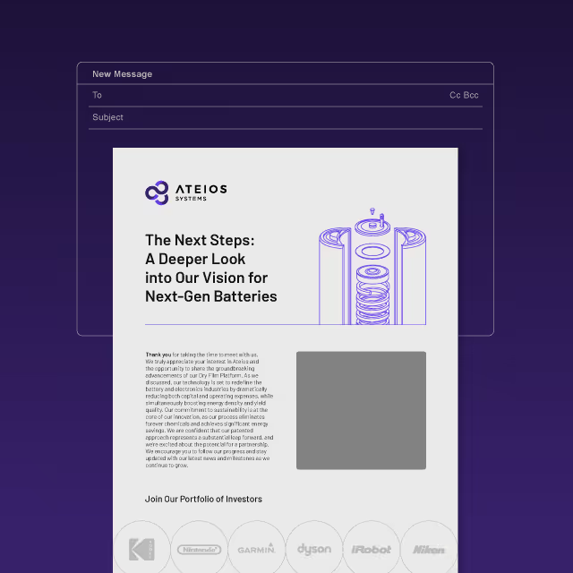
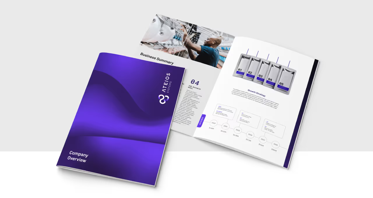
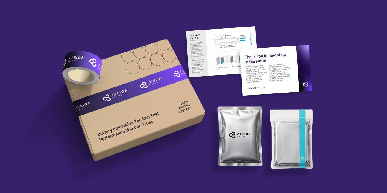
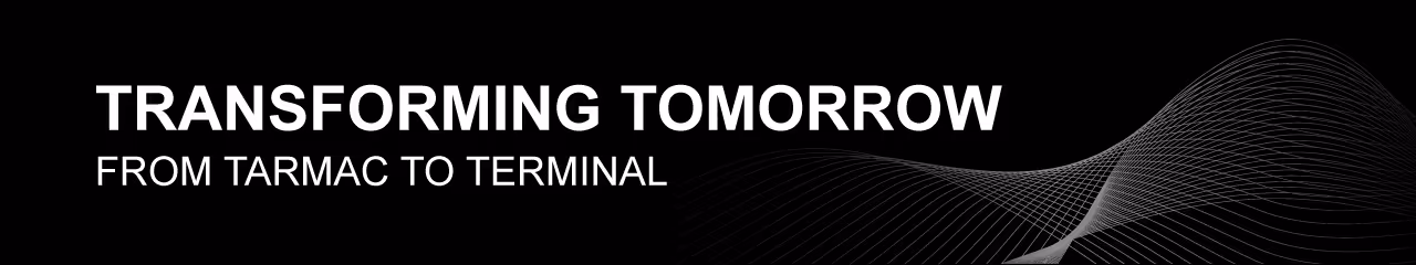
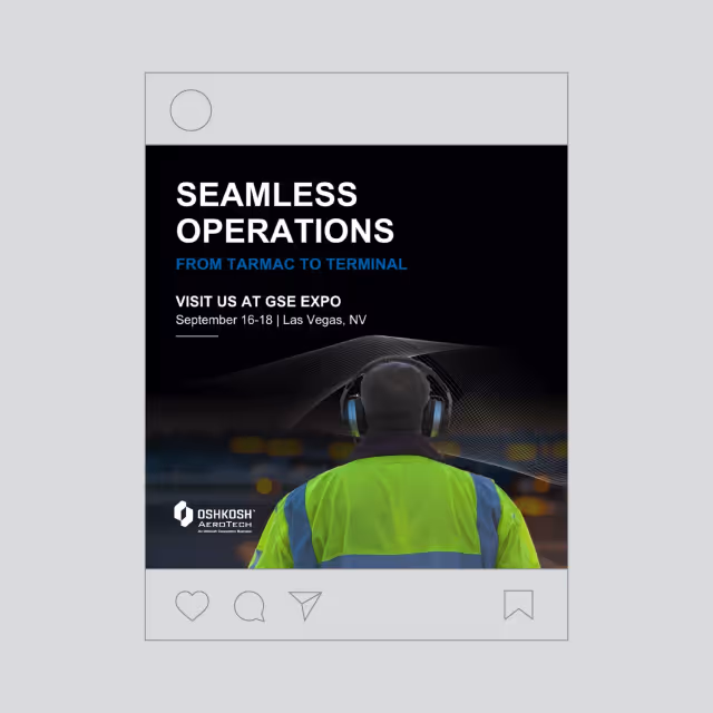
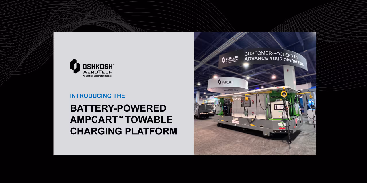
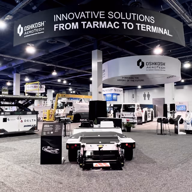
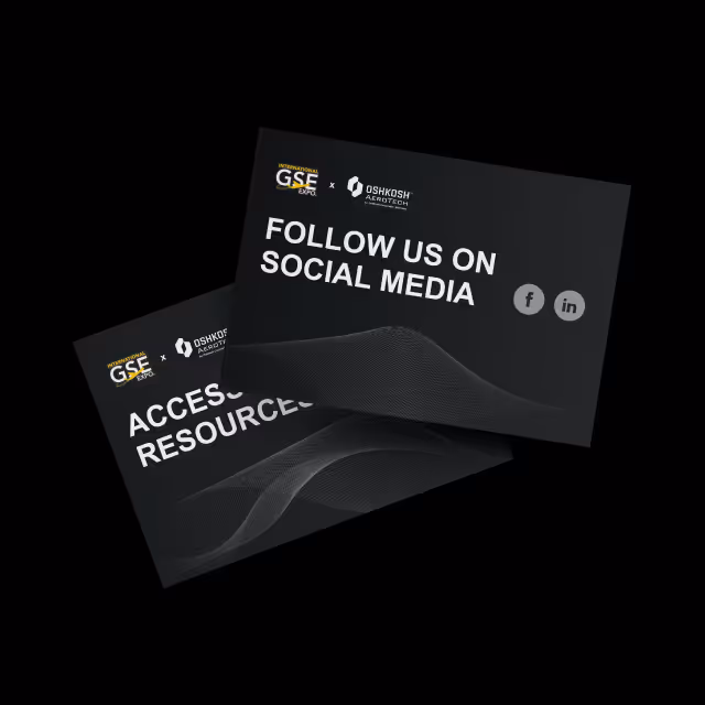
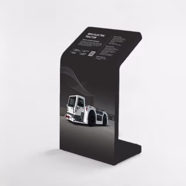
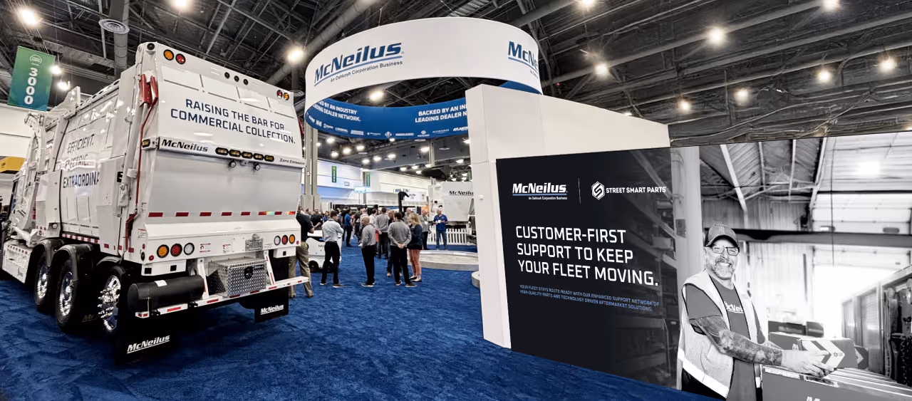
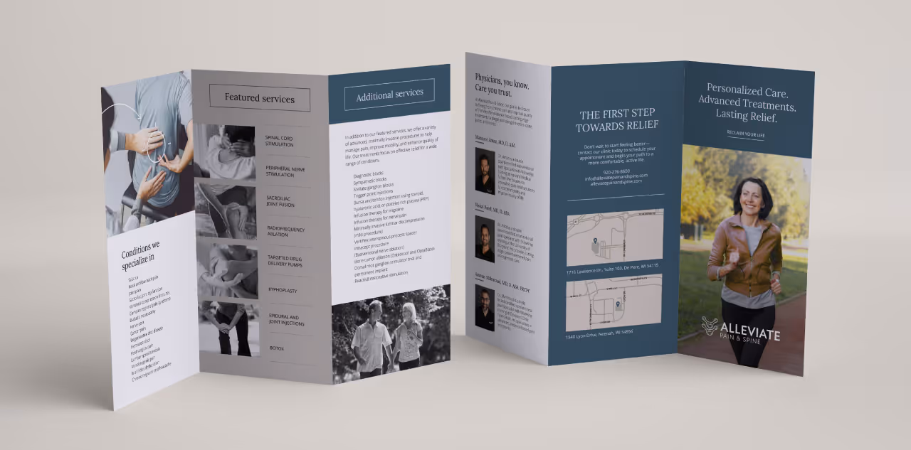
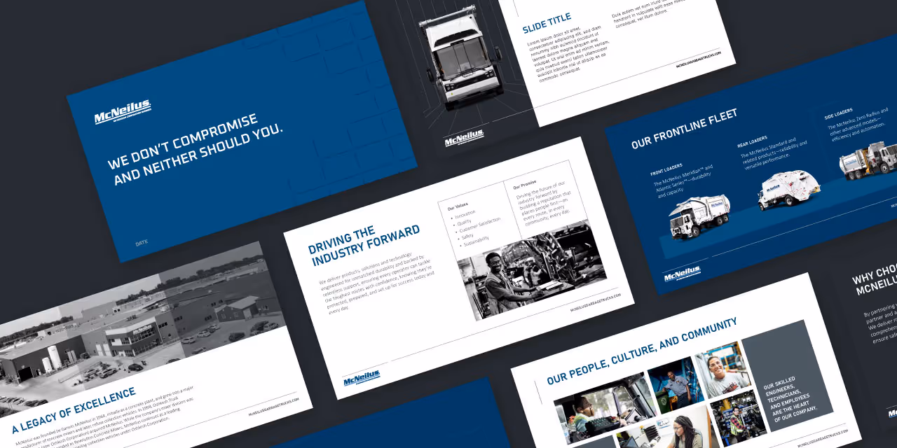
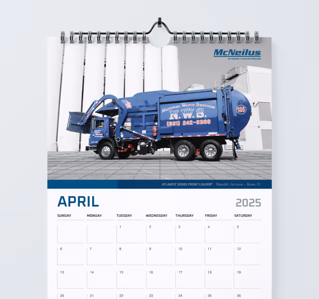
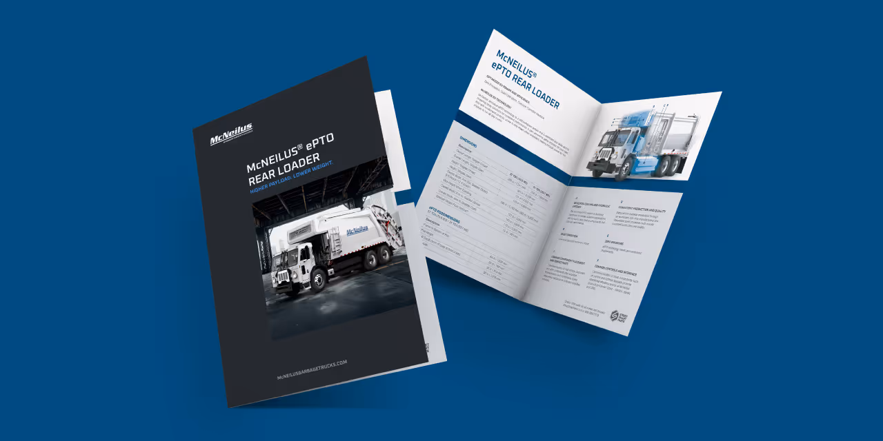
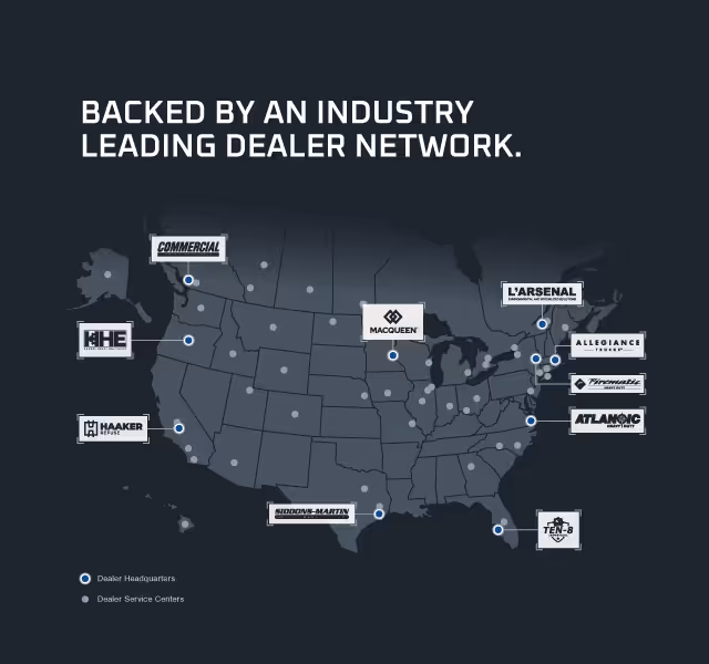
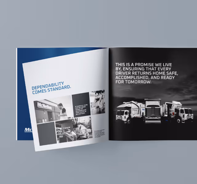
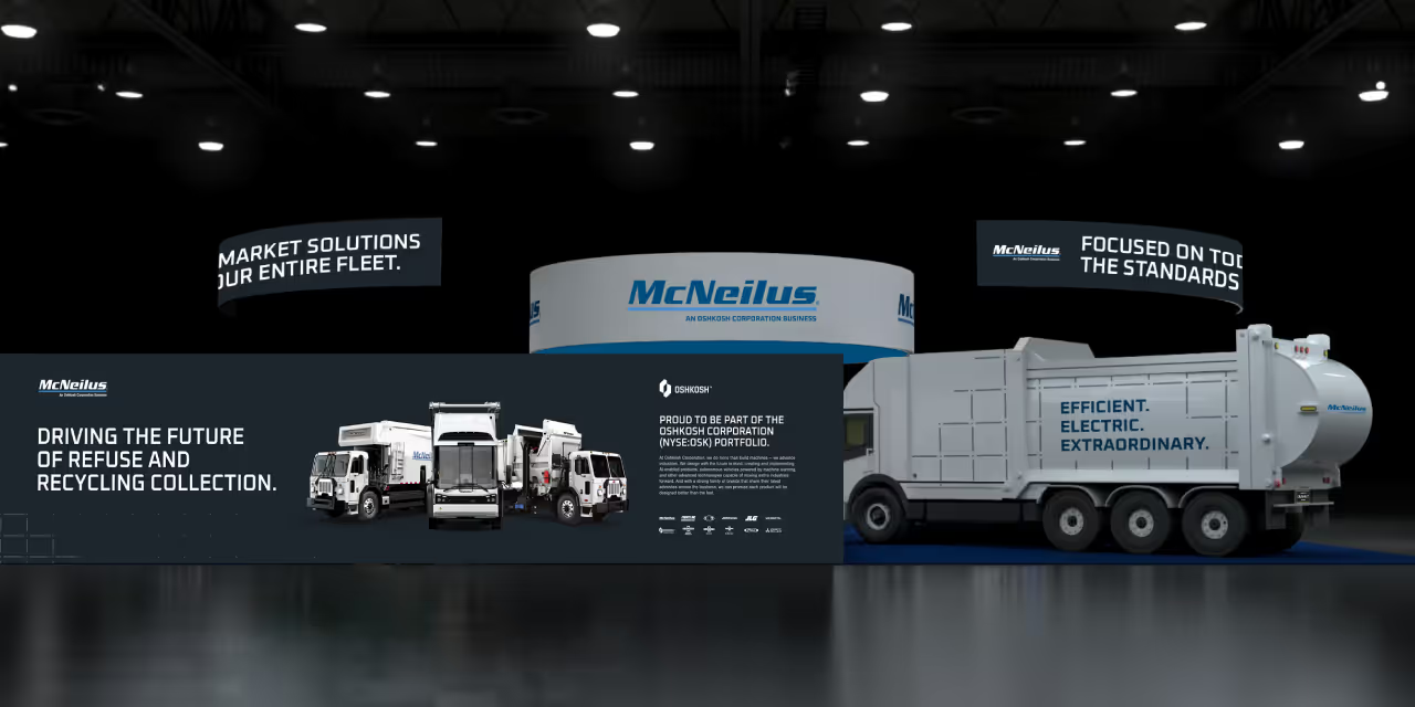
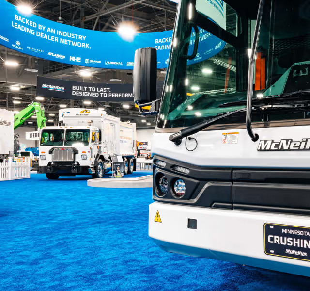
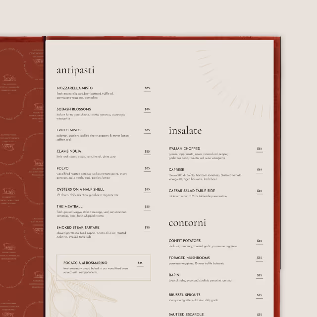
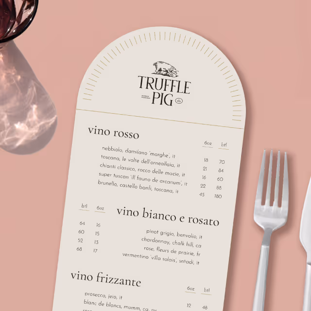
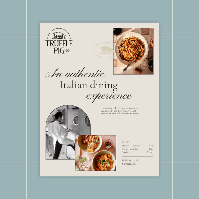
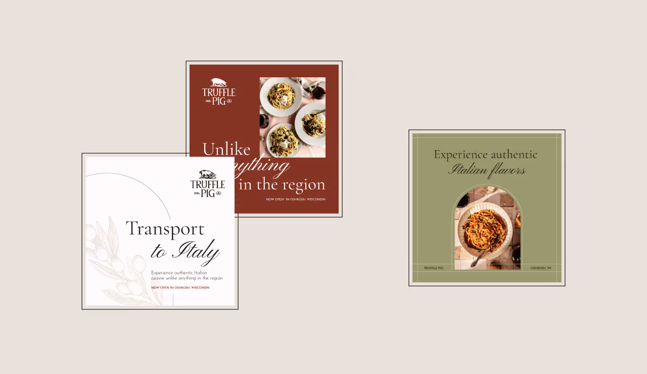
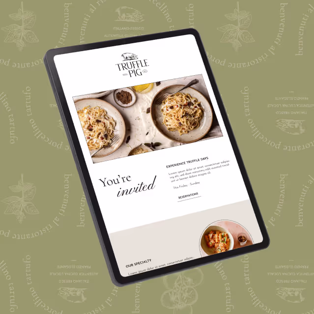
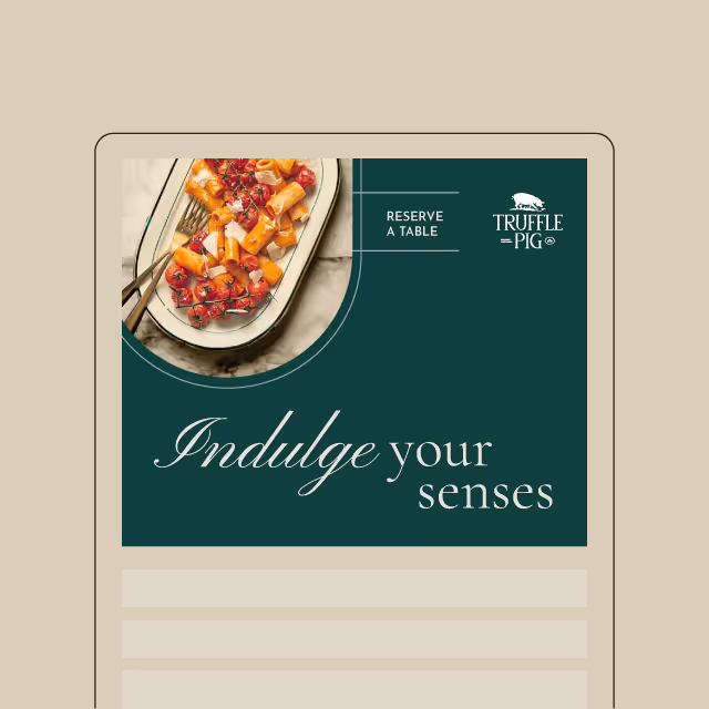
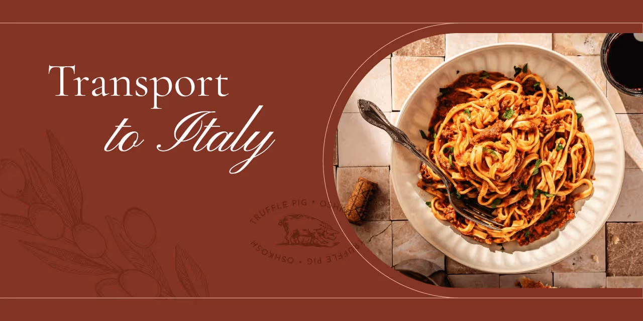
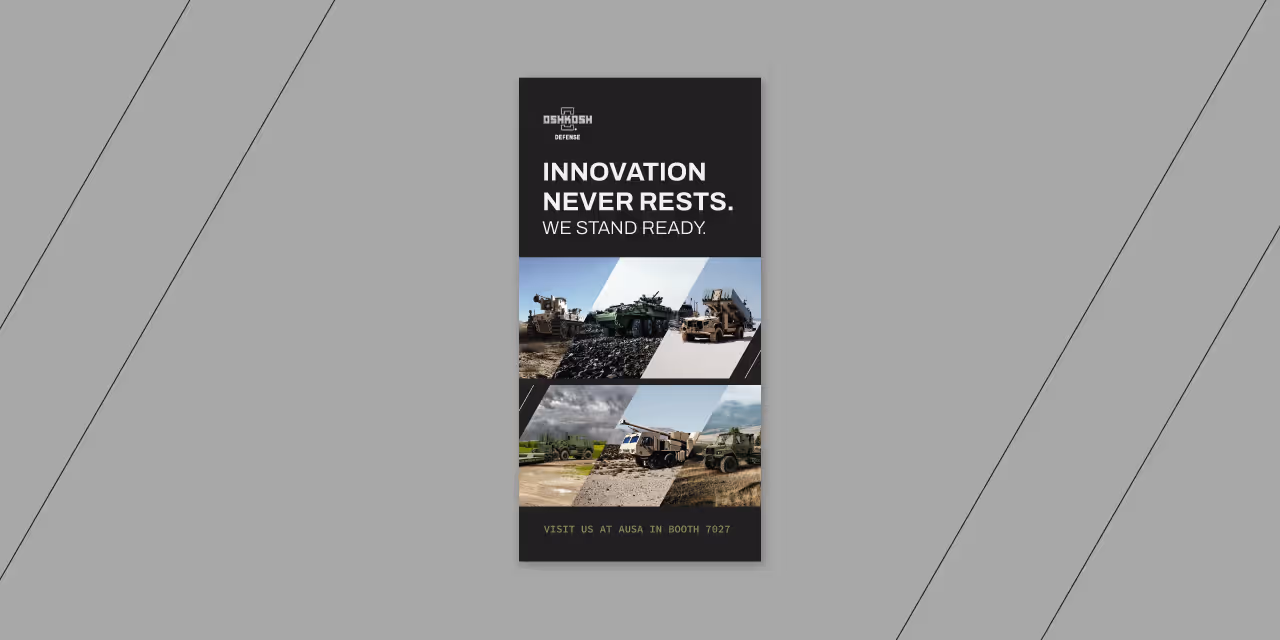
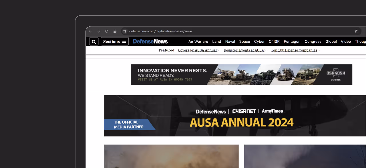
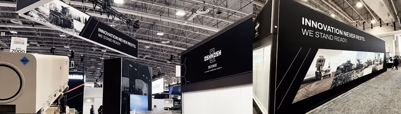
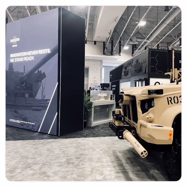
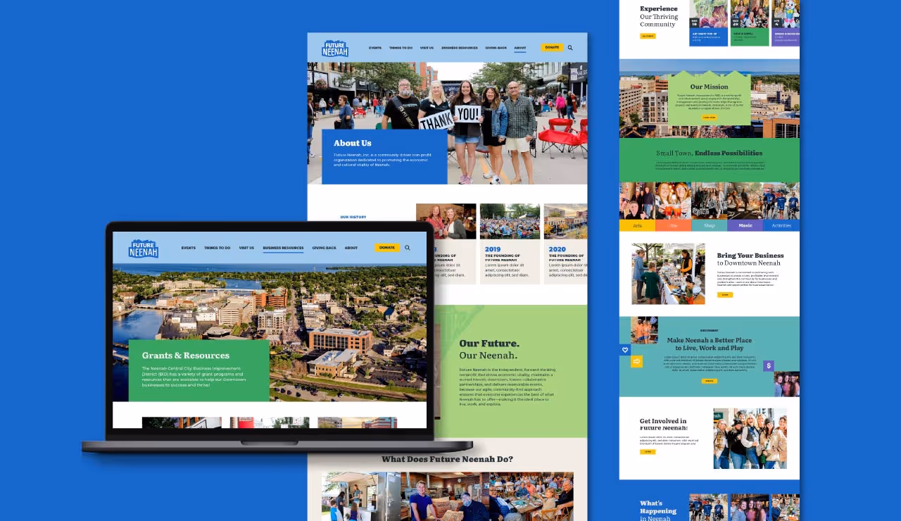
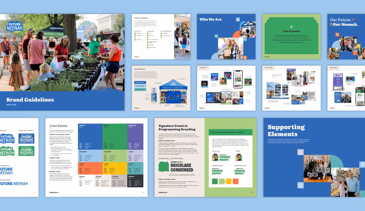
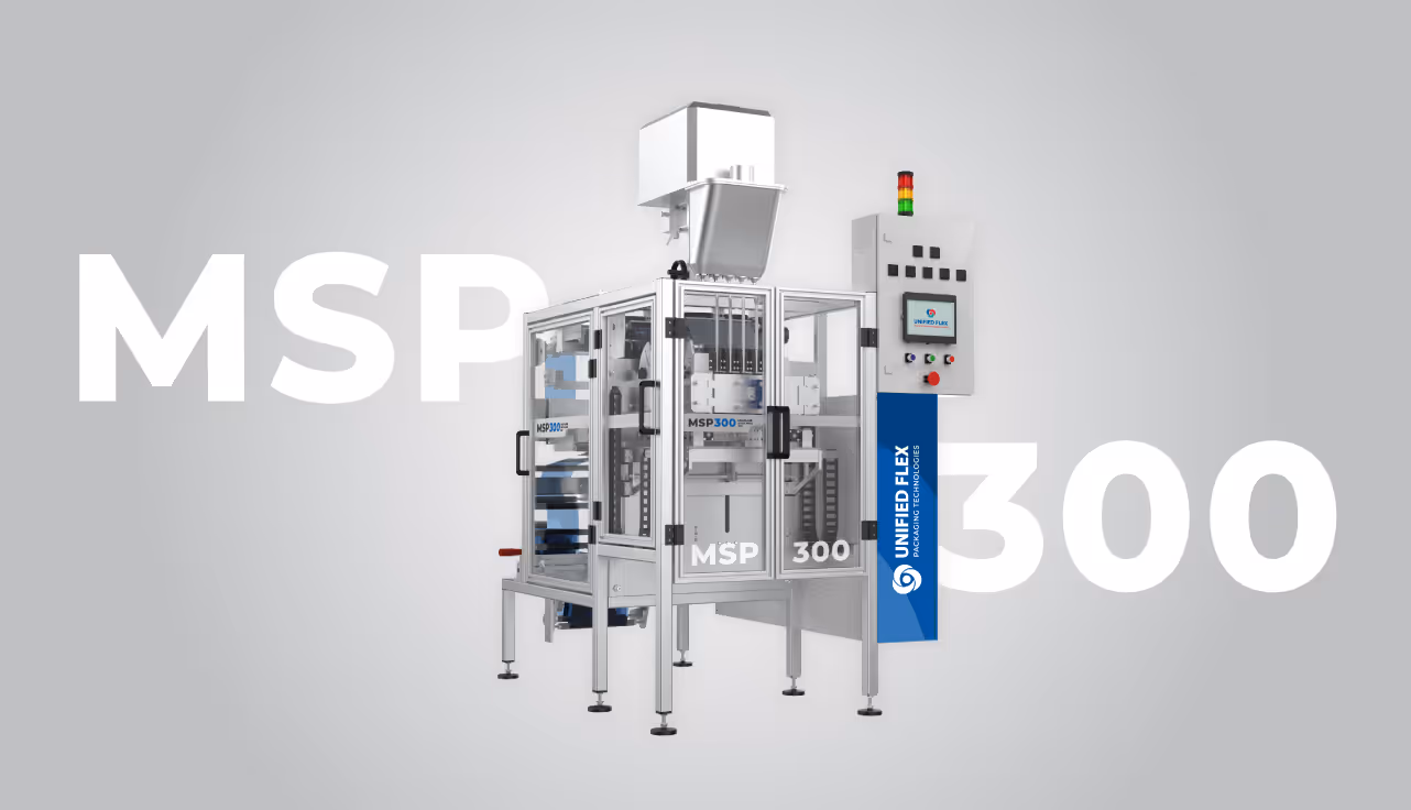
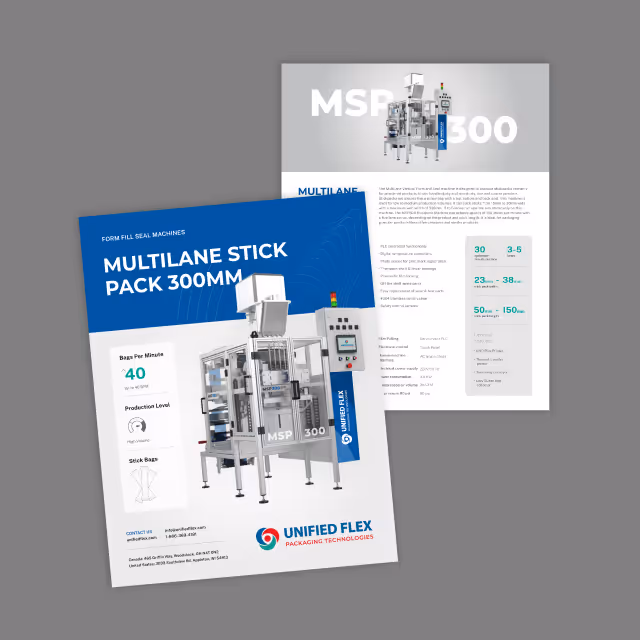
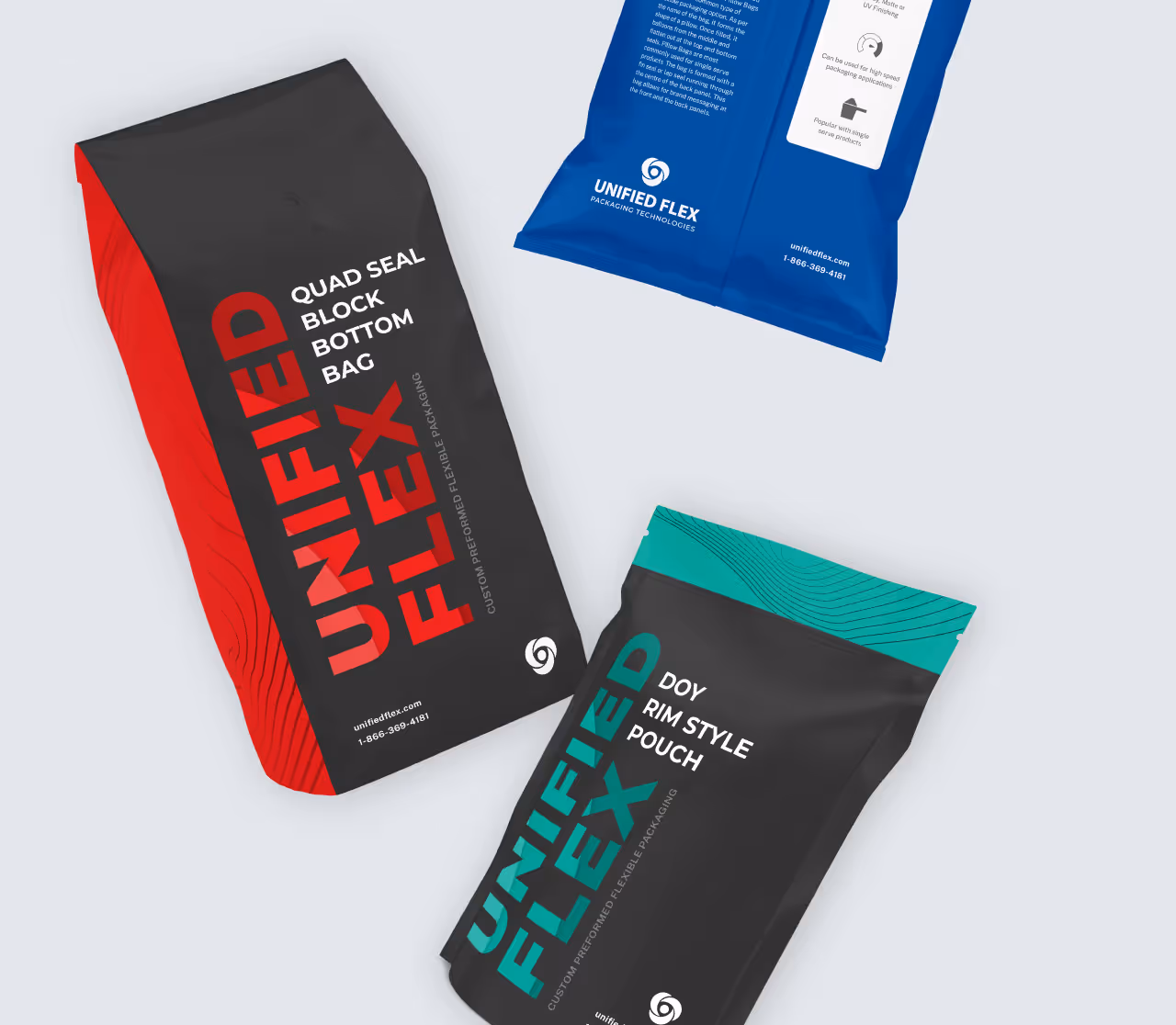
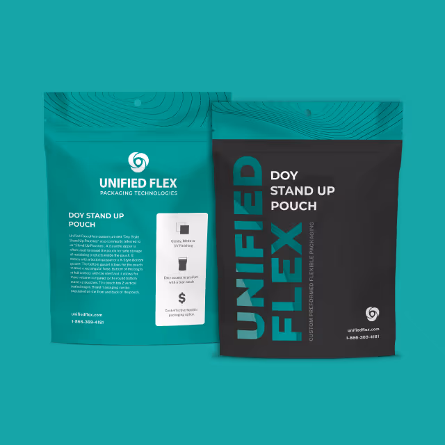
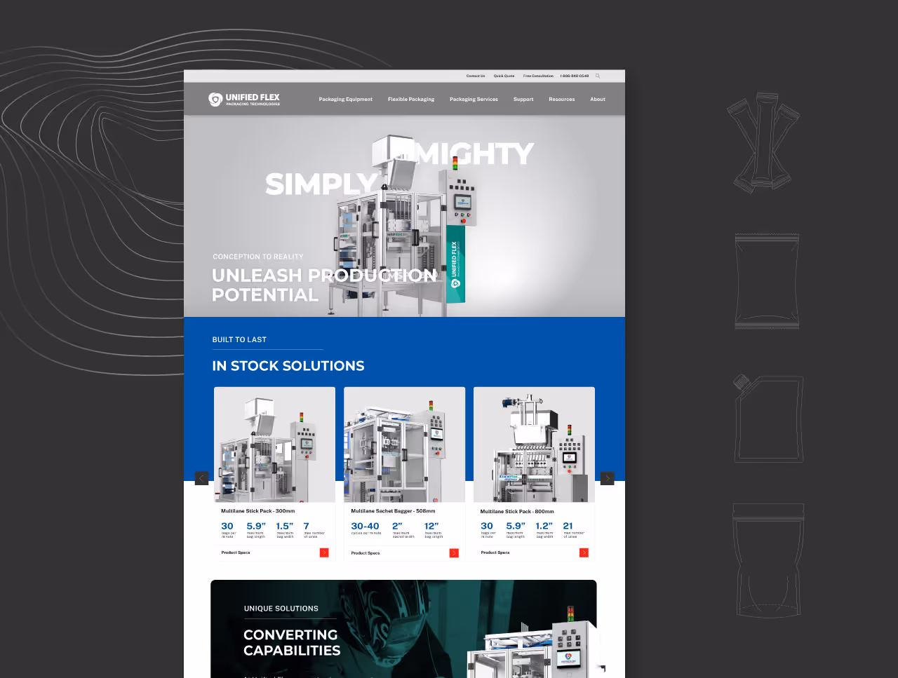
To validate and apply the refreshed identity, we extended the system across key customer and marketing touchpoints including a redesigned website, sales materials, machine graphics, and tradeshow environments. A flexible design system of warped line patterns, expanding arch shapes, and purposeful color use gave the brand a sense of strength and motion. These elements support the core message that Unified Flex machines are reliable, simple to operate, and built to perform.

Unified Flex Packaging Technologies now has a cohesive and elevated brand experience that reinforces their value in the market. The updated identity allows their team to communicate more clearly and stand out with confidence, while preserving the logo that built their reputation. With a more strategic and modern presentation, Unified Flex is positioned for long-term growth and stronger customer engagement.
Unified Flex had built a strong reputation for producing high-quality Form Fill & Seal machines and flexible packaging materials. Their name and logo held valuable brand equity, but the supporting identity lacked cohesion, clarity, and depth. With plans to expand their marketing efforts, update their website, and solidify their standing in the flexible packaging industry, the Unified Flex team needed a brand refresh that retained their visual legacy while elevating the overall experience.
Quill Creative Studio developed a refreshed brand built on a strategic foundation centered on collaboration, simplicity, and industry expertise. Core brand pillars such as Simplified Experience, Form Fill & Seal Focus, and Sustainability guided the development of messaging and design. We refined their voice to sound confident, knowledgeable, and clear. The visual identity system added polish and energy while remaining true to the existing brand.
To validate and apply the refreshed identity, we extended the system across key customer and marketing touchpoints including a redesigned website, sales materials, machine graphics, and tradeshow environments. A flexible design system of warped line patterns, expanding arch shapes, and purposeful color use gave the brand a sense of strength and motion. These elements support the core message that Unified Flex machines are reliable, simple to operate, and built to perform.

Unified Flex Packaging Technologies now has a cohesive and elevated brand experience that reinforces their value in the market. The updated identity allows their team to communicate more clearly and stand out with confidence, while preserving the logo that built their reputation. With a more strategic and modern presentation, Unified Flex is positioned for long-term growth and stronger customer engagement.


Unified Flex had built a strong reputation for producing high-quality Form Fill & Seal machines and flexible packaging materials. Their name and logo held valuable brand equity, but the supporting identity lacked cohesion, clarity, and depth. With plans to expand their marketing efforts, update their website, and solidify their standing in the flexible packaging industry, the Unified Flex team needed a brand refresh that retained their visual legacy while elevating the overall experience.
Quill Creative Studio developed a refreshed brand built on a strategic foundation centered on collaboration, simplicity, and industry expertise. Core brand pillars such as Simplified Experience, Form Fill & Seal Focus, and Sustainability guided the development of messaging and design. We refined their voice to sound confident, knowledgeable, and clear. The visual identity system added polish and energy while remaining true to the existing brand.
To validate and apply the refreshed identity, we extended the system across key customer and marketing touchpoints including a redesigned website, sales materials, machine graphics, and tradeshow environments. A flexible design system of warped line patterns, expanding arch shapes, and purposeful color use gave the brand a sense of strength and motion. These elements support the core message that Unified Flex machines are reliable, simple to operate, and built to perform.


Unified Flex Packaging Technologies now has a cohesive and elevated brand experience that reinforces their value in the market. The updated identity allows their team to communicate more clearly and stand out with confidence, while preserving the logo that built their reputation. With a more strategic and modern presentation, Unified Flex is positioned for long-term growth and stronger customer engagement.

Unified Flex had built a strong reputation for producing high-quality Form Fill & Seal machines and flexible packaging materials. Their name and logo held valuable brand equity, but the supporting identity lacked cohesion, clarity, and depth. With plans to expand their marketing efforts, update their website, and solidify their standing in the flexible packaging industry, the Unified Flex team needed a brand refresh that retained their visual legacy while elevating the overall experience.
Quill Creative Studio developed a refreshed brand built on a strategic foundation centered on collaboration, simplicity, and industry expertise. Core brand pillars such as Simplified Experience, Form Fill & Seal Focus, and Sustainability guided the development of messaging and design. We refined their voice to sound confident, knowledgeable, and clear. The visual identity system added polish and energy while remaining true to the existing brand.
To validate and apply the refreshed identity, we extended the system across key customer and marketing touchpoints including a redesigned website, sales materials, machine graphics, and tradeshow environments. A flexible design system of warped line patterns, expanding arch shapes, and purposeful color use gave the brand a sense of strength and motion. These elements support the core message that Unified Flex machines are reliable, simple to operate, and built to perform.

Unified Flex Packaging Technologies now has a cohesive and elevated brand experience that reinforces their value in the market. The updated identity allows their team to communicate more clearly and stand out with confidence, while preserving the logo that built their reputation. With a more strategic and modern presentation, Unified Flex is positioned for long-term growth and stronger customer engagement.
Unified Flex had built a strong reputation for producing high-quality Form Fill & Seal machines and flexible packaging materials. Their name and logo held valuable brand equity, but the supporting identity lacked cohesion, clarity, and depth. With plans to expand their marketing efforts, update their website, and solidify their standing in the flexible packaging industry, the Unified Flex team needed a brand refresh that retained their visual legacy while elevating the overall experience.

Quill Creative Studio developed a refreshed brand built on a strategic foundation centered on collaboration, simplicity, and industry expertise. Core brand pillars such as Simplified Experience, Form Fill & Seal Focus, and Sustainability guided the development of messaging and design. We refined their voice to sound confident, knowledgeable, and clear. The visual identity system added polish and energy while remaining true to the existing brand.
To validate and apply the refreshed identity, we extended the system across key customer and marketing touchpoints including a redesigned website, sales materials, machine graphics, and tradeshow environments. A flexible design system of warped line patterns, expanding arch shapes, and purposeful color use gave the brand a sense of strength and motion. These elements support the core message that Unified Flex machines are reliable, simple to operate, and built to perform.
Unified Flex Packaging Technologies now has a cohesive and elevated brand experience that reinforces their value in the market. The updated identity allows their team to communicate more clearly and stand out with confidence, while preserving the logo that built their reputation. With a more strategic and modern presentation, Unified Flex is positioned for long-term growth and stronger customer engagement.
Unified Flex had built a strong reputation for producing high-quality Form Fill & Seal machines and flexible packaging materials. Their name and logo held valuable brand equity, but the supporting identity lacked cohesion, clarity, and depth. With plans to expand their marketing efforts, update their website, and solidify their standing in the flexible packaging industry, the Unified Flex team needed a brand refresh that retained their visual legacy while elevating the overall experience.

Quill Creative Studio developed a refreshed brand built on a strategic foundation centered on collaboration, simplicity, and industry expertise. Core brand pillars such as Simplified Experience, Form Fill & Seal Focus, and Sustainability guided the development of messaging and design. We refined their voice to sound confident, knowledgeable, and clear. The visual identity system added polish and energy while remaining true to the existing brand.
To validate and apply the refreshed identity, we extended the system across key customer and marketing touchpoints including a redesigned website, sales materials, machine graphics, and tradeshow environments. A flexible design system of warped line patterns, expanding arch shapes, and purposeful color use gave the brand a sense of strength and motion. These elements support the core message that Unified Flex machines are reliable, simple to operate, and built to perform.

Unified Flex Packaging Technologies now has a cohesive and elevated brand experience that reinforces their value in the market. The updated identity allows their team to communicate more clearly and stand out with confidence, while preserving the logo that built their reputation. With a more strategic and modern presentation, Unified Flex is positioned for long-term growth and stronger customer engagement.


Unified Flex had built a strong reputation for producing high-quality Form Fill & Seal machines and flexible packaging materials. Their name and logo held valuable brand equity, but the supporting identity lacked cohesion, clarity, and depth. With plans to expand their marketing efforts, update their website, and solidify their standing in the flexible packaging industry, the Unified Flex team needed a brand refresh that retained their visual legacy while elevating the overall experience.
Quill Creative Studio developed a refreshed brand built on a strategic foundation centered on collaboration, simplicity, and industry expertise. Core brand pillars such as Simplified Experience, Form Fill & Seal Focus, and Sustainability guided the development of messaging and design. We refined their voice to sound confident, knowledgeable, and clear. The visual identity system added polish and energy while remaining true to the existing brand.
To validate and apply the refreshed identity, we extended the system across key customer and marketing touchpoints including a redesigned website, sales materials, machine graphics, and tradeshow environments. A flexible design system of warped line patterns, expanding arch shapes, and purposeful color use gave the brand a sense of strength and motion. These elements support the core message that Unified Flex machines are reliable, simple to operate, and built to perform.
Unified Flex Packaging Technologies now has a cohesive and elevated brand experience that reinforces their value in the market. The updated identity allows their team to communicate more clearly and stand out with confidence, while preserving the logo that built their reputation. With a more strategic and modern presentation, Unified Flex is positioned for long-term growth and stronger customer engagement.


Unified Flex had built a strong reputation for producing high-quality Form Fill & Seal machines and flexible packaging materials. Their name and logo held valuable brand equity, but the supporting identity lacked cohesion, clarity, and depth. With plans to expand their marketing efforts, update their website, and solidify their standing in the flexible packaging industry, the Unified Flex team needed a brand refresh that retained their visual legacy while elevating the overall experience.

Quill Creative Studio developed a refreshed brand built on a strategic foundation centered on collaboration, simplicity, and industry expertise. Core brand pillars such as Simplified Experience, Form Fill & Seal Focus, and Sustainability guided the development of messaging and design. We refined their voice to sound confident, knowledgeable, and clear. The visual identity system added polish and energy while remaining true to the existing brand.
To validate and apply the refreshed identity, we extended the system across key customer and marketing touchpoints including a redesigned website, sales materials, machine graphics, and tradeshow environments. A flexible design system of warped line patterns, expanding arch shapes, and purposeful color use gave the brand a sense of strength and motion. These elements support the core message that Unified Flex machines are reliable, simple to operate, and built to perform.


Unified Flex Packaging Technologies now has a cohesive and elevated brand experience that reinforces their value in the market. The updated identity allows their team to communicate more clearly and stand out with confidence, while preserving the logo that built their reputation. With a more strategic and modern presentation, Unified Flex is positioned for long-term growth and stronger customer engagement.

Unified Flex had built a strong reputation for producing high-quality Form Fill & Seal machines and flexible packaging materials. Their name and logo held valuable brand equity, but the supporting identity lacked cohesion, clarity, and depth. With plans to expand their marketing efforts, update their website, and solidify their standing in the flexible packaging industry, the Unified Flex team needed a brand refresh that retained their visual legacy while elevating the overall experience.
Quill Creative Studio developed a refreshed brand built on a strategic foundation centered on collaboration, simplicity, and industry expertise. Core brand pillars such as Simplified Experience, Form Fill & Seal Focus, and Sustainability guided the development of messaging and design. We refined their voice to sound confident, knowledgeable, and clear. The visual identity system added polish and energy while remaining true to the existing brand.
To validate and apply the refreshed identity, we extended the system across key customer and marketing touchpoints including a redesigned website, sales materials, machine graphics, and tradeshow environments. A flexible design system of warped line patterns, expanding arch shapes, and purposeful color use gave the brand a sense of strength and motion. These elements support the core message that Unified Flex machines are reliable, simple to operate, and built to perform.
Unified Flex Packaging Technologies now has a cohesive and elevated brand experience that reinforces their value in the market. The updated identity allows their team to communicate more clearly and stand out with confidence, while preserving the logo that built their reputation. With a more strategic and modern presentation, Unified Flex is positioned for long-term growth and stronger customer engagement.
Unified Flex had built a strong reputation for producing high-quality Form Fill & Seal machines and flexible packaging materials. Their name and logo held valuable brand equity, but the supporting identity lacked cohesion, clarity, and depth. With plans to expand their marketing efforts, update their website, and solidify their standing in the flexible packaging industry, the Unified Flex team needed a brand refresh that retained their visual legacy while elevating the overall experience.

Quill Creative Studio developed a refreshed brand built on a strategic foundation centered on collaboration, simplicity, and industry expertise. Core brand pillars such as Simplified Experience, Form Fill & Seal Focus, and Sustainability guided the development of messaging and design. We refined their voice to sound confident, knowledgeable, and clear. The visual identity system added polish and energy while remaining true to the existing brand.
To validate and apply the refreshed identity, we extended the system across key customer and marketing touchpoints including a redesigned website, sales materials, machine graphics, and tradeshow environments. A flexible design system of warped line patterns, expanding arch shapes, and purposeful color use gave the brand a sense of strength and motion. These elements support the core message that Unified Flex machines are reliable, simple to operate, and built to perform.
Unified Flex Packaging Technologies now has a cohesive and elevated brand experience that reinforces their value in the market. The updated identity allows their team to communicate more clearly and stand out with confidence, while preserving the logo that built their reputation. With a more strategic and modern presentation, Unified Flex is positioned for long-term growth and stronger customer engagement.

Unified Flex had built a strong reputation for producing high-quality Form Fill & Seal machines and flexible packaging materials. Their name and logo held valuable brand equity, but the supporting identity lacked cohesion, clarity, and depth. With plans to expand their marketing efforts, update their website, and solidify their standing in the flexible packaging industry, the Unified Flex team needed a brand refresh that retained their visual legacy while elevating the overall experience.

Quill Creative Studio developed a refreshed brand built on a strategic foundation centered on collaboration, simplicity, and industry expertise. Core brand pillars such as Simplified Experience, Form Fill & Seal Focus, and Sustainability guided the development of messaging and design. We refined their voice to sound confident, knowledgeable, and clear. The visual identity system added polish and energy while remaining true to the existing brand.
To validate and apply the refreshed identity, we extended the system across key customer and marketing touchpoints including a redesigned website, sales materials, machine graphics, and tradeshow environments. A flexible design system of warped line patterns, expanding arch shapes, and purposeful color use gave the brand a sense of strength and motion. These elements support the core message that Unified Flex machines are reliable, simple to operate, and built to perform.
Unified Flex Packaging Technologies now has a cohesive and elevated brand experience that reinforces their value in the market. The updated identity allows their team to communicate more clearly and stand out with confidence, while preserving the logo that built their reputation. With a more strategic and modern presentation, Unified Flex is positioned for long-term growth and stronger customer engagement.


Unified Flex had built a strong reputation for producing high-quality Form Fill & Seal machines and flexible packaging materials. Their name and logo held valuable brand equity, but the supporting identity lacked cohesion, clarity, and depth. With plans to expand their marketing efforts, update their website, and solidify their standing in the flexible packaging industry, the Unified Flex team needed a brand refresh that retained their visual legacy while elevating the overall experience.


Quill Creative Studio developed a refreshed brand built on a strategic foundation centered on collaboration, simplicity, and industry expertise. Core brand pillars such as Simplified Experience, Form Fill & Seal Focus, and Sustainability guided the development of messaging and design. We refined their voice to sound confident, knowledgeable, and clear. The visual identity system added polish and energy while remaining true to the existing brand.
To validate and apply the refreshed identity, we extended the system across key customer and marketing touchpoints including a redesigned website, sales materials, machine graphics, and tradeshow environments. A flexible design system of warped line patterns, expanding arch shapes, and purposeful color use gave the brand a sense of strength and motion. These elements support the core message that Unified Flex machines are reliable, simple to operate, and built to perform.

Unified Flex Packaging Technologies now has a cohesive and elevated brand experience that reinforces their value in the market. The updated identity allows their team to communicate more clearly and stand out with confidence, while preserving the logo that built their reputation. With a more strategic and modern presentation, Unified Flex is positioned for long-term growth and stronger customer engagement.


Unified Flex had built a strong reputation for producing high-quality Form Fill & Seal machines and flexible packaging materials. Their name and logo held valuable brand equity, but the supporting identity lacked cohesion, clarity, and depth. With plans to expand their marketing efforts, update their website, and solidify their standing in the flexible packaging industry, the Unified Flex team needed a brand refresh that retained their visual legacy while elevating the overall experience.

Quill Creative Studio developed a refreshed brand built on a strategic foundation centered on collaboration, simplicity, and industry expertise. Core brand pillars such as Simplified Experience, Form Fill & Seal Focus, and Sustainability guided the development of messaging and design. We refined their voice to sound confident, knowledgeable, and clear. The visual identity system added polish and energy while remaining true to the existing brand.
To validate and apply the refreshed identity, we extended the system across key customer and marketing touchpoints including a redesigned website, sales materials, machine graphics, and tradeshow environments. A flexible design system of warped line patterns, expanding arch shapes, and purposeful color use gave the brand a sense of strength and motion. These elements support the core message that Unified Flex machines are reliable, simple to operate, and built to perform.


Unified Flex Packaging Technologies now has a cohesive and elevated brand experience that reinforces their value in the market. The updated identity allows their team to communicate more clearly and stand out with confidence, while preserving the logo that built their reputation. With a more strategic and modern presentation, Unified Flex is positioned for long-term growth and stronger customer engagement.


Unified Flex had built a strong reputation for producing high-quality Form Fill & Seal machines and flexible packaging materials. Their name and logo held valuable brand equity, but the supporting identity lacked cohesion, clarity, and depth. With plans to expand their marketing efforts, update their website, and solidify their standing in the flexible packaging industry, the Unified Flex team needed a brand refresh that retained their visual legacy while elevating the overall experience.


Quill Creative Studio developed a refreshed brand built on a strategic foundation centered on collaboration, simplicity, and industry expertise. Core brand pillars such as Simplified Experience, Form Fill & Seal Focus, and Sustainability guided the development of messaging and design. We refined their voice to sound confident, knowledgeable, and clear. The visual identity system added polish and energy while remaining true to the existing brand.
To validate and apply the refreshed identity, we extended the system across key customer and marketing touchpoints including a redesigned website, sales materials, machine graphics, and tradeshow environments. A flexible design system of warped line patterns, expanding arch shapes, and purposeful color use gave the brand a sense of strength and motion. These elements support the core message that Unified Flex machines are reliable, simple to operate, and built to perform.


Unified Flex Packaging Technologies now has a cohesive and elevated brand experience that reinforces their value in the market. The updated identity allows their team to communicate more clearly and stand out with confidence, while preserving the logo that built their reputation. With a more strategic and modern presentation, Unified Flex is positioned for long-term growth and stronger customer engagement.


Unified Flex had built a strong reputation for producing high-quality Form Fill & Seal machines and flexible packaging materials. Their name and logo held valuable brand equity, but the supporting identity lacked cohesion, clarity, and depth. With plans to expand their marketing efforts, update their website, and solidify their standing in the flexible packaging industry, the Unified Flex team needed a brand refresh that retained their visual legacy while elevating the overall experience.


Quill Creative Studio developed a refreshed brand built on a strategic foundation centered on collaboration, simplicity, and industry expertise. Core brand pillars such as Simplified Experience, Form Fill & Seal Focus, and Sustainability guided the development of messaging and design. We refined their voice to sound confident, knowledgeable, and clear. The visual identity system added polish and energy while remaining true to the existing brand.
To validate and apply the refreshed identity, we extended the system across key customer and marketing touchpoints including a redesigned website, sales materials, machine graphics, and tradeshow environments. A flexible design system of warped line patterns, expanding arch shapes, and purposeful color use gave the brand a sense of strength and motion. These elements support the core message that Unified Flex machines are reliable, simple to operate, and built to perform.

Unified Flex Packaging Technologies now has a cohesive and elevated brand experience that reinforces their value in the market. The updated identity allows their team to communicate more clearly and stand out with confidence, while preserving the logo that built their reputation. With a more strategic and modern presentation, Unified Flex is positioned for long-term growth and stronger customer engagement.


Unified Flex had built a strong reputation for producing high-quality Form Fill & Seal machines and flexible packaging materials. Their name and logo held valuable brand equity, but the supporting identity lacked cohesion, clarity, and depth. With plans to expand their marketing efforts, update their website, and solidify their standing in the flexible packaging industry, the Unified Flex team needed a brand refresh that retained their visual legacy while elevating the overall experience.

Quill Creative Studio developed a refreshed brand built on a strategic foundation centered on collaboration, simplicity, and industry expertise. Core brand pillars such as Simplified Experience, Form Fill & Seal Focus, and Sustainability guided the development of messaging and design. We refined their voice to sound confident, knowledgeable, and clear. The visual identity system added polish and energy while remaining true to the existing brand.
To validate and apply the refreshed identity, we extended the system across key customer and marketing touchpoints including a redesigned website, sales materials, machine graphics, and tradeshow environments. A flexible design system of warped line patterns, expanding arch shapes, and purposeful color use gave the brand a sense of strength and motion. These elements support the core message that Unified Flex machines are reliable, simple to operate, and built to perform.


Unified Flex Packaging Technologies now has a cohesive and elevated brand experience that reinforces their value in the market. The updated identity allows their team to communicate more clearly and stand out with confidence, while preserving the logo that built their reputation. With a more strategic and modern presentation, Unified Flex is positioned for long-term growth and stronger customer engagement.


Unified Flex had built a strong reputation for producing high-quality Form Fill & Seal machines and flexible packaging materials. Their name and logo held valuable brand equity, but the supporting identity lacked cohesion, clarity, and depth. With plans to expand their marketing efforts, update their website, and solidify their standing in the flexible packaging industry, the Unified Flex team needed a brand refresh that retained their visual legacy while elevating the overall experience.


Quill Creative Studio developed a refreshed brand built on a strategic foundation centered on collaboration, simplicity, and industry expertise. Core brand pillars such as Simplified Experience, Form Fill & Seal Focus, and Sustainability guided the development of messaging and design. We refined their voice to sound confident, knowledgeable, and clear. The visual identity system added polish and energy while remaining true to the existing brand.
To validate and apply the refreshed identity, we extended the system across key customer and marketing touchpoints including a redesigned website, sales materials, machine graphics, and tradeshow environments. A flexible design system of warped line patterns, expanding arch shapes, and purposeful color use gave the brand a sense of strength and motion. These elements support the core message that Unified Flex machines are reliable, simple to operate, and built to perform.


Unified Flex Packaging Technologies now has a cohesive and elevated brand experience that reinforces their value in the market. The updated identity allows their team to communicate more clearly and stand out with confidence, while preserving the logo that built their reputation. With a more strategic and modern presentation, Unified Flex is positioned for long-term growth and stronger customer engagement.


Unified Flex had built a strong reputation for producing high-quality Form Fill & Seal machines and flexible packaging materials. Their name and logo held valuable brand equity, but the supporting identity lacked cohesion, clarity, and depth. With plans to expand their marketing efforts, update their website, and solidify their standing in the flexible packaging industry, the Unified Flex team needed a brand refresh that retained their visual legacy while elevating the overall experience.


Quill Creative Studio developed a refreshed brand built on a strategic foundation centered on collaboration, simplicity, and industry expertise. Core brand pillars such as Simplified Experience, Form Fill & Seal Focus, and Sustainability guided the development of messaging and design. We refined their voice to sound confident, knowledgeable, and clear. The visual identity system added polish and energy while remaining true to the existing brand.
To validate and apply the refreshed identity, we extended the system across key customer and marketing touchpoints including a redesigned website, sales materials, machine graphics, and tradeshow environments. A flexible design system of warped line patterns, expanding arch shapes, and purposeful color use gave the brand a sense of strength and motion. These elements support the core message that Unified Flex machines are reliable, simple to operate, and built to perform.


Unified Flex Packaging Technologies now has a cohesive and elevated brand experience that reinforces their value in the market. The updated identity allows their team to communicate more clearly and stand out with confidence, while preserving the logo that built their reputation. With a more strategic and modern presentation, Unified Flex is positioned for long-term growth and stronger customer engagement.


Unified Flex had built a strong reputation for producing high-quality Form Fill & Seal machines and flexible packaging materials. Their name and logo held valuable brand equity, but the supporting identity lacked cohesion, clarity, and depth. With plans to expand their marketing efforts, update their website, and solidify their standing in the flexible packaging industry, the Unified Flex team needed a brand refresh that retained their visual legacy while elevating the overall experience.

Quill Creative Studio developed a refreshed brand built on a strategic foundation centered on collaboration, simplicity, and industry expertise. Core brand pillars such as Simplified Experience, Form Fill & Seal Focus, and Sustainability guided the development of messaging and design. We refined their voice to sound confident, knowledgeable, and clear. The visual identity system added polish and energy while remaining true to the existing brand.
To validate and apply the refreshed identity, we extended the system across key customer and marketing touchpoints including a redesigned website, sales materials, machine graphics, and tradeshow environments. A flexible design system of warped line patterns, expanding arch shapes, and purposeful color use gave the brand a sense of strength and motion. These elements support the core message that Unified Flex machines are reliable, simple to operate, and built to perform.


Unified Flex Packaging Technologies now has a cohesive and elevated brand experience that reinforces their value in the market. The updated identity allows their team to communicate more clearly and stand out with confidence, while preserving the logo that built their reputation. With a more strategic and modern presentation, Unified Flex is positioned for long-term growth and stronger customer engagement.


