
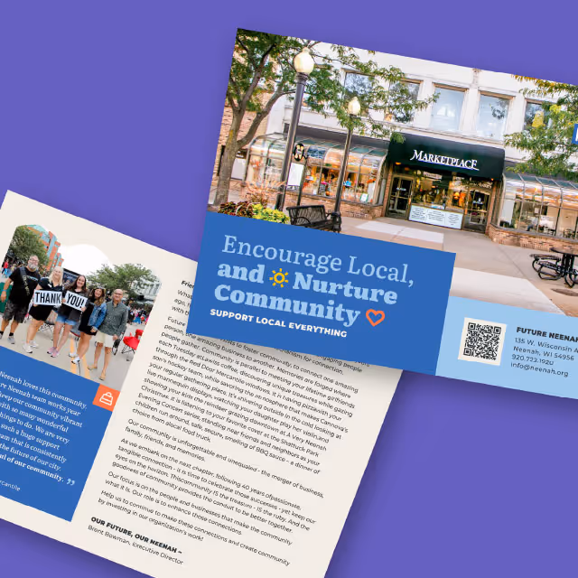
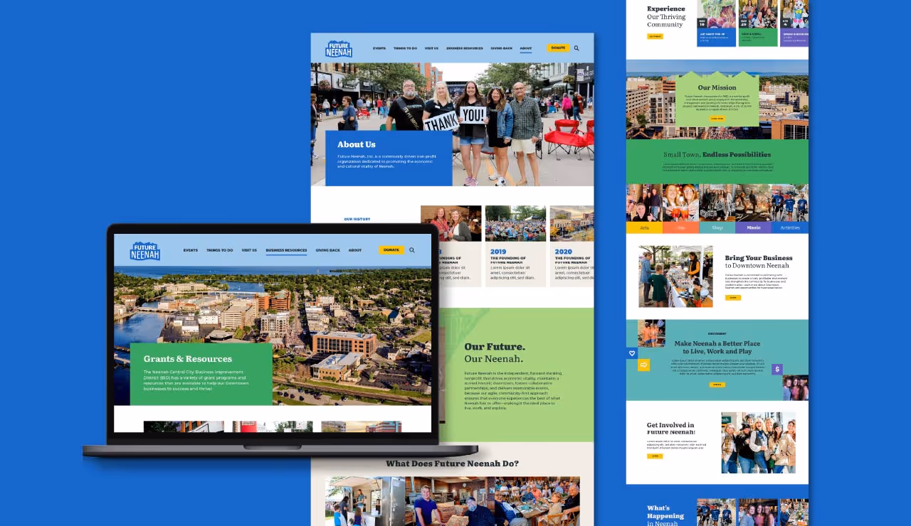
This year, our biggest challenge was to seamlessly incorporate the new style elements from Feeding America’s brand identity refresh into the annual report while ensuring a natural flow that avoided any sense of forced integration. The task was twofold–not only to showcase the organization's impactful work but also to do so in a manner that effortlessly reflected the refreshed brand identity.
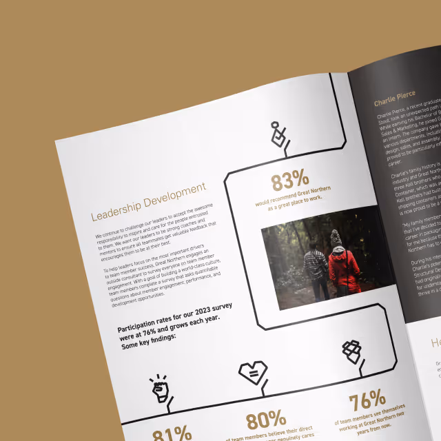
As with any long-format report, an additional challenge was ensuring that all pertinent information was presented in a visually appealing manner that facilitated ease of comprehension and engagement. The report needed to distill complex information into digestible sections, making the report not only informative but also captivating to the reader.

Navigating these challenges required a strategic approach, one that prioritized both form and function. Our designers weaved Feeding America’s newly created style elements into the report in a way that feels organic and cohesive, enhancing rather than overshadowing the content within.
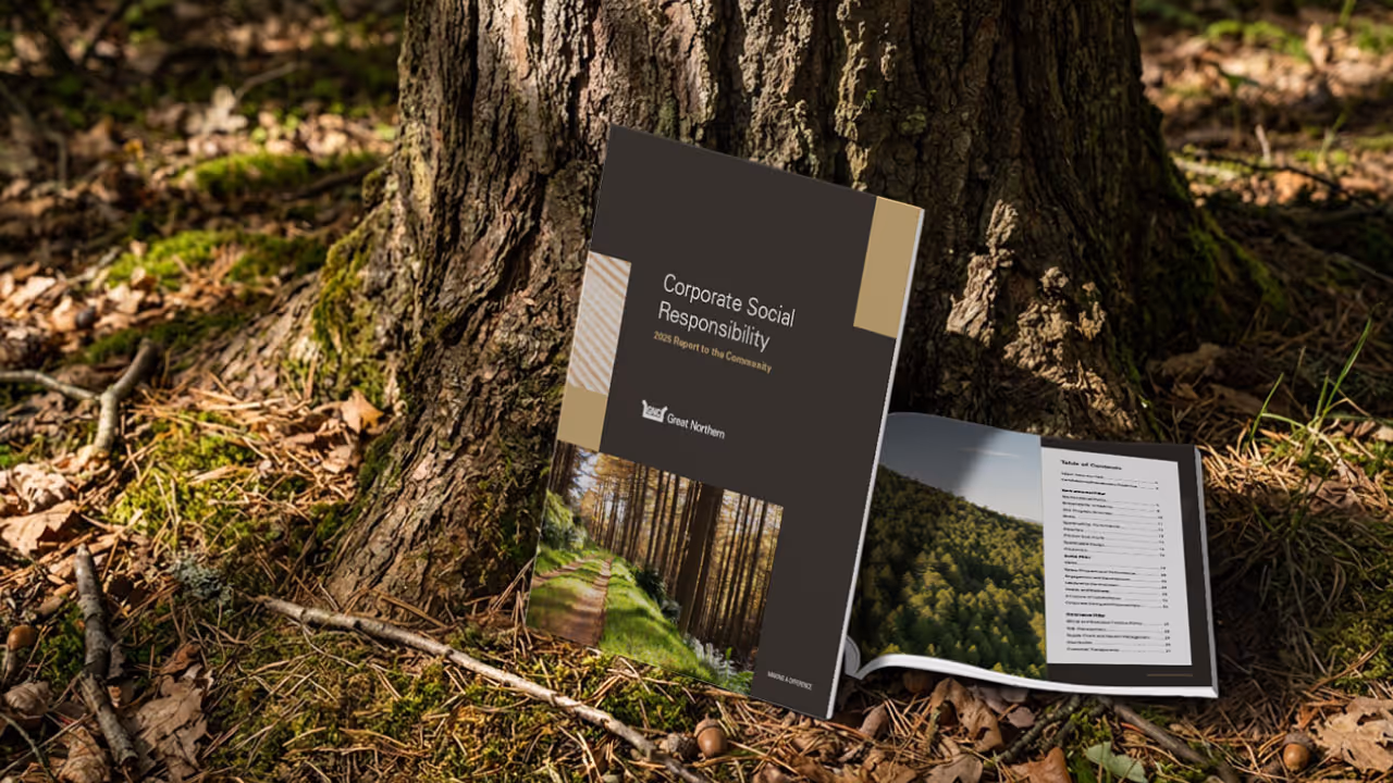
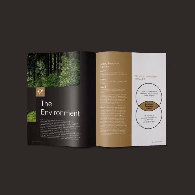
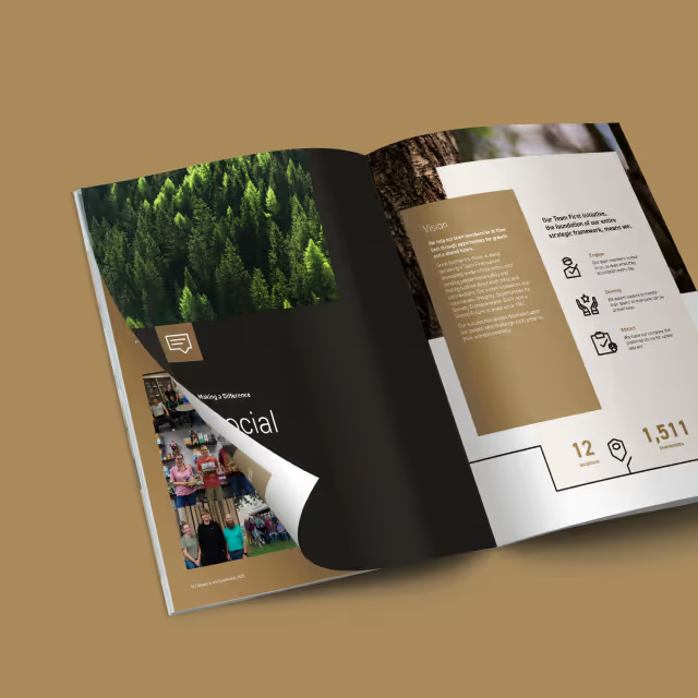
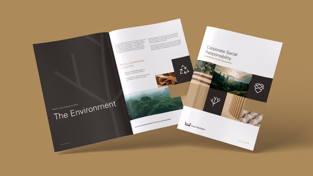
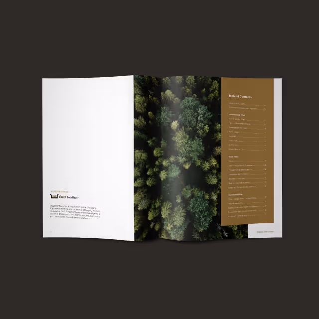
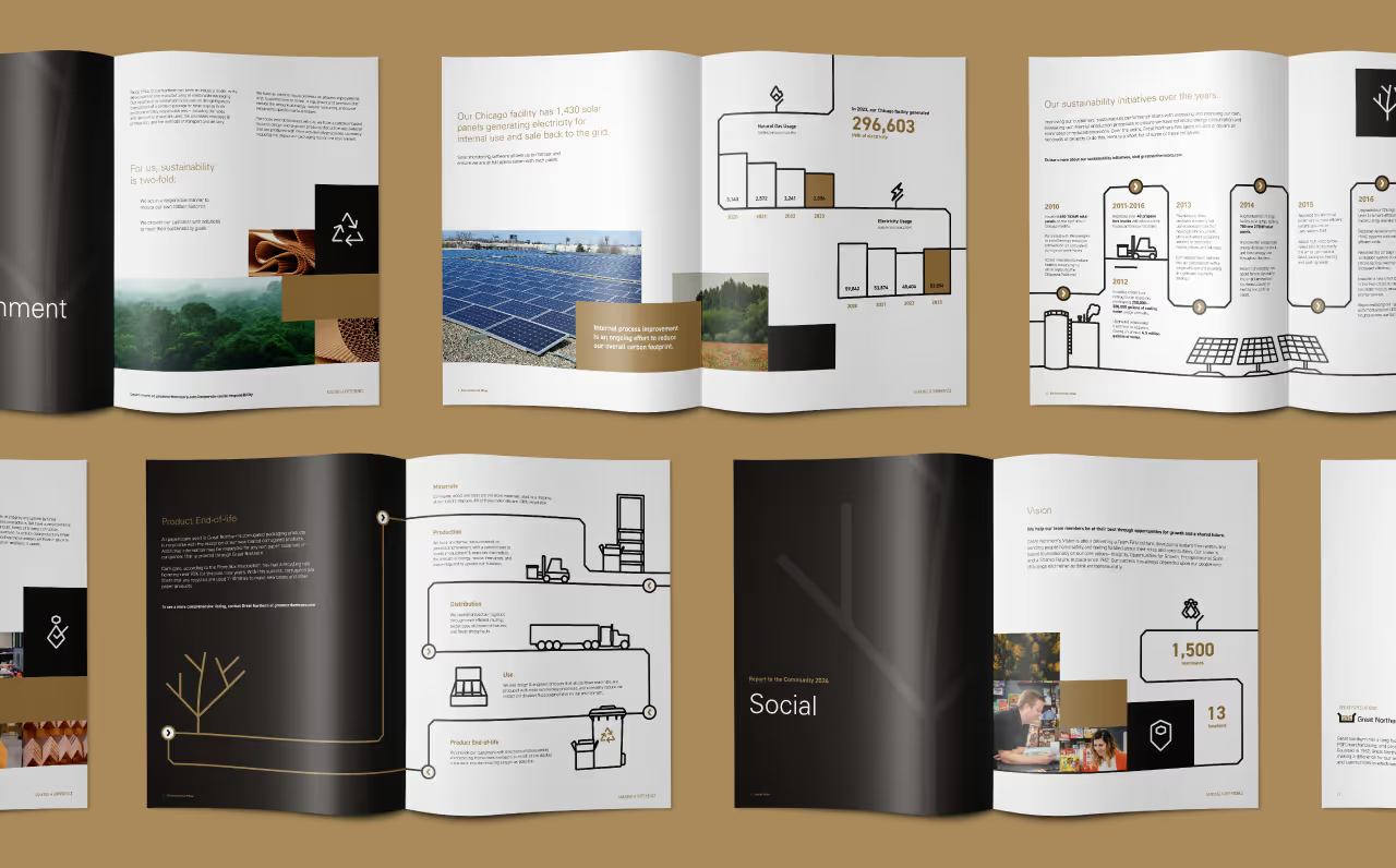
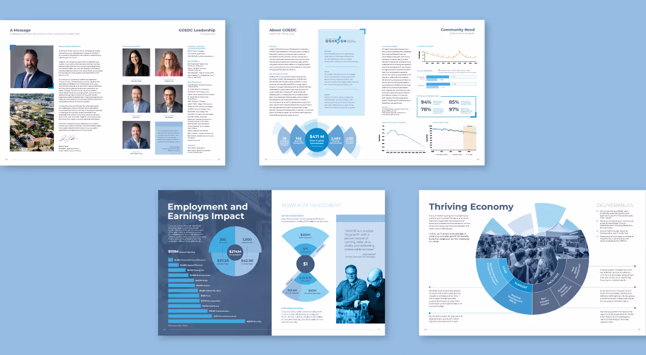
By leveraging a palette inspired by nature's hues, our designers curated a visual narrative that resonated with the organization's commitment to sustainability and community. Earthy tones and lush greens provided the backdrop for compelling stories and impactful data, creating a dynamic interplay between content and design. The new vibrant, natural colors and organic illustrated elements infuse each page with a sense of energy, capturing the essence of the organization's mission while maintaining visual continuity and cohesion.

Feeding America Eastern Wisconsin now has another beautiful annual report under their belt that highlights the important work done over the past year and subtly showcases their brand refresh in a way that reinforces their core identity and mission.

This year, our biggest challenge was to seamlessly incorporate the new style elements from Feeding America’s brand identity refresh into the annual report while ensuring a natural flow that avoided any sense of forced integration. The task was twofold–not only to showcase the organization's impactful work but also to do so in a manner that effortlessly reflected the refreshed brand identity.
As with any long-format report, an additional challenge was ensuring that all pertinent information was presented in a visually appealing manner that facilitated ease of comprehension and engagement. The report needed to distill complex information into digestible sections, making the report not only informative but also captivating to the reader.
Navigating these challenges required a strategic approach, one that prioritized both form and function. Our designers weaved Feeding America’s newly created style elements into the report in a way that feels organic and cohesive, enhancing rather than overshadowing the content within.
By leveraging a palette inspired by nature's hues, our designers curated a visual narrative that resonated with the organization's commitment to sustainability and community. Earthy tones and lush greens provided the backdrop for compelling stories and impactful data, creating a dynamic interplay between content and design. The new vibrant, natural colors and organic illustrated elements infuse each page with a sense of energy, capturing the essence of the organization's mission while maintaining visual continuity and cohesion.

Feeding America Eastern Wisconsin now has another beautiful annual report under their belt that highlights the important work done over the past year and subtly showcases their brand refresh in a way that reinforces their core identity and mission.


This year, our biggest challenge was to seamlessly incorporate the new style elements from Feeding America’s brand identity refresh into the annual report while ensuring a natural flow that avoided any sense of forced integration. The task was twofold–not only to showcase the organization's impactful work but also to do so in a manner that effortlessly reflected the refreshed brand identity.
As with any long-format report, an additional challenge was ensuring that all pertinent information was presented in a visually appealing manner that facilitated ease of comprehension and engagement. The report needed to distill complex information into digestible sections, making the report not only informative but also captivating to the reader.

Navigating these challenges required a strategic approach, one that prioritized both form and function. Our designers weaved Feeding America’s newly created style elements into the report in a way that feels organic and cohesive, enhancing rather than overshadowing the content within.
By leveraging a palette inspired by nature's hues, our designers curated a visual narrative that resonated with the organization's commitment to sustainability and community. Earthy tones and lush greens provided the backdrop for compelling stories and impactful data, creating a dynamic interplay between content and design. The new vibrant, natural colors and organic illustrated elements infuse each page with a sense of energy, capturing the essence of the organization's mission while maintaining visual continuity and cohesion.


Feeding America Eastern Wisconsin now has another beautiful annual report under their belt that highlights the important work done over the past year and subtly showcases their brand refresh in a way that reinforces their core identity and mission.


This year, our biggest challenge was to seamlessly incorporate the new style elements from Feeding America’s brand identity refresh into the annual report while ensuring a natural flow that avoided any sense of forced integration. The task was twofold–not only to showcase the organization's impactful work but also to do so in a manner that effortlessly reflected the refreshed brand identity.
As with any long-format report, an additional challenge was ensuring that all pertinent information was presented in a visually appealing manner that facilitated ease of comprehension and engagement. The report needed to distill complex information into digestible sections, making the report not only informative but also captivating to the reader.
Navigating these challenges required a strategic approach, one that prioritized both form and function. Our designers weaved Feeding America’s newly created style elements into the report in a way that feels organic and cohesive, enhancing rather than overshadowing the content within.
By leveraging a palette inspired by nature's hues, our designers curated a visual narrative that resonated with the organization's commitment to sustainability and community. Earthy tones and lush greens provided the backdrop for compelling stories and impactful data, creating a dynamic interplay between content and design. The new vibrant, natural colors and organic illustrated elements infuse each page with a sense of energy, capturing the essence of the organization's mission while maintaining visual continuity and cohesion.

Feeding America Eastern Wisconsin now has another beautiful annual report under their belt that highlights the important work done over the past year and subtly showcases their brand refresh in a way that reinforces their core identity and mission.
This year, our biggest challenge was to seamlessly incorporate the new style elements from Feeding America’s brand identity refresh into the annual report while ensuring a natural flow that avoided any sense of forced integration. The task was twofold–not only to showcase the organization's impactful work but also to do so in a manner that effortlessly reflected the refreshed brand identity.
As with any long-format report, an additional challenge was ensuring that all pertinent information was presented in a visually appealing manner that facilitated ease of comprehension and engagement. The report needed to distill complex information into digestible sections, making the report not only informative but also captivating to the reader.

Navigating these challenges required a strategic approach, one that prioritized both form and function. Our designers weaved Feeding America’s newly created style elements into the report in a way that feels organic and cohesive, enhancing rather than overshadowing the content within.
By leveraging a palette inspired by nature's hues, our designers curated a visual narrative that resonated with the organization's commitment to sustainability and community. Earthy tones and lush greens provided the backdrop for compelling stories and impactful data, creating a dynamic interplay between content and design. The new vibrant, natural colors and organic illustrated elements infuse each page with a sense of energy, capturing the essence of the organization's mission while maintaining visual continuity and cohesion.
Feeding America Eastern Wisconsin now has another beautiful annual report under their belt that highlights the important work done over the past year and subtly showcases their brand refresh in a way that reinforces their core identity and mission.

This year, our biggest challenge was to seamlessly incorporate the new style elements from Feeding America’s brand identity refresh into the annual report while ensuring a natural flow that avoided any sense of forced integration. The task was twofold–not only to showcase the organization's impactful work but also to do so in a manner that effortlessly reflected the refreshed brand identity.
As with any long-format report, an additional challenge was ensuring that all pertinent information was presented in a visually appealing manner that facilitated ease of comprehension and engagement. The report needed to distill complex information into digestible sections, making the report not only informative but also captivating to the reader.


Navigating these challenges required a strategic approach, one that prioritized both form and function. Our designers weaved Feeding America’s newly created style elements into the report in a way that feels organic and cohesive, enhancing rather than overshadowing the content within.
By leveraging a palette inspired by nature's hues, our designers curated a visual narrative that resonated with the organization's commitment to sustainability and community. Earthy tones and lush greens provided the backdrop for compelling stories and impactful data, creating a dynamic interplay between content and design. The new vibrant, natural colors and organic illustrated elements infuse each page with a sense of energy, capturing the essence of the organization's mission while maintaining visual continuity and cohesion.


Feeding America Eastern Wisconsin now has another beautiful annual report under their belt that highlights the important work done over the past year and subtly showcases their brand refresh in a way that reinforces their core identity and mission.


This year, our biggest challenge was to seamlessly incorporate the new style elements from Feeding America’s brand identity refresh into the annual report while ensuring a natural flow that avoided any sense of forced integration. The task was twofold–not only to showcase the organization's impactful work but also to do so in a manner that effortlessly reflected the refreshed brand identity.
As with any long-format report, an additional challenge was ensuring that all pertinent information was presented in a visually appealing manner that facilitated ease of comprehension and engagement. The report needed to distill complex information into digestible sections, making the report not only informative but also captivating to the reader.

Navigating these challenges required a strategic approach, one that prioritized both form and function. Our designers weaved Feeding America’s newly created style elements into the report in a way that feels organic and cohesive, enhancing rather than overshadowing the content within.
By leveraging a palette inspired by nature's hues, our designers curated a visual narrative that resonated with the organization's commitment to sustainability and community. Earthy tones and lush greens provided the backdrop for compelling stories and impactful data, creating a dynamic interplay between content and design. The new vibrant, natural colors and organic illustrated elements infuse each page with a sense of energy, capturing the essence of the organization's mission while maintaining visual continuity and cohesion.


Feeding America Eastern Wisconsin now has another beautiful annual report under their belt that highlights the important work done over the past year and subtly showcases their brand refresh in a way that reinforces their core identity and mission.
This year, our biggest challenge was to seamlessly incorporate the new style elements from Feeding America’s brand identity refresh into the annual report while ensuring a natural flow that avoided any sense of forced integration. The task was twofold–not only to showcase the organization's impactful work but also to do so in a manner that effortlessly reflected the refreshed brand identity.
As with any long-format report, an additional challenge was ensuring that all pertinent information was presented in a visually appealing manner that facilitated ease of comprehension and engagement. The report needed to distill complex information into digestible sections, making the report not only informative but also captivating to the reader.


Navigating these challenges required a strategic approach, one that prioritized both form and function. Our designers weaved Feeding America’s newly created style elements into the report in a way that feels organic and cohesive, enhancing rather than overshadowing the content within.
By leveraging a palette inspired by nature's hues, our designers curated a visual narrative that resonated with the organization's commitment to sustainability and community. Earthy tones and lush greens provided the backdrop for compelling stories and impactful data, creating a dynamic interplay between content and design. The new vibrant, natural colors and organic illustrated elements infuse each page with a sense of energy, capturing the essence of the organization's mission while maintaining visual continuity and cohesion.


Feeding America Eastern Wisconsin now has another beautiful annual report under their belt that highlights the important work done over the past year and subtly showcases their brand refresh in a way that reinforces their core identity and mission.


This year, our biggest challenge was to seamlessly incorporate the new style elements from Feeding America’s brand identity refresh into the annual report while ensuring a natural flow that avoided any sense of forced integration. The task was twofold–not only to showcase the organization's impactful work but also to do so in a manner that effortlessly reflected the refreshed brand identity.
As with any long-format report, an additional challenge was ensuring that all pertinent information was presented in a visually appealing manner that facilitated ease of comprehension and engagement. The report needed to distill complex information into digestible sections, making the report not only informative but also captivating to the reader.

Navigating these challenges required a strategic approach, one that prioritized both form and function. Our designers weaved Feeding America’s newly created style elements into the report in a way that feels organic and cohesive, enhancing rather than overshadowing the content within.
By leveraging a palette inspired by nature's hues, our designers curated a visual narrative that resonated with the organization's commitment to sustainability and community. Earthy tones and lush greens provided the backdrop for compelling stories and impactful data, creating a dynamic interplay between content and design. The new vibrant, natural colors and organic illustrated elements infuse each page with a sense of energy, capturing the essence of the organization's mission while maintaining visual continuity and cohesion.

Feeding America Eastern Wisconsin now has another beautiful annual report under their belt that highlights the important work done over the past year and subtly showcases their brand refresh in a way that reinforces their core identity and mission.


This year, our biggest challenge was to seamlessly incorporate the new style elements from Feeding America’s brand identity refresh into the annual report while ensuring a natural flow that avoided any sense of forced integration. The task was twofold–not only to showcase the organization's impactful work but also to do so in a manner that effortlessly reflected the refreshed brand identity.
As with any long-format report, an additional challenge was ensuring that all pertinent information was presented in a visually appealing manner that facilitated ease of comprehension and engagement. The report needed to distill complex information into digestible sections, making the report not only informative but also captivating to the reader.
Navigating these challenges required a strategic approach, one that prioritized both form and function. Our designers weaved Feeding America’s newly created style elements into the report in a way that feels organic and cohesive, enhancing rather than overshadowing the content within.
By leveraging a palette inspired by nature's hues, our designers curated a visual narrative that resonated with the organization's commitment to sustainability and community. Earthy tones and lush greens provided the backdrop for compelling stories and impactful data, creating a dynamic interplay between content and design. The new vibrant, natural colors and organic illustrated elements infuse each page with a sense of energy, capturing the essence of the organization's mission while maintaining visual continuity and cohesion.
Feeding America Eastern Wisconsin now has another beautiful annual report under their belt that highlights the important work done over the past year and subtly showcases their brand refresh in a way that reinforces their core identity and mission.


This year, our biggest challenge was to seamlessly incorporate the new style elements from Feeding America’s brand identity refresh into the annual report while ensuring a natural flow that avoided any sense of forced integration. The task was twofold–not only to showcase the organization's impactful work but also to do so in a manner that effortlessly reflected the refreshed brand identity.
As with any long-format report, an additional challenge was ensuring that all pertinent information was presented in a visually appealing manner that facilitated ease of comprehension and engagement. The report needed to distill complex information into digestible sections, making the report not only informative but also captivating to the reader.

Navigating these challenges required a strategic approach, one that prioritized both form and function. Our designers weaved Feeding America’s newly created style elements into the report in a way that feels organic and cohesive, enhancing rather than overshadowing the content within.
By leveraging a palette inspired by nature's hues, our designers curated a visual narrative that resonated with the organization's commitment to sustainability and community. Earthy tones and lush greens provided the backdrop for compelling stories and impactful data, creating a dynamic interplay between content and design. The new vibrant, natural colors and organic illustrated elements infuse each page with a sense of energy, capturing the essence of the organization's mission while maintaining visual continuity and cohesion.

Feeding America Eastern Wisconsin now has another beautiful annual report under their belt that highlights the important work done over the past year and subtly showcases their brand refresh in a way that reinforces their core identity and mission.

This year, our biggest challenge was to seamlessly incorporate the new style elements from Feeding America’s brand identity refresh into the annual report while ensuring a natural flow that avoided any sense of forced integration. The task was twofold–not only to showcase the organization's impactful work but also to do so in a manner that effortlessly reflected the refreshed brand identity.
As with any long-format report, an additional challenge was ensuring that all pertinent information was presented in a visually appealing manner that facilitated ease of comprehension and engagement. The report needed to distill complex information into digestible sections, making the report not only informative but also captivating to the reader.
Navigating these challenges required a strategic approach, one that prioritized both form and function. Our designers weaved Feeding America’s newly created style elements into the report in a way that feels organic and cohesive, enhancing rather than overshadowing the content within.
By leveraging a palette inspired by nature's hues, our designers curated a visual narrative that resonated with the organization's commitment to sustainability and community. Earthy tones and lush greens provided the backdrop for compelling stories and impactful data, creating a dynamic interplay between content and design. The new vibrant, natural colors and organic illustrated elements infuse each page with a sense of energy, capturing the essence of the organization's mission while maintaining visual continuity and cohesion.
Feeding America Eastern Wisconsin now has another beautiful annual report under their belt that highlights the important work done over the past year and subtly showcases their brand refresh in a way that reinforces their core identity and mission.
This year, our biggest challenge was to seamlessly incorporate the new style elements from Feeding America’s brand identity refresh into the annual report while ensuring a natural flow that avoided any sense of forced integration. The task was twofold–not only to showcase the organization's impactful work but also to do so in a manner that effortlessly reflected the refreshed brand identity.
As with any long-format report, an additional challenge was ensuring that all pertinent information was presented in a visually appealing manner that facilitated ease of comprehension and engagement. The report needed to distill complex information into digestible sections, making the report not only informative but also captivating to the reader.

Navigating these challenges required a strategic approach, one that prioritized both form and function. Our designers weaved Feeding America’s newly created style elements into the report in a way that feels organic and cohesive, enhancing rather than overshadowing the content within.
By leveraging a palette inspired by nature's hues, our designers curated a visual narrative that resonated with the organization's commitment to sustainability and community. Earthy tones and lush greens provided the backdrop for compelling stories and impactful data, creating a dynamic interplay between content and design. The new vibrant, natural colors and organic illustrated elements infuse each page with a sense of energy, capturing the essence of the organization's mission while maintaining visual continuity and cohesion.

Feeding America Eastern Wisconsin now has another beautiful annual report under their belt that highlights the important work done over the past year and subtly showcases their brand refresh in a way that reinforces their core identity and mission.

This year, our biggest challenge was to seamlessly incorporate the new style elements from Feeding America’s brand identity refresh into the annual report while ensuring a natural flow that avoided any sense of forced integration. The task was twofold–not only to showcase the organization's impactful work but also to do so in a manner that effortlessly reflected the refreshed brand identity.
As with any long-format report, an additional challenge was ensuring that all pertinent information was presented in a visually appealing manner that facilitated ease of comprehension and engagement. The report needed to distill complex information into digestible sections, making the report not only informative but also captivating to the reader.


Navigating these challenges required a strategic approach, one that prioritized both form and function. Our designers weaved Feeding America’s newly created style elements into the report in a way that feels organic and cohesive, enhancing rather than overshadowing the content within.
By leveraging a palette inspired by nature's hues, our designers curated a visual narrative that resonated with the organization's commitment to sustainability and community. Earthy tones and lush greens provided the backdrop for compelling stories and impactful data, creating a dynamic interplay between content and design. The new vibrant, natural colors and organic illustrated elements infuse each page with a sense of energy, capturing the essence of the organization's mission while maintaining visual continuity and cohesion.
Feeding America Eastern Wisconsin now has another beautiful annual report under their belt that highlights the important work done over the past year and subtly showcases their brand refresh in a way that reinforces their core identity and mission.


This year, our biggest challenge was to seamlessly incorporate the new style elements from Feeding America’s brand identity refresh into the annual report while ensuring a natural flow that avoided any sense of forced integration. The task was twofold–not only to showcase the organization's impactful work but also to do so in a manner that effortlessly reflected the refreshed brand identity.
As with any long-format report, an additional challenge was ensuring that all pertinent information was presented in a visually appealing manner that facilitated ease of comprehension and engagement. The report needed to distill complex information into digestible sections, making the report not only informative but also captivating to the reader.


Navigating these challenges required a strategic approach, one that prioritized both form and function. Our designers weaved Feeding America’s newly created style elements into the report in a way that feels organic and cohesive, enhancing rather than overshadowing the content within.
By leveraging a palette inspired by nature's hues, our designers curated a visual narrative that resonated with the organization's commitment to sustainability and community. Earthy tones and lush greens provided the backdrop for compelling stories and impactful data, creating a dynamic interplay between content and design. The new vibrant, natural colors and organic illustrated elements infuse each page with a sense of energy, capturing the essence of the organization's mission while maintaining visual continuity and cohesion.

Feeding America Eastern Wisconsin now has another beautiful annual report under their belt that highlights the important work done over the past year and subtly showcases their brand refresh in a way that reinforces their core identity and mission.


This year, our biggest challenge was to seamlessly incorporate the new style elements from Feeding America’s brand identity refresh into the annual report while ensuring a natural flow that avoided any sense of forced integration. The task was twofold–not only to showcase the organization's impactful work but also to do so in a manner that effortlessly reflected the refreshed brand identity.
As with any long-format report, an additional challenge was ensuring that all pertinent information was presented in a visually appealing manner that facilitated ease of comprehension and engagement. The report needed to distill complex information into digestible sections, making the report not only informative but also captivating to the reader.

Navigating these challenges required a strategic approach, one that prioritized both form and function. Our designers weaved Feeding America’s newly created style elements into the report in a way that feels organic and cohesive, enhancing rather than overshadowing the content within.
By leveraging a palette inspired by nature's hues, our designers curated a visual narrative that resonated with the organization's commitment to sustainability and community. Earthy tones and lush greens provided the backdrop for compelling stories and impactful data, creating a dynamic interplay between content and design. The new vibrant, natural colors and organic illustrated elements infuse each page with a sense of energy, capturing the essence of the organization's mission while maintaining visual continuity and cohesion.


Feeding America Eastern Wisconsin now has another beautiful annual report under their belt that highlights the important work done over the past year and subtly showcases their brand refresh in a way that reinforces their core identity and mission.


This year, our biggest challenge was to seamlessly incorporate the new style elements from Feeding America’s brand identity refresh into the annual report while ensuring a natural flow that avoided any sense of forced integration. The task was twofold–not only to showcase the organization's impactful work but also to do so in a manner that effortlessly reflected the refreshed brand identity.
As with any long-format report, an additional challenge was ensuring that all pertinent information was presented in a visually appealing manner that facilitated ease of comprehension and engagement. The report needed to distill complex information into digestible sections, making the report not only informative but also captivating to the reader.


Navigating these challenges required a strategic approach, one that prioritized both form and function. Our designers weaved Feeding America’s newly created style elements into the report in a way that feels organic and cohesive, enhancing rather than overshadowing the content within.
By leveraging a palette inspired by nature's hues, our designers curated a visual narrative that resonated with the organization's commitment to sustainability and community. Earthy tones and lush greens provided the backdrop for compelling stories and impactful data, creating a dynamic interplay between content and design. The new vibrant, natural colors and organic illustrated elements infuse each page with a sense of energy, capturing the essence of the organization's mission while maintaining visual continuity and cohesion.


Feeding America Eastern Wisconsin now has another beautiful annual report under their belt that highlights the important work done over the past year and subtly showcases their brand refresh in a way that reinforces their core identity and mission.


This year, our biggest challenge was to seamlessly incorporate the new style elements from Feeding America’s brand identity refresh into the annual report while ensuring a natural flow that avoided any sense of forced integration. The task was twofold–not only to showcase the organization's impactful work but also to do so in a manner that effortlessly reflected the refreshed brand identity.
As with any long-format report, an additional challenge was ensuring that all pertinent information was presented in a visually appealing manner that facilitated ease of comprehension and engagement. The report needed to distill complex information into digestible sections, making the report not only informative but also captivating to the reader.


Navigating these challenges required a strategic approach, one that prioritized both form and function. Our designers weaved Feeding America’s newly created style elements into the report in a way that feels organic and cohesive, enhancing rather than overshadowing the content within.
By leveraging a palette inspired by nature's hues, our designers curated a visual narrative that resonated with the organization's commitment to sustainability and community. Earthy tones and lush greens provided the backdrop for compelling stories and impactful data, creating a dynamic interplay between content and design. The new vibrant, natural colors and organic illustrated elements infuse each page with a sense of energy, capturing the essence of the organization's mission while maintaining visual continuity and cohesion.

Feeding America Eastern Wisconsin now has another beautiful annual report under their belt that highlights the important work done over the past year and subtly showcases their brand refresh in a way that reinforces their core identity and mission.


This year, our biggest challenge was to seamlessly incorporate the new style elements from Feeding America’s brand identity refresh into the annual report while ensuring a natural flow that avoided any sense of forced integration. The task was twofold–not only to showcase the organization's impactful work but also to do so in a manner that effortlessly reflected the refreshed brand identity.
As with any long-format report, an additional challenge was ensuring that all pertinent information was presented in a visually appealing manner that facilitated ease of comprehension and engagement. The report needed to distill complex information into digestible sections, making the report not only informative but also captivating to the reader.

Navigating these challenges required a strategic approach, one that prioritized both form and function. Our designers weaved Feeding America’s newly created style elements into the report in a way that feels organic and cohesive, enhancing rather than overshadowing the content within.
By leveraging a palette inspired by nature's hues, our designers curated a visual narrative that resonated with the organization's commitment to sustainability and community. Earthy tones and lush greens provided the backdrop for compelling stories and impactful data, creating a dynamic interplay between content and design. The new vibrant, natural colors and organic illustrated elements infuse each page with a sense of energy, capturing the essence of the organization's mission while maintaining visual continuity and cohesion.


Feeding America Eastern Wisconsin now has another beautiful annual report under their belt that highlights the important work done over the past year and subtly showcases their brand refresh in a way that reinforces their core identity and mission.


This year, our biggest challenge was to seamlessly incorporate the new style elements from Feeding America’s brand identity refresh into the annual report while ensuring a natural flow that avoided any sense of forced integration. The task was twofold–not only to showcase the organization's impactful work but also to do so in a manner that effortlessly reflected the refreshed brand identity.
As with any long-format report, an additional challenge was ensuring that all pertinent information was presented in a visually appealing manner that facilitated ease of comprehension and engagement. The report needed to distill complex information into digestible sections, making the report not only informative but also captivating to the reader.


Navigating these challenges required a strategic approach, one that prioritized both form and function. Our designers weaved Feeding America’s newly created style elements into the report in a way that feels organic and cohesive, enhancing rather than overshadowing the content within.
By leveraging a palette inspired by nature's hues, our designers curated a visual narrative that resonated with the organization's commitment to sustainability and community. Earthy tones and lush greens provided the backdrop for compelling stories and impactful data, creating a dynamic interplay between content and design. The new vibrant, natural colors and organic illustrated elements infuse each page with a sense of energy, capturing the essence of the organization's mission while maintaining visual continuity and cohesion.


Feeding America Eastern Wisconsin now has another beautiful annual report under their belt that highlights the important work done over the past year and subtly showcases their brand refresh in a way that reinforces their core identity and mission.


This year, our biggest challenge was to seamlessly incorporate the new style elements from Feeding America’s brand identity refresh into the annual report while ensuring a natural flow that avoided any sense of forced integration. The task was twofold–not only to showcase the organization's impactful work but also to do so in a manner that effortlessly reflected the refreshed brand identity.
As with any long-format report, an additional challenge was ensuring that all pertinent information was presented in a visually appealing manner that facilitated ease of comprehension and engagement. The report needed to distill complex information into digestible sections, making the report not only informative but also captivating to the reader.


Navigating these challenges required a strategic approach, one that prioritized both form and function. Our designers weaved Feeding America’s newly created style elements into the report in a way that feels organic and cohesive, enhancing rather than overshadowing the content within.
By leveraging a palette inspired by nature's hues, our designers curated a visual narrative that resonated with the organization's commitment to sustainability and community. Earthy tones and lush greens provided the backdrop for compelling stories and impactful data, creating a dynamic interplay between content and design. The new vibrant, natural colors and organic illustrated elements infuse each page with a sense of energy, capturing the essence of the organization's mission while maintaining visual continuity and cohesion.


Feeding America Eastern Wisconsin now has another beautiful annual report under their belt that highlights the important work done over the past year and subtly showcases their brand refresh in a way that reinforces their core identity and mission.


This year, our biggest challenge was to seamlessly incorporate the new style elements from Feeding America’s brand identity refresh into the annual report while ensuring a natural flow that avoided any sense of forced integration. The task was twofold–not only to showcase the organization's impactful work but also to do so in a manner that effortlessly reflected the refreshed brand identity.
As with any long-format report, an additional challenge was ensuring that all pertinent information was presented in a visually appealing manner that facilitated ease of comprehension and engagement. The report needed to distill complex information into digestible sections, making the report not only informative but also captivating to the reader.

Navigating these challenges required a strategic approach, one that prioritized both form and function. Our designers weaved Feeding America’s newly created style elements into the report in a way that feels organic and cohesive, enhancing rather than overshadowing the content within.
By leveraging a palette inspired by nature's hues, our designers curated a visual narrative that resonated with the organization's commitment to sustainability and community. Earthy tones and lush greens provided the backdrop for compelling stories and impactful data, creating a dynamic interplay between content and design. The new vibrant, natural colors and organic illustrated elements infuse each page with a sense of energy, capturing the essence of the organization's mission while maintaining visual continuity and cohesion.


Feeding America Eastern Wisconsin now has another beautiful annual report under their belt that highlights the important work done over the past year and subtly showcases their brand refresh in a way that reinforces their core identity and mission.


Working with Quill on our annual report always leaves us with a compelling and impactful piece that helps tell our story and illustrate how we are living out our mission. We are always excited to share the finished product with our donors and partners.
LISA ENDL, DIRECTOR OF COMMUNICATIONS, FEEDING AMERICA EASTERN WISCONSIN

