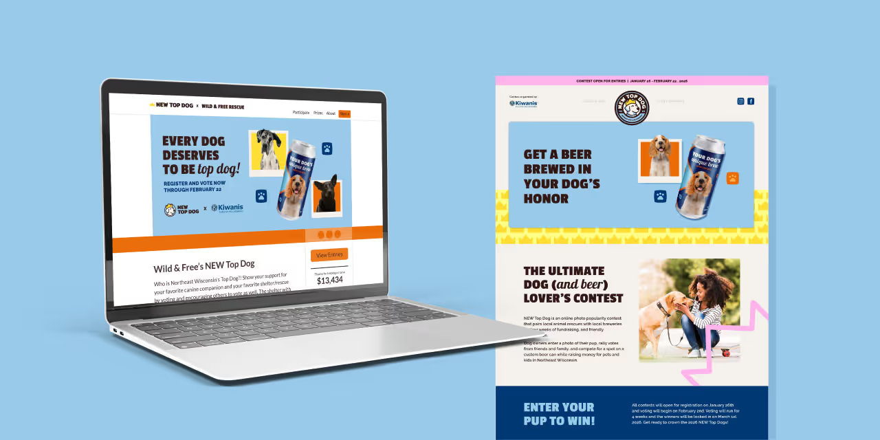
Although Treasure Coast Food Bank had strong brand recognition locally, their visual identity lacked the cohesion and emotional impact needed to match their comprehensive work. Additionally, the brand needed to distinguish itself from Feeding America while staying true to its connection with this national organization. The goal was to create a refreshed brand identity that would resonate with clients, partners, and donors while conveying the organization’s unique approach to addressing food insecurity and community wellbeing.
Quill Creative Studio began by conducting in-depth voice-of-customer research, engaging with employees, partner organizations, donors, and board members to understand what makes Treasure Coast Food Bank so essential to the community. Using these insights, we developed a brand identity that feels inviting, fresh, and versatile—balancing the gravity of their mission with an optimistic, approachable tone.
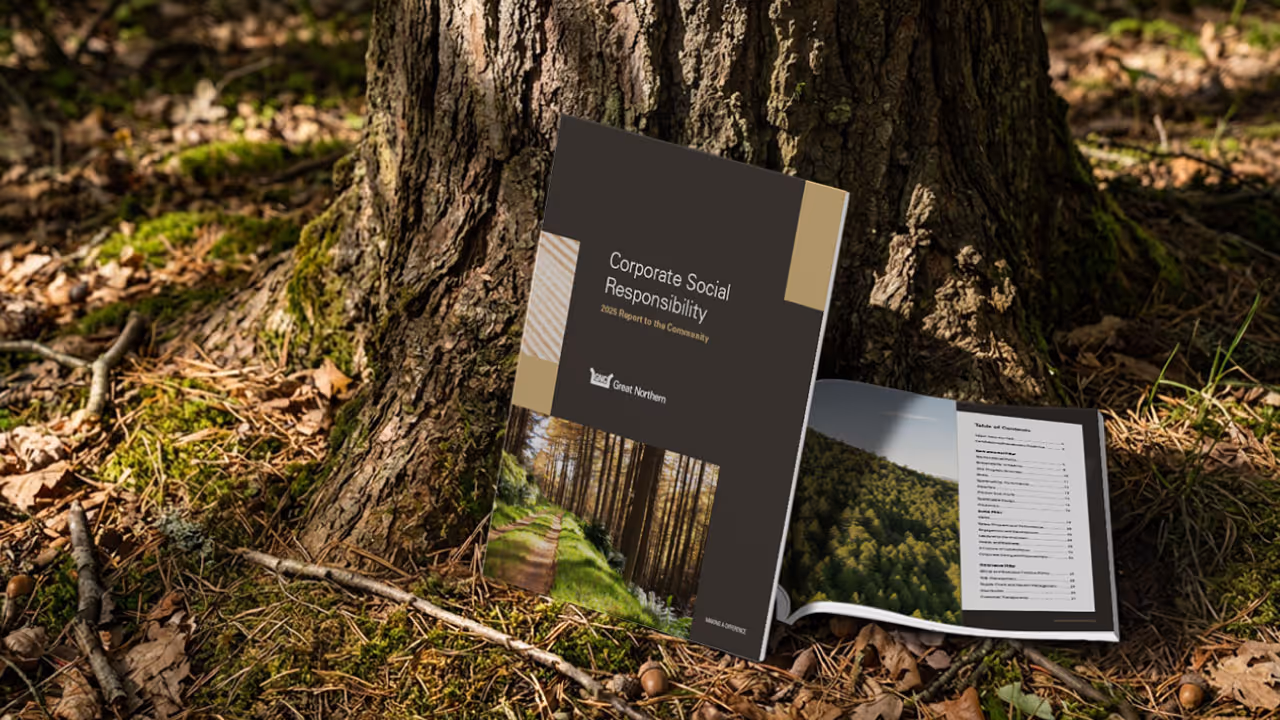
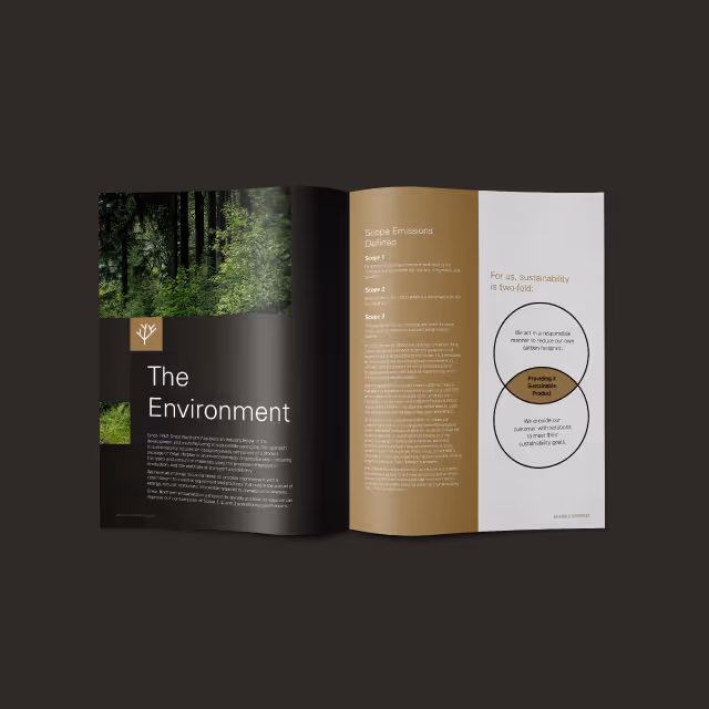
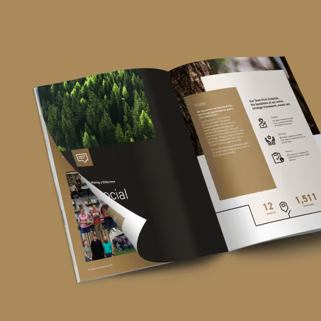
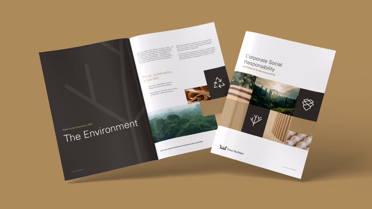
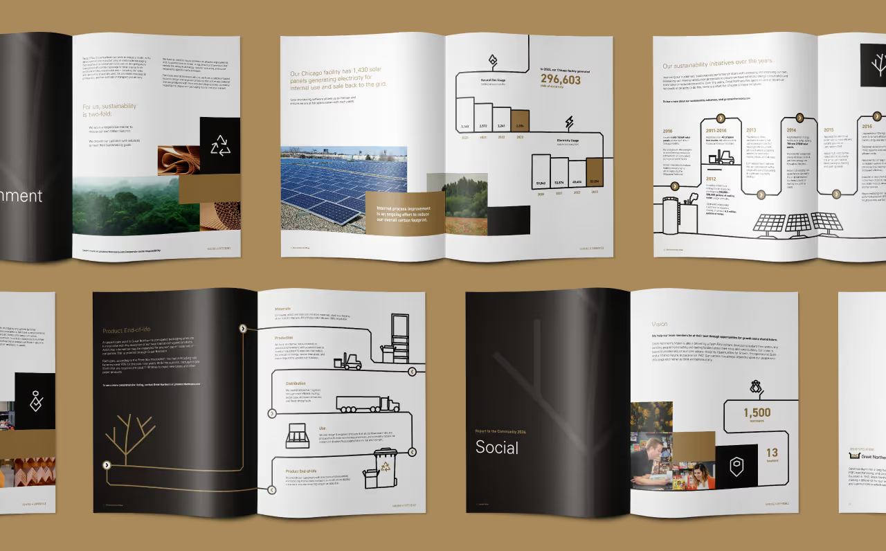
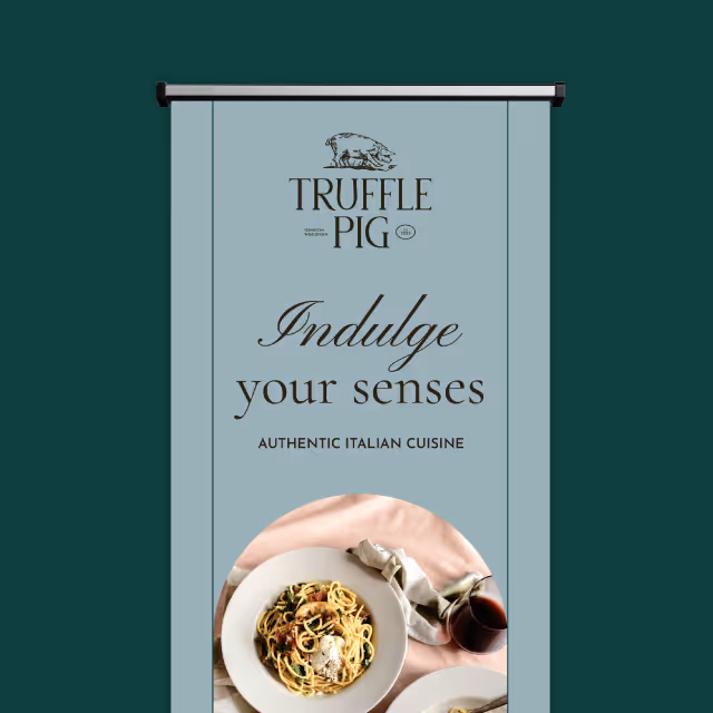
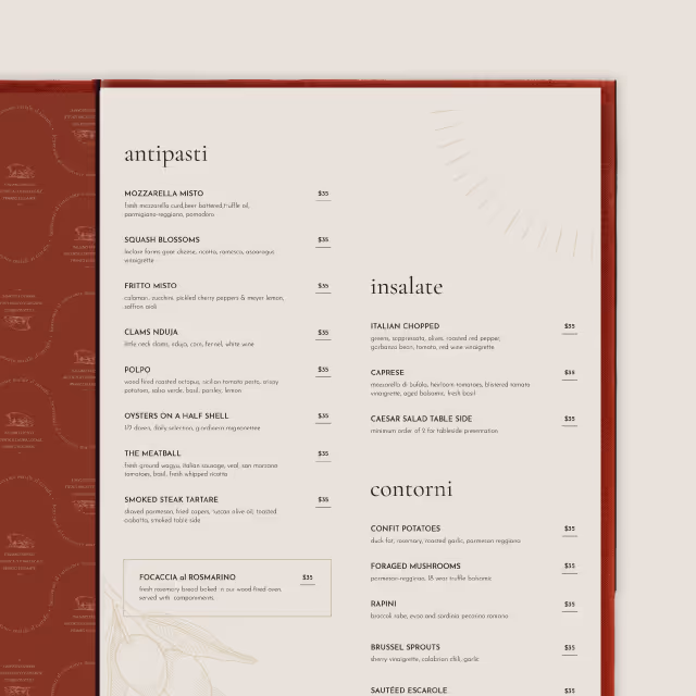
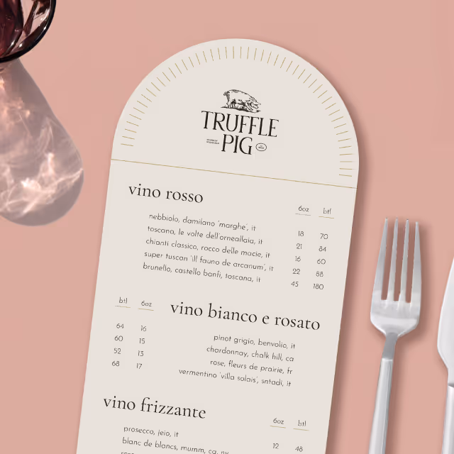
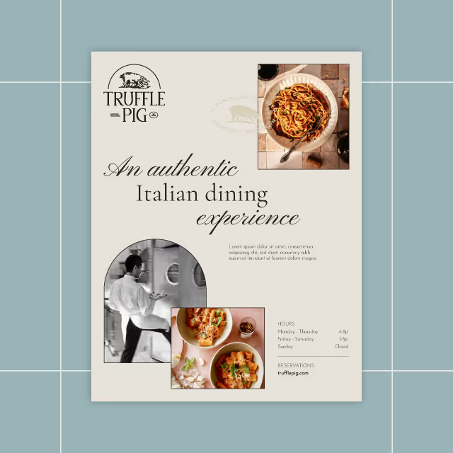
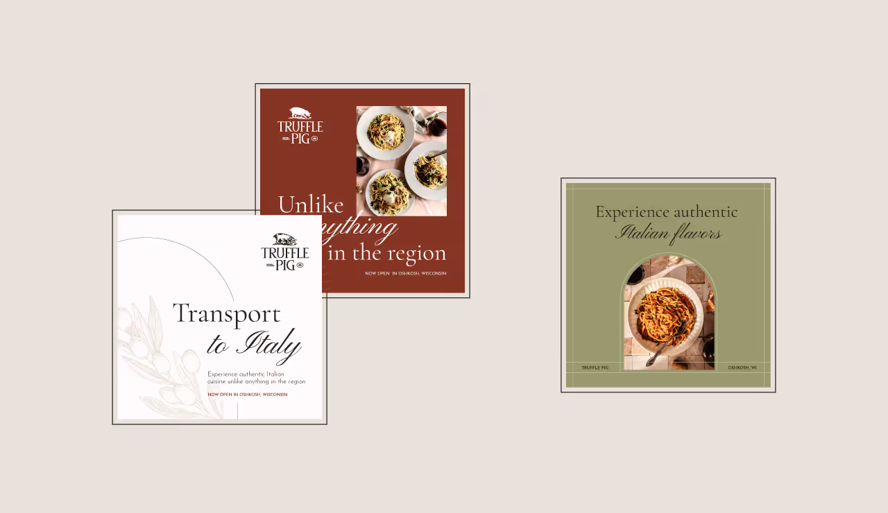
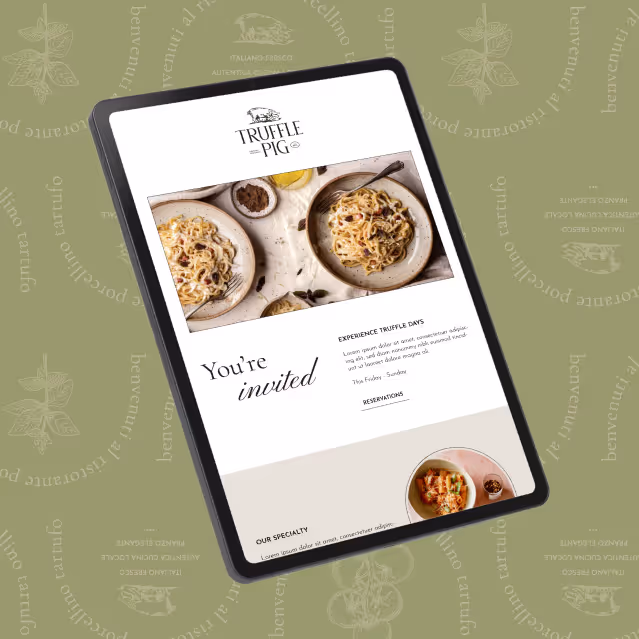
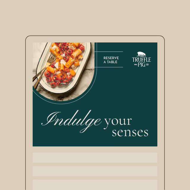
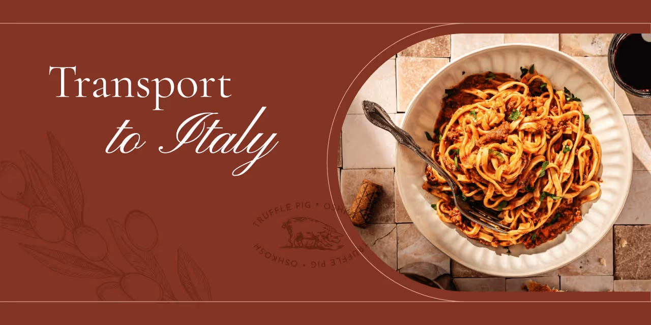
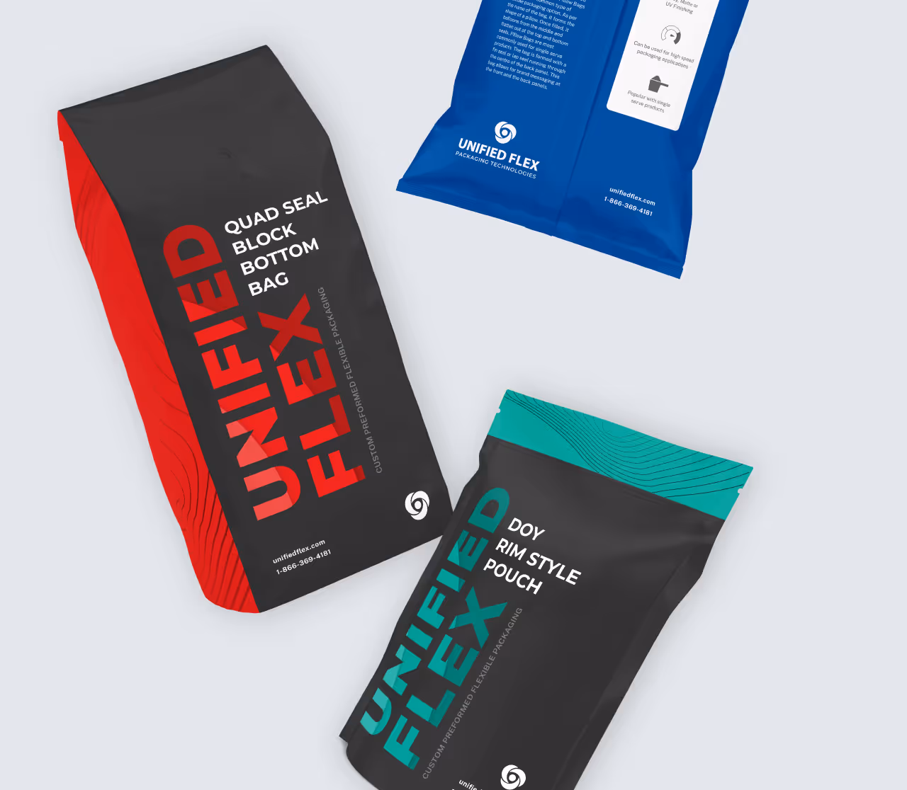
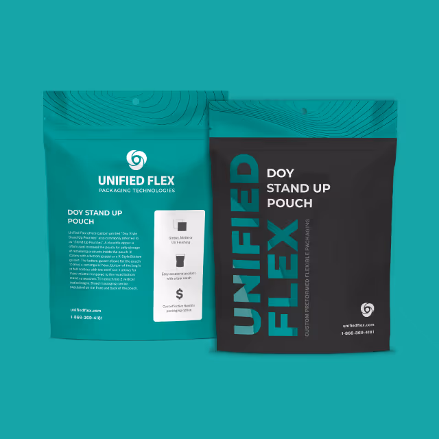
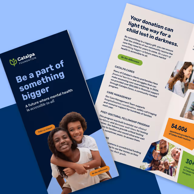
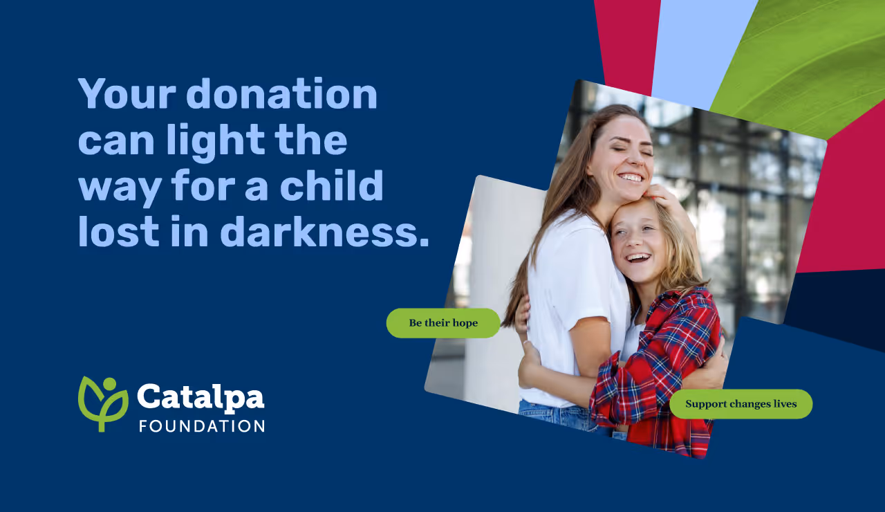
The updated identity features organic textures, a natural color palette, and dynamic yet grounded layouts that communicate a sense of reliability and authenticity. Large, impactful images and expressive typography add visual interest, while woodcut-style illustrations and icons create a distinctive, local feel. Every visual and written element was crafted to highlight the organization's innovative programs and wrap-around services that go beyond food. By applying the refreshed identity to key collateral and validating it through real-world touchpoints, we ensured the new brand could meet the needs of every stakeholder while staying true to Treasure Coast Food Bank’s mission of dignified, transformative support.

As Treasure Coast Food Bank prepares to open its new facility, the refreshed brand identity will be a central element of the launch. The updated brand offers a cohesive and inspiring experience for clients, partners, and community members, reinforcing the organization’s reputation as a trusted, innovative leader in hunger relief. With a strong brand foundation in place, Treasure Coast Food Bank is ready to nourish their greatest treasure, the community, with clarity, confidence, and compassion.

Although Treasure Coast Food Bank had strong brand recognition locally, their visual identity lacked the cohesion and emotional impact needed to match their comprehensive work. Additionally, the brand needed to distinguish itself from Feeding America while staying true to its connection with this national organization. The goal was to create a refreshed brand identity that would resonate with clients, partners, and donors while conveying the organization’s unique approach to addressing food insecurity and community wellbeing.
Quill Creative Studio began by conducting in-depth voice-of-customer research, engaging with employees, partner organizations, donors, and board members to understand what makes Treasure Coast Food Bank so essential to the community. Using these insights, we developed a brand identity that feels inviting, fresh, and versatile—balancing the gravity of their mission with an optimistic, approachable tone.
The updated identity features organic textures, a natural color palette, and dynamic yet grounded layouts that communicate a sense of reliability and authenticity. Large, impactful images and expressive typography add visual interest, while woodcut-style illustrations and icons create a distinctive, local feel. Every visual and written element was crafted to highlight the organization's innovative programs and wrap-around services that go beyond food. By applying the refreshed identity to key collateral and validating it through real-world touchpoints, we ensured the new brand could meet the needs of every stakeholder while staying true to Treasure Coast Food Bank’s mission of dignified, transformative support.


As Treasure Coast Food Bank prepares to open its new facility, the refreshed brand identity will be a central element of the launch. The updated brand offers a cohesive and inspiring experience for clients, partners, and community members, reinforcing the organization’s reputation as a trusted, innovative leader in hunger relief. With a strong brand foundation in place, Treasure Coast Food Bank is ready to nourish their greatest treasure, the community, with clarity, confidence, and compassion.


Although Treasure Coast Food Bank had strong brand recognition locally, their visual identity lacked the cohesion and emotional impact needed to match their comprehensive work. Additionally, the brand needed to distinguish itself from Feeding America while staying true to its connection with this national organization. The goal was to create a refreshed brand identity that would resonate with clients, partners, and donors while conveying the organization’s unique approach to addressing food insecurity and community wellbeing.
Quill Creative Studio began by conducting in-depth voice-of-customer research, engaging with employees, partner organizations, donors, and board members to understand what makes Treasure Coast Food Bank so essential to the community. Using these insights, we developed a brand identity that feels inviting, fresh, and versatile—balancing the gravity of their mission with an optimistic, approachable tone.
The updated identity features organic textures, a natural color palette, and dynamic yet grounded layouts that communicate a sense of reliability and authenticity. Large, impactful images and expressive typography add visual interest, while woodcut-style illustrations and icons create a distinctive, local feel. Every visual and written element was crafted to highlight the organization's innovative programs and wrap-around services that go beyond food. By applying the refreshed identity to key collateral and validating it through real-world touchpoints, we ensured the new brand could meet the needs of every stakeholder while staying true to Treasure Coast Food Bank’s mission of dignified, transformative support.

As Treasure Coast Food Bank prepares to open its new facility, the refreshed brand identity will be a central element of the launch. The updated brand offers a cohesive and inspiring experience for clients, partners, and community members, reinforcing the organization’s reputation as a trusted, innovative leader in hunger relief. With a strong brand foundation in place, Treasure Coast Food Bank is ready to nourish their greatest treasure, the community, with clarity, confidence, and compassion.
Although Treasure Coast Food Bank had strong brand recognition locally, their visual identity lacked the cohesion and emotional impact needed to match their comprehensive work. Additionally, the brand needed to distinguish itself from Feeding America while staying true to its connection with this national organization. The goal was to create a refreshed brand identity that would resonate with clients, partners, and donors while conveying the organization’s unique approach to addressing food insecurity and community wellbeing.


Quill Creative Studio began by conducting in-depth voice-of-customer research, engaging with employees, partner organizations, donors, and board members to understand what makes Treasure Coast Food Bank so essential to the community. Using these insights, we developed a brand identity that feels inviting, fresh, and versatile—balancing the gravity of their mission with an optimistic, approachable tone.
The updated identity features organic textures, a natural color palette, and dynamic yet grounded layouts that communicate a sense of reliability and authenticity. Large, impactful images and expressive typography add visual interest, while woodcut-style illustrations and icons create a distinctive, local feel. Every visual and written element was crafted to highlight the organization's innovative programs and wrap-around services that go beyond food. By applying the refreshed identity to key collateral and validating it through real-world touchpoints, we ensured the new brand could meet the needs of every stakeholder while staying true to Treasure Coast Food Bank’s mission of dignified, transformative support.
As Treasure Coast Food Bank prepares to open its new facility, the refreshed brand identity will be a central element of the launch. The updated brand offers a cohesive and inspiring experience for clients, partners, and community members, reinforcing the organization’s reputation as a trusted, innovative leader in hunger relief. With a strong brand foundation in place, Treasure Coast Food Bank is ready to nourish their greatest treasure, the community, with clarity, confidence, and compassion.

Although Treasure Coast Food Bank had strong brand recognition locally, their visual identity lacked the cohesion and emotional impact needed to match their comprehensive work. Additionally, the brand needed to distinguish itself from Feeding America while staying true to its connection with this national organization. The goal was to create a refreshed brand identity that would resonate with clients, partners, and donors while conveying the organization’s unique approach to addressing food insecurity and community wellbeing.


Quill Creative Studio began by conducting in-depth voice-of-customer research, engaging with employees, partner organizations, donors, and board members to understand what makes Treasure Coast Food Bank so essential to the community. Using these insights, we developed a brand identity that feels inviting, fresh, and versatile—balancing the gravity of their mission with an optimistic, approachable tone.
The updated identity features organic textures, a natural color palette, and dynamic yet grounded layouts that communicate a sense of reliability and authenticity. Large, impactful images and expressive typography add visual interest, while woodcut-style illustrations and icons create a distinctive, local feel. Every visual and written element was crafted to highlight the organization's innovative programs and wrap-around services that go beyond food. By applying the refreshed identity to key collateral and validating it through real-world touchpoints, we ensured the new brand could meet the needs of every stakeholder while staying true to Treasure Coast Food Bank’s mission of dignified, transformative support.


As Treasure Coast Food Bank prepares to open its new facility, the refreshed brand identity will be a central element of the launch. The updated brand offers a cohesive and inspiring experience for clients, partners, and community members, reinforcing the organization’s reputation as a trusted, innovative leader in hunger relief. With a strong brand foundation in place, Treasure Coast Food Bank is ready to nourish their greatest treasure, the community, with clarity, confidence, and compassion.


Although Treasure Coast Food Bank had strong brand recognition locally, their visual identity lacked the cohesion and emotional impact needed to match their comprehensive work. Additionally, the brand needed to distinguish itself from Feeding America while staying true to its connection with this national organization. The goal was to create a refreshed brand identity that would resonate with clients, partners, and donors while conveying the organization’s unique approach to addressing food insecurity and community wellbeing.

Quill Creative Studio began by conducting in-depth voice-of-customer research, engaging with employees, partner organizations, donors, and board members to understand what makes Treasure Coast Food Bank so essential to the community. Using these insights, we developed a brand identity that feels inviting, fresh, and versatile—balancing the gravity of their mission with an optimistic, approachable tone.
The updated identity features organic textures, a natural color palette, and dynamic yet grounded layouts that communicate a sense of reliability and authenticity. Large, impactful images and expressive typography add visual interest, while woodcut-style illustrations and icons create a distinctive, local feel. Every visual and written element was crafted to highlight the organization's innovative programs and wrap-around services that go beyond food. By applying the refreshed identity to key collateral and validating it through real-world touchpoints, we ensured the new brand could meet the needs of every stakeholder while staying true to Treasure Coast Food Bank’s mission of dignified, transformative support.


As Treasure Coast Food Bank prepares to open its new facility, the refreshed brand identity will be a central element of the launch. The updated brand offers a cohesive and inspiring experience for clients, partners, and community members, reinforcing the organization’s reputation as a trusted, innovative leader in hunger relief. With a strong brand foundation in place, Treasure Coast Food Bank is ready to nourish their greatest treasure, the community, with clarity, confidence, and compassion.

Although Treasure Coast Food Bank had strong brand recognition locally, their visual identity lacked the cohesion and emotional impact needed to match their comprehensive work. Additionally, the brand needed to distinguish itself from Feeding America while staying true to its connection with this national organization. The goal was to create a refreshed brand identity that would resonate with clients, partners, and donors while conveying the organization’s unique approach to addressing food insecurity and community wellbeing.


Quill Creative Studio began by conducting in-depth voice-of-customer research, engaging with employees, partner organizations, donors, and board members to understand what makes Treasure Coast Food Bank so essential to the community. Using these insights, we developed a brand identity that feels inviting, fresh, and versatile—balancing the gravity of their mission with an optimistic, approachable tone.
The updated identity features organic textures, a natural color palette, and dynamic yet grounded layouts that communicate a sense of reliability and authenticity. Large, impactful images and expressive typography add visual interest, while woodcut-style illustrations and icons create a distinctive, local feel. Every visual and written element was crafted to highlight the organization's innovative programs and wrap-around services that go beyond food. By applying the refreshed identity to key collateral and validating it through real-world touchpoints, we ensured the new brand could meet the needs of every stakeholder while staying true to Treasure Coast Food Bank’s mission of dignified, transformative support.


As Treasure Coast Food Bank prepares to open its new facility, the refreshed brand identity will be a central element of the launch. The updated brand offers a cohesive and inspiring experience for clients, partners, and community members, reinforcing the organization’s reputation as a trusted, innovative leader in hunger relief. With a strong brand foundation in place, Treasure Coast Food Bank is ready to nourish their greatest treasure, the community, with clarity, confidence, and compassion.


Although Treasure Coast Food Bank had strong brand recognition locally, their visual identity lacked the cohesion and emotional impact needed to match their comprehensive work. Additionally, the brand needed to distinguish itself from Feeding America while staying true to its connection with this national organization. The goal was to create a refreshed brand identity that would resonate with clients, partners, and donors while conveying the organization’s unique approach to addressing food insecurity and community wellbeing.
Quill Creative Studio began by conducting in-depth voice-of-customer research, engaging with employees, partner organizations, donors, and board members to understand what makes Treasure Coast Food Bank so essential to the community. Using these insights, we developed a brand identity that feels inviting, fresh, and versatile—balancing the gravity of their mission with an optimistic, approachable tone.
The updated identity features organic textures, a natural color palette, and dynamic yet grounded layouts that communicate a sense of reliability and authenticity. Large, impactful images and expressive typography add visual interest, while woodcut-style illustrations and icons create a distinctive, local feel. Every visual and written element was crafted to highlight the organization's innovative programs and wrap-around services that go beyond food. By applying the refreshed identity to key collateral and validating it through real-world touchpoints, we ensured the new brand could meet the needs of every stakeholder while staying true to Treasure Coast Food Bank’s mission of dignified, transformative support.

As Treasure Coast Food Bank prepares to open its new facility, the refreshed brand identity will be a central element of the launch. The updated brand offers a cohesive and inspiring experience for clients, partners, and community members, reinforcing the organization’s reputation as a trusted, innovative leader in hunger relief. With a strong brand foundation in place, Treasure Coast Food Bank is ready to nourish their greatest treasure, the community, with clarity, confidence, and compassion.


Although Treasure Coast Food Bank had strong brand recognition locally, their visual identity lacked the cohesion and emotional impact needed to match their comprehensive work. Additionally, the brand needed to distinguish itself from Feeding America while staying true to its connection with this national organization. The goal was to create a refreshed brand identity that would resonate with clients, partners, and donors while conveying the organization’s unique approach to addressing food insecurity and community wellbeing.

Quill Creative Studio began by conducting in-depth voice-of-customer research, engaging with employees, partner organizations, donors, and board members to understand what makes Treasure Coast Food Bank so essential to the community. Using these insights, we developed a brand identity that feels inviting, fresh, and versatile—balancing the gravity of their mission with an optimistic, approachable tone.
The updated identity features organic textures, a natural color palette, and dynamic yet grounded layouts that communicate a sense of reliability and authenticity. Large, impactful images and expressive typography add visual interest, while woodcut-style illustrations and icons create a distinctive, local feel. Every visual and written element was crafted to highlight the organization's innovative programs and wrap-around services that go beyond food. By applying the refreshed identity to key collateral and validating it through real-world touchpoints, we ensured the new brand could meet the needs of every stakeholder while staying true to Treasure Coast Food Bank’s mission of dignified, transformative support.


As Treasure Coast Food Bank prepares to open its new facility, the refreshed brand identity will be a central element of the launch. The updated brand offers a cohesive and inspiring experience for clients, partners, and community members, reinforcing the organization’s reputation as a trusted, innovative leader in hunger relief. With a strong brand foundation in place, Treasure Coast Food Bank is ready to nourish their greatest treasure, the community, with clarity, confidence, and compassion.

Although Treasure Coast Food Bank had strong brand recognition locally, their visual identity lacked the cohesion and emotional impact needed to match their comprehensive work. Additionally, the brand needed to distinguish itself from Feeding America while staying true to its connection with this national organization. The goal was to create a refreshed brand identity that would resonate with clients, partners, and donors while conveying the organization’s unique approach to addressing food insecurity and community wellbeing.
Quill Creative Studio began by conducting in-depth voice-of-customer research, engaging with employees, partner organizations, donors, and board members to understand what makes Treasure Coast Food Bank so essential to the community. Using these insights, we developed a brand identity that feels inviting, fresh, and versatile—balancing the gravity of their mission with an optimistic, approachable tone.
The updated identity features organic textures, a natural color palette, and dynamic yet grounded layouts that communicate a sense of reliability and authenticity. Large, impactful images and expressive typography add visual interest, while woodcut-style illustrations and icons create a distinctive, local feel. Every visual and written element was crafted to highlight the organization's innovative programs and wrap-around services that go beyond food. By applying the refreshed identity to key collateral and validating it through real-world touchpoints, we ensured the new brand could meet the needs of every stakeholder while staying true to Treasure Coast Food Bank’s mission of dignified, transformative support.
As Treasure Coast Food Bank prepares to open its new facility, the refreshed brand identity will be a central element of the launch. The updated brand offers a cohesive and inspiring experience for clients, partners, and community members, reinforcing the organization’s reputation as a trusted, innovative leader in hunger relief. With a strong brand foundation in place, Treasure Coast Food Bank is ready to nourish their greatest treasure, the community, with clarity, confidence, and compassion.
Although Treasure Coast Food Bank had strong brand recognition locally, their visual identity lacked the cohesion and emotional impact needed to match their comprehensive work. Additionally, the brand needed to distinguish itself from Feeding America while staying true to its connection with this national organization. The goal was to create a refreshed brand identity that would resonate with clients, partners, and donors while conveying the organization’s unique approach to addressing food insecurity and community wellbeing.

Quill Creative Studio began by conducting in-depth voice-of-customer research, engaging with employees, partner organizations, donors, and board members to understand what makes Treasure Coast Food Bank so essential to the community. Using these insights, we developed a brand identity that feels inviting, fresh, and versatile—balancing the gravity of their mission with an optimistic, approachable tone.
The updated identity features organic textures, a natural color palette, and dynamic yet grounded layouts that communicate a sense of reliability and authenticity. Large, impactful images and expressive typography add visual interest, while woodcut-style illustrations and icons create a distinctive, local feel. Every visual and written element was crafted to highlight the organization's innovative programs and wrap-around services that go beyond food. By applying the refreshed identity to key collateral and validating it through real-world touchpoints, we ensured the new brand could meet the needs of every stakeholder while staying true to Treasure Coast Food Bank’s mission of dignified, transformative support.

As Treasure Coast Food Bank prepares to open its new facility, the refreshed brand identity will be a central element of the launch. The updated brand offers a cohesive and inspiring experience for clients, partners, and community members, reinforcing the organization’s reputation as a trusted, innovative leader in hunger relief. With a strong brand foundation in place, Treasure Coast Food Bank is ready to nourish their greatest treasure, the community, with clarity, confidence, and compassion.


Although Treasure Coast Food Bank had strong brand recognition locally, their visual identity lacked the cohesion and emotional impact needed to match their comprehensive work. Additionally, the brand needed to distinguish itself from Feeding America while staying true to its connection with this national organization. The goal was to create a refreshed brand identity that would resonate with clients, partners, and donors while conveying the organization’s unique approach to addressing food insecurity and community wellbeing.

Quill Creative Studio began by conducting in-depth voice-of-customer research, engaging with employees, partner organizations, donors, and board members to understand what makes Treasure Coast Food Bank so essential to the community. Using these insights, we developed a brand identity that feels inviting, fresh, and versatile—balancing the gravity of their mission with an optimistic, approachable tone.
The updated identity features organic textures, a natural color palette, and dynamic yet grounded layouts that communicate a sense of reliability and authenticity. Large, impactful images and expressive typography add visual interest, while woodcut-style illustrations and icons create a distinctive, local feel. Every visual and written element was crafted to highlight the organization's innovative programs and wrap-around services that go beyond food. By applying the refreshed identity to key collateral and validating it through real-world touchpoints, we ensured the new brand could meet the needs of every stakeholder while staying true to Treasure Coast Food Bank’s mission of dignified, transformative support.
As Treasure Coast Food Bank prepares to open its new facility, the refreshed brand identity will be a central element of the launch. The updated brand offers a cohesive and inspiring experience for clients, partners, and community members, reinforcing the organization’s reputation as a trusted, innovative leader in hunger relief. With a strong brand foundation in place, Treasure Coast Food Bank is ready to nourish their greatest treasure, the community, with clarity, confidence, and compassion.


Although Treasure Coast Food Bank had strong brand recognition locally, their visual identity lacked the cohesion and emotional impact needed to match their comprehensive work. Additionally, the brand needed to distinguish itself from Feeding America while staying true to its connection with this national organization. The goal was to create a refreshed brand identity that would resonate with clients, partners, and donors while conveying the organization’s unique approach to addressing food insecurity and community wellbeing.


Quill Creative Studio began by conducting in-depth voice-of-customer research, engaging with employees, partner organizations, donors, and board members to understand what makes Treasure Coast Food Bank so essential to the community. Using these insights, we developed a brand identity that feels inviting, fresh, and versatile—balancing the gravity of their mission with an optimistic, approachable tone.
The updated identity features organic textures, a natural color palette, and dynamic yet grounded layouts that communicate a sense of reliability and authenticity. Large, impactful images and expressive typography add visual interest, while woodcut-style illustrations and icons create a distinctive, local feel. Every visual and written element was crafted to highlight the organization's innovative programs and wrap-around services that go beyond food. By applying the refreshed identity to key collateral and validating it through real-world touchpoints, we ensured the new brand could meet the needs of every stakeholder while staying true to Treasure Coast Food Bank’s mission of dignified, transformative support.

As Treasure Coast Food Bank prepares to open its new facility, the refreshed brand identity will be a central element of the launch. The updated brand offers a cohesive and inspiring experience for clients, partners, and community members, reinforcing the organization’s reputation as a trusted, innovative leader in hunger relief. With a strong brand foundation in place, Treasure Coast Food Bank is ready to nourish their greatest treasure, the community, with clarity, confidence, and compassion.


Although Treasure Coast Food Bank had strong brand recognition locally, their visual identity lacked the cohesion and emotional impact needed to match their comprehensive work. Additionally, the brand needed to distinguish itself from Feeding America while staying true to its connection with this national organization. The goal was to create a refreshed brand identity that would resonate with clients, partners, and donors while conveying the organization’s unique approach to addressing food insecurity and community wellbeing.

Quill Creative Studio began by conducting in-depth voice-of-customer research, engaging with employees, partner organizations, donors, and board members to understand what makes Treasure Coast Food Bank so essential to the community. Using these insights, we developed a brand identity that feels inviting, fresh, and versatile—balancing the gravity of their mission with an optimistic, approachable tone.
The updated identity features organic textures, a natural color palette, and dynamic yet grounded layouts that communicate a sense of reliability and authenticity. Large, impactful images and expressive typography add visual interest, while woodcut-style illustrations and icons create a distinctive, local feel. Every visual and written element was crafted to highlight the organization's innovative programs and wrap-around services that go beyond food. By applying the refreshed identity to key collateral and validating it through real-world touchpoints, we ensured the new brand could meet the needs of every stakeholder while staying true to Treasure Coast Food Bank’s mission of dignified, transformative support.


As Treasure Coast Food Bank prepares to open its new facility, the refreshed brand identity will be a central element of the launch. The updated brand offers a cohesive and inspiring experience for clients, partners, and community members, reinforcing the organization’s reputation as a trusted, innovative leader in hunger relief. With a strong brand foundation in place, Treasure Coast Food Bank is ready to nourish their greatest treasure, the community, with clarity, confidence, and compassion.


Although Treasure Coast Food Bank had strong brand recognition locally, their visual identity lacked the cohesion and emotional impact needed to match their comprehensive work. Additionally, the brand needed to distinguish itself from Feeding America while staying true to its connection with this national organization. The goal was to create a refreshed brand identity that would resonate with clients, partners, and donors while conveying the organization’s unique approach to addressing food insecurity and community wellbeing.


Quill Creative Studio began by conducting in-depth voice-of-customer research, engaging with employees, partner organizations, donors, and board members to understand what makes Treasure Coast Food Bank so essential to the community. Using these insights, we developed a brand identity that feels inviting, fresh, and versatile—balancing the gravity of their mission with an optimistic, approachable tone.
The updated identity features organic textures, a natural color palette, and dynamic yet grounded layouts that communicate a sense of reliability and authenticity. Large, impactful images and expressive typography add visual interest, while woodcut-style illustrations and icons create a distinctive, local feel. Every visual and written element was crafted to highlight the organization's innovative programs and wrap-around services that go beyond food. By applying the refreshed identity to key collateral and validating it through real-world touchpoints, we ensured the new brand could meet the needs of every stakeholder while staying true to Treasure Coast Food Bank’s mission of dignified, transformative support.


As Treasure Coast Food Bank prepares to open its new facility, the refreshed brand identity will be a central element of the launch. The updated brand offers a cohesive and inspiring experience for clients, partners, and community members, reinforcing the organization’s reputation as a trusted, innovative leader in hunger relief. With a strong brand foundation in place, Treasure Coast Food Bank is ready to nourish their greatest treasure, the community, with clarity, confidence, and compassion.


Although Treasure Coast Food Bank had strong brand recognition locally, their visual identity lacked the cohesion and emotional impact needed to match their comprehensive work. Additionally, the brand needed to distinguish itself from Feeding America while staying true to its connection with this national organization. The goal was to create a refreshed brand identity that would resonate with clients, partners, and donors while conveying the organization’s unique approach to addressing food insecurity and community wellbeing.


Quill Creative Studio began by conducting in-depth voice-of-customer research, engaging with employees, partner organizations, donors, and board members to understand what makes Treasure Coast Food Bank so essential to the community. Using these insights, we developed a brand identity that feels inviting, fresh, and versatile—balancing the gravity of their mission with an optimistic, approachable tone.
The updated identity features organic textures, a natural color palette, and dynamic yet grounded layouts that communicate a sense of reliability and authenticity. Large, impactful images and expressive typography add visual interest, while woodcut-style illustrations and icons create a distinctive, local feel. Every visual and written element was crafted to highlight the organization's innovative programs and wrap-around services that go beyond food. By applying the refreshed identity to key collateral and validating it through real-world touchpoints, we ensured the new brand could meet the needs of every stakeholder while staying true to Treasure Coast Food Bank’s mission of dignified, transformative support.

As Treasure Coast Food Bank prepares to open its new facility, the refreshed brand identity will be a central element of the launch. The updated brand offers a cohesive and inspiring experience for clients, partners, and community members, reinforcing the organization’s reputation as a trusted, innovative leader in hunger relief. With a strong brand foundation in place, Treasure Coast Food Bank is ready to nourish their greatest treasure, the community, with clarity, confidence, and compassion.


Although Treasure Coast Food Bank had strong brand recognition locally, their visual identity lacked the cohesion and emotional impact needed to match their comprehensive work. Additionally, the brand needed to distinguish itself from Feeding America while staying true to its connection with this national organization. The goal was to create a refreshed brand identity that would resonate with clients, partners, and donors while conveying the organization’s unique approach to addressing food insecurity and community wellbeing.

Quill Creative Studio began by conducting in-depth voice-of-customer research, engaging with employees, partner organizations, donors, and board members to understand what makes Treasure Coast Food Bank so essential to the community. Using these insights, we developed a brand identity that feels inviting, fresh, and versatile—balancing the gravity of their mission with an optimistic, approachable tone.
The updated identity features organic textures, a natural color palette, and dynamic yet grounded layouts that communicate a sense of reliability and authenticity. Large, impactful images and expressive typography add visual interest, while woodcut-style illustrations and icons create a distinctive, local feel. Every visual and written element was crafted to highlight the organization's innovative programs and wrap-around services that go beyond food. By applying the refreshed identity to key collateral and validating it through real-world touchpoints, we ensured the new brand could meet the needs of every stakeholder while staying true to Treasure Coast Food Bank’s mission of dignified, transformative support.


As Treasure Coast Food Bank prepares to open its new facility, the refreshed brand identity will be a central element of the launch. The updated brand offers a cohesive and inspiring experience for clients, partners, and community members, reinforcing the organization’s reputation as a trusted, innovative leader in hunger relief. With a strong brand foundation in place, Treasure Coast Food Bank is ready to nourish their greatest treasure, the community, with clarity, confidence, and compassion.


Although Treasure Coast Food Bank had strong brand recognition locally, their visual identity lacked the cohesion and emotional impact needed to match their comprehensive work. Additionally, the brand needed to distinguish itself from Feeding America while staying true to its connection with this national organization. The goal was to create a refreshed brand identity that would resonate with clients, partners, and donors while conveying the organization’s unique approach to addressing food insecurity and community wellbeing.


Quill Creative Studio began by conducting in-depth voice-of-customer research, engaging with employees, partner organizations, donors, and board members to understand what makes Treasure Coast Food Bank so essential to the community. Using these insights, we developed a brand identity that feels inviting, fresh, and versatile—balancing the gravity of their mission with an optimistic, approachable tone.
The updated identity features organic textures, a natural color palette, and dynamic yet grounded layouts that communicate a sense of reliability and authenticity. Large, impactful images and expressive typography add visual interest, while woodcut-style illustrations and icons create a distinctive, local feel. Every visual and written element was crafted to highlight the organization's innovative programs and wrap-around services that go beyond food. By applying the refreshed identity to key collateral and validating it through real-world touchpoints, we ensured the new brand could meet the needs of every stakeholder while staying true to Treasure Coast Food Bank’s mission of dignified, transformative support.


As Treasure Coast Food Bank prepares to open its new facility, the refreshed brand identity will be a central element of the launch. The updated brand offers a cohesive and inspiring experience for clients, partners, and community members, reinforcing the organization’s reputation as a trusted, innovative leader in hunger relief. With a strong brand foundation in place, Treasure Coast Food Bank is ready to nourish their greatest treasure, the community, with clarity, confidence, and compassion.


Although Treasure Coast Food Bank had strong brand recognition locally, their visual identity lacked the cohesion and emotional impact needed to match their comprehensive work. Additionally, the brand needed to distinguish itself from Feeding America while staying true to its connection with this national organization. The goal was to create a refreshed brand identity that would resonate with clients, partners, and donors while conveying the organization’s unique approach to addressing food insecurity and community wellbeing.


Quill Creative Studio began by conducting in-depth voice-of-customer research, engaging with employees, partner organizations, donors, and board members to understand what makes Treasure Coast Food Bank so essential to the community. Using these insights, we developed a brand identity that feels inviting, fresh, and versatile—balancing the gravity of their mission with an optimistic, approachable tone.
The updated identity features organic textures, a natural color palette, and dynamic yet grounded layouts that communicate a sense of reliability and authenticity. Large, impactful images and expressive typography add visual interest, while woodcut-style illustrations and icons create a distinctive, local feel. Every visual and written element was crafted to highlight the organization's innovative programs and wrap-around services that go beyond food. By applying the refreshed identity to key collateral and validating it through real-world touchpoints, we ensured the new brand could meet the needs of every stakeholder while staying true to Treasure Coast Food Bank’s mission of dignified, transformative support.


As Treasure Coast Food Bank prepares to open its new facility, the refreshed brand identity will be a central element of the launch. The updated brand offers a cohesive and inspiring experience for clients, partners, and community members, reinforcing the organization’s reputation as a trusted, innovative leader in hunger relief. With a strong brand foundation in place, Treasure Coast Food Bank is ready to nourish their greatest treasure, the community, with clarity, confidence, and compassion.


Although Treasure Coast Food Bank had strong brand recognition locally, their visual identity lacked the cohesion and emotional impact needed to match their comprehensive work. Additionally, the brand needed to distinguish itself from Feeding America while staying true to its connection with this national organization. The goal was to create a refreshed brand identity that would resonate with clients, partners, and donors while conveying the organization’s unique approach to addressing food insecurity and community wellbeing.

Quill Creative Studio began by conducting in-depth voice-of-customer research, engaging with employees, partner organizations, donors, and board members to understand what makes Treasure Coast Food Bank so essential to the community. Using these insights, we developed a brand identity that feels inviting, fresh, and versatile—balancing the gravity of their mission with an optimistic, approachable tone.
The updated identity features organic textures, a natural color palette, and dynamic yet grounded layouts that communicate a sense of reliability and authenticity. Large, impactful images and expressive typography add visual interest, while woodcut-style illustrations and icons create a distinctive, local feel. Every visual and written element was crafted to highlight the organization's innovative programs and wrap-around services that go beyond food. By applying the refreshed identity to key collateral and validating it through real-world touchpoints, we ensured the new brand could meet the needs of every stakeholder while staying true to Treasure Coast Food Bank’s mission of dignified, transformative support.


As Treasure Coast Food Bank prepares to open its new facility, the refreshed brand identity will be a central element of the launch. The updated brand offers a cohesive and inspiring experience for clients, partners, and community members, reinforcing the organization’s reputation as a trusted, innovative leader in hunger relief. With a strong brand foundation in place, Treasure Coast Food Bank is ready to nourish their greatest treasure, the community, with clarity, confidence, and compassion.


