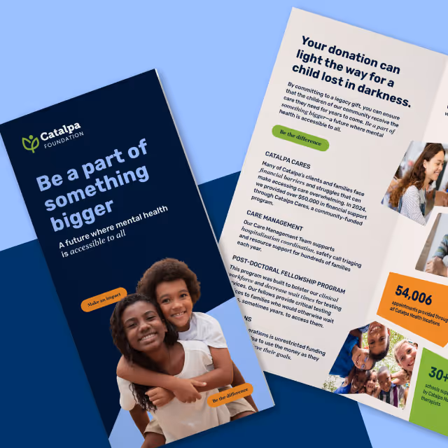
The Catalpa Foundation needed to make a strong entrance into the community with a brand that could inspire generosity and trust. While the new brand needed to align with Catalpa Health, it also had to clearly communicate the Foundation’s distinct purpose as the fundraising engine for pediatric mental health. The brand had to speak to donors, corporate partners, and community members alike, building an emotional connection while also reflecting professionalism, transparency, and vision.
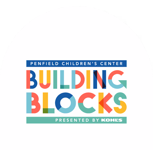
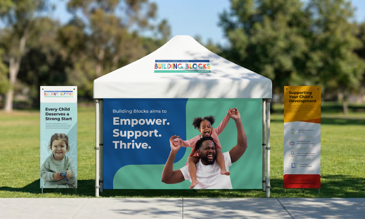
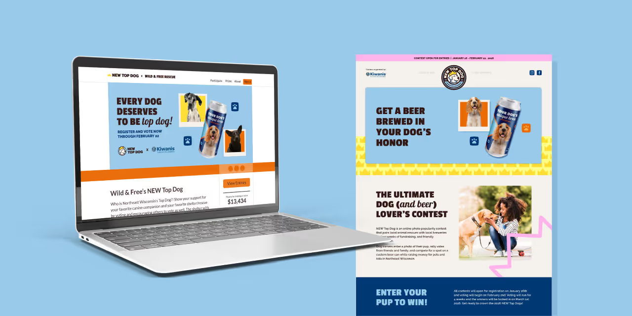
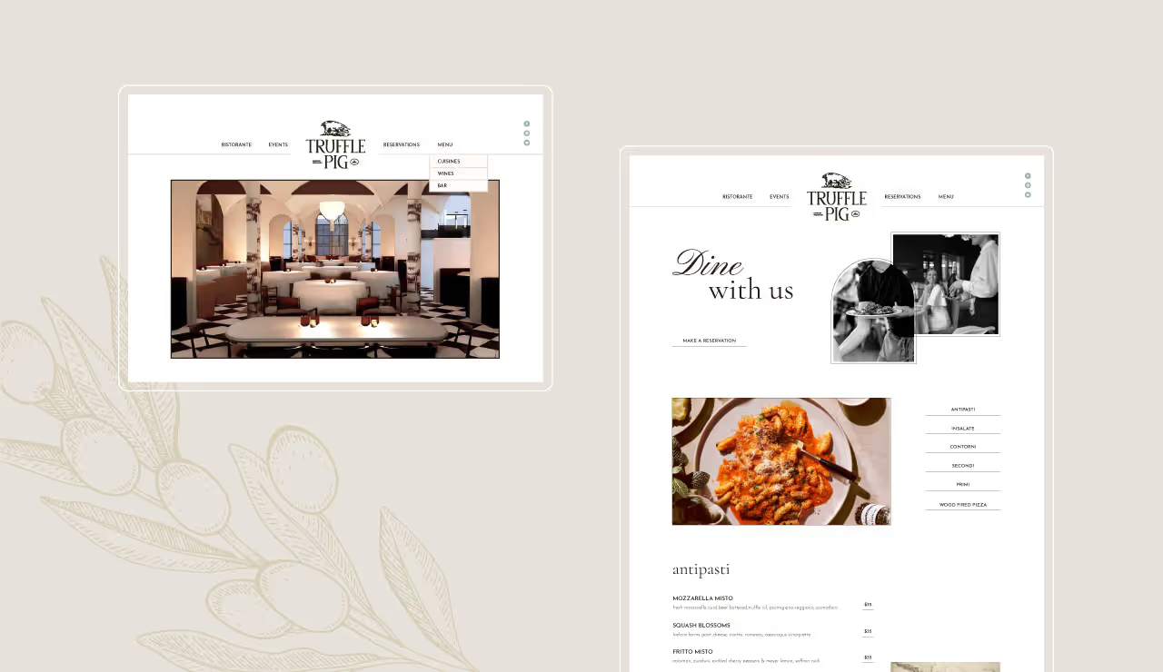
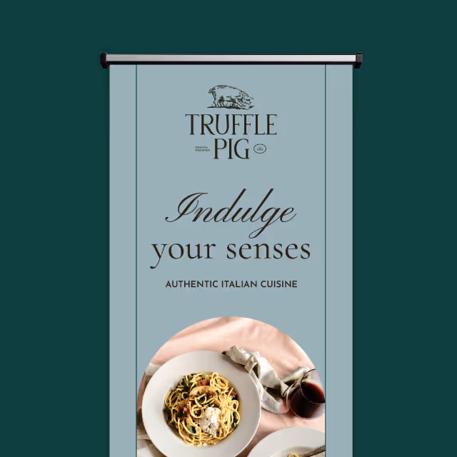
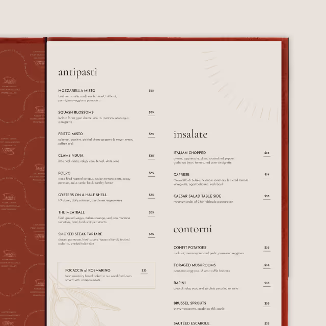
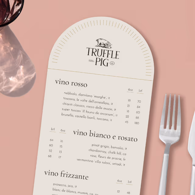
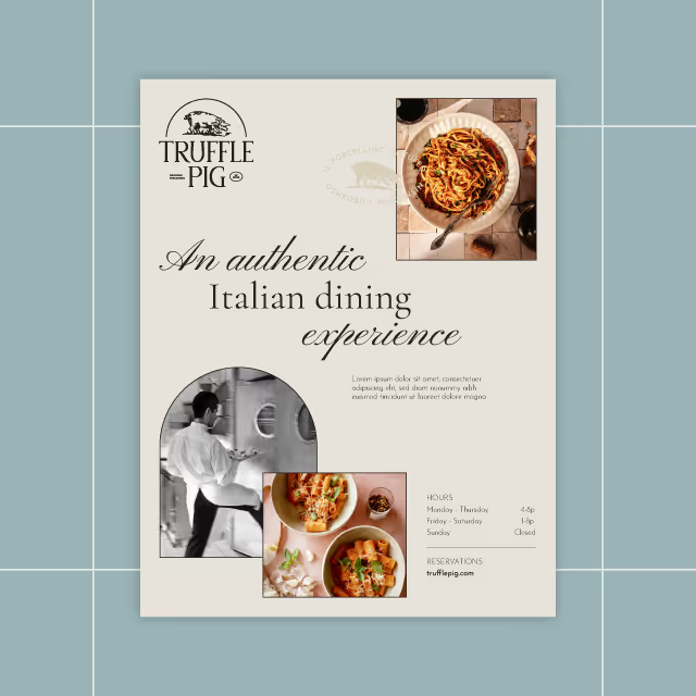
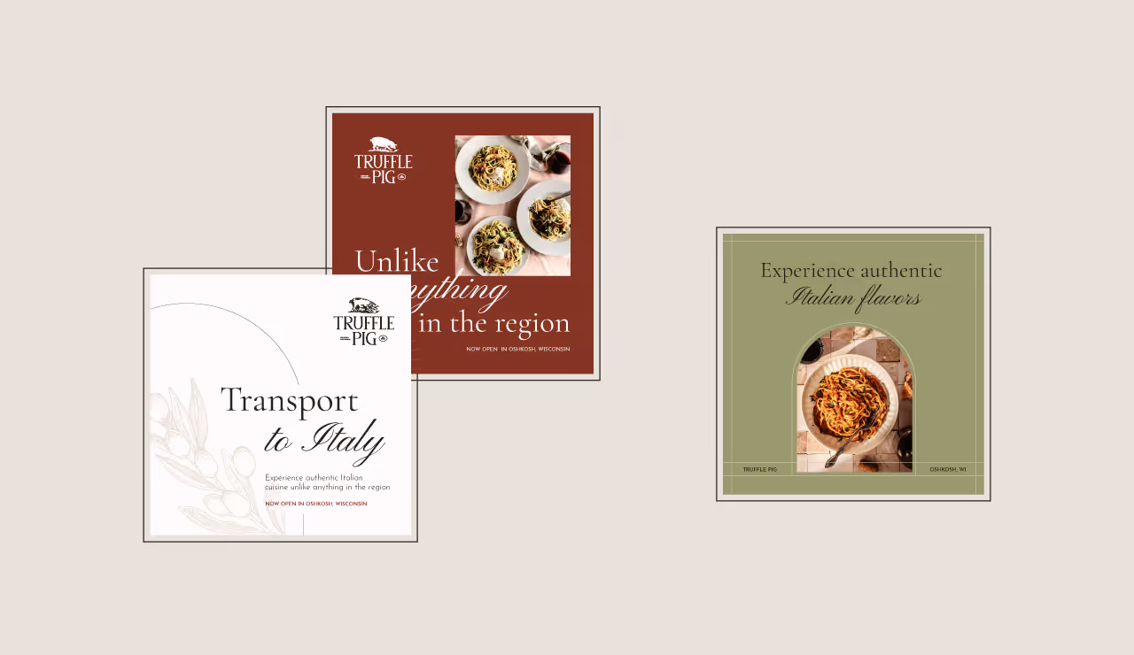
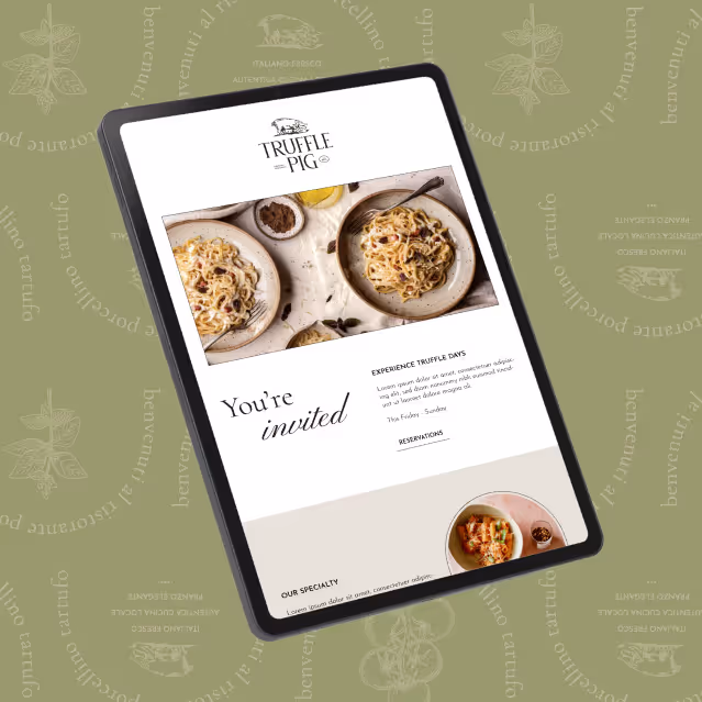
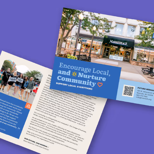
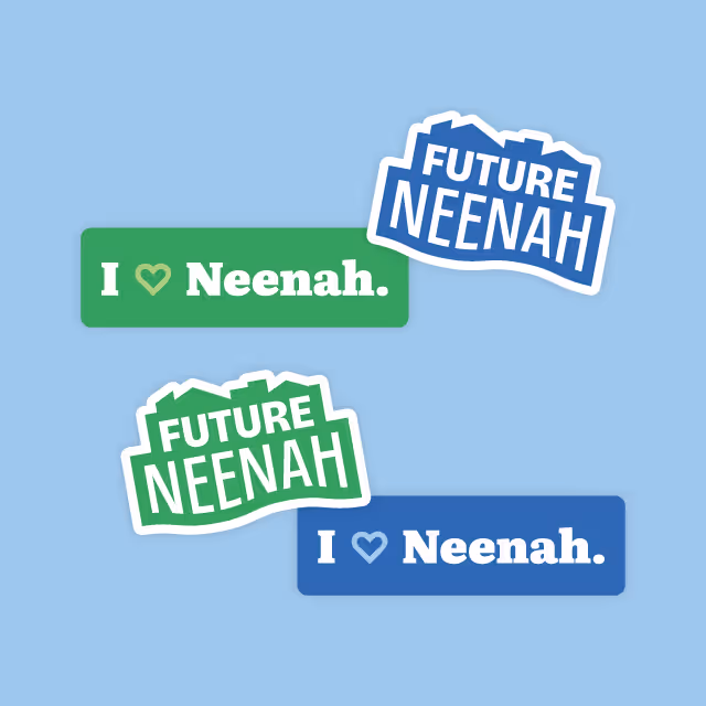
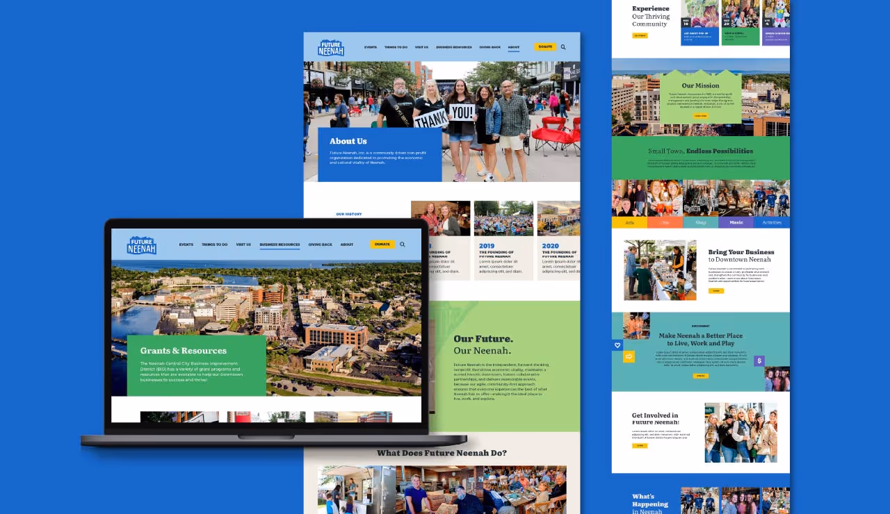
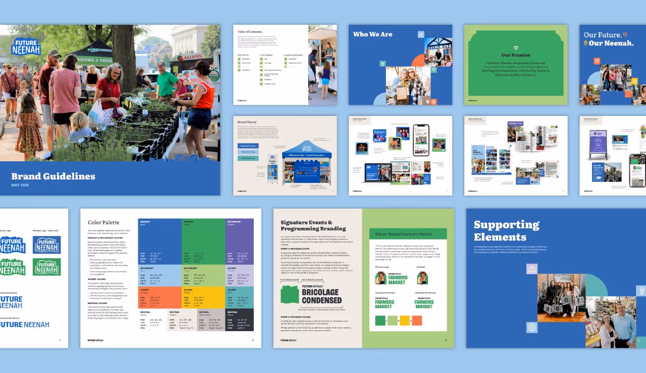
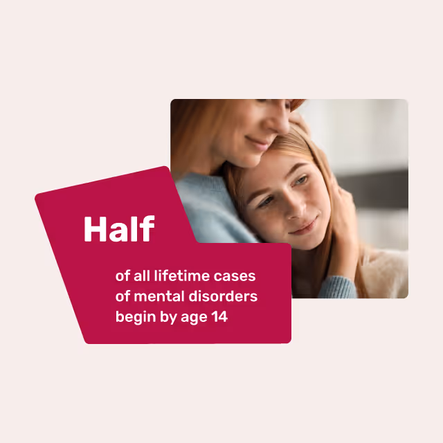
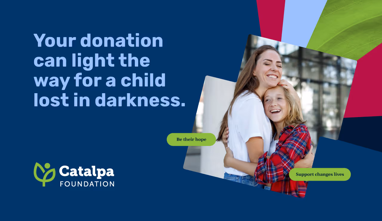
Quill Creative Studio led the development of a strategic and cohesive brand identity that visually and verbally communicates the Foundation’s mission to support the mental health of children and families. The identity balances polish and warmth, using bold typography, expressive radial graphics, and a rich color palette that evokes both seriousness and hope.
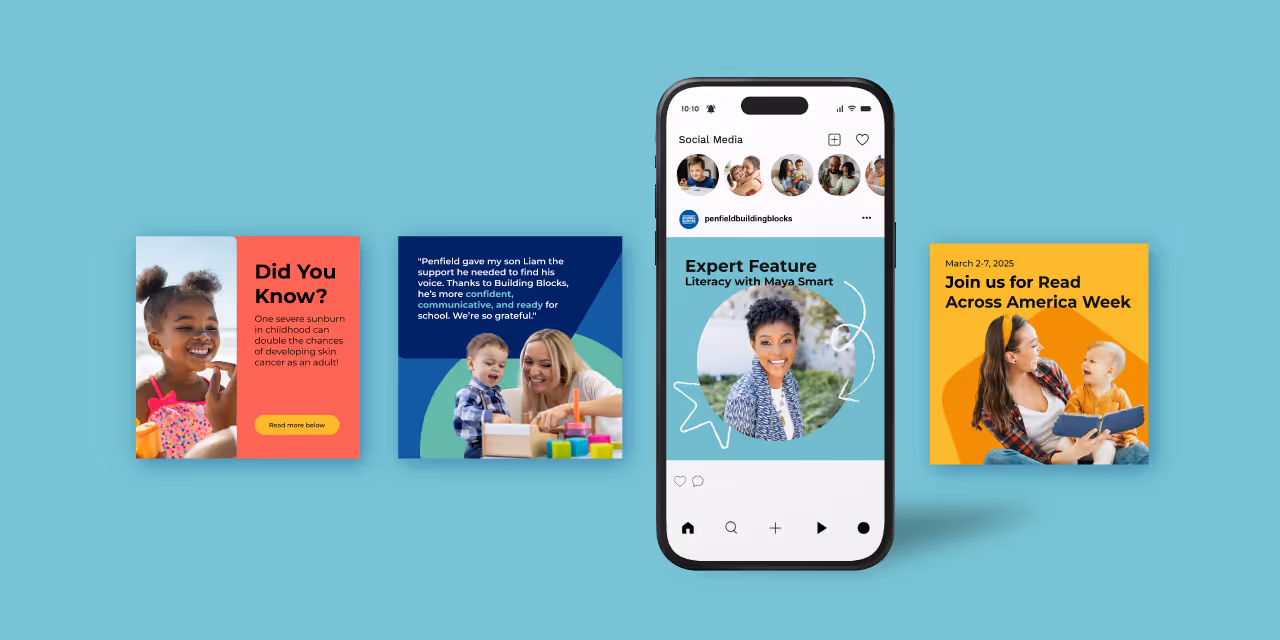
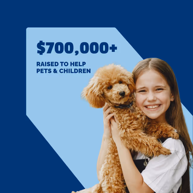
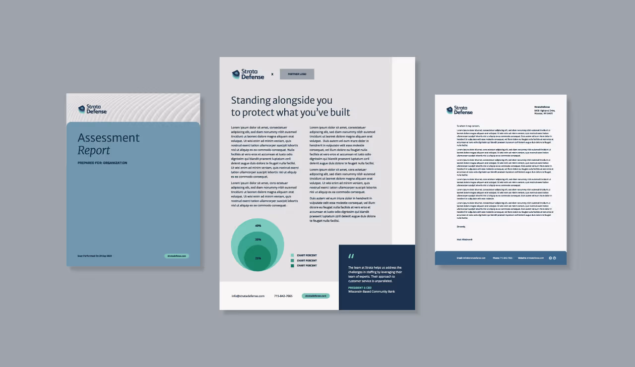
We crafted a visual system that includes impactful layouts with intentional white space, textured background elements that symbolize growth and transparency, and dynamic data visuals to showcase outcomes. Messaging was built around themes of transformation, collective action, and donor empowerment. The voice was designed to be uplifting, genuine, and action-oriented, giving the Foundation the tools to rally the community with confidence and clarity.
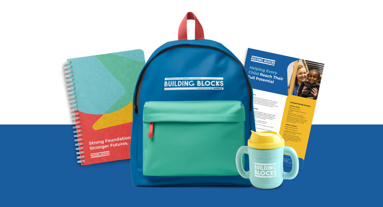
Catalpa Foundation made its public debut supported by a network of respected corporate partners and donors. With a complete brand identity system and user-friendly tools like a Canva-based collateral suite, the Foundation is now equipped to drive engagement and inspire lasting impact. The new brand has helped position the Foundation as a trusted force for good, ready to fund essential services and create a healthier future for every child in the Fox Valley region.
The Catalpa Foundation needed to make a strong entrance into the community with a brand that could inspire generosity and trust. While the new brand needed to align with Catalpa Health, it also had to clearly communicate the Foundation’s distinct purpose as the fundraising engine for pediatric mental health. The brand had to speak to donors, corporate partners, and community members alike, building an emotional connection while also reflecting professionalism, transparency, and vision.
Quill Creative Studio led the development of a strategic and cohesive brand identity that visually and verbally communicates the Foundation’s mission to support the mental health of children and families. The identity balances polish and warmth, using bold typography, expressive radial graphics, and a rich color palette that evokes both seriousness and hope.
We crafted a visual system that includes impactful layouts with intentional white space, textured background elements that symbolize growth and transparency, and dynamic data visuals to showcase outcomes. Messaging was built around themes of transformation, collective action, and donor empowerment. The voice was designed to be uplifting, genuine, and action-oriented, giving the Foundation the tools to rally the community with confidence and clarity.
Catalpa Foundation made its public debut supported by a network of respected corporate partners and donors. With a complete brand identity system and user-friendly tools like a Canva-based collateral suite, the Foundation is now equipped to drive engagement and inspire lasting impact. The new brand has helped position the Foundation as a trusted force for good, ready to fund essential services and create a healthier future for every child in the Fox Valley region.


The Catalpa Foundation needed to make a strong entrance into the community with a brand that could inspire generosity and trust. While the new brand needed to align with Catalpa Health, it also had to clearly communicate the Foundation’s distinct purpose as the fundraising engine for pediatric mental health. The brand had to speak to donors, corporate partners, and community members alike, building an emotional connection while also reflecting professionalism, transparency, and vision.

Quill Creative Studio led the development of a strategic and cohesive brand identity that visually and verbally communicates the Foundation’s mission to support the mental health of children and families. The identity balances polish and warmth, using bold typography, expressive radial graphics, and a rich color palette that evokes both seriousness and hope.
We crafted a visual system that includes impactful layouts with intentional white space, textured background elements that symbolize growth and transparency, and dynamic data visuals to showcase outcomes. Messaging was built around themes of transformation, collective action, and donor empowerment. The voice was designed to be uplifting, genuine, and action-oriented, giving the Foundation the tools to rally the community with confidence and clarity.


Catalpa Foundation made its public debut supported by a network of respected corporate partners and donors. With a complete brand identity system and user-friendly tools like a Canva-based collateral suite, the Foundation is now equipped to drive engagement and inspire lasting impact. The new brand has helped position the Foundation as a trusted force for good, ready to fund essential services and create a healthier future for every child in the Fox Valley region.


The Catalpa Foundation needed to make a strong entrance into the community with a brand that could inspire generosity and trust. While the new brand needed to align with Catalpa Health, it also had to clearly communicate the Foundation’s distinct purpose as the fundraising engine for pediatric mental health. The brand had to speak to donors, corporate partners, and community members alike, building an emotional connection while also reflecting professionalism, transparency, and vision.
Quill Creative Studio led the development of a strategic and cohesive brand identity that visually and verbally communicates the Foundation’s mission to support the mental health of children and families. The identity balances polish and warmth, using bold typography, expressive radial graphics, and a rich color palette that evokes both seriousness and hope.
We crafted a visual system that includes impactful layouts with intentional white space, textured background elements that symbolize growth and transparency, and dynamic data visuals to showcase outcomes. Messaging was built around themes of transformation, collective action, and donor empowerment. The voice was designed to be uplifting, genuine, and action-oriented, giving the Foundation the tools to rally the community with confidence and clarity.

Catalpa Foundation made its public debut supported by a network of respected corporate partners and donors. With a complete brand identity system and user-friendly tools like a Canva-based collateral suite, the Foundation is now equipped to drive engagement and inspire lasting impact. The new brand has helped position the Foundation as a trusted force for good, ready to fund essential services and create a healthier future for every child in the Fox Valley region.
The Catalpa Foundation needed to make a strong entrance into the community with a brand that could inspire generosity and trust. While the new brand needed to align with Catalpa Health, it also had to clearly communicate the Foundation’s distinct purpose as the fundraising engine for pediatric mental health. The brand had to speak to donors, corporate partners, and community members alike, building an emotional connection while also reflecting professionalism, transparency, and vision.


Quill Creative Studio led the development of a strategic and cohesive brand identity that visually and verbally communicates the Foundation’s mission to support the mental health of children and families. The identity balances polish and warmth, using bold typography, expressive radial graphics, and a rich color palette that evokes both seriousness and hope.
We crafted a visual system that includes impactful layouts with intentional white space, textured background elements that symbolize growth and transparency, and dynamic data visuals to showcase outcomes. Messaging was built around themes of transformation, collective action, and donor empowerment. The voice was designed to be uplifting, genuine, and action-oriented, giving the Foundation the tools to rally the community with confidence and clarity.
Catalpa Foundation made its public debut supported by a network of respected corporate partners and donors. With a complete brand identity system and user-friendly tools like a Canva-based collateral suite, the Foundation is now equipped to drive engagement and inspire lasting impact. The new brand has helped position the Foundation as a trusted force for good, ready to fund essential services and create a healthier future for every child in the Fox Valley region.

The Catalpa Foundation needed to make a strong entrance into the community with a brand that could inspire generosity and trust. While the new brand needed to align with Catalpa Health, it also had to clearly communicate the Foundation’s distinct purpose as the fundraising engine for pediatric mental health. The brand had to speak to donors, corporate partners, and community members alike, building an emotional connection while also reflecting professionalism, transparency, and vision.


Quill Creative Studio led the development of a strategic and cohesive brand identity that visually and verbally communicates the Foundation’s mission to support the mental health of children and families. The identity balances polish and warmth, using bold typography, expressive radial graphics, and a rich color palette that evokes both seriousness and hope.
We crafted a visual system that includes impactful layouts with intentional white space, textured background elements that symbolize growth and transparency, and dynamic data visuals to showcase outcomes. Messaging was built around themes of transformation, collective action, and donor empowerment. The voice was designed to be uplifting, genuine, and action-oriented, giving the Foundation the tools to rally the community with confidence and clarity.


Catalpa Foundation made its public debut supported by a network of respected corporate partners and donors. With a complete brand identity system and user-friendly tools like a Canva-based collateral suite, the Foundation is now equipped to drive engagement and inspire lasting impact. The new brand has helped position the Foundation as a trusted force for good, ready to fund essential services and create a healthier future for every child in the Fox Valley region.

The Catalpa Foundation needed to make a strong entrance into the community with a brand that could inspire generosity and trust. While the new brand needed to align with Catalpa Health, it also had to clearly communicate the Foundation’s distinct purpose as the fundraising engine for pediatric mental health. The brand had to speak to donors, corporate partners, and community members alike, building an emotional connection while also reflecting professionalism, transparency, and vision.


Quill Creative Studio led the development of a strategic and cohesive brand identity that visually and verbally communicates the Foundation’s mission to support the mental health of children and families. The identity balances polish and warmth, using bold typography, expressive radial graphics, and a rich color palette that evokes both seriousness and hope.
We crafted a visual system that includes impactful layouts with intentional white space, textured background elements that symbolize growth and transparency, and dynamic data visuals to showcase outcomes. Messaging was built around themes of transformation, collective action, and donor empowerment. The voice was designed to be uplifting, genuine, and action-oriented, giving the Foundation the tools to rally the community with confidence and clarity.


Catalpa Foundation made its public debut supported by a network of respected corporate partners and donors. With a complete brand identity system and user-friendly tools like a Canva-based collateral suite, the Foundation is now equipped to drive engagement and inspire lasting impact. The new brand has helped position the Foundation as a trusted force for good, ready to fund essential services and create a healthier future for every child in the Fox Valley region.


The Catalpa Foundation needed to make a strong entrance into the community with a brand that could inspire generosity and trust. While the new brand needed to align with Catalpa Health, it also had to clearly communicate the Foundation’s distinct purpose as the fundraising engine for pediatric mental health. The brand had to speak to donors, corporate partners, and community members alike, building an emotional connection while also reflecting professionalism, transparency, and vision.

Quill Creative Studio led the development of a strategic and cohesive brand identity that visually and verbally communicates the Foundation’s mission to support the mental health of children and families. The identity balances polish and warmth, using bold typography, expressive radial graphics, and a rich color palette that evokes both seriousness and hope.
We crafted a visual system that includes impactful layouts with intentional white space, textured background elements that symbolize growth and transparency, and dynamic data visuals to showcase outcomes. Messaging was built around themes of transformation, collective action, and donor empowerment. The voice was designed to be uplifting, genuine, and action-oriented, giving the Foundation the tools to rally the community with confidence and clarity.

Catalpa Foundation made its public debut supported by a network of respected corporate partners and donors. With a complete brand identity system and user-friendly tools like a Canva-based collateral suite, the Foundation is now equipped to drive engagement and inspire lasting impact. The new brand has helped position the Foundation as a trusted force for good, ready to fund essential services and create a healthier future for every child in the Fox Valley region.


The Catalpa Foundation needed to make a strong entrance into the community with a brand that could inspire generosity and trust. While the new brand needed to align with Catalpa Health, it also had to clearly communicate the Foundation’s distinct purpose as the fundraising engine for pediatric mental health. The brand had to speak to donors, corporate partners, and community members alike, building an emotional connection while also reflecting professionalism, transparency, and vision.

Quill Creative Studio led the development of a strategic and cohesive brand identity that visually and verbally communicates the Foundation’s mission to support the mental health of children and families. The identity balances polish and warmth, using bold typography, expressive radial graphics, and a rich color palette that evokes both seriousness and hope.
We crafted a visual system that includes impactful layouts with intentional white space, textured background elements that symbolize growth and transparency, and dynamic data visuals to showcase outcomes. Messaging was built around themes of transformation, collective action, and donor empowerment. The voice was designed to be uplifting, genuine, and action-oriented, giving the Foundation the tools to rally the community with confidence and clarity.

Catalpa Foundation made its public debut supported by a network of respected corporate partners and donors. With a complete brand identity system and user-friendly tools like a Canva-based collateral suite, the Foundation is now equipped to drive engagement and inspire lasting impact. The new brand has helped position the Foundation as a trusted force for good, ready to fund essential services and create a healthier future for every child in the Fox Valley region.

The Catalpa Foundation needed to make a strong entrance into the community with a brand that could inspire generosity and trust. While the new brand needed to align with Catalpa Health, it also had to clearly communicate the Foundation’s distinct purpose as the fundraising engine for pediatric mental health. The brand had to speak to donors, corporate partners, and community members alike, building an emotional connection while also reflecting professionalism, transparency, and vision.
Quill Creative Studio led the development of a strategic and cohesive brand identity that visually and verbally communicates the Foundation’s mission to support the mental health of children and families. The identity balances polish and warmth, using bold typography, expressive radial graphics, and a rich color palette that evokes both seriousness and hope.
We crafted a visual system that includes impactful layouts with intentional white space, textured background elements that symbolize growth and transparency, and dynamic data visuals to showcase outcomes. Messaging was built around themes of transformation, collective action, and donor empowerment. The voice was designed to be uplifting, genuine, and action-oriented, giving the Foundation the tools to rally the community with confidence and clarity.
Catalpa Foundation made its public debut supported by a network of respected corporate partners and donors. With a complete brand identity system and user-friendly tools like a Canva-based collateral suite, the Foundation is now equipped to drive engagement and inspire lasting impact. The new brand has helped position the Foundation as a trusted force for good, ready to fund essential services and create a healthier future for every child in the Fox Valley region.


The Catalpa Foundation needed to make a strong entrance into the community with a brand that could inspire generosity and trust. While the new brand needed to align with Catalpa Health, it also had to clearly communicate the Foundation’s distinct purpose as the fundraising engine for pediatric mental health. The brand had to speak to donors, corporate partners, and community members alike, building an emotional connection while also reflecting professionalism, transparency, and vision.

Quill Creative Studio led the development of a strategic and cohesive brand identity that visually and verbally communicates the Foundation’s mission to support the mental health of children and families. The identity balances polish and warmth, using bold typography, expressive radial graphics, and a rich color palette that evokes both seriousness and hope.
We crafted a visual system that includes impactful layouts with intentional white space, textured background elements that symbolize growth and transparency, and dynamic data visuals to showcase outcomes. Messaging was built around themes of transformation, collective action, and donor empowerment. The voice was designed to be uplifting, genuine, and action-oriented, giving the Foundation the tools to rally the community with confidence and clarity.
Catalpa Foundation made its public debut supported by a network of respected corporate partners and donors. With a complete brand identity system and user-friendly tools like a Canva-based collateral suite, the Foundation is now equipped to drive engagement and inspire lasting impact. The new brand has helped position the Foundation as a trusted force for good, ready to fund essential services and create a healthier future for every child in the Fox Valley region.


The Catalpa Foundation needed to make a strong entrance into the community with a brand that could inspire generosity and trust. While the new brand needed to align with Catalpa Health, it also had to clearly communicate the Foundation’s distinct purpose as the fundraising engine for pediatric mental health. The brand had to speak to donors, corporate partners, and community members alike, building an emotional connection while also reflecting professionalism, transparency, and vision.


Quill Creative Studio led the development of a strategic and cohesive brand identity that visually and verbally communicates the Foundation’s mission to support the mental health of children and families. The identity balances polish and warmth, using bold typography, expressive radial graphics, and a rich color palette that evokes both seriousness and hope.
We crafted a visual system that includes impactful layouts with intentional white space, textured background elements that symbolize growth and transparency, and dynamic data visuals to showcase outcomes. Messaging was built around themes of transformation, collective action, and donor empowerment. The voice was designed to be uplifting, genuine, and action-oriented, giving the Foundation the tools to rally the community with confidence and clarity.

Catalpa Foundation made its public debut supported by a network of respected corporate partners and donors. With a complete brand identity system and user-friendly tools like a Canva-based collateral suite, the Foundation is now equipped to drive engagement and inspire lasting impact. The new brand has helped position the Foundation as a trusted force for good, ready to fund essential services and create a healthier future for every child in the Fox Valley region.


The Catalpa Foundation needed to make a strong entrance into the community with a brand that could inspire generosity and trust. While the new brand needed to align with Catalpa Health, it also had to clearly communicate the Foundation’s distinct purpose as the fundraising engine for pediatric mental health. The brand had to speak to donors, corporate partners, and community members alike, building an emotional connection while also reflecting professionalism, transparency, and vision.

Quill Creative Studio led the development of a strategic and cohesive brand identity that visually and verbally communicates the Foundation’s mission to support the mental health of children and families. The identity balances polish and warmth, using bold typography, expressive radial graphics, and a rich color palette that evokes both seriousness and hope.
We crafted a visual system that includes impactful layouts with intentional white space, textured background elements that symbolize growth and transparency, and dynamic data visuals to showcase outcomes. Messaging was built around themes of transformation, collective action, and donor empowerment. The voice was designed to be uplifting, genuine, and action-oriented, giving the Foundation the tools to rally the community with confidence and clarity.


Catalpa Foundation made its public debut supported by a network of respected corporate partners and donors. With a complete brand identity system and user-friendly tools like a Canva-based collateral suite, the Foundation is now equipped to drive engagement and inspire lasting impact. The new brand has helped position the Foundation as a trusted force for good, ready to fund essential services and create a healthier future for every child in the Fox Valley region.


The Catalpa Foundation needed to make a strong entrance into the community with a brand that could inspire generosity and trust. While the new brand needed to align with Catalpa Health, it also had to clearly communicate the Foundation’s distinct purpose as the fundraising engine for pediatric mental health. The brand had to speak to donors, corporate partners, and community members alike, building an emotional connection while also reflecting professionalism, transparency, and vision.


Quill Creative Studio led the development of a strategic and cohesive brand identity that visually and verbally communicates the Foundation’s mission to support the mental health of children and families. The identity balances polish and warmth, using bold typography, expressive radial graphics, and a rich color palette that evokes both seriousness and hope.
We crafted a visual system that includes impactful layouts with intentional white space, textured background elements that symbolize growth and transparency, and dynamic data visuals to showcase outcomes. Messaging was built around themes of transformation, collective action, and donor empowerment. The voice was designed to be uplifting, genuine, and action-oriented, giving the Foundation the tools to rally the community with confidence and clarity.


Catalpa Foundation made its public debut supported by a network of respected corporate partners and donors. With a complete brand identity system and user-friendly tools like a Canva-based collateral suite, the Foundation is now equipped to drive engagement and inspire lasting impact. The new brand has helped position the Foundation as a trusted force for good, ready to fund essential services and create a healthier future for every child in the Fox Valley region.


The Catalpa Foundation needed to make a strong entrance into the community with a brand that could inspire generosity and trust. While the new brand needed to align with Catalpa Health, it also had to clearly communicate the Foundation’s distinct purpose as the fundraising engine for pediatric mental health. The brand had to speak to donors, corporate partners, and community members alike, building an emotional connection while also reflecting professionalism, transparency, and vision.


Quill Creative Studio led the development of a strategic and cohesive brand identity that visually and verbally communicates the Foundation’s mission to support the mental health of children and families. The identity balances polish and warmth, using bold typography, expressive radial graphics, and a rich color palette that evokes both seriousness and hope.
We crafted a visual system that includes impactful layouts with intentional white space, textured background elements that symbolize growth and transparency, and dynamic data visuals to showcase outcomes. Messaging was built around themes of transformation, collective action, and donor empowerment. The voice was designed to be uplifting, genuine, and action-oriented, giving the Foundation the tools to rally the community with confidence and clarity.

Catalpa Foundation made its public debut supported by a network of respected corporate partners and donors. With a complete brand identity system and user-friendly tools like a Canva-based collateral suite, the Foundation is now equipped to drive engagement and inspire lasting impact. The new brand has helped position the Foundation as a trusted force for good, ready to fund essential services and create a healthier future for every child in the Fox Valley region.


The Catalpa Foundation needed to make a strong entrance into the community with a brand that could inspire generosity and trust. While the new brand needed to align with Catalpa Health, it also had to clearly communicate the Foundation’s distinct purpose as the fundraising engine for pediatric mental health. The brand had to speak to donors, corporate partners, and community members alike, building an emotional connection while also reflecting professionalism, transparency, and vision.

Quill Creative Studio led the development of a strategic and cohesive brand identity that visually and verbally communicates the Foundation’s mission to support the mental health of children and families. The identity balances polish and warmth, using bold typography, expressive radial graphics, and a rich color palette that evokes both seriousness and hope.
We crafted a visual system that includes impactful layouts with intentional white space, textured background elements that symbolize growth and transparency, and dynamic data visuals to showcase outcomes. Messaging was built around themes of transformation, collective action, and donor empowerment. The voice was designed to be uplifting, genuine, and action-oriented, giving the Foundation the tools to rally the community with confidence and clarity.


Catalpa Foundation made its public debut supported by a network of respected corporate partners and donors. With a complete brand identity system and user-friendly tools like a Canva-based collateral suite, the Foundation is now equipped to drive engagement and inspire lasting impact. The new brand has helped position the Foundation as a trusted force for good, ready to fund essential services and create a healthier future for every child in the Fox Valley region.


The Catalpa Foundation needed to make a strong entrance into the community with a brand that could inspire generosity and trust. While the new brand needed to align with Catalpa Health, it also had to clearly communicate the Foundation’s distinct purpose as the fundraising engine for pediatric mental health. The brand had to speak to donors, corporate partners, and community members alike, building an emotional connection while also reflecting professionalism, transparency, and vision.


Quill Creative Studio led the development of a strategic and cohesive brand identity that visually and verbally communicates the Foundation’s mission to support the mental health of children and families. The identity balances polish and warmth, using bold typography, expressive radial graphics, and a rich color palette that evokes both seriousness and hope.
We crafted a visual system that includes impactful layouts with intentional white space, textured background elements that symbolize growth and transparency, and dynamic data visuals to showcase outcomes. Messaging was built around themes of transformation, collective action, and donor empowerment. The voice was designed to be uplifting, genuine, and action-oriented, giving the Foundation the tools to rally the community with confidence and clarity.


Catalpa Foundation made its public debut supported by a network of respected corporate partners and donors. With a complete brand identity system and user-friendly tools like a Canva-based collateral suite, the Foundation is now equipped to drive engagement and inspire lasting impact. The new brand has helped position the Foundation as a trusted force for good, ready to fund essential services and create a healthier future for every child in the Fox Valley region.


The Catalpa Foundation needed to make a strong entrance into the community with a brand that could inspire generosity and trust. While the new brand needed to align with Catalpa Health, it also had to clearly communicate the Foundation’s distinct purpose as the fundraising engine for pediatric mental health. The brand had to speak to donors, corporate partners, and community members alike, building an emotional connection while also reflecting professionalism, transparency, and vision.


Quill Creative Studio led the development of a strategic and cohesive brand identity that visually and verbally communicates the Foundation’s mission to support the mental health of children and families. The identity balances polish and warmth, using bold typography, expressive radial graphics, and a rich color palette that evokes both seriousness and hope.
We crafted a visual system that includes impactful layouts with intentional white space, textured background elements that symbolize growth and transparency, and dynamic data visuals to showcase outcomes. Messaging was built around themes of transformation, collective action, and donor empowerment. The voice was designed to be uplifting, genuine, and action-oriented, giving the Foundation the tools to rally the community with confidence and clarity.


Catalpa Foundation made its public debut supported by a network of respected corporate partners and donors. With a complete brand identity system and user-friendly tools like a Canva-based collateral suite, the Foundation is now equipped to drive engagement and inspire lasting impact. The new brand has helped position the Foundation as a trusted force for good, ready to fund essential services and create a healthier future for every child in the Fox Valley region.


The Catalpa Foundation needed to make a strong entrance into the community with a brand that could inspire generosity and trust. While the new brand needed to align with Catalpa Health, it also had to clearly communicate the Foundation’s distinct purpose as the fundraising engine for pediatric mental health. The brand had to speak to donors, corporate partners, and community members alike, building an emotional connection while also reflecting professionalism, transparency, and vision.

Quill Creative Studio led the development of a strategic and cohesive brand identity that visually and verbally communicates the Foundation’s mission to support the mental health of children and families. The identity balances polish and warmth, using bold typography, expressive radial graphics, and a rich color palette that evokes both seriousness and hope.
We crafted a visual system that includes impactful layouts with intentional white space, textured background elements that symbolize growth and transparency, and dynamic data visuals to showcase outcomes. Messaging was built around themes of transformation, collective action, and donor empowerment. The voice was designed to be uplifting, genuine, and action-oriented, giving the Foundation the tools to rally the community with confidence and clarity.


Catalpa Foundation made its public debut supported by a network of respected corporate partners and donors. With a complete brand identity system and user-friendly tools like a Canva-based collateral suite, the Foundation is now equipped to drive engagement and inspire lasting impact. The new brand has helped position the Foundation as a trusted force for good, ready to fund essential services and create a healthier future for every child in the Fox Valley region.


When we needed a creative partner to help launch the Catalpa Foundation, we knew Quill Creative could support us in creating a cohesive but unique brand focused on our mission-driven work. They took the time to dive in and learn about us - helping shape the brand to expand our reach and solidify our presence as the leading pediatric mental health provider in the Fox Valley. We are grateful for their expertise, creativity and passion!
Kathryn Schultz, Marketing Manager, Catalpa Health

