
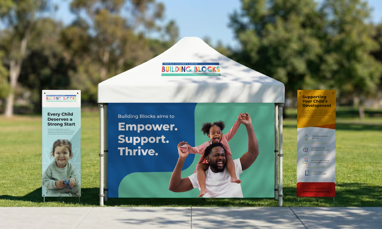
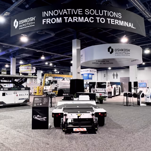
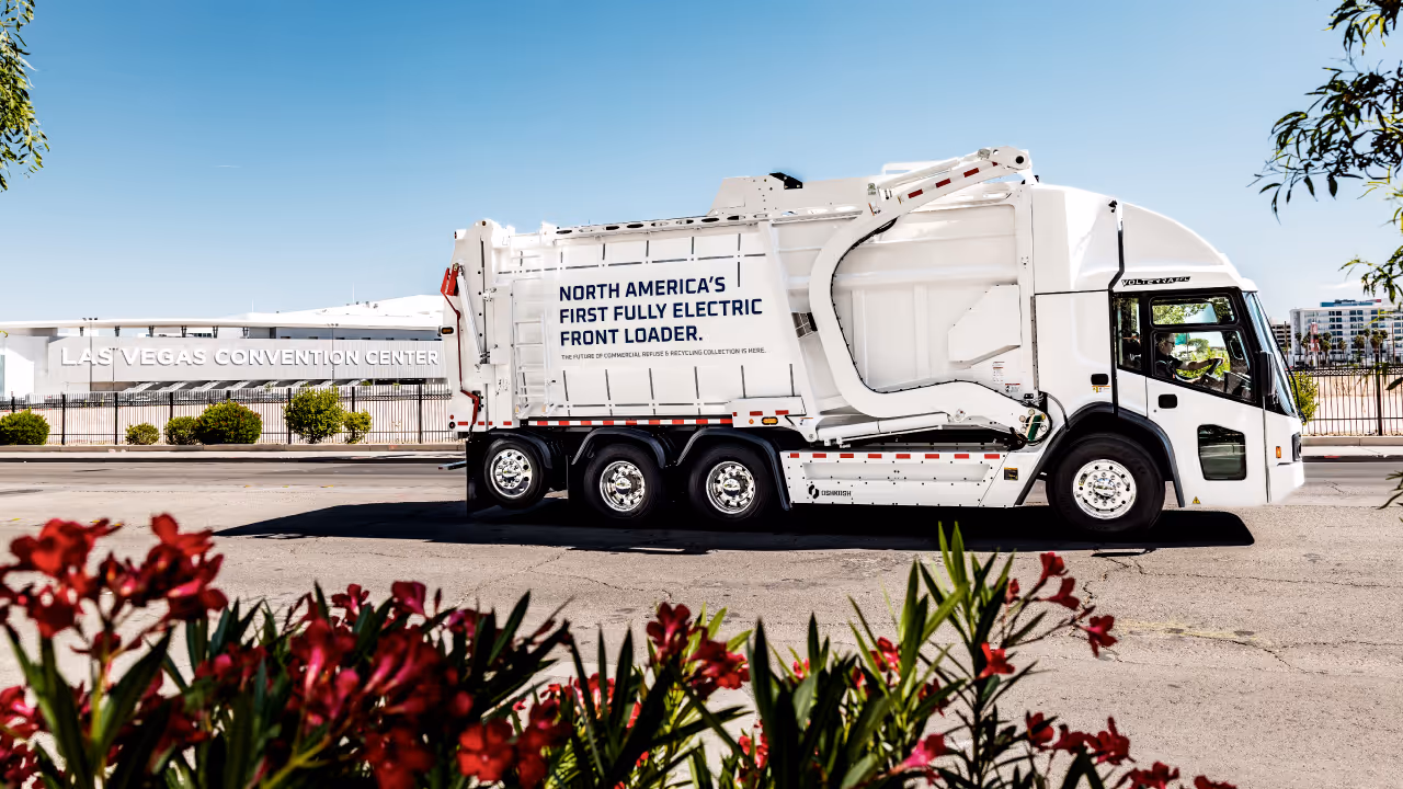
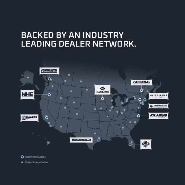
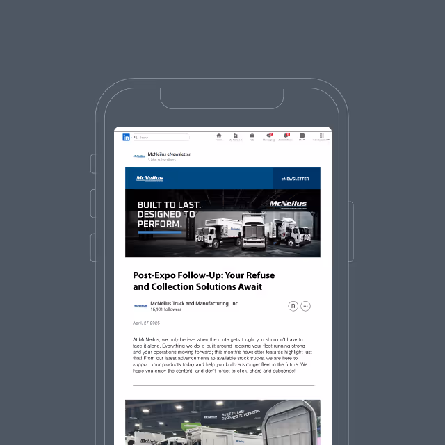
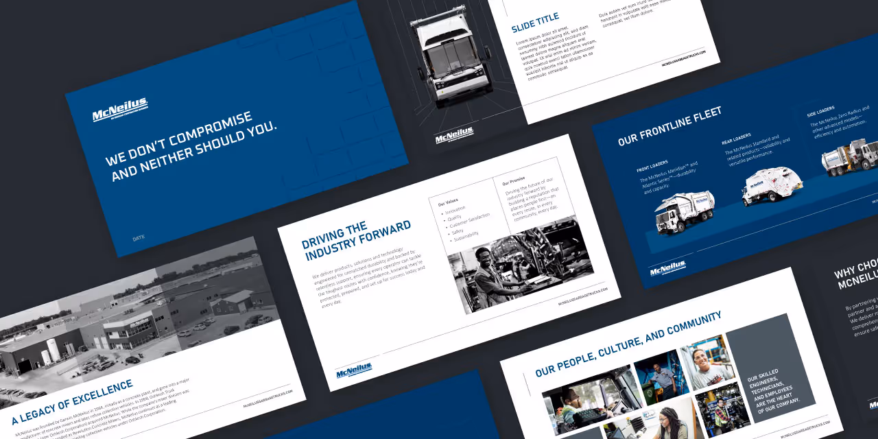
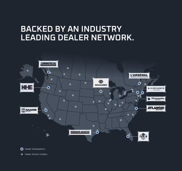
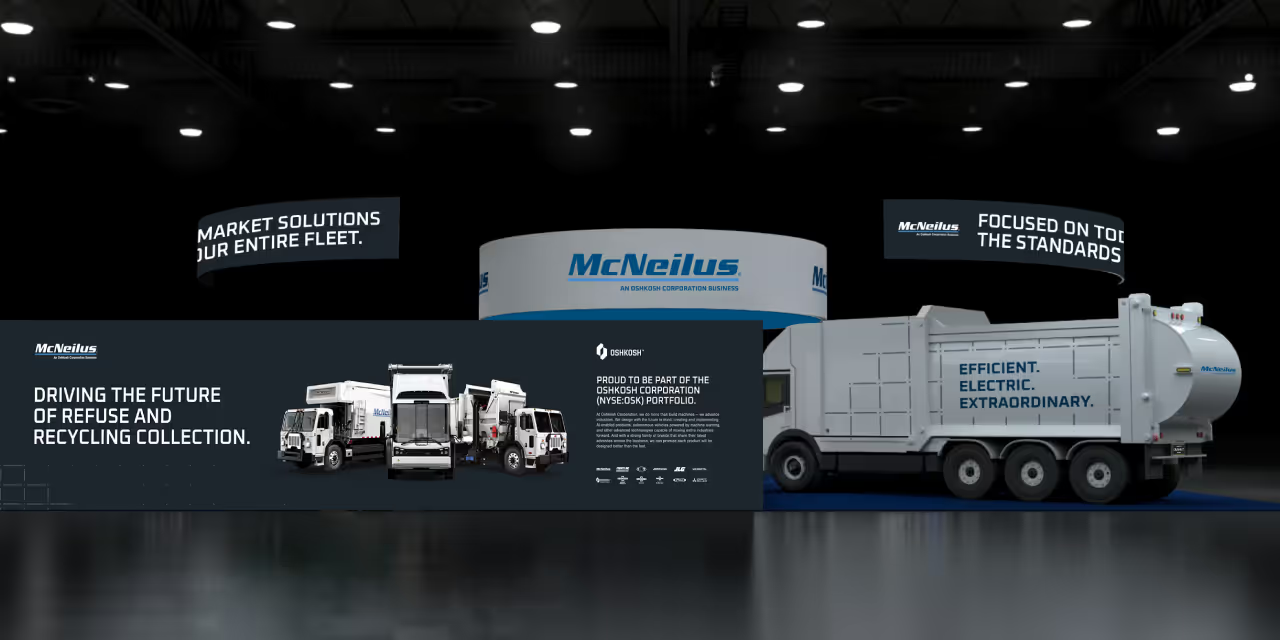
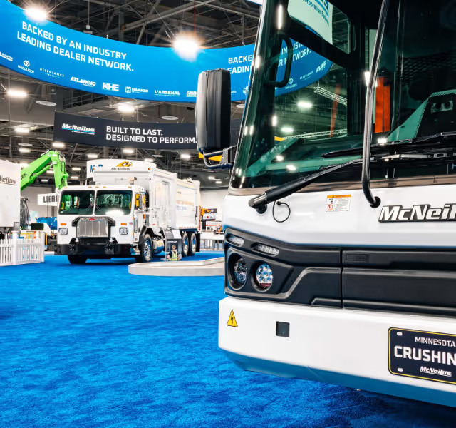
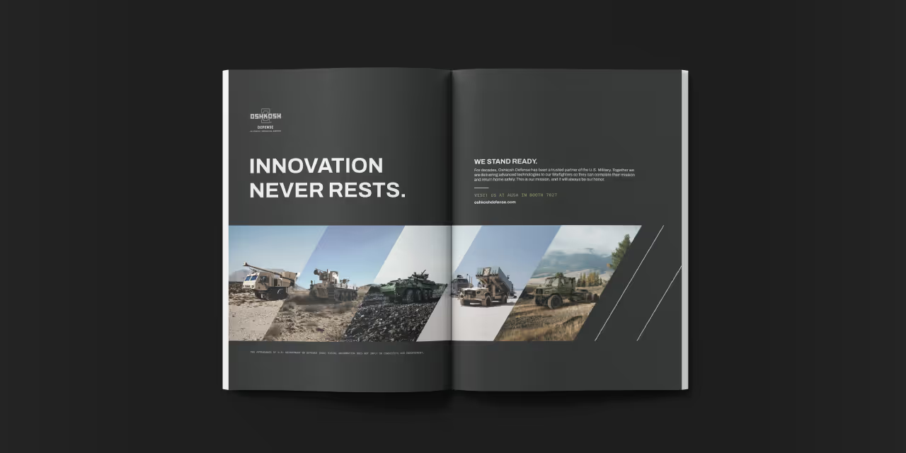
This year required McNeilus to make its most aggressive tradeshow appearance to date. Following a recent brand identity refresh and a strategic pivot to a dealer-based support network, the company needed to capitalize on the momentum generated by its parent company, Oshkosh Corporation, at CES. The challenge was to create a cohesive, high-impact campaign that would unify these major business shifts. We needed to design a visual system that could boldly assert their leadership in future-forward technology while simultaneously educating the market on their "customer-first" support infrastructure.

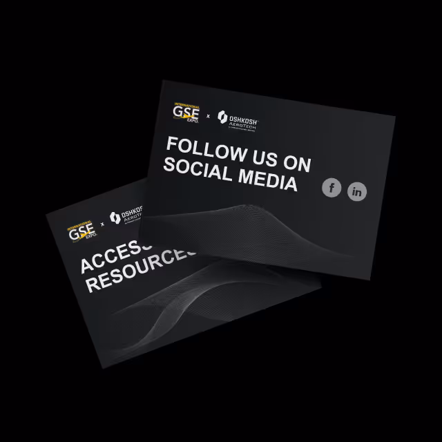
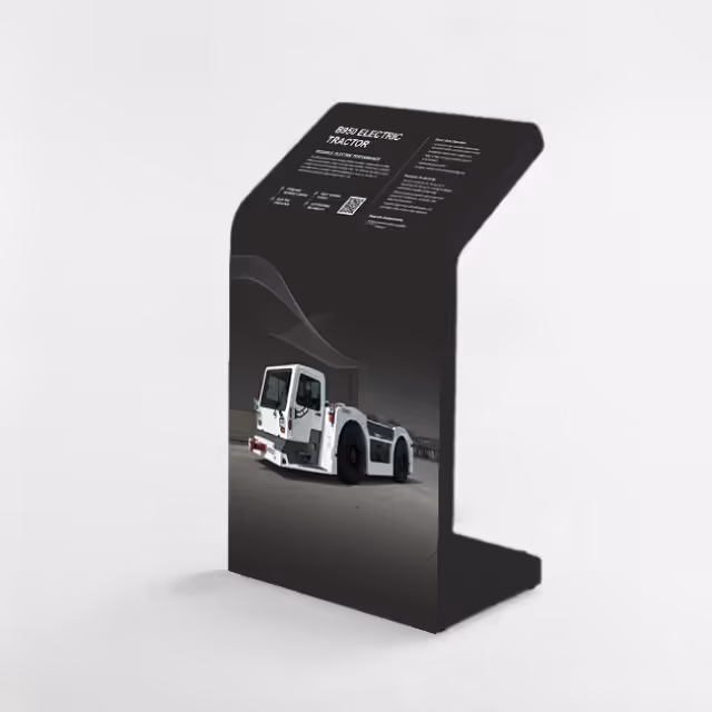
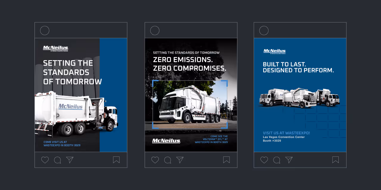
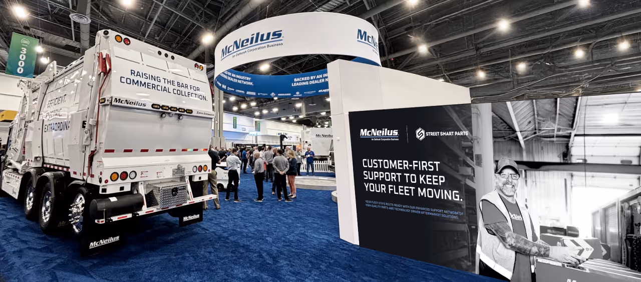
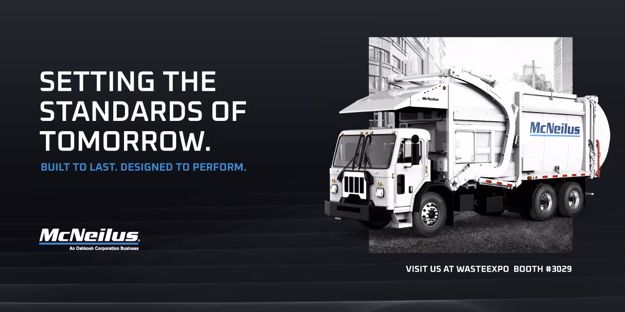
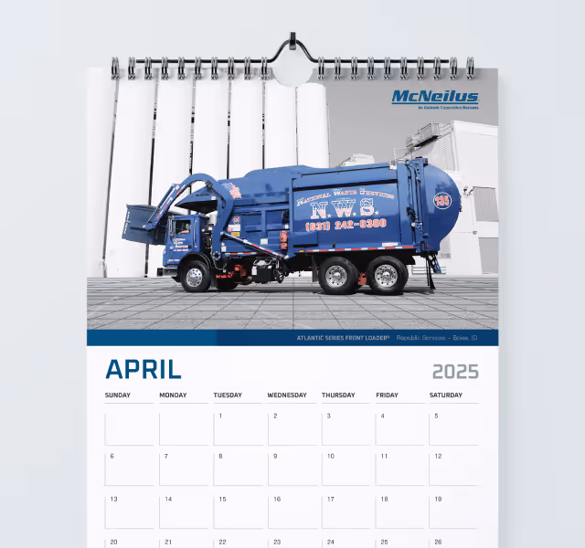
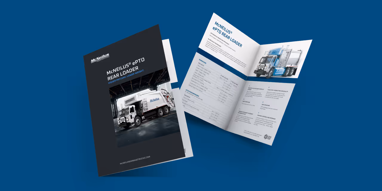
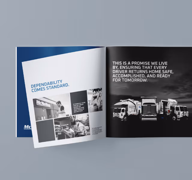
We developed the campaign concept "Setting the Standards of Tomorrow" to position McNeilus as the architect of the industry’s future. This messaging strategy bridged their innovation in hardware with their service evolution. The design execution utilized visual elements from their recent brand identity refresh to convey premium durability, anchored by core brand messaging pillars. We rolled this aesthetic out across a variety of touchpoints, including immersive booth graphics, vehicle decals, social media assets, and aftermarket solutions literature to ensure a consistent brand experience.


The campaign successfully established McNeilus’s dominant presence at the expo, delivering a unified brand experience that resonated with attendees. The consistent application of the new visual identity across every medium, from the tradeshow floor to post-expo email follow-ups, reinforced their market leadership. Feedback from the event indicated that the cohesive look and forward-thinking messaging effectively energized their customer base and clearly positioned McNeilus as the industry leader, driving innovation and shaping the future of waste collection.

This year required McNeilus to make its most aggressive tradeshow appearance to date. Following a recent brand identity refresh and a strategic pivot to a dealer-based support network, the company needed to capitalize on the momentum generated by its parent company, Oshkosh Corporation, at CES. The challenge was to create a cohesive, high-impact campaign that would unify these major business shifts. We needed to design a visual system that could boldly assert their leadership in future-forward technology while simultaneously educating the market on their "customer-first" support infrastructure.
We developed the campaign concept "Setting the Standards of Tomorrow" to position McNeilus as the architect of the industry’s future. This messaging strategy bridged their innovation in hardware with their service evolution. The design execution utilized visual elements from their recent brand identity refresh to convey premium durability, anchored by core brand messaging pillars. We rolled this aesthetic out across a variety of touchpoints, including immersive booth graphics, vehicle decals, social media assets, and aftermarket solutions literature to ensure a consistent brand experience.


The campaign successfully established McNeilus’s dominant presence at the expo, delivering a unified brand experience that resonated with attendees. The consistent application of the new visual identity across every medium, from the tradeshow floor to post-expo email follow-ups, reinforced their market leadership. Feedback from the event indicated that the cohesive look and forward-thinking messaging effectively energized their customer base and clearly positioned McNeilus as the industry leader, driving innovation and shaping the future of waste collection.


This year required McNeilus to make its most aggressive tradeshow appearance to date. Following a recent brand identity refresh and a strategic pivot to a dealer-based support network, the company needed to capitalize on the momentum generated by its parent company, Oshkosh Corporation, at CES. The challenge was to create a cohesive, high-impact campaign that would unify these major business shifts. We needed to design a visual system that could boldly assert their leadership in future-forward technology while simultaneously educating the market on their "customer-first" support infrastructure.
We developed the campaign concept "Setting the Standards of Tomorrow" to position McNeilus as the architect of the industry’s future. This messaging strategy bridged their innovation in hardware with their service evolution. The design execution utilized visual elements from their recent brand identity refresh to convey premium durability, anchored by core brand messaging pillars. We rolled this aesthetic out across a variety of touchpoints, including immersive booth graphics, vehicle decals, social media assets, and aftermarket solutions literature to ensure a consistent brand experience.

The campaign successfully established McNeilus’s dominant presence at the expo, delivering a unified brand experience that resonated with attendees. The consistent application of the new visual identity across every medium, from the tradeshow floor to post-expo email follow-ups, reinforced their market leadership. Feedback from the event indicated that the cohesive look and forward-thinking messaging effectively energized their customer base and clearly positioned McNeilus as the industry leader, driving innovation and shaping the future of waste collection.
This year required McNeilus to make its most aggressive tradeshow appearance to date. Following a recent brand identity refresh and a strategic pivot to a dealer-based support network, the company needed to capitalize on the momentum generated by its parent company, Oshkosh Corporation, at CES. The challenge was to create a cohesive, high-impact campaign that would unify these major business shifts. We needed to design a visual system that could boldly assert their leadership in future-forward technology while simultaneously educating the market on their "customer-first" support infrastructure.
We developed the campaign concept "Setting the Standards of Tomorrow" to position McNeilus as the architect of the industry’s future. This messaging strategy bridged their innovation in hardware with their service evolution. The design execution utilized visual elements from their recent brand identity refresh to convey premium durability, anchored by core brand messaging pillars. We rolled this aesthetic out across a variety of touchpoints, including immersive booth graphics, vehicle decals, social media assets, and aftermarket solutions literature to ensure a consistent brand experience.
The campaign successfully established McNeilus’s dominant presence at the expo, delivering a unified brand experience that resonated with attendees. The consistent application of the new visual identity across every medium, from the tradeshow floor to post-expo email follow-ups, reinforced their market leadership. Feedback from the event indicated that the cohesive look and forward-thinking messaging effectively energized their customer base and clearly positioned McNeilus as the industry leader, driving innovation and shaping the future of waste collection.

This year required McNeilus to make its most aggressive tradeshow appearance to date. Following a recent brand identity refresh and a strategic pivot to a dealer-based support network, the company needed to capitalize on the momentum generated by its parent company, Oshkosh Corporation, at CES. The challenge was to create a cohesive, high-impact campaign that would unify these major business shifts. We needed to design a visual system that could boldly assert their leadership in future-forward technology while simultaneously educating the market on their "customer-first" support infrastructure.

We developed the campaign concept "Setting the Standards of Tomorrow" to position McNeilus as the architect of the industry’s future. This messaging strategy bridged their innovation in hardware with their service evolution. The design execution utilized visual elements from their recent brand identity refresh to convey premium durability, anchored by core brand messaging pillars. We rolled this aesthetic out across a variety of touchpoints, including immersive booth graphics, vehicle decals, social media assets, and aftermarket solutions literature to ensure a consistent brand experience.

The campaign successfully established McNeilus’s dominant presence at the expo, delivering a unified brand experience that resonated with attendees. The consistent application of the new visual identity across every medium, from the tradeshow floor to post-expo email follow-ups, reinforced their market leadership. Feedback from the event indicated that the cohesive look and forward-thinking messaging effectively energized their customer base and clearly positioned McNeilus as the industry leader, driving innovation and shaping the future of waste collection.
This year required McNeilus to make its most aggressive tradeshow appearance to date. Following a recent brand identity refresh and a strategic pivot to a dealer-based support network, the company needed to capitalize on the momentum generated by its parent company, Oshkosh Corporation, at CES. The challenge was to create a cohesive, high-impact campaign that would unify these major business shifts. We needed to design a visual system that could boldly assert their leadership in future-forward technology while simultaneously educating the market on their "customer-first" support infrastructure.

We developed the campaign concept "Setting the Standards of Tomorrow" to position McNeilus as the architect of the industry’s future. This messaging strategy bridged their innovation in hardware with their service evolution. The design execution utilized visual elements from their recent brand identity refresh to convey premium durability, anchored by core brand messaging pillars. We rolled this aesthetic out across a variety of touchpoints, including immersive booth graphics, vehicle decals, social media assets, and aftermarket solutions literature to ensure a consistent brand experience.


The campaign successfully established McNeilus’s dominant presence at the expo, delivering a unified brand experience that resonated with attendees. The consistent application of the new visual identity across every medium, from the tradeshow floor to post-expo email follow-ups, reinforced their market leadership. Feedback from the event indicated that the cohesive look and forward-thinking messaging effectively energized their customer base and clearly positioned McNeilus as the industry leader, driving innovation and shaping the future of waste collection.
This year required McNeilus to make its most aggressive tradeshow appearance to date. Following a recent brand identity refresh and a strategic pivot to a dealer-based support network, the company needed to capitalize on the momentum generated by its parent company, Oshkosh Corporation, at CES. The challenge was to create a cohesive, high-impact campaign that would unify these major business shifts. We needed to design a visual system that could boldly assert their leadership in future-forward technology while simultaneously educating the market on their "customer-first" support infrastructure.


We developed the campaign concept "Setting the Standards of Tomorrow" to position McNeilus as the architect of the industry’s future. This messaging strategy bridged their innovation in hardware with their service evolution. The design execution utilized visual elements from their recent brand identity refresh to convey premium durability, anchored by core brand messaging pillars. We rolled this aesthetic out across a variety of touchpoints, including immersive booth graphics, vehicle decals, social media assets, and aftermarket solutions literature to ensure a consistent brand experience.

The campaign successfully established McNeilus’s dominant presence at the expo, delivering a unified brand experience that resonated with attendees. The consistent application of the new visual identity across every medium, from the tradeshow floor to post-expo email follow-ups, reinforced their market leadership. Feedback from the event indicated that the cohesive look and forward-thinking messaging effectively energized their customer base and clearly positioned McNeilus as the industry leader, driving innovation and shaping the future of waste collection.

This year required McNeilus to make its most aggressive tradeshow appearance to date. Following a recent brand identity refresh and a strategic pivot to a dealer-based support network, the company needed to capitalize on the momentum generated by its parent company, Oshkosh Corporation, at CES. The challenge was to create a cohesive, high-impact campaign that would unify these major business shifts. We needed to design a visual system that could boldly assert their leadership in future-forward technology while simultaneously educating the market on their "customer-first" support infrastructure.

We developed the campaign concept "Setting the Standards of Tomorrow" to position McNeilus as the architect of the industry’s future. This messaging strategy bridged their innovation in hardware with their service evolution. The design execution utilized visual elements from their recent brand identity refresh to convey premium durability, anchored by core brand messaging pillars. We rolled this aesthetic out across a variety of touchpoints, including immersive booth graphics, vehicle decals, social media assets, and aftermarket solutions literature to ensure a consistent brand experience.


The campaign successfully established McNeilus’s dominant presence at the expo, delivering a unified brand experience that resonated with attendees. The consistent application of the new visual identity across every medium, from the tradeshow floor to post-expo email follow-ups, reinforced their market leadership. Feedback from the event indicated that the cohesive look and forward-thinking messaging effectively energized their customer base and clearly positioned McNeilus as the industry leader, driving innovation and shaping the future of waste collection.


This year required McNeilus to make its most aggressive tradeshow appearance to date. Following a recent brand identity refresh and a strategic pivot to a dealer-based support network, the company needed to capitalize on the momentum generated by its parent company, Oshkosh Corporation, at CES. The challenge was to create a cohesive, high-impact campaign that would unify these major business shifts. We needed to design a visual system that could boldly assert their leadership in future-forward technology while simultaneously educating the market on their "customer-first" support infrastructure.
We developed the campaign concept "Setting the Standards of Tomorrow" to position McNeilus as the architect of the industry’s future. This messaging strategy bridged their innovation in hardware with their service evolution. The design execution utilized visual elements from their recent brand identity refresh to convey premium durability, anchored by core brand messaging pillars. We rolled this aesthetic out across a variety of touchpoints, including immersive booth graphics, vehicle decals, social media assets, and aftermarket solutions literature to ensure a consistent brand experience.
The campaign successfully established McNeilus’s dominant presence at the expo, delivering a unified brand experience that resonated with attendees. The consistent application of the new visual identity across every medium, from the tradeshow floor to post-expo email follow-ups, reinforced their market leadership. Feedback from the event indicated that the cohesive look and forward-thinking messaging effectively energized their customer base and clearly positioned McNeilus as the industry leader, driving innovation and shaping the future of waste collection.


This year required McNeilus to make its most aggressive tradeshow appearance to date. Following a recent brand identity refresh and a strategic pivot to a dealer-based support network, the company needed to capitalize on the momentum generated by its parent company, Oshkosh Corporation, at CES. The challenge was to create a cohesive, high-impact campaign that would unify these major business shifts. We needed to design a visual system that could boldly assert their leadership in future-forward technology while simultaneously educating the market on their "customer-first" support infrastructure.

We developed the campaign concept "Setting the Standards of Tomorrow" to position McNeilus as the architect of the industry’s future. This messaging strategy bridged their innovation in hardware with their service evolution. The design execution utilized visual elements from their recent brand identity refresh to convey premium durability, anchored by core brand messaging pillars. We rolled this aesthetic out across a variety of touchpoints, including immersive booth graphics, vehicle decals, social media assets, and aftermarket solutions literature to ensure a consistent brand experience.


The campaign successfully established McNeilus’s dominant presence at the expo, delivering a unified brand experience that resonated with attendees. The consistent application of the new visual identity across every medium, from the tradeshow floor to post-expo email follow-ups, reinforced their market leadership. Feedback from the event indicated that the cohesive look and forward-thinking messaging effectively energized their customer base and clearly positioned McNeilus as the industry leader, driving innovation and shaping the future of waste collection.


This year required McNeilus to make its most aggressive tradeshow appearance to date. Following a recent brand identity refresh and a strategic pivot to a dealer-based support network, the company needed to capitalize on the momentum generated by its parent company, Oshkosh Corporation, at CES. The challenge was to create a cohesive, high-impact campaign that would unify these major business shifts. We needed to design a visual system that could boldly assert their leadership in future-forward technology while simultaneously educating the market on their "customer-first" support infrastructure.

We developed the campaign concept "Setting the Standards of Tomorrow" to position McNeilus as the architect of the industry’s future. This messaging strategy bridged their innovation in hardware with their service evolution. The design execution utilized visual elements from their recent brand identity refresh to convey premium durability, anchored by core brand messaging pillars. We rolled this aesthetic out across a variety of touchpoints, including immersive booth graphics, vehicle decals, social media assets, and aftermarket solutions literature to ensure a consistent brand experience.
The campaign successfully established McNeilus’s dominant presence at the expo, delivering a unified brand experience that resonated with attendees. The consistent application of the new visual identity across every medium, from the tradeshow floor to post-expo email follow-ups, reinforced their market leadership. Feedback from the event indicated that the cohesive look and forward-thinking messaging effectively energized their customer base and clearly positioned McNeilus as the industry leader, driving innovation and shaping the future of waste collection.

This year required McNeilus to make its most aggressive tradeshow appearance to date. Following a recent brand identity refresh and a strategic pivot to a dealer-based support network, the company needed to capitalize on the momentum generated by its parent company, Oshkosh Corporation, at CES. The challenge was to create a cohesive, high-impact campaign that would unify these major business shifts. We needed to design a visual system that could boldly assert their leadership in future-forward technology while simultaneously educating the market on their "customer-first" support infrastructure.

We developed the campaign concept "Setting the Standards of Tomorrow" to position McNeilus as the architect of the industry’s future. This messaging strategy bridged their innovation in hardware with their service evolution. The design execution utilized visual elements from their recent brand identity refresh to convey premium durability, anchored by core brand messaging pillars. We rolled this aesthetic out across a variety of touchpoints, including immersive booth graphics, vehicle decals, social media assets, and aftermarket solutions literature to ensure a consistent brand experience.


The campaign successfully established McNeilus’s dominant presence at the expo, delivering a unified brand experience that resonated with attendees. The consistent application of the new visual identity across every medium, from the tradeshow floor to post-expo email follow-ups, reinforced their market leadership. Feedback from the event indicated that the cohesive look and forward-thinking messaging effectively energized their customer base and clearly positioned McNeilus as the industry leader, driving innovation and shaping the future of waste collection.


This year required McNeilus to make its most aggressive tradeshow appearance to date. Following a recent brand identity refresh and a strategic pivot to a dealer-based support network, the company needed to capitalize on the momentum generated by its parent company, Oshkosh Corporation, at CES. The challenge was to create a cohesive, high-impact campaign that would unify these major business shifts. We needed to design a visual system that could boldly assert their leadership in future-forward technology while simultaneously educating the market on their "customer-first" support infrastructure.

We developed the campaign concept "Setting the Standards of Tomorrow" to position McNeilus as the architect of the industry’s future. This messaging strategy bridged their innovation in hardware with their service evolution. The design execution utilized visual elements from their recent brand identity refresh to convey premium durability, anchored by core brand messaging pillars. We rolled this aesthetic out across a variety of touchpoints, including immersive booth graphics, vehicle decals, social media assets, and aftermarket solutions literature to ensure a consistent brand experience.

The campaign successfully established McNeilus’s dominant presence at the expo, delivering a unified brand experience that resonated with attendees. The consistent application of the new visual identity across every medium, from the tradeshow floor to post-expo email follow-ups, reinforced their market leadership. Feedback from the event indicated that the cohesive look and forward-thinking messaging effectively energized their customer base and clearly positioned McNeilus as the industry leader, driving innovation and shaping the future of waste collection.


This year required McNeilus to make its most aggressive tradeshow appearance to date. Following a recent brand identity refresh and a strategic pivot to a dealer-based support network, the company needed to capitalize on the momentum generated by its parent company, Oshkosh Corporation, at CES. The challenge was to create a cohesive, high-impact campaign that would unify these major business shifts. We needed to design a visual system that could boldly assert their leadership in future-forward technology while simultaneously educating the market on their "customer-first" support infrastructure.

We developed the campaign concept "Setting the Standards of Tomorrow" to position McNeilus as the architect of the industry’s future. This messaging strategy bridged their innovation in hardware with their service evolution. The design execution utilized visual elements from their recent brand identity refresh to convey premium durability, anchored by core brand messaging pillars. We rolled this aesthetic out across a variety of touchpoints, including immersive booth graphics, vehicle decals, social media assets, and aftermarket solutions literature to ensure a consistent brand experience.


The campaign successfully established McNeilus’s dominant presence at the expo, delivering a unified brand experience that resonated with attendees. The consistent application of the new visual identity across every medium, from the tradeshow floor to post-expo email follow-ups, reinforced their market leadership. Feedback from the event indicated that the cohesive look and forward-thinking messaging effectively energized their customer base and clearly positioned McNeilus as the industry leader, driving innovation and shaping the future of waste collection.


This year required McNeilus to make its most aggressive tradeshow appearance to date. Following a recent brand identity refresh and a strategic pivot to a dealer-based support network, the company needed to capitalize on the momentum generated by its parent company, Oshkosh Corporation, at CES. The challenge was to create a cohesive, high-impact campaign that would unify these major business shifts. We needed to design a visual system that could boldly assert their leadership in future-forward technology while simultaneously educating the market on their "customer-first" support infrastructure.


We developed the campaign concept "Setting the Standards of Tomorrow" to position McNeilus as the architect of the industry’s future. This messaging strategy bridged their innovation in hardware with their service evolution. The design execution utilized visual elements from their recent brand identity refresh to convey premium durability, anchored by core brand messaging pillars. We rolled this aesthetic out across a variety of touchpoints, including immersive booth graphics, vehicle decals, social media assets, and aftermarket solutions literature to ensure a consistent brand experience.


The campaign successfully established McNeilus’s dominant presence at the expo, delivering a unified brand experience that resonated with attendees. The consistent application of the new visual identity across every medium, from the tradeshow floor to post-expo email follow-ups, reinforced their market leadership. Feedback from the event indicated that the cohesive look and forward-thinking messaging effectively energized their customer base and clearly positioned McNeilus as the industry leader, driving innovation and shaping the future of waste collection.


This year required McNeilus to make its most aggressive tradeshow appearance to date. Following a recent brand identity refresh and a strategic pivot to a dealer-based support network, the company needed to capitalize on the momentum generated by its parent company, Oshkosh Corporation, at CES. The challenge was to create a cohesive, high-impact campaign that would unify these major business shifts. We needed to design a visual system that could boldly assert their leadership in future-forward technology while simultaneously educating the market on their "customer-first" support infrastructure.


We developed the campaign concept "Setting the Standards of Tomorrow" to position McNeilus as the architect of the industry’s future. This messaging strategy bridged their innovation in hardware with their service evolution. The design execution utilized visual elements from their recent brand identity refresh to convey premium durability, anchored by core brand messaging pillars. We rolled this aesthetic out across a variety of touchpoints, including immersive booth graphics, vehicle decals, social media assets, and aftermarket solutions literature to ensure a consistent brand experience.

The campaign successfully established McNeilus’s dominant presence at the expo, delivering a unified brand experience that resonated with attendees. The consistent application of the new visual identity across every medium, from the tradeshow floor to post-expo email follow-ups, reinforced their market leadership. Feedback from the event indicated that the cohesive look and forward-thinking messaging effectively energized their customer base and clearly positioned McNeilus as the industry leader, driving innovation and shaping the future of waste collection.


This year required McNeilus to make its most aggressive tradeshow appearance to date. Following a recent brand identity refresh and a strategic pivot to a dealer-based support network, the company needed to capitalize on the momentum generated by its parent company, Oshkosh Corporation, at CES. The challenge was to create a cohesive, high-impact campaign that would unify these major business shifts. We needed to design a visual system that could boldly assert their leadership in future-forward technology while simultaneously educating the market on their "customer-first" support infrastructure.

We developed the campaign concept "Setting the Standards of Tomorrow" to position McNeilus as the architect of the industry’s future. This messaging strategy bridged their innovation in hardware with their service evolution. The design execution utilized visual elements from their recent brand identity refresh to convey premium durability, anchored by core brand messaging pillars. We rolled this aesthetic out across a variety of touchpoints, including immersive booth graphics, vehicle decals, social media assets, and aftermarket solutions literature to ensure a consistent brand experience.


The campaign successfully established McNeilus’s dominant presence at the expo, delivering a unified brand experience that resonated with attendees. The consistent application of the new visual identity across every medium, from the tradeshow floor to post-expo email follow-ups, reinforced their market leadership. Feedback from the event indicated that the cohesive look and forward-thinking messaging effectively energized their customer base and clearly positioned McNeilus as the industry leader, driving innovation and shaping the future of waste collection.


This year required McNeilus to make its most aggressive tradeshow appearance to date. Following a recent brand identity refresh and a strategic pivot to a dealer-based support network, the company needed to capitalize on the momentum generated by its parent company, Oshkosh Corporation, at CES. The challenge was to create a cohesive, high-impact campaign that would unify these major business shifts. We needed to design a visual system that could boldly assert their leadership in future-forward technology while simultaneously educating the market on their "customer-first" support infrastructure.


We developed the campaign concept "Setting the Standards of Tomorrow" to position McNeilus as the architect of the industry’s future. This messaging strategy bridged their innovation in hardware with their service evolution. The design execution utilized visual elements from their recent brand identity refresh to convey premium durability, anchored by core brand messaging pillars. We rolled this aesthetic out across a variety of touchpoints, including immersive booth graphics, vehicle decals, social media assets, and aftermarket solutions literature to ensure a consistent brand experience.


The campaign successfully established McNeilus’s dominant presence at the expo, delivering a unified brand experience that resonated with attendees. The consistent application of the new visual identity across every medium, from the tradeshow floor to post-expo email follow-ups, reinforced their market leadership. Feedback from the event indicated that the cohesive look and forward-thinking messaging effectively energized their customer base and clearly positioned McNeilus as the industry leader, driving innovation and shaping the future of waste collection.


This year required McNeilus to make its most aggressive tradeshow appearance to date. Following a recent brand identity refresh and a strategic pivot to a dealer-based support network, the company needed to capitalize on the momentum generated by its parent company, Oshkosh Corporation, at CES. The challenge was to create a cohesive, high-impact campaign that would unify these major business shifts. We needed to design a visual system that could boldly assert their leadership in future-forward technology while simultaneously educating the market on their "customer-first" support infrastructure.


We developed the campaign concept "Setting the Standards of Tomorrow" to position McNeilus as the architect of the industry’s future. This messaging strategy bridged their innovation in hardware with their service evolution. The design execution utilized visual elements from their recent brand identity refresh to convey premium durability, anchored by core brand messaging pillars. We rolled this aesthetic out across a variety of touchpoints, including immersive booth graphics, vehicle decals, social media assets, and aftermarket solutions literature to ensure a consistent brand experience.


The campaign successfully established McNeilus’s dominant presence at the expo, delivering a unified brand experience that resonated with attendees. The consistent application of the new visual identity across every medium, from the tradeshow floor to post-expo email follow-ups, reinforced their market leadership. Feedback from the event indicated that the cohesive look and forward-thinking messaging effectively energized their customer base and clearly positioned McNeilus as the industry leader, driving innovation and shaping the future of waste collection.


This year required McNeilus to make its most aggressive tradeshow appearance to date. Following a recent brand identity refresh and a strategic pivot to a dealer-based support network, the company needed to capitalize on the momentum generated by its parent company, Oshkosh Corporation, at CES. The challenge was to create a cohesive, high-impact campaign that would unify these major business shifts. We needed to design a visual system that could boldly assert their leadership in future-forward technology while simultaneously educating the market on their "customer-first" support infrastructure.

We developed the campaign concept "Setting the Standards of Tomorrow" to position McNeilus as the architect of the industry’s future. This messaging strategy bridged their innovation in hardware with their service evolution. The design execution utilized visual elements from their recent brand identity refresh to convey premium durability, anchored by core brand messaging pillars. We rolled this aesthetic out across a variety of touchpoints, including immersive booth graphics, vehicle decals, social media assets, and aftermarket solutions literature to ensure a consistent brand experience.


The campaign successfully established McNeilus’s dominant presence at the expo, delivering a unified brand experience that resonated with attendees. The consistent application of the new visual identity across every medium, from the tradeshow floor to post-expo email follow-ups, reinforced their market leadership. Feedback from the event indicated that the cohesive look and forward-thinking messaging effectively energized their customer base and clearly positioned McNeilus as the industry leader, driving innovation and shaping the future of waste collection.


