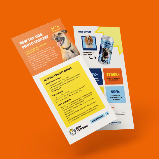
The challenge was to build upon the brand equity and visual identity of Showcase Communications while translating it into a modern, cohesive digital experience. The new website needed to communicate their vision, highlight their impact, and serve as a resource for potential clients and partners. It also had to balance simplicity and sophistication in its design, ensuring every visitor felt the calm confidence and polished energy that define Showcase Communications.
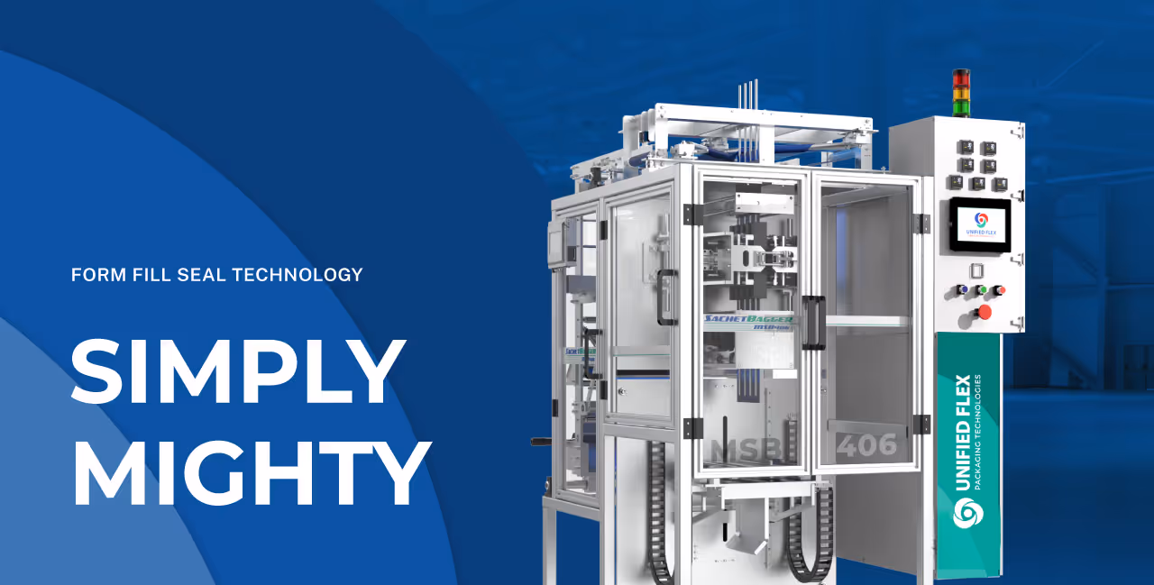
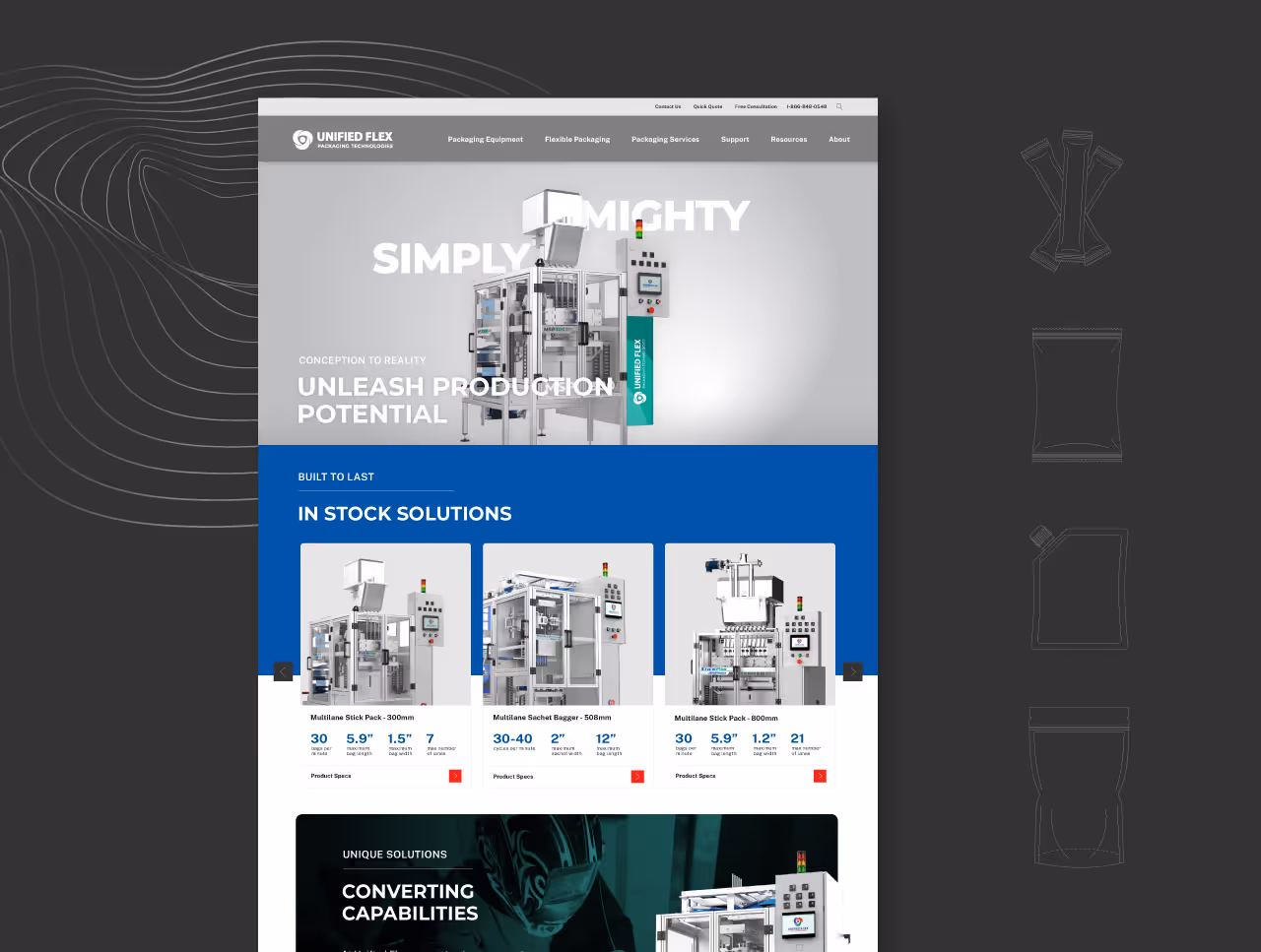
Quill Creative Studio designed a web experience to elevate the Showcase brand. We used imagery featuring rays of light and subtle radial gradients in brand colors to create a sense of depth and motion throughout the site. Naturally lit photography adds a human, authentic touch, while a structured grid layout ensures clarity and ease of use.
The result is a digital experience that feels fresh and contemporary while staying true to Showcase Communications’ identity as a trusted partner in public relations and brand storytelling. It’s a place where their mission to illuminate brands with purpose comes to life through a design that is both engaging and welcoming.

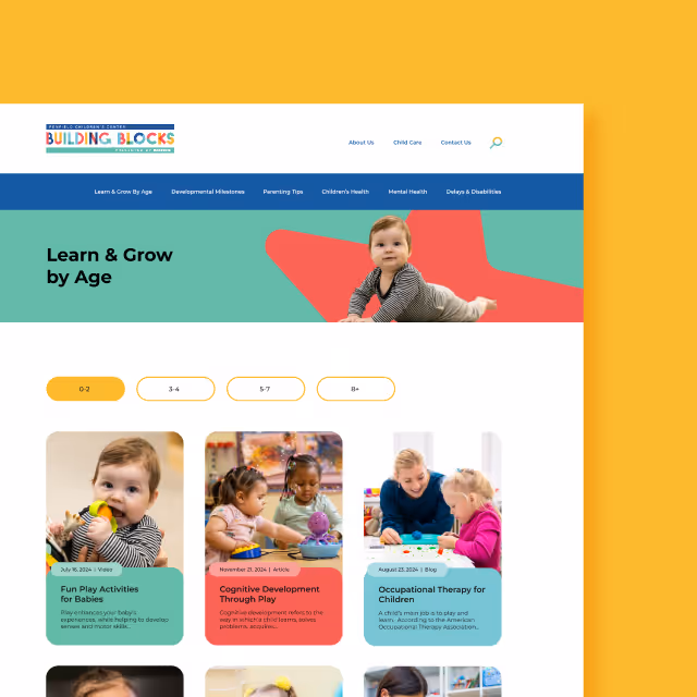
Showcase Communications now has an essential tool to share their impact and insight with the world. The new website empowers them to highlight their expertise, showcase their projects, and connect with prospective clients and partners in a way that feels both polished and approachable. With this foundation in place, the Showcase team is well positioned to continue building trust, driving engagement, and delivering exceptional results for the brands they support.

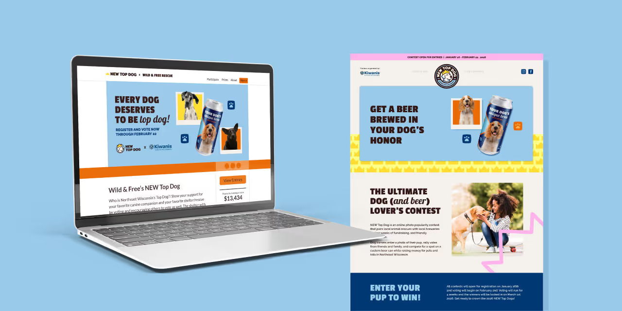
The challenge was to build upon the brand equity and visual identity of Showcase Communications while translating it into a modern, cohesive digital experience. The new website needed to communicate their vision, highlight their impact, and serve as a resource for potential clients and partners. It also had to balance simplicity and sophistication in its design, ensuring every visitor felt the calm confidence and polished energy that define Showcase Communications.
Quill Creative Studio designed a web experience to elevate the Showcase brand. We used imagery featuring rays of light and subtle radial gradients in brand colors to create a sense of depth and motion throughout the site. Naturally lit photography adds a human, authentic touch, while a structured grid layout ensures clarity and ease of use.
The result is a digital experience that feels fresh and contemporary while staying true to Showcase Communications’ identity as a trusted partner in public relations and brand storytelling. It’s a place where their mission to illuminate brands with purpose comes to life through a design that is both engaging and welcoming.

Showcase Communications now has an essential tool to share their impact and insight with the world. The new website empowers them to highlight their expertise, showcase their projects, and connect with prospective clients and partners in a way that feels both polished and approachable. With this foundation in place, the Showcase team is well positioned to continue building trust, driving engagement, and delivering exceptional results for the brands they support.


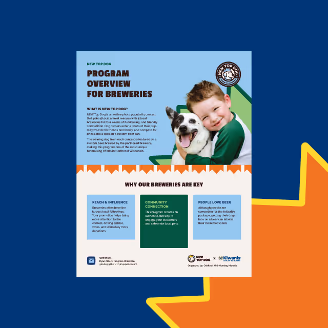
The challenge was to build upon the brand equity and visual identity of Showcase Communications while translating it into a modern, cohesive digital experience. The new website needed to communicate their vision, highlight their impact, and serve as a resource for potential clients and partners. It also had to balance simplicity and sophistication in its design, ensuring every visitor felt the calm confidence and polished energy that define Showcase Communications.

Quill Creative Studio designed a web experience to elevate the Showcase brand. We used imagery featuring rays of light and subtle radial gradients in brand colors to create a sense of depth and motion throughout the site. Naturally lit photography adds a human, authentic touch, while a structured grid layout ensures clarity and ease of use.
The result is a digital experience that feels fresh and contemporary while staying true to Showcase Communications’ identity as a trusted partner in public relations and brand storytelling. It’s a place where their mission to illuminate brands with purpose comes to life through a design that is both engaging and welcoming.


Showcase Communications now has an essential tool to share their impact and insight with the world. The new website empowers them to highlight their expertise, showcase their projects, and connect with prospective clients and partners in a way that feels both polished and approachable. With this foundation in place, the Showcase team is well positioned to continue building trust, driving engagement, and delivering exceptional results for the brands they support.


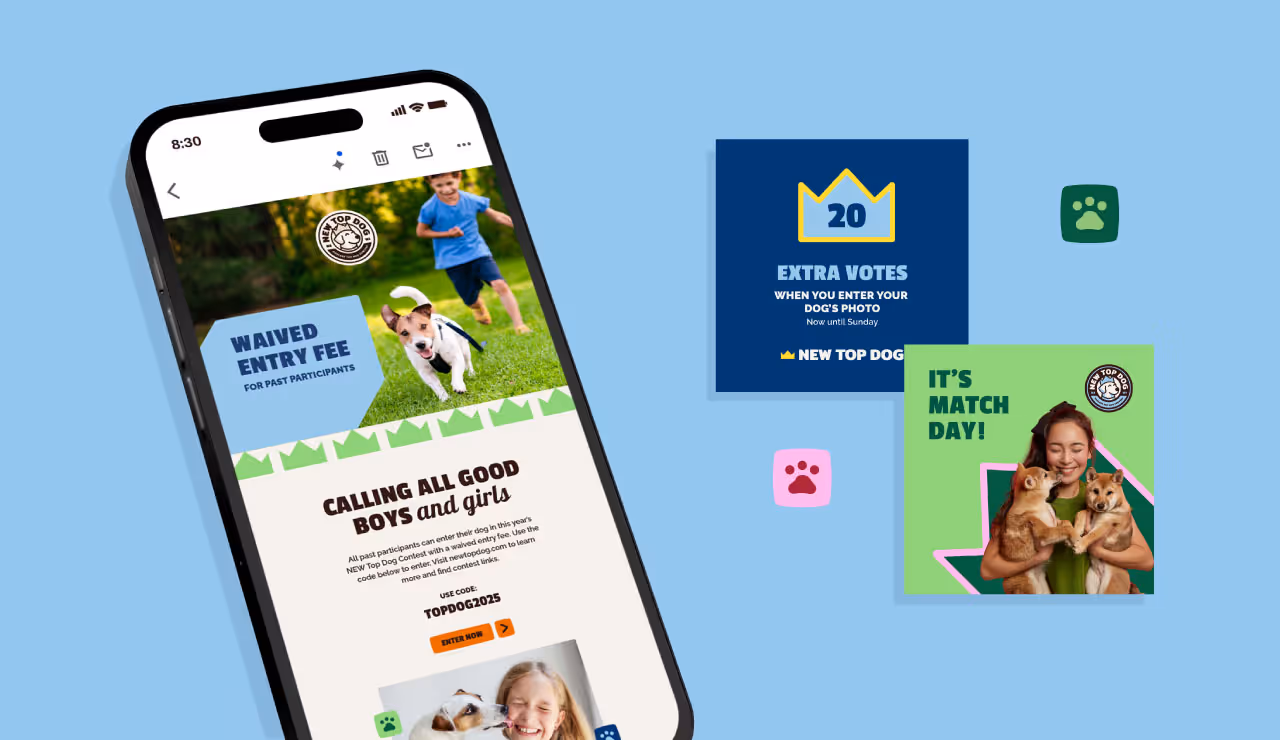
The challenge was to build upon the brand equity and visual identity of Showcase Communications while translating it into a modern, cohesive digital experience. The new website needed to communicate their vision, highlight their impact, and serve as a resource for potential clients and partners. It also had to balance simplicity and sophistication in its design, ensuring every visitor felt the calm confidence and polished energy that define Showcase Communications.
Quill Creative Studio designed a web experience to elevate the Showcase brand. We used imagery featuring rays of light and subtle radial gradients in brand colors to create a sense of depth and motion throughout the site. Naturally lit photography adds a human, authentic touch, while a structured grid layout ensures clarity and ease of use.
The result is a digital experience that feels fresh and contemporary while staying true to Showcase Communications’ identity as a trusted partner in public relations and brand storytelling. It’s a place where their mission to illuminate brands with purpose comes to life through a design that is both engaging and welcoming.

Showcase Communications now has an essential tool to share their impact and insight with the world. The new website empowers them to highlight their expertise, showcase their projects, and connect with prospective clients and partners in a way that feels both polished and approachable. With this foundation in place, the Showcase team is well positioned to continue building trust, driving engagement, and delivering exceptional results for the brands they support.
The challenge was to build upon the brand equity and visual identity of Showcase Communications while translating it into a modern, cohesive digital experience. The new website needed to communicate their vision, highlight their impact, and serve as a resource for potential clients and partners. It also had to balance simplicity and sophistication in its design, ensuring every visitor felt the calm confidence and polished energy that define Showcase Communications.


Quill Creative Studio designed a web experience to elevate the Showcase brand. We used imagery featuring rays of light and subtle radial gradients in brand colors to create a sense of depth and motion throughout the site. Naturally lit photography adds a human, authentic touch, while a structured grid layout ensures clarity and ease of use.
The result is a digital experience that feels fresh and contemporary while staying true to Showcase Communications’ identity as a trusted partner in public relations and brand storytelling. It’s a place where their mission to illuminate brands with purpose comes to life through a design that is both engaging and welcoming.
Showcase Communications now has an essential tool to share their impact and insight with the world. The new website empowers them to highlight their expertise, showcase their projects, and connect with prospective clients and partners in a way that feels both polished and approachable. With this foundation in place, the Showcase team is well positioned to continue building trust, driving engagement, and delivering exceptional results for the brands they support.

The challenge was to build upon the brand equity and visual identity of Showcase Communications while translating it into a modern, cohesive digital experience. The new website needed to communicate their vision, highlight their impact, and serve as a resource for potential clients and partners. It also had to balance simplicity and sophistication in its design, ensuring every visitor felt the calm confidence and polished energy that define Showcase Communications.


Quill Creative Studio designed a web experience to elevate the Showcase brand. We used imagery featuring rays of light and subtle radial gradients in brand colors to create a sense of depth and motion throughout the site. Naturally lit photography adds a human, authentic touch, while a structured grid layout ensures clarity and ease of use.
The result is a digital experience that feels fresh and contemporary while staying true to Showcase Communications’ identity as a trusted partner in public relations and brand storytelling. It’s a place where their mission to illuminate brands with purpose comes to life through a design that is both engaging and welcoming.


Showcase Communications now has an essential tool to share their impact and insight with the world. The new website empowers them to highlight their expertise, showcase their projects, and connect with prospective clients and partners in a way that feels both polished and approachable. With this foundation in place, the Showcase team is well positioned to continue building trust, driving engagement, and delivering exceptional results for the brands they support.


The challenge was to build upon the brand equity and visual identity of Showcase Communications while translating it into a modern, cohesive digital experience. The new website needed to communicate their vision, highlight their impact, and serve as a resource for potential clients and partners. It also had to balance simplicity and sophistication in its design, ensuring every visitor felt the calm confidence and polished energy that define Showcase Communications.

Quill Creative Studio designed a web experience to elevate the Showcase brand. We used imagery featuring rays of light and subtle radial gradients in brand colors to create a sense of depth and motion throughout the site. Naturally lit photography adds a human, authentic touch, while a structured grid layout ensures clarity and ease of use.
The result is a digital experience that feels fresh and contemporary while staying true to Showcase Communications’ identity as a trusted partner in public relations and brand storytelling. It’s a place where their mission to illuminate brands with purpose comes to life through a design that is both engaging and welcoming.


Showcase Communications now has an essential tool to share their impact and insight with the world. The new website empowers them to highlight their expertise, showcase their projects, and connect with prospective clients and partners in a way that feels both polished and approachable. With this foundation in place, the Showcase team is well positioned to continue building trust, driving engagement, and delivering exceptional results for the brands they support.

The challenge was to build upon the brand equity and visual identity of Showcase Communications while translating it into a modern, cohesive digital experience. The new website needed to communicate their vision, highlight their impact, and serve as a resource for potential clients and partners. It also had to balance simplicity and sophistication in its design, ensuring every visitor felt the calm confidence and polished energy that define Showcase Communications.


Quill Creative Studio designed a web experience to elevate the Showcase brand. We used imagery featuring rays of light and subtle radial gradients in brand colors to create a sense of depth and motion throughout the site. Naturally lit photography adds a human, authentic touch, while a structured grid layout ensures clarity and ease of use.
The result is a digital experience that feels fresh and contemporary while staying true to Showcase Communications’ identity as a trusted partner in public relations and brand storytelling. It’s a place where their mission to illuminate brands with purpose comes to life through a design that is both engaging and welcoming.


Showcase Communications now has an essential tool to share their impact and insight with the world. The new website empowers them to highlight their expertise, showcase their projects, and connect with prospective clients and partners in a way that feels both polished and approachable. With this foundation in place, the Showcase team is well positioned to continue building trust, driving engagement, and delivering exceptional results for the brands they support.


The challenge was to build upon the brand equity and visual identity of Showcase Communications while translating it into a modern, cohesive digital experience. The new website needed to communicate their vision, highlight their impact, and serve as a resource for potential clients and partners. It also had to balance simplicity and sophistication in its design, ensuring every visitor felt the calm confidence and polished energy that define Showcase Communications.

Quill Creative Studio designed a web experience to elevate the Showcase brand. We used imagery featuring rays of light and subtle radial gradients in brand colors to create a sense of depth and motion throughout the site. Naturally lit photography adds a human, authentic touch, while a structured grid layout ensures clarity and ease of use.
The result is a digital experience that feels fresh and contemporary while staying true to Showcase Communications’ identity as a trusted partner in public relations and brand storytelling. It’s a place where their mission to illuminate brands with purpose comes to life through a design that is both engaging and welcoming.


Showcase Communications now has an essential tool to share their impact and insight with the world. The new website empowers them to highlight their expertise, showcase their projects, and connect with prospective clients and partners in a way that feels both polished and approachable. With this foundation in place, the Showcase team is well positioned to continue building trust, driving engagement, and delivering exceptional results for the brands they support.

The challenge was to build upon the brand equity and visual identity of Showcase Communications while translating it into a modern, cohesive digital experience. The new website needed to communicate their vision, highlight their impact, and serve as a resource for potential clients and partners. It also had to balance simplicity and sophistication in its design, ensuring every visitor felt the calm confidence and polished energy that define Showcase Communications.
Quill Creative Studio designed a web experience to elevate the Showcase brand. We used imagery featuring rays of light and subtle radial gradients in brand colors to create a sense of depth and motion throughout the site. Naturally lit photography adds a human, authentic touch, while a structured grid layout ensures clarity and ease of use.
The result is a digital experience that feels fresh and contemporary while staying true to Showcase Communications’ identity as a trusted partner in public relations and brand storytelling. It’s a place where their mission to illuminate brands with purpose comes to life through a design that is both engaging and welcoming.
Showcase Communications now has an essential tool to share their impact and insight with the world. The new website empowers them to highlight their expertise, showcase their projects, and connect with prospective clients and partners in a way that feels both polished and approachable. With this foundation in place, the Showcase team is well positioned to continue building trust, driving engagement, and delivering exceptional results for the brands they support.


The challenge was to build upon the brand equity and visual identity of Showcase Communications while translating it into a modern, cohesive digital experience. The new website needed to communicate their vision, highlight their impact, and serve as a resource for potential clients and partners. It also had to balance simplicity and sophistication in its design, ensuring every visitor felt the calm confidence and polished energy that define Showcase Communications.

Quill Creative Studio designed a web experience to elevate the Showcase brand. We used imagery featuring rays of light and subtle radial gradients in brand colors to create a sense of depth and motion throughout the site. Naturally lit photography adds a human, authentic touch, while a structured grid layout ensures clarity and ease of use.
The result is a digital experience that feels fresh and contemporary while staying true to Showcase Communications’ identity as a trusted partner in public relations and brand storytelling. It’s a place where their mission to illuminate brands with purpose comes to life through a design that is both engaging and welcoming.

Showcase Communications now has an essential tool to share their impact and insight with the world. The new website empowers them to highlight their expertise, showcase their projects, and connect with prospective clients and partners in a way that feels both polished and approachable. With this foundation in place, the Showcase team is well positioned to continue building trust, driving engagement, and delivering exceptional results for the brands they support.

The challenge was to build upon the brand equity and visual identity of Showcase Communications while translating it into a modern, cohesive digital experience. The new website needed to communicate their vision, highlight their impact, and serve as a resource for potential clients and partners. It also had to balance simplicity and sophistication in its design, ensuring every visitor felt the calm confidence and polished energy that define Showcase Communications.


Quill Creative Studio designed a web experience to elevate the Showcase brand. We used imagery featuring rays of light and subtle radial gradients in brand colors to create a sense of depth and motion throughout the site. Naturally lit photography adds a human, authentic touch, while a structured grid layout ensures clarity and ease of use.
The result is a digital experience that feels fresh and contemporary while staying true to Showcase Communications’ identity as a trusted partner in public relations and brand storytelling. It’s a place where their mission to illuminate brands with purpose comes to life through a design that is both engaging and welcoming.
Showcase Communications now has an essential tool to share their impact and insight with the world. The new website empowers them to highlight their expertise, showcase their projects, and connect with prospective clients and partners in a way that feels both polished and approachable. With this foundation in place, the Showcase team is well positioned to continue building trust, driving engagement, and delivering exceptional results for the brands they support.


The challenge was to build upon the brand equity and visual identity of Showcase Communications while translating it into a modern, cohesive digital experience. The new website needed to communicate their vision, highlight their impact, and serve as a resource for potential clients and partners. It also had to balance simplicity and sophistication in its design, ensuring every visitor felt the calm confidence and polished energy that define Showcase Communications.


Quill Creative Studio designed a web experience to elevate the Showcase brand. We used imagery featuring rays of light and subtle radial gradients in brand colors to create a sense of depth and motion throughout the site. Naturally lit photography adds a human, authentic touch, while a structured grid layout ensures clarity and ease of use.
The result is a digital experience that feels fresh and contemporary while staying true to Showcase Communications’ identity as a trusted partner in public relations and brand storytelling. It’s a place where their mission to illuminate brands with purpose comes to life through a design that is both engaging and welcoming.

Showcase Communications now has an essential tool to share their impact and insight with the world. The new website empowers them to highlight their expertise, showcase their projects, and connect with prospective clients and partners in a way that feels both polished and approachable. With this foundation in place, the Showcase team is well positioned to continue building trust, driving engagement, and delivering exceptional results for the brands they support.


The challenge was to build upon the brand equity and visual identity of Showcase Communications while translating it into a modern, cohesive digital experience. The new website needed to communicate their vision, highlight their impact, and serve as a resource for potential clients and partners. It also had to balance simplicity and sophistication in its design, ensuring every visitor felt the calm confidence and polished energy that define Showcase Communications.

Quill Creative Studio designed a web experience to elevate the Showcase brand. We used imagery featuring rays of light and subtle radial gradients in brand colors to create a sense of depth and motion throughout the site. Naturally lit photography adds a human, authentic touch, while a structured grid layout ensures clarity and ease of use.
The result is a digital experience that feels fresh and contemporary while staying true to Showcase Communications’ identity as a trusted partner in public relations and brand storytelling. It’s a place where their mission to illuminate brands with purpose comes to life through a design that is both engaging and welcoming.


Showcase Communications now has an essential tool to share their impact and insight with the world. The new website empowers them to highlight their expertise, showcase their projects, and connect with prospective clients and partners in a way that feels both polished and approachable. With this foundation in place, the Showcase team is well positioned to continue building trust, driving engagement, and delivering exceptional results for the brands they support.


The challenge was to build upon the brand equity and visual identity of Showcase Communications while translating it into a modern, cohesive digital experience. The new website needed to communicate their vision, highlight their impact, and serve as a resource for potential clients and partners. It also had to balance simplicity and sophistication in its design, ensuring every visitor felt the calm confidence and polished energy that define Showcase Communications.


Quill Creative Studio designed a web experience to elevate the Showcase brand. We used imagery featuring rays of light and subtle radial gradients in brand colors to create a sense of depth and motion throughout the site. Naturally lit photography adds a human, authentic touch, while a structured grid layout ensures clarity and ease of use.
The result is a digital experience that feels fresh and contemporary while staying true to Showcase Communications’ identity as a trusted partner in public relations and brand storytelling. It’s a place where their mission to illuminate brands with purpose comes to life through a design that is both engaging and welcoming.


Showcase Communications now has an essential tool to share their impact and insight with the world. The new website empowers them to highlight their expertise, showcase their projects, and connect with prospective clients and partners in a way that feels both polished and approachable. With this foundation in place, the Showcase team is well positioned to continue building trust, driving engagement, and delivering exceptional results for the brands they support.


The challenge was to build upon the brand equity and visual identity of Showcase Communications while translating it into a modern, cohesive digital experience. The new website needed to communicate their vision, highlight their impact, and serve as a resource for potential clients and partners. It also had to balance simplicity and sophistication in its design, ensuring every visitor felt the calm confidence and polished energy that define Showcase Communications.


Quill Creative Studio designed a web experience to elevate the Showcase brand. We used imagery featuring rays of light and subtle radial gradients in brand colors to create a sense of depth and motion throughout the site. Naturally lit photography adds a human, authentic touch, while a structured grid layout ensures clarity and ease of use.
The result is a digital experience that feels fresh and contemporary while staying true to Showcase Communications’ identity as a trusted partner in public relations and brand storytelling. It’s a place where their mission to illuminate brands with purpose comes to life through a design that is both engaging and welcoming.

Showcase Communications now has an essential tool to share their impact and insight with the world. The new website empowers them to highlight their expertise, showcase their projects, and connect with prospective clients and partners in a way that feels both polished and approachable. With this foundation in place, the Showcase team is well positioned to continue building trust, driving engagement, and delivering exceptional results for the brands they support.


The challenge was to build upon the brand equity and visual identity of Showcase Communications while translating it into a modern, cohesive digital experience. The new website needed to communicate their vision, highlight their impact, and serve as a resource for potential clients and partners. It also had to balance simplicity and sophistication in its design, ensuring every visitor felt the calm confidence and polished energy that define Showcase Communications.

Quill Creative Studio designed a web experience to elevate the Showcase brand. We used imagery featuring rays of light and subtle radial gradients in brand colors to create a sense of depth and motion throughout the site. Naturally lit photography adds a human, authentic touch, while a structured grid layout ensures clarity and ease of use.
The result is a digital experience that feels fresh and contemporary while staying true to Showcase Communications’ identity as a trusted partner in public relations and brand storytelling. It’s a place where their mission to illuminate brands with purpose comes to life through a design that is both engaging and welcoming.


Showcase Communications now has an essential tool to share their impact and insight with the world. The new website empowers them to highlight their expertise, showcase their projects, and connect with prospective clients and partners in a way that feels both polished and approachable. With this foundation in place, the Showcase team is well positioned to continue building trust, driving engagement, and delivering exceptional results for the brands they support.


The challenge was to build upon the brand equity and visual identity of Showcase Communications while translating it into a modern, cohesive digital experience. The new website needed to communicate their vision, highlight their impact, and serve as a resource for potential clients and partners. It also had to balance simplicity and sophistication in its design, ensuring every visitor felt the calm confidence and polished energy that define Showcase Communications.


Quill Creative Studio designed a web experience to elevate the Showcase brand. We used imagery featuring rays of light and subtle radial gradients in brand colors to create a sense of depth and motion throughout the site. Naturally lit photography adds a human, authentic touch, while a structured grid layout ensures clarity and ease of use.
The result is a digital experience that feels fresh and contemporary while staying true to Showcase Communications’ identity as a trusted partner in public relations and brand storytelling. It’s a place where their mission to illuminate brands with purpose comes to life through a design that is both engaging and welcoming.


Showcase Communications now has an essential tool to share their impact and insight with the world. The new website empowers them to highlight their expertise, showcase their projects, and connect with prospective clients and partners in a way that feels both polished and approachable. With this foundation in place, the Showcase team is well positioned to continue building trust, driving engagement, and delivering exceptional results for the brands they support.


The challenge was to build upon the brand equity and visual identity of Showcase Communications while translating it into a modern, cohesive digital experience. The new website needed to communicate their vision, highlight their impact, and serve as a resource for potential clients and partners. It also had to balance simplicity and sophistication in its design, ensuring every visitor felt the calm confidence and polished energy that define Showcase Communications.


Quill Creative Studio designed a web experience to elevate the Showcase brand. We used imagery featuring rays of light and subtle radial gradients in brand colors to create a sense of depth and motion throughout the site. Naturally lit photography adds a human, authentic touch, while a structured grid layout ensures clarity and ease of use.
The result is a digital experience that feels fresh and contemporary while staying true to Showcase Communications’ identity as a trusted partner in public relations and brand storytelling. It’s a place where their mission to illuminate brands with purpose comes to life through a design that is both engaging and welcoming.


Showcase Communications now has an essential tool to share their impact and insight with the world. The new website empowers them to highlight their expertise, showcase their projects, and connect with prospective clients and partners in a way that feels both polished and approachable. With this foundation in place, the Showcase team is well positioned to continue building trust, driving engagement, and delivering exceptional results for the brands they support.


The challenge was to build upon the brand equity and visual identity of Showcase Communications while translating it into a modern, cohesive digital experience. The new website needed to communicate their vision, highlight their impact, and serve as a resource for potential clients and partners. It also had to balance simplicity and sophistication in its design, ensuring every visitor felt the calm confidence and polished energy that define Showcase Communications.

Quill Creative Studio designed a web experience to elevate the Showcase brand. We used imagery featuring rays of light and subtle radial gradients in brand colors to create a sense of depth and motion throughout the site. Naturally lit photography adds a human, authentic touch, while a structured grid layout ensures clarity and ease of use.
The result is a digital experience that feels fresh and contemporary while staying true to Showcase Communications’ identity as a trusted partner in public relations and brand storytelling. It’s a place where their mission to illuminate brands with purpose comes to life through a design that is both engaging and welcoming.


Showcase Communications now has an essential tool to share their impact and insight with the world. The new website empowers them to highlight their expertise, showcase their projects, and connect with prospective clients and partners in a way that feels both polished and approachable. With this foundation in place, the Showcase team is well positioned to continue building trust, driving engagement, and delivering exceptional results for the brands they support.


