In 1934, the MacDowell Male Chorus was founded in Appleton, WI. For the many years that followed, they delighted audiences by performing throughout the nation. In 2020, with shows being canceled due to the pandemic, they decided to focus on building a stronger brand for themselves and give homage to past generations.

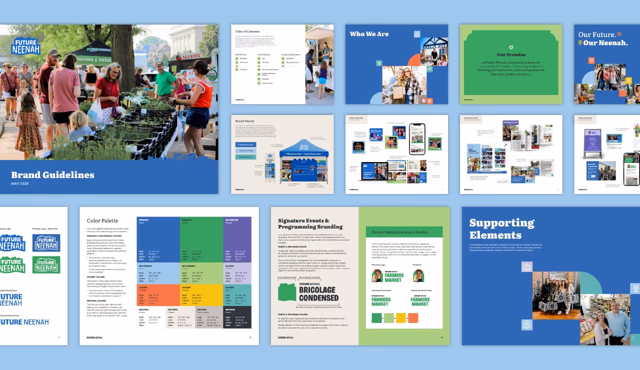
As with every identity we work on at Quill Creative Studio, we began with research. The archives of historic photos, performance programs and event posters was extensive and provided loads of inspiration for our creative team. After choosing some key design elements that were featured in years past, we worked to combine their rich history with modern styles to make them appear relevant and polished.


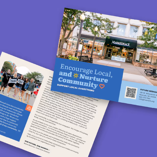
The new visual identity solution for MacDowell Male Chorus has been applied to recent event themes and campaigns to drive membership. Now that the chorus is performing in public again, the members and community have a new sense of pride with a polished and professional brand identity.

In 1934, the MacDowell Male Chorus was founded in Appleton, WI. For the many years that followed, they delighted audiences by performing throughout the nation. In 2020, with shows being canceled due to the pandemic, they decided to focus on building a stronger brand for themselves and give homage to past generations.
As with every identity we work on at Quill Creative Studio, we began with research. The archives of historic photos, performance programs and event posters was extensive and provided loads of inspiration for our creative team. After choosing some key design elements that were featured in years past, we worked to combine their rich history with modern styles to make them appear relevant and polished.


The new visual identity solution for MacDowell Male Chorus has been applied to recent event themes and campaigns to drive membership. Now that the chorus is performing in public again, the members and community have a new sense of pride with a polished and professional brand identity.


In 1934, the MacDowell Male Chorus was founded in Appleton, WI. For the many years that followed, they delighted audiences by performing throughout the nation. In 2020, with shows being canceled due to the pandemic, they decided to focus on building a stronger brand for themselves and give homage to past generations.
As with every identity we work on at Quill Creative Studio, we began with research. The archives of historic photos, performance programs and event posters was extensive and provided loads of inspiration for our creative team. After choosing some key design elements that were featured in years past, we worked to combine their rich history with modern styles to make them appear relevant and polished.

The new visual identity solution for MacDowell Male Chorus has been applied to recent event themes and campaigns to drive membership. Now that the chorus is performing in public again, the members and community have a new sense of pride with a polished and professional brand identity.
In 1934, the MacDowell Male Chorus was founded in Appleton, WI. For the many years that followed, they delighted audiences by performing throughout the nation. In 2020, with shows being canceled due to the pandemic, they decided to focus on building a stronger brand for themselves and give homage to past generations.


As with every identity we work on at Quill Creative Studio, we began with research. The archives of historic photos, performance programs and event posters was extensive and provided loads of inspiration for our creative team. After choosing some key design elements that were featured in years past, we worked to combine their rich history with modern styles to make them appear relevant and polished.
The new visual identity solution for MacDowell Male Chorus has been applied to recent event themes and campaigns to drive membership. Now that the chorus is performing in public again, the members and community have a new sense of pride with a polished and professional brand identity.


In 1934, the MacDowell Male Chorus was founded in Appleton, WI. For the many years that followed, they delighted audiences by performing throughout the nation. In 2020, with shows being canceled due to the pandemic, they decided to focus on building a stronger brand for themselves and give homage to past generations.


As with every identity we work on at Quill Creative Studio, we began with research. The archives of historic photos, performance programs and event posters was extensive and provided loads of inspiration for our creative team. After choosing some key design elements that were featured in years past, we worked to combine their rich history with modern styles to make them appear relevant and polished.


The new visual identity solution for MacDowell Male Chorus has been applied to recent event themes and campaigns to drive membership. Now that the chorus is performing in public again, the members and community have a new sense of pride with a polished and professional brand identity.


In 1934, the MacDowell Male Chorus was founded in Appleton, WI. For the many years that followed, they delighted audiences by performing throughout the nation. In 2020, with shows being canceled due to the pandemic, they decided to focus on building a stronger brand for themselves and give homage to past generations.

As with every identity we work on at Quill Creative Studio, we began with research. The archives of historic photos, performance programs and event posters was extensive and provided loads of inspiration for our creative team. After choosing some key design elements that were featured in years past, we worked to combine their rich history with modern styles to make them appear relevant and polished.


The new visual identity solution for MacDowell Male Chorus has been applied to recent event themes and campaigns to drive membership. Now that the chorus is performing in public again, the members and community have a new sense of pride with a polished and professional brand identity.

In 1934, the MacDowell Male Chorus was founded in Appleton, WI. For the many years that followed, they delighted audiences by performing throughout the nation. In 2020, with shows being canceled due to the pandemic, they decided to focus on building a stronger brand for themselves and give homage to past generations.


As with every identity we work on at Quill Creative Studio, we began with research. The archives of historic photos, performance programs and event posters was extensive and provided loads of inspiration for our creative team. After choosing some key design elements that were featured in years past, we worked to combine their rich history with modern styles to make them appear relevant and polished.


The new visual identity solution for MacDowell Male Chorus has been applied to recent event themes and campaigns to drive membership. Now that the chorus is performing in public again, the members and community have a new sense of pride with a polished and professional brand identity.


In 1934, the MacDowell Male Chorus was founded in Appleton, WI. For the many years that followed, they delighted audiences by performing throughout the nation. In 2020, with shows being canceled due to the pandemic, they decided to focus on building a stronger brand for themselves and give homage to past generations.

As with every identity we work on at Quill Creative Studio, we began with research. The archives of historic photos, performance programs and event posters was extensive and provided loads of inspiration for our creative team. After choosing some key design elements that were featured in years past, we worked to combine their rich history with modern styles to make them appear relevant and polished.


The new visual identity solution for MacDowell Male Chorus has been applied to recent event themes and campaigns to drive membership. Now that the chorus is performing in public again, the members and community have a new sense of pride with a polished and professional brand identity.

In 1934, the MacDowell Male Chorus was founded in Appleton, WI. For the many years that followed, they delighted audiences by performing throughout the nation. In 2020, with shows being canceled due to the pandemic, they decided to focus on building a stronger brand for themselves and give homage to past generations.
As with every identity we work on at Quill Creative Studio, we began with research. The archives of historic photos, performance programs and event posters was extensive and provided loads of inspiration for our creative team. After choosing some key design elements that were featured in years past, we worked to combine their rich history with modern styles to make them appear relevant and polished.


The new visual identity solution for MacDowell Male Chorus has been applied to recent event themes and campaigns to drive membership. Now that the chorus is performing in public again, the members and community have a new sense of pride with a polished and professional brand identity.


In 1934, the MacDowell Male Chorus was founded in Appleton, WI. For the many years that followed, they delighted audiences by performing throughout the nation. In 2020, with shows being canceled due to the pandemic, they decided to focus on building a stronger brand for themselves and give homage to past generations.


As with every identity we work on at Quill Creative Studio, we began with research. The archives of historic photos, performance programs and event posters was extensive and provided loads of inspiration for our creative team. After choosing some key design elements that were featured in years past, we worked to combine their rich history with modern styles to make them appear relevant and polished.

The new visual identity solution for MacDowell Male Chorus has been applied to recent event themes and campaigns to drive membership. Now that the chorus is performing in public again, the members and community have a new sense of pride with a polished and professional brand identity.


In 1934, the MacDowell Male Chorus was founded in Appleton, WI. For the many years that followed, they delighted audiences by performing throughout the nation. In 2020, with shows being canceled due to the pandemic, they decided to focus on building a stronger brand for themselves and give homage to past generations.

As with every identity we work on at Quill Creative Studio, we began with research. The archives of historic photos, performance programs and event posters was extensive and provided loads of inspiration for our creative team. After choosing some key design elements that were featured in years past, we worked to combine their rich history with modern styles to make them appear relevant and polished.


The new visual identity solution for MacDowell Male Chorus has been applied to recent event themes and campaigns to drive membership. Now that the chorus is performing in public again, the members and community have a new sense of pride with a polished and professional brand identity.


In 1934, the MacDowell Male Chorus was founded in Appleton, WI. For the many years that followed, they delighted audiences by performing throughout the nation. In 2020, with shows being canceled due to the pandemic, they decided to focus on building a stronger brand for themselves and give homage to past generations.


As with every identity we work on at Quill Creative Studio, we began with research. The archives of historic photos, performance programs and event posters was extensive and provided loads of inspiration for our creative team. After choosing some key design elements that were featured in years past, we worked to combine their rich history with modern styles to make them appear relevant and polished.

The new visual identity solution for MacDowell Male Chorus has been applied to recent event themes and campaigns to drive membership. Now that the chorus is performing in public again, the members and community have a new sense of pride with a polished and professional brand identity.


In 1934, the MacDowell Male Chorus was founded in Appleton, WI. For the many years that followed, they delighted audiences by performing throughout the nation. In 2020, with shows being canceled due to the pandemic, they decided to focus on building a stronger brand for themselves and give homage to past generations.

As with every identity we work on at Quill Creative Studio, we began with research. The archives of historic photos, performance programs and event posters was extensive and provided loads of inspiration for our creative team. After choosing some key design elements that were featured in years past, we worked to combine their rich history with modern styles to make them appear relevant and polished.


The new visual identity solution for MacDowell Male Chorus has been applied to recent event themes and campaigns to drive membership. Now that the chorus is performing in public again, the members and community have a new sense of pride with a polished and professional brand identity.


In 1934, the MacDowell Male Chorus was founded in Appleton, WI. For the many years that followed, they delighted audiences by performing throughout the nation. In 2020, with shows being canceled due to the pandemic, they decided to focus on building a stronger brand for themselves and give homage to past generations.


As with every identity we work on at Quill Creative Studio, we began with research. The archives of historic photos, performance programs and event posters was extensive and provided loads of inspiration for our creative team. After choosing some key design elements that were featured in years past, we worked to combine their rich history with modern styles to make them appear relevant and polished.


The new visual identity solution for MacDowell Male Chorus has been applied to recent event themes and campaigns to drive membership. Now that the chorus is performing in public again, the members and community have a new sense of pride with a polished and professional brand identity.


In 1934, the MacDowell Male Chorus was founded in Appleton, WI. For the many years that followed, they delighted audiences by performing throughout the nation. In 2020, with shows being canceled due to the pandemic, they decided to focus on building a stronger brand for themselves and give homage to past generations.


As with every identity we work on at Quill Creative Studio, we began with research. The archives of historic photos, performance programs and event posters was extensive and provided loads of inspiration for our creative team. After choosing some key design elements that were featured in years past, we worked to combine their rich history with modern styles to make them appear relevant and polished.

The new visual identity solution for MacDowell Male Chorus has been applied to recent event themes and campaigns to drive membership. Now that the chorus is performing in public again, the members and community have a new sense of pride with a polished and professional brand identity.


In 1934, the MacDowell Male Chorus was founded in Appleton, WI. For the many years that followed, they delighted audiences by performing throughout the nation. In 2020, with shows being canceled due to the pandemic, they decided to focus on building a stronger brand for themselves and give homage to past generations.

As with every identity we work on at Quill Creative Studio, we began with research. The archives of historic photos, performance programs and event posters was extensive and provided loads of inspiration for our creative team. After choosing some key design elements that were featured in years past, we worked to combine their rich history with modern styles to make them appear relevant and polished.


The new visual identity solution for MacDowell Male Chorus has been applied to recent event themes and campaigns to drive membership. Now that the chorus is performing in public again, the members and community have a new sense of pride with a polished and professional brand identity.


In 1934, the MacDowell Male Chorus was founded in Appleton, WI. For the many years that followed, they delighted audiences by performing throughout the nation. In 2020, with shows being canceled due to the pandemic, they decided to focus on building a stronger brand for themselves and give homage to past generations.


As with every identity we work on at Quill Creative Studio, we began with research. The archives of historic photos, performance programs and event posters was extensive and provided loads of inspiration for our creative team. After choosing some key design elements that were featured in years past, we worked to combine their rich history with modern styles to make them appear relevant and polished.


The new visual identity solution for MacDowell Male Chorus has been applied to recent event themes and campaigns to drive membership. Now that the chorus is performing in public again, the members and community have a new sense of pride with a polished and professional brand identity.


In 1934, the MacDowell Male Chorus was founded in Appleton, WI. For the many years that followed, they delighted audiences by performing throughout the nation. In 2020, with shows being canceled due to the pandemic, they decided to focus on building a stronger brand for themselves and give homage to past generations.


As with every identity we work on at Quill Creative Studio, we began with research. The archives of historic photos, performance programs and event posters was extensive and provided loads of inspiration for our creative team. After choosing some key design elements that were featured in years past, we worked to combine their rich history with modern styles to make them appear relevant and polished.


The new visual identity solution for MacDowell Male Chorus has been applied to recent event themes and campaigns to drive membership. Now that the chorus is performing in public again, the members and community have a new sense of pride with a polished and professional brand identity.


In 1934, the MacDowell Male Chorus was founded in Appleton, WI. For the many years that followed, they delighted audiences by performing throughout the nation. In 2020, with shows being canceled due to the pandemic, they decided to focus on building a stronger brand for themselves and give homage to past generations.

As with every identity we work on at Quill Creative Studio, we began with research. The archives of historic photos, performance programs and event posters was extensive and provided loads of inspiration for our creative team. After choosing some key design elements that were featured in years past, we worked to combine their rich history with modern styles to make them appear relevant and polished.


The new visual identity solution for MacDowell Male Chorus has been applied to recent event themes and campaigns to drive membership. Now that the chorus is performing in public again, the members and community have a new sense of pride with a polished and professional brand identity.


Quill helped us define the intangible of our organization. They were there at every step to help us, they dived deep into our history and found a brand that felt like us. Can't say enough about them or their process.
JUSTIN KASPER, PRESIDENT, MACDOWELL MALE CHORUS

