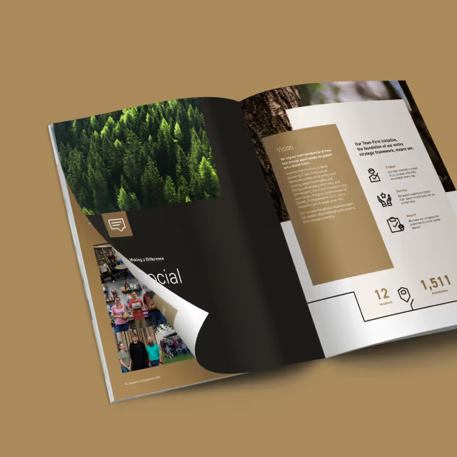
With every annual report designed at Quill Creative Studio, we took a good look at past reports and developed an approach for design to support the theme that would also pair well with the organization’s core visual brand. With the theme of “Together we can” we chose a spirited illustration style that could display multiple subjects and individuals that play a role in accomplishing their yearly mission.
From stylistic infographics to dynamic article layout and clean photography placements, we developed an annual report that kept readers engaged and interested in each spread. Too often, annual reports are bland and overwhelming with business jargon. Since the work done by Feeding America and their partners is a labor of love, our solution aimed to make this piece of collateral feel like it was a joy to put together. Which it truly was.
Through the hard work and collaborative effort from the Feeding America team, this year’s theme resonated consistently throughout the report and reinforced meaningful impact with every graphic and article. Every year, we hear that stakeholders and partners are impressed with the impact they provide and the approachable professionalism of how it’s displayed. We look forward to creating this annual report for many years to come.


With every annual report designed at Quill Creative Studio, we took a good look at past reports and developed an approach for design to support the theme that would also pair well with the organization’s core visual brand. With the theme of “Together we can” we chose a spirited illustration style that could display multiple subjects and individuals that play a role in accomplishing their yearly mission.
From stylistic infographics to dynamic article layout and clean photography placements, we developed an annual report that kept readers engaged and interested in each spread. Too often, annual reports are bland and overwhelming with business jargon. Since the work done by Feeding America and their partners is a labor of love, our solution aimed to make this piece of collateral feel like it was a joy to put together. Which it truly was.

Through the hard work and collaborative effort from the Feeding America team, this year’s theme resonated consistently throughout the report and reinforced meaningful impact with every graphic and article. Every year, we hear that stakeholders and partners are impressed with the impact they provide and the approachable professionalism of how it’s displayed. We look forward to creating this annual report for many years to come.
With every annual report designed at Quill Creative Studio, we took a good look at past reports and developed an approach for design to support the theme that would also pair well with the organization’s core visual brand. With the theme of “Together we can” we chose a spirited illustration style that could display multiple subjects and individuals that play a role in accomplishing their yearly mission.
From stylistic infographics to dynamic article layout and clean photography placements, we developed an annual report that kept readers engaged and interested in each spread. Too often, annual reports are bland and overwhelming with business jargon. Since the work done by Feeding America and their partners is a labor of love, our solution aimed to make this piece of collateral feel like it was a joy to put together. Which it truly was.
Through the hard work and collaborative effort from the Feeding America team, this year’s theme resonated consistently throughout the report and reinforced meaningful impact with every graphic and article. Every year, we hear that stakeholders and partners are impressed with the impact they provide and the approachable professionalism of how it’s displayed. We look forward to creating this annual report for many years to come.

With every annual report designed at Quill Creative Studio, we took a good look at past reports and developed an approach for design to support the theme that would also pair well with the organization’s core visual brand. With the theme of “Together we can” we chose a spirited illustration style that could display multiple subjects and individuals that play a role in accomplishing their yearly mission.

From stylistic infographics to dynamic article layout and clean photography placements, we developed an annual report that kept readers engaged and interested in each spread. Too often, annual reports are bland and overwhelming with business jargon. Since the work done by Feeding America and their partners is a labor of love, our solution aimed to make this piece of collateral feel like it was a joy to put together. Which it truly was.
Through the hard work and collaborative effort from the Feeding America team, this year’s theme resonated consistently throughout the report and reinforced meaningful impact with every graphic and article. Every year, we hear that stakeholders and partners are impressed with the impact they provide and the approachable professionalism of how it’s displayed. We look forward to creating this annual report for many years to come.
With every annual report designed at Quill Creative Studio, we took a good look at past reports and developed an approach for design to support the theme that would also pair well with the organization’s core visual brand. With the theme of “Together we can” we chose a spirited illustration style that could display multiple subjects and individuals that play a role in accomplishing their yearly mission.

From stylistic infographics to dynamic article layout and clean photography placements, we developed an annual report that kept readers engaged and interested in each spread. Too often, annual reports are bland and overwhelming with business jargon. Since the work done by Feeding America and their partners is a labor of love, our solution aimed to make this piece of collateral feel like it was a joy to put together. Which it truly was.

Through the hard work and collaborative effort from the Feeding America team, this year’s theme resonated consistently throughout the report and reinforced meaningful impact with every graphic and article. Every year, we hear that stakeholders and partners are impressed with the impact they provide and the approachable professionalism of how it’s displayed. We look forward to creating this annual report for many years to come.


With every annual report designed at Quill Creative Studio, we took a good look at past reports and developed an approach for design to support the theme that would also pair well with the organization’s core visual brand. With the theme of “Together we can” we chose a spirited illustration style that could display multiple subjects and individuals that play a role in accomplishing their yearly mission.
From stylistic infographics to dynamic article layout and clean photography placements, we developed an annual report that kept readers engaged and interested in each spread. Too often, annual reports are bland and overwhelming with business jargon. Since the work done by Feeding America and their partners is a labor of love, our solution aimed to make this piece of collateral feel like it was a joy to put together. Which it truly was.
Through the hard work and collaborative effort from the Feeding America team, this year’s theme resonated consistently throughout the report and reinforced meaningful impact with every graphic and article. Every year, we hear that stakeholders and partners are impressed with the impact they provide and the approachable professionalism of how it’s displayed. We look forward to creating this annual report for many years to come.


With every annual report designed at Quill Creative Studio, we took a good look at past reports and developed an approach for design to support the theme that would also pair well with the organization’s core visual brand. With the theme of “Together we can” we chose a spirited illustration style that could display multiple subjects and individuals that play a role in accomplishing their yearly mission.

From stylistic infographics to dynamic article layout and clean photography placements, we developed an annual report that kept readers engaged and interested in each spread. Too often, annual reports are bland and overwhelming with business jargon. Since the work done by Feeding America and their partners is a labor of love, our solution aimed to make this piece of collateral feel like it was a joy to put together. Which it truly was.

Through the hard work and collaborative effort from the Feeding America team, this year’s theme resonated consistently throughout the report and reinforced meaningful impact with every graphic and article. Every year, we hear that stakeholders and partners are impressed with the impact they provide and the approachable professionalism of how it’s displayed. We look forward to creating this annual report for many years to come.

With every annual report designed at Quill Creative Studio, we took a good look at past reports and developed an approach for design to support the theme that would also pair well with the organization’s core visual brand. With the theme of “Together we can” we chose a spirited illustration style that could display multiple subjects and individuals that play a role in accomplishing their yearly mission.
From stylistic infographics to dynamic article layout and clean photography placements, we developed an annual report that kept readers engaged and interested in each spread. Too often, annual reports are bland and overwhelming with business jargon. Since the work done by Feeding America and their partners is a labor of love, our solution aimed to make this piece of collateral feel like it was a joy to put together. Which it truly was.
Through the hard work and collaborative effort from the Feeding America team, this year’s theme resonated consistently throughout the report and reinforced meaningful impact with every graphic and article. Every year, we hear that stakeholders and partners are impressed with the impact they provide and the approachable professionalism of how it’s displayed. We look forward to creating this annual report for many years to come.
With every annual report designed at Quill Creative Studio, we took a good look at past reports and developed an approach for design to support the theme that would also pair well with the organization’s core visual brand. With the theme of “Together we can” we chose a spirited illustration style that could display multiple subjects and individuals that play a role in accomplishing their yearly mission.

From stylistic infographics to dynamic article layout and clean photography placements, we developed an annual report that kept readers engaged and interested in each spread. Too often, annual reports are bland and overwhelming with business jargon. Since the work done by Feeding America and their partners is a labor of love, our solution aimed to make this piece of collateral feel like it was a joy to put together. Which it truly was.
Through the hard work and collaborative effort from the Feeding America team, this year’s theme resonated consistently throughout the report and reinforced meaningful impact with every graphic and article. Every year, we hear that stakeholders and partners are impressed with the impact they provide and the approachable professionalism of how it’s displayed. We look forward to creating this annual report for many years to come.

With every annual report designed at Quill Creative Studio, we took a good look at past reports and developed an approach for design to support the theme that would also pair well with the organization’s core visual brand. With the theme of “Together we can” we chose a spirited illustration style that could display multiple subjects and individuals that play a role in accomplishing their yearly mission.
From stylistic infographics to dynamic article layout and clean photography placements, we developed an annual report that kept readers engaged and interested in each spread. Too often, annual reports are bland and overwhelming with business jargon. Since the work done by Feeding America and their partners is a labor of love, our solution aimed to make this piece of collateral feel like it was a joy to put together. Which it truly was.

Through the hard work and collaborative effort from the Feeding America team, this year’s theme resonated consistently throughout the report and reinforced meaningful impact with every graphic and article. Every year, we hear that stakeholders and partners are impressed with the impact they provide and the approachable professionalism of how it’s displayed. We look forward to creating this annual report for many years to come.
With every annual report designed at Quill Creative Studio, we took a good look at past reports and developed an approach for design to support the theme that would also pair well with the organization’s core visual brand. With the theme of “Together we can” we chose a spirited illustration style that could display multiple subjects and individuals that play a role in accomplishing their yearly mission.

From stylistic infographics to dynamic article layout and clean photography placements, we developed an annual report that kept readers engaged and interested in each spread. Too often, annual reports are bland and overwhelming with business jargon. Since the work done by Feeding America and their partners is a labor of love, our solution aimed to make this piece of collateral feel like it was a joy to put together. Which it truly was.
Through the hard work and collaborative effort from the Feeding America team, this year’s theme resonated consistently throughout the report and reinforced meaningful impact with every graphic and article. Every year, we hear that stakeholders and partners are impressed with the impact they provide and the approachable professionalism of how it’s displayed. We look forward to creating this annual report for many years to come.


With every annual report designed at Quill Creative Studio, we took a good look at past reports and developed an approach for design to support the theme that would also pair well with the organization’s core visual brand. With the theme of “Together we can” we chose a spirited illustration style that could display multiple subjects and individuals that play a role in accomplishing their yearly mission.


From stylistic infographics to dynamic article layout and clean photography placements, we developed an annual report that kept readers engaged and interested in each spread. Too often, annual reports are bland and overwhelming with business jargon. Since the work done by Feeding America and their partners is a labor of love, our solution aimed to make this piece of collateral feel like it was a joy to put together. Which it truly was.

Through the hard work and collaborative effort from the Feeding America team, this year’s theme resonated consistently throughout the report and reinforced meaningful impact with every graphic and article. Every year, we hear that stakeholders and partners are impressed with the impact they provide and the approachable professionalism of how it’s displayed. We look forward to creating this annual report for many years to come.


With every annual report designed at Quill Creative Studio, we took a good look at past reports and developed an approach for design to support the theme that would also pair well with the organization’s core visual brand. With the theme of “Together we can” we chose a spirited illustration style that could display multiple subjects and individuals that play a role in accomplishing their yearly mission.

From stylistic infographics to dynamic article layout and clean photography placements, we developed an annual report that kept readers engaged and interested in each spread. Too often, annual reports are bland and overwhelming with business jargon. Since the work done by Feeding America and their partners is a labor of love, our solution aimed to make this piece of collateral feel like it was a joy to put together. Which it truly was.


Through the hard work and collaborative effort from the Feeding America team, this year’s theme resonated consistently throughout the report and reinforced meaningful impact with every graphic and article. Every year, we hear that stakeholders and partners are impressed with the impact they provide and the approachable professionalism of how it’s displayed. We look forward to creating this annual report for many years to come.


With every annual report designed at Quill Creative Studio, we took a good look at past reports and developed an approach for design to support the theme that would also pair well with the organization’s core visual brand. With the theme of “Together we can” we chose a spirited illustration style that could display multiple subjects and individuals that play a role in accomplishing their yearly mission.


From stylistic infographics to dynamic article layout and clean photography placements, we developed an annual report that kept readers engaged and interested in each spread. Too often, annual reports are bland and overwhelming with business jargon. Since the work done by Feeding America and their partners is a labor of love, our solution aimed to make this piece of collateral feel like it was a joy to put together. Which it truly was.


Through the hard work and collaborative effort from the Feeding America team, this year’s theme resonated consistently throughout the report and reinforced meaningful impact with every graphic and article. Every year, we hear that stakeholders and partners are impressed with the impact they provide and the approachable professionalism of how it’s displayed. We look forward to creating this annual report for many years to come.


With every annual report designed at Quill Creative Studio, we took a good look at past reports and developed an approach for design to support the theme that would also pair well with the organization’s core visual brand. With the theme of “Together we can” we chose a spirited illustration style that could display multiple subjects and individuals that play a role in accomplishing their yearly mission.


From stylistic infographics to dynamic article layout and clean photography placements, we developed an annual report that kept readers engaged and interested in each spread. Too often, annual reports are bland and overwhelming with business jargon. Since the work done by Feeding America and their partners is a labor of love, our solution aimed to make this piece of collateral feel like it was a joy to put together. Which it truly was.

Through the hard work and collaborative effort from the Feeding America team, this year’s theme resonated consistently throughout the report and reinforced meaningful impact with every graphic and article. Every year, we hear that stakeholders and partners are impressed with the impact they provide and the approachable professionalism of how it’s displayed. We look forward to creating this annual report for many years to come.


With every annual report designed at Quill Creative Studio, we took a good look at past reports and developed an approach for design to support the theme that would also pair well with the organization’s core visual brand. With the theme of “Together we can” we chose a spirited illustration style that could display multiple subjects and individuals that play a role in accomplishing their yearly mission.

From stylistic infographics to dynamic article layout and clean photography placements, we developed an annual report that kept readers engaged and interested in each spread. Too often, annual reports are bland and overwhelming with business jargon. Since the work done by Feeding America and their partners is a labor of love, our solution aimed to make this piece of collateral feel like it was a joy to put together. Which it truly was.


Through the hard work and collaborative effort from the Feeding America team, this year’s theme resonated consistently throughout the report and reinforced meaningful impact with every graphic and article. Every year, we hear that stakeholders and partners are impressed with the impact they provide and the approachable professionalism of how it’s displayed. We look forward to creating this annual report for many years to come.


With every annual report designed at Quill Creative Studio, we took a good look at past reports and developed an approach for design to support the theme that would also pair well with the organization’s core visual brand. With the theme of “Together we can” we chose a spirited illustration style that could display multiple subjects and individuals that play a role in accomplishing their yearly mission.


From stylistic infographics to dynamic article layout and clean photography placements, we developed an annual report that kept readers engaged and interested in each spread. Too often, annual reports are bland and overwhelming with business jargon. Since the work done by Feeding America and their partners is a labor of love, our solution aimed to make this piece of collateral feel like it was a joy to put together. Which it truly was.


Through the hard work and collaborative effort from the Feeding America team, this year’s theme resonated consistently throughout the report and reinforced meaningful impact with every graphic and article. Every year, we hear that stakeholders and partners are impressed with the impact they provide and the approachable professionalism of how it’s displayed. We look forward to creating this annual report for many years to come.


With every annual report designed at Quill Creative Studio, we took a good look at past reports and developed an approach for design to support the theme that would also pair well with the organization’s core visual brand. With the theme of “Together we can” we chose a spirited illustration style that could display multiple subjects and individuals that play a role in accomplishing their yearly mission.


From stylistic infographics to dynamic article layout and clean photography placements, we developed an annual report that kept readers engaged and interested in each spread. Too often, annual reports are bland and overwhelming with business jargon. Since the work done by Feeding America and their partners is a labor of love, our solution aimed to make this piece of collateral feel like it was a joy to put together. Which it truly was.


Through the hard work and collaborative effort from the Feeding America team, this year’s theme resonated consistently throughout the report and reinforced meaningful impact with every graphic and article. Every year, we hear that stakeholders and partners are impressed with the impact they provide and the approachable professionalism of how it’s displayed. We look forward to creating this annual report for many years to come.


With every annual report designed at Quill Creative Studio, we took a good look at past reports and developed an approach for design to support the theme that would also pair well with the organization’s core visual brand. With the theme of “Together we can” we chose a spirited illustration style that could display multiple subjects and individuals that play a role in accomplishing their yearly mission.

From stylistic infographics to dynamic article layout and clean photography placements, we developed an annual report that kept readers engaged and interested in each spread. Too often, annual reports are bland and overwhelming with business jargon. Since the work done by Feeding America and their partners is a labor of love, our solution aimed to make this piece of collateral feel like it was a joy to put together. Which it truly was.


Through the hard work and collaborative effort from the Feeding America team, this year’s theme resonated consistently throughout the report and reinforced meaningful impact with every graphic and article. Every year, we hear that stakeholders and partners are impressed with the impact they provide and the approachable professionalism of how it’s displayed. We look forward to creating this annual report for many years to come.


Working with Quill on our annual report always leaves us with a compelling and impactful piece that helps tell our story and illustrate how we are living out our mission. We are always excited to share the finished product with our donors and partners.
LISA ENDL, DIRECTOR OF COMMUNICATIONS, FEEDING AMERICA EASTERN WISCONSIN

