
A few years following the company’s initial branding, Arise Balanced Wellness expanded their product offerings and needed to revamp the packaging solution. We took this opportunity to refresh the label designs and propel the organic and boutique products to compete in a growing market.

The new product packaging comes to life in a way that feels earthy, approachable and refined. Designs for labels are vibrant with clean layout and typography for clear communication which is on-brand and educational. A clear label stock was chosen to appear high-end and well thought out just like the contents of the products.

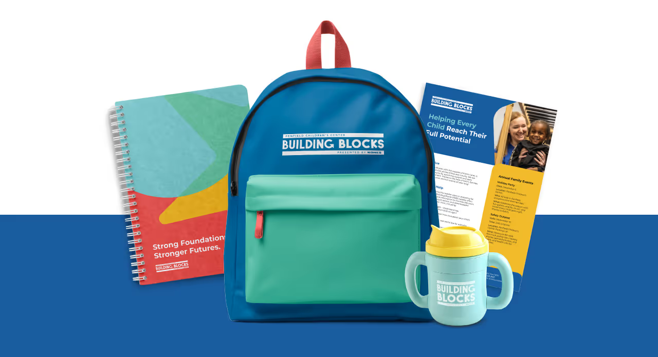

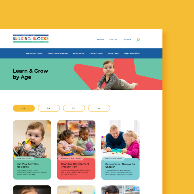
With each ingredient added by hand, the personal touch given to these Ayurvedic medicines is matched by the essence of the packaging. Products are sold online and in various local retail outlets with new products being released regularly. Especially since the pandemic, people have turned to these products for improving their family's health through natural avenues.


A few years following the company’s initial branding, Arise Balanced Wellness expanded their product offerings and needed to revamp the packaging solution. We took this opportunity to refresh the label designs and propel the organic and boutique products to compete in a growing market.

The new product packaging comes to life in a way that feels earthy, approachable and refined. Designs for labels are vibrant with clean layout and typography for clear communication which is on-brand and educational. A clear label stock was chosen to appear high-end and well thought out just like the contents of the products.




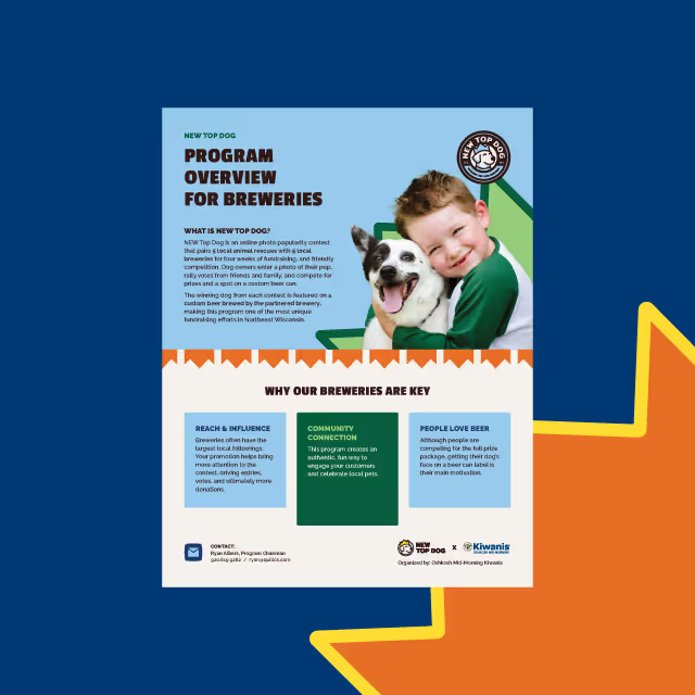
With each ingredient added by hand, the personal touch given to these Ayurvedic medicines is matched by the essence of the packaging. Products are sold online and in various local retail outlets with new products being released regularly. Especially since the pandemic, people have turned to these products for improving their family's health through natural avenues.


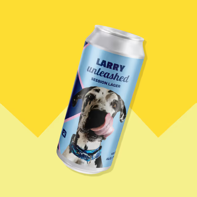


A few years following the company’s initial branding, Arise Balanced Wellness expanded their product offerings and needed to revamp the packaging solution. We took this opportunity to refresh the label designs and propel the organic and boutique products to compete in a growing market.
The new product packaging comes to life in a way that feels earthy, approachable and refined. Designs for labels are vibrant with clean layout and typography for clear communication which is on-brand and educational. A clear label stock was chosen to appear high-end and well thought out just like the contents of the products.



With each ingredient added by hand, the personal touch given to these Ayurvedic medicines is matched by the essence of the packaging. Products are sold online and in various local retail outlets with new products being released regularly. Especially since the pandemic, people have turned to these products for improving their family's health through natural avenues.



A few years following the company’s initial branding, Arise Balanced Wellness expanded their product offerings and needed to revamp the packaging solution. We took this opportunity to refresh the label designs and propel the organic and boutique products to compete in a growing market.
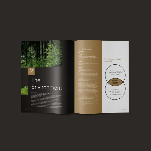
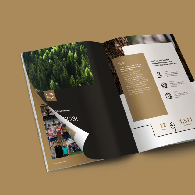
The new product packaging comes to life in a way that feels earthy, approachable and refined. Designs for labels are vibrant with clean layout and typography for clear communication which is on-brand and educational. A clear label stock was chosen to appear high-end and well thought out just like the contents of the products.

With each ingredient added by hand, the personal touch given to these Ayurvedic medicines is matched by the essence of the packaging. Products are sold online and in various local retail outlets with new products being released regularly. Especially since the pandemic, people have turned to these products for improving their family's health through natural avenues.
A few years following the company’s initial branding, Arise Balanced Wellness expanded their product offerings and needed to revamp the packaging solution. We took this opportunity to refresh the label designs and propel the organic and boutique products to compete in a growing market.


The new product packaging comes to life in a way that feels earthy, approachable and refined. Designs for labels are vibrant with clean layout and typography for clear communication which is on-brand and educational. A clear label stock was chosen to appear high-end and well thought out just like the contents of the products.
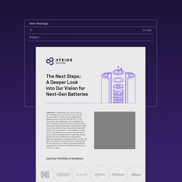

With each ingredient added by hand, the personal touch given to these Ayurvedic medicines is matched by the essence of the packaging. Products are sold online and in various local retail outlets with new products being released regularly. Especially since the pandemic, people have turned to these products for improving their family's health through natural avenues.

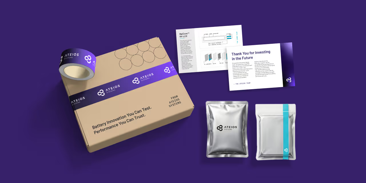
A few years following the company’s initial branding, Arise Balanced Wellness expanded their product offerings and needed to revamp the packaging solution. We took this opportunity to refresh the label designs and propel the organic and boutique products to compete in a growing market.



The new product packaging comes to life in a way that feels earthy, approachable and refined. Designs for labels are vibrant with clean layout and typography for clear communication which is on-brand and educational. A clear label stock was chosen to appear high-end and well thought out just like the contents of the products.


With each ingredient added by hand, the personal touch given to these Ayurvedic medicines is matched by the essence of the packaging. Products are sold online and in various local retail outlets with new products being released regularly. Especially since the pandemic, people have turned to these products for improving their family's health through natural avenues.


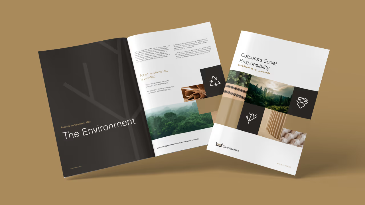
A few years following the company’s initial branding, Arise Balanced Wellness expanded their product offerings and needed to revamp the packaging solution. We took this opportunity to refresh the label designs and propel the organic and boutique products to compete in a growing market.

The new product packaging comes to life in a way that feels earthy, approachable and refined. Designs for labels are vibrant with clean layout and typography for clear communication which is on-brand and educational. A clear label stock was chosen to appear high-end and well thought out just like the contents of the products.


With each ingredient added by hand, the personal touch given to these Ayurvedic medicines is matched by the essence of the packaging. Products are sold online and in various local retail outlets with new products being released regularly. Especially since the pandemic, people have turned to these products for improving their family's health through natural avenues.


A few years following the company’s initial branding, Arise Balanced Wellness expanded their product offerings and needed to revamp the packaging solution. We took this opportunity to refresh the label designs and propel the organic and boutique products to compete in a growing market.



The new product packaging comes to life in a way that feels earthy, approachable and refined. Designs for labels are vibrant with clean layout and typography for clear communication which is on-brand and educational. A clear label stock was chosen to appear high-end and well thought out just like the contents of the products.


With each ingredient added by hand, the personal touch given to these Ayurvedic medicines is matched by the essence of the packaging. Products are sold online and in various local retail outlets with new products being released regularly. Especially since the pandemic, people have turned to these products for improving their family's health through natural avenues.




A few years following the company’s initial branding, Arise Balanced Wellness expanded their product offerings and needed to revamp the packaging solution. We took this opportunity to refresh the label designs and propel the organic and boutique products to compete in a growing market.

The new product packaging comes to life in a way that feels earthy, approachable and refined. Designs for labels are vibrant with clean layout and typography for clear communication which is on-brand and educational. A clear label stock was chosen to appear high-end and well thought out just like the contents of the products.



With each ingredient added by hand, the personal touch given to these Ayurvedic medicines is matched by the essence of the packaging. Products are sold online and in various local retail outlets with new products being released regularly. Especially since the pandemic, people have turned to these products for improving their family's health through natural avenues.



A few years following the company’s initial branding, Arise Balanced Wellness expanded their product offerings and needed to revamp the packaging solution. We took this opportunity to refresh the label designs and propel the organic and boutique products to compete in a growing market.
The new product packaging comes to life in a way that feels earthy, approachable and refined. Designs for labels are vibrant with clean layout and typography for clear communication which is on-brand and educational. A clear label stock was chosen to appear high-end and well thought out just like the contents of the products.



With each ingredient added by hand, the personal touch given to these Ayurvedic medicines is matched by the essence of the packaging. Products are sold online and in various local retail outlets with new products being released regularly. Especially since the pandemic, people have turned to these products for improving their family's health through natural avenues.





A few years following the company’s initial branding, Arise Balanced Wellness expanded their product offerings and needed to revamp the packaging solution. We took this opportunity to refresh the label designs and propel the organic and boutique products to compete in a growing market.

The new product packaging comes to life in a way that feels earthy, approachable and refined. Designs for labels are vibrant with clean layout and typography for clear communication which is on-brand and educational. A clear label stock was chosen to appear high-end and well thought out just like the contents of the products.



With each ingredient added by hand, the personal touch given to these Ayurvedic medicines is matched by the essence of the packaging. Products are sold online and in various local retail outlets with new products being released regularly. Especially since the pandemic, people have turned to these products for improving their family's health through natural avenues.

A few years following the company’s initial branding, Arise Balanced Wellness expanded their product offerings and needed to revamp the packaging solution. We took this opportunity to refresh the label designs and propel the organic and boutique products to compete in a growing market.
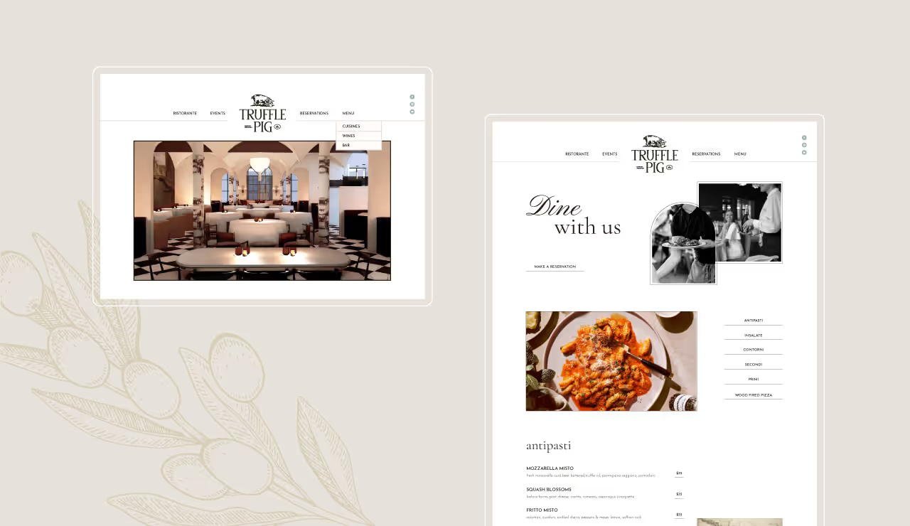
The new product packaging comes to life in a way that feels earthy, approachable and refined. Designs for labels are vibrant with clean layout and typography for clear communication which is on-brand and educational. A clear label stock was chosen to appear high-end and well thought out just like the contents of the products.
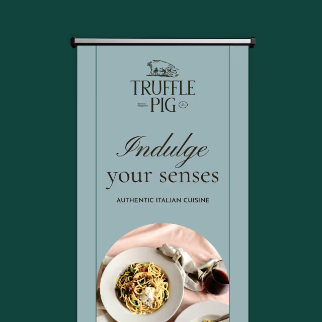
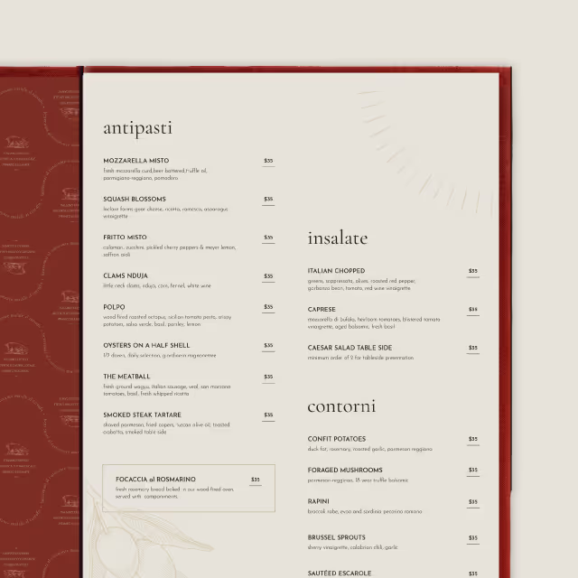
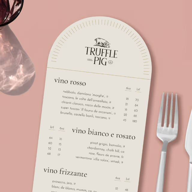
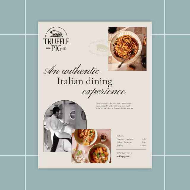
With each ingredient added by hand, the personal touch given to these Ayurvedic medicines is matched by the essence of the packaging. Products are sold online and in various local retail outlets with new products being released regularly. Especially since the pandemic, people have turned to these products for improving their family's health through natural avenues.
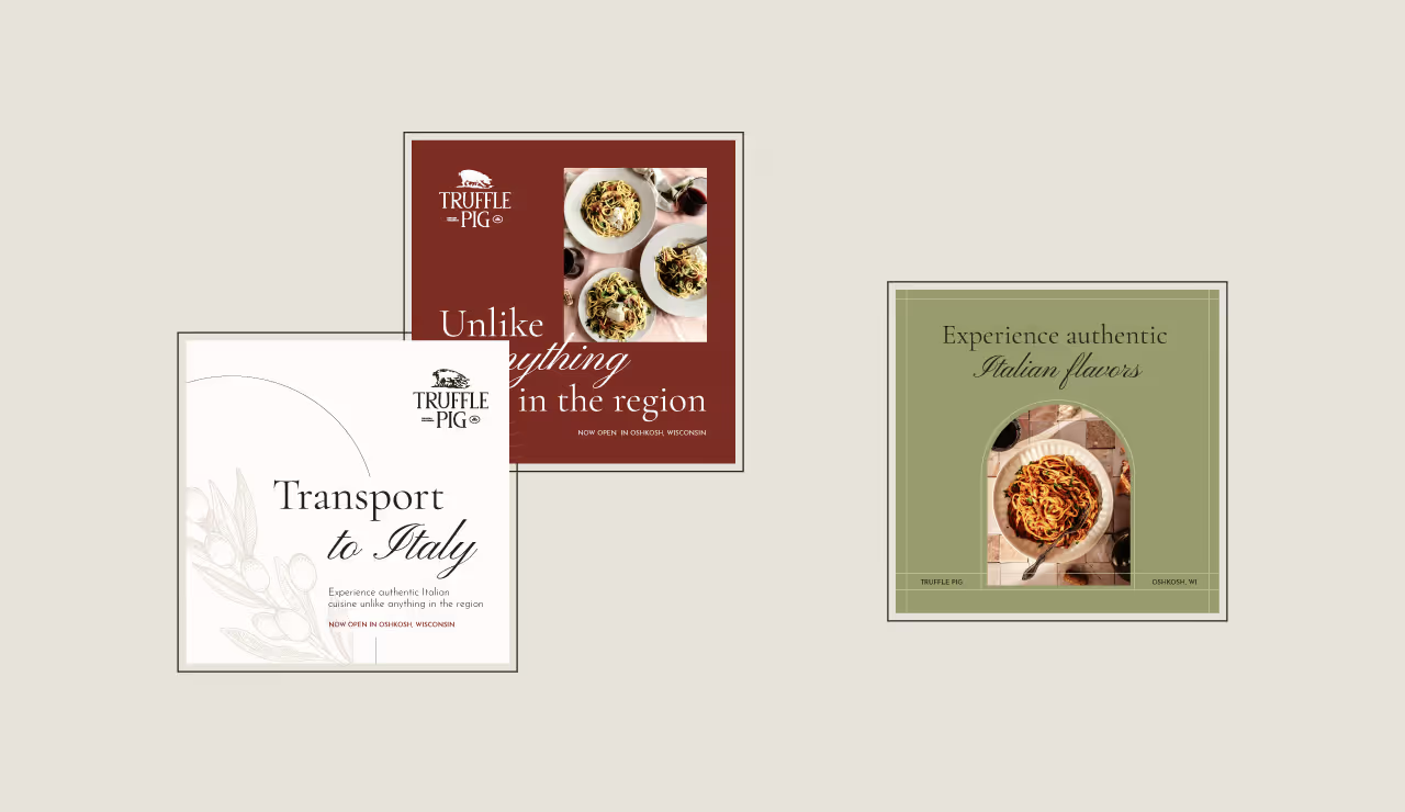
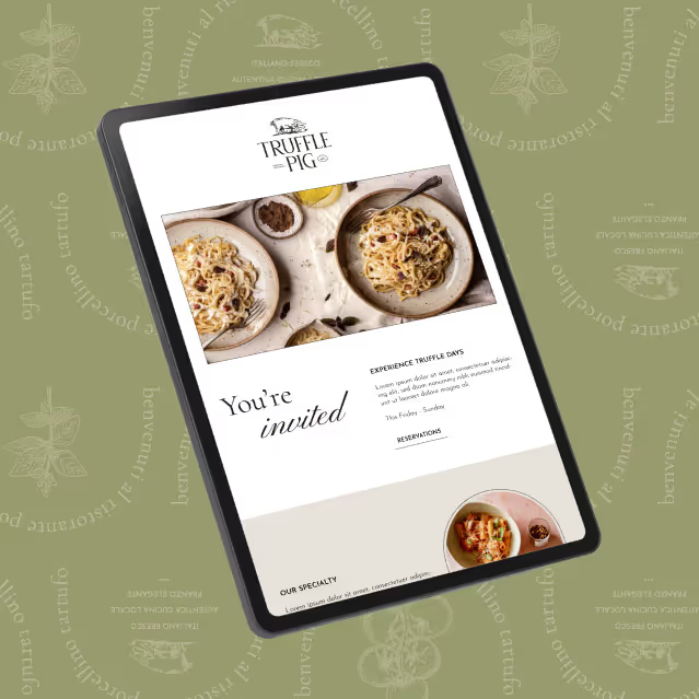


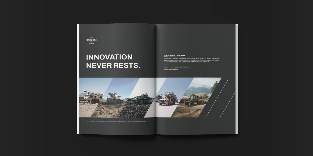
A few years following the company’s initial branding, Arise Balanced Wellness expanded their product offerings and needed to revamp the packaging solution. We took this opportunity to refresh the label designs and propel the organic and boutique products to compete in a growing market.



The new product packaging comes to life in a way that feels earthy, approachable and refined. Designs for labels are vibrant with clean layout and typography for clear communication which is on-brand and educational. A clear label stock was chosen to appear high-end and well thought out just like the contents of the products.

With each ingredient added by hand, the personal touch given to these Ayurvedic medicines is matched by the essence of the packaging. Products are sold online and in various local retail outlets with new products being released regularly. Especially since the pandemic, people have turned to these products for improving their family's health through natural avenues.


A few years following the company’s initial branding, Arise Balanced Wellness expanded their product offerings and needed to revamp the packaging solution. We took this opportunity to refresh the label designs and propel the organic and boutique products to compete in a growing market.

The new product packaging comes to life in a way that feels earthy, approachable and refined. Designs for labels are vibrant with clean layout and typography for clear communication which is on-brand and educational. A clear label stock was chosen to appear high-end and well thought out just like the contents of the products.


With each ingredient added by hand, the personal touch given to these Ayurvedic medicines is matched by the essence of the packaging. Products are sold online and in various local retail outlets with new products being released regularly. Especially since the pandemic, people have turned to these products for improving their family's health through natural avenues.



A few years following the company’s initial branding, Arise Balanced Wellness expanded their product offerings and needed to revamp the packaging solution. We took this opportunity to refresh the label designs and propel the organic and boutique products to compete in a growing market.


The new product packaging comes to life in a way that feels earthy, approachable and refined. Designs for labels are vibrant with clean layout and typography for clear communication which is on-brand and educational. A clear label stock was chosen to appear high-end and well thought out just like the contents of the products.
With each ingredient added by hand, the personal touch given to these Ayurvedic medicines is matched by the essence of the packaging. Products are sold online and in various local retail outlets with new products being released regularly. Especially since the pandemic, people have turned to these products for improving their family's health through natural avenues.


A few years following the company’s initial branding, Arise Balanced Wellness expanded their product offerings and needed to revamp the packaging solution. We took this opportunity to refresh the label designs and propel the organic and boutique products to compete in a growing market.


The new product packaging comes to life in a way that feels earthy, approachable and refined. Designs for labels are vibrant with clean layout and typography for clear communication which is on-brand and educational. A clear label stock was chosen to appear high-end and well thought out just like the contents of the products.

With each ingredient added by hand, the personal touch given to these Ayurvedic medicines is matched by the essence of the packaging. Products are sold online and in various local retail outlets with new products being released regularly. Especially since the pandemic, people have turned to these products for improving their family's health through natural avenues.


A few years following the company’s initial branding, Arise Balanced Wellness expanded their product offerings and needed to revamp the packaging solution. We took this opportunity to refresh the label designs and propel the organic and boutique products to compete in a growing market.

The new product packaging comes to life in a way that feels earthy, approachable and refined. Designs for labels are vibrant with clean layout and typography for clear communication which is on-brand and educational. A clear label stock was chosen to appear high-end and well thought out just like the contents of the products.


With each ingredient added by hand, the personal touch given to these Ayurvedic medicines is matched by the essence of the packaging. Products are sold online and in various local retail outlets with new products being released regularly. Especially since the pandemic, people have turned to these products for improving their family's health through natural avenues.


A few years following the company’s initial branding, Arise Balanced Wellness expanded their product offerings and needed to revamp the packaging solution. We took this opportunity to refresh the label designs and propel the organic and boutique products to compete in a growing market.


The new product packaging comes to life in a way that feels earthy, approachable and refined. Designs for labels are vibrant with clean layout and typography for clear communication which is on-brand and educational. A clear label stock was chosen to appear high-end and well thought out just like the contents of the products.



With each ingredient added by hand, the personal touch given to these Ayurvedic medicines is matched by the essence of the packaging. Products are sold online and in various local retail outlets with new products being released regularly. Especially since the pandemic, people have turned to these products for improving their family's health through natural avenues.





A few years following the company’s initial branding, Arise Balanced Wellness expanded their product offerings and needed to revamp the packaging solution. We took this opportunity to refresh the label designs and propel the organic and boutique products to compete in a growing market.


The new product packaging comes to life in a way that feels earthy, approachable and refined. Designs for labels are vibrant with clean layout and typography for clear communication which is on-brand and educational. A clear label stock was chosen to appear high-end and well thought out just like the contents of the products.

With each ingredient added by hand, the personal touch given to these Ayurvedic medicines is matched by the essence of the packaging. Products are sold online and in various local retail outlets with new products being released regularly. Especially since the pandemic, people have turned to these products for improving their family's health through natural avenues.


A few years following the company’s initial branding, Arise Balanced Wellness expanded their product offerings and needed to revamp the packaging solution. We took this opportunity to refresh the label designs and propel the organic and boutique products to compete in a growing market.


The new product packaging comes to life in a way that feels earthy, approachable and refined. Designs for labels are vibrant with clean layout and typography for clear communication which is on-brand and educational. A clear label stock was chosen to appear high-end and well thought out just like the contents of the products.


With each ingredient added by hand, the personal touch given to these Ayurvedic medicines is matched by the essence of the packaging. Products are sold online and in various local retail outlets with new products being released regularly. Especially since the pandemic, people have turned to these products for improving their family's health through natural avenues.



A few years following the company’s initial branding, Arise Balanced Wellness expanded their product offerings and needed to revamp the packaging solution. We took this opportunity to refresh the label designs and propel the organic and boutique products to compete in a growing market.

The new product packaging comes to life in a way that feels earthy, approachable and refined. Designs for labels are vibrant with clean layout and typography for clear communication which is on-brand and educational. A clear label stock was chosen to appear high-end and well thought out just like the contents of the products.


With each ingredient added by hand, the personal touch given to these Ayurvedic medicines is matched by the essence of the packaging. Products are sold online and in various local retail outlets with new products being released regularly. Especially since the pandemic, people have turned to these products for improving their family's health through natural avenues.


A few years following the company’s initial branding, Arise Balanced Wellness expanded their product offerings and needed to revamp the packaging solution. We took this opportunity to refresh the label designs and propel the organic and boutique products to compete in a growing market.


The new product packaging comes to life in a way that feels earthy, approachable and refined. Designs for labels are vibrant with clean layout and typography for clear communication which is on-brand and educational. A clear label stock was chosen to appear high-end and well thought out just like the contents of the products.


With each ingredient added by hand, the personal touch given to these Ayurvedic medicines is matched by the essence of the packaging. Products are sold online and in various local retail outlets with new products being released regularly. Especially since the pandemic, people have turned to these products for improving their family's health through natural avenues.


A few years following the company’s initial branding, Arise Balanced Wellness expanded their product offerings and needed to revamp the packaging solution. We took this opportunity to refresh the label designs and propel the organic and boutique products to compete in a growing market.

The new product packaging comes to life in a way that feels earthy, approachable and refined. Designs for labels are vibrant with clean layout and typography for clear communication which is on-brand and educational. A clear label stock was chosen to appear high-end and well thought out just like the contents of the products.


With each ingredient added by hand, the personal touch given to these Ayurvedic medicines is matched by the essence of the packaging. Products are sold online and in various local retail outlets with new products being released regularly. Especially since the pandemic, people have turned to these products for improving their family's health through natural avenues.


A few years following the company’s initial branding, Arise Balanced Wellness expanded their product offerings and needed to revamp the packaging solution. We took this opportunity to refresh the label designs and propel the organic and boutique products to compete in a growing market.

The new product packaging comes to life in a way that feels earthy, approachable and refined. Designs for labels are vibrant with clean layout and typography for clear communication which is on-brand and educational. A clear label stock was chosen to appear high-end and well thought out just like the contents of the products.


With each ingredient added by hand, the personal touch given to these Ayurvedic medicines is matched by the essence of the packaging. Products are sold online and in various local retail outlets with new products being released regularly. Especially since the pandemic, people have turned to these products for improving their family's health through natural avenues.


A few years following the company’s initial branding, Arise Balanced Wellness expanded their product offerings and needed to revamp the packaging solution. We took this opportunity to refresh the label designs and propel the organic and boutique products to compete in a growing market.


The new product packaging comes to life in a way that feels earthy, approachable and refined. Designs for labels are vibrant with clean layout and typography for clear communication which is on-brand and educational. A clear label stock was chosen to appear high-end and well thought out just like the contents of the products.

With each ingredient added by hand, the personal touch given to these Ayurvedic medicines is matched by the essence of the packaging. Products are sold online and in various local retail outlets with new products being released regularly. Especially since the pandemic, people have turned to these products for improving their family's health through natural avenues.


A few years following the company’s initial branding, Arise Balanced Wellness expanded their product offerings and needed to revamp the packaging solution. We took this opportunity to refresh the label designs and propel the organic and boutique products to compete in a growing market.

The new product packaging comes to life in a way that feels earthy, approachable and refined. Designs for labels are vibrant with clean layout and typography for clear communication which is on-brand and educational. A clear label stock was chosen to appear high-end and well thought out just like the contents of the products.


With each ingredient added by hand, the personal touch given to these Ayurvedic medicines is matched by the essence of the packaging. Products are sold online and in various local retail outlets with new products being released regularly. Especially since the pandemic, people have turned to these products for improving their family's health through natural avenues.


A few years following the company’s initial branding, Arise Balanced Wellness expanded their product offerings and needed to revamp the packaging solution. We took this opportunity to refresh the label designs and propel the organic and boutique products to compete in a growing market.

The new product packaging comes to life in a way that feels earthy, approachable and refined. Designs for labels are vibrant with clean layout and typography for clear communication which is on-brand and educational. A clear label stock was chosen to appear high-end and well thought out just like the contents of the products.


With each ingredient added by hand, the personal touch given to these Ayurvedic medicines is matched by the essence of the packaging. Products are sold online and in various local retail outlets with new products being released regularly. Especially since the pandemic, people have turned to these products for improving their family's health through natural avenues.


A few years following the company’s initial branding, Arise Balanced Wellness expanded their product offerings and needed to revamp the packaging solution. We took this opportunity to refresh the label designs and propel the organic and boutique products to compete in a growing market.


The new product packaging comes to life in a way that feels earthy, approachable and refined. Designs for labels are vibrant with clean layout and typography for clear communication which is on-brand and educational. A clear label stock was chosen to appear high-end and well thought out just like the contents of the products.

With each ingredient added by hand, the personal touch given to these Ayurvedic medicines is matched by the essence of the packaging. Products are sold online and in various local retail outlets with new products being released regularly. Especially since the pandemic, people have turned to these products for improving their family's health through natural avenues.


A few years following the company’s initial branding, Arise Balanced Wellness expanded their product offerings and needed to revamp the packaging solution. We took this opportunity to refresh the label designs and propel the organic and boutique products to compete in a growing market.


The new product packaging comes to life in a way that feels earthy, approachable and refined. Designs for labels are vibrant with clean layout and typography for clear communication which is on-brand and educational. A clear label stock was chosen to appear high-end and well thought out just like the contents of the products.

With each ingredient added by hand, the personal touch given to these Ayurvedic medicines is matched by the essence of the packaging. Products are sold online and in various local retail outlets with new products being released regularly. Especially since the pandemic, people have turned to these products for improving their family's health through natural avenues.


A few years following the company’s initial branding, Arise Balanced Wellness expanded their product offerings and needed to revamp the packaging solution. We took this opportunity to refresh the label designs and propel the organic and boutique products to compete in a growing market.


The new product packaging comes to life in a way that feels earthy, approachable and refined. Designs for labels are vibrant with clean layout and typography for clear communication which is on-brand and educational. A clear label stock was chosen to appear high-end and well thought out just like the contents of the products.


With each ingredient added by hand, the personal touch given to these Ayurvedic medicines is matched by the essence of the packaging. Products are sold online and in various local retail outlets with new products being released regularly. Especially since the pandemic, people have turned to these products for improving their family's health through natural avenues.


A few years following the company’s initial branding, Arise Balanced Wellness expanded their product offerings and needed to revamp the packaging solution. We took this opportunity to refresh the label designs and propel the organic and boutique products to compete in a growing market.


The new product packaging comes to life in a way that feels earthy, approachable and refined. Designs for labels are vibrant with clean layout and typography for clear communication which is on-brand and educational. A clear label stock was chosen to appear high-end and well thought out just like the contents of the products.


With each ingredient added by hand, the personal touch given to these Ayurvedic medicines is matched by the essence of the packaging. Products are sold online and in various local retail outlets with new products being released regularly. Especially since the pandemic, people have turned to these products for improving their family's health through natural avenues.


A few years following the company’s initial branding, Arise Balanced Wellness expanded their product offerings and needed to revamp the packaging solution. We took this opportunity to refresh the label designs and propel the organic and boutique products to compete in a growing market.

The new product packaging comes to life in a way that feels earthy, approachable and refined. Designs for labels are vibrant with clean layout and typography for clear communication which is on-brand and educational. A clear label stock was chosen to appear high-end and well thought out just like the contents of the products.

With each ingredient added by hand, the personal touch given to these Ayurvedic medicines is matched by the essence of the packaging. Products are sold online and in various local retail outlets with new products being released regularly. Especially since the pandemic, people have turned to these products for improving their family's health through natural avenues.


A few years following the company’s initial branding, Arise Balanced Wellness expanded their product offerings and needed to revamp the packaging solution. We took this opportunity to refresh the label designs and propel the organic and boutique products to compete in a growing market.


The new product packaging comes to life in a way that feels earthy, approachable and refined. Designs for labels are vibrant with clean layout and typography for clear communication which is on-brand and educational. A clear label stock was chosen to appear high-end and well thought out just like the contents of the products.


With each ingredient added by hand, the personal touch given to these Ayurvedic medicines is matched by the essence of the packaging. Products are sold online and in various local retail outlets with new products being released regularly. Especially since the pandemic, people have turned to these products for improving their family's health through natural avenues.


A few years following the company’s initial branding, Arise Balanced Wellness expanded their product offerings and needed to revamp the packaging solution. We took this opportunity to refresh the label designs and propel the organic and boutique products to compete in a growing market.


The new product packaging comes to life in a way that feels earthy, approachable and refined. Designs for labels are vibrant with clean layout and typography for clear communication which is on-brand and educational. A clear label stock was chosen to appear high-end and well thought out just like the contents of the products.


With each ingredient added by hand, the personal touch given to these Ayurvedic medicines is matched by the essence of the packaging. Products are sold online and in various local retail outlets with new products being released regularly. Especially since the pandemic, people have turned to these products for improving their family's health through natural avenues.


A few years following the company’s initial branding, Arise Balanced Wellness expanded their product offerings and needed to revamp the packaging solution. We took this opportunity to refresh the label designs and propel the organic and boutique products to compete in a growing market.


The new product packaging comes to life in a way that feels earthy, approachable and refined. Designs for labels are vibrant with clean layout and typography for clear communication which is on-brand and educational. A clear label stock was chosen to appear high-end and well thought out just like the contents of the products.


With each ingredient added by hand, the personal touch given to these Ayurvedic medicines is matched by the essence of the packaging. Products are sold online and in various local retail outlets with new products being released regularly. Especially since the pandemic, people have turned to these products for improving their family's health through natural avenues.




A few years following the company’s initial branding, Arise Balanced Wellness expanded their product offerings and needed to revamp the packaging solution. We took this opportunity to refresh the label designs and propel the organic and boutique products to compete in a growing market.


The new product packaging comes to life in a way that feels earthy, approachable and refined. Designs for labels are vibrant with clean layout and typography for clear communication which is on-brand and educational. A clear label stock was chosen to appear high-end and well thought out just like the contents of the products.


With each ingredient added by hand, the personal touch given to these Ayurvedic medicines is matched by the essence of the packaging. Products are sold online and in various local retail outlets with new products being released regularly. Especially since the pandemic, people have turned to these products for improving their family's health through natural avenues.


A few years following the company’s initial branding, Arise Balanced Wellness expanded their product offerings and needed to revamp the packaging solution. We took this opportunity to refresh the label designs and propel the organic and boutique products to compete in a growing market.

The new product packaging comes to life in a way that feels earthy, approachable and refined. Designs for labels are vibrant with clean layout and typography for clear communication which is on-brand and educational. A clear label stock was chosen to appear high-end and well thought out just like the contents of the products.


With each ingredient added by hand, the personal touch given to these Ayurvedic medicines is matched by the essence of the packaging. Products are sold online and in various local retail outlets with new products being released regularly. Especially since the pandemic, people have turned to these products for improving their family's health through natural avenues.


A few years following the company’s initial branding, Arise Balanced Wellness expanded their product offerings and needed to revamp the packaging solution. We took this opportunity to refresh the label designs and propel the organic and boutique products to compete in a growing market.


The new product packaging comes to life in a way that feels earthy, approachable and refined. Designs for labels are vibrant with clean layout and typography for clear communication which is on-brand and educational. A clear label stock was chosen to appear high-end and well thought out just like the contents of the products.


With each ingredient added by hand, the personal touch given to these Ayurvedic medicines is matched by the essence of the packaging. Products are sold online and in various local retail outlets with new products being released regularly. Especially since the pandemic, people have turned to these products for improving their family's health through natural avenues.

A few years following the company’s initial branding, Arise Balanced Wellness expanded their product offerings and needed to revamp the packaging solution. We took this opportunity to refresh the label designs and propel the organic and boutique products to compete in a growing market.


The new product packaging comes to life in a way that feels earthy, approachable and refined. Designs for labels are vibrant with clean layout and typography for clear communication which is on-brand and educational. A clear label stock was chosen to appear high-end and well thought out just like the contents of the products.


With each ingredient added by hand, the personal touch given to these Ayurvedic medicines is matched by the essence of the packaging. Products are sold online and in various local retail outlets with new products being released regularly. Especially since the pandemic, people have turned to these products for improving their family's health through natural avenues.


A few years following the company’s initial branding, Arise Balanced Wellness expanded their product offerings and needed to revamp the packaging solution. We took this opportunity to refresh the label designs and propel the organic and boutique products to compete in a growing market.

The new product packaging comes to life in a way that feels earthy, approachable and refined. Designs for labels are vibrant with clean layout and typography for clear communication which is on-brand and educational. A clear label stock was chosen to appear high-end and well thought out just like the contents of the products.


With each ingredient added by hand, the personal touch given to these Ayurvedic medicines is matched by the essence of the packaging. Products are sold online and in various local retail outlets with new products being released regularly. Especially since the pandemic, people have turned to these products for improving their family's health through natural avenues.


A few years following the company’s initial branding, Arise Balanced Wellness expanded their product offerings and needed to revamp the packaging solution. We took this opportunity to refresh the label designs and propel the organic and boutique products to compete in a growing market.


The new product packaging comes to life in a way that feels earthy, approachable and refined. Designs for labels are vibrant with clean layout and typography for clear communication which is on-brand and educational. A clear label stock was chosen to appear high-end and well thought out just like the contents of the products.


With each ingredient added by hand, the personal touch given to these Ayurvedic medicines is matched by the essence of the packaging. Products are sold online and in various local retail outlets with new products being released regularly. Especially since the pandemic, people have turned to these products for improving their family's health through natural avenues.


A few years following the company’s initial branding, Arise Balanced Wellness expanded their product offerings and needed to revamp the packaging solution. We took this opportunity to refresh the label designs and propel the organic and boutique products to compete in a growing market.


The new product packaging comes to life in a way that feels earthy, approachable and refined. Designs for labels are vibrant with clean layout and typography for clear communication which is on-brand and educational. A clear label stock was chosen to appear high-end and well thought out just like the contents of the products.


With each ingredient added by hand, the personal touch given to these Ayurvedic medicines is matched by the essence of the packaging. Products are sold online and in various local retail outlets with new products being released regularly. Especially since the pandemic, people have turned to these products for improving their family's health through natural avenues.


A few years following the company’s initial branding, Arise Balanced Wellness expanded their product offerings and needed to revamp the packaging solution. We took this opportunity to refresh the label designs and propel the organic and boutique products to compete in a growing market.


The new product packaging comes to life in a way that feels earthy, approachable and refined. Designs for labels are vibrant with clean layout and typography for clear communication which is on-brand and educational. A clear label stock was chosen to appear high-end and well thought out just like the contents of the products.


With each ingredient added by hand, the personal touch given to these Ayurvedic medicines is matched by the essence of the packaging. Products are sold online and in various local retail outlets with new products being released regularly. Especially since the pandemic, people have turned to these products for improving their family's health through natural avenues.





A few years following the company’s initial branding, Arise Balanced Wellness expanded their product offerings and needed to revamp the packaging solution. We took this opportunity to refresh the label designs and propel the organic and boutique products to compete in a growing market.


The new product packaging comes to life in a way that feels earthy, approachable and refined. Designs for labels are vibrant with clean layout and typography for clear communication which is on-brand and educational. A clear label stock was chosen to appear high-end and well thought out just like the contents of the products.


With each ingredient added by hand, the personal touch given to these Ayurvedic medicines is matched by the essence of the packaging. Products are sold online and in various local retail outlets with new products being released regularly. Especially since the pandemic, people have turned to these products for improving their family's health through natural avenues.


A few years following the company’s initial branding, Arise Balanced Wellness expanded their product offerings and needed to revamp the packaging solution. We took this opportunity to refresh the label designs and propel the organic and boutique products to compete in a growing market.

The new product packaging comes to life in a way that feels earthy, approachable and refined. Designs for labels are vibrant with clean layout and typography for clear communication which is on-brand and educational. A clear label stock was chosen to appear high-end and well thought out just like the contents of the products.


With each ingredient added by hand, the personal touch given to these Ayurvedic medicines is matched by the essence of the packaging. Products are sold online and in various local retail outlets with new products being released regularly. Especially since the pandemic, people have turned to these products for improving their family's health through natural avenues.


A few years following the company’s initial branding, Arise Balanced Wellness expanded their product offerings and needed to revamp the packaging solution. We took this opportunity to refresh the label designs and propel the organic and boutique products to compete in a growing market.





The new product packaging comes to life in a way that feels earthy, approachable and refined. Designs for labels are vibrant with clean layout and typography for clear communication which is on-brand and educational. A clear label stock was chosen to appear high-end and well thought out just like the contents of the products.


With each ingredient added by hand, the personal touch given to these Ayurvedic medicines is matched by the essence of the packaging. Products are sold online and in various local retail outlets with new products being released regularly. Especially since the pandemic, people have turned to these products for improving their family's health through natural avenues.


A few years following the company’s initial branding, Arise Balanced Wellness expanded their product offerings and needed to revamp the packaging solution. We took this opportunity to refresh the label designs and propel the organic and boutique products to compete in a growing market.

The new product packaging comes to life in a way that feels earthy, approachable and refined. Designs for labels are vibrant with clean layout and typography for clear communication which is on-brand and educational. A clear label stock was chosen to appear high-end and well thought out just like the contents of the products.


With each ingredient added by hand, the personal touch given to these Ayurvedic medicines is matched by the essence of the packaging. Products are sold online and in various local retail outlets with new products being released regularly. Especially since the pandemic, people have turned to these products for improving their family's health through natural avenues.


A few years following the company’s initial branding, Arise Balanced Wellness expanded their product offerings and needed to revamp the packaging solution. We took this opportunity to refresh the label designs and propel the organic and boutique products to compete in a growing market.


The new product packaging comes to life in a way that feels earthy, approachable and refined. Designs for labels are vibrant with clean layout and typography for clear communication which is on-brand and educational. A clear label stock was chosen to appear high-end and well thought out just like the contents of the products.



With each ingredient added by hand, the personal touch given to these Ayurvedic medicines is matched by the essence of the packaging. Products are sold online and in various local retail outlets with new products being released regularly. Especially since the pandemic, people have turned to these products for improving their family's health through natural avenues.


A few years following the company’s initial branding, Arise Balanced Wellness expanded their product offerings and needed to revamp the packaging solution. We took this opportunity to refresh the label designs and propel the organic and boutique products to compete in a growing market.


The new product packaging comes to life in a way that feels earthy, approachable and refined. Designs for labels are vibrant with clean layout and typography for clear communication which is on-brand and educational. A clear label stock was chosen to appear high-end and well thought out just like the contents of the products.


With each ingredient added by hand, the personal touch given to these Ayurvedic medicines is matched by the essence of the packaging. Products are sold online and in various local retail outlets with new products being released regularly. Especially since the pandemic, people have turned to these products for improving their family's health through natural avenues.


A few years following the company’s initial branding, Arise Balanced Wellness expanded their product offerings and needed to revamp the packaging solution. We took this opportunity to refresh the label designs and propel the organic and boutique products to compete in a growing market.


The new product packaging comes to life in a way that feels earthy, approachable and refined. Designs for labels are vibrant with clean layout and typography for clear communication which is on-brand and educational. A clear label stock was chosen to appear high-end and well thought out just like the contents of the products.


With each ingredient added by hand, the personal touch given to these Ayurvedic medicines is matched by the essence of the packaging. Products are sold online and in various local retail outlets with new products being released regularly. Especially since the pandemic, people have turned to these products for improving their family's health through natural avenues.


A few years following the company’s initial branding, Arise Balanced Wellness expanded their product offerings and needed to revamp the packaging solution. We took this opportunity to refresh the label designs and propel the organic and boutique products to compete in a growing market.


The new product packaging comes to life in a way that feels earthy, approachable and refined. Designs for labels are vibrant with clean layout and typography for clear communication which is on-brand and educational. A clear label stock was chosen to appear high-end and well thought out just like the contents of the products.





A few years following the company’s initial branding, Arise Balanced Wellness expanded their product offerings and needed to revamp the packaging solution. We took this opportunity to refresh the label designs and propel the organic and boutique products to compete in a growing market.
The new product packaging comes to life in a way that feels earthy, approachable and refined. Designs for labels are vibrant with clean layout and typography for clear communication which is on-brand and educational. A clear label stock was chosen to appear high-end and well thought out just like the contents of the products.


With each ingredient added by hand, the personal touch given to these Ayurvedic medicines is matched by the essence of the packaging. Products are sold online and in various local retail outlets with new products being released regularly. Especially since the pandemic, people have turned to these products for improving their family's health through natural avenues.


A few years following the company’s initial branding, Arise Balanced Wellness expanded their product offerings and needed to revamp the packaging solution. We took this opportunity to refresh the label designs and propel the organic and boutique products to compete in a growing market.


The new product packaging comes to life in a way that feels earthy, approachable and refined. Designs for labels are vibrant with clean layout and typography for clear communication which is on-brand and educational. A clear label stock was chosen to appear high-end and well thought out just like the contents of the products.
With each ingredient added by hand, the personal touch given to these Ayurvedic medicines is matched by the essence of the packaging. Products are sold online and in various local retail outlets with new products being released regularly. Especially since the pandemic, people have turned to these products for improving their family's health through natural avenues.

A few years following the company’s initial branding, Arise Balanced Wellness expanded their product offerings and needed to revamp the packaging solution. We took this opportunity to refresh the label designs and propel the organic and boutique products to compete in a growing market.


The new product packaging comes to life in a way that feels earthy, approachable and refined. Designs for labels are vibrant with clean layout and typography for clear communication which is on-brand and educational. A clear label stock was chosen to appear high-end and well thought out just like the contents of the products.


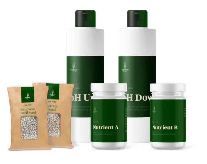
With each ingredient added by hand, the personal touch given to these Ayurvedic medicines is matched by the essence of the packaging. Products are sold online and in various local retail outlets with new products being released regularly. Especially since the pandemic, people have turned to these products for improving their family's health through natural avenues.


A few years following the company’s initial branding, Arise Balanced Wellness expanded their product offerings and needed to revamp the packaging solution. We took this opportunity to refresh the label designs and propel the organic and boutique products to compete in a growing market.

The new product packaging comes to life in a way that feels earthy, approachable and refined. Designs for labels are vibrant with clean layout and typography for clear communication which is on-brand and educational. A clear label stock was chosen to appear high-end and well thought out just like the contents of the products.


With each ingredient added by hand, the personal touch given to these Ayurvedic medicines is matched by the essence of the packaging. Products are sold online and in various local retail outlets with new products being released regularly. Especially since the pandemic, people have turned to these products for improving their family's health through natural avenues.


A few years following the company’s initial branding, Arise Balanced Wellness expanded their product offerings and needed to revamp the packaging solution. We took this opportunity to refresh the label designs and propel the organic and boutique products to compete in a growing market.

The new product packaging comes to life in a way that feels earthy, approachable and refined. Designs for labels are vibrant with clean layout and typography for clear communication which is on-brand and educational. A clear label stock was chosen to appear high-end and well thought out just like the contents of the products.

With each ingredient added by hand, the personal touch given to these Ayurvedic medicines is matched by the essence of the packaging. Products are sold online and in various local retail outlets with new products being released regularly. Especially since the pandemic, people have turned to these products for improving their family's health through natural avenues.


A few years following the company’s initial branding, Arise Balanced Wellness expanded their product offerings and needed to revamp the packaging solution. We took this opportunity to refresh the label designs and propel the organic and boutique products to compete in a growing market.


The new product packaging comes to life in a way that feels earthy, approachable and refined. Designs for labels are vibrant with clean layout and typography for clear communication which is on-brand and educational. A clear label stock was chosen to appear high-end and well thought out just like the contents of the products.


With each ingredient added by hand, the personal touch given to these Ayurvedic medicines is matched by the essence of the packaging. Products are sold online and in various local retail outlets with new products being released regularly. Especially since the pandemic, people have turned to these products for improving their family's health through natural avenues.


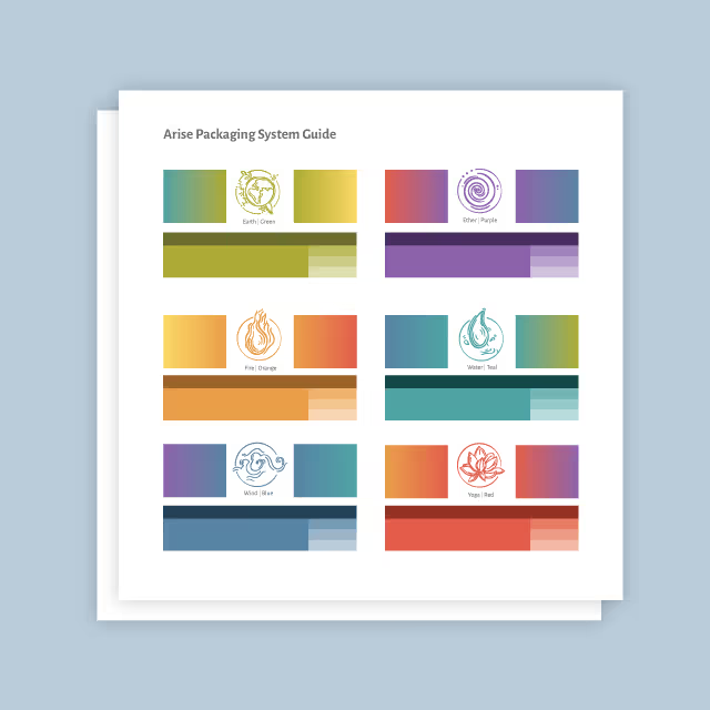
A few years following the company’s initial branding, Arise Balanced Wellness expanded their product offerings and needed to revamp the packaging solution. We took this opportunity to refresh the label designs and propel the organic and boutique products to compete in a growing market.
The new product packaging comes to life in a way that feels earthy, approachable and refined. Designs for labels are vibrant with clean layout and typography for clear communication which is on-brand and educational. A clear label stock was chosen to appear high-end and well thought out just like the contents of the products.


With each ingredient added by hand, the personal touch given to these Ayurvedic medicines is matched by the essence of the packaging. Products are sold online and in various local retail outlets with new products being released regularly. Especially since the pandemic, people have turned to these products for improving their family's health through natural avenues.


A few years following the company’s initial branding, Arise Balanced Wellness expanded their product offerings and needed to revamp the packaging solution. We took this opportunity to refresh the label designs and propel the organic and boutique products to compete in a growing market.


The new product packaging comes to life in a way that feels earthy, approachable and refined. Designs for labels are vibrant with clean layout and typography for clear communication which is on-brand and educational. A clear label stock was chosen to appear high-end and well thought out just like the contents of the products.


With each ingredient added by hand, the personal touch given to these Ayurvedic medicines is matched by the essence of the packaging. Products are sold online and in various local retail outlets with new products being released regularly. Especially since the pandemic, people have turned to these products for improving their family's health through natural avenues.


A few years following the company’s initial branding, Arise Balanced Wellness expanded their product offerings and needed to revamp the packaging solution. We took this opportunity to refresh the label designs and propel the organic and boutique products to compete in a growing market.


The new product packaging comes to life in a way that feels earthy, approachable and refined. Designs for labels are vibrant with clean layout and typography for clear communication which is on-brand and educational. A clear label stock was chosen to appear high-end and well thought out just like the contents of the products.


With each ingredient added by hand, the personal touch given to these Ayurvedic medicines is matched by the essence of the packaging. Products are sold online and in various local retail outlets with new products being released regularly. Especially since the pandemic, people have turned to these products for improving their family's health through natural avenues.


A few years following the company’s initial branding, Arise Balanced Wellness expanded their product offerings and needed to revamp the packaging solution. We took this opportunity to refresh the label designs and propel the organic and boutique products to compete in a growing market.


The new product packaging comes to life in a way that feels earthy, approachable and refined. Designs for labels are vibrant with clean layout and typography for clear communication which is on-brand and educational. A clear label stock was chosen to appear high-end and well thought out just like the contents of the products.


With each ingredient added by hand, the personal touch given to these Ayurvedic medicines is matched by the essence of the packaging. Products are sold online and in various local retail outlets with new products being released regularly. Especially since the pandemic, people have turned to these products for improving their family's health through natural avenues.


A few years following the company’s initial branding, Arise Balanced Wellness expanded their product offerings and needed to revamp the packaging solution. We took this opportunity to refresh the label designs and propel the organic and boutique products to compete in a growing market.

The new product packaging comes to life in a way that feels earthy, approachable and refined. Designs for labels are vibrant with clean layout and typography for clear communication which is on-brand and educational. A clear label stock was chosen to appear high-end and well thought out just like the contents of the products.


With each ingredient added by hand, the personal touch given to these Ayurvedic medicines is matched by the essence of the packaging. Products are sold online and in various local retail outlets with new products being released regularly. Especially since the pandemic, people have turned to these products for improving their family's health through natural avenues.

A few years following the company’s initial branding, Arise Balanced Wellness expanded their product offerings and needed to revamp the packaging solution. We took this opportunity to refresh the label designs and propel the organic and boutique products to compete in a growing market.

The new product packaging comes to life in a way that feels earthy, approachable and refined. Designs for labels are vibrant with clean layout and typography for clear communication which is on-brand and educational. A clear label stock was chosen to appear high-end and well thought out just like the contents of the products.


With each ingredient added by hand, the personal touch given to these Ayurvedic medicines is matched by the essence of the packaging. Products are sold online and in various local retail outlets with new products being released regularly. Especially since the pandemic, people have turned to these products for improving their family's health through natural avenues.


A few years following the company’s initial branding, Arise Balanced Wellness expanded their product offerings and needed to revamp the packaging solution. We took this opportunity to refresh the label designs and propel the organic and boutique products to compete in a growing market.


The new product packaging comes to life in a way that feels earthy, approachable and refined. Designs for labels are vibrant with clean layout and typography for clear communication which is on-brand and educational. A clear label stock was chosen to appear high-end and well thought out just like the contents of the products.


With each ingredient added by hand, the personal touch given to these Ayurvedic medicines is matched by the essence of the packaging. Products are sold online and in various local retail outlets with new products being released regularly. Especially since the pandemic, people have turned to these products for improving their family's health through natural avenues.


A few years following the company’s initial branding, Arise Balanced Wellness expanded their product offerings and needed to revamp the packaging solution. We took this opportunity to refresh the label designs and propel the organic and boutique products to compete in a growing market.


The new product packaging comes to life in a way that feels earthy, approachable and refined. Designs for labels are vibrant with clean layout and typography for clear communication which is on-brand and educational. A clear label stock was chosen to appear high-end and well thought out just like the contents of the products.


With each ingredient added by hand, the personal touch given to these Ayurvedic medicines is matched by the essence of the packaging. Products are sold online and in various local retail outlets with new products being released regularly. Especially since the pandemic, people have turned to these products for improving their family's health through natural avenues.


A few years following the company’s initial branding, Arise Balanced Wellness expanded their product offerings and needed to revamp the packaging solution. We took this opportunity to refresh the label designs and propel the organic and boutique products to compete in a growing market.

The new product packaging comes to life in a way that feels earthy, approachable and refined. Designs for labels are vibrant with clean layout and typography for clear communication which is on-brand and educational. A clear label stock was chosen to appear high-end and well thought out just like the contents of the products.


With each ingredient added by hand, the personal touch given to these Ayurvedic medicines is matched by the essence of the packaging. Products are sold online and in various local retail outlets with new products being released regularly. Especially since the pandemic, people have turned to these products for improving their family's health through natural avenues.


A few years following the company’s initial branding, Arise Balanced Wellness expanded their product offerings and needed to revamp the packaging solution. We took this opportunity to refresh the label designs and propel the organic and boutique products to compete in a growing market.


The new product packaging comes to life in a way that feels earthy, approachable and refined. Designs for labels are vibrant with clean layout and typography for clear communication which is on-brand and educational. A clear label stock was chosen to appear high-end and well thought out just like the contents of the products.

With each ingredient added by hand, the personal touch given to these Ayurvedic medicines is matched by the essence of the packaging. Products are sold online and in various local retail outlets with new products being released regularly. Especially since the pandemic, people have turned to these products for improving their family's health through natural avenues.


A few years following the company’s initial branding, Arise Balanced Wellness expanded their product offerings and needed to revamp the packaging solution. We took this opportunity to refresh the label designs and propel the organic and boutique products to compete in a growing market.

The new product packaging comes to life in a way that feels earthy, approachable and refined. Designs for labels are vibrant with clean layout and typography for clear communication which is on-brand and educational. A clear label stock was chosen to appear high-end and well thought out just like the contents of the products.


With each ingredient added by hand, the personal touch given to these Ayurvedic medicines is matched by the essence of the packaging. Products are sold online and in various local retail outlets with new products being released regularly. Especially since the pandemic, people have turned to these products for improving their family's health through natural avenues.


With each ingredient added by hand, the personal touch given to these Ayurvedic medicines is matched by the essence of the packaging. Products are sold online and in various local retail outlets with new products being released regularly. Especially since the pandemic, people have turned to these products for improving their family's health through natural avenues.
A few years following the company’s initial branding, Arise Balanced Wellness expanded their product offerings and needed to revamp the packaging solution. We took this opportunity to refresh the label designs and propel the organic and boutique products to compete in a growing market.

The new product packaging comes to life in a way that feels earthy, approachable and refined. Designs for labels are vibrant with clean layout and typography for clear communication which is on-brand and educational. A clear label stock was chosen to appear high-end and well thought out just like the contents of the products.

With each ingredient added by hand, the personal touch given to these Ayurvedic medicines is matched by the essence of the packaging. Products are sold online and in various local retail outlets with new products being released regularly. Especially since the pandemic, people have turned to these products for improving their family's health through natural avenues.

With each ingredient added by hand, the personal touch given to these Ayurvedic medicines is matched by the essence of the packaging. Products are sold online and in various local retail outlets with new products being released regularly. Especially since the pandemic, people have turned to these products for improving their family's health through natural avenues.

The new product packaging comes to life in a way that feels earthy, approachable and refined. Designs for labels are vibrant with clean layout and typography for clear communication which is on-brand and educational. A clear label stock was chosen to appear high-end and well thought out just like the contents of the products.

A few years following the company’s initial branding, Arise Balanced Wellness expanded their product offerings and needed to revamp the packaging solution. We took this opportunity to refresh the label designs and propel the organic and boutique products to compete in a growing market.

With each ingredient added by hand, the personal touch given to these Ayurvedic medicines is matched by the essence of the packaging. Products are sold online and in various local retail outlets with new products being released regularly. Especially since the pandemic, people have turned to these products for improving their family's health through natural avenues.


With each ingredient added by hand, the personal touch given to these Ayurvedic medicines is matched by the essence of the packaging. Products are sold online and in various local retail outlets with new products being released regularly. Especially since the pandemic, people have turned to these products for improving their family's health through natural avenues.


A few years following the company’s initial branding, Arise Balanced Wellness expanded their product offerings and needed to revamp the packaging solution. We took this opportunity to refresh the label designs and propel the organic and boutique products to compete in a growing market.


The new product packaging comes to life in a way that feels earthy, approachable and refined. Designs for labels are vibrant with clean layout and typography for clear communication which is on-brand and educational. A clear label stock was chosen to appear high-end and well thought out just like the contents of the products.

With each ingredient added by hand, the personal touch given to these Ayurvedic medicines is matched by the essence of the packaging. Products are sold online and in various local retail outlets with new products being released regularly. Especially since the pandemic, people have turned to these products for improving their family's health through natural avenues.


A few years following the company’s initial branding, Arise Balanced Wellness expanded their product offerings and needed to revamp the packaging solution. We took this opportunity to refresh the label designs and propel the organic and boutique products to compete in a growing market.
The new product packaging comes to life in a way that feels earthy, approachable and refined. Designs for labels are vibrant with clean layout and typography for clear communication which is on-brand and educational. A clear label stock was chosen to appear high-end and well thought out just like the contents of the products.


With each ingredient added by hand, the personal touch given to these Ayurvedic medicines is matched by the essence of the packaging. Products are sold online and in various local retail outlets with new products being released regularly. Especially since the pandemic, people have turned to these products for improving their family's health through natural avenues.


A few years following the company’s initial branding, Arise Balanced Wellness expanded their product offerings and needed to revamp the packaging solution. We took this opportunity to refresh the label designs and propel the organic and boutique products to compete in a growing market.
With each ingredient added by hand, the personal touch given to these Ayurvedic medicines is matched by the essence of the packaging. Products are sold online and in various local retail outlets with new products being released regularly. Especially since the pandemic, people have turned to these products for improving their family's health through natural avenues.

The new product packaging comes to life in a way that feels earthy, approachable and refined. Designs for labels are vibrant with clean layout and typography for clear communication which is on-brand and educational. A clear label stock was chosen to appear high-end and well thought out just like the contents of the products.


With each ingredient added by hand, the personal touch given to these Ayurvedic medicines is matched by the essence of the packaging. Products are sold online and in various local retail outlets with new products being released regularly. Especially since the pandemic, people have turned to these products for improving their family's health through natural avenues.


A few years following the company’s initial branding, Arise Balanced Wellness expanded their product offerings and needed to revamp the packaging solution. We took this opportunity to refresh the label designs and propel the organic and boutique products to compete in a growing market.
The new product packaging comes to life in a way that feels earthy, approachable and refined. Designs for labels are vibrant with clean layout and typography for clear communication which is on-brand and educational. A clear label stock was chosen to appear high-end and well thought out just like the contents of the products.


With each ingredient added by hand, the personal touch given to these Ayurvedic medicines is matched by the essence of the packaging. Products are sold online and in various local retail outlets with new products being released regularly. Especially since the pandemic, people have turned to these products for improving their family's health through natural avenues.


A few years following the company’s initial branding, Arise Balanced Wellness expanded their product offerings and needed to revamp the packaging solution. We took this opportunity to refresh the label designs and propel the organic and boutique products to compete in a growing market.

The new product packaging comes to life in a way that feels earthy, approachable and refined. Designs for labels are vibrant with clean layout and typography for clear communication which is on-brand and educational. A clear label stock was chosen to appear high-end and well thought out just like the contents of the products.

With each ingredient added by hand, the personal touch given to these Ayurvedic medicines is matched by the essence of the packaging. Products are sold online and in various local retail outlets with new products being released regularly. Especially since the pandemic, people have turned to these products for improving their family's health through natural avenues.


A few years following the company’s initial branding, Arise Balanced Wellness expanded their product offerings and needed to revamp the packaging solution. We took this opportunity to refresh the label designs and propel the organic and boutique products to compete in a growing market.

The new product packaging comes to life in a way that feels earthy, approachable and refined. Designs for labels are vibrant with clean layout and typography for clear communication which is on-brand and educational. A clear label stock was chosen to appear high-end and well thought out just like the contents of the products.


With each ingredient added by hand, the personal touch given to these Ayurvedic medicines is matched by the essence of the packaging. Products are sold online and in various local retail outlets with new products being released regularly. Especially since the pandemic, people have turned to these products for improving their family's health through natural avenues.


Working with Quill has been a priceless asset to our company! They are extremely talented and their work is impeccable. Their team helped bring our company alive in award winning ways! Their communication and timeliness makes working with them seamless and extremely easy. They really do all they can to meet every one of our needs. We are so appreciative of their hard work!
DR. STEPHANIE MATULLE, AYD, CAS, AHC, RYT - OWNER, CLINICAL AYURVEDIC DOCTOR, ARISE BALANCED WELLNESS
