With a growing user base and expanding functionality, Unext needed a brand identity that could speak confidently to multiple audiences: students seeking clarity and experience, universities prioritizing post-graduate success, and employers eager to recruit new talent. The brand had to remain authentic and engaging for students while presenting a level of sophistication and credibility for institutional and business partners. Our challenge was to build upon their existing foundation and create a brand that could unify all audiences under a single, future-focused vision.
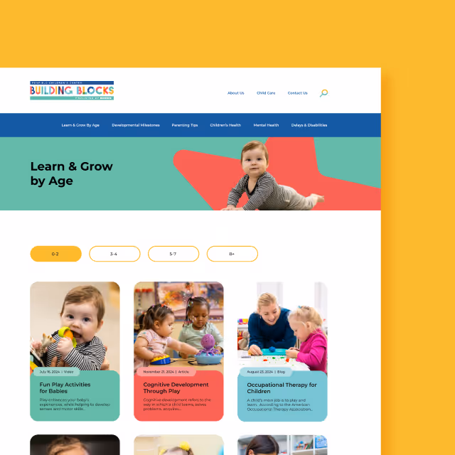
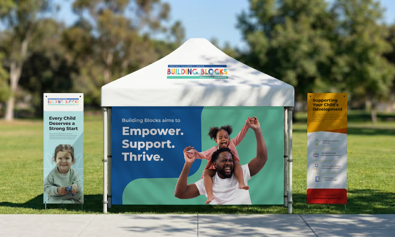
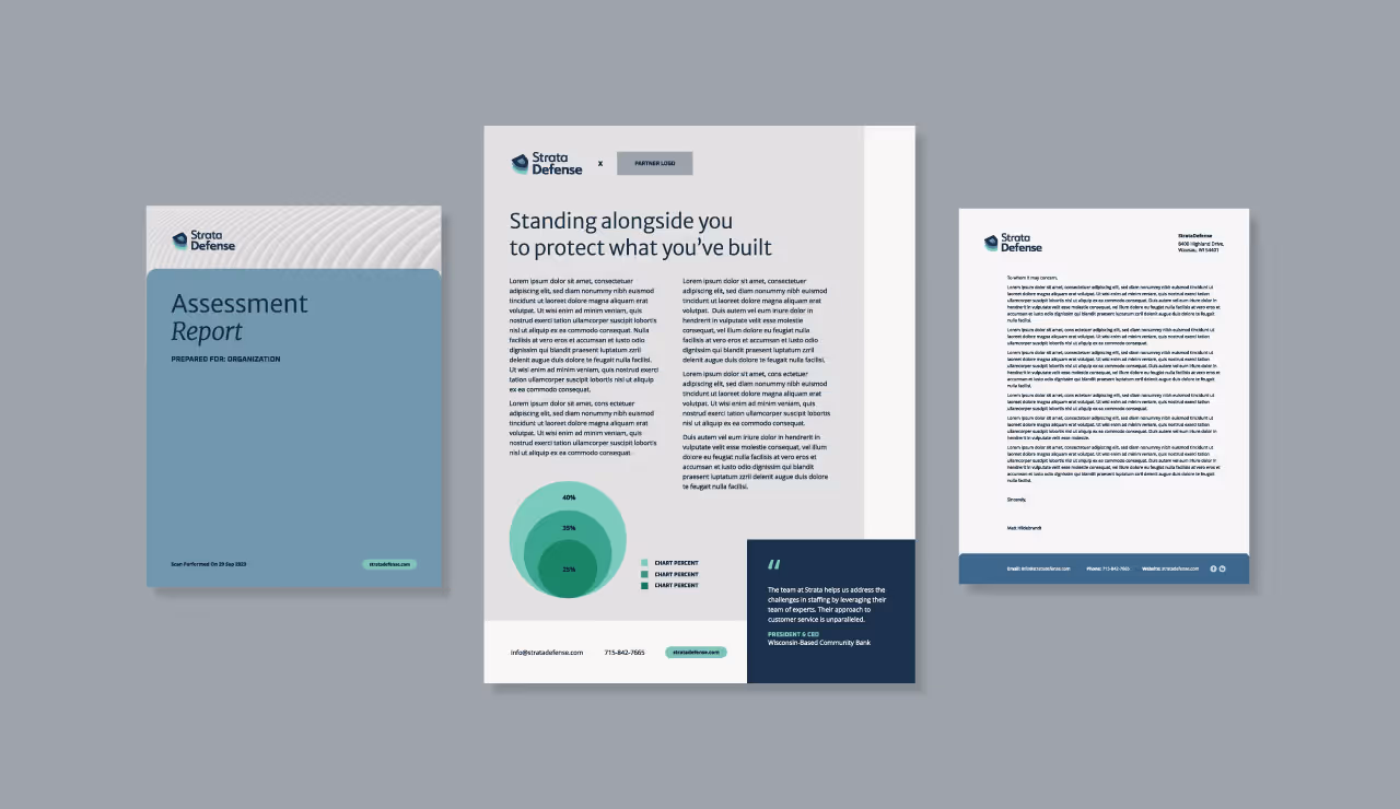
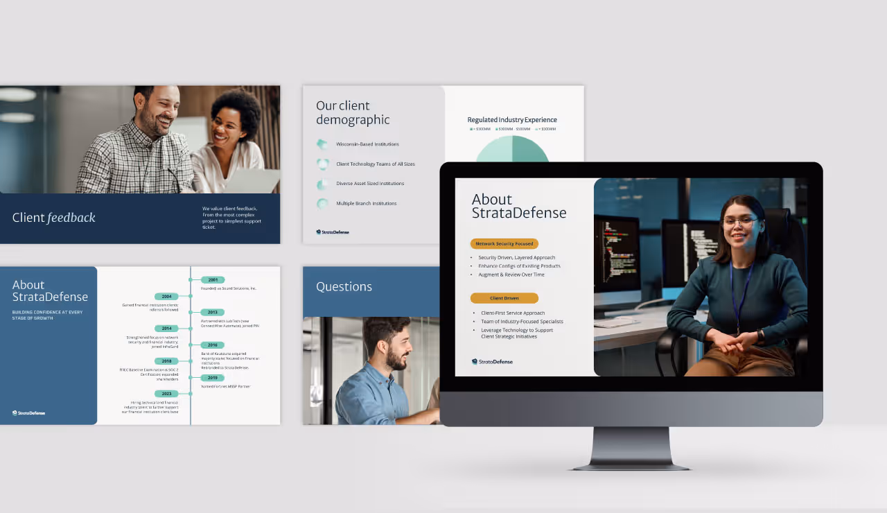
Quill Creative Studio developed a brand strategy and visual identity system that reflects the ambition and clarity Unext brings to the career readiness space. Visually, the identity balances polish and relatability through bold typography, vibrant colors, and dynamic layouts. Abstract shapes, overlapping imagery, and career path line graphics were used to represent both possibility and progression.
The messaging framework focused on providing “major confidence” for students navigating their future, while reinforcing the platform’s value for employers and universities. Voice and tone were intentionally crafted to be inclusive, encouraging, and clear, ensuring each audience felt informed and empowered to take the next step with Unext.

With a reimagined brand identity, Unext is now equipped to scale its platform with clarity and consistency. The new visuals, messaging, and tone have created a unified system that strengthens engagement with students, academic institutions, and employer partners alike. As the product continues to grow, Unext stands out with a confident brand presence that helps users see what’s next and take action toward a career that fits.
With a growing user base and expanding functionality, Unext needed a brand identity that could speak confidently to multiple audiences: students seeking clarity and experience, universities prioritizing post-graduate success, and employers eager to recruit new talent. The brand had to remain authentic and engaging for students while presenting a level of sophistication and credibility for institutional and business partners. Our challenge was to build upon their existing foundation and create a brand that could unify all audiences under a single, future-focused vision.
Quill Creative Studio developed a brand strategy and visual identity system that reflects the ambition and clarity Unext brings to the career readiness space. Visually, the identity balances polish and relatability through bold typography, vibrant colors, and dynamic layouts. Abstract shapes, overlapping imagery, and career path line graphics were used to represent both possibility and progression.
The messaging framework focused on providing “major confidence” for students navigating their future, while reinforcing the platform’s value for employers and universities. Voice and tone were intentionally crafted to be inclusive, encouraging, and clear, ensuring each audience felt informed and empowered to take the next step with Unext.
With a reimagined brand identity, Unext is now equipped to scale its platform with clarity and consistency. The new visuals, messaging, and tone have created a unified system that strengthens engagement with students, academic institutions, and employer partners alike. As the product continues to grow, Unext stands out with a confident brand presence that helps users see what’s next and take action toward a career that fits.


With a growing user base and expanding functionality, Unext needed a brand identity that could speak confidently to multiple audiences: students seeking clarity and experience, universities prioritizing post-graduate success, and employers eager to recruit new talent. The brand had to remain authentic and engaging for students while presenting a level of sophistication and credibility for institutional and business partners. Our challenge was to build upon their existing foundation and create a brand that could unify all audiences under a single, future-focused vision.
Quill Creative Studio developed a brand strategy and visual identity system that reflects the ambition and clarity Unext brings to the career readiness space. Visually, the identity balances polish and relatability through bold typography, vibrant colors, and dynamic layouts. Abstract shapes, overlapping imagery, and career path line graphics were used to represent both possibility and progression.
The messaging framework focused on providing “major confidence” for students navigating their future, while reinforcing the platform’s value for employers and universities. Voice and tone were intentionally crafted to be inclusive, encouraging, and clear, ensuring each audience felt informed and empowered to take the next step with Unext.


With a reimagined brand identity, Unext is now equipped to scale its platform with clarity and consistency. The new visuals, messaging, and tone have created a unified system that strengthens engagement with students, academic institutions, and employer partners alike. As the product continues to grow, Unext stands out with a confident brand presence that helps users see what’s next and take action toward a career that fits.

With a growing user base and expanding functionality, Unext needed a brand identity that could speak confidently to multiple audiences: students seeking clarity and experience, universities prioritizing post-graduate success, and employers eager to recruit new talent. The brand had to remain authentic and engaging for students while presenting a level of sophistication and credibility for institutional and business partners. Our challenge was to build upon their existing foundation and create a brand that could unify all audiences under a single, future-focused vision.
Quill Creative Studio developed a brand strategy and visual identity system that reflects the ambition and clarity Unext brings to the career readiness space. Visually, the identity balances polish and relatability through bold typography, vibrant colors, and dynamic layouts. Abstract shapes, overlapping imagery, and career path line graphics were used to represent both possibility and progression.
The messaging framework focused on providing “major confidence” for students navigating their future, while reinforcing the platform’s value for employers and universities. Voice and tone were intentionally crafted to be inclusive, encouraging, and clear, ensuring each audience felt informed and empowered to take the next step with Unext.

With a reimagined brand identity, Unext is now equipped to scale its platform with clarity and consistency. The new visuals, messaging, and tone have created a unified system that strengthens engagement with students, academic institutions, and employer partners alike. As the product continues to grow, Unext stands out with a confident brand presence that helps users see what’s next and take action toward a career that fits.
With a growing user base and expanding functionality, Unext needed a brand identity that could speak confidently to multiple audiences: students seeking clarity and experience, universities prioritizing post-graduate success, and employers eager to recruit new talent. The brand had to remain authentic and engaging for students while presenting a level of sophistication and credibility for institutional and business partners. Our challenge was to build upon their existing foundation and create a brand that could unify all audiences under a single, future-focused vision.

Quill Creative Studio developed a brand strategy and visual identity system that reflects the ambition and clarity Unext brings to the career readiness space. Visually, the identity balances polish and relatability through bold typography, vibrant colors, and dynamic layouts. Abstract shapes, overlapping imagery, and career path line graphics were used to represent both possibility and progression.
The messaging framework focused on providing “major confidence” for students navigating their future, while reinforcing the platform’s value for employers and universities. Voice and tone were intentionally crafted to be inclusive, encouraging, and clear, ensuring each audience felt informed and empowered to take the next step with Unext.
With a reimagined brand identity, Unext is now equipped to scale its platform with clarity and consistency. The new visuals, messaging, and tone have created a unified system that strengthens engagement with students, academic institutions, and employer partners alike. As the product continues to grow, Unext stands out with a confident brand presence that helps users see what’s next and take action toward a career that fits.

With a growing user base and expanding functionality, Unext needed a brand identity that could speak confidently to multiple audiences: students seeking clarity and experience, universities prioritizing post-graduate success, and employers eager to recruit new talent. The brand had to remain authentic and engaging for students while presenting a level of sophistication and credibility for institutional and business partners. Our challenge was to build upon their existing foundation and create a brand that could unify all audiences under a single, future-focused vision.

Quill Creative Studio developed a brand strategy and visual identity system that reflects the ambition and clarity Unext brings to the career readiness space. Visually, the identity balances polish and relatability through bold typography, vibrant colors, and dynamic layouts. Abstract shapes, overlapping imagery, and career path line graphics were used to represent both possibility and progression.
The messaging framework focused on providing “major confidence” for students navigating their future, while reinforcing the platform’s value for employers and universities. Voice and tone were intentionally crafted to be inclusive, encouraging, and clear, ensuring each audience felt informed and empowered to take the next step with Unext.

With a reimagined brand identity, Unext is now equipped to scale its platform with clarity and consistency. The new visuals, messaging, and tone have created a unified system that strengthens engagement with students, academic institutions, and employer partners alike. As the product continues to grow, Unext stands out with a confident brand presence that helps users see what’s next and take action toward a career that fits.


With a growing user base and expanding functionality, Unext needed a brand identity that could speak confidently to multiple audiences: students seeking clarity and experience, universities prioritizing post-graduate success, and employers eager to recruit new talent. The brand had to remain authentic and engaging for students while presenting a level of sophistication and credibility for institutional and business partners. Our challenge was to build upon their existing foundation and create a brand that could unify all audiences under a single, future-focused vision.

Quill Creative Studio developed a brand strategy and visual identity system that reflects the ambition and clarity Unext brings to the career readiness space. Visually, the identity balances polish and relatability through bold typography, vibrant colors, and dynamic layouts. Abstract shapes, overlapping imagery, and career path line graphics were used to represent both possibility and progression.
The messaging framework focused on providing “major confidence” for students navigating their future, while reinforcing the platform’s value for employers and universities. Voice and tone were intentionally crafted to be inclusive, encouraging, and clear, ensuring each audience felt informed and empowered to take the next step with Unext.


With a reimagined brand identity, Unext is now equipped to scale its platform with clarity and consistency. The new visuals, messaging, and tone have created a unified system that strengthens engagement with students, academic institutions, and employer partners alike. As the product continues to grow, Unext stands out with a confident brand presence that helps users see what’s next and take action toward a career that fits.


With a growing user base and expanding functionality, Unext needed a brand identity that could speak confidently to multiple audiences: students seeking clarity and experience, universities prioritizing post-graduate success, and employers eager to recruit new talent. The brand had to remain authentic and engaging for students while presenting a level of sophistication and credibility for institutional and business partners. Our challenge was to build upon their existing foundation and create a brand that could unify all audiences under a single, future-focused vision.
Quill Creative Studio developed a brand strategy and visual identity system that reflects the ambition and clarity Unext brings to the career readiness space. Visually, the identity balances polish and relatability through bold typography, vibrant colors, and dynamic layouts. Abstract shapes, overlapping imagery, and career path line graphics were used to represent both possibility and progression.
The messaging framework focused on providing “major confidence” for students navigating their future, while reinforcing the platform’s value for employers and universities. Voice and tone were intentionally crafted to be inclusive, encouraging, and clear, ensuring each audience felt informed and empowered to take the next step with Unext.

With a reimagined brand identity, Unext is now equipped to scale its platform with clarity and consistency. The new visuals, messaging, and tone have created a unified system that strengthens engagement with students, academic institutions, and employer partners alike. As the product continues to grow, Unext stands out with a confident brand presence that helps users see what’s next and take action toward a career that fits.


With a growing user base and expanding functionality, Unext needed a brand identity that could speak confidently to multiple audiences: students seeking clarity and experience, universities prioritizing post-graduate success, and employers eager to recruit new talent. The brand had to remain authentic and engaging for students while presenting a level of sophistication and credibility for institutional and business partners. Our challenge was to build upon their existing foundation and create a brand that could unify all audiences under a single, future-focused vision.

Quill Creative Studio developed a brand strategy and visual identity system that reflects the ambition and clarity Unext brings to the career readiness space. Visually, the identity balances polish and relatability through bold typography, vibrant colors, and dynamic layouts. Abstract shapes, overlapping imagery, and career path line graphics were used to represent both possibility and progression.
The messaging framework focused on providing “major confidence” for students navigating their future, while reinforcing the platform’s value for employers and universities. Voice and tone were intentionally crafted to be inclusive, encouraging, and clear, ensuring each audience felt informed and empowered to take the next step with Unext.

With a reimagined brand identity, Unext is now equipped to scale its platform with clarity and consistency. The new visuals, messaging, and tone have created a unified system that strengthens engagement with students, academic institutions, and employer partners alike. As the product continues to grow, Unext stands out with a confident brand presence that helps users see what’s next and take action toward a career that fits.

With a growing user base and expanding functionality, Unext needed a brand identity that could speak confidently to multiple audiences: students seeking clarity and experience, universities prioritizing post-graduate success, and employers eager to recruit new talent. The brand had to remain authentic and engaging for students while presenting a level of sophistication and credibility for institutional and business partners. Our challenge was to build upon their existing foundation and create a brand that could unify all audiences under a single, future-focused vision.
Quill Creative Studio developed a brand strategy and visual identity system that reflects the ambition and clarity Unext brings to the career readiness space. Visually, the identity balances polish and relatability through bold typography, vibrant colors, and dynamic layouts. Abstract shapes, overlapping imagery, and career path line graphics were used to represent both possibility and progression.
The messaging framework focused on providing “major confidence” for students navigating their future, while reinforcing the platform’s value for employers and universities. Voice and tone were intentionally crafted to be inclusive, encouraging, and clear, ensuring each audience felt informed and empowered to take the next step with Unext.


With a reimagined brand identity, Unext is now equipped to scale its platform with clarity and consistency. The new visuals, messaging, and tone have created a unified system that strengthens engagement with students, academic institutions, and employer partners alike. As the product continues to grow, Unext stands out with a confident brand presence that helps users see what’s next and take action toward a career that fits.


With a growing user base and expanding functionality, Unext needed a brand identity that could speak confidently to multiple audiences: students seeking clarity and experience, universities prioritizing post-graduate success, and employers eager to recruit new talent. The brand had to remain authentic and engaging for students while presenting a level of sophistication and credibility for institutional and business partners. Our challenge was to build upon their existing foundation and create a brand that could unify all audiences under a single, future-focused vision.

Quill Creative Studio developed a brand strategy and visual identity system that reflects the ambition and clarity Unext brings to the career readiness space. Visually, the identity balances polish and relatability through bold typography, vibrant colors, and dynamic layouts. Abstract shapes, overlapping imagery, and career path line graphics were used to represent both possibility and progression.
The messaging framework focused on providing “major confidence” for students navigating their future, while reinforcing the platform’s value for employers and universities. Voice and tone were intentionally crafted to be inclusive, encouraging, and clear, ensuring each audience felt informed and empowered to take the next step with Unext.

With a reimagined brand identity, Unext is now equipped to scale its platform with clarity and consistency. The new visuals, messaging, and tone have created a unified system that strengthens engagement with students, academic institutions, and employer partners alike. As the product continues to grow, Unext stands out with a confident brand presence that helps users see what’s next and take action toward a career that fits.

With a growing user base and expanding functionality, Unext needed a brand identity that could speak confidently to multiple audiences: students seeking clarity and experience, universities prioritizing post-graduate success, and employers eager to recruit new talent. The brand had to remain authentic and engaging for students while presenting a level of sophistication and credibility for institutional and business partners. Our challenge was to build upon their existing foundation and create a brand that could unify all audiences under a single, future-focused vision.

Quill Creative Studio developed a brand strategy and visual identity system that reflects the ambition and clarity Unext brings to the career readiness space. Visually, the identity balances polish and relatability through bold typography, vibrant colors, and dynamic layouts. Abstract shapes, overlapping imagery, and career path line graphics were used to represent both possibility and progression.
The messaging framework focused on providing “major confidence” for students navigating their future, while reinforcing the platform’s value for employers and universities. Voice and tone were intentionally crafted to be inclusive, encouraging, and clear, ensuring each audience felt informed and empowered to take the next step with Unext.
With a reimagined brand identity, Unext is now equipped to scale its platform with clarity and consistency. The new visuals, messaging, and tone have created a unified system that strengthens engagement with students, academic institutions, and employer partners alike. As the product continues to grow, Unext stands out with a confident brand presence that helps users see what’s next and take action toward a career that fits.


With a growing user base and expanding functionality, Unext needed a brand identity that could speak confidently to multiple audiences: students seeking clarity and experience, universities prioritizing post-graduate success, and employers eager to recruit new talent. The brand had to remain authentic and engaging for students while presenting a level of sophistication and credibility for institutional and business partners. Our challenge was to build upon their existing foundation and create a brand that could unify all audiences under a single, future-focused vision.


Quill Creative Studio developed a brand strategy and visual identity system that reflects the ambition and clarity Unext brings to the career readiness space. Visually, the identity balances polish and relatability through bold typography, vibrant colors, and dynamic layouts. Abstract shapes, overlapping imagery, and career path line graphics were used to represent both possibility and progression.
The messaging framework focused on providing “major confidence” for students navigating their future, while reinforcing the platform’s value for employers and universities. Voice and tone were intentionally crafted to be inclusive, encouraging, and clear, ensuring each audience felt informed and empowered to take the next step with Unext.

With a reimagined brand identity, Unext is now equipped to scale its platform with clarity and consistency. The new visuals, messaging, and tone have created a unified system that strengthens engagement with students, academic institutions, and employer partners alike. As the product continues to grow, Unext stands out with a confident brand presence that helps users see what’s next and take action toward a career that fits.


With a growing user base and expanding functionality, Unext needed a brand identity that could speak confidently to multiple audiences: students seeking clarity and experience, universities prioritizing post-graduate success, and employers eager to recruit new talent. The brand had to remain authentic and engaging for students while presenting a level of sophistication and credibility for institutional and business partners. Our challenge was to build upon their existing foundation and create a brand that could unify all audiences under a single, future-focused vision.

Quill Creative Studio developed a brand strategy and visual identity system that reflects the ambition and clarity Unext brings to the career readiness space. Visually, the identity balances polish and relatability through bold typography, vibrant colors, and dynamic layouts. Abstract shapes, overlapping imagery, and career path line graphics were used to represent both possibility and progression.
The messaging framework focused on providing “major confidence” for students navigating their future, while reinforcing the platform’s value for employers and universities. Voice and tone were intentionally crafted to be inclusive, encouraging, and clear, ensuring each audience felt informed and empowered to take the next step with Unext.


With a reimagined brand identity, Unext is now equipped to scale its platform with clarity and consistency. The new visuals, messaging, and tone have created a unified system that strengthens engagement with students, academic institutions, and employer partners alike. As the product continues to grow, Unext stands out with a confident brand presence that helps users see what’s next and take action toward a career that fits.


With a growing user base and expanding functionality, Unext needed a brand identity that could speak confidently to multiple audiences: students seeking clarity and experience, universities prioritizing post-graduate success, and employers eager to recruit new talent. The brand had to remain authentic and engaging for students while presenting a level of sophistication and credibility for institutional and business partners. Our challenge was to build upon their existing foundation and create a brand that could unify all audiences under a single, future-focused vision.


Quill Creative Studio developed a brand strategy and visual identity system that reflects the ambition and clarity Unext brings to the career readiness space. Visually, the identity balances polish and relatability through bold typography, vibrant colors, and dynamic layouts. Abstract shapes, overlapping imagery, and career path line graphics were used to represent both possibility and progression.
The messaging framework focused on providing “major confidence” for students navigating their future, while reinforcing the platform’s value for employers and universities. Voice and tone were intentionally crafted to be inclusive, encouraging, and clear, ensuring each audience felt informed and empowered to take the next step with Unext.


With a reimagined brand identity, Unext is now equipped to scale its platform with clarity and consistency. The new visuals, messaging, and tone have created a unified system that strengthens engagement with students, academic institutions, and employer partners alike. As the product continues to grow, Unext stands out with a confident brand presence that helps users see what’s next and take action toward a career that fits.


With a growing user base and expanding functionality, Unext needed a brand identity that could speak confidently to multiple audiences: students seeking clarity and experience, universities prioritizing post-graduate success, and employers eager to recruit new talent. The brand had to remain authentic and engaging for students while presenting a level of sophistication and credibility for institutional and business partners. Our challenge was to build upon their existing foundation and create a brand that could unify all audiences under a single, future-focused vision.


Quill Creative Studio developed a brand strategy and visual identity system that reflects the ambition and clarity Unext brings to the career readiness space. Visually, the identity balances polish and relatability through bold typography, vibrant colors, and dynamic layouts. Abstract shapes, overlapping imagery, and career path line graphics were used to represent both possibility and progression.
The messaging framework focused on providing “major confidence” for students navigating their future, while reinforcing the platform’s value for employers and universities. Voice and tone were intentionally crafted to be inclusive, encouraging, and clear, ensuring each audience felt informed and empowered to take the next step with Unext.

With a reimagined brand identity, Unext is now equipped to scale its platform with clarity and consistency. The new visuals, messaging, and tone have created a unified system that strengthens engagement with students, academic institutions, and employer partners alike. As the product continues to grow, Unext stands out with a confident brand presence that helps users see what’s next and take action toward a career that fits.


With a growing user base and expanding functionality, Unext needed a brand identity that could speak confidently to multiple audiences: students seeking clarity and experience, universities prioritizing post-graduate success, and employers eager to recruit new talent. The brand had to remain authentic and engaging for students while presenting a level of sophistication and credibility for institutional and business partners. Our challenge was to build upon their existing foundation and create a brand that could unify all audiences under a single, future-focused vision.

Quill Creative Studio developed a brand strategy and visual identity system that reflects the ambition and clarity Unext brings to the career readiness space. Visually, the identity balances polish and relatability through bold typography, vibrant colors, and dynamic layouts. Abstract shapes, overlapping imagery, and career path line graphics were used to represent both possibility and progression.
The messaging framework focused on providing “major confidence” for students navigating their future, while reinforcing the platform’s value for employers and universities. Voice and tone were intentionally crafted to be inclusive, encouraging, and clear, ensuring each audience felt informed and empowered to take the next step with Unext.


With a reimagined brand identity, Unext is now equipped to scale its platform with clarity and consistency. The new visuals, messaging, and tone have created a unified system that strengthens engagement with students, academic institutions, and employer partners alike. As the product continues to grow, Unext stands out with a confident brand presence that helps users see what’s next and take action toward a career that fits.


With a growing user base and expanding functionality, Unext needed a brand identity that could speak confidently to multiple audiences: students seeking clarity and experience, universities prioritizing post-graduate success, and employers eager to recruit new talent. The brand had to remain authentic and engaging for students while presenting a level of sophistication and credibility for institutional and business partners. Our challenge was to build upon their existing foundation and create a brand that could unify all audiences under a single, future-focused vision.


Quill Creative Studio developed a brand strategy and visual identity system that reflects the ambition and clarity Unext brings to the career readiness space. Visually, the identity balances polish and relatability through bold typography, vibrant colors, and dynamic layouts. Abstract shapes, overlapping imagery, and career path line graphics were used to represent both possibility and progression.
The messaging framework focused on providing “major confidence” for students navigating their future, while reinforcing the platform’s value for employers and universities. Voice and tone were intentionally crafted to be inclusive, encouraging, and clear, ensuring each audience felt informed and empowered to take the next step with Unext.


With a reimagined brand identity, Unext is now equipped to scale its platform with clarity and consistency. The new visuals, messaging, and tone have created a unified system that strengthens engagement with students, academic institutions, and employer partners alike. As the product continues to grow, Unext stands out with a confident brand presence that helps users see what’s next and take action toward a career that fits.


With a growing user base and expanding functionality, Unext needed a brand identity that could speak confidently to multiple audiences: students seeking clarity and experience, universities prioritizing post-graduate success, and employers eager to recruit new talent. The brand had to remain authentic and engaging for students while presenting a level of sophistication and credibility for institutional and business partners. Our challenge was to build upon their existing foundation and create a brand that could unify all audiences under a single, future-focused vision.


Quill Creative Studio developed a brand strategy and visual identity system that reflects the ambition and clarity Unext brings to the career readiness space. Visually, the identity balances polish and relatability through bold typography, vibrant colors, and dynamic layouts. Abstract shapes, overlapping imagery, and career path line graphics were used to represent both possibility and progression.
The messaging framework focused on providing “major confidence” for students navigating their future, while reinforcing the platform’s value for employers and universities. Voice and tone were intentionally crafted to be inclusive, encouraging, and clear, ensuring each audience felt informed and empowered to take the next step with Unext.


With a reimagined brand identity, Unext is now equipped to scale its platform with clarity and consistency. The new visuals, messaging, and tone have created a unified system that strengthens engagement with students, academic institutions, and employer partners alike. As the product continues to grow, Unext stands out with a confident brand presence that helps users see what’s next and take action toward a career that fits.


With a growing user base and expanding functionality, Unext needed a brand identity that could speak confidently to multiple audiences: students seeking clarity and experience, universities prioritizing post-graduate success, and employers eager to recruit new talent. The brand had to remain authentic and engaging for students while presenting a level of sophistication and credibility for institutional and business partners. Our challenge was to build upon their existing foundation and create a brand that could unify all audiences under a single, future-focused vision.

Quill Creative Studio developed a brand strategy and visual identity system that reflects the ambition and clarity Unext brings to the career readiness space. Visually, the identity balances polish and relatability through bold typography, vibrant colors, and dynamic layouts. Abstract shapes, overlapping imagery, and career path line graphics were used to represent both possibility and progression.
The messaging framework focused on providing “major confidence” for students navigating their future, while reinforcing the platform’s value for employers and universities. Voice and tone were intentionally crafted to be inclusive, encouraging, and clear, ensuring each audience felt informed and empowered to take the next step with Unext.


With a reimagined brand identity, Unext is now equipped to scale its platform with clarity and consistency. The new visuals, messaging, and tone have created a unified system that strengthens engagement with students, academic institutions, and employer partners alike. As the product continues to grow, Unext stands out with a confident brand presence that helps users see what’s next and take action toward a career that fits.


