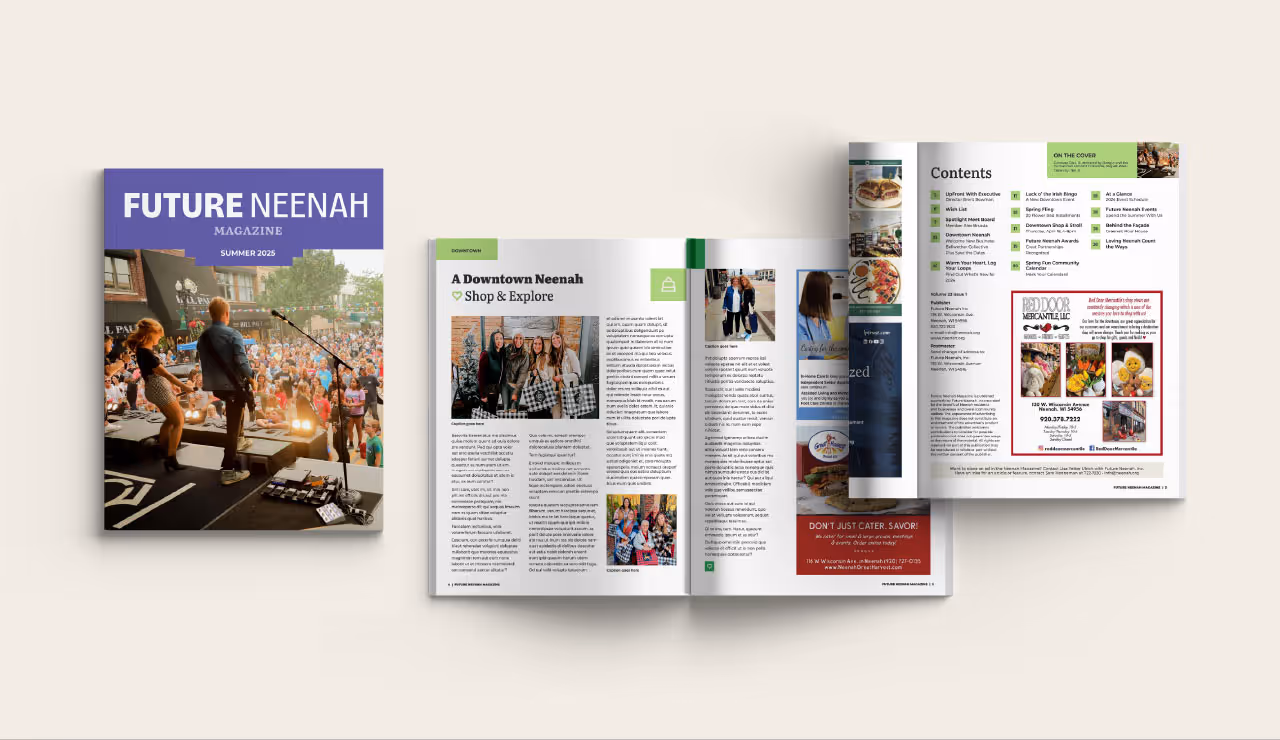
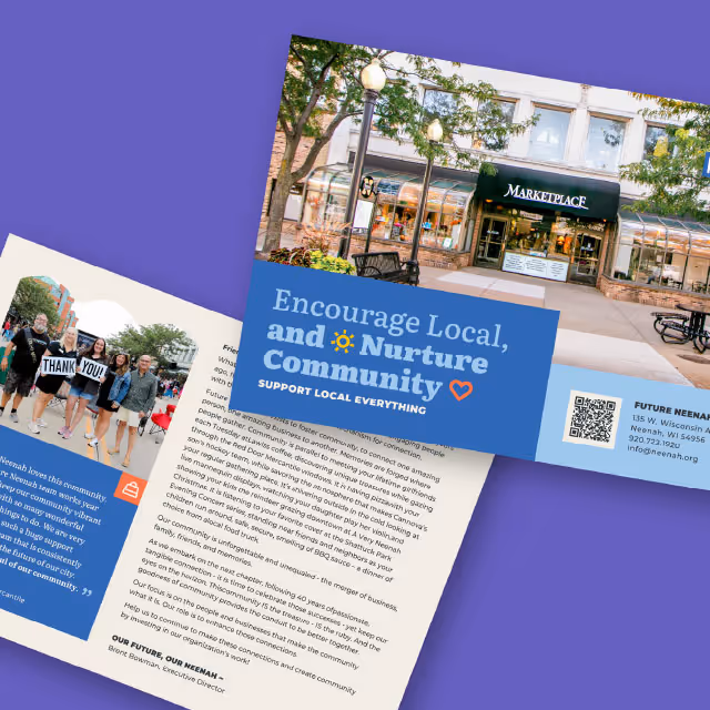
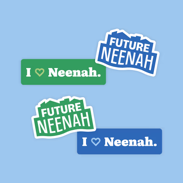
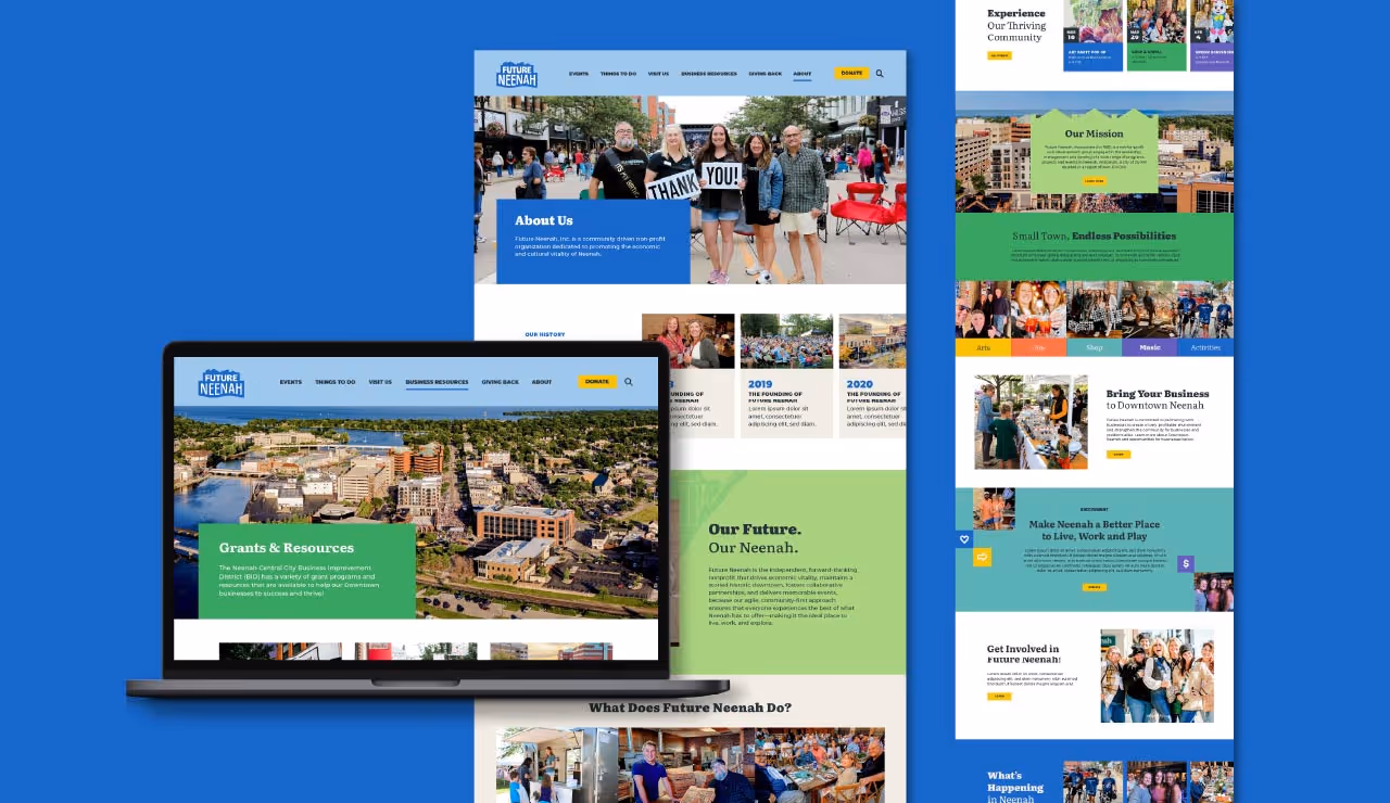
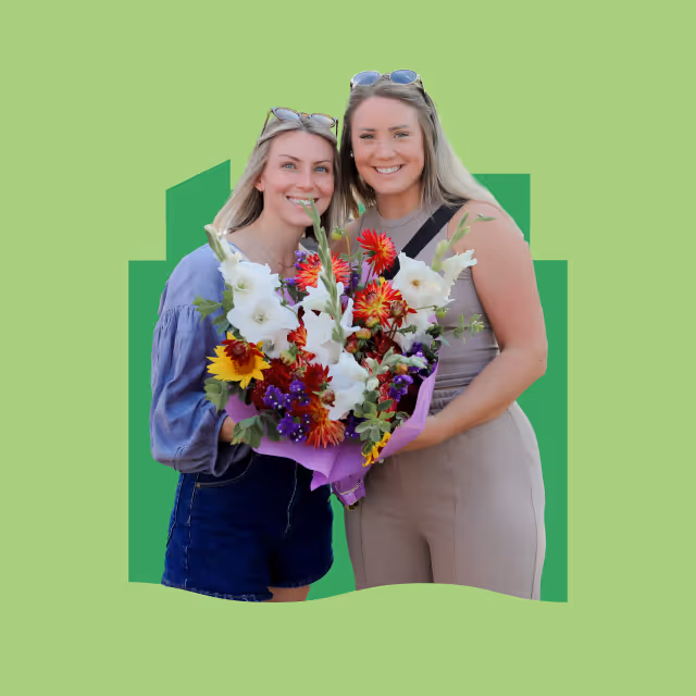
As a new nonprofit entering the wellness space, HomeTree4Life required a brand identity that would establish credibility, communicate its mission effectively, and create a sense of community. The challenge was to develop a visual and messaging framework that balanced professionalism with approachability while standing out in a growing industry. Additionally, the brand needed to resonate with both individuals seeking holistic health resources and potential donors supporting their mission.
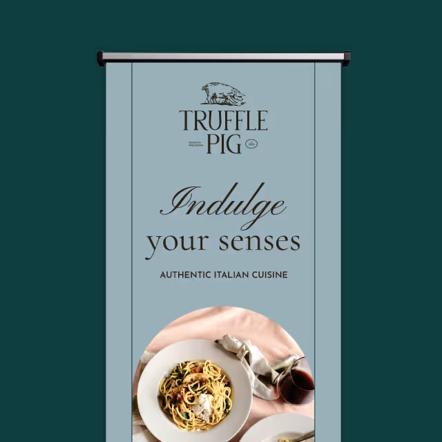
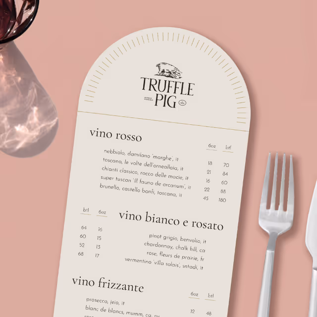
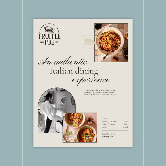
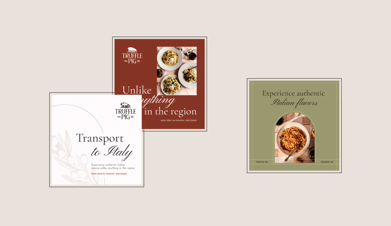
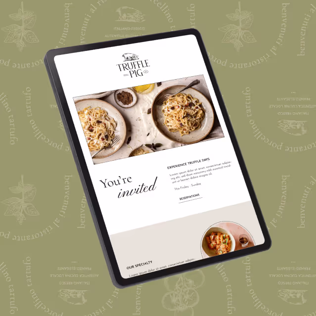
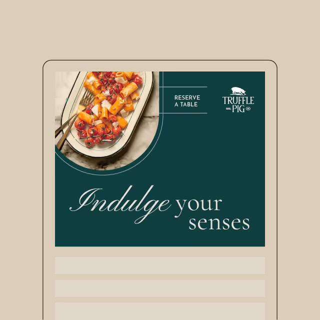
Quill Creative Studio crafted a brand identity that reflects Hometree4Life’s commitment to integrative wellness, community support, and empowerment. The logo incorporates elements hidden in the negative space and structured typography, symbolizing growth and connection. A natural color palette with calming neutrals and vibrant accents was chosen to evoke trust, balance, and vitality.
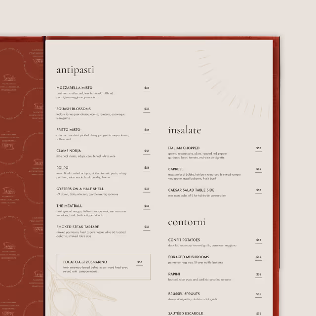
The messaging framework reinforces Hometree4Life’s role as a trusted resource for holistic wellness, using a warm, encouraging tone that emphasizes accessibility and empowerment. Key design elements, such as tree ring-inspired graphics, fine-line details, and rounded content boxes, create a cohesive and inviting brand experience across digital assets, promotional materials, and community engagement efforts.


HomeTree4Life now has a polished and professional brand identity that establishes a strong foundation for growth. With a clearly defined visual and messaging strategy, they are well-positioned to attract new supporters, expand their outreach, and create meaningful connections within the holistic wellness community.

As a new nonprofit entering the wellness space, HomeTree4Life required a brand identity that would establish credibility, communicate its mission effectively, and create a sense of community. The challenge was to develop a visual and messaging framework that balanced professionalism with approachability while standing out in a growing industry. Additionally, the brand needed to resonate with both individuals seeking holistic health resources and potential donors supporting their mission.
Quill Creative Studio crafted a brand identity that reflects Hometree4Life’s commitment to integrative wellness, community support, and empowerment. The logo incorporates elements hidden in the negative space and structured typography, symbolizing growth and connection. A natural color palette with calming neutrals and vibrant accents was chosen to evoke trust, balance, and vitality.
The messaging framework reinforces Hometree4Life’s role as a trusted resource for holistic wellness, using a warm, encouraging tone that emphasizes accessibility and empowerment. Key design elements, such as tree ring-inspired graphics, fine-line details, and rounded content boxes, create a cohesive and inviting brand experience across digital assets, promotional materials, and community engagement efforts.

HomeTree4Life now has a polished and professional brand identity that establishes a strong foundation for growth. With a clearly defined visual and messaging strategy, they are well-positioned to attract new supporters, expand their outreach, and create meaningful connections within the holistic wellness community.


As a new nonprofit entering the wellness space, HomeTree4Life required a brand identity that would establish credibility, communicate its mission effectively, and create a sense of community. The challenge was to develop a visual and messaging framework that balanced professionalism with approachability while standing out in a growing industry. Additionally, the brand needed to resonate with both individuals seeking holistic health resources and potential donors supporting their mission.

Quill Creative Studio crafted a brand identity that reflects Hometree4Life’s commitment to integrative wellness, community support, and empowerment. The logo incorporates elements hidden in the negative space and structured typography, symbolizing growth and connection. A natural color palette with calming neutrals and vibrant accents was chosen to evoke trust, balance, and vitality.
The messaging framework reinforces Hometree4Life’s role as a trusted resource for holistic wellness, using a warm, encouraging tone that emphasizes accessibility and empowerment. Key design elements, such as tree ring-inspired graphics, fine-line details, and rounded content boxes, create a cohesive and inviting brand experience across digital assets, promotional materials, and community engagement efforts.


HomeTree4Life now has a polished and professional brand identity that establishes a strong foundation for growth. With a clearly defined visual and messaging strategy, they are well-positioned to attract new supporters, expand their outreach, and create meaningful connections within the holistic wellness community.


As a new nonprofit entering the wellness space, HomeTree4Life required a brand identity that would establish credibility, communicate its mission effectively, and create a sense of community. The challenge was to develop a visual and messaging framework that balanced professionalism with approachability while standing out in a growing industry. Additionally, the brand needed to resonate with both individuals seeking holistic health resources and potential donors supporting their mission.
Quill Creative Studio crafted a brand identity that reflects Hometree4Life’s commitment to integrative wellness, community support, and empowerment. The logo incorporates elements hidden in the negative space and structured typography, symbolizing growth and connection. A natural color palette with calming neutrals and vibrant accents was chosen to evoke trust, balance, and vitality.
The messaging framework reinforces Hometree4Life’s role as a trusted resource for holistic wellness, using a warm, encouraging tone that emphasizes accessibility and empowerment. Key design elements, such as tree ring-inspired graphics, fine-line details, and rounded content boxes, create a cohesive and inviting brand experience across digital assets, promotional materials, and community engagement efforts.

HomeTree4Life now has a polished and professional brand identity that establishes a strong foundation for growth. With a clearly defined visual and messaging strategy, they are well-positioned to attract new supporters, expand their outreach, and create meaningful connections within the holistic wellness community.
As a new nonprofit entering the wellness space, HomeTree4Life required a brand identity that would establish credibility, communicate its mission effectively, and create a sense of community. The challenge was to develop a visual and messaging framework that balanced professionalism with approachability while standing out in a growing industry. Additionally, the brand needed to resonate with both individuals seeking holistic health resources and potential donors supporting their mission.


Quill Creative Studio crafted a brand identity that reflects Hometree4Life’s commitment to integrative wellness, community support, and empowerment. The logo incorporates elements hidden in the negative space and structured typography, symbolizing growth and connection. A natural color palette with calming neutrals and vibrant accents was chosen to evoke trust, balance, and vitality.
The messaging framework reinforces Hometree4Life’s role as a trusted resource for holistic wellness, using a warm, encouraging tone that emphasizes accessibility and empowerment. Key design elements, such as tree ring-inspired graphics, fine-line details, and rounded content boxes, create a cohesive and inviting brand experience across digital assets, promotional materials, and community engagement efforts.

HomeTree4Life now has a polished and professional brand identity that establishes a strong foundation for growth. With a clearly defined visual and messaging strategy, they are well-positioned to attract new supporters, expand their outreach, and create meaningful connections within the holistic wellness community.

As a new nonprofit entering the wellness space, HomeTree4Life required a brand identity that would establish credibility, communicate its mission effectively, and create a sense of community. The challenge was to develop a visual and messaging framework that balanced professionalism with approachability while standing out in a growing industry. Additionally, the brand needed to resonate with both individuals seeking holistic health resources and potential donors supporting their mission.


Quill Creative Studio crafted a brand identity that reflects Hometree4Life’s commitment to integrative wellness, community support, and empowerment. The logo incorporates elements hidden in the negative space and structured typography, symbolizing growth and connection. A natural color palette with calming neutrals and vibrant accents was chosen to evoke trust, balance, and vitality.
The messaging framework reinforces Hometree4Life’s role as a trusted resource for holistic wellness, using a warm, encouraging tone that emphasizes accessibility and empowerment. Key design elements, such as tree ring-inspired graphics, fine-line details, and rounded content boxes, create a cohesive and inviting brand experience across digital assets, promotional materials, and community engagement efforts.


HomeTree4Life now has a polished and professional brand identity that establishes a strong foundation for growth. With a clearly defined visual and messaging strategy, they are well-positioned to attract new supporters, expand their outreach, and create meaningful connections within the holistic wellness community.


As a new nonprofit entering the wellness space, HomeTree4Life required a brand identity that would establish credibility, communicate its mission effectively, and create a sense of community. The challenge was to develop a visual and messaging framework that balanced professionalism with approachability while standing out in a growing industry. Additionally, the brand needed to resonate with both individuals seeking holistic health resources and potential donors supporting their mission.

Quill Creative Studio crafted a brand identity that reflects Hometree4Life’s commitment to integrative wellness, community support, and empowerment. The logo incorporates elements hidden in the negative space and structured typography, symbolizing growth and connection. A natural color palette with calming neutrals and vibrant accents was chosen to evoke trust, balance, and vitality.
The messaging framework reinforces Hometree4Life’s role as a trusted resource for holistic wellness, using a warm, encouraging tone that emphasizes accessibility and empowerment. Key design elements, such as tree ring-inspired graphics, fine-line details, and rounded content boxes, create a cohesive and inviting brand experience across digital assets, promotional materials, and community engagement efforts.


HomeTree4Life now has a polished and professional brand identity that establishes a strong foundation for growth. With a clearly defined visual and messaging strategy, they are well-positioned to attract new supporters, expand their outreach, and create meaningful connections within the holistic wellness community.

As a new nonprofit entering the wellness space, HomeTree4Life required a brand identity that would establish credibility, communicate its mission effectively, and create a sense of community. The challenge was to develop a visual and messaging framework that balanced professionalism with approachability while standing out in a growing industry. Additionally, the brand needed to resonate with both individuals seeking holistic health resources and potential donors supporting their mission.


Quill Creative Studio crafted a brand identity that reflects Hometree4Life’s commitment to integrative wellness, community support, and empowerment. The logo incorporates elements hidden in the negative space and structured typography, symbolizing growth and connection. A natural color palette with calming neutrals and vibrant accents was chosen to evoke trust, balance, and vitality.
The messaging framework reinforces Hometree4Life’s role as a trusted resource for holistic wellness, using a warm, encouraging tone that emphasizes accessibility and empowerment. Key design elements, such as tree ring-inspired graphics, fine-line details, and rounded content boxes, create a cohesive and inviting brand experience across digital assets, promotional materials, and community engagement efforts.


HomeTree4Life now has a polished and professional brand identity that establishes a strong foundation for growth. With a clearly defined visual and messaging strategy, they are well-positioned to attract new supporters, expand their outreach, and create meaningful connections within the holistic wellness community.


As a new nonprofit entering the wellness space, HomeTree4Life required a brand identity that would establish credibility, communicate its mission effectively, and create a sense of community. The challenge was to develop a visual and messaging framework that balanced professionalism with approachability while standing out in a growing industry. Additionally, the brand needed to resonate with both individuals seeking holistic health resources and potential donors supporting their mission.

Quill Creative Studio crafted a brand identity that reflects Hometree4Life’s commitment to integrative wellness, community support, and empowerment. The logo incorporates elements hidden in the negative space and structured typography, symbolizing growth and connection. A natural color palette with calming neutrals and vibrant accents was chosen to evoke trust, balance, and vitality.
The messaging framework reinforces Hometree4Life’s role as a trusted resource for holistic wellness, using a warm, encouraging tone that emphasizes accessibility and empowerment. Key design elements, such as tree ring-inspired graphics, fine-line details, and rounded content boxes, create a cohesive and inviting brand experience across digital assets, promotional materials, and community engagement efforts.


HomeTree4Life now has a polished and professional brand identity that establishes a strong foundation for growth. With a clearly defined visual and messaging strategy, they are well-positioned to attract new supporters, expand their outreach, and create meaningful connections within the holistic wellness community.

As a new nonprofit entering the wellness space, HomeTree4Life required a brand identity that would establish credibility, communicate its mission effectively, and create a sense of community. The challenge was to develop a visual and messaging framework that balanced professionalism with approachability while standing out in a growing industry. Additionally, the brand needed to resonate with both individuals seeking holistic health resources and potential donors supporting their mission.
Quill Creative Studio crafted a brand identity that reflects Hometree4Life’s commitment to integrative wellness, community support, and empowerment. The logo incorporates elements hidden in the negative space and structured typography, symbolizing growth and connection. A natural color palette with calming neutrals and vibrant accents was chosen to evoke trust, balance, and vitality.
The messaging framework reinforces Hometree4Life’s role as a trusted resource for holistic wellness, using a warm, encouraging tone that emphasizes accessibility and empowerment. Key design elements, such as tree ring-inspired graphics, fine-line details, and rounded content boxes, create a cohesive and inviting brand experience across digital assets, promotional materials, and community engagement efforts.
HomeTree4Life now has a polished and professional brand identity that establishes a strong foundation for growth. With a clearly defined visual and messaging strategy, they are well-positioned to attract new supporters, expand their outreach, and create meaningful connections within the holistic wellness community.


As a new nonprofit entering the wellness space, HomeTree4Life required a brand identity that would establish credibility, communicate its mission effectively, and create a sense of community. The challenge was to develop a visual and messaging framework that balanced professionalism with approachability while standing out in a growing industry. Additionally, the brand needed to resonate with both individuals seeking holistic health resources and potential donors supporting their mission.


Quill Creative Studio crafted a brand identity that reflects Hometree4Life’s commitment to integrative wellness, community support, and empowerment. The logo incorporates elements hidden in the negative space and structured typography, symbolizing growth and connection. A natural color palette with calming neutrals and vibrant accents was chosen to evoke trust, balance, and vitality.
The messaging framework reinforces Hometree4Life’s role as a trusted resource for holistic wellness, using a warm, encouraging tone that emphasizes accessibility and empowerment. Key design elements, such as tree ring-inspired graphics, fine-line details, and rounded content boxes, create a cohesive and inviting brand experience across digital assets, promotional materials, and community engagement efforts.

HomeTree4Life now has a polished and professional brand identity that establishes a strong foundation for growth. With a clearly defined visual and messaging strategy, they are well-positioned to attract new supporters, expand their outreach, and create meaningful connections within the holistic wellness community.


As a new nonprofit entering the wellness space, HomeTree4Life required a brand identity that would establish credibility, communicate its mission effectively, and create a sense of community. The challenge was to develop a visual and messaging framework that balanced professionalism with approachability while standing out in a growing industry. Additionally, the brand needed to resonate with both individuals seeking holistic health resources and potential donors supporting their mission.


Quill Creative Studio crafted a brand identity that reflects Hometree4Life’s commitment to integrative wellness, community support, and empowerment. The logo incorporates elements hidden in the negative space and structured typography, symbolizing growth and connection. A natural color palette with calming neutrals and vibrant accents was chosen to evoke trust, balance, and vitality.
The messaging framework reinforces Hometree4Life’s role as a trusted resource for holistic wellness, using a warm, encouraging tone that emphasizes accessibility and empowerment. Key design elements, such as tree ring-inspired graphics, fine-line details, and rounded content boxes, create a cohesive and inviting brand experience across digital assets, promotional materials, and community engagement efforts.

HomeTree4Life now has a polished and professional brand identity that establishes a strong foundation for growth. With a clearly defined visual and messaging strategy, they are well-positioned to attract new supporters, expand their outreach, and create meaningful connections within the holistic wellness community.


As a new nonprofit entering the wellness space, HomeTree4Life required a brand identity that would establish credibility, communicate its mission effectively, and create a sense of community. The challenge was to develop a visual and messaging framework that balanced professionalism with approachability while standing out in a growing industry. Additionally, the brand needed to resonate with both individuals seeking holistic health resources and potential donors supporting their mission.

Quill Creative Studio crafted a brand identity that reflects Hometree4Life’s commitment to integrative wellness, community support, and empowerment. The logo incorporates elements hidden in the negative space and structured typography, symbolizing growth and connection. A natural color palette with calming neutrals and vibrant accents was chosen to evoke trust, balance, and vitality.
The messaging framework reinforces Hometree4Life’s role as a trusted resource for holistic wellness, using a warm, encouraging tone that emphasizes accessibility and empowerment. Key design elements, such as tree ring-inspired graphics, fine-line details, and rounded content boxes, create a cohesive and inviting brand experience across digital assets, promotional materials, and community engagement efforts.


HomeTree4Life now has a polished and professional brand identity that establishes a strong foundation for growth. With a clearly defined visual and messaging strategy, they are well-positioned to attract new supporters, expand their outreach, and create meaningful connections within the holistic wellness community.


As a new nonprofit entering the wellness space, HomeTree4Life required a brand identity that would establish credibility, communicate its mission effectively, and create a sense of community. The challenge was to develop a visual and messaging framework that balanced professionalism with approachability while standing out in a growing industry. Additionally, the brand needed to resonate with both individuals seeking holistic health resources and potential donors supporting their mission.


Quill Creative Studio crafted a brand identity that reflects Hometree4Life’s commitment to integrative wellness, community support, and empowerment. The logo incorporates elements hidden in the negative space and structured typography, symbolizing growth and connection. A natural color palette with calming neutrals and vibrant accents was chosen to evoke trust, balance, and vitality.
The messaging framework reinforces Hometree4Life’s role as a trusted resource for holistic wellness, using a warm, encouraging tone that emphasizes accessibility and empowerment. Key design elements, such as tree ring-inspired graphics, fine-line details, and rounded content boxes, create a cohesive and inviting brand experience across digital assets, promotional materials, and community engagement efforts.


HomeTree4Life now has a polished and professional brand identity that establishes a strong foundation for growth. With a clearly defined visual and messaging strategy, they are well-positioned to attract new supporters, expand their outreach, and create meaningful connections within the holistic wellness community.


As a new nonprofit entering the wellness space, HomeTree4Life required a brand identity that would establish credibility, communicate its mission effectively, and create a sense of community. The challenge was to develop a visual and messaging framework that balanced professionalism with approachability while standing out in a growing industry. Additionally, the brand needed to resonate with both individuals seeking holistic health resources and potential donors supporting their mission.


Quill Creative Studio crafted a brand identity that reflects Hometree4Life’s commitment to integrative wellness, community support, and empowerment. The logo incorporates elements hidden in the negative space and structured typography, symbolizing growth and connection. A natural color palette with calming neutrals and vibrant accents was chosen to evoke trust, balance, and vitality.
The messaging framework reinforces Hometree4Life’s role as a trusted resource for holistic wellness, using a warm, encouraging tone that emphasizes accessibility and empowerment. Key design elements, such as tree ring-inspired graphics, fine-line details, and rounded content boxes, create a cohesive and inviting brand experience across digital assets, promotional materials, and community engagement efforts.

HomeTree4Life now has a polished and professional brand identity that establishes a strong foundation for growth. With a clearly defined visual and messaging strategy, they are well-positioned to attract new supporters, expand their outreach, and create meaningful connections within the holistic wellness community.


As a new nonprofit entering the wellness space, HomeTree4Life required a brand identity that would establish credibility, communicate its mission effectively, and create a sense of community. The challenge was to develop a visual and messaging framework that balanced professionalism with approachability while standing out in a growing industry. Additionally, the brand needed to resonate with both individuals seeking holistic health resources and potential donors supporting their mission.

Quill Creative Studio crafted a brand identity that reflects Hometree4Life’s commitment to integrative wellness, community support, and empowerment. The logo incorporates elements hidden in the negative space and structured typography, symbolizing growth and connection. A natural color palette with calming neutrals and vibrant accents was chosen to evoke trust, balance, and vitality.
The messaging framework reinforces Hometree4Life’s role as a trusted resource for holistic wellness, using a warm, encouraging tone that emphasizes accessibility and empowerment. Key design elements, such as tree ring-inspired graphics, fine-line details, and rounded content boxes, create a cohesive and inviting brand experience across digital assets, promotional materials, and community engagement efforts.


HomeTree4Life now has a polished and professional brand identity that establishes a strong foundation for growth. With a clearly defined visual and messaging strategy, they are well-positioned to attract new supporters, expand their outreach, and create meaningful connections within the holistic wellness community.


As a new nonprofit entering the wellness space, HomeTree4Life required a brand identity that would establish credibility, communicate its mission effectively, and create a sense of community. The challenge was to develop a visual and messaging framework that balanced professionalism with approachability while standing out in a growing industry. Additionally, the brand needed to resonate with both individuals seeking holistic health resources and potential donors supporting their mission.


Quill Creative Studio crafted a brand identity that reflects Hometree4Life’s commitment to integrative wellness, community support, and empowerment. The logo incorporates elements hidden in the negative space and structured typography, symbolizing growth and connection. A natural color palette with calming neutrals and vibrant accents was chosen to evoke trust, balance, and vitality.
The messaging framework reinforces Hometree4Life’s role as a trusted resource for holistic wellness, using a warm, encouraging tone that emphasizes accessibility and empowerment. Key design elements, such as tree ring-inspired graphics, fine-line details, and rounded content boxes, create a cohesive and inviting brand experience across digital assets, promotional materials, and community engagement efforts.


HomeTree4Life now has a polished and professional brand identity that establishes a strong foundation for growth. With a clearly defined visual and messaging strategy, they are well-positioned to attract new supporters, expand their outreach, and create meaningful connections within the holistic wellness community.


As a new nonprofit entering the wellness space, HomeTree4Life required a brand identity that would establish credibility, communicate its mission effectively, and create a sense of community. The challenge was to develop a visual and messaging framework that balanced professionalism with approachability while standing out in a growing industry. Additionally, the brand needed to resonate with both individuals seeking holistic health resources and potential donors supporting their mission.


Quill Creative Studio crafted a brand identity that reflects Hometree4Life’s commitment to integrative wellness, community support, and empowerment. The logo incorporates elements hidden in the negative space and structured typography, symbolizing growth and connection. A natural color palette with calming neutrals and vibrant accents was chosen to evoke trust, balance, and vitality.
The messaging framework reinforces Hometree4Life’s role as a trusted resource for holistic wellness, using a warm, encouraging tone that emphasizes accessibility and empowerment. Key design elements, such as tree ring-inspired graphics, fine-line details, and rounded content boxes, create a cohesive and inviting brand experience across digital assets, promotional materials, and community engagement efforts.


HomeTree4Life now has a polished and professional brand identity that establishes a strong foundation for growth. With a clearly defined visual and messaging strategy, they are well-positioned to attract new supporters, expand their outreach, and create meaningful connections within the holistic wellness community.


As a new nonprofit entering the wellness space, HomeTree4Life required a brand identity that would establish credibility, communicate its mission effectively, and create a sense of community. The challenge was to develop a visual and messaging framework that balanced professionalism with approachability while standing out in a growing industry. Additionally, the brand needed to resonate with both individuals seeking holistic health resources and potential donors supporting their mission.

Quill Creative Studio crafted a brand identity that reflects Hometree4Life’s commitment to integrative wellness, community support, and empowerment. The logo incorporates elements hidden in the negative space and structured typography, symbolizing growth and connection. A natural color palette with calming neutrals and vibrant accents was chosen to evoke trust, balance, and vitality.
The messaging framework reinforces Hometree4Life’s role as a trusted resource for holistic wellness, using a warm, encouraging tone that emphasizes accessibility and empowerment. Key design elements, such as tree ring-inspired graphics, fine-line details, and rounded content boxes, create a cohesive and inviting brand experience across digital assets, promotional materials, and community engagement efforts.


HomeTree4Life now has a polished and professional brand identity that establishes a strong foundation for growth. With a clearly defined visual and messaging strategy, they are well-positioned to attract new supporters, expand their outreach, and create meaningful connections within the holistic wellness community.


