
Devil’s Cask came to us with little more than a name and a cutting edge product. The product? A fluid vapor barrier that, when applied to the exterior surface of wooden casks used in the maturation process of barrel-aged spirits will eliminate 45% of Angels’ share and result in 20% more product to be bottled. They had a clear understanding of the industry but lacked expertise on how to bring the company and product’s brand to life in a meaningful and strategic way. Our challenge was to produce the brand foundation for an innovative company within an industry ripe with tradition.

As with every brand identity effort, the process started with research and guided conversations with the team of stakeholders. After all the cards were on the table, our creative team got to work identifying a gap in the market and strategically positioning Devil’s Cask with intentional differentiation. Most competitors offered repurposed solutions attempting to reduce product loss, however, those solutions were disruptive to the traditional process and yielded poor results. With that in mind, we chose to focus on the numbers and let results do the talking.

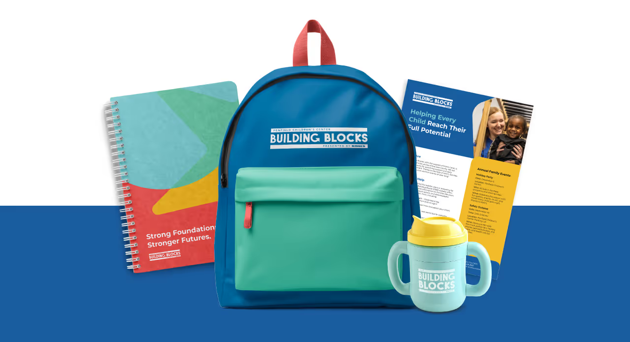


Informed by the brand position of providing proactive industry solutions that are scientifically proven, durable and tailored, we pushed an innovative visual theme throughout the visual identity and anchored messaging in bold statements and confident reassurance. Currently, the team at Devil’s Cask is securing final rounds of capital funding to support their launch with some of the nation’s most prominent distilleries.

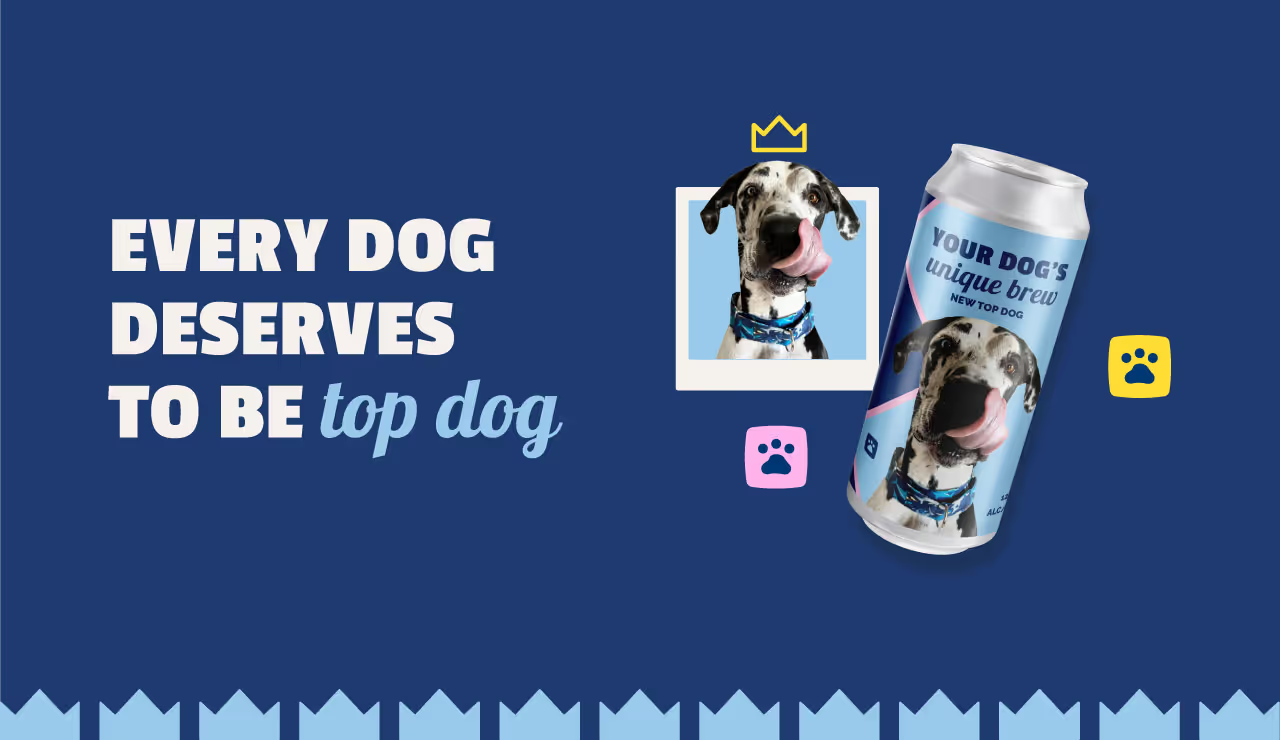
Devil’s Cask came to us with little more than a name and a cutting edge product. The product? A fluid vapor barrier that, when applied to the exterior surface of wooden casks used in the maturation process of barrel-aged spirits will eliminate 45% of Angels’ share and result in 20% more product to be bottled. They had a clear understanding of the industry but lacked expertise on how to bring the company and product’s brand to life in a meaningful and strategic way. Our challenge was to produce the brand foundation for an innovative company within an industry ripe with tradition.
As with every brand identity effort, the process started with research and guided conversations with the team of stakeholders. After all the cards were on the table, our creative team got to work identifying a gap in the market and strategically positioning Devil’s Cask with intentional differentiation. Most competitors offered repurposed solutions attempting to reduce product loss, however, those solutions were disruptive to the traditional process and yielded poor results. With that in mind, we chose to focus on the numbers and let results do the talking.


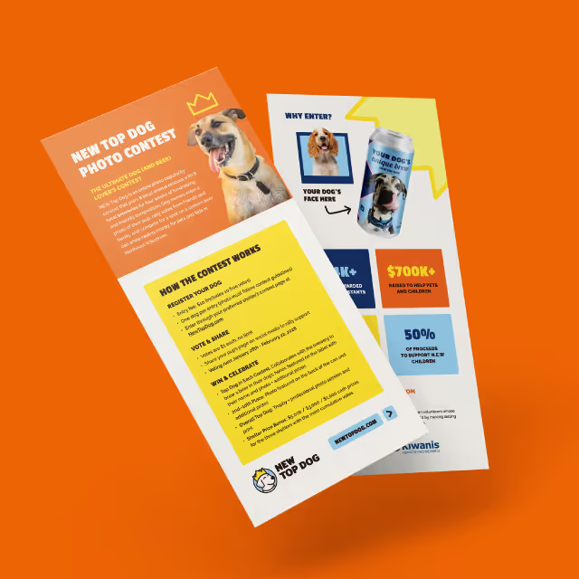

Informed by the brand position of providing proactive industry solutions that are scientifically proven, durable and tailored, we pushed an innovative visual theme throughout the visual identity and anchored messaging in bold statements and confident reassurance. Currently, the team at Devil’s Cask is securing final rounds of capital funding to support their launch with some of the nation’s most prominent distilleries.




Devil’s Cask came to us with little more than a name and a cutting edge product. The product? A fluid vapor barrier that, when applied to the exterior surface of wooden casks used in the maturation process of barrel-aged spirits will eliminate 45% of Angels’ share and result in 20% more product to be bottled. They had a clear understanding of the industry but lacked expertise on how to bring the company and product’s brand to life in a meaningful and strategic way. Our challenge was to produce the brand foundation for an innovative company within an industry ripe with tradition.
As with every brand identity effort, the process started with research and guided conversations with the team of stakeholders. After all the cards were on the table, our creative team got to work identifying a gap in the market and strategically positioning Devil’s Cask with intentional differentiation. Most competitors offered repurposed solutions attempting to reduce product loss, however, those solutions were disruptive to the traditional process and yielded poor results. With that in mind, we chose to focus on the numbers and let results do the talking.




Informed by the brand position of providing proactive industry solutions that are scientifically proven, durable and tailored, we pushed an innovative visual theme throughout the visual identity and anchored messaging in bold statements and confident reassurance. Currently, the team at Devil’s Cask is securing final rounds of capital funding to support their launch with some of the nation’s most prominent distilleries.


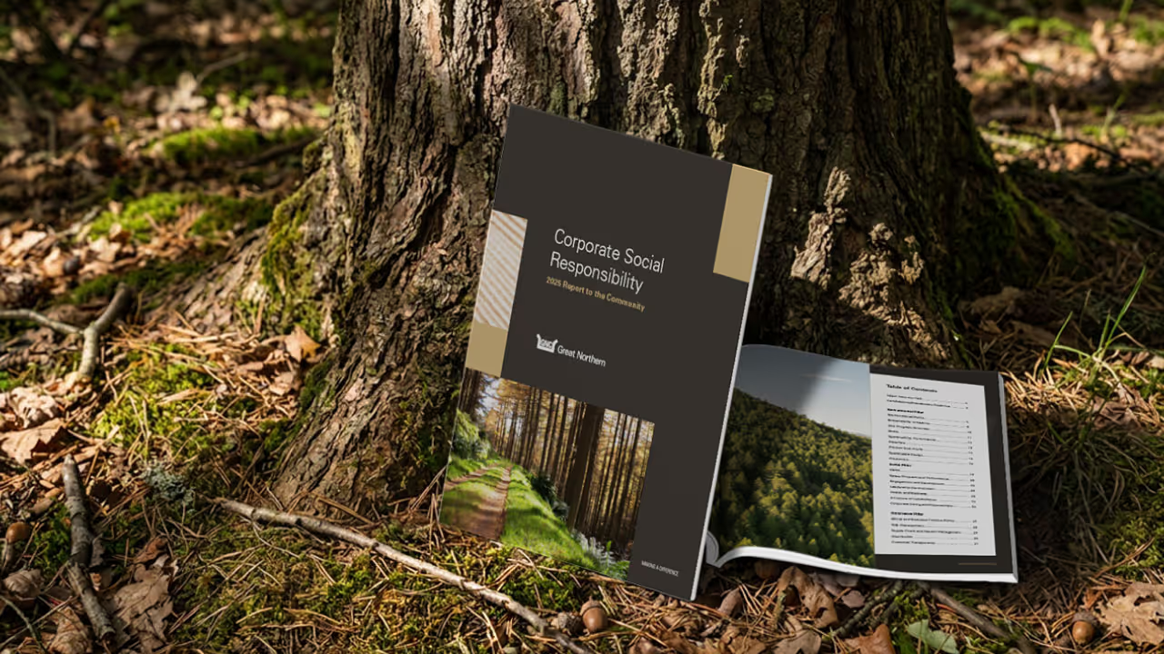
Devil’s Cask came to us with little more than a name and a cutting edge product. The product? A fluid vapor barrier that, when applied to the exterior surface of wooden casks used in the maturation process of barrel-aged spirits will eliminate 45% of Angels’ share and result in 20% more product to be bottled. They had a clear understanding of the industry but lacked expertise on how to bring the company and product’s brand to life in a meaningful and strategic way. Our challenge was to produce the brand foundation for an innovative company within an industry ripe with tradition.
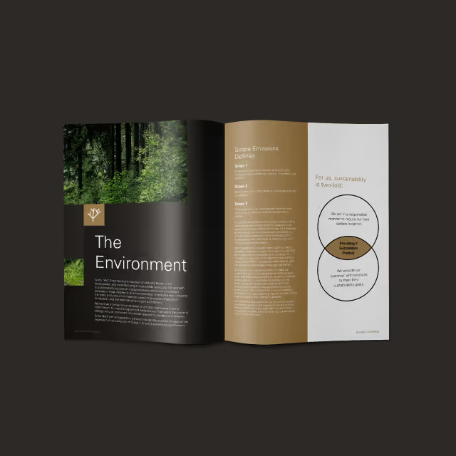
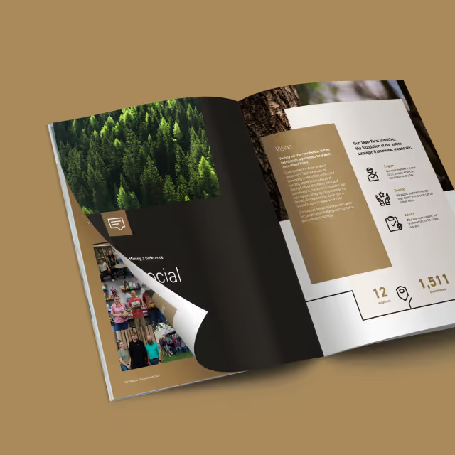
As with every brand identity effort, the process started with research and guided conversations with the team of stakeholders. After all the cards were on the table, our creative team got to work identifying a gap in the market and strategically positioning Devil’s Cask with intentional differentiation. Most competitors offered repurposed solutions attempting to reduce product loss, however, those solutions were disruptive to the traditional process and yielded poor results. With that in mind, we chose to focus on the numbers and let results do the talking.

Informed by the brand position of providing proactive industry solutions that are scientifically proven, durable and tailored, we pushed an innovative visual theme throughout the visual identity and anchored messaging in bold statements and confident reassurance. Currently, the team at Devil’s Cask is securing final rounds of capital funding to support their launch with some of the nation’s most prominent distilleries.
Devil’s Cask came to us with little more than a name and a cutting edge product. The product? A fluid vapor barrier that, when applied to the exterior surface of wooden casks used in the maturation process of barrel-aged spirits will eliminate 45% of Angels’ share and result in 20% more product to be bottled. They had a clear understanding of the industry but lacked expertise on how to bring the company and product’s brand to life in a meaningful and strategic way. Our challenge was to produce the brand foundation for an innovative company within an industry ripe with tradition.


As with every brand identity effort, the process started with research and guided conversations with the team of stakeholders. After all the cards were on the table, our creative team got to work identifying a gap in the market and strategically positioning Devil’s Cask with intentional differentiation. Most competitors offered repurposed solutions attempting to reduce product loss, however, those solutions were disruptive to the traditional process and yielded poor results. With that in mind, we chose to focus on the numbers and let results do the talking.
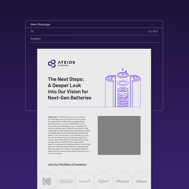
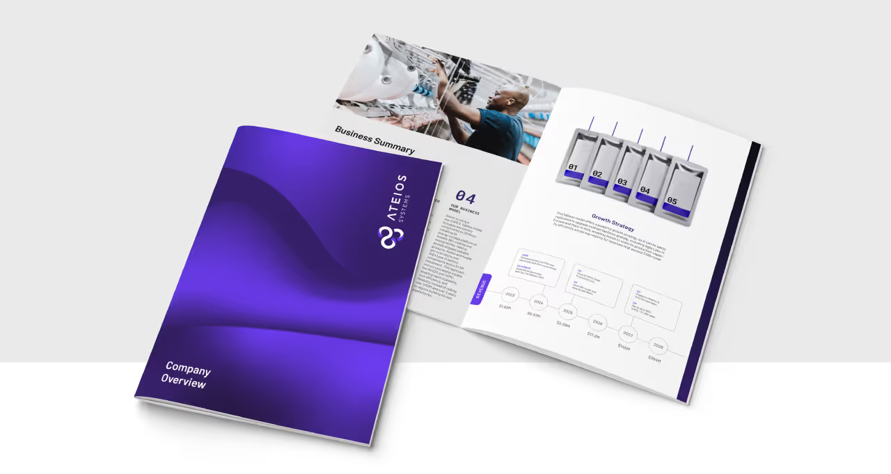
Informed by the brand position of providing proactive industry solutions that are scientifically proven, durable and tailored, we pushed an innovative visual theme throughout the visual identity and anchored messaging in bold statements and confident reassurance. Currently, the team at Devil’s Cask is securing final rounds of capital funding to support their launch with some of the nation’s most prominent distilleries.

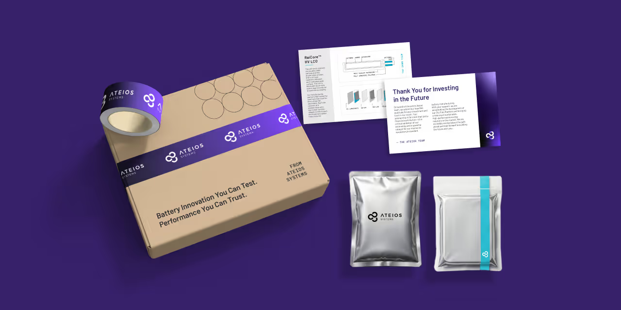
Devil’s Cask came to us with little more than a name and a cutting edge product. The product? A fluid vapor barrier that, when applied to the exterior surface of wooden casks used in the maturation process of barrel-aged spirits will eliminate 45% of Angels’ share and result in 20% more product to be bottled. They had a clear understanding of the industry but lacked expertise on how to bring the company and product’s brand to life in a meaningful and strategic way. Our challenge was to produce the brand foundation for an innovative company within an industry ripe with tradition.

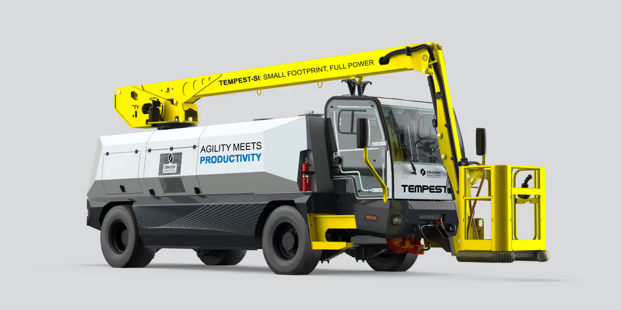

As with every brand identity effort, the process started with research and guided conversations with the team of stakeholders. After all the cards were on the table, our creative team got to work identifying a gap in the market and strategically positioning Devil’s Cask with intentional differentiation. Most competitors offered repurposed solutions attempting to reduce product loss, however, those solutions were disruptive to the traditional process and yielded poor results. With that in mind, we chose to focus on the numbers and let results do the talking.


Informed by the brand position of providing proactive industry solutions that are scientifically proven, durable and tailored, we pushed an innovative visual theme throughout the visual identity and anchored messaging in bold statements and confident reassurance. Currently, the team at Devil’s Cask is securing final rounds of capital funding to support their launch with some of the nation’s most prominent distilleries.
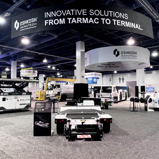

Devil’s Cask came to us with little more than a name and a cutting edge product. The product? A fluid vapor barrier that, when applied to the exterior surface of wooden casks used in the maturation process of barrel-aged spirits will eliminate 45% of Angels’ share and result in 20% more product to be bottled. They had a clear understanding of the industry but lacked expertise on how to bring the company and product’s brand to life in a meaningful and strategic way. Our challenge was to produce the brand foundation for an innovative company within an industry ripe with tradition.

As with every brand identity effort, the process started with research and guided conversations with the team of stakeholders. After all the cards were on the table, our creative team got to work identifying a gap in the market and strategically positioning Devil’s Cask with intentional differentiation. Most competitors offered repurposed solutions attempting to reduce product loss, however, those solutions were disruptive to the traditional process and yielded poor results. With that in mind, we chose to focus on the numbers and let results do the talking.


Informed by the brand position of providing proactive industry solutions that are scientifically proven, durable and tailored, we pushed an innovative visual theme throughout the visual identity and anchored messaging in bold statements and confident reassurance. Currently, the team at Devil’s Cask is securing final rounds of capital funding to support their launch with some of the nation’s most prominent distilleries.

Devil’s Cask came to us with little more than a name and a cutting edge product. The product? A fluid vapor barrier that, when applied to the exterior surface of wooden casks used in the maturation process of barrel-aged spirits will eliminate 45% of Angels’ share and result in 20% more product to be bottled. They had a clear understanding of the industry but lacked expertise on how to bring the company and product’s brand to life in a meaningful and strategic way. Our challenge was to produce the brand foundation for an innovative company within an industry ripe with tradition.


As with every brand identity effort, the process started with research and guided conversations with the team of stakeholders. After all the cards were on the table, our creative team got to work identifying a gap in the market and strategically positioning Devil’s Cask with intentional differentiation. Most competitors offered repurposed solutions attempting to reduce product loss, however, those solutions were disruptive to the traditional process and yielded poor results. With that in mind, we chose to focus on the numbers and let results do the talking.


Informed by the brand position of providing proactive industry solutions that are scientifically proven, durable and tailored, we pushed an innovative visual theme throughout the visual identity and anchored messaging in bold statements and confident reassurance. Currently, the team at Devil’s Cask is securing final rounds of capital funding to support their launch with some of the nation’s most prominent distilleries.




Devil’s Cask came to us with little more than a name and a cutting edge product. The product? A fluid vapor barrier that, when applied to the exterior surface of wooden casks used in the maturation process of barrel-aged spirits will eliminate 45% of Angels’ share and result in 20% more product to be bottled. They had a clear understanding of the industry but lacked expertise on how to bring the company and product’s brand to life in a meaningful and strategic way. Our challenge was to produce the brand foundation for an innovative company within an industry ripe with tradition.

As with every brand identity effort, the process started with research and guided conversations with the team of stakeholders. After all the cards were on the table, our creative team got to work identifying a gap in the market and strategically positioning Devil’s Cask with intentional differentiation. Most competitors offered repurposed solutions attempting to reduce product loss, however, those solutions were disruptive to the traditional process and yielded poor results. With that in mind, we chose to focus on the numbers and let results do the talking.


Informed by the brand position of providing proactive industry solutions that are scientifically proven, durable and tailored, we pushed an innovative visual theme throughout the visual identity and anchored messaging in bold statements and confident reassurance. Currently, the team at Devil’s Cask is securing final rounds of capital funding to support their launch with some of the nation’s most prominent distilleries.



Devil’s Cask came to us with little more than a name and a cutting edge product. The product? A fluid vapor barrier that, when applied to the exterior surface of wooden casks used in the maturation process of barrel-aged spirits will eliminate 45% of Angels’ share and result in 20% more product to be bottled. They had a clear understanding of the industry but lacked expertise on how to bring the company and product’s brand to life in a meaningful and strategic way. Our challenge was to produce the brand foundation for an innovative company within an industry ripe with tradition.
As with every brand identity effort, the process started with research and guided conversations with the team of stakeholders. After all the cards were on the table, our creative team got to work identifying a gap in the market and strategically positioning Devil’s Cask with intentional differentiation. Most competitors offered repurposed solutions attempting to reduce product loss, however, those solutions were disruptive to the traditional process and yielded poor results. With that in mind, we chose to focus on the numbers and let results do the talking.
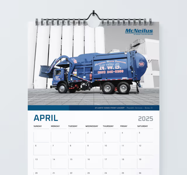


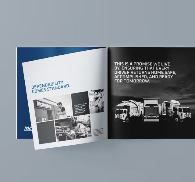
Informed by the brand position of providing proactive industry solutions that are scientifically proven, durable and tailored, we pushed an innovative visual theme throughout the visual identity and anchored messaging in bold statements and confident reassurance. Currently, the team at Devil’s Cask is securing final rounds of capital funding to support their launch with some of the nation’s most prominent distilleries.


Devil’s Cask came to us with little more than a name and a cutting edge product. The product? A fluid vapor barrier that, when applied to the exterior surface of wooden casks used in the maturation process of barrel-aged spirits will eliminate 45% of Angels’ share and result in 20% more product to be bottled. They had a clear understanding of the industry but lacked expertise on how to bring the company and product’s brand to life in a meaningful and strategic way. Our challenge was to produce the brand foundation for an innovative company within an industry ripe with tradition.

As with every brand identity effort, the process started with research and guided conversations with the team of stakeholders. After all the cards were on the table, our creative team got to work identifying a gap in the market and strategically positioning Devil’s Cask with intentional differentiation. Most competitors offered repurposed solutions attempting to reduce product loss, however, those solutions were disruptive to the traditional process and yielded poor results. With that in mind, we chose to focus on the numbers and let results do the talking.


Informed by the brand position of providing proactive industry solutions that are scientifically proven, durable and tailored, we pushed an innovative visual theme throughout the visual identity and anchored messaging in bold statements and confident reassurance. Currently, the team at Devil’s Cask is securing final rounds of capital funding to support their launch with some of the nation’s most prominent distilleries.

Devil’s Cask came to us with little more than a name and a cutting edge product. The product? A fluid vapor barrier that, when applied to the exterior surface of wooden casks used in the maturation process of barrel-aged spirits will eliminate 45% of Angels’ share and result in 20% more product to be bottled. They had a clear understanding of the industry but lacked expertise on how to bring the company and product’s brand to life in a meaningful and strategic way. Our challenge was to produce the brand foundation for an innovative company within an industry ripe with tradition.
As with every brand identity effort, the process started with research and guided conversations with the team of stakeholders. After all the cards were on the table, our creative team got to work identifying a gap in the market and strategically positioning Devil’s Cask with intentional differentiation. Most competitors offered repurposed solutions attempting to reduce product loss, however, those solutions were disruptive to the traditional process and yielded poor results. With that in mind, we chose to focus on the numbers and let results do the talking.
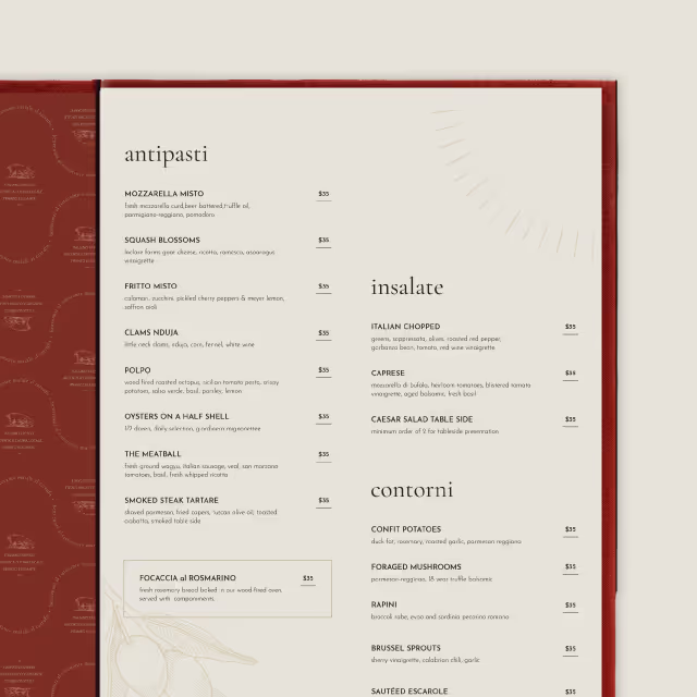
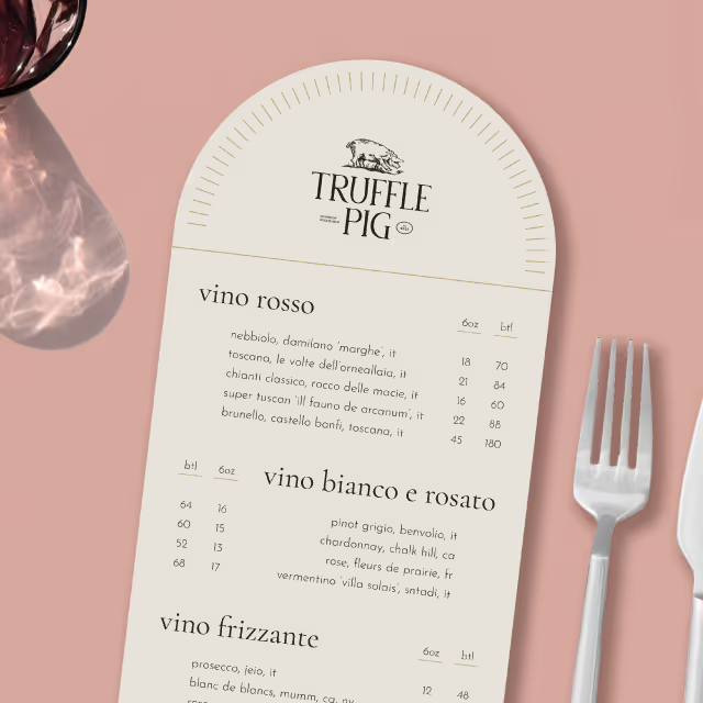
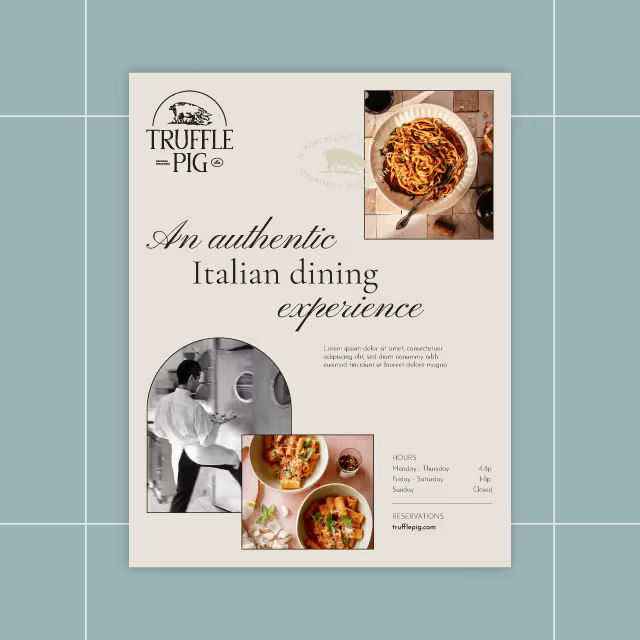
Informed by the brand position of providing proactive industry solutions that are scientifically proven, durable and tailored, we pushed an innovative visual theme throughout the visual identity and anchored messaging in bold statements and confident reassurance. Currently, the team at Devil’s Cask is securing final rounds of capital funding to support their launch with some of the nation’s most prominent distilleries.
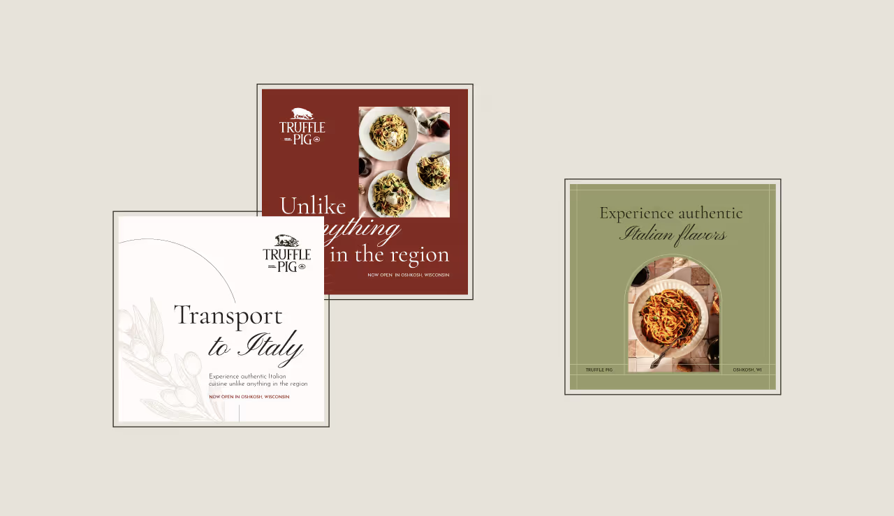

Devil’s Cask came to us with little more than a name and a cutting edge product. The product? A fluid vapor barrier that, when applied to the exterior surface of wooden casks used in the maturation process of barrel-aged spirits will eliminate 45% of Angels’ share and result in 20% more product to be bottled. They had a clear understanding of the industry but lacked expertise on how to bring the company and product’s brand to life in a meaningful and strategic way. Our challenge was to produce the brand foundation for an innovative company within an industry ripe with tradition.

As with every brand identity effort, the process started with research and guided conversations with the team of stakeholders. After all the cards were on the table, our creative team got to work identifying a gap in the market and strategically positioning Devil’s Cask with intentional differentiation. Most competitors offered repurposed solutions attempting to reduce product loss, however, those solutions were disruptive to the traditional process and yielded poor results. With that in mind, we chose to focus on the numbers and let results do the talking.

Informed by the brand position of providing proactive industry solutions that are scientifically proven, durable and tailored, we pushed an innovative visual theme throughout the visual identity and anchored messaging in bold statements and confident reassurance. Currently, the team at Devil’s Cask is securing final rounds of capital funding to support their launch with some of the nation’s most prominent distilleries.


Devil’s Cask came to us with little more than a name and a cutting edge product. The product? A fluid vapor barrier that, when applied to the exterior surface of wooden casks used in the maturation process of barrel-aged spirits will eliminate 45% of Angels’ share and result in 20% more product to be bottled. They had a clear understanding of the industry but lacked expertise on how to bring the company and product’s brand to life in a meaningful and strategic way. Our challenge was to produce the brand foundation for an innovative company within an industry ripe with tradition.

As with every brand identity effort, the process started with research and guided conversations with the team of stakeholders. After all the cards were on the table, our creative team got to work identifying a gap in the market and strategically positioning Devil’s Cask with intentional differentiation. Most competitors offered repurposed solutions attempting to reduce product loss, however, those solutions were disruptive to the traditional process and yielded poor results. With that in mind, we chose to focus on the numbers and let results do the talking.

Informed by the brand position of providing proactive industry solutions that are scientifically proven, durable and tailored, we pushed an innovative visual theme throughout the visual identity and anchored messaging in bold statements and confident reassurance. Currently, the team at Devil’s Cask is securing final rounds of capital funding to support their launch with some of the nation’s most prominent distilleries.


Devil’s Cask came to us with little more than a name and a cutting edge product. The product? A fluid vapor barrier that, when applied to the exterior surface of wooden casks used in the maturation process of barrel-aged spirits will eliminate 45% of Angels’ share and result in 20% more product to be bottled. They had a clear understanding of the industry but lacked expertise on how to bring the company and product’s brand to life in a meaningful and strategic way. Our challenge was to produce the brand foundation for an innovative company within an industry ripe with tradition.

As with every brand identity effort, the process started with research and guided conversations with the team of stakeholders. After all the cards were on the table, our creative team got to work identifying a gap in the market and strategically positioning Devil’s Cask with intentional differentiation. Most competitors offered repurposed solutions attempting to reduce product loss, however, those solutions were disruptive to the traditional process and yielded poor results. With that in mind, we chose to focus on the numbers and let results do the talking.
Informed by the brand position of providing proactive industry solutions that are scientifically proven, durable and tailored, we pushed an innovative visual theme throughout the visual identity and anchored messaging in bold statements and confident reassurance. Currently, the team at Devil’s Cask is securing final rounds of capital funding to support their launch with some of the nation’s most prominent distilleries.


Devil’s Cask came to us with little more than a name and a cutting edge product. The product? A fluid vapor barrier that, when applied to the exterior surface of wooden casks used in the maturation process of barrel-aged spirits will eliminate 45% of Angels’ share and result in 20% more product to be bottled. They had a clear understanding of the industry but lacked expertise on how to bring the company and product’s brand to life in a meaningful and strategic way. Our challenge was to produce the brand foundation for an innovative company within an industry ripe with tradition.


As with every brand identity effort, the process started with research and guided conversations with the team of stakeholders. After all the cards were on the table, our creative team got to work identifying a gap in the market and strategically positioning Devil’s Cask with intentional differentiation. Most competitors offered repurposed solutions attempting to reduce product loss, however, those solutions were disruptive to the traditional process and yielded poor results. With that in mind, we chose to focus on the numbers and let results do the talking.

Informed by the brand position of providing proactive industry solutions that are scientifically proven, durable and tailored, we pushed an innovative visual theme throughout the visual identity and anchored messaging in bold statements and confident reassurance. Currently, the team at Devil’s Cask is securing final rounds of capital funding to support their launch with some of the nation’s most prominent distilleries.


Devil’s Cask came to us with little more than a name and a cutting edge product. The product? A fluid vapor barrier that, when applied to the exterior surface of wooden casks used in the maturation process of barrel-aged spirits will eliminate 45% of Angels’ share and result in 20% more product to be bottled. They had a clear understanding of the industry but lacked expertise on how to bring the company and product’s brand to life in a meaningful and strategic way. Our challenge was to produce the brand foundation for an innovative company within an industry ripe with tradition.

As with every brand identity effort, the process started with research and guided conversations with the team of stakeholders. After all the cards were on the table, our creative team got to work identifying a gap in the market and strategically positioning Devil’s Cask with intentional differentiation. Most competitors offered repurposed solutions attempting to reduce product loss, however, those solutions were disruptive to the traditional process and yielded poor results. With that in mind, we chose to focus on the numbers and let results do the talking.


Informed by the brand position of providing proactive industry solutions that are scientifically proven, durable and tailored, we pushed an innovative visual theme throughout the visual identity and anchored messaging in bold statements and confident reassurance. Currently, the team at Devil’s Cask is securing final rounds of capital funding to support their launch with some of the nation’s most prominent distilleries.


Devil’s Cask came to us with little more than a name and a cutting edge product. The product? A fluid vapor barrier that, when applied to the exterior surface of wooden casks used in the maturation process of barrel-aged spirits will eliminate 45% of Angels’ share and result in 20% more product to be bottled. They had a clear understanding of the industry but lacked expertise on how to bring the company and product’s brand to life in a meaningful and strategic way. Our challenge was to produce the brand foundation for an innovative company within an industry ripe with tradition.


As with every brand identity effort, the process started with research and guided conversations with the team of stakeholders. After all the cards were on the table, our creative team got to work identifying a gap in the market and strategically positioning Devil’s Cask with intentional differentiation. Most competitors offered repurposed solutions attempting to reduce product loss, however, those solutions were disruptive to the traditional process and yielded poor results. With that in mind, we chose to focus on the numbers and let results do the talking.


Informed by the brand position of providing proactive industry solutions that are scientifically proven, durable and tailored, we pushed an innovative visual theme throughout the visual identity and anchored messaging in bold statements and confident reassurance. Currently, the team at Devil’s Cask is securing final rounds of capital funding to support their launch with some of the nation’s most prominent distilleries.


Devil’s Cask came to us with little more than a name and a cutting edge product. The product? A fluid vapor barrier that, when applied to the exterior surface of wooden casks used in the maturation process of barrel-aged spirits will eliminate 45% of Angels’ share and result in 20% more product to be bottled. They had a clear understanding of the industry but lacked expertise on how to bring the company and product’s brand to life in a meaningful and strategic way. Our challenge was to produce the brand foundation for an innovative company within an industry ripe with tradition.


As with every brand identity effort, the process started with research and guided conversations with the team of stakeholders. After all the cards were on the table, our creative team got to work identifying a gap in the market and strategically positioning Devil’s Cask with intentional differentiation. Most competitors offered repurposed solutions attempting to reduce product loss, however, those solutions were disruptive to the traditional process and yielded poor results. With that in mind, we chose to focus on the numbers and let results do the talking.

Informed by the brand position of providing proactive industry solutions that are scientifically proven, durable and tailored, we pushed an innovative visual theme throughout the visual identity and anchored messaging in bold statements and confident reassurance. Currently, the team at Devil’s Cask is securing final rounds of capital funding to support their launch with some of the nation’s most prominent distilleries.


Devil’s Cask came to us with little more than a name and a cutting edge product. The product? A fluid vapor barrier that, when applied to the exterior surface of wooden casks used in the maturation process of barrel-aged spirits will eliminate 45% of Angels’ share and result in 20% more product to be bottled. They had a clear understanding of the industry but lacked expertise on how to bring the company and product’s brand to life in a meaningful and strategic way. Our challenge was to produce the brand foundation for an innovative company within an industry ripe with tradition.


As with every brand identity effort, the process started with research and guided conversations with the team of stakeholders. After all the cards were on the table, our creative team got to work identifying a gap in the market and strategically positioning Devil’s Cask with intentional differentiation. Most competitors offered repurposed solutions attempting to reduce product loss, however, those solutions were disruptive to the traditional process and yielded poor results. With that in mind, we chose to focus on the numbers and let results do the talking.


Informed by the brand position of providing proactive industry solutions that are scientifically proven, durable and tailored, we pushed an innovative visual theme throughout the visual identity and anchored messaging in bold statements and confident reassurance. Currently, the team at Devil’s Cask is securing final rounds of capital funding to support their launch with some of the nation’s most prominent distilleries.


Devil’s Cask came to us with little more than a name and a cutting edge product. The product? A fluid vapor barrier that, when applied to the exterior surface of wooden casks used in the maturation process of barrel-aged spirits will eliminate 45% of Angels’ share and result in 20% more product to be bottled. They had a clear understanding of the industry but lacked expertise on how to bring the company and product’s brand to life in a meaningful and strategic way. Our challenge was to produce the brand foundation for an innovative company within an industry ripe with tradition.

As with every brand identity effort, the process started with research and guided conversations with the team of stakeholders. After all the cards were on the table, our creative team got to work identifying a gap in the market and strategically positioning Devil’s Cask with intentional differentiation. Most competitors offered repurposed solutions attempting to reduce product loss, however, those solutions were disruptive to the traditional process and yielded poor results. With that in mind, we chose to focus on the numbers and let results do the talking.


Informed by the brand position of providing proactive industry solutions that are scientifically proven, durable and tailored, we pushed an innovative visual theme throughout the visual identity and anchored messaging in bold statements and confident reassurance. Currently, the team at Devil’s Cask is securing final rounds of capital funding to support their launch with some of the nation’s most prominent distilleries.


Devil’s Cask came to us with little more than a name and a cutting edge product. The product? A fluid vapor barrier that, when applied to the exterior surface of wooden casks used in the maturation process of barrel-aged spirits will eliminate 45% of Angels’ share and result in 20% more product to be bottled. They had a clear understanding of the industry but lacked expertise on how to bring the company and product’s brand to life in a meaningful and strategic way. Our challenge was to produce the brand foundation for an innovative company within an industry ripe with tradition.


As with every brand identity effort, the process started with research and guided conversations with the team of stakeholders. After all the cards were on the table, our creative team got to work identifying a gap in the market and strategically positioning Devil’s Cask with intentional differentiation. Most competitors offered repurposed solutions attempting to reduce product loss, however, those solutions were disruptive to the traditional process and yielded poor results. With that in mind, we chose to focus on the numbers and let results do the talking.


Informed by the brand position of providing proactive industry solutions that are scientifically proven, durable and tailored, we pushed an innovative visual theme throughout the visual identity and anchored messaging in bold statements and confident reassurance. Currently, the team at Devil’s Cask is securing final rounds of capital funding to support their launch with some of the nation’s most prominent distilleries.


Devil’s Cask came to us with little more than a name and a cutting edge product. The product? A fluid vapor barrier that, when applied to the exterior surface of wooden casks used in the maturation process of barrel-aged spirits will eliminate 45% of Angels’ share and result in 20% more product to be bottled. They had a clear understanding of the industry but lacked expertise on how to bring the company and product’s brand to life in a meaningful and strategic way. Our challenge was to produce the brand foundation for an innovative company within an industry ripe with tradition.

As with every brand identity effort, the process started with research and guided conversations with the team of stakeholders. After all the cards were on the table, our creative team got to work identifying a gap in the market and strategically positioning Devil’s Cask with intentional differentiation. Most competitors offered repurposed solutions attempting to reduce product loss, however, those solutions were disruptive to the traditional process and yielded poor results. With that in mind, we chose to focus on the numbers and let results do the talking.


Informed by the brand position of providing proactive industry solutions that are scientifically proven, durable and tailored, we pushed an innovative visual theme throughout the visual identity and anchored messaging in bold statements and confident reassurance. Currently, the team at Devil’s Cask is securing final rounds of capital funding to support their launch with some of the nation’s most prominent distilleries.


Devil’s Cask came to us with little more than a name and a cutting edge product. The product? A fluid vapor barrier that, when applied to the exterior surface of wooden casks used in the maturation process of barrel-aged spirits will eliminate 45% of Angels’ share and result in 20% more product to be bottled. They had a clear understanding of the industry but lacked expertise on how to bring the company and product’s brand to life in a meaningful and strategic way. Our challenge was to produce the brand foundation for an innovative company within an industry ripe with tradition.

As with every brand identity effort, the process started with research and guided conversations with the team of stakeholders. After all the cards were on the table, our creative team got to work identifying a gap in the market and strategically positioning Devil’s Cask with intentional differentiation. Most competitors offered repurposed solutions attempting to reduce product loss, however, those solutions were disruptive to the traditional process and yielded poor results. With that in mind, we chose to focus on the numbers and let results do the talking.


Informed by the brand position of providing proactive industry solutions that are scientifically proven, durable and tailored, we pushed an innovative visual theme throughout the visual identity and anchored messaging in bold statements and confident reassurance. Currently, the team at Devil’s Cask is securing final rounds of capital funding to support their launch with some of the nation’s most prominent distilleries.


Devil’s Cask came to us with little more than a name and a cutting edge product. The product? A fluid vapor barrier that, when applied to the exterior surface of wooden casks used in the maturation process of barrel-aged spirits will eliminate 45% of Angels’ share and result in 20% more product to be bottled. They had a clear understanding of the industry but lacked expertise on how to bring the company and product’s brand to life in a meaningful and strategic way. Our challenge was to produce the brand foundation for an innovative company within an industry ripe with tradition.


As with every brand identity effort, the process started with research and guided conversations with the team of stakeholders. After all the cards were on the table, our creative team got to work identifying a gap in the market and strategically positioning Devil’s Cask with intentional differentiation. Most competitors offered repurposed solutions attempting to reduce product loss, however, those solutions were disruptive to the traditional process and yielded poor results. With that in mind, we chose to focus on the numbers and let results do the talking.

Informed by the brand position of providing proactive industry solutions that are scientifically proven, durable and tailored, we pushed an innovative visual theme throughout the visual identity and anchored messaging in bold statements and confident reassurance. Currently, the team at Devil’s Cask is securing final rounds of capital funding to support their launch with some of the nation’s most prominent distilleries.


Devil’s Cask came to us with little more than a name and a cutting edge product. The product? A fluid vapor barrier that, when applied to the exterior surface of wooden casks used in the maturation process of barrel-aged spirits will eliminate 45% of Angels’ share and result in 20% more product to be bottled. They had a clear understanding of the industry but lacked expertise on how to bring the company and product’s brand to life in a meaningful and strategic way. Our challenge was to produce the brand foundation for an innovative company within an industry ripe with tradition.

As with every brand identity effort, the process started with research and guided conversations with the team of stakeholders. After all the cards were on the table, our creative team got to work identifying a gap in the market and strategically positioning Devil’s Cask with intentional differentiation. Most competitors offered repurposed solutions attempting to reduce product loss, however, those solutions were disruptive to the traditional process and yielded poor results. With that in mind, we chose to focus on the numbers and let results do the talking.


Informed by the brand position of providing proactive industry solutions that are scientifically proven, durable and tailored, we pushed an innovative visual theme throughout the visual identity and anchored messaging in bold statements and confident reassurance. Currently, the team at Devil’s Cask is securing final rounds of capital funding to support their launch with some of the nation’s most prominent distilleries.


Devil’s Cask came to us with little more than a name and a cutting edge product. The product? A fluid vapor barrier that, when applied to the exterior surface of wooden casks used in the maturation process of barrel-aged spirits will eliminate 45% of Angels’ share and result in 20% more product to be bottled. They had a clear understanding of the industry but lacked expertise on how to bring the company and product’s brand to life in a meaningful and strategic way. Our challenge was to produce the brand foundation for an innovative company within an industry ripe with tradition.

As with every brand identity effort, the process started with research and guided conversations with the team of stakeholders. After all the cards were on the table, our creative team got to work identifying a gap in the market and strategically positioning Devil’s Cask with intentional differentiation. Most competitors offered repurposed solutions attempting to reduce product loss, however, those solutions were disruptive to the traditional process and yielded poor results. With that in mind, we chose to focus on the numbers and let results do the talking.


Informed by the brand position of providing proactive industry solutions that are scientifically proven, durable and tailored, we pushed an innovative visual theme throughout the visual identity and anchored messaging in bold statements and confident reassurance. Currently, the team at Devil’s Cask is securing final rounds of capital funding to support their launch with some of the nation’s most prominent distilleries.


Devil’s Cask came to us with little more than a name and a cutting edge product. The product? A fluid vapor barrier that, when applied to the exterior surface of wooden casks used in the maturation process of barrel-aged spirits will eliminate 45% of Angels’ share and result in 20% more product to be bottled. They had a clear understanding of the industry but lacked expertise on how to bring the company and product’s brand to life in a meaningful and strategic way. Our challenge was to produce the brand foundation for an innovative company within an industry ripe with tradition.


As with every brand identity effort, the process started with research and guided conversations with the team of stakeholders. After all the cards were on the table, our creative team got to work identifying a gap in the market and strategically positioning Devil’s Cask with intentional differentiation. Most competitors offered repurposed solutions attempting to reduce product loss, however, those solutions were disruptive to the traditional process and yielded poor results. With that in mind, we chose to focus on the numbers and let results do the talking.

Informed by the brand position of providing proactive industry solutions that are scientifically proven, durable and tailored, we pushed an innovative visual theme throughout the visual identity and anchored messaging in bold statements and confident reassurance. Currently, the team at Devil’s Cask is securing final rounds of capital funding to support their launch with some of the nation’s most prominent distilleries.


Devil’s Cask came to us with little more than a name and a cutting edge product. The product? A fluid vapor barrier that, when applied to the exterior surface of wooden casks used in the maturation process of barrel-aged spirits will eliminate 45% of Angels’ share and result in 20% more product to be bottled. They had a clear understanding of the industry but lacked expertise on how to bring the company and product’s brand to life in a meaningful and strategic way. Our challenge was to produce the brand foundation for an innovative company within an industry ripe with tradition.


As with every brand identity effort, the process started with research and guided conversations with the team of stakeholders. After all the cards were on the table, our creative team got to work identifying a gap in the market and strategically positioning Devil’s Cask with intentional differentiation. Most competitors offered repurposed solutions attempting to reduce product loss, however, those solutions were disruptive to the traditional process and yielded poor results. With that in mind, we chose to focus on the numbers and let results do the talking.

Informed by the brand position of providing proactive industry solutions that are scientifically proven, durable and tailored, we pushed an innovative visual theme throughout the visual identity and anchored messaging in bold statements and confident reassurance. Currently, the team at Devil’s Cask is securing final rounds of capital funding to support their launch with some of the nation’s most prominent distilleries.


Devil’s Cask came to us with little more than a name and a cutting edge product. The product? A fluid vapor barrier that, when applied to the exterior surface of wooden casks used in the maturation process of barrel-aged spirits will eliminate 45% of Angels’ share and result in 20% more product to be bottled. They had a clear understanding of the industry but lacked expertise on how to bring the company and product’s brand to life in a meaningful and strategic way. Our challenge was to produce the brand foundation for an innovative company within an industry ripe with tradition.


As with every brand identity effort, the process started with research and guided conversations with the team of stakeholders. After all the cards were on the table, our creative team got to work identifying a gap in the market and strategically positioning Devil’s Cask with intentional differentiation. Most competitors offered repurposed solutions attempting to reduce product loss, however, those solutions were disruptive to the traditional process and yielded poor results. With that in mind, we chose to focus on the numbers and let results do the talking.


Informed by the brand position of providing proactive industry solutions that are scientifically proven, durable and tailored, we pushed an innovative visual theme throughout the visual identity and anchored messaging in bold statements and confident reassurance. Currently, the team at Devil’s Cask is securing final rounds of capital funding to support their launch with some of the nation’s most prominent distilleries.


Devil’s Cask came to us with little more than a name and a cutting edge product. The product? A fluid vapor barrier that, when applied to the exterior surface of wooden casks used in the maturation process of barrel-aged spirits will eliminate 45% of Angels’ share and result in 20% more product to be bottled. They had a clear understanding of the industry but lacked expertise on how to bring the company and product’s brand to life in a meaningful and strategic way. Our challenge was to produce the brand foundation for an innovative company within an industry ripe with tradition.


As with every brand identity effort, the process started with research and guided conversations with the team of stakeholders. After all the cards were on the table, our creative team got to work identifying a gap in the market and strategically positioning Devil’s Cask with intentional differentiation. Most competitors offered repurposed solutions attempting to reduce product loss, however, those solutions were disruptive to the traditional process and yielded poor results. With that in mind, we chose to focus on the numbers and let results do the talking.


Informed by the brand position of providing proactive industry solutions that are scientifically proven, durable and tailored, we pushed an innovative visual theme throughout the visual identity and anchored messaging in bold statements and confident reassurance. Currently, the team at Devil’s Cask is securing final rounds of capital funding to support their launch with some of the nation’s most prominent distilleries.


Devil’s Cask came to us with little more than a name and a cutting edge product. The product? A fluid vapor barrier that, when applied to the exterior surface of wooden casks used in the maturation process of barrel-aged spirits will eliminate 45% of Angels’ share and result in 20% more product to be bottled. They had a clear understanding of the industry but lacked expertise on how to bring the company and product’s brand to life in a meaningful and strategic way. Our challenge was to produce the brand foundation for an innovative company within an industry ripe with tradition.

As with every brand identity effort, the process started with research and guided conversations with the team of stakeholders. After all the cards were on the table, our creative team got to work identifying a gap in the market and strategically positioning Devil’s Cask with intentional differentiation. Most competitors offered repurposed solutions attempting to reduce product loss, however, those solutions were disruptive to the traditional process and yielded poor results. With that in mind, we chose to focus on the numbers and let results do the talking.

Informed by the brand position of providing proactive industry solutions that are scientifically proven, durable and tailored, we pushed an innovative visual theme throughout the visual identity and anchored messaging in bold statements and confident reassurance. Currently, the team at Devil’s Cask is securing final rounds of capital funding to support their launch with some of the nation’s most prominent distilleries.


Devil’s Cask came to us with little more than a name and a cutting edge product. The product? A fluid vapor barrier that, when applied to the exterior surface of wooden casks used in the maturation process of barrel-aged spirits will eliminate 45% of Angels’ share and result in 20% more product to be bottled. They had a clear understanding of the industry but lacked expertise on how to bring the company and product’s brand to life in a meaningful and strategic way. Our challenge was to produce the brand foundation for an innovative company within an industry ripe with tradition.


As with every brand identity effort, the process started with research and guided conversations with the team of stakeholders. After all the cards were on the table, our creative team got to work identifying a gap in the market and strategically positioning Devil’s Cask with intentional differentiation. Most competitors offered repurposed solutions attempting to reduce product loss, however, those solutions were disruptive to the traditional process and yielded poor results. With that in mind, we chose to focus on the numbers and let results do the talking.


Informed by the brand position of providing proactive industry solutions that are scientifically proven, durable and tailored, we pushed an innovative visual theme throughout the visual identity and anchored messaging in bold statements and confident reassurance. Currently, the team at Devil’s Cask is securing final rounds of capital funding to support their launch with some of the nation’s most prominent distilleries.


Devil’s Cask came to us with little more than a name and a cutting edge product. The product? A fluid vapor barrier that, when applied to the exterior surface of wooden casks used in the maturation process of barrel-aged spirits will eliminate 45% of Angels’ share and result in 20% more product to be bottled. They had a clear understanding of the industry but lacked expertise on how to bring the company and product’s brand to life in a meaningful and strategic way. Our challenge was to produce the brand foundation for an innovative company within an industry ripe with tradition.


As with every brand identity effort, the process started with research and guided conversations with the team of stakeholders. After all the cards were on the table, our creative team got to work identifying a gap in the market and strategically positioning Devil’s Cask with intentional differentiation. Most competitors offered repurposed solutions attempting to reduce product loss, however, those solutions were disruptive to the traditional process and yielded poor results. With that in mind, we chose to focus on the numbers and let results do the talking.


Informed by the brand position of providing proactive industry solutions that are scientifically proven, durable and tailored, we pushed an innovative visual theme throughout the visual identity and anchored messaging in bold statements and confident reassurance. Currently, the team at Devil’s Cask is securing final rounds of capital funding to support their launch with some of the nation’s most prominent distilleries.


Devil’s Cask came to us with little more than a name and a cutting edge product. The product? A fluid vapor barrier that, when applied to the exterior surface of wooden casks used in the maturation process of barrel-aged spirits will eliminate 45% of Angels’ share and result in 20% more product to be bottled. They had a clear understanding of the industry but lacked expertise on how to bring the company and product’s brand to life in a meaningful and strategic way. Our challenge was to produce the brand foundation for an innovative company within an industry ripe with tradition.


As with every brand identity effort, the process started with research and guided conversations with the team of stakeholders. After all the cards were on the table, our creative team got to work identifying a gap in the market and strategically positioning Devil’s Cask with intentional differentiation. Most competitors offered repurposed solutions attempting to reduce product loss, however, those solutions were disruptive to the traditional process and yielded poor results. With that in mind, we chose to focus on the numbers and let results do the talking.


Informed by the brand position of providing proactive industry solutions that are scientifically proven, durable and tailored, we pushed an innovative visual theme throughout the visual identity and anchored messaging in bold statements and confident reassurance. Currently, the team at Devil’s Cask is securing final rounds of capital funding to support their launch with some of the nation’s most prominent distilleries.



Devil’s Cask came to us with little more than a name and a cutting edge product. The product? A fluid vapor barrier that, when applied to the exterior surface of wooden casks used in the maturation process of barrel-aged spirits will eliminate 45% of Angels’ share and result in 20% more product to be bottled. They had a clear understanding of the industry but lacked expertise on how to bring the company and product’s brand to life in a meaningful and strategic way. Our challenge was to produce the brand foundation for an innovative company within an industry ripe with tradition.


As with every brand identity effort, the process started with research and guided conversations with the team of stakeholders. After all the cards were on the table, our creative team got to work identifying a gap in the market and strategically positioning Devil’s Cask with intentional differentiation. Most competitors offered repurposed solutions attempting to reduce product loss, however, those solutions were disruptive to the traditional process and yielded poor results. With that in mind, we chose to focus on the numbers and let results do the talking.


Informed by the brand position of providing proactive industry solutions that are scientifically proven, durable and tailored, we pushed an innovative visual theme throughout the visual identity and anchored messaging in bold statements and confident reassurance. Currently, the team at Devil’s Cask is securing final rounds of capital funding to support their launch with some of the nation’s most prominent distilleries.


Devil’s Cask came to us with little more than a name and a cutting edge product. The product? A fluid vapor barrier that, when applied to the exterior surface of wooden casks used in the maturation process of barrel-aged spirits will eliminate 45% of Angels’ share and result in 20% more product to be bottled. They had a clear understanding of the industry but lacked expertise on how to bring the company and product’s brand to life in a meaningful and strategic way. Our challenge was to produce the brand foundation for an innovative company within an industry ripe with tradition.

As with every brand identity effort, the process started with research and guided conversations with the team of stakeholders. After all the cards were on the table, our creative team got to work identifying a gap in the market and strategically positioning Devil’s Cask with intentional differentiation. Most competitors offered repurposed solutions attempting to reduce product loss, however, those solutions were disruptive to the traditional process and yielded poor results. With that in mind, we chose to focus on the numbers and let results do the talking.


Informed by the brand position of providing proactive industry solutions that are scientifically proven, durable and tailored, we pushed an innovative visual theme throughout the visual identity and anchored messaging in bold statements and confident reassurance. Currently, the team at Devil’s Cask is securing final rounds of capital funding to support their launch with some of the nation’s most prominent distilleries.


Devil’s Cask came to us with little more than a name and a cutting edge product. The product? A fluid vapor barrier that, when applied to the exterior surface of wooden casks used in the maturation process of barrel-aged spirits will eliminate 45% of Angels’ share and result in 20% more product to be bottled. They had a clear understanding of the industry but lacked expertise on how to bring the company and product’s brand to life in a meaningful and strategic way. Our challenge was to produce the brand foundation for an innovative company within an industry ripe with tradition.


As with every brand identity effort, the process started with research and guided conversations with the team of stakeholders. After all the cards were on the table, our creative team got to work identifying a gap in the market and strategically positioning Devil’s Cask with intentional differentiation. Most competitors offered repurposed solutions attempting to reduce product loss, however, those solutions were disruptive to the traditional process and yielded poor results. With that in mind, we chose to focus on the numbers and let results do the talking.


Informed by the brand position of providing proactive industry solutions that are scientifically proven, durable and tailored, we pushed an innovative visual theme throughout the visual identity and anchored messaging in bold statements and confident reassurance. Currently, the team at Devil’s Cask is securing final rounds of capital funding to support their launch with some of the nation’s most prominent distilleries.

Devil’s Cask came to us with little more than a name and a cutting edge product. The product? A fluid vapor barrier that, when applied to the exterior surface of wooden casks used in the maturation process of barrel-aged spirits will eliminate 45% of Angels’ share and result in 20% more product to be bottled. They had a clear understanding of the industry but lacked expertise on how to bring the company and product’s brand to life in a meaningful and strategic way. Our challenge was to produce the brand foundation for an innovative company within an industry ripe with tradition.


As with every brand identity effort, the process started with research and guided conversations with the team of stakeholders. After all the cards were on the table, our creative team got to work identifying a gap in the market and strategically positioning Devil’s Cask with intentional differentiation. Most competitors offered repurposed solutions attempting to reduce product loss, however, those solutions were disruptive to the traditional process and yielded poor results. With that in mind, we chose to focus on the numbers and let results do the talking.


Informed by the brand position of providing proactive industry solutions that are scientifically proven, durable and tailored, we pushed an innovative visual theme throughout the visual identity and anchored messaging in bold statements and confident reassurance. Currently, the team at Devil’s Cask is securing final rounds of capital funding to support their launch with some of the nation’s most prominent distilleries.


Devil’s Cask came to us with little more than a name and a cutting edge product. The product? A fluid vapor barrier that, when applied to the exterior surface of wooden casks used in the maturation process of barrel-aged spirits will eliminate 45% of Angels’ share and result in 20% more product to be bottled. They had a clear understanding of the industry but lacked expertise on how to bring the company and product’s brand to life in a meaningful and strategic way. Our challenge was to produce the brand foundation for an innovative company within an industry ripe with tradition.

As with every brand identity effort, the process started with research and guided conversations with the team of stakeholders. After all the cards were on the table, our creative team got to work identifying a gap in the market and strategically positioning Devil’s Cask with intentional differentiation. Most competitors offered repurposed solutions attempting to reduce product loss, however, those solutions were disruptive to the traditional process and yielded poor results. With that in mind, we chose to focus on the numbers and let results do the talking.


Informed by the brand position of providing proactive industry solutions that are scientifically proven, durable and tailored, we pushed an innovative visual theme throughout the visual identity and anchored messaging in bold statements and confident reassurance. Currently, the team at Devil’s Cask is securing final rounds of capital funding to support their launch with some of the nation’s most prominent distilleries.


Devil’s Cask came to us with little more than a name and a cutting edge product. The product? A fluid vapor barrier that, when applied to the exterior surface of wooden casks used in the maturation process of barrel-aged spirits will eliminate 45% of Angels’ share and result in 20% more product to be bottled. They had a clear understanding of the industry but lacked expertise on how to bring the company and product’s brand to life in a meaningful and strategic way. Our challenge was to produce the brand foundation for an innovative company within an industry ripe with tradition.


As with every brand identity effort, the process started with research and guided conversations with the team of stakeholders. After all the cards were on the table, our creative team got to work identifying a gap in the market and strategically positioning Devil’s Cask with intentional differentiation. Most competitors offered repurposed solutions attempting to reduce product loss, however, those solutions were disruptive to the traditional process and yielded poor results. With that in mind, we chose to focus on the numbers and let results do the talking.


Informed by the brand position of providing proactive industry solutions that are scientifically proven, durable and tailored, we pushed an innovative visual theme throughout the visual identity and anchored messaging in bold statements and confident reassurance. Currently, the team at Devil’s Cask is securing final rounds of capital funding to support their launch with some of the nation’s most prominent distilleries.


Devil’s Cask came to us with little more than a name and a cutting edge product. The product? A fluid vapor barrier that, when applied to the exterior surface of wooden casks used in the maturation process of barrel-aged spirits will eliminate 45% of Angels’ share and result in 20% more product to be bottled. They had a clear understanding of the industry but lacked expertise on how to bring the company and product’s brand to life in a meaningful and strategic way. Our challenge was to produce the brand foundation for an innovative company within an industry ripe with tradition.


As with every brand identity effort, the process started with research and guided conversations with the team of stakeholders. After all the cards were on the table, our creative team got to work identifying a gap in the market and strategically positioning Devil’s Cask with intentional differentiation. Most competitors offered repurposed solutions attempting to reduce product loss, however, those solutions were disruptive to the traditional process and yielded poor results. With that in mind, we chose to focus on the numbers and let results do the talking.


Informed by the brand position of providing proactive industry solutions that are scientifically proven, durable and tailored, we pushed an innovative visual theme throughout the visual identity and anchored messaging in bold statements and confident reassurance. Currently, the team at Devil’s Cask is securing final rounds of capital funding to support their launch with some of the nation’s most prominent distilleries.


Devil’s Cask came to us with little more than a name and a cutting edge product. The product? A fluid vapor barrier that, when applied to the exterior surface of wooden casks used in the maturation process of barrel-aged spirits will eliminate 45% of Angels’ share and result in 20% more product to be bottled. They had a clear understanding of the industry but lacked expertise on how to bring the company and product’s brand to life in a meaningful and strategic way. Our challenge was to produce the brand foundation for an innovative company within an industry ripe with tradition.


As with every brand identity effort, the process started with research and guided conversations with the team of stakeholders. After all the cards were on the table, our creative team got to work identifying a gap in the market and strategically positioning Devil’s Cask with intentional differentiation. Most competitors offered repurposed solutions attempting to reduce product loss, however, those solutions were disruptive to the traditional process and yielded poor results. With that in mind, we chose to focus on the numbers and let results do the talking.


Informed by the brand position of providing proactive industry solutions that are scientifically proven, durable and tailored, we pushed an innovative visual theme throughout the visual identity and anchored messaging in bold statements and confident reassurance. Currently, the team at Devil’s Cask is securing final rounds of capital funding to support their launch with some of the nation’s most prominent distilleries.




Devil’s Cask came to us with little more than a name and a cutting edge product. The product? A fluid vapor barrier that, when applied to the exterior surface of wooden casks used in the maturation process of barrel-aged spirits will eliminate 45% of Angels’ share and result in 20% more product to be bottled. They had a clear understanding of the industry but lacked expertise on how to bring the company and product’s brand to life in a meaningful and strategic way. Our challenge was to produce the brand foundation for an innovative company within an industry ripe with tradition.


As with every brand identity effort, the process started with research and guided conversations with the team of stakeholders. After all the cards were on the table, our creative team got to work identifying a gap in the market and strategically positioning Devil’s Cask with intentional differentiation. Most competitors offered repurposed solutions attempting to reduce product loss, however, those solutions were disruptive to the traditional process and yielded poor results. With that in mind, we chose to focus on the numbers and let results do the talking.


Informed by the brand position of providing proactive industry solutions that are scientifically proven, durable and tailored, we pushed an innovative visual theme throughout the visual identity and anchored messaging in bold statements and confident reassurance. Currently, the team at Devil’s Cask is securing final rounds of capital funding to support their launch with some of the nation’s most prominent distilleries.


Devil’s Cask came to us with little more than a name and a cutting edge product. The product? A fluid vapor barrier that, when applied to the exterior surface of wooden casks used in the maturation process of barrel-aged spirits will eliminate 45% of Angels’ share and result in 20% more product to be bottled. They had a clear understanding of the industry but lacked expertise on how to bring the company and product’s brand to life in a meaningful and strategic way. Our challenge was to produce the brand foundation for an innovative company within an industry ripe with tradition.

As with every brand identity effort, the process started with research and guided conversations with the team of stakeholders. After all the cards were on the table, our creative team got to work identifying a gap in the market and strategically positioning Devil’s Cask with intentional differentiation. Most competitors offered repurposed solutions attempting to reduce product loss, however, those solutions were disruptive to the traditional process and yielded poor results. With that in mind, we chose to focus on the numbers and let results do the talking.


Informed by the brand position of providing proactive industry solutions that are scientifically proven, durable and tailored, we pushed an innovative visual theme throughout the visual identity and anchored messaging in bold statements and confident reassurance. Currently, the team at Devil’s Cask is securing final rounds of capital funding to support their launch with some of the nation’s most prominent distilleries.


Devil’s Cask came to us with little more than a name and a cutting edge product. The product? A fluid vapor barrier that, when applied to the exterior surface of wooden casks used in the maturation process of barrel-aged spirits will eliminate 45% of Angels’ share and result in 20% more product to be bottled. They had a clear understanding of the industry but lacked expertise on how to bring the company and product’s brand to life in a meaningful and strategic way. Our challenge was to produce the brand foundation for an innovative company within an industry ripe with tradition.




As with every brand identity effort, the process started with research and guided conversations with the team of stakeholders. After all the cards were on the table, our creative team got to work identifying a gap in the market and strategically positioning Devil’s Cask with intentional differentiation. Most competitors offered repurposed solutions attempting to reduce product loss, however, those solutions were disruptive to the traditional process and yielded poor results. With that in mind, we chose to focus on the numbers and let results do the talking.


Informed by the brand position of providing proactive industry solutions that are scientifically proven, durable and tailored, we pushed an innovative visual theme throughout the visual identity and anchored messaging in bold statements and confident reassurance. Currently, the team at Devil’s Cask is securing final rounds of capital funding to support their launch with some of the nation’s most prominent distilleries.


Devil’s Cask came to us with little more than a name and a cutting edge product. The product? A fluid vapor barrier that, when applied to the exterior surface of wooden casks used in the maturation process of barrel-aged spirits will eliminate 45% of Angels’ share and result in 20% more product to be bottled. They had a clear understanding of the industry but lacked expertise on how to bring the company and product’s brand to life in a meaningful and strategic way. Our challenge was to produce the brand foundation for an innovative company within an industry ripe with tradition.

As with every brand identity effort, the process started with research and guided conversations with the team of stakeholders. After all the cards were on the table, our creative team got to work identifying a gap in the market and strategically positioning Devil’s Cask with intentional differentiation. Most competitors offered repurposed solutions attempting to reduce product loss, however, those solutions were disruptive to the traditional process and yielded poor results. With that in mind, we chose to focus on the numbers and let results do the talking.


Informed by the brand position of providing proactive industry solutions that are scientifically proven, durable and tailored, we pushed an innovative visual theme throughout the visual identity and anchored messaging in bold statements and confident reassurance. Currently, the team at Devil’s Cask is securing final rounds of capital funding to support their launch with some of the nation’s most prominent distilleries.


Devil’s Cask came to us with little more than a name and a cutting edge product. The product? A fluid vapor barrier that, when applied to the exterior surface of wooden casks used in the maturation process of barrel-aged spirits will eliminate 45% of Angels’ share and result in 20% more product to be bottled. They had a clear understanding of the industry but lacked expertise on how to bring the company and product’s brand to life in a meaningful and strategic way. Our challenge was to produce the brand foundation for an innovative company within an industry ripe with tradition.


As with every brand identity effort, the process started with research and guided conversations with the team of stakeholders. After all the cards were on the table, our creative team got to work identifying a gap in the market and strategically positioning Devil’s Cask with intentional differentiation. Most competitors offered repurposed solutions attempting to reduce product loss, however, those solutions were disruptive to the traditional process and yielded poor results. With that in mind, we chose to focus on the numbers and let results do the talking.



Informed by the brand position of providing proactive industry solutions that are scientifically proven, durable and tailored, we pushed an innovative visual theme throughout the visual identity and anchored messaging in bold statements and confident reassurance. Currently, the team at Devil’s Cask is securing final rounds of capital funding to support their launch with some of the nation’s most prominent distilleries.


Devil’s Cask came to us with little more than a name and a cutting edge product. The product? A fluid vapor barrier that, when applied to the exterior surface of wooden casks used in the maturation process of barrel-aged spirits will eliminate 45% of Angels’ share and result in 20% more product to be bottled. They had a clear understanding of the industry but lacked expertise on how to bring the company and product’s brand to life in a meaningful and strategic way. Our challenge was to produce the brand foundation for an innovative company within an industry ripe with tradition.


As with every brand identity effort, the process started with research and guided conversations with the team of stakeholders. After all the cards were on the table, our creative team got to work identifying a gap in the market and strategically positioning Devil’s Cask with intentional differentiation. Most competitors offered repurposed solutions attempting to reduce product loss, however, those solutions were disruptive to the traditional process and yielded poor results. With that in mind, we chose to focus on the numbers and let results do the talking.


Informed by the brand position of providing proactive industry solutions that are scientifically proven, durable and tailored, we pushed an innovative visual theme throughout the visual identity and anchored messaging in bold statements and confident reassurance. Currently, the team at Devil’s Cask is securing final rounds of capital funding to support their launch with some of the nation’s most prominent distilleries.


Devil’s Cask came to us with little more than a name and a cutting edge product. The product? A fluid vapor barrier that, when applied to the exterior surface of wooden casks used in the maturation process of barrel-aged spirits will eliminate 45% of Angels’ share and result in 20% more product to be bottled. They had a clear understanding of the industry but lacked expertise on how to bring the company and product’s brand to life in a meaningful and strategic way. Our challenge was to produce the brand foundation for an innovative company within an industry ripe with tradition.


As with every brand identity effort, the process started with research and guided conversations with the team of stakeholders. After all the cards were on the table, our creative team got to work identifying a gap in the market and strategically positioning Devil’s Cask with intentional differentiation. Most competitors offered repurposed solutions attempting to reduce product loss, however, those solutions were disruptive to the traditional process and yielded poor results. With that in mind, we chose to focus on the numbers and let results do the talking.


Informed by the brand position of providing proactive industry solutions that are scientifically proven, durable and tailored, we pushed an innovative visual theme throughout the visual identity and anchored messaging in bold statements and confident reassurance. Currently, the team at Devil’s Cask is securing final rounds of capital funding to support their launch with some of the nation’s most prominent distilleries.


Devil’s Cask came to us with little more than a name and a cutting edge product. The product? A fluid vapor barrier that, when applied to the exterior surface of wooden casks used in the maturation process of barrel-aged spirits will eliminate 45% of Angels’ share and result in 20% more product to be bottled. They had a clear understanding of the industry but lacked expertise on how to bring the company and product’s brand to life in a meaningful and strategic way. Our challenge was to produce the brand foundation for an innovative company within an industry ripe with tradition.


As with every brand identity effort, the process started with research and guided conversations with the team of stakeholders. After all the cards were on the table, our creative team got to work identifying a gap in the market and strategically positioning Devil’s Cask with intentional differentiation. Most competitors offered repurposed solutions attempting to reduce product loss, however, those solutions were disruptive to the traditional process and yielded poor results. With that in mind, we chose to focus on the numbers and let results do the talking.


Devil’s Cask came to us with little more than a name and a cutting edge product. The product? A fluid vapor barrier that, when applied to the exterior surface of wooden casks used in the maturation process of barrel-aged spirits will eliminate 45% of Angels’ share and result in 20% more product to be bottled. They had a clear understanding of the industry but lacked expertise on how to bring the company and product’s brand to life in a meaningful and strategic way. Our challenge was to produce the brand foundation for an innovative company within an industry ripe with tradition.
As with every brand identity effort, the process started with research and guided conversations with the team of stakeholders. After all the cards were on the table, our creative team got to work identifying a gap in the market and strategically positioning Devil’s Cask with intentional differentiation. Most competitors offered repurposed solutions attempting to reduce product loss, however, those solutions were disruptive to the traditional process and yielded poor results. With that in mind, we chose to focus on the numbers and let results do the talking.


Informed by the brand position of providing proactive industry solutions that are scientifically proven, durable and tailored, we pushed an innovative visual theme throughout the visual identity and anchored messaging in bold statements and confident reassurance. Currently, the team at Devil’s Cask is securing final rounds of capital funding to support their launch with some of the nation’s most prominent distilleries.


Devil’s Cask came to us with little more than a name and a cutting edge product. The product? A fluid vapor barrier that, when applied to the exterior surface of wooden casks used in the maturation process of barrel-aged spirits will eliminate 45% of Angels’ share and result in 20% more product to be bottled. They had a clear understanding of the industry but lacked expertise on how to bring the company and product’s brand to life in a meaningful and strategic way. Our challenge was to produce the brand foundation for an innovative company within an industry ripe with tradition.


As with every brand identity effort, the process started with research and guided conversations with the team of stakeholders. After all the cards were on the table, our creative team got to work identifying a gap in the market and strategically positioning Devil’s Cask with intentional differentiation. Most competitors offered repurposed solutions attempting to reduce product loss, however, those solutions were disruptive to the traditional process and yielded poor results. With that in mind, we chose to focus on the numbers and let results do the talking.
Informed by the brand position of providing proactive industry solutions that are scientifically proven, durable and tailored, we pushed an innovative visual theme throughout the visual identity and anchored messaging in bold statements and confident reassurance. Currently, the team at Devil’s Cask is securing final rounds of capital funding to support their launch with some of the nation’s most prominent distilleries.

Devil’s Cask came to us with little more than a name and a cutting edge product. The product? A fluid vapor barrier that, when applied to the exterior surface of wooden casks used in the maturation process of barrel-aged spirits will eliminate 45% of Angels’ share and result in 20% more product to be bottled. They had a clear understanding of the industry but lacked expertise on how to bring the company and product’s brand to life in a meaningful and strategic way. Our challenge was to produce the brand foundation for an innovative company within an industry ripe with tradition.


As with every brand identity effort, the process started with research and guided conversations with the team of stakeholders. After all the cards were on the table, our creative team got to work identifying a gap in the market and strategically positioning Devil’s Cask with intentional differentiation. Most competitors offered repurposed solutions attempting to reduce product loss, however, those solutions were disruptive to the traditional process and yielded poor results. With that in mind, we chose to focus on the numbers and let results do the talking.


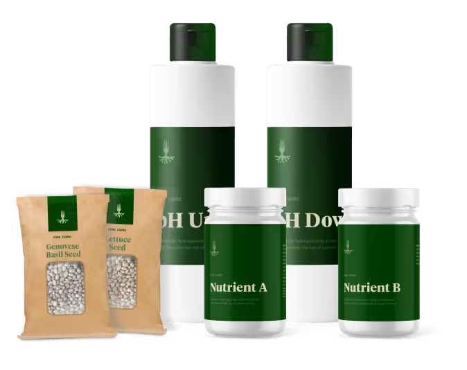
Informed by the brand position of providing proactive industry solutions that are scientifically proven, durable and tailored, we pushed an innovative visual theme throughout the visual identity and anchored messaging in bold statements and confident reassurance. Currently, the team at Devil’s Cask is securing final rounds of capital funding to support their launch with some of the nation’s most prominent distilleries.


Devil’s Cask came to us with little more than a name and a cutting edge product. The product? A fluid vapor barrier that, when applied to the exterior surface of wooden casks used in the maturation process of barrel-aged spirits will eliminate 45% of Angels’ share and result in 20% more product to be bottled. They had a clear understanding of the industry but lacked expertise on how to bring the company and product’s brand to life in a meaningful and strategic way. Our challenge was to produce the brand foundation for an innovative company within an industry ripe with tradition.

As with every brand identity effort, the process started with research and guided conversations with the team of stakeholders. After all the cards were on the table, our creative team got to work identifying a gap in the market and strategically positioning Devil’s Cask with intentional differentiation. Most competitors offered repurposed solutions attempting to reduce product loss, however, those solutions were disruptive to the traditional process and yielded poor results. With that in mind, we chose to focus on the numbers and let results do the talking.


Informed by the brand position of providing proactive industry solutions that are scientifically proven, durable and tailored, we pushed an innovative visual theme throughout the visual identity and anchored messaging in bold statements and confident reassurance. Currently, the team at Devil’s Cask is securing final rounds of capital funding to support their launch with some of the nation’s most prominent distilleries.


Devil’s Cask came to us with little more than a name and a cutting edge product. The product? A fluid vapor barrier that, when applied to the exterior surface of wooden casks used in the maturation process of barrel-aged spirits will eliminate 45% of Angels’ share and result in 20% more product to be bottled. They had a clear understanding of the industry but lacked expertise on how to bring the company and product’s brand to life in a meaningful and strategic way. Our challenge was to produce the brand foundation for an innovative company within an industry ripe with tradition.

As with every brand identity effort, the process started with research and guided conversations with the team of stakeholders. After all the cards were on the table, our creative team got to work identifying a gap in the market and strategically positioning Devil’s Cask with intentional differentiation. Most competitors offered repurposed solutions attempting to reduce product loss, however, those solutions were disruptive to the traditional process and yielded poor results. With that in mind, we chose to focus on the numbers and let results do the talking.

Informed by the brand position of providing proactive industry solutions that are scientifically proven, durable and tailored, we pushed an innovative visual theme throughout the visual identity and anchored messaging in bold statements and confident reassurance. Currently, the team at Devil’s Cask is securing final rounds of capital funding to support their launch with some of the nation’s most prominent distilleries.


Devil’s Cask came to us with little more than a name and a cutting edge product. The product? A fluid vapor barrier that, when applied to the exterior surface of wooden casks used in the maturation process of barrel-aged spirits will eliminate 45% of Angels’ share and result in 20% more product to be bottled. They had a clear understanding of the industry but lacked expertise on how to bring the company and product’s brand to life in a meaningful and strategic way. Our challenge was to produce the brand foundation for an innovative company within an industry ripe with tradition.


As with every brand identity effort, the process started with research and guided conversations with the team of stakeholders. After all the cards were on the table, our creative team got to work identifying a gap in the market and strategically positioning Devil’s Cask with intentional differentiation. Most competitors offered repurposed solutions attempting to reduce product loss, however, those solutions were disruptive to the traditional process and yielded poor results. With that in mind, we chose to focus on the numbers and let results do the talking.


Informed by the brand position of providing proactive industry solutions that are scientifically proven, durable and tailored, we pushed an innovative visual theme throughout the visual identity and anchored messaging in bold statements and confident reassurance. Currently, the team at Devil’s Cask is securing final rounds of capital funding to support their launch with some of the nation’s most prominent distilleries.


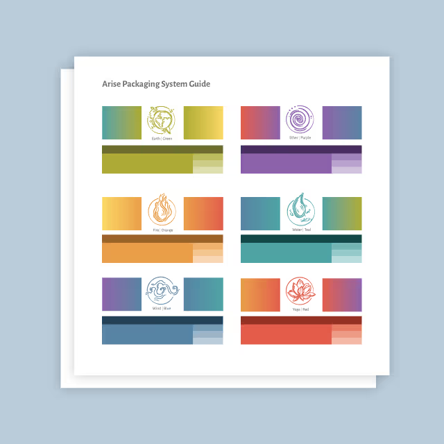
Devil’s Cask came to us with little more than a name and a cutting edge product. The product? A fluid vapor barrier that, when applied to the exterior surface of wooden casks used in the maturation process of barrel-aged spirits will eliminate 45% of Angels’ share and result in 20% more product to be bottled. They had a clear understanding of the industry but lacked expertise on how to bring the company and product’s brand to life in a meaningful and strategic way. Our challenge was to produce the brand foundation for an innovative company within an industry ripe with tradition.
As with every brand identity effort, the process started with research and guided conversations with the team of stakeholders. After all the cards were on the table, our creative team got to work identifying a gap in the market and strategically positioning Devil’s Cask with intentional differentiation. Most competitors offered repurposed solutions attempting to reduce product loss, however, those solutions were disruptive to the traditional process and yielded poor results. With that in mind, we chose to focus on the numbers and let results do the talking.


Informed by the brand position of providing proactive industry solutions that are scientifically proven, durable and tailored, we pushed an innovative visual theme throughout the visual identity and anchored messaging in bold statements and confident reassurance. Currently, the team at Devil’s Cask is securing final rounds of capital funding to support their launch with some of the nation’s most prominent distilleries.


Devil’s Cask came to us with little more than a name and a cutting edge product. The product? A fluid vapor barrier that, when applied to the exterior surface of wooden casks used in the maturation process of barrel-aged spirits will eliminate 45% of Angels’ share and result in 20% more product to be bottled. They had a clear understanding of the industry but lacked expertise on how to bring the company and product’s brand to life in a meaningful and strategic way. Our challenge was to produce the brand foundation for an innovative company within an industry ripe with tradition.


As with every brand identity effort, the process started with research and guided conversations with the team of stakeholders. After all the cards were on the table, our creative team got to work identifying a gap in the market and strategically positioning Devil’s Cask with intentional differentiation. Most competitors offered repurposed solutions attempting to reduce product loss, however, those solutions were disruptive to the traditional process and yielded poor results. With that in mind, we chose to focus on the numbers and let results do the talking.


Informed by the brand position of providing proactive industry solutions that are scientifically proven, durable and tailored, we pushed an innovative visual theme throughout the visual identity and anchored messaging in bold statements and confident reassurance. Currently, the team at Devil’s Cask is securing final rounds of capital funding to support their launch with some of the nation’s most prominent distilleries.


Devil’s Cask came to us with little more than a name and a cutting edge product. The product? A fluid vapor barrier that, when applied to the exterior surface of wooden casks used in the maturation process of barrel-aged spirits will eliminate 45% of Angels’ share and result in 20% more product to be bottled. They had a clear understanding of the industry but lacked expertise on how to bring the company and product’s brand to life in a meaningful and strategic way. Our challenge was to produce the brand foundation for an innovative company within an industry ripe with tradition.


As with every brand identity effort, the process started with research and guided conversations with the team of stakeholders. After all the cards were on the table, our creative team got to work identifying a gap in the market and strategically positioning Devil’s Cask with intentional differentiation. Most competitors offered repurposed solutions attempting to reduce product loss, however, those solutions were disruptive to the traditional process and yielded poor results. With that in mind, we chose to focus on the numbers and let results do the talking.


Informed by the brand position of providing proactive industry solutions that are scientifically proven, durable and tailored, we pushed an innovative visual theme throughout the visual identity and anchored messaging in bold statements and confident reassurance. Currently, the team at Devil’s Cask is securing final rounds of capital funding to support their launch with some of the nation’s most prominent distilleries.


Devil’s Cask came to us with little more than a name and a cutting edge product. The product? A fluid vapor barrier that, when applied to the exterior surface of wooden casks used in the maturation process of barrel-aged spirits will eliminate 45% of Angels’ share and result in 20% more product to be bottled. They had a clear understanding of the industry but lacked expertise on how to bring the company and product’s brand to life in a meaningful and strategic way. Our challenge was to produce the brand foundation for an innovative company within an industry ripe with tradition.


As with every brand identity effort, the process started with research and guided conversations with the team of stakeholders. After all the cards were on the table, our creative team got to work identifying a gap in the market and strategically positioning Devil’s Cask with intentional differentiation. Most competitors offered repurposed solutions attempting to reduce product loss, however, those solutions were disruptive to the traditional process and yielded poor results. With that in mind, we chose to focus on the numbers and let results do the talking.


Informed by the brand position of providing proactive industry solutions that are scientifically proven, durable and tailored, we pushed an innovative visual theme throughout the visual identity and anchored messaging in bold statements and confident reassurance. Currently, the team at Devil’s Cask is securing final rounds of capital funding to support their launch with some of the nation’s most prominent distilleries.


Devil’s Cask came to us with little more than a name and a cutting edge product. The product? A fluid vapor barrier that, when applied to the exterior surface of wooden casks used in the maturation process of barrel-aged spirits will eliminate 45% of Angels’ share and result in 20% more product to be bottled. They had a clear understanding of the industry but lacked expertise on how to bring the company and product’s brand to life in a meaningful and strategic way. Our challenge was to produce the brand foundation for an innovative company within an industry ripe with tradition.

As with every brand identity effort, the process started with research and guided conversations with the team of stakeholders. After all the cards were on the table, our creative team got to work identifying a gap in the market and strategically positioning Devil’s Cask with intentional differentiation. Most competitors offered repurposed solutions attempting to reduce product loss, however, those solutions were disruptive to the traditional process and yielded poor results. With that in mind, we chose to focus on the numbers and let results do the talking.

Informed by the brand position of providing proactive industry solutions that are scientifically proven, durable and tailored, we pushed an innovative visual theme throughout the visual identity and anchored messaging in bold statements and confident reassurance. Currently, the team at Devil’s Cask is securing final rounds of capital funding to support their launch with some of the nation’s most prominent distilleries.

Devil’s Cask came to us with little more than a name and a cutting edge product. The product? A fluid vapor barrier that, when applied to the exterior surface of wooden casks used in the maturation process of barrel-aged spirits will eliminate 45% of Angels’ share and result in 20% more product to be bottled. They had a clear understanding of the industry but lacked expertise on how to bring the company and product’s brand to life in a meaningful and strategic way. Our challenge was to produce the brand foundation for an innovative company within an industry ripe with tradition.

As with every brand identity effort, the process started with research and guided conversations with the team of stakeholders. After all the cards were on the table, our creative team got to work identifying a gap in the market and strategically positioning Devil’s Cask with intentional differentiation. Most competitors offered repurposed solutions attempting to reduce product loss, however, those solutions were disruptive to the traditional process and yielded poor results. With that in mind, we chose to focus on the numbers and let results do the talking.


Informed by the brand position of providing proactive industry solutions that are scientifically proven, durable and tailored, we pushed an innovative visual theme throughout the visual identity and anchored messaging in bold statements and confident reassurance. Currently, the team at Devil’s Cask is securing final rounds of capital funding to support their launch with some of the nation’s most prominent distilleries.
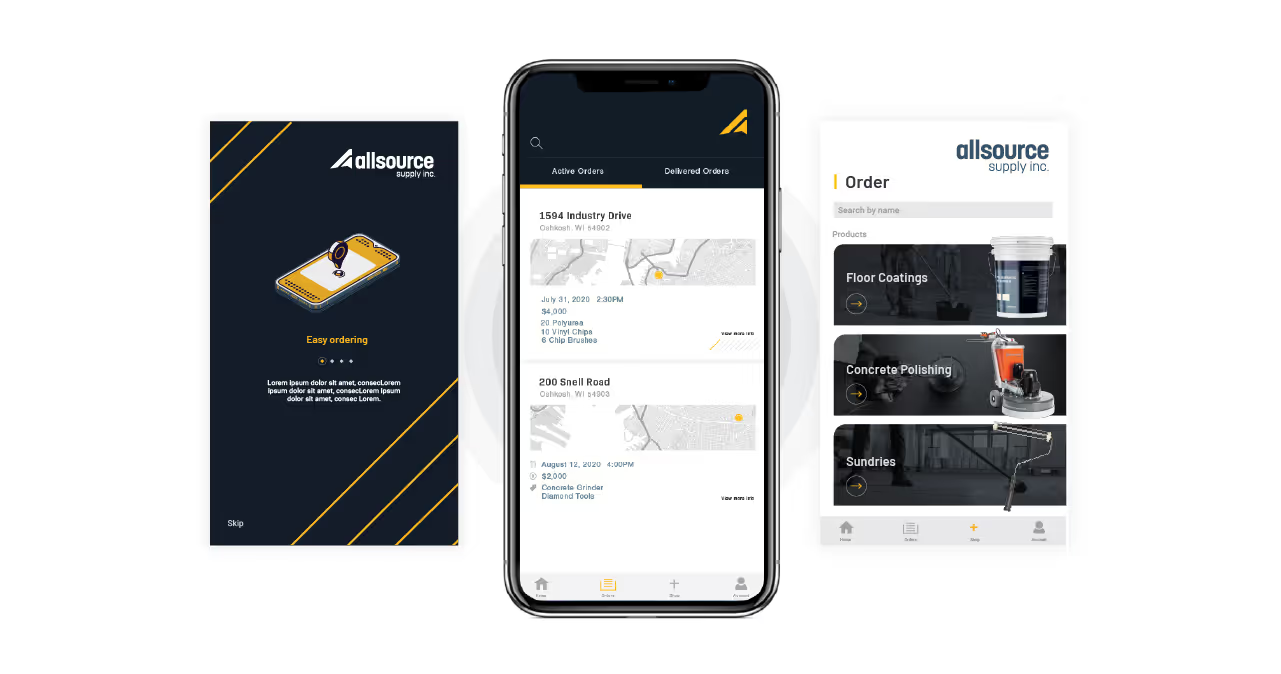


Devil’s Cask came to us with little more than a name and a cutting edge product. The product? A fluid vapor barrier that, when applied to the exterior surface of wooden casks used in the maturation process of barrel-aged spirits will eliminate 45% of Angels’ share and result in 20% more product to be bottled. They had a clear understanding of the industry but lacked expertise on how to bring the company and product’s brand to life in a meaningful and strategic way. Our challenge was to produce the brand foundation for an innovative company within an industry ripe with tradition.


As with every brand identity effort, the process started with research and guided conversations with the team of stakeholders. After all the cards were on the table, our creative team got to work identifying a gap in the market and strategically positioning Devil’s Cask with intentional differentiation. Most competitors offered repurposed solutions attempting to reduce product loss, however, those solutions were disruptive to the traditional process and yielded poor results. With that in mind, we chose to focus on the numbers and let results do the talking.


Informed by the brand position of providing proactive industry solutions that are scientifically proven, durable and tailored, we pushed an innovative visual theme throughout the visual identity and anchored messaging in bold statements and confident reassurance. Currently, the team at Devil’s Cask is securing final rounds of capital funding to support their launch with some of the nation’s most prominent distilleries.


Devil’s Cask came to us with little more than a name and a cutting edge product. The product? A fluid vapor barrier that, when applied to the exterior surface of wooden casks used in the maturation process of barrel-aged spirits will eliminate 45% of Angels’ share and result in 20% more product to be bottled. They had a clear understanding of the industry but lacked expertise on how to bring the company and product’s brand to life in a meaningful and strategic way. Our challenge was to produce the brand foundation for an innovative company within an industry ripe with tradition.


As with every brand identity effort, the process started with research and guided conversations with the team of stakeholders. After all the cards were on the table, our creative team got to work identifying a gap in the market and strategically positioning Devil’s Cask with intentional differentiation. Most competitors offered repurposed solutions attempting to reduce product loss, however, those solutions were disruptive to the traditional process and yielded poor results. With that in mind, we chose to focus on the numbers and let results do the talking.


Informed by the brand position of providing proactive industry solutions that are scientifically proven, durable and tailored, we pushed an innovative visual theme throughout the visual identity and anchored messaging in bold statements and confident reassurance. Currently, the team at Devil’s Cask is securing final rounds of capital funding to support their launch with some of the nation’s most prominent distilleries.


Devil’s Cask came to us with little more than a name and a cutting edge product. The product? A fluid vapor barrier that, when applied to the exterior surface of wooden casks used in the maturation process of barrel-aged spirits will eliminate 45% of Angels’ share and result in 20% more product to be bottled. They had a clear understanding of the industry but lacked expertise on how to bring the company and product’s brand to life in a meaningful and strategic way. Our challenge was to produce the brand foundation for an innovative company within an industry ripe with tradition.

As with every brand identity effort, the process started with research and guided conversations with the team of stakeholders. After all the cards were on the table, our creative team got to work identifying a gap in the market and strategically positioning Devil’s Cask with intentional differentiation. Most competitors offered repurposed solutions attempting to reduce product loss, however, those solutions were disruptive to the traditional process and yielded poor results. With that in mind, we chose to focus on the numbers and let results do the talking.


Informed by the brand position of providing proactive industry solutions that are scientifically proven, durable and tailored, we pushed an innovative visual theme throughout the visual identity and anchored messaging in bold statements and confident reassurance. Currently, the team at Devil’s Cask is securing final rounds of capital funding to support their launch with some of the nation’s most prominent distilleries.


Devil’s Cask came to us with little more than a name and a cutting edge product. The product? A fluid vapor barrier that, when applied to the exterior surface of wooden casks used in the maturation process of barrel-aged spirits will eliminate 45% of Angels’ share and result in 20% more product to be bottled. They had a clear understanding of the industry but lacked expertise on how to bring the company and product’s brand to life in a meaningful and strategic way. Our challenge was to produce the brand foundation for an innovative company within an industry ripe with tradition.


As with every brand identity effort, the process started with research and guided conversations with the team of stakeholders. After all the cards were on the table, our creative team got to work identifying a gap in the market and strategically positioning Devil’s Cask with intentional differentiation. Most competitors offered repurposed solutions attempting to reduce product loss, however, those solutions were disruptive to the traditional process and yielded poor results. With that in mind, we chose to focus on the numbers and let results do the talking.

Informed by the brand position of providing proactive industry solutions that are scientifically proven, durable and tailored, we pushed an innovative visual theme throughout the visual identity and anchored messaging in bold statements and confident reassurance. Currently, the team at Devil’s Cask is securing final rounds of capital funding to support their launch with some of the nation’s most prominent distilleries.


Devil’s Cask came to us with little more than a name and a cutting edge product. The product? A fluid vapor barrier that, when applied to the exterior surface of wooden casks used in the maturation process of barrel-aged spirits will eliminate 45% of Angels’ share and result in 20% more product to be bottled. They had a clear understanding of the industry but lacked expertise on how to bring the company and product’s brand to life in a meaningful and strategic way. Our challenge was to produce the brand foundation for an innovative company within an industry ripe with tradition.

As with every brand identity effort, the process started with research and guided conversations with the team of stakeholders. After all the cards were on the table, our creative team got to work identifying a gap in the market and strategically positioning Devil’s Cask with intentional differentiation. Most competitors offered repurposed solutions attempting to reduce product loss, however, those solutions were disruptive to the traditional process and yielded poor results. With that in mind, we chose to focus on the numbers and let results do the talking.


Informed by the brand position of providing proactive industry solutions that are scientifically proven, durable and tailored, we pushed an innovative visual theme throughout the visual identity and anchored messaging in bold statements and confident reassurance. Currently, the team at Devil’s Cask is securing final rounds of capital funding to support their launch with some of the nation’s most prominent distilleries.


Informed by the brand position of providing proactive industry solutions that are scientifically proven, durable and tailored, we pushed an innovative visual theme throughout the visual identity and anchored messaging in bold statements and confident reassurance. Currently, the team at Devil’s Cask is securing final rounds of capital funding to support their launch with some of the nation’s most prominent distilleries.
Devil’s Cask came to us with little more than a name and a cutting edge product. The product? A fluid vapor barrier that, when applied to the exterior surface of wooden casks used in the maturation process of barrel-aged spirits will eliminate 45% of Angels’ share and result in 20% more product to be bottled. They had a clear understanding of the industry but lacked expertise on how to bring the company and product’s brand to life in a meaningful and strategic way. Our challenge was to produce the brand foundation for an innovative company within an industry ripe with tradition.

As with every brand identity effort, the process started with research and guided conversations with the team of stakeholders. After all the cards were on the table, our creative team got to work identifying a gap in the market and strategically positioning Devil’s Cask with intentional differentiation. Most competitors offered repurposed solutions attempting to reduce product loss, however, those solutions were disruptive to the traditional process and yielded poor results. With that in mind, we chose to focus on the numbers and let results do the talking.

Informed by the brand position of providing proactive industry solutions that are scientifically proven, durable and tailored, we pushed an innovative visual theme throughout the visual identity and anchored messaging in bold statements and confident reassurance. Currently, the team at Devil’s Cask is securing final rounds of capital funding to support their launch with some of the nation’s most prominent distilleries.

Informed by the brand position of providing proactive industry solutions that are scientifically proven, durable and tailored, we pushed an innovative visual theme throughout the visual identity and anchored messaging in bold statements and confident reassurance. Currently, the team at Devil’s Cask is securing final rounds of capital funding to support their launch with some of the nation’s most prominent distilleries.

As with every brand identity effort, the process started with research and guided conversations with the team of stakeholders. After all the cards were on the table, our creative team got to work identifying a gap in the market and strategically positioning Devil’s Cask with intentional differentiation. Most competitors offered repurposed solutions attempting to reduce product loss, however, those solutions were disruptive to the traditional process and yielded poor results. With that in mind, we chose to focus on the numbers and let results do the talking.

Devil’s Cask came to us with little more than a name and a cutting edge product. The product? A fluid vapor barrier that, when applied to the exterior surface of wooden casks used in the maturation process of barrel-aged spirits will eliminate 45% of Angels’ share and result in 20% more product to be bottled. They had a clear understanding of the industry but lacked expertise on how to bring the company and product’s brand to life in a meaningful and strategic way. Our challenge was to produce the brand foundation for an innovative company within an industry ripe with tradition.

Informed by the brand position of providing proactive industry solutions that are scientifically proven, durable and tailored, we pushed an innovative visual theme throughout the visual identity and anchored messaging in bold statements and confident reassurance. Currently, the team at Devil’s Cask is securing final rounds of capital funding to support their launch with some of the nation’s most prominent distilleries.


Informed by the brand position of providing proactive industry solutions that are scientifically proven, durable and tailored, we pushed an innovative visual theme throughout the visual identity and anchored messaging in bold statements and confident reassurance. Currently, the team at Devil’s Cask is securing final rounds of capital funding to support their launch with some of the nation’s most prominent distilleries.


Devil’s Cask came to us with little more than a name and a cutting edge product. The product? A fluid vapor barrier that, when applied to the exterior surface of wooden casks used in the maturation process of barrel-aged spirits will eliminate 45% of Angels’ share and result in 20% more product to be bottled. They had a clear understanding of the industry but lacked expertise on how to bring the company and product’s brand to life in a meaningful and strategic way. Our challenge was to produce the brand foundation for an innovative company within an industry ripe with tradition.


As with every brand identity effort, the process started with research and guided conversations with the team of stakeholders. After all the cards were on the table, our creative team got to work identifying a gap in the market and strategically positioning Devil’s Cask with intentional differentiation. Most competitors offered repurposed solutions attempting to reduce product loss, however, those solutions were disruptive to the traditional process and yielded poor results. With that in mind, we chose to focus on the numbers and let results do the talking.

Informed by the brand position of providing proactive industry solutions that are scientifically proven, durable and tailored, we pushed an innovative visual theme throughout the visual identity and anchored messaging in bold statements and confident reassurance. Currently, the team at Devil’s Cask is securing final rounds of capital funding to support their launch with some of the nation’s most prominent distilleries.


Devil’s Cask came to us with little more than a name and a cutting edge product. The product? A fluid vapor barrier that, when applied to the exterior surface of wooden casks used in the maturation process of barrel-aged spirits will eliminate 45% of Angels’ share and result in 20% more product to be bottled. They had a clear understanding of the industry but lacked expertise on how to bring the company and product’s brand to life in a meaningful and strategic way. Our challenge was to produce the brand foundation for an innovative company within an industry ripe with tradition.
As with every brand identity effort, the process started with research and guided conversations with the team of stakeholders. After all the cards were on the table, our creative team got to work identifying a gap in the market and strategically positioning Devil’s Cask with intentional differentiation. Most competitors offered repurposed solutions attempting to reduce product loss, however, those solutions were disruptive to the traditional process and yielded poor results. With that in mind, we chose to focus on the numbers and let results do the talking.


Informed by the brand position of providing proactive industry solutions that are scientifically proven, durable and tailored, we pushed an innovative visual theme throughout the visual identity and anchored messaging in bold statements and confident reassurance. Currently, the team at Devil’s Cask is securing final rounds of capital funding to support their launch with some of the nation’s most prominent distilleries.


Devil’s Cask came to us with little more than a name and a cutting edge product. The product? A fluid vapor barrier that, when applied to the exterior surface of wooden casks used in the maturation process of barrel-aged spirits will eliminate 45% of Angels’ share and result in 20% more product to be bottled. They had a clear understanding of the industry but lacked expertise on how to bring the company and product’s brand to life in a meaningful and strategic way. Our challenge was to produce the brand foundation for an innovative company within an industry ripe with tradition.
Informed by the brand position of providing proactive industry solutions that are scientifically proven, durable and tailored, we pushed an innovative visual theme throughout the visual identity and anchored messaging in bold statements and confident reassurance. Currently, the team at Devil’s Cask is securing final rounds of capital funding to support their launch with some of the nation’s most prominent distilleries.

As with every brand identity effort, the process started with research and guided conversations with the team of stakeholders. After all the cards were on the table, our creative team got to work identifying a gap in the market and strategically positioning Devil’s Cask with intentional differentiation. Most competitors offered repurposed solutions attempting to reduce product loss, however, those solutions were disruptive to the traditional process and yielded poor results. With that in mind, we chose to focus on the numbers and let results do the talking.


Informed by the brand position of providing proactive industry solutions that are scientifically proven, durable and tailored, we pushed an innovative visual theme throughout the visual identity and anchored messaging in bold statements and confident reassurance. Currently, the team at Devil’s Cask is securing final rounds of capital funding to support their launch with some of the nation’s most prominent distilleries.


Devil’s Cask came to us with little more than a name and a cutting edge product. The product? A fluid vapor barrier that, when applied to the exterior surface of wooden casks used in the maturation process of barrel-aged spirits will eliminate 45% of Angels’ share and result in 20% more product to be bottled. They had a clear understanding of the industry but lacked expertise on how to bring the company and product’s brand to life in a meaningful and strategic way. Our challenge was to produce the brand foundation for an innovative company within an industry ripe with tradition.
As with every brand identity effort, the process started with research and guided conversations with the team of stakeholders. After all the cards were on the table, our creative team got to work identifying a gap in the market and strategically positioning Devil’s Cask with intentional differentiation. Most competitors offered repurposed solutions attempting to reduce product loss, however, those solutions were disruptive to the traditional process and yielded poor results. With that in mind, we chose to focus on the numbers and let results do the talking.


Informed by the brand position of providing proactive industry solutions that are scientifically proven, durable and tailored, we pushed an innovative visual theme throughout the visual identity and anchored messaging in bold statements and confident reassurance. Currently, the team at Devil’s Cask is securing final rounds of capital funding to support their launch with some of the nation’s most prominent distilleries.


Devil’s Cask came to us with little more than a name and a cutting edge product. The product? A fluid vapor barrier that, when applied to the exterior surface of wooden casks used in the maturation process of barrel-aged spirits will eliminate 45% of Angels’ share and result in 20% more product to be bottled. They had a clear understanding of the industry but lacked expertise on how to bring the company and product’s brand to life in a meaningful and strategic way. Our challenge was to produce the brand foundation for an innovative company within an industry ripe with tradition.

As with every brand identity effort, the process started with research and guided conversations with the team of stakeholders. After all the cards were on the table, our creative team got to work identifying a gap in the market and strategically positioning Devil’s Cask with intentional differentiation. Most competitors offered repurposed solutions attempting to reduce product loss, however, those solutions were disruptive to the traditional process and yielded poor results. With that in mind, we chose to focus on the numbers and let results do the talking.

Informed by the brand position of providing proactive industry solutions that are scientifically proven, durable and tailored, we pushed an innovative visual theme throughout the visual identity and anchored messaging in bold statements and confident reassurance. Currently, the team at Devil’s Cask is securing final rounds of capital funding to support their launch with some of the nation’s most prominent distilleries.


Devil’s Cask came to us with little more than a name and a cutting edge product. The product? A fluid vapor barrier that, when applied to the exterior surface of wooden casks used in the maturation process of barrel-aged spirits will eliminate 45% of Angels’ share and result in 20% more product to be bottled. They had a clear understanding of the industry but lacked expertise on how to bring the company and product’s brand to life in a meaningful and strategic way. Our challenge was to produce the brand foundation for an innovative company within an industry ripe with tradition.

As with every brand identity effort, the process started with research and guided conversations with the team of stakeholders. After all the cards were on the table, our creative team got to work identifying a gap in the market and strategically positioning Devil’s Cask with intentional differentiation. Most competitors offered repurposed solutions attempting to reduce product loss, however, those solutions were disruptive to the traditional process and yielded poor results. With that in mind, we chose to focus on the numbers and let results do the talking.


Informed by the brand position of providing proactive industry solutions that are scientifically proven, durable and tailored, we pushed an innovative visual theme throughout the visual identity and anchored messaging in bold statements and confident reassurance. Currently, the team at Devil’s Cask is securing final rounds of capital funding to support their launch with some of the nation’s most prominent distilleries.


