
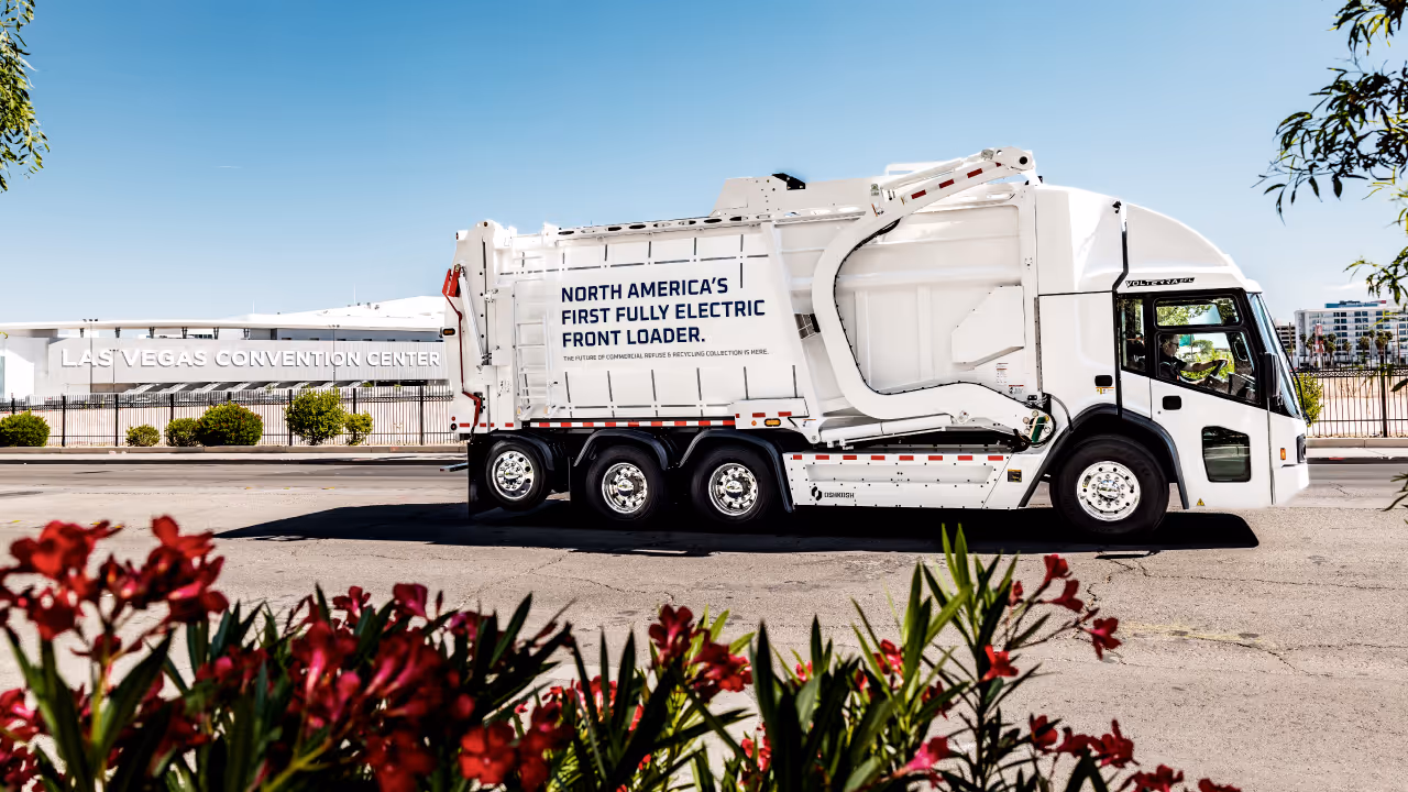
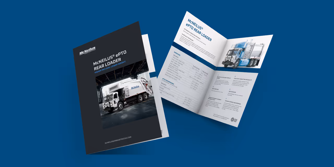
For decades, McNeilus had built its reputation on being the toughest, most reliable workhorse in the waste management sector. While this brand equity was essential to maintain, their business was evolving rapidly, introducing innovative solutions like the Volterra electric vehicle and EPTO electrification systems. The core challenge was navigating the delicate balance between preservation and evolution. To evolve the perception of the brand from a reliable legacy equipment manufacturer to a visionary technology partner, without compromising the trust built on the pillars of ruggedness and dependability required a thorough creative process. The existing visual identity needed refinement to appropriately convey this high-tech, human-touch focus.

Quill began with a deep immersion phase, facilitating comprehensive voice-of-customer research and leadership discovery sessions to chart the path from the current brand position to its ideal future state. This strategic groundwork yielded a new brand theory and four defining characteristics; Streamlined and Structured, Unmatched Reliability and Toughness, Striking and Visionary, and Maintained Relevance, to serve as the brand identity’s foundational DNA.
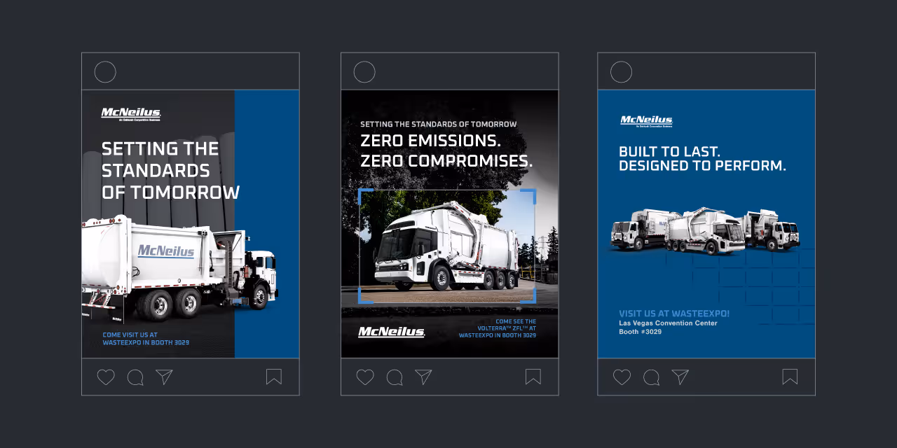
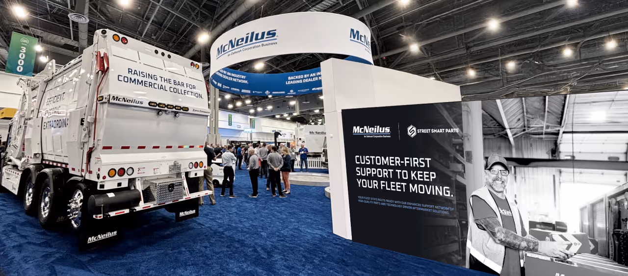
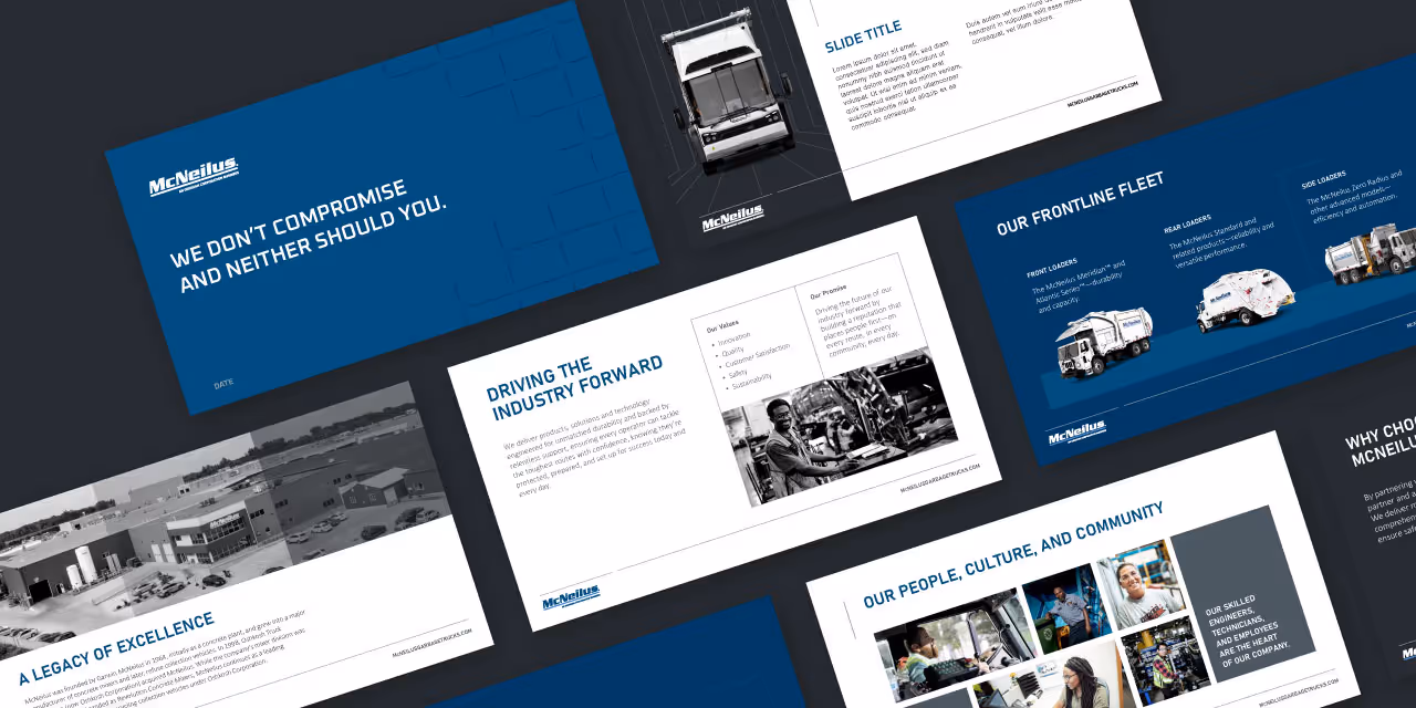
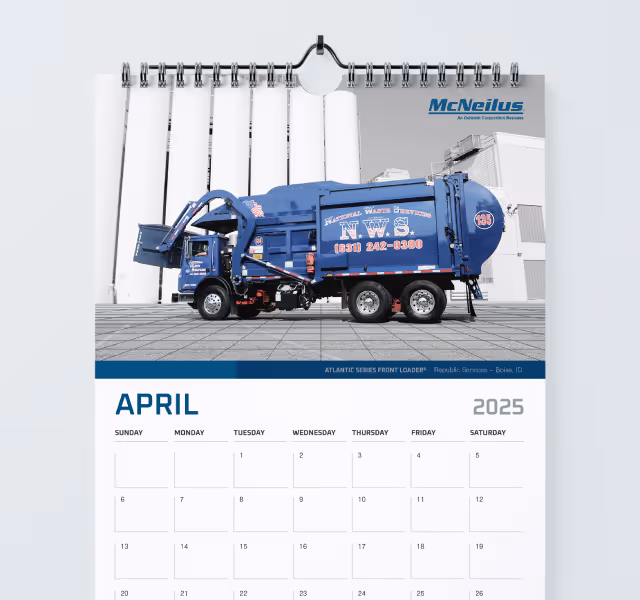
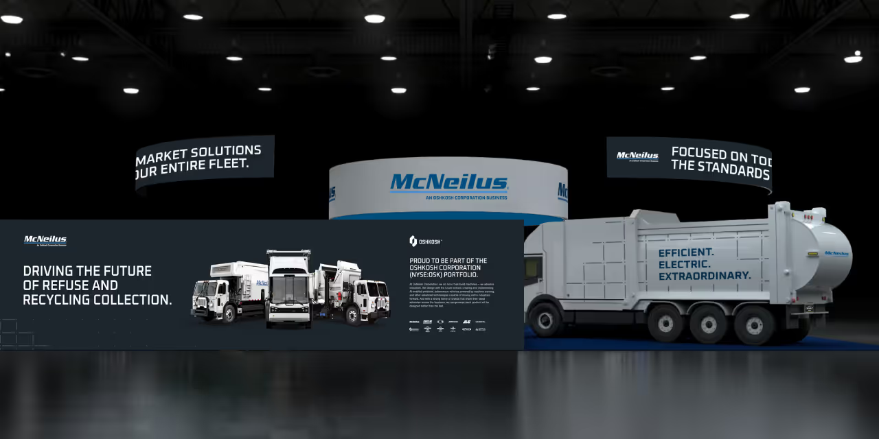
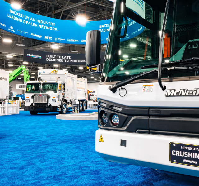
The revised visual identity was designed to maintain decade’s worth of equity, integrating the traditional blue and gray palette with new visual assets that communicate sophistication and technological leadership. The outcome was a fully cohesive system, detailed in an updated brand guidelines document, that empowers McNeilus across all customer touchpoints, from digital ads to technical sales collateral.


The refreshed brand is elevating McNeilus's market position, striking the critical balance between dependability and innovation.
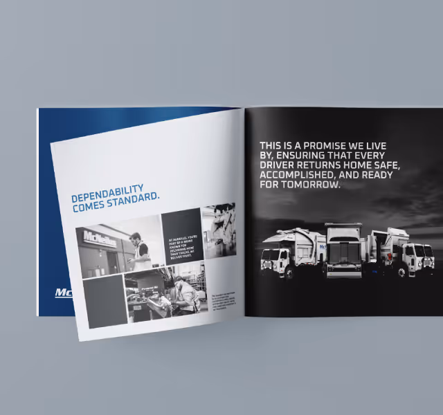
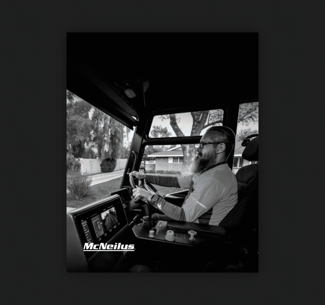
Visuals and messaging now clearly communicate a commitment to people-first engineering and a sustainable vision for the future of the industry. By leveraging the connection to Oshkosh Corporation more explicitly, the brand strengthened its overall credibility and access to cross-industry resources. The consistent application of the new visual and verbal identity system ensures that McNeilus is positioned not just to meet the demands of today but to lead the industry into tomorrow, reinforcing the confidence that "Every truck is a promise."


For decades, McNeilus had built its reputation on being the toughest, most reliable workhorse in the waste management sector. While this brand equity was essential to maintain, their business was evolving rapidly, introducing innovative solutions like the Volterra electric vehicle and EPTO electrification systems. The core challenge was navigating the delicate balance between preservation and evolution. To evolve the perception of the brand from a reliable legacy equipment manufacturer to a visionary technology partner, without compromising the trust built on the pillars of ruggedness and dependability required a thorough creative process. The existing visual identity needed refinement to appropriately convey this high-tech, human-touch focus.
Quill began with a deep immersion phase, facilitating comprehensive voice-of-customer research and leadership discovery sessions to chart the path from the current brand position to its ideal future state. This strategic groundwork yielded a new brand theory and four defining characteristics; Streamlined and Structured, Unmatched Reliability and Toughness, Striking and Visionary, and Maintained Relevance, to serve as the brand identity’s foundational DNA.
The revised visual identity was designed to maintain decade’s worth of equity, integrating the traditional blue and gray palette with new visual assets that communicate sophistication and technological leadership. The outcome was a fully cohesive system, detailed in an updated brand guidelines document, that empowers McNeilus across all customer touchpoints, from digital ads to technical sales collateral.


The refreshed brand is elevating McNeilus's market position, striking the critical balance between dependability and innovation.
Visuals and messaging now clearly communicate a commitment to people-first engineering and a sustainable vision for the future of the industry. By leveraging the connection to Oshkosh Corporation more explicitly, the brand strengthened its overall credibility and access to cross-industry resources. The consistent application of the new visual and verbal identity system ensures that McNeilus is positioned not just to meet the demands of today but to lead the industry into tomorrow, reinforcing the confidence that "Every truck is a promise."


For decades, McNeilus had built its reputation on being the toughest, most reliable workhorse in the waste management sector. While this brand equity was essential to maintain, their business was evolving rapidly, introducing innovative solutions like the Volterra electric vehicle and EPTO electrification systems. The core challenge was navigating the delicate balance between preservation and evolution. To evolve the perception of the brand from a reliable legacy equipment manufacturer to a visionary technology partner, without compromising the trust built on the pillars of ruggedness and dependability required a thorough creative process. The existing visual identity needed refinement to appropriately convey this high-tech, human-touch focus.
Quill began with a deep immersion phase, facilitating comprehensive voice-of-customer research and leadership discovery sessions to chart the path from the current brand position to its ideal future state. This strategic groundwork yielded a new brand theory and four defining characteristics; Streamlined and Structured, Unmatched Reliability and Toughness, Striking and Visionary, and Maintained Relevance, to serve as the brand identity’s foundational DNA.
The revised visual identity was designed to maintain decade’s worth of equity, integrating the traditional blue and gray palette with new visual assets that communicate sophistication and technological leadership. The outcome was a fully cohesive system, detailed in an updated brand guidelines document, that empowers McNeilus across all customer touchpoints, from digital ads to technical sales collateral.

The refreshed brand is elevating McNeilus's market position, striking the critical balance between dependability and innovation.
Visuals and messaging now clearly communicate a commitment to people-first engineering and a sustainable vision for the future of the industry. By leveraging the connection to Oshkosh Corporation more explicitly, the brand strengthened its overall credibility and access to cross-industry resources. The consistent application of the new visual and verbal identity system ensures that McNeilus is positioned not just to meet the demands of today but to lead the industry into tomorrow, reinforcing the confidence that "Every truck is a promise."
For decades, McNeilus had built its reputation on being the toughest, most reliable workhorse in the waste management sector. While this brand equity was essential to maintain, their business was evolving rapidly, introducing innovative solutions like the Volterra electric vehicle and EPTO electrification systems. The core challenge was navigating the delicate balance between preservation and evolution. To evolve the perception of the brand from a reliable legacy equipment manufacturer to a visionary technology partner, without compromising the trust built on the pillars of ruggedness and dependability required a thorough creative process. The existing visual identity needed refinement to appropriately convey this high-tech, human-touch focus.

Quill began with a deep immersion phase, facilitating comprehensive voice-of-customer research and leadership discovery sessions to chart the path from the current brand position to its ideal future state. This strategic groundwork yielded a new brand theory and four defining characteristics; Streamlined and Structured, Unmatched Reliability and Toughness, Striking and Visionary, and Maintained Relevance, to serve as the brand identity’s foundational DNA.
The revised visual identity was designed to maintain decade’s worth of equity, integrating the traditional blue and gray palette with new visual assets that communicate sophistication and technological leadership. The outcome was a fully cohesive system, detailed in an updated brand guidelines document, that empowers McNeilus across all customer touchpoints, from digital ads to technical sales collateral.
The refreshed brand is elevating McNeilus's market position, striking the critical balance between dependability and innovation.
Visuals and messaging now clearly communicate a commitment to people-first engineering and a sustainable vision for the future of the industry. By leveraging the connection to Oshkosh Corporation more explicitly, the brand strengthened its overall credibility and access to cross-industry resources. The consistent application of the new visual and verbal identity system ensures that McNeilus is positioned not just to meet the demands of today but to lead the industry into tomorrow, reinforcing the confidence that "Every truck is a promise."


For decades, McNeilus had built its reputation on being the toughest, most reliable workhorse in the waste management sector. While this brand equity was essential to maintain, their business was evolving rapidly, introducing innovative solutions like the Volterra electric vehicle and EPTO electrification systems. The core challenge was navigating the delicate balance between preservation and evolution. To evolve the perception of the brand from a reliable legacy equipment manufacturer to a visionary technology partner, without compromising the trust built on the pillars of ruggedness and dependability required a thorough creative process. The existing visual identity needed refinement to appropriately convey this high-tech, human-touch focus.


Quill began with a deep immersion phase, facilitating comprehensive voice-of-customer research and leadership discovery sessions to chart the path from the current brand position to its ideal future state. This strategic groundwork yielded a new brand theory and four defining characteristics; Streamlined and Structured, Unmatched Reliability and Toughness, Striking and Visionary, and Maintained Relevance, to serve as the brand identity’s foundational DNA.
The revised visual identity was designed to maintain decade’s worth of equity, integrating the traditional blue and gray palette with new visual assets that communicate sophistication and technological leadership. The outcome was a fully cohesive system, detailed in an updated brand guidelines document, that empowers McNeilus across all customer touchpoints, from digital ads to technical sales collateral.

The refreshed brand is elevating McNeilus's market position, striking the critical balance between dependability and innovation.
Visuals and messaging now clearly communicate a commitment to people-first engineering and a sustainable vision for the future of the industry. By leveraging the connection to Oshkosh Corporation more explicitly, the brand strengthened its overall credibility and access to cross-industry resources. The consistent application of the new visual and verbal identity system ensures that McNeilus is positioned not just to meet the demands of today but to lead the industry into tomorrow, reinforcing the confidence that "Every truck is a promise."


For decades, McNeilus had built its reputation on being the toughest, most reliable workhorse in the waste management sector. While this brand equity was essential to maintain, their business was evolving rapidly, introducing innovative solutions like the Volterra electric vehicle and EPTO electrification systems. The core challenge was navigating the delicate balance between preservation and evolution. To evolve the perception of the brand from a reliable legacy equipment manufacturer to a visionary technology partner, without compromising the trust built on the pillars of ruggedness and dependability required a thorough creative process. The existing visual identity needed refinement to appropriately convey this high-tech, human-touch focus.

Quill began with a deep immersion phase, facilitating comprehensive voice-of-customer research and leadership discovery sessions to chart the path from the current brand position to its ideal future state. This strategic groundwork yielded a new brand theory and four defining characteristics; Streamlined and Structured, Unmatched Reliability and Toughness, Striking and Visionary, and Maintained Relevance, to serve as the brand identity’s foundational DNA.
The revised visual identity was designed to maintain decade’s worth of equity, integrating the traditional blue and gray palette with new visual assets that communicate sophistication and technological leadership. The outcome was a fully cohesive system, detailed in an updated brand guidelines document, that empowers McNeilus across all customer touchpoints, from digital ads to technical sales collateral.


The refreshed brand is elevating McNeilus's market position, striking the critical balance between dependability and innovation.
Visuals and messaging now clearly communicate a commitment to people-first engineering and a sustainable vision for the future of the industry. By leveraging the connection to Oshkosh Corporation more explicitly, the brand strengthened its overall credibility and access to cross-industry resources. The consistent application of the new visual and verbal identity system ensures that McNeilus is positioned not just to meet the demands of today but to lead the industry into tomorrow, reinforcing the confidence that "Every truck is a promise."
For decades, McNeilus had built its reputation on being the toughest, most reliable workhorse in the waste management sector. While this brand equity was essential to maintain, their business was evolving rapidly, introducing innovative solutions like the Volterra electric vehicle and EPTO electrification systems. The core challenge was navigating the delicate balance between preservation and evolution. To evolve the perception of the brand from a reliable legacy equipment manufacturer to a visionary technology partner, without compromising the trust built on the pillars of ruggedness and dependability required a thorough creative process. The existing visual identity needed refinement to appropriately convey this high-tech, human-touch focus.


Quill began with a deep immersion phase, facilitating comprehensive voice-of-customer research and leadership discovery sessions to chart the path from the current brand position to its ideal future state. This strategic groundwork yielded a new brand theory and four defining characteristics; Streamlined and Structured, Unmatched Reliability and Toughness, Striking and Visionary, and Maintained Relevance, to serve as the brand identity’s foundational DNA.
The revised visual identity was designed to maintain decade’s worth of equity, integrating the traditional blue and gray palette with new visual assets that communicate sophistication and technological leadership. The outcome was a fully cohesive system, detailed in an updated brand guidelines document, that empowers McNeilus across all customer touchpoints, from digital ads to technical sales collateral.

The refreshed brand is elevating McNeilus's market position, striking the critical balance between dependability and innovation.
Visuals and messaging now clearly communicate a commitment to people-first engineering and a sustainable vision for the future of the industry. By leveraging the connection to Oshkosh Corporation more explicitly, the brand strengthened its overall credibility and access to cross-industry resources. The consistent application of the new visual and verbal identity system ensures that McNeilus is positioned not just to meet the demands of today but to lead the industry into tomorrow, reinforcing the confidence that "Every truck is a promise."


For decades, McNeilus had built its reputation on being the toughest, most reliable workhorse in the waste management sector. While this brand equity was essential to maintain, their business was evolving rapidly, introducing innovative solutions like the Volterra electric vehicle and EPTO electrification systems. The core challenge was navigating the delicate balance between preservation and evolution. To evolve the perception of the brand from a reliable legacy equipment manufacturer to a visionary technology partner, without compromising the trust built on the pillars of ruggedness and dependability required a thorough creative process. The existing visual identity needed refinement to appropriately convey this high-tech, human-touch focus.

Quill began with a deep immersion phase, facilitating comprehensive voice-of-customer research and leadership discovery sessions to chart the path from the current brand position to its ideal future state. This strategic groundwork yielded a new brand theory and four defining characteristics; Streamlined and Structured, Unmatched Reliability and Toughness, Striking and Visionary, and Maintained Relevance, to serve as the brand identity’s foundational DNA.
The revised visual identity was designed to maintain decade’s worth of equity, integrating the traditional blue and gray palette with new visual assets that communicate sophistication and technological leadership. The outcome was a fully cohesive system, detailed in an updated brand guidelines document, that empowers McNeilus across all customer touchpoints, from digital ads to technical sales collateral.


The refreshed brand is elevating McNeilus's market position, striking the critical balance between dependability and innovation.
Visuals and messaging now clearly communicate a commitment to people-first engineering and a sustainable vision for the future of the industry. By leveraging the connection to Oshkosh Corporation more explicitly, the brand strengthened its overall credibility and access to cross-industry resources. The consistent application of the new visual and verbal identity system ensures that McNeilus is positioned not just to meet the demands of today but to lead the industry into tomorrow, reinforcing the confidence that "Every truck is a promise."


For decades, McNeilus had built its reputation on being the toughest, most reliable workhorse in the waste management sector. While this brand equity was essential to maintain, their business was evolving rapidly, introducing innovative solutions like the Volterra electric vehicle and EPTO electrification systems. The core challenge was navigating the delicate balance between preservation and evolution. To evolve the perception of the brand from a reliable legacy equipment manufacturer to a visionary technology partner, without compromising the trust built on the pillars of ruggedness and dependability required a thorough creative process. The existing visual identity needed refinement to appropriately convey this high-tech, human-touch focus.
Quill began with a deep immersion phase, facilitating comprehensive voice-of-customer research and leadership discovery sessions to chart the path from the current brand position to its ideal future state. This strategic groundwork yielded a new brand theory and four defining characteristics; Streamlined and Structured, Unmatched Reliability and Toughness, Striking and Visionary, and Maintained Relevance, to serve as the brand identity’s foundational DNA.
The revised visual identity was designed to maintain decade’s worth of equity, integrating the traditional blue and gray palette with new visual assets that communicate sophistication and technological leadership. The outcome was a fully cohesive system, detailed in an updated brand guidelines document, that empowers McNeilus across all customer touchpoints, from digital ads to technical sales collateral.

The refreshed brand is elevating McNeilus's market position, striking the critical balance between dependability and innovation.
Visuals and messaging now clearly communicate a commitment to people-first engineering and a sustainable vision for the future of the industry. By leveraging the connection to Oshkosh Corporation more explicitly, the brand strengthened its overall credibility and access to cross-industry resources. The consistent application of the new visual and verbal identity system ensures that McNeilus is positioned not just to meet the demands of today but to lead the industry into tomorrow, reinforcing the confidence that "Every truck is a promise."


For decades, McNeilus had built its reputation on being the toughest, most reliable workhorse in the waste management sector. While this brand equity was essential to maintain, their business was evolving rapidly, introducing innovative solutions like the Volterra electric vehicle and EPTO electrification systems. The core challenge was navigating the delicate balance between preservation and evolution. To evolve the perception of the brand from a reliable legacy equipment manufacturer to a visionary technology partner, without compromising the trust built on the pillars of ruggedness and dependability required a thorough creative process. The existing visual identity needed refinement to appropriately convey this high-tech, human-touch focus.

Quill began with a deep immersion phase, facilitating comprehensive voice-of-customer research and leadership discovery sessions to chart the path from the current brand position to its ideal future state. This strategic groundwork yielded a new brand theory and four defining characteristics; Streamlined and Structured, Unmatched Reliability and Toughness, Striking and Visionary, and Maintained Relevance, to serve as the brand identity’s foundational DNA.
The revised visual identity was designed to maintain decade’s worth of equity, integrating the traditional blue and gray palette with new visual assets that communicate sophistication and technological leadership. The outcome was a fully cohesive system, detailed in an updated brand guidelines document, that empowers McNeilus across all customer touchpoints, from digital ads to technical sales collateral.
The refreshed brand is elevating McNeilus's market position, striking the critical balance between dependability and innovation.
Visuals and messaging now clearly communicate a commitment to people-first engineering and a sustainable vision for the future of the industry. By leveraging the connection to Oshkosh Corporation more explicitly, the brand strengthened its overall credibility and access to cross-industry resources. The consistent application of the new visual and verbal identity system ensures that McNeilus is positioned not just to meet the demands of today but to lead the industry into tomorrow, reinforcing the confidence that "Every truck is a promise."

For decades, McNeilus had built its reputation on being the toughest, most reliable workhorse in the waste management sector. While this brand equity was essential to maintain, their business was evolving rapidly, introducing innovative solutions like the Volterra electric vehicle and EPTO electrification systems. The core challenge was navigating the delicate balance between preservation and evolution. To evolve the perception of the brand from a reliable legacy equipment manufacturer to a visionary technology partner, without compromising the trust built on the pillars of ruggedness and dependability required a thorough creative process. The existing visual identity needed refinement to appropriately convey this high-tech, human-touch focus.

Quill began with a deep immersion phase, facilitating comprehensive voice-of-customer research and leadership discovery sessions to chart the path from the current brand position to its ideal future state. This strategic groundwork yielded a new brand theory and four defining characteristics; Streamlined and Structured, Unmatched Reliability and Toughness, Striking and Visionary, and Maintained Relevance, to serve as the brand identity’s foundational DNA.
The revised visual identity was designed to maintain decade’s worth of equity, integrating the traditional blue and gray palette with new visual assets that communicate sophistication and technological leadership. The outcome was a fully cohesive system, detailed in an updated brand guidelines document, that empowers McNeilus across all customer touchpoints, from digital ads to technical sales collateral.


The refreshed brand is elevating McNeilus's market position, striking the critical balance between dependability and innovation.
Visuals and messaging now clearly communicate a commitment to people-first engineering and a sustainable vision for the future of the industry. By leveraging the connection to Oshkosh Corporation more explicitly, the brand strengthened its overall credibility and access to cross-industry resources. The consistent application of the new visual and verbal identity system ensures that McNeilus is positioned not just to meet the demands of today but to lead the industry into tomorrow, reinforcing the confidence that "Every truck is a promise."


For decades, McNeilus had built its reputation on being the toughest, most reliable workhorse in the waste management sector. While this brand equity was essential to maintain, their business was evolving rapidly, introducing innovative solutions like the Volterra electric vehicle and EPTO electrification systems. The core challenge was navigating the delicate balance between preservation and evolution. To evolve the perception of the brand from a reliable legacy equipment manufacturer to a visionary technology partner, without compromising the trust built on the pillars of ruggedness and dependability required a thorough creative process. The existing visual identity needed refinement to appropriately convey this high-tech, human-touch focus.

Quill began with a deep immersion phase, facilitating comprehensive voice-of-customer research and leadership discovery sessions to chart the path from the current brand position to its ideal future state. This strategic groundwork yielded a new brand theory and four defining characteristics; Streamlined and Structured, Unmatched Reliability and Toughness, Striking and Visionary, and Maintained Relevance, to serve as the brand identity’s foundational DNA.
The revised visual identity was designed to maintain decade’s worth of equity, integrating the traditional blue and gray palette with new visual assets that communicate sophistication and technological leadership. The outcome was a fully cohesive system, detailed in an updated brand guidelines document, that empowers McNeilus across all customer touchpoints, from digital ads to technical sales collateral.

The refreshed brand is elevating McNeilus's market position, striking the critical balance between dependability and innovation.
Visuals and messaging now clearly communicate a commitment to people-first engineering and a sustainable vision for the future of the industry. By leveraging the connection to Oshkosh Corporation more explicitly, the brand strengthened its overall credibility and access to cross-industry resources. The consistent application of the new visual and verbal identity system ensures that McNeilus is positioned not just to meet the demands of today but to lead the industry into tomorrow, reinforcing the confidence that "Every truck is a promise."


For decades, McNeilus had built its reputation on being the toughest, most reliable workhorse in the waste management sector. While this brand equity was essential to maintain, their business was evolving rapidly, introducing innovative solutions like the Volterra electric vehicle and EPTO electrification systems. The core challenge was navigating the delicate balance between preservation and evolution. To evolve the perception of the brand from a reliable legacy equipment manufacturer to a visionary technology partner, without compromising the trust built on the pillars of ruggedness and dependability required a thorough creative process. The existing visual identity needed refinement to appropriately convey this high-tech, human-touch focus.

Quill began with a deep immersion phase, facilitating comprehensive voice-of-customer research and leadership discovery sessions to chart the path from the current brand position to its ideal future state. This strategic groundwork yielded a new brand theory and four defining characteristics; Streamlined and Structured, Unmatched Reliability and Toughness, Striking and Visionary, and Maintained Relevance, to serve as the brand identity’s foundational DNA.
The revised visual identity was designed to maintain decade’s worth of equity, integrating the traditional blue and gray palette with new visual assets that communicate sophistication and technological leadership. The outcome was a fully cohesive system, detailed in an updated brand guidelines document, that empowers McNeilus across all customer touchpoints, from digital ads to technical sales collateral.


The refreshed brand is elevating McNeilus's market position, striking the critical balance between dependability and innovation.
Visuals and messaging now clearly communicate a commitment to people-first engineering and a sustainable vision for the future of the industry. By leveraging the connection to Oshkosh Corporation more explicitly, the brand strengthened its overall credibility and access to cross-industry resources. The consistent application of the new visual and verbal identity system ensures that McNeilus is positioned not just to meet the demands of today but to lead the industry into tomorrow, reinforcing the confidence that "Every truck is a promise."


For decades, McNeilus had built its reputation on being the toughest, most reliable workhorse in the waste management sector. While this brand equity was essential to maintain, their business was evolving rapidly, introducing innovative solutions like the Volterra electric vehicle and EPTO electrification systems. The core challenge was navigating the delicate balance between preservation and evolution. To evolve the perception of the brand from a reliable legacy equipment manufacturer to a visionary technology partner, without compromising the trust built on the pillars of ruggedness and dependability required a thorough creative process. The existing visual identity needed refinement to appropriately convey this high-tech, human-touch focus.


Quill began with a deep immersion phase, facilitating comprehensive voice-of-customer research and leadership discovery sessions to chart the path from the current brand position to its ideal future state. This strategic groundwork yielded a new brand theory and four defining characteristics; Streamlined and Structured, Unmatched Reliability and Toughness, Striking and Visionary, and Maintained Relevance, to serve as the brand identity’s foundational DNA.
The revised visual identity was designed to maintain decade’s worth of equity, integrating the traditional blue and gray palette with new visual assets that communicate sophistication and technological leadership. The outcome was a fully cohesive system, detailed in an updated brand guidelines document, that empowers McNeilus across all customer touchpoints, from digital ads to technical sales collateral.


The refreshed brand is elevating McNeilus's market position, striking the critical balance between dependability and innovation.
Visuals and messaging now clearly communicate a commitment to people-first engineering and a sustainable vision for the future of the industry. By leveraging the connection to Oshkosh Corporation more explicitly, the brand strengthened its overall credibility and access to cross-industry resources. The consistent application of the new visual and verbal identity system ensures that McNeilus is positioned not just to meet the demands of today but to lead the industry into tomorrow, reinforcing the confidence that "Every truck is a promise."


For decades, McNeilus had built its reputation on being the toughest, most reliable workhorse in the waste management sector. While this brand equity was essential to maintain, their business was evolving rapidly, introducing innovative solutions like the Volterra electric vehicle and EPTO electrification systems. The core challenge was navigating the delicate balance between preservation and evolution. To evolve the perception of the brand from a reliable legacy equipment manufacturer to a visionary technology partner, without compromising the trust built on the pillars of ruggedness and dependability required a thorough creative process. The existing visual identity needed refinement to appropriately convey this high-tech, human-touch focus.


Quill began with a deep immersion phase, facilitating comprehensive voice-of-customer research and leadership discovery sessions to chart the path from the current brand position to its ideal future state. This strategic groundwork yielded a new brand theory and four defining characteristics; Streamlined and Structured, Unmatched Reliability and Toughness, Striking and Visionary, and Maintained Relevance, to serve as the brand identity’s foundational DNA.
The revised visual identity was designed to maintain decade’s worth of equity, integrating the traditional blue and gray palette with new visual assets that communicate sophistication and technological leadership. The outcome was a fully cohesive system, detailed in an updated brand guidelines document, that empowers McNeilus across all customer touchpoints, from digital ads to technical sales collateral.

The refreshed brand is elevating McNeilus's market position, striking the critical balance between dependability and innovation.
Visuals and messaging now clearly communicate a commitment to people-first engineering and a sustainable vision for the future of the industry. By leveraging the connection to Oshkosh Corporation more explicitly, the brand strengthened its overall credibility and access to cross-industry resources. The consistent application of the new visual and verbal identity system ensures that McNeilus is positioned not just to meet the demands of today but to lead the industry into tomorrow, reinforcing the confidence that "Every truck is a promise."


For decades, McNeilus had built its reputation on being the toughest, most reliable workhorse in the waste management sector. While this brand equity was essential to maintain, their business was evolving rapidly, introducing innovative solutions like the Volterra electric vehicle and EPTO electrification systems. The core challenge was navigating the delicate balance between preservation and evolution. To evolve the perception of the brand from a reliable legacy equipment manufacturer to a visionary technology partner, without compromising the trust built on the pillars of ruggedness and dependability required a thorough creative process. The existing visual identity needed refinement to appropriately convey this high-tech, human-touch focus.

Quill began with a deep immersion phase, facilitating comprehensive voice-of-customer research and leadership discovery sessions to chart the path from the current brand position to its ideal future state. This strategic groundwork yielded a new brand theory and four defining characteristics; Streamlined and Structured, Unmatched Reliability and Toughness, Striking and Visionary, and Maintained Relevance, to serve as the brand identity’s foundational DNA.
The revised visual identity was designed to maintain decade’s worth of equity, integrating the traditional blue and gray palette with new visual assets that communicate sophistication and technological leadership. The outcome was a fully cohesive system, detailed in an updated brand guidelines document, that empowers McNeilus across all customer touchpoints, from digital ads to technical sales collateral.


The refreshed brand is elevating McNeilus's market position, striking the critical balance between dependability and innovation.
Visuals and messaging now clearly communicate a commitment to people-first engineering and a sustainable vision for the future of the industry. By leveraging the connection to Oshkosh Corporation more explicitly, the brand strengthened its overall credibility and access to cross-industry resources. The consistent application of the new visual and verbal identity system ensures that McNeilus is positioned not just to meet the demands of today but to lead the industry into tomorrow, reinforcing the confidence that "Every truck is a promise."


For decades, McNeilus had built its reputation on being the toughest, most reliable workhorse in the waste management sector. While this brand equity was essential to maintain, their business was evolving rapidly, introducing innovative solutions like the Volterra electric vehicle and EPTO electrification systems. The core challenge was navigating the delicate balance between preservation and evolution. To evolve the perception of the brand from a reliable legacy equipment manufacturer to a visionary technology partner, without compromising the trust built on the pillars of ruggedness and dependability required a thorough creative process. The existing visual identity needed refinement to appropriately convey this high-tech, human-touch focus.


Quill began with a deep immersion phase, facilitating comprehensive voice-of-customer research and leadership discovery sessions to chart the path from the current brand position to its ideal future state. This strategic groundwork yielded a new brand theory and four defining characteristics; Streamlined and Structured, Unmatched Reliability and Toughness, Striking and Visionary, and Maintained Relevance, to serve as the brand identity’s foundational DNA.
The revised visual identity was designed to maintain decade’s worth of equity, integrating the traditional blue and gray palette with new visual assets that communicate sophistication and technological leadership. The outcome was a fully cohesive system, detailed in an updated brand guidelines document, that empowers McNeilus across all customer touchpoints, from digital ads to technical sales collateral.


The refreshed brand is elevating McNeilus's market position, striking the critical balance between dependability and innovation.
Visuals and messaging now clearly communicate a commitment to people-first engineering and a sustainable vision for the future of the industry. By leveraging the connection to Oshkosh Corporation more explicitly, the brand strengthened its overall credibility and access to cross-industry resources. The consistent application of the new visual and verbal identity system ensures that McNeilus is positioned not just to meet the demands of today but to lead the industry into tomorrow, reinforcing the confidence that "Every truck is a promise."


For decades, McNeilus had built its reputation on being the toughest, most reliable workhorse in the waste management sector. While this brand equity was essential to maintain, their business was evolving rapidly, introducing innovative solutions like the Volterra electric vehicle and EPTO electrification systems. The core challenge was navigating the delicate balance between preservation and evolution. To evolve the perception of the brand from a reliable legacy equipment manufacturer to a visionary technology partner, without compromising the trust built on the pillars of ruggedness and dependability required a thorough creative process. The existing visual identity needed refinement to appropriately convey this high-tech, human-touch focus.


Quill began with a deep immersion phase, facilitating comprehensive voice-of-customer research and leadership discovery sessions to chart the path from the current brand position to its ideal future state. This strategic groundwork yielded a new brand theory and four defining characteristics; Streamlined and Structured, Unmatched Reliability and Toughness, Striking and Visionary, and Maintained Relevance, to serve as the brand identity’s foundational DNA.
The revised visual identity was designed to maintain decade’s worth of equity, integrating the traditional blue and gray palette with new visual assets that communicate sophistication and technological leadership. The outcome was a fully cohesive system, detailed in an updated brand guidelines document, that empowers McNeilus across all customer touchpoints, from digital ads to technical sales collateral.


The refreshed brand is elevating McNeilus's market position, striking the critical balance between dependability and innovation.
Visuals and messaging now clearly communicate a commitment to people-first engineering and a sustainable vision for the future of the industry. By leveraging the connection to Oshkosh Corporation more explicitly, the brand strengthened its overall credibility and access to cross-industry resources. The consistent application of the new visual and verbal identity system ensures that McNeilus is positioned not just to meet the demands of today but to lead the industry into tomorrow, reinforcing the confidence that "Every truck is a promise."


For decades, McNeilus had built its reputation on being the toughest, most reliable workhorse in the waste management sector. While this brand equity was essential to maintain, their business was evolving rapidly, introducing innovative solutions like the Volterra electric vehicle and EPTO electrification systems. The core challenge was navigating the delicate balance between preservation and evolution. To evolve the perception of the brand from a reliable legacy equipment manufacturer to a visionary technology partner, without compromising the trust built on the pillars of ruggedness and dependability required a thorough creative process. The existing visual identity needed refinement to appropriately convey this high-tech, human-touch focus.

Quill began with a deep immersion phase, facilitating comprehensive voice-of-customer research and leadership discovery sessions to chart the path from the current brand position to its ideal future state. This strategic groundwork yielded a new brand theory and four defining characteristics; Streamlined and Structured, Unmatched Reliability and Toughness, Striking and Visionary, and Maintained Relevance, to serve as the brand identity’s foundational DNA.
The revised visual identity was designed to maintain decade’s worth of equity, integrating the traditional blue and gray palette with new visual assets that communicate sophistication and technological leadership. The outcome was a fully cohesive system, detailed in an updated brand guidelines document, that empowers McNeilus across all customer touchpoints, from digital ads to technical sales collateral.


The refreshed brand is elevating McNeilus's market position, striking the critical balance between dependability and innovation.
Visuals and messaging now clearly communicate a commitment to people-first engineering and a sustainable vision for the future of the industry. By leveraging the connection to Oshkosh Corporation more explicitly, the brand strengthened its overall credibility and access to cross-industry resources. The consistent application of the new visual and verbal identity system ensures that McNeilus is positioned not just to meet the demands of today but to lead the industry into tomorrow, reinforcing the confidence that "Every truck is a promise."


