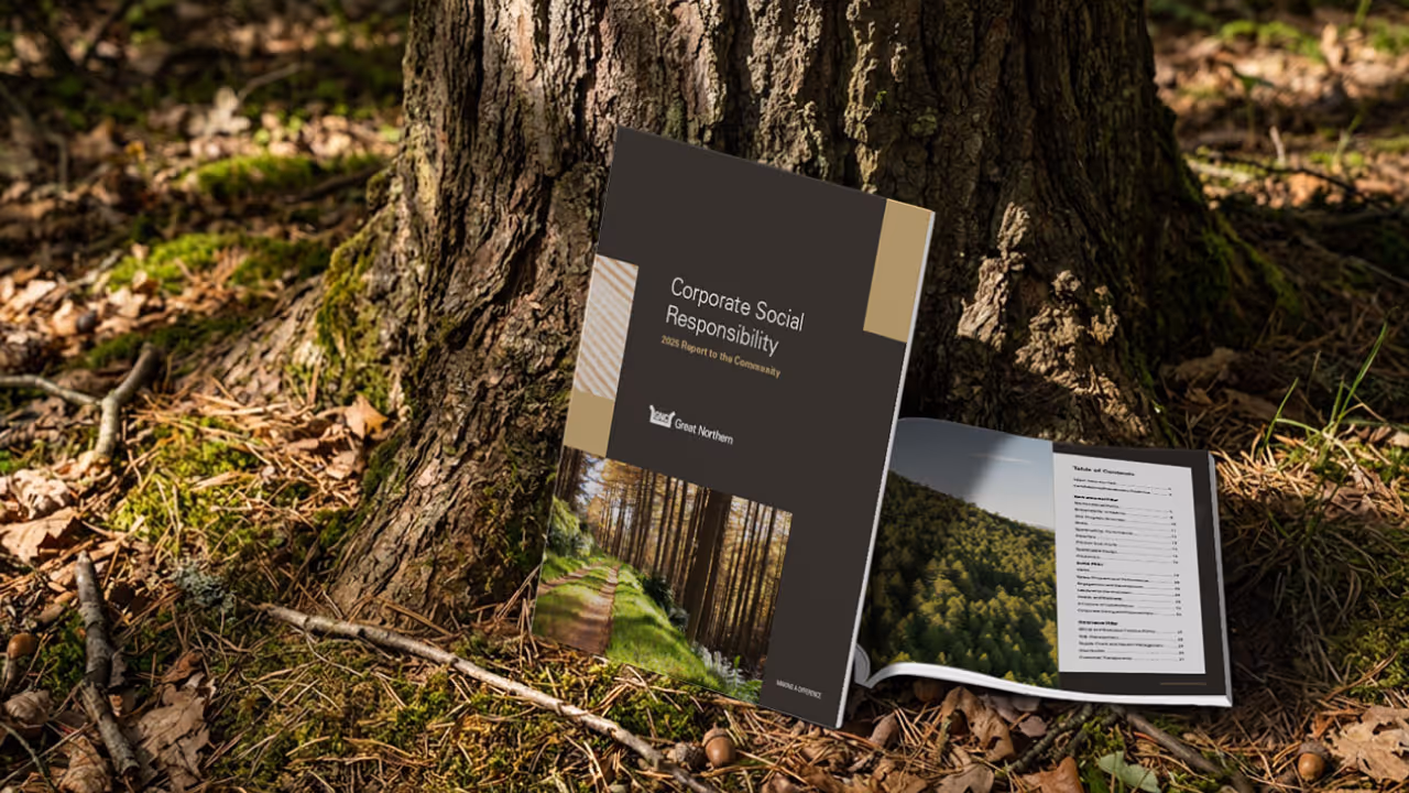
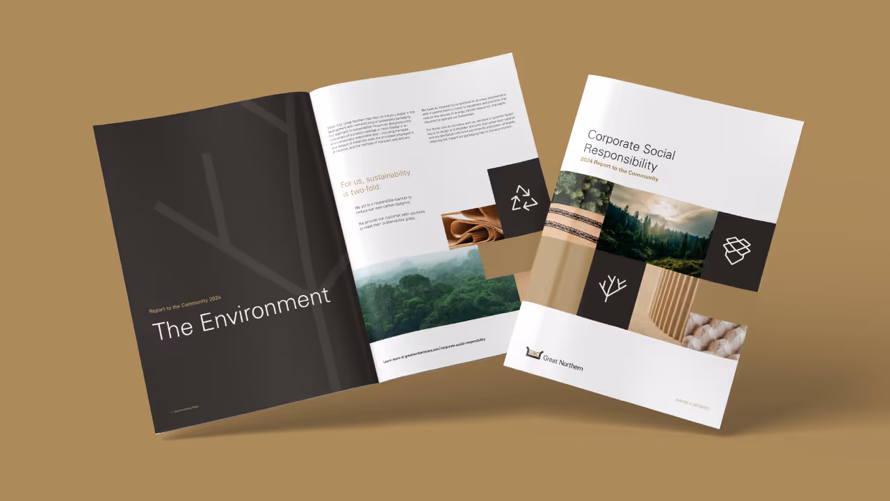
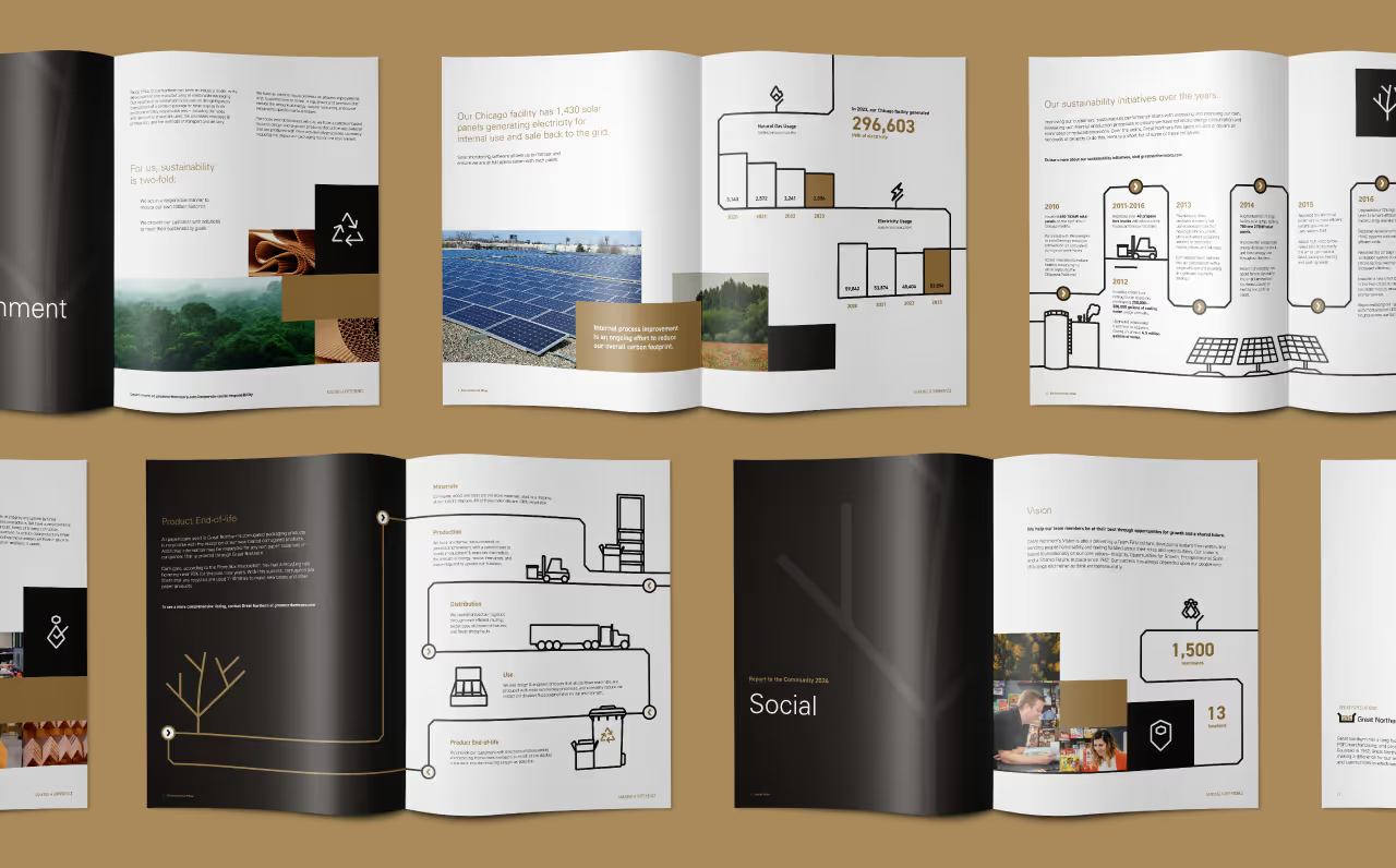
Great Northern wanted to elevate the visibility of their dedication to social responsibility and sustainability as they placed more focus on this part of their mission. As a large parent company overseeing multiple brands, the task was to refresh the visual identity in a nuanced way that captured the unique mission and services of each brand while remaining consistent with the overall Great Northern brand.
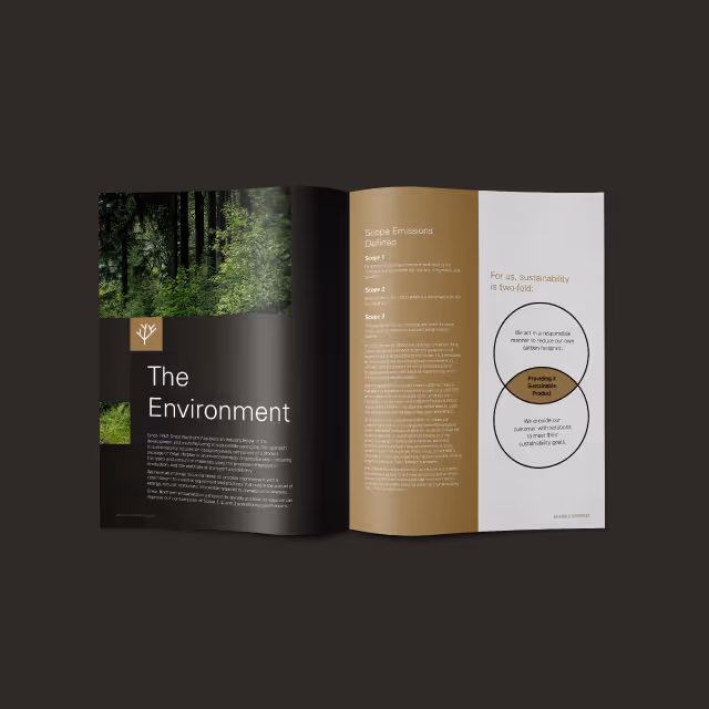
Quill leveraged the existing Great Northern logo as a foundation to create new iconography that integrated the essence of the corporate branding into the sustainability initiative. The centerpiece of this iconography is the Great Northern tree, a modern symbol of sustainability, incorporating angles inspired by the main Great Northern logo for structural consistency.
Maintaining the same typography, Quill adjusted the copy to sentence case, enhancing approachability and legibility for diverse audiences. The color palette retained alignment with the core Great Northern brand, introducing bold accent colors for each sub-brand to distinguish them while preserving a connection to the larger corporate branding.
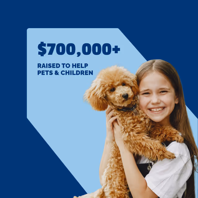
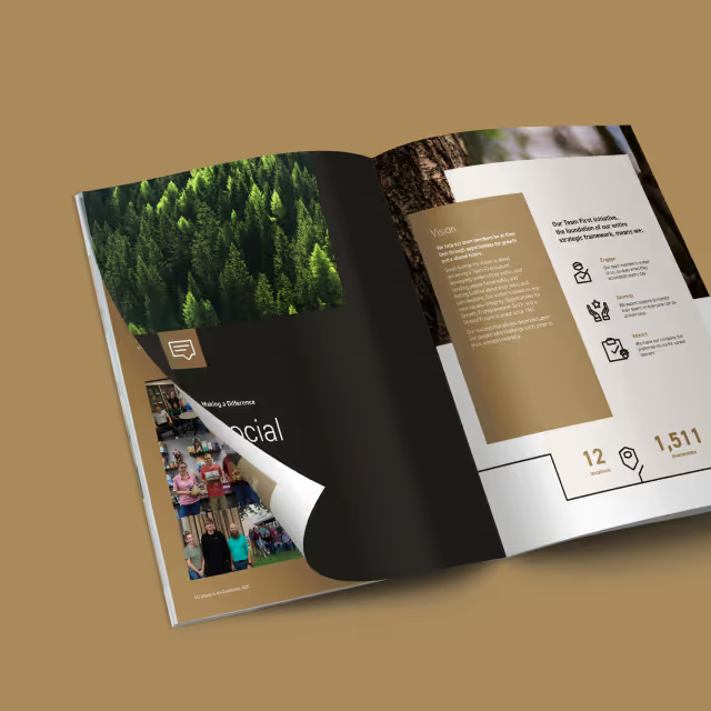
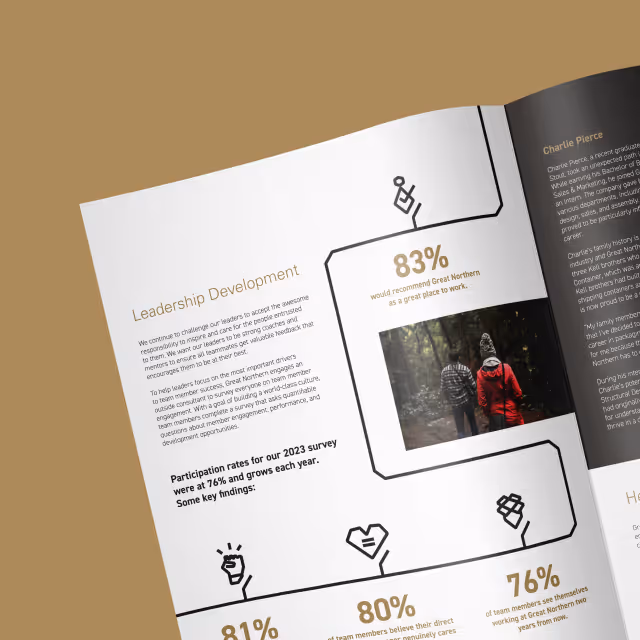
The inclusion of close-up imagery of products and materials emphasized recyclability and eco-friendliness, reinforcing Great Northern's commitment to sustainable solutions. Complementary images of Great Northern team members provided a human connection to the mission and shared future.

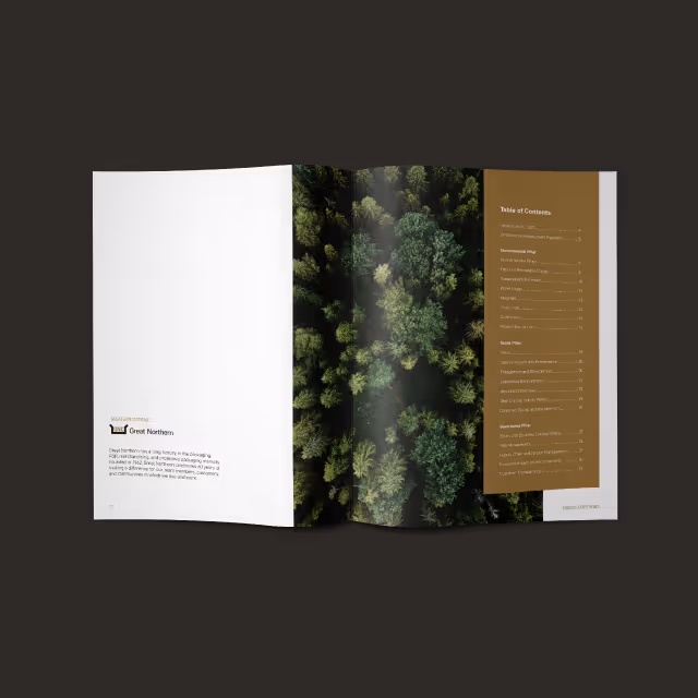
Consistency in visual structure, with strategic nuances for each brand across the Great Northern branded family, establishes familiarity and trust, ensuring the corporate message of sustainability can be felt across all channels of brand communication. The base grid layout, recognizable iconography, and aligned color palette offer structured flow and versatility, applicable across all Great Northern brands, contributing to a cohesive and impactful visual identity.
The visual identity refresh successfully brought Great Northern's social responsibility and sustainability mission to the forefront. Designed with versatility in mind, new elements, icons, and data visualizations can be seamlessly developed in the future as the brands continue to evolve.
Great Northern wanted to elevate the visibility of their dedication to social responsibility and sustainability as they placed more focus on this part of their mission. As a large parent company overseeing multiple brands, the task was to refresh the visual identity in a nuanced way that captured the unique mission and services of each brand while remaining consistent with the overall Great Northern brand.
Quill leveraged the existing Great Northern logo as a foundation to create new iconography that integrated the essence of the corporate branding into the sustainability initiative. The centerpiece of this iconography is the Great Northern tree, a modern symbol of sustainability, incorporating angles inspired by the main Great Northern logo for structural consistency.
Maintaining the same typography, Quill adjusted the copy to sentence case, enhancing approachability and legibility for diverse audiences. The color palette retained alignment with the core Great Northern brand, introducing bold accent colors for each sub-brand to distinguish them while preserving a connection to the larger corporate branding.
The inclusion of close-up imagery of products and materials emphasized recyclability and eco-friendliness, reinforcing Great Northern's commitment to sustainable solutions. Complementary images of Great Northern team members provided a human connection to the mission and shared future.
Consistency in visual structure, with strategic nuances for each brand across the Great Northern branded family, establishes familiarity and trust, ensuring the corporate message of sustainability can be felt across all channels of brand communication. The base grid layout, recognizable iconography, and aligned color palette offer structured flow and versatility, applicable across all Great Northern brands, contributing to a cohesive and impactful visual identity.
The visual identity refresh successfully brought Great Northern's social responsibility and sustainability mission to the forefront. Designed with versatility in mind, new elements, icons, and data visualizations can be seamlessly developed in the future as the brands continue to evolve.


Great Northern wanted to elevate the visibility of their dedication to social responsibility and sustainability as they placed more focus on this part of their mission. As a large parent company overseeing multiple brands, the task was to refresh the visual identity in a nuanced way that captured the unique mission and services of each brand while remaining consistent with the overall Great Northern brand.
Quill leveraged the existing Great Northern logo as a foundation to create new iconography that integrated the essence of the corporate branding into the sustainability initiative. The centerpiece of this iconography is the Great Northern tree, a modern symbol of sustainability, incorporating angles inspired by the main Great Northern logo for structural consistency.
Maintaining the same typography, Quill adjusted the copy to sentence case, enhancing approachability and legibility for diverse audiences. The color palette retained alignment with the core Great Northern brand, introducing bold accent colors for each sub-brand to distinguish them while preserving a connection to the larger corporate branding.
The inclusion of close-up imagery of products and materials emphasized recyclability and eco-friendliness, reinforcing Great Northern's commitment to sustainable solutions. Complementary images of Great Northern team members provided a human connection to the mission and shared future.

Consistency in visual structure, with strategic nuances for each brand across the Great Northern branded family, establishes familiarity and trust, ensuring the corporate message of sustainability can be felt across all channels of brand communication. The base grid layout, recognizable iconography, and aligned color palette offer structured flow and versatility, applicable across all Great Northern brands, contributing to a cohesive and impactful visual identity.
The visual identity refresh successfully brought Great Northern's social responsibility and sustainability mission to the forefront. Designed with versatility in mind, new elements, icons, and data visualizations can be seamlessly developed in the future as the brands continue to evolve.
Great Northern wanted to elevate the visibility of their dedication to social responsibility and sustainability as they placed more focus on this part of their mission. As a large parent company overseeing multiple brands, the task was to refresh the visual identity in a nuanced way that captured the unique mission and services of each brand while remaining consistent with the overall Great Northern brand.

Quill leveraged the existing Great Northern logo as a foundation to create new iconography that integrated the essence of the corporate branding into the sustainability initiative. The centerpiece of this iconography is the Great Northern tree, a modern symbol of sustainability, incorporating angles inspired by the main Great Northern logo for structural consistency.
Maintaining the same typography, Quill adjusted the copy to sentence case, enhancing approachability and legibility for diverse audiences. The color palette retained alignment with the core Great Northern brand, introducing bold accent colors for each sub-brand to distinguish them while preserving a connection to the larger corporate branding.
The inclusion of close-up imagery of products and materials emphasized recyclability and eco-friendliness, reinforcing Great Northern's commitment to sustainable solutions. Complementary images of Great Northern team members provided a human connection to the mission and shared future.
Consistency in visual structure, with strategic nuances for each brand across the Great Northern branded family, establishes familiarity and trust, ensuring the corporate message of sustainability can be felt across all channels of brand communication. The base grid layout, recognizable iconography, and aligned color palette offer structured flow and versatility, applicable across all Great Northern brands, contributing to a cohesive and impactful visual identity.
The visual identity refresh successfully brought Great Northern's social responsibility and sustainability mission to the forefront. Designed with versatility in mind, new elements, icons, and data visualizations can be seamlessly developed in the future as the brands continue to evolve.

Great Northern wanted to elevate the visibility of their dedication to social responsibility and sustainability as they placed more focus on this part of their mission. As a large parent company overseeing multiple brands, the task was to refresh the visual identity in a nuanced way that captured the unique mission and services of each brand while remaining consistent with the overall Great Northern brand.


Quill leveraged the existing Great Northern logo as a foundation to create new iconography that integrated the essence of the corporate branding into the sustainability initiative. The centerpiece of this iconography is the Great Northern tree, a modern symbol of sustainability, incorporating angles inspired by the main Great Northern logo for structural consistency.
Maintaining the same typography, Quill adjusted the copy to sentence case, enhancing approachability and legibility for diverse audiences. The color palette retained alignment with the core Great Northern brand, introducing bold accent colors for each sub-brand to distinguish them while preserving a connection to the larger corporate branding.
The inclusion of close-up imagery of products and materials emphasized recyclability and eco-friendliness, reinforcing Great Northern's commitment to sustainable solutions. Complementary images of Great Northern team members provided a human connection to the mission and shared future.


Consistency in visual structure, with strategic nuances for each brand across the Great Northern branded family, establishes familiarity and trust, ensuring the corporate message of sustainability can be felt across all channels of brand communication. The base grid layout, recognizable iconography, and aligned color palette offer structured flow and versatility, applicable across all Great Northern brands, contributing to a cohesive and impactful visual identity.
The visual identity refresh successfully brought Great Northern's social responsibility and sustainability mission to the forefront. Designed with versatility in mind, new elements, icons, and data visualizations can be seamlessly developed in the future as the brands continue to evolve.

Great Northern wanted to elevate the visibility of their dedication to social responsibility and sustainability as they placed more focus on this part of their mission. As a large parent company overseeing multiple brands, the task was to refresh the visual identity in a nuanced way that captured the unique mission and services of each brand while remaining consistent with the overall Great Northern brand.

Quill leveraged the existing Great Northern logo as a foundation to create new iconography that integrated the essence of the corporate branding into the sustainability initiative. The centerpiece of this iconography is the Great Northern tree, a modern symbol of sustainability, incorporating angles inspired by the main Great Northern logo for structural consistency.
Maintaining the same typography, Quill adjusted the copy to sentence case, enhancing approachability and legibility for diverse audiences. The color palette retained alignment with the core Great Northern brand, introducing bold accent colors for each sub-brand to distinguish them while preserving a connection to the larger corporate branding.
The inclusion of close-up imagery of products and materials emphasized recyclability and eco-friendliness, reinforcing Great Northern's commitment to sustainable solutions. Complementary images of Great Northern team members provided a human connection to the mission and shared future.


Consistency in visual structure, with strategic nuances for each brand across the Great Northern branded family, establishes familiarity and trust, ensuring the corporate message of sustainability can be felt across all channels of brand communication. The base grid layout, recognizable iconography, and aligned color palette offer structured flow and versatility, applicable across all Great Northern brands, contributing to a cohesive and impactful visual identity.
The visual identity refresh successfully brought Great Northern's social responsibility and sustainability mission to the forefront. Designed with versatility in mind, new elements, icons, and data visualizations can be seamlessly developed in the future as the brands continue to evolve.
Great Northern wanted to elevate the visibility of their dedication to social responsibility and sustainability as they placed more focus on this part of their mission. As a large parent company overseeing multiple brands, the task was to refresh the visual identity in a nuanced way that captured the unique mission and services of each brand while remaining consistent with the overall Great Northern brand.


Quill leveraged the existing Great Northern logo as a foundation to create new iconography that integrated the essence of the corporate branding into the sustainability initiative. The centerpiece of this iconography is the Great Northern tree, a modern symbol of sustainability, incorporating angles inspired by the main Great Northern logo for structural consistency.
Maintaining the same typography, Quill adjusted the copy to sentence case, enhancing approachability and legibility for diverse audiences. The color palette retained alignment with the core Great Northern brand, introducing bold accent colors for each sub-brand to distinguish them while preserving a connection to the larger corporate branding.
The inclusion of close-up imagery of products and materials emphasized recyclability and eco-friendliness, reinforcing Great Northern's commitment to sustainable solutions. Complementary images of Great Northern team members provided a human connection to the mission and shared future.


Consistency in visual structure, with strategic nuances for each brand across the Great Northern branded family, establishes familiarity and trust, ensuring the corporate message of sustainability can be felt across all channels of brand communication. The base grid layout, recognizable iconography, and aligned color palette offer structured flow and versatility, applicable across all Great Northern brands, contributing to a cohesive and impactful visual identity.
The visual identity refresh successfully brought Great Northern's social responsibility and sustainability mission to the forefront. Designed with versatility in mind, new elements, icons, and data visualizations can be seamlessly developed in the future as the brands continue to evolve.


Great Northern wanted to elevate the visibility of their dedication to social responsibility and sustainability as they placed more focus on this part of their mission. As a large parent company overseeing multiple brands, the task was to refresh the visual identity in a nuanced way that captured the unique mission and services of each brand while remaining consistent with the overall Great Northern brand.
Quill leveraged the existing Great Northern logo as a foundation to create new iconography that integrated the essence of the corporate branding into the sustainability initiative. The centerpiece of this iconography is the Great Northern tree, a modern symbol of sustainability, incorporating angles inspired by the main Great Northern logo for structural consistency.
Maintaining the same typography, Quill adjusted the copy to sentence case, enhancing approachability and legibility for diverse audiences. The color palette retained alignment with the core Great Northern brand, introducing bold accent colors for each sub-brand to distinguish them while preserving a connection to the larger corporate branding.
The inclusion of close-up imagery of products and materials emphasized recyclability and eco-friendliness, reinforcing Great Northern's commitment to sustainable solutions. Complementary images of Great Northern team members provided a human connection to the mission and shared future.

Consistency in visual structure, with strategic nuances for each brand across the Great Northern branded family, establishes familiarity and trust, ensuring the corporate message of sustainability can be felt across all channels of brand communication. The base grid layout, recognizable iconography, and aligned color palette offer structured flow and versatility, applicable across all Great Northern brands, contributing to a cohesive and impactful visual identity.
The visual identity refresh successfully brought Great Northern's social responsibility and sustainability mission to the forefront. Designed with versatility in mind, new elements, icons, and data visualizations can be seamlessly developed in the future as the brands continue to evolve.


Great Northern wanted to elevate the visibility of their dedication to social responsibility and sustainability as they placed more focus on this part of their mission. As a large parent company overseeing multiple brands, the task was to refresh the visual identity in a nuanced way that captured the unique mission and services of each brand while remaining consistent with the overall Great Northern brand.

Quill leveraged the existing Great Northern logo as a foundation to create new iconography that integrated the essence of the corporate branding into the sustainability initiative. The centerpiece of this iconography is the Great Northern tree, a modern symbol of sustainability, incorporating angles inspired by the main Great Northern logo for structural consistency.
Maintaining the same typography, Quill adjusted the copy to sentence case, enhancing approachability and legibility for diverse audiences. The color palette retained alignment with the core Great Northern brand, introducing bold accent colors for each sub-brand to distinguish them while preserving a connection to the larger corporate branding.
The inclusion of close-up imagery of products and materials emphasized recyclability and eco-friendliness, reinforcing Great Northern's commitment to sustainable solutions. Complementary images of Great Northern team members provided a human connection to the mission and shared future.

Consistency in visual structure, with strategic nuances for each brand across the Great Northern branded family, establishes familiarity and trust, ensuring the corporate message of sustainability can be felt across all channels of brand communication. The base grid layout, recognizable iconography, and aligned color palette offer structured flow and versatility, applicable across all Great Northern brands, contributing to a cohesive and impactful visual identity.
The visual identity refresh successfully brought Great Northern's social responsibility and sustainability mission to the forefront. Designed with versatility in mind, new elements, icons, and data visualizations can be seamlessly developed in the future as the brands continue to evolve.

Great Northern wanted to elevate the visibility of their dedication to social responsibility and sustainability as they placed more focus on this part of their mission. As a large parent company overseeing multiple brands, the task was to refresh the visual identity in a nuanced way that captured the unique mission and services of each brand while remaining consistent with the overall Great Northern brand.
Quill leveraged the existing Great Northern logo as a foundation to create new iconography that integrated the essence of the corporate branding into the sustainability initiative. The centerpiece of this iconography is the Great Northern tree, a modern symbol of sustainability, incorporating angles inspired by the main Great Northern logo for structural consistency.
Maintaining the same typography, Quill adjusted the copy to sentence case, enhancing approachability and legibility for diverse audiences. The color palette retained alignment with the core Great Northern brand, introducing bold accent colors for each sub-brand to distinguish them while preserving a connection to the larger corporate branding.
The inclusion of close-up imagery of products and materials emphasized recyclability and eco-friendliness, reinforcing Great Northern's commitment to sustainable solutions. Complementary images of Great Northern team members provided a human connection to the mission and shared future.
Consistency in visual structure, with strategic nuances for each brand across the Great Northern branded family, establishes familiarity and trust, ensuring the corporate message of sustainability can be felt across all channels of brand communication. The base grid layout, recognizable iconography, and aligned color palette offer structured flow and versatility, applicable across all Great Northern brands, contributing to a cohesive and impactful visual identity.
The visual identity refresh successfully brought Great Northern's social responsibility and sustainability mission to the forefront. Designed with versatility in mind, new elements, icons, and data visualizations can be seamlessly developed in the future as the brands continue to evolve.

Great Northern wanted to elevate the visibility of their dedication to social responsibility and sustainability as they placed more focus on this part of their mission. As a large parent company overseeing multiple brands, the task was to refresh the visual identity in a nuanced way that captured the unique mission and services of each brand while remaining consistent with the overall Great Northern brand.


Quill leveraged the existing Great Northern logo as a foundation to create new iconography that integrated the essence of the corporate branding into the sustainability initiative. The centerpiece of this iconography is the Great Northern tree, a modern symbol of sustainability, incorporating angles inspired by the main Great Northern logo for structural consistency.
Maintaining the same typography, Quill adjusted the copy to sentence case, enhancing approachability and legibility for diverse audiences. The color palette retained alignment with the core Great Northern brand, introducing bold accent colors for each sub-brand to distinguish them while preserving a connection to the larger corporate branding.
The inclusion of close-up imagery of products and materials emphasized recyclability and eco-friendliness, reinforcing Great Northern's commitment to sustainable solutions. Complementary images of Great Northern team members provided a human connection to the mission and shared future.

Consistency in visual structure, with strategic nuances for each brand across the Great Northern branded family, establishes familiarity and trust, ensuring the corporate message of sustainability can be felt across all channels of brand communication. The base grid layout, recognizable iconography, and aligned color palette offer structured flow and versatility, applicable across all Great Northern brands, contributing to a cohesive and impactful visual identity.
The visual identity refresh successfully brought Great Northern's social responsibility and sustainability mission to the forefront. Designed with versatility in mind, new elements, icons, and data visualizations can be seamlessly developed in the future as the brands continue to evolve.


Great Northern wanted to elevate the visibility of their dedication to social responsibility and sustainability as they placed more focus on this part of their mission. As a large parent company overseeing multiple brands, the task was to refresh the visual identity in a nuanced way that captured the unique mission and services of each brand while remaining consistent with the overall Great Northern brand.

Quill leveraged the existing Great Northern logo as a foundation to create new iconography that integrated the essence of the corporate branding into the sustainability initiative. The centerpiece of this iconography is the Great Northern tree, a modern symbol of sustainability, incorporating angles inspired by the main Great Northern logo for structural consistency.
Maintaining the same typography, Quill adjusted the copy to sentence case, enhancing approachability and legibility for diverse audiences. The color palette retained alignment with the core Great Northern brand, introducing bold accent colors for each sub-brand to distinguish them while preserving a connection to the larger corporate branding.
The inclusion of close-up imagery of products and materials emphasized recyclability and eco-friendliness, reinforcing Great Northern's commitment to sustainable solutions. Complementary images of Great Northern team members provided a human connection to the mission and shared future.

Consistency in visual structure, with strategic nuances for each brand across the Great Northern branded family, establishes familiarity and trust, ensuring the corporate message of sustainability can be felt across all channels of brand communication. The base grid layout, recognizable iconography, and aligned color palette offer structured flow and versatility, applicable across all Great Northern brands, contributing to a cohesive and impactful visual identity.
The visual identity refresh successfully brought Great Northern's social responsibility and sustainability mission to the forefront. Designed with versatility in mind, new elements, icons, and data visualizations can be seamlessly developed in the future as the brands continue to evolve.
Great Northern wanted to elevate the visibility of their dedication to social responsibility and sustainability as they placed more focus on this part of their mission. As a large parent company overseeing multiple brands, the task was to refresh the visual identity in a nuanced way that captured the unique mission and services of each brand while remaining consistent with the overall Great Northern brand.

Quill leveraged the existing Great Northern logo as a foundation to create new iconography that integrated the essence of the corporate branding into the sustainability initiative. The centerpiece of this iconography is the Great Northern tree, a modern symbol of sustainability, incorporating angles inspired by the main Great Northern logo for structural consistency.
Maintaining the same typography, Quill adjusted the copy to sentence case, enhancing approachability and legibility for diverse audiences. The color palette retained alignment with the core Great Northern brand, introducing bold accent colors for each sub-brand to distinguish them while preserving a connection to the larger corporate branding.
The inclusion of close-up imagery of products and materials emphasized recyclability and eco-friendliness, reinforcing Great Northern's commitment to sustainable solutions. Complementary images of Great Northern team members provided a human connection to the mission and shared future.
Consistency in visual structure, with strategic nuances for each brand across the Great Northern branded family, establishes familiarity and trust, ensuring the corporate message of sustainability can be felt across all channels of brand communication. The base grid layout, recognizable iconography, and aligned color palette offer structured flow and versatility, applicable across all Great Northern brands, contributing to a cohesive and impactful visual identity.
The visual identity refresh successfully brought Great Northern's social responsibility and sustainability mission to the forefront. Designed with versatility in mind, new elements, icons, and data visualizations can be seamlessly developed in the future as the brands continue to evolve.


Great Northern wanted to elevate the visibility of their dedication to social responsibility and sustainability as they placed more focus on this part of their mission. As a large parent company overseeing multiple brands, the task was to refresh the visual identity in a nuanced way that captured the unique mission and services of each brand while remaining consistent with the overall Great Northern brand.


Quill leveraged the existing Great Northern logo as a foundation to create new iconography that integrated the essence of the corporate branding into the sustainability initiative. The centerpiece of this iconography is the Great Northern tree, a modern symbol of sustainability, incorporating angles inspired by the main Great Northern logo for structural consistency.
Maintaining the same typography, Quill adjusted the copy to sentence case, enhancing approachability and legibility for diverse audiences. The color palette retained alignment with the core Great Northern brand, introducing bold accent colors for each sub-brand to distinguish them while preserving a connection to the larger corporate branding.
The inclusion of close-up imagery of products and materials emphasized recyclability and eco-friendliness, reinforcing Great Northern's commitment to sustainable solutions. Complementary images of Great Northern team members provided a human connection to the mission and shared future.

Consistency in visual structure, with strategic nuances for each brand across the Great Northern branded family, establishes familiarity and trust, ensuring the corporate message of sustainability can be felt across all channels of brand communication. The base grid layout, recognizable iconography, and aligned color palette offer structured flow and versatility, applicable across all Great Northern brands, contributing to a cohesive and impactful visual identity.
The visual identity refresh successfully brought Great Northern's social responsibility and sustainability mission to the forefront. Designed with versatility in mind, new elements, icons, and data visualizations can be seamlessly developed in the future as the brands continue to evolve.


Great Northern wanted to elevate the visibility of their dedication to social responsibility and sustainability as they placed more focus on this part of their mission. As a large parent company overseeing multiple brands, the task was to refresh the visual identity in a nuanced way that captured the unique mission and services of each brand while remaining consistent with the overall Great Northern brand.

Quill leveraged the existing Great Northern logo as a foundation to create new iconography that integrated the essence of the corporate branding into the sustainability initiative. The centerpiece of this iconography is the Great Northern tree, a modern symbol of sustainability, incorporating angles inspired by the main Great Northern logo for structural consistency.
Maintaining the same typography, Quill adjusted the copy to sentence case, enhancing approachability and legibility for diverse audiences. The color palette retained alignment with the core Great Northern brand, introducing bold accent colors for each sub-brand to distinguish them while preserving a connection to the larger corporate branding.
The inclusion of close-up imagery of products and materials emphasized recyclability and eco-friendliness, reinforcing Great Northern's commitment to sustainable solutions. Complementary images of Great Northern team members provided a human connection to the mission and shared future.


Consistency in visual structure, with strategic nuances for each brand across the Great Northern branded family, establishes familiarity and trust, ensuring the corporate message of sustainability can be felt across all channels of brand communication. The base grid layout, recognizable iconography, and aligned color palette offer structured flow and versatility, applicable across all Great Northern brands, contributing to a cohesive and impactful visual identity.
The visual identity refresh successfully brought Great Northern's social responsibility and sustainability mission to the forefront. Designed with versatility in mind, new elements, icons, and data visualizations can be seamlessly developed in the future as the brands continue to evolve.


Great Northern wanted to elevate the visibility of their dedication to social responsibility and sustainability as they placed more focus on this part of their mission. As a large parent company overseeing multiple brands, the task was to refresh the visual identity in a nuanced way that captured the unique mission and services of each brand while remaining consistent with the overall Great Northern brand.


Quill leveraged the existing Great Northern logo as a foundation to create new iconography that integrated the essence of the corporate branding into the sustainability initiative. The centerpiece of this iconography is the Great Northern tree, a modern symbol of sustainability, incorporating angles inspired by the main Great Northern logo for structural consistency.
Maintaining the same typography, Quill adjusted the copy to sentence case, enhancing approachability and legibility for diverse audiences. The color palette retained alignment with the core Great Northern brand, introducing bold accent colors for each sub-brand to distinguish them while preserving a connection to the larger corporate branding.
The inclusion of close-up imagery of products and materials emphasized recyclability and eco-friendliness, reinforcing Great Northern's commitment to sustainable solutions. Complementary images of Great Northern team members provided a human connection to the mission and shared future.


Consistency in visual structure, with strategic nuances for each brand across the Great Northern branded family, establishes familiarity and trust, ensuring the corporate message of sustainability can be felt across all channels of brand communication. The base grid layout, recognizable iconography, and aligned color palette offer structured flow and versatility, applicable across all Great Northern brands, contributing to a cohesive and impactful visual identity.
The visual identity refresh successfully brought Great Northern's social responsibility and sustainability mission to the forefront. Designed with versatility in mind, new elements, icons, and data visualizations can be seamlessly developed in the future as the brands continue to evolve.


Great Northern wanted to elevate the visibility of their dedication to social responsibility and sustainability as they placed more focus on this part of their mission. As a large parent company overseeing multiple brands, the task was to refresh the visual identity in a nuanced way that captured the unique mission and services of each brand while remaining consistent with the overall Great Northern brand.


Quill leveraged the existing Great Northern logo as a foundation to create new iconography that integrated the essence of the corporate branding into the sustainability initiative. The centerpiece of this iconography is the Great Northern tree, a modern symbol of sustainability, incorporating angles inspired by the main Great Northern logo for structural consistency.
Maintaining the same typography, Quill adjusted the copy to sentence case, enhancing approachability and legibility for diverse audiences. The color palette retained alignment with the core Great Northern brand, introducing bold accent colors for each sub-brand to distinguish them while preserving a connection to the larger corporate branding.
The inclusion of close-up imagery of products and materials emphasized recyclability and eco-friendliness, reinforcing Great Northern's commitment to sustainable solutions. Complementary images of Great Northern team members provided a human connection to the mission and shared future.

Consistency in visual structure, with strategic nuances for each brand across the Great Northern branded family, establishes familiarity and trust, ensuring the corporate message of sustainability can be felt across all channels of brand communication. The base grid layout, recognizable iconography, and aligned color palette offer structured flow and versatility, applicable across all Great Northern brands, contributing to a cohesive and impactful visual identity.
The visual identity refresh successfully brought Great Northern's social responsibility and sustainability mission to the forefront. Designed with versatility in mind, new elements, icons, and data visualizations can be seamlessly developed in the future as the brands continue to evolve.


Great Northern wanted to elevate the visibility of their dedication to social responsibility and sustainability as they placed more focus on this part of their mission. As a large parent company overseeing multiple brands, the task was to refresh the visual identity in a nuanced way that captured the unique mission and services of each brand while remaining consistent with the overall Great Northern brand.

Quill leveraged the existing Great Northern logo as a foundation to create new iconography that integrated the essence of the corporate branding into the sustainability initiative. The centerpiece of this iconography is the Great Northern tree, a modern symbol of sustainability, incorporating angles inspired by the main Great Northern logo for structural consistency.
Maintaining the same typography, Quill adjusted the copy to sentence case, enhancing approachability and legibility for diverse audiences. The color palette retained alignment with the core Great Northern brand, introducing bold accent colors for each sub-brand to distinguish them while preserving a connection to the larger corporate branding.
The inclusion of close-up imagery of products and materials emphasized recyclability and eco-friendliness, reinforcing Great Northern's commitment to sustainable solutions. Complementary images of Great Northern team members provided a human connection to the mission and shared future.


Consistency in visual structure, with strategic nuances for each brand across the Great Northern branded family, establishes familiarity and trust, ensuring the corporate message of sustainability can be felt across all channels of brand communication. The base grid layout, recognizable iconography, and aligned color palette offer structured flow and versatility, applicable across all Great Northern brands, contributing to a cohesive and impactful visual identity.
The visual identity refresh successfully brought Great Northern's social responsibility and sustainability mission to the forefront. Designed with versatility in mind, new elements, icons, and data visualizations can be seamlessly developed in the future as the brands continue to evolve.


Great Northern wanted to elevate the visibility of their dedication to social responsibility and sustainability as they placed more focus on this part of their mission. As a large parent company overseeing multiple brands, the task was to refresh the visual identity in a nuanced way that captured the unique mission and services of each brand while remaining consistent with the overall Great Northern brand.


Quill leveraged the existing Great Northern logo as a foundation to create new iconography that integrated the essence of the corporate branding into the sustainability initiative. The centerpiece of this iconography is the Great Northern tree, a modern symbol of sustainability, incorporating angles inspired by the main Great Northern logo for structural consistency.
Maintaining the same typography, Quill adjusted the copy to sentence case, enhancing approachability and legibility for diverse audiences. The color palette retained alignment with the core Great Northern brand, introducing bold accent colors for each sub-brand to distinguish them while preserving a connection to the larger corporate branding.
The inclusion of close-up imagery of products and materials emphasized recyclability and eco-friendliness, reinforcing Great Northern's commitment to sustainable solutions. Complementary images of Great Northern team members provided a human connection to the mission and shared future.


Consistency in visual structure, with strategic nuances for each brand across the Great Northern branded family, establishes familiarity and trust, ensuring the corporate message of sustainability can be felt across all channels of brand communication. The base grid layout, recognizable iconography, and aligned color palette offer structured flow and versatility, applicable across all Great Northern brands, contributing to a cohesive and impactful visual identity.
The visual identity refresh successfully brought Great Northern's social responsibility and sustainability mission to the forefront. Designed with versatility in mind, new elements, icons, and data visualizations can be seamlessly developed in the future as the brands continue to evolve.


Great Northern wanted to elevate the visibility of their dedication to social responsibility and sustainability as they placed more focus on this part of their mission. As a large parent company overseeing multiple brands, the task was to refresh the visual identity in a nuanced way that captured the unique mission and services of each brand while remaining consistent with the overall Great Northern brand.


Quill leveraged the existing Great Northern logo as a foundation to create new iconography that integrated the essence of the corporate branding into the sustainability initiative. The centerpiece of this iconography is the Great Northern tree, a modern symbol of sustainability, incorporating angles inspired by the main Great Northern logo for structural consistency.
Maintaining the same typography, Quill adjusted the copy to sentence case, enhancing approachability and legibility for diverse audiences. The color palette retained alignment with the core Great Northern brand, introducing bold accent colors for each sub-brand to distinguish them while preserving a connection to the larger corporate branding.
The inclusion of close-up imagery of products and materials emphasized recyclability and eco-friendliness, reinforcing Great Northern's commitment to sustainable solutions. Complementary images of Great Northern team members provided a human connection to the mission and shared future.


Consistency in visual structure, with strategic nuances for each brand across the Great Northern branded family, establishes familiarity and trust, ensuring the corporate message of sustainability can be felt across all channels of brand communication. The base grid layout, recognizable iconography, and aligned color palette offer structured flow and versatility, applicable across all Great Northern brands, contributing to a cohesive and impactful visual identity.
The visual identity refresh successfully brought Great Northern's social responsibility and sustainability mission to the forefront. Designed with versatility in mind, new elements, icons, and data visualizations can be seamlessly developed in the future as the brands continue to evolve.


Great Northern wanted to elevate the visibility of their dedication to social responsibility and sustainability as they placed more focus on this part of their mission. As a large parent company overseeing multiple brands, the task was to refresh the visual identity in a nuanced way that captured the unique mission and services of each brand while remaining consistent with the overall Great Northern brand.

Quill leveraged the existing Great Northern logo as a foundation to create new iconography that integrated the essence of the corporate branding into the sustainability initiative. The centerpiece of this iconography is the Great Northern tree, a modern symbol of sustainability, incorporating angles inspired by the main Great Northern logo for structural consistency.
Maintaining the same typography, Quill adjusted the copy to sentence case, enhancing approachability and legibility for diverse audiences. The color palette retained alignment with the core Great Northern brand, introducing bold accent colors for each sub-brand to distinguish them while preserving a connection to the larger corporate branding.
The inclusion of close-up imagery of products and materials emphasized recyclability and eco-friendliness, reinforcing Great Northern's commitment to sustainable solutions. Complementary images of Great Northern team members provided a human connection to the mission and shared future.


Consistency in visual structure, with strategic nuances for each brand across the Great Northern branded family, establishes familiarity and trust, ensuring the corporate message of sustainability can be felt across all channels of brand communication. The base grid layout, recognizable iconography, and aligned color palette offer structured flow and versatility, applicable across all Great Northern brands, contributing to a cohesive and impactful visual identity.
The visual identity refresh successfully brought Great Northern's social responsibility and sustainability mission to the forefront. Designed with versatility in mind, new elements, icons, and data visualizations can be seamlessly developed in the future as the brands continue to evolve.


Quill spent the time to understand our brand and what it stood for in the marketplace. They were able to cleverly integrate elements of our current brand graphics into the refresh to ensure a smooth transition. Our brand graphics are now much more in sync with who we are as a company. Quill managed this project really well and their creativity is outstanding.
Mark Van Pay, Vice President - Marketing, Great Northern Corporation

