Each year, our team gets to tackle the challenge of painting a comprehensive picture of Feeding America’s journey, aspirations, and impact over the last year. We always want this report, as well as the corresponding event, to be relevant and fresh while still feeling seamlessly aligned with the organization’s overall brand. It was important that we delivered a final product that was both visually tailored to the event and showcased a narrative of resilience, hope, and determination that inspired support and action from donors, volunteers, and advocates alike.
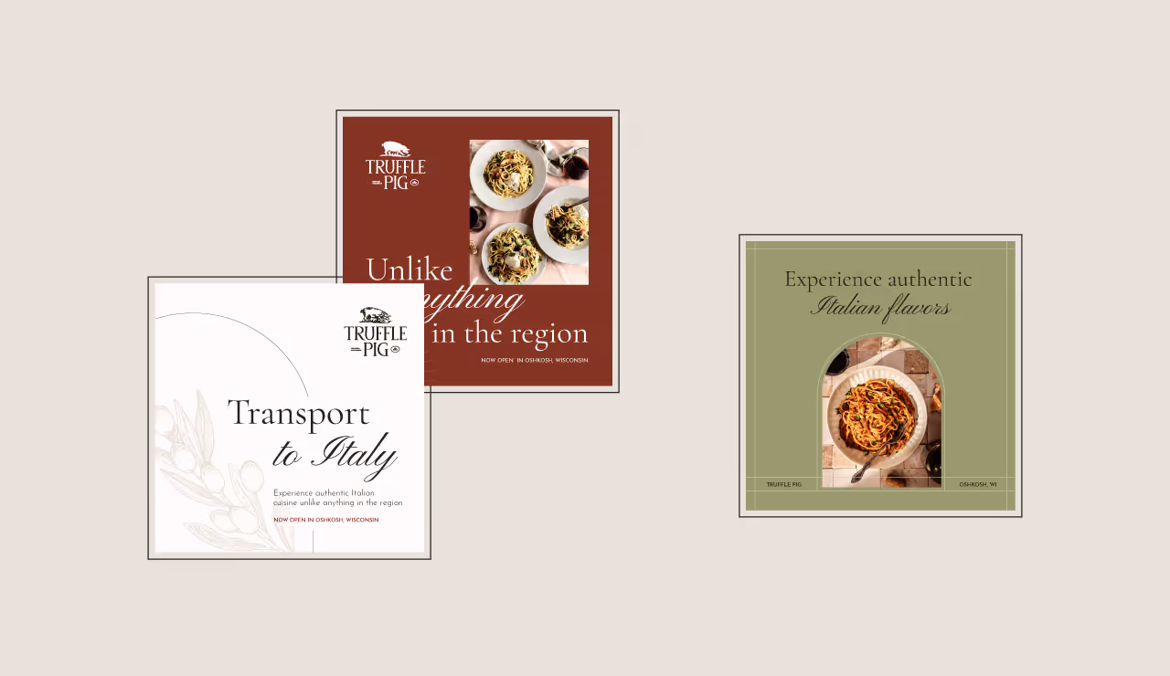
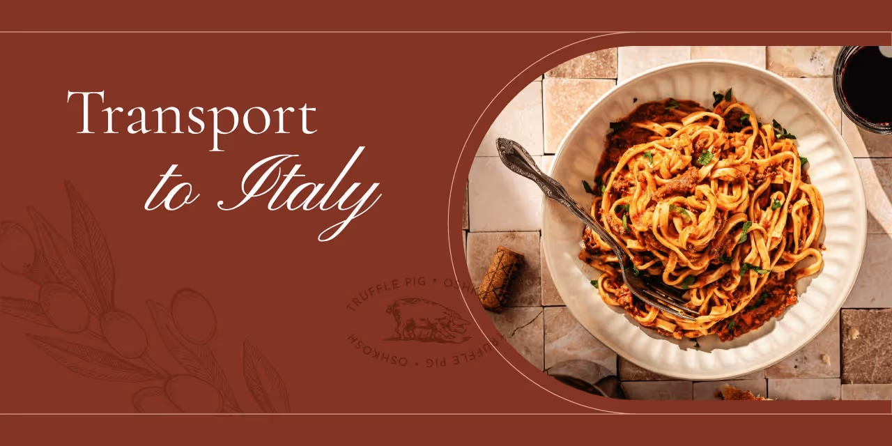
For this year’s report iteration, our team assessed the content and messaging that Feeding America wanted to spotlight and reviewed the elements that make up its core brand identity and strategy. This led us to our central theme: Graze. The theme embraces the idea of abundance, diversity, and community and invites attendees to explore the many ways that Feeding America makes meaningful impacts in communities all over the state.
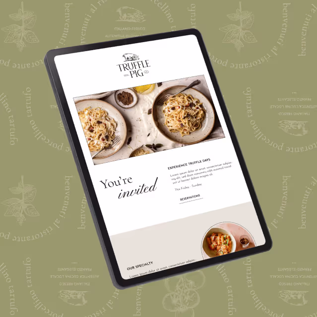
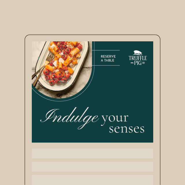
“Graze” reflects a contemporary yet playful approach by using vibrant, natural colors and organic illustrated elements that add a sense of energy to each page. Coupled with the clean, easy-to-read approach for the important data and stories within the report, these design elements allowed us to showcase the unique spirit of the event while maintaining continuity and cohesion across all touchpoints.

By embracing a theme that is both distinct and curated for this special event and aligned with the overall brand identity, we were able to deliver a compelling narrative within the report and environmentally throughout the gala. The final product is crafted to resonate with Feeding America’s audience, inspire action, and foster a sense of community by providing a taste of the impactful work they achieved.
Each year, our team gets to tackle the challenge of painting a comprehensive picture of Feeding America’s journey, aspirations, and impact over the last year. We always want this report, as well as the corresponding event, to be relevant and fresh while still feeling seamlessly aligned with the organization’s overall brand. It was important that we delivered a final product that was both visually tailored to the event and showcased a narrative of resilience, hope, and determination that inspired support and action from donors, volunteers, and advocates alike.
For this year’s report iteration, our team assessed the content and messaging that Feeding America wanted to spotlight and reviewed the elements that make up its core brand identity and strategy. This led us to our central theme: Graze. The theme embraces the idea of abundance, diversity, and community and invites attendees to explore the many ways that Feeding America makes meaningful impacts in communities all over the state.
“Graze” reflects a contemporary yet playful approach by using vibrant, natural colors and organic illustrated elements that add a sense of energy to each page. Coupled with the clean, easy-to-read approach for the important data and stories within the report, these design elements allowed us to showcase the unique spirit of the event while maintaining continuity and cohesion across all touchpoints.
By embracing a theme that is both distinct and curated for this special event and aligned with the overall brand identity, we were able to deliver a compelling narrative within the report and environmentally throughout the gala. The final product is crafted to resonate with Feeding America’s audience, inspire action, and foster a sense of community by providing a taste of the impactful work they achieved.


Each year, our team gets to tackle the challenge of painting a comprehensive picture of Feeding America’s journey, aspirations, and impact over the last year. We always want this report, as well as the corresponding event, to be relevant and fresh while still feeling seamlessly aligned with the organization’s overall brand. It was important that we delivered a final product that was both visually tailored to the event and showcased a narrative of resilience, hope, and determination that inspired support and action from donors, volunteers, and advocates alike.

For this year’s report iteration, our team assessed the content and messaging that Feeding America wanted to spotlight and reviewed the elements that make up its core brand identity and strategy. This led us to our central theme: Graze. The theme embraces the idea of abundance, diversity, and community and invites attendees to explore the many ways that Feeding America makes meaningful impacts in communities all over the state.
“Graze” reflects a contemporary yet playful approach by using vibrant, natural colors and organic illustrated elements that add a sense of energy to each page. Coupled with the clean, easy-to-read approach for the important data and stories within the report, these design elements allowed us to showcase the unique spirit of the event while maintaining continuity and cohesion across all touchpoints.


By embracing a theme that is both distinct and curated for this special event and aligned with the overall brand identity, we were able to deliver a compelling narrative within the report and environmentally throughout the gala. The final product is crafted to resonate with Feeding America’s audience, inspire action, and foster a sense of community by providing a taste of the impactful work they achieved.

Each year, our team gets to tackle the challenge of painting a comprehensive picture of Feeding America’s journey, aspirations, and impact over the last year. We always want this report, as well as the corresponding event, to be relevant and fresh while still feeling seamlessly aligned with the organization’s overall brand. It was important that we delivered a final product that was both visually tailored to the event and showcased a narrative of resilience, hope, and determination that inspired support and action from donors, volunteers, and advocates alike.
For this year’s report iteration, our team assessed the content and messaging that Feeding America wanted to spotlight and reviewed the elements that make up its core brand identity and strategy. This led us to our central theme: Graze. The theme embraces the idea of abundance, diversity, and community and invites attendees to explore the many ways that Feeding America makes meaningful impacts in communities all over the state.
“Graze” reflects a contemporary yet playful approach by using vibrant, natural colors and organic illustrated elements that add a sense of energy to each page. Coupled with the clean, easy-to-read approach for the important data and stories within the report, these design elements allowed us to showcase the unique spirit of the event while maintaining continuity and cohesion across all touchpoints.

By embracing a theme that is both distinct and curated for this special event and aligned with the overall brand identity, we were able to deliver a compelling narrative within the report and environmentally throughout the gala. The final product is crafted to resonate with Feeding America’s audience, inspire action, and foster a sense of community by providing a taste of the impactful work they achieved.
Each year, our team gets to tackle the challenge of painting a comprehensive picture of Feeding America’s journey, aspirations, and impact over the last year. We always want this report, as well as the corresponding event, to be relevant and fresh while still feeling seamlessly aligned with the organization’s overall brand. It was important that we delivered a final product that was both visually tailored to the event and showcased a narrative of resilience, hope, and determination that inspired support and action from donors, volunteers, and advocates alike.

For this year’s report iteration, our team assessed the content and messaging that Feeding America wanted to spotlight and reviewed the elements that make up its core brand identity and strategy. This led us to our central theme: Graze. The theme embraces the idea of abundance, diversity, and community and invites attendees to explore the many ways that Feeding America makes meaningful impacts in communities all over the state.
“Graze” reflects a contemporary yet playful approach by using vibrant, natural colors and organic illustrated elements that add a sense of energy to each page. Coupled with the clean, easy-to-read approach for the important data and stories within the report, these design elements allowed us to showcase the unique spirit of the event while maintaining continuity and cohesion across all touchpoints.
By embracing a theme that is both distinct and curated for this special event and aligned with the overall brand identity, we were able to deliver a compelling narrative within the report and environmentally throughout the gala. The final product is crafted to resonate with Feeding America’s audience, inspire action, and foster a sense of community by providing a taste of the impactful work they achieved.

Each year, our team gets to tackle the challenge of painting a comprehensive picture of Feeding America’s journey, aspirations, and impact over the last year. We always want this report, as well as the corresponding event, to be relevant and fresh while still feeling seamlessly aligned with the organization’s overall brand. It was important that we delivered a final product that was both visually tailored to the event and showcased a narrative of resilience, hope, and determination that inspired support and action from donors, volunteers, and advocates alike.

For this year’s report iteration, our team assessed the content and messaging that Feeding America wanted to spotlight and reviewed the elements that make up its core brand identity and strategy. This led us to our central theme: Graze. The theme embraces the idea of abundance, diversity, and community and invites attendees to explore the many ways that Feeding America makes meaningful impacts in communities all over the state.
“Graze” reflects a contemporary yet playful approach by using vibrant, natural colors and organic illustrated elements that add a sense of energy to each page. Coupled with the clean, easy-to-read approach for the important data and stories within the report, these design elements allowed us to showcase the unique spirit of the event while maintaining continuity and cohesion across all touchpoints.

By embracing a theme that is both distinct and curated for this special event and aligned with the overall brand identity, we were able to deliver a compelling narrative within the report and environmentally throughout the gala. The final product is crafted to resonate with Feeding America’s audience, inspire action, and foster a sense of community by providing a taste of the impactful work they achieved.
Each year, our team gets to tackle the challenge of painting a comprehensive picture of Feeding America’s journey, aspirations, and impact over the last year. We always want this report, as well as the corresponding event, to be relevant and fresh while still feeling seamlessly aligned with the organization’s overall brand. It was important that we delivered a final product that was both visually tailored to the event and showcased a narrative of resilience, hope, and determination that inspired support and action from donors, volunteers, and advocates alike.


For this year’s report iteration, our team assessed the content and messaging that Feeding America wanted to spotlight and reviewed the elements that make up its core brand identity and strategy. This led us to our central theme: Graze. The theme embraces the idea of abundance, diversity, and community and invites attendees to explore the many ways that Feeding America makes meaningful impacts in communities all over the state.
“Graze” reflects a contemporary yet playful approach by using vibrant, natural colors and organic illustrated elements that add a sense of energy to each page. Coupled with the clean, easy-to-read approach for the important data and stories within the report, these design elements allowed us to showcase the unique spirit of the event while maintaining continuity and cohesion across all touchpoints.


By embracing a theme that is both distinct and curated for this special event and aligned with the overall brand identity, we were able to deliver a compelling narrative within the report and environmentally throughout the gala. The final product is crafted to resonate with Feeding America’s audience, inspire action, and foster a sense of community by providing a taste of the impactful work they achieved.

Each year, our team gets to tackle the challenge of painting a comprehensive picture of Feeding America’s journey, aspirations, and impact over the last year. We always want this report, as well as the corresponding event, to be relevant and fresh while still feeling seamlessly aligned with the organization’s overall brand. It was important that we delivered a final product that was both visually tailored to the event and showcased a narrative of resilience, hope, and determination that inspired support and action from donors, volunteers, and advocates alike.

For this year’s report iteration, our team assessed the content and messaging that Feeding America wanted to spotlight and reviewed the elements that make up its core brand identity and strategy. This led us to our central theme: Graze. The theme embraces the idea of abundance, diversity, and community and invites attendees to explore the many ways that Feeding America makes meaningful impacts in communities all over the state.
“Graze” reflects a contemporary yet playful approach by using vibrant, natural colors and organic illustrated elements that add a sense of energy to each page. Coupled with the clean, easy-to-read approach for the important data and stories within the report, these design elements allowed us to showcase the unique spirit of the event while maintaining continuity and cohesion across all touchpoints.

By embracing a theme that is both distinct and curated for this special event and aligned with the overall brand identity, we were able to deliver a compelling narrative within the report and environmentally throughout the gala. The final product is crafted to resonate with Feeding America’s audience, inspire action, and foster a sense of community by providing a taste of the impactful work they achieved.


Each year, our team gets to tackle the challenge of painting a comprehensive picture of Feeding America’s journey, aspirations, and impact over the last year. We always want this report, as well as the corresponding event, to be relevant and fresh while still feeling seamlessly aligned with the organization’s overall brand. It was important that we delivered a final product that was both visually tailored to the event and showcased a narrative of resilience, hope, and determination that inspired support and action from donors, volunteers, and advocates alike.
For this year’s report iteration, our team assessed the content and messaging that Feeding America wanted to spotlight and reviewed the elements that make up its core brand identity and strategy. This led us to our central theme: Graze. The theme embraces the idea of abundance, diversity, and community and invites attendees to explore the many ways that Feeding America makes meaningful impacts in communities all over the state.
“Graze” reflects a contemporary yet playful approach by using vibrant, natural colors and organic illustrated elements that add a sense of energy to each page. Coupled with the clean, easy-to-read approach for the important data and stories within the report, these design elements allowed us to showcase the unique spirit of the event while maintaining continuity and cohesion across all touchpoints.
By embracing a theme that is both distinct and curated for this special event and aligned with the overall brand identity, we were able to deliver a compelling narrative within the report and environmentally throughout the gala. The final product is crafted to resonate with Feeding America’s audience, inspire action, and foster a sense of community by providing a taste of the impactful work they achieved.


Each year, our team gets to tackle the challenge of painting a comprehensive picture of Feeding America’s journey, aspirations, and impact over the last year. We always want this report, as well as the corresponding event, to be relevant and fresh while still feeling seamlessly aligned with the organization’s overall brand. It was important that we delivered a final product that was both visually tailored to the event and showcased a narrative of resilience, hope, and determination that inspired support and action from donors, volunteers, and advocates alike.

For this year’s report iteration, our team assessed the content and messaging that Feeding America wanted to spotlight and reviewed the elements that make up its core brand identity and strategy. This led us to our central theme: Graze. The theme embraces the idea of abundance, diversity, and community and invites attendees to explore the many ways that Feeding America makes meaningful impacts in communities all over the state.
“Graze” reflects a contemporary yet playful approach by using vibrant, natural colors and organic illustrated elements that add a sense of energy to each page. Coupled with the clean, easy-to-read approach for the important data and stories within the report, these design elements allowed us to showcase the unique spirit of the event while maintaining continuity and cohesion across all touchpoints.

By embracing a theme that is both distinct and curated for this special event and aligned with the overall brand identity, we were able to deliver a compelling narrative within the report and environmentally throughout the gala. The final product is crafted to resonate with Feeding America’s audience, inspire action, and foster a sense of community by providing a taste of the impactful work they achieved.

Each year, our team gets to tackle the challenge of painting a comprehensive picture of Feeding America’s journey, aspirations, and impact over the last year. We always want this report, as well as the corresponding event, to be relevant and fresh while still feeling seamlessly aligned with the organization’s overall brand. It was important that we delivered a final product that was both visually tailored to the event and showcased a narrative of resilience, hope, and determination that inspired support and action from donors, volunteers, and advocates alike.
For this year’s report iteration, our team assessed the content and messaging that Feeding America wanted to spotlight and reviewed the elements that make up its core brand identity and strategy. This led us to our central theme: Graze. The theme embraces the idea of abundance, diversity, and community and invites attendees to explore the many ways that Feeding America makes meaningful impacts in communities all over the state.
“Graze” reflects a contemporary yet playful approach by using vibrant, natural colors and organic illustrated elements that add a sense of energy to each page. Coupled with the clean, easy-to-read approach for the important data and stories within the report, these design elements allowed us to showcase the unique spirit of the event while maintaining continuity and cohesion across all touchpoints.
By embracing a theme that is both distinct and curated for this special event and aligned with the overall brand identity, we were able to deliver a compelling narrative within the report and environmentally throughout the gala. The final product is crafted to resonate with Feeding America’s audience, inspire action, and foster a sense of community by providing a taste of the impactful work they achieved.
Each year, our team gets to tackle the challenge of painting a comprehensive picture of Feeding America’s journey, aspirations, and impact over the last year. We always want this report, as well as the corresponding event, to be relevant and fresh while still feeling seamlessly aligned with the organization’s overall brand. It was important that we delivered a final product that was both visually tailored to the event and showcased a narrative of resilience, hope, and determination that inspired support and action from donors, volunteers, and advocates alike.

For this year’s report iteration, our team assessed the content and messaging that Feeding America wanted to spotlight and reviewed the elements that make up its core brand identity and strategy. This led us to our central theme: Graze. The theme embraces the idea of abundance, diversity, and community and invites attendees to explore the many ways that Feeding America makes meaningful impacts in communities all over the state.
“Graze” reflects a contemporary yet playful approach by using vibrant, natural colors and organic illustrated elements that add a sense of energy to each page. Coupled with the clean, easy-to-read approach for the important data and stories within the report, these design elements allowed us to showcase the unique spirit of the event while maintaining continuity and cohesion across all touchpoints.

By embracing a theme that is both distinct and curated for this special event and aligned with the overall brand identity, we were able to deliver a compelling narrative within the report and environmentally throughout the gala. The final product is crafted to resonate with Feeding America’s audience, inspire action, and foster a sense of community by providing a taste of the impactful work they achieved.
Each year, our team gets to tackle the challenge of painting a comprehensive picture of Feeding America’s journey, aspirations, and impact over the last year. We always want this report, as well as the corresponding event, to be relevant and fresh while still feeling seamlessly aligned with the organization’s overall brand. It was important that we delivered a final product that was both visually tailored to the event and showcased a narrative of resilience, hope, and determination that inspired support and action from donors, volunteers, and advocates alike.

For this year’s report iteration, our team assessed the content and messaging that Feeding America wanted to spotlight and reviewed the elements that make up its core brand identity and strategy. This led us to our central theme: Graze. The theme embraces the idea of abundance, diversity, and community and invites attendees to explore the many ways that Feeding America makes meaningful impacts in communities all over the state.
“Graze” reflects a contemporary yet playful approach by using vibrant, natural colors and organic illustrated elements that add a sense of energy to each page. Coupled with the clean, easy-to-read approach for the important data and stories within the report, these design elements allowed us to showcase the unique spirit of the event while maintaining continuity and cohesion across all touchpoints.
By embracing a theme that is both distinct and curated for this special event and aligned with the overall brand identity, we were able to deliver a compelling narrative within the report and environmentally throughout the gala. The final product is crafted to resonate with Feeding America’s audience, inspire action, and foster a sense of community by providing a taste of the impactful work they achieved.


Each year, our team gets to tackle the challenge of painting a comprehensive picture of Feeding America’s journey, aspirations, and impact over the last year. We always want this report, as well as the corresponding event, to be relevant and fresh while still feeling seamlessly aligned with the organization’s overall brand. It was important that we delivered a final product that was both visually tailored to the event and showcased a narrative of resilience, hope, and determination that inspired support and action from donors, volunteers, and advocates alike.


For this year’s report iteration, our team assessed the content and messaging that Feeding America wanted to spotlight and reviewed the elements that make up its core brand identity and strategy. This led us to our central theme: Graze. The theme embraces the idea of abundance, diversity, and community and invites attendees to explore the many ways that Feeding America makes meaningful impacts in communities all over the state.
“Graze” reflects a contemporary yet playful approach by using vibrant, natural colors and organic illustrated elements that add a sense of energy to each page. Coupled with the clean, easy-to-read approach for the important data and stories within the report, these design elements allowed us to showcase the unique spirit of the event while maintaining continuity and cohesion across all touchpoints.

By embracing a theme that is both distinct and curated for this special event and aligned with the overall brand identity, we were able to deliver a compelling narrative within the report and environmentally throughout the gala. The final product is crafted to resonate with Feeding America’s audience, inspire action, and foster a sense of community by providing a taste of the impactful work they achieved.


Each year, our team gets to tackle the challenge of painting a comprehensive picture of Feeding America’s journey, aspirations, and impact over the last year. We always want this report, as well as the corresponding event, to be relevant and fresh while still feeling seamlessly aligned with the organization’s overall brand. It was important that we delivered a final product that was both visually tailored to the event and showcased a narrative of resilience, hope, and determination that inspired support and action from donors, volunteers, and advocates alike.

For this year’s report iteration, our team assessed the content and messaging that Feeding America wanted to spotlight and reviewed the elements that make up its core brand identity and strategy. This led us to our central theme: Graze. The theme embraces the idea of abundance, diversity, and community and invites attendees to explore the many ways that Feeding America makes meaningful impacts in communities all over the state.
“Graze” reflects a contemporary yet playful approach by using vibrant, natural colors and organic illustrated elements that add a sense of energy to each page. Coupled with the clean, easy-to-read approach for the important data and stories within the report, these design elements allowed us to showcase the unique spirit of the event while maintaining continuity and cohesion across all touchpoints.


By embracing a theme that is both distinct and curated for this special event and aligned with the overall brand identity, we were able to deliver a compelling narrative within the report and environmentally throughout the gala. The final product is crafted to resonate with Feeding America’s audience, inspire action, and foster a sense of community by providing a taste of the impactful work they achieved.


Each year, our team gets to tackle the challenge of painting a comprehensive picture of Feeding America’s journey, aspirations, and impact over the last year. We always want this report, as well as the corresponding event, to be relevant and fresh while still feeling seamlessly aligned with the organization’s overall brand. It was important that we delivered a final product that was both visually tailored to the event and showcased a narrative of resilience, hope, and determination that inspired support and action from donors, volunteers, and advocates alike.


For this year’s report iteration, our team assessed the content and messaging that Feeding America wanted to spotlight and reviewed the elements that make up its core brand identity and strategy. This led us to our central theme: Graze. The theme embraces the idea of abundance, diversity, and community and invites attendees to explore the many ways that Feeding America makes meaningful impacts in communities all over the state.
“Graze” reflects a contemporary yet playful approach by using vibrant, natural colors and organic illustrated elements that add a sense of energy to each page. Coupled with the clean, easy-to-read approach for the important data and stories within the report, these design elements allowed us to showcase the unique spirit of the event while maintaining continuity and cohesion across all touchpoints.


By embracing a theme that is both distinct and curated for this special event and aligned with the overall brand identity, we were able to deliver a compelling narrative within the report and environmentally throughout the gala. The final product is crafted to resonate with Feeding America’s audience, inspire action, and foster a sense of community by providing a taste of the impactful work they achieved.


Each year, our team gets to tackle the challenge of painting a comprehensive picture of Feeding America’s journey, aspirations, and impact over the last year. We always want this report, as well as the corresponding event, to be relevant and fresh while still feeling seamlessly aligned with the organization’s overall brand. It was important that we delivered a final product that was both visually tailored to the event and showcased a narrative of resilience, hope, and determination that inspired support and action from donors, volunteers, and advocates alike.


For this year’s report iteration, our team assessed the content and messaging that Feeding America wanted to spotlight and reviewed the elements that make up its core brand identity and strategy. This led us to our central theme: Graze. The theme embraces the idea of abundance, diversity, and community and invites attendees to explore the many ways that Feeding America makes meaningful impacts in communities all over the state.
“Graze” reflects a contemporary yet playful approach by using vibrant, natural colors and organic illustrated elements that add a sense of energy to each page. Coupled with the clean, easy-to-read approach for the important data and stories within the report, these design elements allowed us to showcase the unique spirit of the event while maintaining continuity and cohesion across all touchpoints.

By embracing a theme that is both distinct and curated for this special event and aligned with the overall brand identity, we were able to deliver a compelling narrative within the report and environmentally throughout the gala. The final product is crafted to resonate with Feeding America’s audience, inspire action, and foster a sense of community by providing a taste of the impactful work they achieved.


Each year, our team gets to tackle the challenge of painting a comprehensive picture of Feeding America’s journey, aspirations, and impact over the last year. We always want this report, as well as the corresponding event, to be relevant and fresh while still feeling seamlessly aligned with the organization’s overall brand. It was important that we delivered a final product that was both visually tailored to the event and showcased a narrative of resilience, hope, and determination that inspired support and action from donors, volunteers, and advocates alike.

For this year’s report iteration, our team assessed the content and messaging that Feeding America wanted to spotlight and reviewed the elements that make up its core brand identity and strategy. This led us to our central theme: Graze. The theme embraces the idea of abundance, diversity, and community and invites attendees to explore the many ways that Feeding America makes meaningful impacts in communities all over the state.
“Graze” reflects a contemporary yet playful approach by using vibrant, natural colors and organic illustrated elements that add a sense of energy to each page. Coupled with the clean, easy-to-read approach for the important data and stories within the report, these design elements allowed us to showcase the unique spirit of the event while maintaining continuity and cohesion across all touchpoints.


By embracing a theme that is both distinct and curated for this special event and aligned with the overall brand identity, we were able to deliver a compelling narrative within the report and environmentally throughout the gala. The final product is crafted to resonate with Feeding America’s audience, inspire action, and foster a sense of community by providing a taste of the impactful work they achieved.


Each year, our team gets to tackle the challenge of painting a comprehensive picture of Feeding America’s journey, aspirations, and impact over the last year. We always want this report, as well as the corresponding event, to be relevant and fresh while still feeling seamlessly aligned with the organization’s overall brand. It was important that we delivered a final product that was both visually tailored to the event and showcased a narrative of resilience, hope, and determination that inspired support and action from donors, volunteers, and advocates alike.


For this year’s report iteration, our team assessed the content and messaging that Feeding America wanted to spotlight and reviewed the elements that make up its core brand identity and strategy. This led us to our central theme: Graze. The theme embraces the idea of abundance, diversity, and community and invites attendees to explore the many ways that Feeding America makes meaningful impacts in communities all over the state.
“Graze” reflects a contemporary yet playful approach by using vibrant, natural colors and organic illustrated elements that add a sense of energy to each page. Coupled with the clean, easy-to-read approach for the important data and stories within the report, these design elements allowed us to showcase the unique spirit of the event while maintaining continuity and cohesion across all touchpoints.


By embracing a theme that is both distinct and curated for this special event and aligned with the overall brand identity, we were able to deliver a compelling narrative within the report and environmentally throughout the gala. The final product is crafted to resonate with Feeding America’s audience, inspire action, and foster a sense of community by providing a taste of the impactful work they achieved.


Each year, our team gets to tackle the challenge of painting a comprehensive picture of Feeding America’s journey, aspirations, and impact over the last year. We always want this report, as well as the corresponding event, to be relevant and fresh while still feeling seamlessly aligned with the organization’s overall brand. It was important that we delivered a final product that was both visually tailored to the event and showcased a narrative of resilience, hope, and determination that inspired support and action from donors, volunteers, and advocates alike.


For this year’s report iteration, our team assessed the content and messaging that Feeding America wanted to spotlight and reviewed the elements that make up its core brand identity and strategy. This led us to our central theme: Graze. The theme embraces the idea of abundance, diversity, and community and invites attendees to explore the many ways that Feeding America makes meaningful impacts in communities all over the state.
“Graze” reflects a contemporary yet playful approach by using vibrant, natural colors and organic illustrated elements that add a sense of energy to each page. Coupled with the clean, easy-to-read approach for the important data and stories within the report, these design elements allowed us to showcase the unique spirit of the event while maintaining continuity and cohesion across all touchpoints.


By embracing a theme that is both distinct and curated for this special event and aligned with the overall brand identity, we were able to deliver a compelling narrative within the report and environmentally throughout the gala. The final product is crafted to resonate with Feeding America’s audience, inspire action, and foster a sense of community by providing a taste of the impactful work they achieved.


Each year, our team gets to tackle the challenge of painting a comprehensive picture of Feeding America’s journey, aspirations, and impact over the last year. We always want this report, as well as the corresponding event, to be relevant and fresh while still feeling seamlessly aligned with the organization’s overall brand. It was important that we delivered a final product that was both visually tailored to the event and showcased a narrative of resilience, hope, and determination that inspired support and action from donors, volunteers, and advocates alike.

For this year’s report iteration, our team assessed the content and messaging that Feeding America wanted to spotlight and reviewed the elements that make up its core brand identity and strategy. This led us to our central theme: Graze. The theme embraces the idea of abundance, diversity, and community and invites attendees to explore the many ways that Feeding America makes meaningful impacts in communities all over the state.
“Graze” reflects a contemporary yet playful approach by using vibrant, natural colors and organic illustrated elements that add a sense of energy to each page. Coupled with the clean, easy-to-read approach for the important data and stories within the report, these design elements allowed us to showcase the unique spirit of the event while maintaining continuity and cohesion across all touchpoints.


By embracing a theme that is both distinct and curated for this special event and aligned with the overall brand identity, we were able to deliver a compelling narrative within the report and environmentally throughout the gala. The final product is crafted to resonate with Feeding America’s audience, inspire action, and foster a sense of community by providing a taste of the impactful work they achieved.


